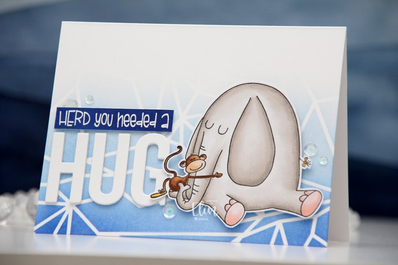
Hi, crafty friends! I’m so happy to be back in the craft room on a somewhat regular basis. The months of mid October through mid January were insane, and I had no crafty time whatsoever, but that’s changed now. I have a fun card to share today, featuring this Hugs image from Purple Onion Designs, illustrated by Julian Charlton. I love his Elliot & Marcel images, they’re quirky and cute and just perfect.
 I chose to color Elliot in a very soft grey, and once fully colored, fussy cut the image leaving a thin white border. I put the image aside and started working on the rest of the card.
 I felt a landscape design would work best for what I had in mind, and used the Geometric Landscape stencil from Altenew to create some interest in the background with blue inks, also from Altenew. I used the entire Lapis Lazuli color palette from Altenew for my blending, (Azurite, Ultramarine, Eastern Sky, Iceberg) which fades to white at the top.
 Using the Sending You Hugs die from My Favorite Things, I die cut the letters to spell out HUG four times from white cardstock from Papertrey Ink, which happens to be the same cardstock I used for my cardbase. I love their white cardstock, it’s the best by far. I stacked the letters for dimension and stamped and white heat embossed a punny sentiment that comes with Elliot & Marcel. There are actually a few more sentiments in the set, and I added another one to the inside of the card. I didn’t have the right color cardstock, though, so I cheated and covered white cardstock with the Azurite color, which is the darkest of the four blues I used for the blending of the background. To create the sentiment strip, I went direct to paper, and used my heat tool to speed up the drying process of the ink so I could stamp and heat emboss on top. I added three additional strips of cardstock behind it to make it flush with the die cut letters, adhered it to the card and finished off with a few sequins from the White Orchid Sequin mix from Little Things from Lucy’s Cards.
 I chimply love punny sentiments and couldn’t resist.
 Very simple color palette for this one. This was fast to color.

 I love these animal number images from Rachelle, and these ducks are sooo cute. Perfect for a birthday card, I think. I colored the image with my Copics, before temporarily adhering the Watercolor Wash Free Form stencil from My Favorite Things and ink blending with Harvest Gold ink from Papertrey Ink. I then stamped a sentiment from the A06 stamp set from Norsk Stempelblad AS using Shadow Creek ink from Altenew.
 I used the largest of the Wonky Stitched Rectangle STAX dies from My Favorite Things to create a quirky faux stitch interest around the edge and adhered my panel to a top fold card base I created from Meadow cardstock from Hero Arts.
 To finish off the card I added a few raindrops from Little Things from Lucy’s Cards, I thought they fit well with the water theme in the image.
 I colored the donut with my Copics and fussy cut it, leaving a thin white border around the edge. I printed a panel of several donuts in light gray for a bit of added interest in the background, popped up my panel onto a card base I created from Rustic Cream cardstock from Papertrey Ink, while I worked on the rest of the card.
 Using the Parker alphabet die set from Memory Box, I die cut the letters to spell sweet from Grapesicle cardstock from My Favorite Things. I stacked six of each for a dimensional look.
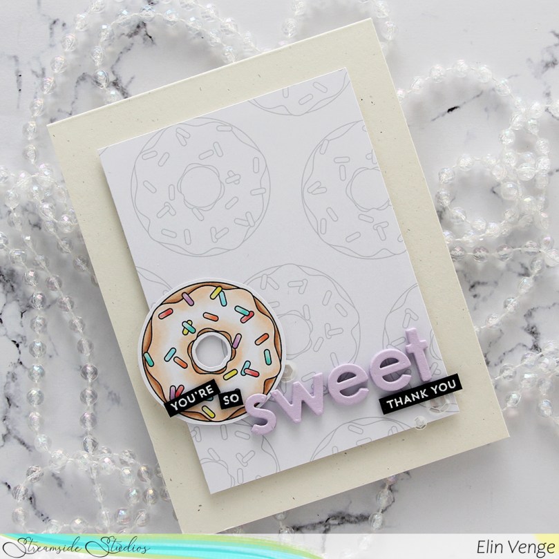 I stamped and white heat embossed partial sentiments from the Itty Bitty Basics and Itty Bitty Gifting stamp sets from My Favorite Things to complete my sentiment, adhered it all to the card and finished with a few sequins from the White Orchid Sequin mix from Little Things From Lucy’s Cards.
 I colored my image with Copics, before using one of the stitched rectangle dies from My Favorite Things to create a nice faux stitching detail along the edges of the panel. I then sprinkled on a generous amount of chunky white embossing enamel from Stampendous and melted the granules from the back of the panel.
 I created a card base from Vintage Timber cardstock from My Favorite Things and mounted my colored panel in the center using foam tape. Using the Believe die from Simon Says stamp, I die cut four white believe that I glued together for a stacked look and added one more on top that I colored with blue Copics (B91 and B0000) before die cutting. It gives the word a little bit of added interest. I stamped and white heat embossed a sentiment from the Holiday Messages stamp set from Mama Elephant onto Wild Cherry cardstock from My Favorite Things and cut the sentiment down to strips, adding a few extra layers of cardstock behind for dimension and strength.
 I have a coloring/card making buddy in Liz Vefall and sometimes ask her for suggestions when I’m stuck and/or can’t make up my mind. I always run with her ideas and the cards usually end up looking great, but I seem to have lost the ability to turn her suggestions into a final product that I’m happy with. The black pants and the brown card base were both suggestions from her, and I’m not comfortable with the end result, somehow. Diecutting the white word with a little bit of blue at the bottom was also her suggestion, and I wound up loving that, so I ended on a positive, at least
 Fairly standard Christmas color palette, with a couple of odd ones thrown in there for good measure.
 I love the playful nature of the Lili of the Valley stamps, and their adorable critters drew me in when I was a new cardmaker years and years ago. I still have all my old rubber stamps from Lili of the Valley, and they stamp so well. This one is digital, however, and the two main advantages that I see in digital stamps are that you can adjust the size to suit your needs and that there’s no waiting for ink to dry. Also, you get a perfect print every time. I love digital stamps!
 I haven’t made a mini slimline card in a while, and decided that this image would be perfect for it. I created a card base that was slightly smaller than an average mini slimline. This one measures 5 1/4 x 3″, it fit the scene better than a 6″ wide base.
 I colored the scene with Copics, cut it down to a size that left a nice border around the edge and adhered it directly to the card base, before adding some crystals from a mix from Little Things from Lucy’s Cards to the banner.
 The crystals add a tiny bit of dimension to an otherwise fairly flat card, and those penguins are the cutest, aren’t they?
 Simple color palette for this one.

 I used flowers from different companies (I honestly don’t know where these are from, I’ve had them for 10+ years, but I’m thinking most of these are from Wild Orchid Crafts. The ruffled roses are really old ones from Kort & Godt, and I think the teal ones might be from I am roses, though I’m not entirely sure), removed the yellow centers from the teal ones and replaced them with white pearls from Papirdesign.
 Both insides share the same layout, and so does the back. I printed a sentiment to go on the back, as well as the date, and a few more flowers. These cards that I make with decorations on all four sides are thick, flowers add a ton of dimension. I used old patterned paper from Maja Design for this card. The Vintage Spring Basics collection and the Vintage Summer Basics collection are both collections that Maja Design released over 10 years ago. Back then, I used plenty of patterned paper, and especially Maja Design. Their paper is such good quality, and I love their use of pattern and color. My style has changed considerably, and I rarely use large pieces of patterned paper anymore, but I still have a lot, and Maja Design is still a favorite.
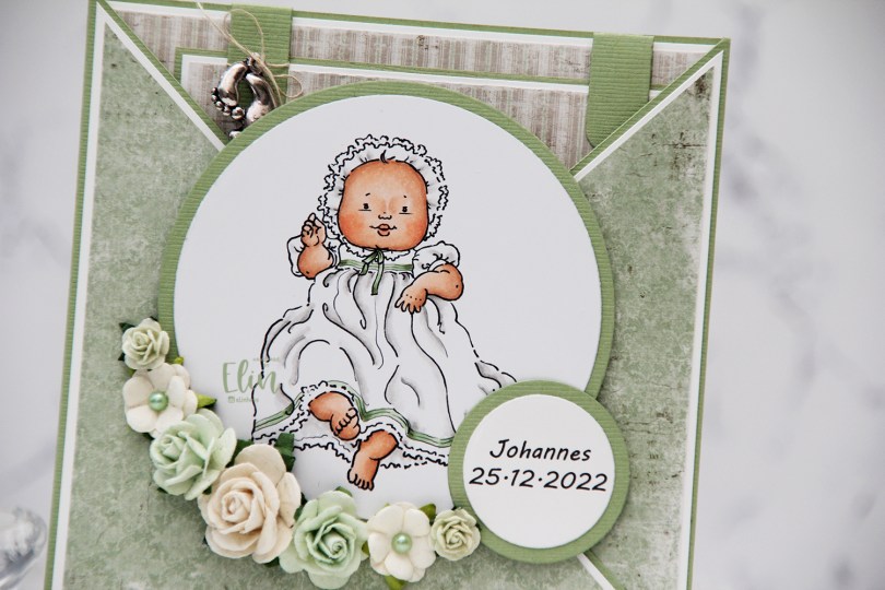
 This
This  I colored the image with Copics and used patterned paper from Maja Design to create this criss cross card. I added some flowers, a few pearls and also a charm to the large square tag I put inside, which has plenty of room for a personal message.
 On the back I put an additional sentiment, and the card was complete. Easy peasy.
 Simple color palette, not a whole lot of Copics.
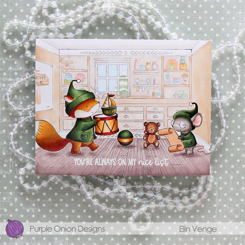
 Cue
Cue  I’ve always been a fan of creating blue Christmas cards, but in the past couple of years, green has grown on me, and I think I made more green Christmas cards this year than blue ones. It helps that I’ve found a green Copic combo that I really like.
 When all the coloring was done, I stamped and white heat embossed a sentiment from the
  Lots of Copics for this one.
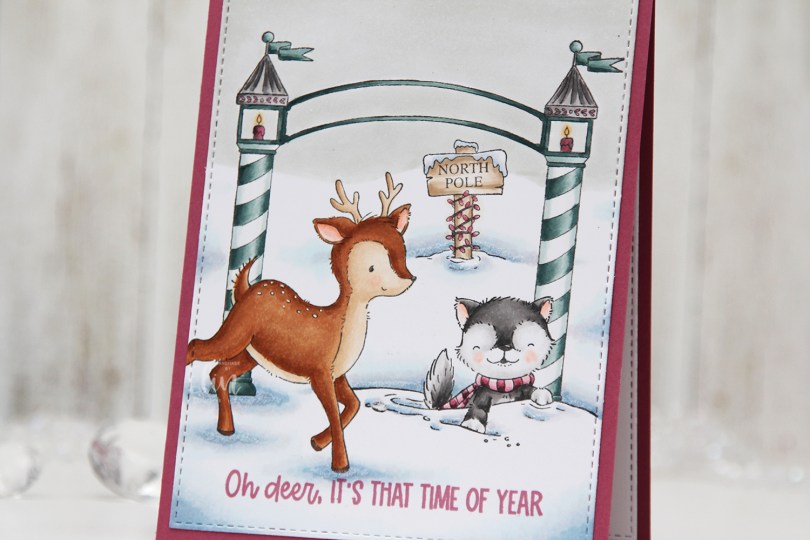

 I used a white Gelly Roll 05 pen to create the white dots on the deer, and a die from the A2 Stitched Rectangles STAX 2 set from My Favorite Things to create the faux stitching on the edges of the panel. By not stamping the entire deer, it creates a dynamic effect of having it walk in from the edge of the card.
 I stamped a sentiment from the
 The pink and blue green color combination is definitely not traditional for Christmas, but I kind of like it. What do you think, does it work?
 Quite a few Copics for such a simple card.
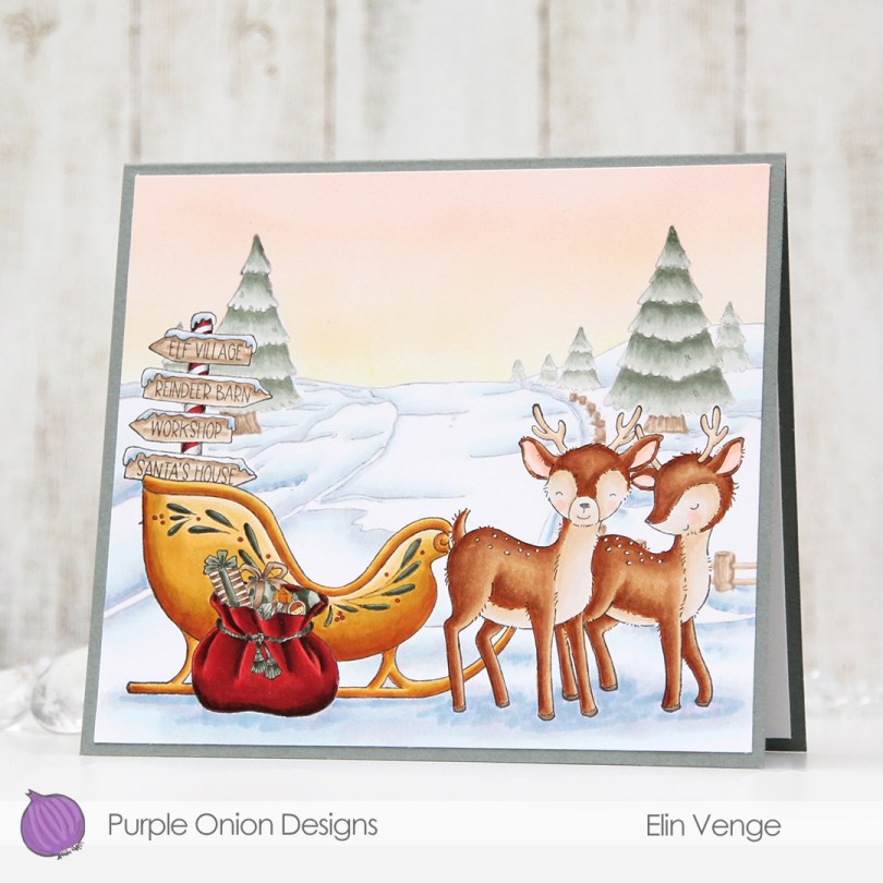
 I wanted to make a peaceful scene for this card. I stamped and masked
  I masked off the background too, before going in with my Copic airbrush system to create a soft winter sunset. I then peeled off the masks, colored the background, then everything else.
 I left the red details till the end. I don’t want to run the risk of other colors picking up the red, so by leaving it to the end, I avoid that.
 Looks like these reindeer are very patiently waiting for Santa. I wonder where he is? Actually, yesterday on my way to work, I saw a passenger on the bus with a long red Santa hat.
 I didn’t want to mess up the sky with a sentiment, and the bottom part of the card is too full for one. I might put one inside, but to finish the card, I merely adhered my scene onto a top fold card base I created from Stormy Sea cardstock from Papertrey Ink. The finished card measures 6 x 5 3/8″, which is a bit of an odd size, but I prefer making my card size fit the scene and not the other way around when I create these full scene cards with Purple Onion images.
 Not a whole lot of Copics for this one, actually.