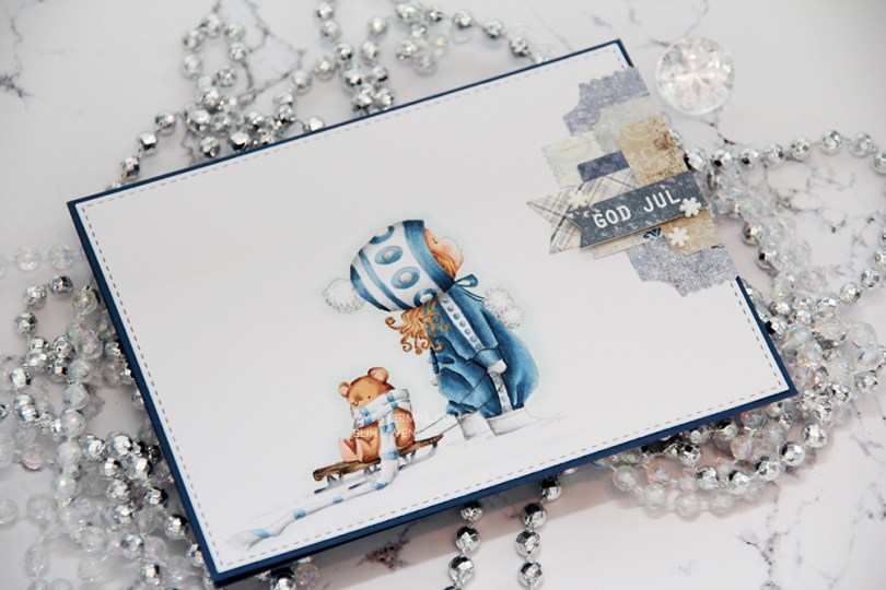
Is it Christmas yet? No? Really? Are you sure? Let’s just pretend for a quick minute, because I have a Christmas card to share today, featuring Katie and Bear from Mo’s Digital Pencil.
 I had to use my favorite color combination for Christmas on this one. Blue, grey and brown. I made my greys very light, so they look more white than grey, and I have to admit I kind of love the look! I printed the image with 15 % opacity and did no line coloring. I love no line coloring!
 This card is very “me”. The cardbase is made from Papertrey Ink Enchanted Evening cardstock, I used a die from My Favorite Things to add the faux stitching detail on the main panel, and I added a little cluster of diecut patterned paper scraps. I stamped and heat embossed a Norsk Stempelblad AS sentiment on one of the patterned paper pieces and added three snowdrift sprinkles from Little Things from Lucy’s Card as my finishing touch.
 Clean and simple with cluster, these cards come together so easily once the image is colored.
 I used quite a few colors for this simple image. Lots of different earth tones for different parts of the image, and two grey families.
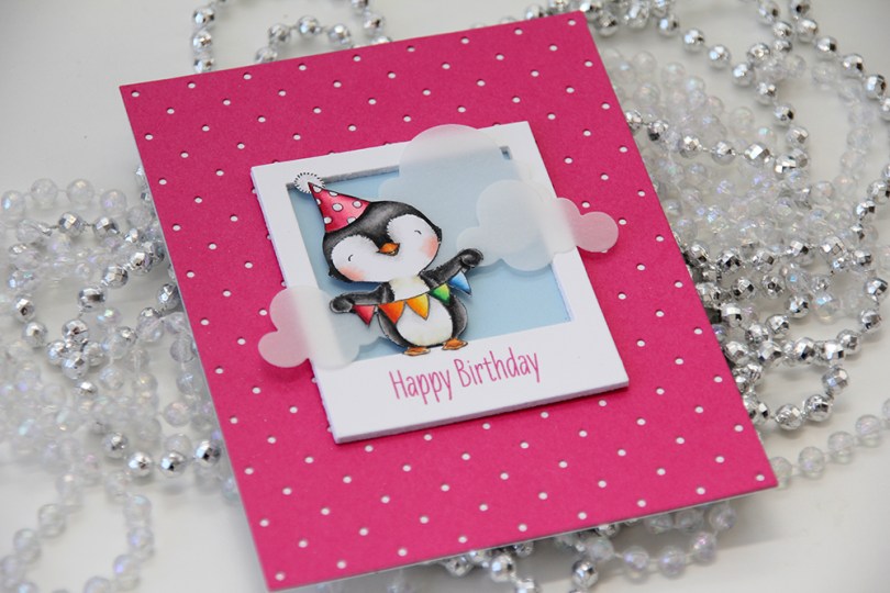
 I love every image Stacey Yacula designs. This little penguin, from the
  I created a polaroid frame by diecutting the
  I wanted a little bit of interest to my background and diecut a piece of Raspberry Fizz cardstock from Papertrey Ink with the
  I glued my polaroid frame in the center of the card and added a few strategically placed vellum clouds. Because they hang off the edge of the frame, they break up the rigid rectangular look a little bit.
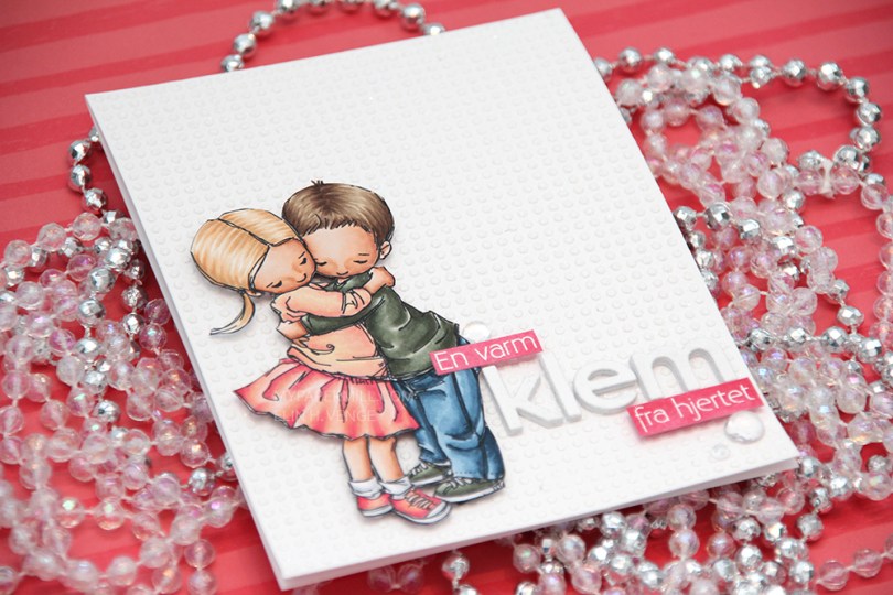
 I colored up
  This card is somewhat different for me. It has a lot of white space, which is fairly common for me, but I used a stencil and texture paste on the card base to change it up a bit, which definitely isn’t normal for me. I even sprinkled distress glitter all over the texture paste while it was still wet, so the card sparkles when you tilt it in the light. Glitter is a nightmare to photograph, though, so it doesn’t show up in the photos very well.
 I used the Parker alpha set from Memory box to diecut the word klem, which means hug in Norwegian. I diecut each letter five times and glued them together for a stacked, dimensional look. I created a couple of pink cardstock pieces by using one of the Copic markers I used on the skirt, stamped the remainder of my sentiment and heat embossed in white before glueing them on with clear foam tape.
 By adding part of my sentiment on top of the image, I get a more cohesive design than I would have if I had put my little sentiment strip above the word only. Just a little design tip. I finished off the card by adding a few raindrops from Little Things from Lucy’s Cards.
 These are all the Copics I used, and I must admit that I really love the pink and peach combos I came up with for this one.
 I colored up
  I used a Docrafts die to create those tickets from scraps of patterned paper from Maja Design, popping them up on foam squares from Gina K designs to give them a little bit of dimension. I white heat embossed a sentiment from Ladybug & Friends on one of the tickets and tucked a diecut pine branch behind it. I finished by adding a few red enamel dots from Papirdesign, tying in the red details from the colored image.
 As usual, I finish with the Copic colors I used to color my image.
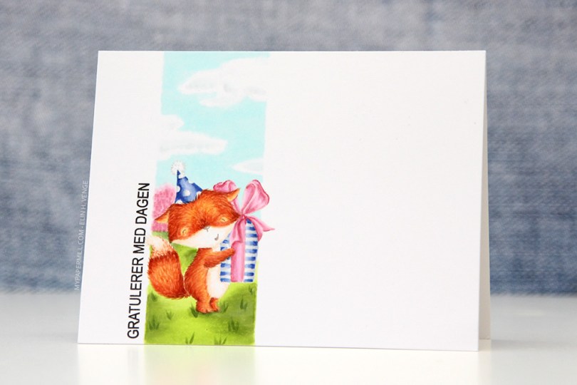
 Jeg startet med å stemple den søte reven fra
  Jeg stemplet en
 I colored up
  I’ve had this image for so long, and it really felt good to finally color it up. I used the largest of the dies in the Stitched Rectangles STAX (2) set from My Favorite Things, before heat embossing a Norsk Stempelblad AS sentiment in white using super fine detail embossing powder from Ranger.
 I love the look of those heart shaped raindrops from Little Things from Lucy’s Cards. They’re part of the crystal collection and add the perfect little touch to such a simple card.

 I turned my image into a card last night by stamping a sentiment, diecutting the entire panel with a faux stitch rectangle die, adding that to my card front and embellishing very sparingly with three clear crystals from the Ice Water mix from Little Things from Lucy’s Cards. That’s it.
 The sentiment is from the B04 stamp set from Norsk Stempelblad AS. I love the stamps Åshild has designed and am so glad I have so many different sets from them. I used Enchanted Evening ink from Papertrey Ink. It’s a beautiful dark blue color.
 Cards don’t get much simpler than this. And cards like this are so fun to make, too.
 Would you believe I used 10 (yes, ten) different colors for the fur?? Am I crazy?
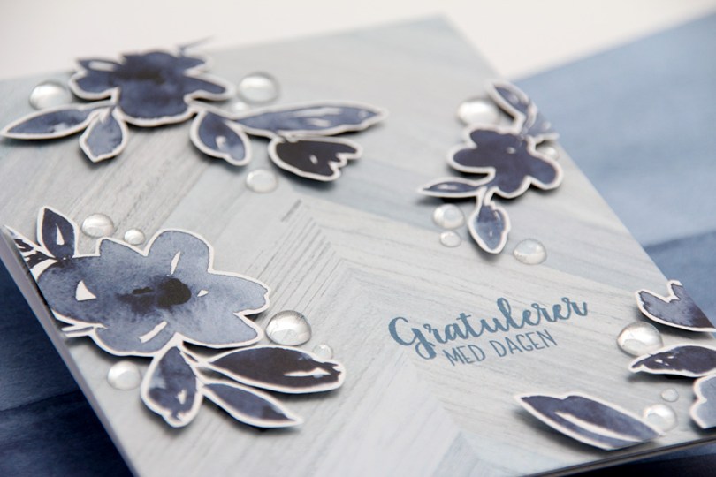
 Utrolig nok er det faktisk kun ett mønsterark som er brukt på dette kortet. Den lysere, mer diskrete bakgrunnen er nemlig baksiden av mønsterarket med alle blomstene.
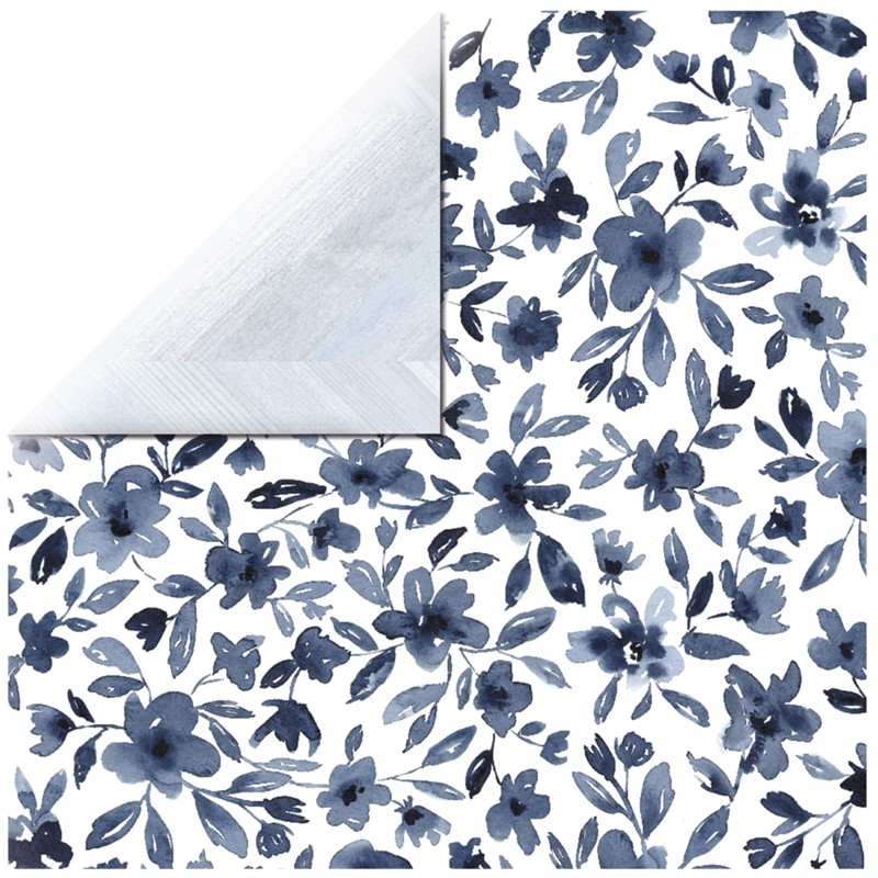 Jeg bestemte meg for å klippe rundt noen av blomstene og bruke dem som elementer på kortet mitt. Vanligvis liker jeg å klippe helt til kanten, men stilkene på disse blomstene er ganske spinkle, så jeg syns det var best med en hvit kant rundt for å spare meg for mye trøbbel.
 Jeg satte lave 3D-puter bak blomstene mine og monterte dem der jeg ville ha dem på kortet. Nede i det høyre hjørnet ser du også at jeg har brukt det jeg hadde til overs på innsiden, der har jeg riktignok kun limt det rett på uten 3D-puter bak, med en tynn strimmel av det lyseblå tvers over nederst på innsiden. Tekststempelet på fronten kommer fra Fleksitekstplaten til Huldra designstudio og er stemplet med Papertrey Ink Enchanted Evening blekk. Den er egentlig ganske mørk, men mulig jeg burde ha gått for en farge som er enda mørkere, jeg syns den ser litt blass ut mot det mørkeste i blomstene.
 Her syns det godt at blomstene sitter litt opp fra fronten av kortet. Jeg har brukt svarte 3D-puter, syns de ofte er bedre å bruke enn hvite, de er nemlig mindre synlige fra siden.
 Til slutt limte jeg på raindrops fra Little Things from Lucy’s Cards i forskjellige størrelser rundt blomstene mine. Vanligvis setter jeg småpynt som dette rundt teksten, to under og en over, men her har jeg fokusert på blomstene istedenfor. Pynten gjør at øynene dras mot blomstene, og gratulerer-teksten blir mer som et bakgrunnselement.
 I colored her up with my Copics, focusing on the RV90s that go so incredibly well with the patterned paper from Papirdesign that I used, it’s ridiculous!
 I made a shaped card using the third largest die in the XXL Square Frames Frilly #10 set from GoKreate, and did a whole bunch of diecutting elsewhere on the card too. To break up the monotony of a diecut on top of a slightly larger diecut on top of a slightly larger diecut on top of a slightly larger diecut, I cut some Kort & Godt lace and put it across the card. The diecut heart banner, the word banner and all those Wild Orchid Crafts flowers also help. The flower berries and pearls are from Kort & Godt.
 There’s a banner hidden behind that image, diecut with a Magnolia die. I tied a bow of seam binding ribbon with the help of a DIY bow easy, I can’t make nice bows for cards to save my life (true story!), so the Bow Easy helps. I stamped a Papirdesign stamp using Memento Sweet Plum ink, which also matches the patterned papers beautifully. On top of the bow I added an old button from Melissa Frances.
 Is that an adorable little fairy or what? Those flower berries from Kort & Godt are really old, I think they might actually be from their first production of flower berries. They made some later on that had more of a greenish yellowy tint, but these are more creme colored and perfect for this card. I still have a few left, I only use them on very special cards.
 I added another Papirdesign sentiment stamp on the back of the card, along with a few more flowers. I removed the centers of the sweetheart blossoms and added back in some purple pearls from Papirdesign that once again matched the colors of everything else.
 As you can see from the above photo, this is a very dimensional card and not at all mail friendly, it’s super thick.
 Not too many Copics used for this one. Probably because it’s mostly that one dominating color.
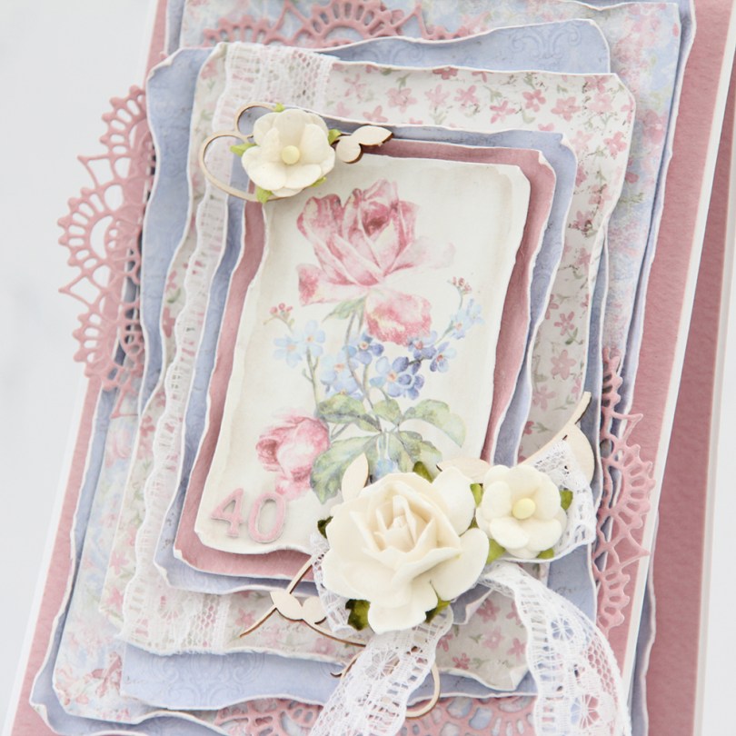
 There are two types of cards I love making more than any other: Christmas cards and birthday cards. I love making clean and simple cards, but also very layered ones with lots of patterned paper. Today’s card is one of those, made exclusively with papers from the Sofiero collection from Maja Design.
 One of the things I love the most about Maja Design paper is the quality of the paper they use. It’s almost as thick as cardstock, something I haven’t really found in other patterned papers. Their patterns are gorgous, too, making card making a breeze. The thick quality also means I can use a wet paint brush (with clean water) and run along the edges, before using my fingers to curl them slightly back. This is so much easier to do when the paper is wet, and so much easier to do with these good quality papers. Thinner paper won’t hold up as well to all that water. I love the look you achieve by doing this.
 I’m not an embellishment queen. I use a little bit on cards like this, but I rarely do a lot. This time, I used some pieces of chipboard from SnipArt and a few flowers to frame the image in the center of my card. I also used some lace to combat the rigid look you sometimes get when using just straight lines like square or rectangular panels.
 I also added a couple of diecut doilies to further break up the linear look, and added stacked diecut numbers to the bottom left of the focal point of the card. As you can tell from this photo, this is a card with lots of dimension, it’s not very mail friendly.
 I did a little bit of layering on the insides, as well. They are both the same, and those pink center panels provide plenty of room to write a personal message to the birthday girl.
 On the back of the card I stamped a sentiment from Norsk Stempelblad AS using Papertrey Ink Autumn Rose ink. The text is about butterflies, so I thought it fitting to add a few chipboard ones for a little bit of extra interest.
 Even though my card isn’t very mail friendly, I needed something to put it in, so I made a box envelope to go with it and added the recipient’s name on the front of it. The card was hand delivered, so this works perfectly.