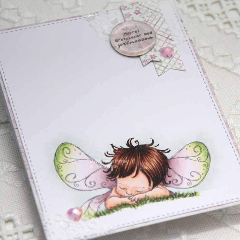
Another Wednesday, another creation featuring a Mo Manning image. I’m still working my way through the alphabet of my unused digis, and today it was time to color up Fairy Sleepy.
 I printed my image on a piece of X-Press It cut down to 4 1/4 x 5 1/2″. I colored my image with my Copics and used the largest of the stitched rectangle dies from My Favorite Things to cut it slightly smaller.
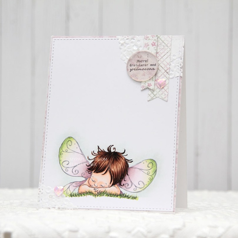 I’m also doing my best this year to use scraps of patterned paper. I have a basket of scraps that I’ve cut down to card front sizes, and I realized pink is the color I have the most of, which was the reason for my color choice today. I found a pink scrap in the basket that I wanted to use, colored my image in matching colors and took a bit of a dive into my smaller scraps to find pieces to use for my cluster. The circle with the sentiment is actually cut from the center of the patterned paper I used on the front of this card, which is a scrap from the Vintage Summer Basics collection from Maja Design. The diecut banners are from the Sofiero collection, the colors were perfect for this card.
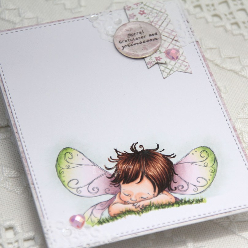 I used part of a Doodlebug mini paper doily in the top right corner as a base for my small cluster. I had a tiny bit left over and glued in the opposite corner. I embellished very simply with a couple of hearts from the Rosy Glow mix from Little Things from Lucy’s Cards and sequins from the White Orchid Sequin mix, also from Little Things from Lucy’s Cards. I added an epoxy pebble to the sentiment circle for a little bit of extra dimension and interest.


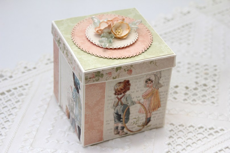 Jeg brukte rester fra en gammel serie fra Pion Design til å kle eksplosjonsesken min. Serien er Grandma’s School Book, og jeg brukte dies fra Cottage Cutz til å lage sirklene på toppen, og pyntet enkelt med kirsebærblomster fra Papirdesign og pyntegrener fra Kort & Godt.
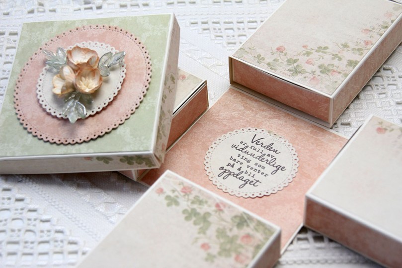 Sidene på boksen er hylser til skuffer, og skuffene har jeg dekt i bunnen med mer mønsterark. I midten av bunnen har jeg stemplet en tekst fra Kort & Godt med Memento Espresso Truffle. Enkelt og greit.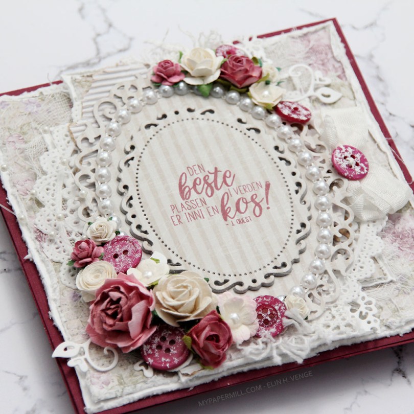
 Jeg var innom Hobbykunst i januar og fikk en utfordring om å bruke et
  Teksten er et stempel fra
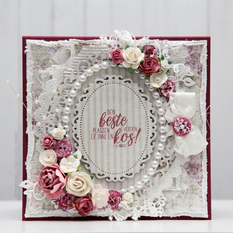
  Kortet ble ikke veldig postgangvennlig, det er ganske tykt, selv om jeg kun har pyntet forsiden. Det var nemlig ikke nok igjen av arket til å bruke inni og bak. Sløyfen med knapp sitter fast i en tag som er under hovedpanelet. Teksten på tagen er også et Huldra-stempel. Hvilket kan du se i Hobbykunst-butikken, der er nemlig kortet.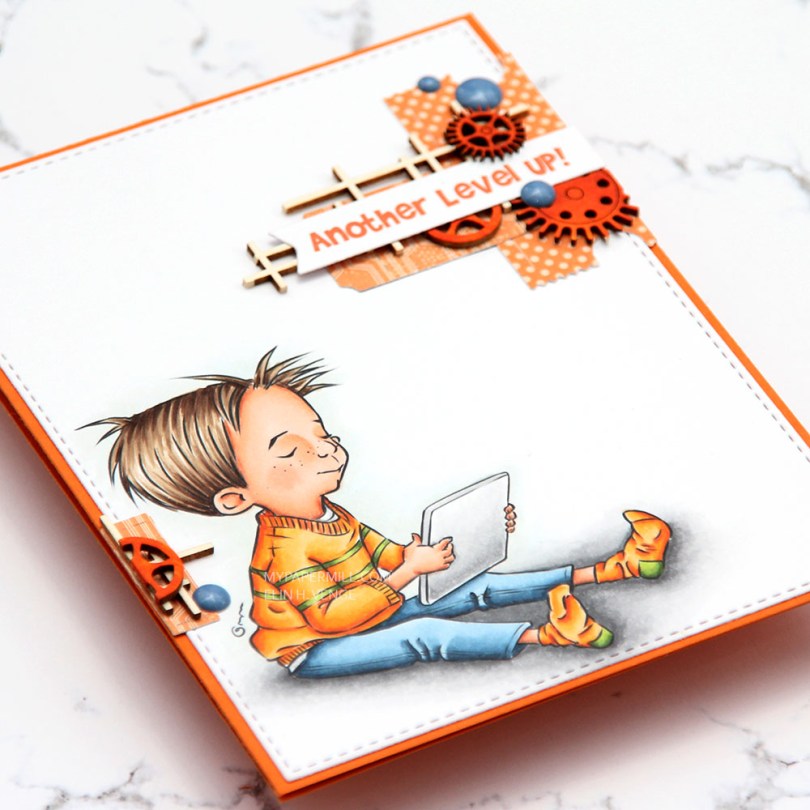
 I decided that
  I don’t really know how I ever survived without the stitched rectangles sets from My Favorite Things. I use the largest in the 2 set for pretty much every card I make. It creates a nice 1/16″ border around my panel, which, to me, is the perfect width. I used another MFT die for the sentiment banner. It’s from the Fishtail Flag Frames set, another set I use a great deal. MFT has some very versatile dies! For the actual sentiment (which is a digital sentiment that comes with the image) to be the right color I put a scrap piece of the orange cardstock into my scanner, opened the scanned image in Photoshop, used the eyedropper tool to choose that color, and changed the color of the sentiment before printing.
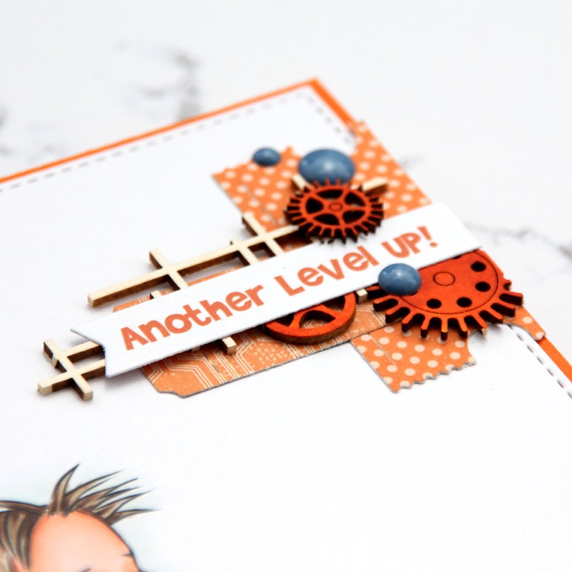 I’ve set myself a challenge to see how far I can get this year by only using scraps of patterned paper and not digging into new ones. Design team contributions for Hobbykunst get to be exempt from my little experiment, but I think I can make it pretty far with just scraps. It helps that I tend to make cards like this, that don’t require big chunks of patterned paper. The orange one with the dots is from a pack of digital patterned papers by Cathy Zielske that I bought years ago, and the other one is actually from a Halloween collection from Papirdesign. I diecut them both with a die from Xcut that diecuts lots of tickets from one die. I put a chipboard piece from Snip Art on top of my tickets, and a sentiment banner straight on top of that. By using the chipboard, I get dimension without having to resort to foam tape, which is always a plus.
 I felt like I needed a little bit towards the bottom, too, so I added another small ticket, another uncolored piece of Snip Art chipboard and half a colored gear, as well as a blue enamel dot from Papirdesign. It’s amazing how much you can fit into such a small space if you just stack it.
 I have found that my blues look better if I skip B93 and jump straight from B95 to B91. Have you made a similar discovery? I’d love to hear about it.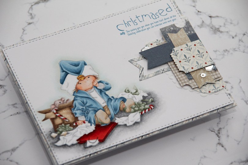
 I colored my image before diecutting it with the largest of the dies in a stitched rectangle set from My Favorite Things.
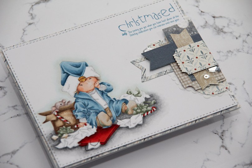 I love the little sentiment that comes with the image. I printed it, along with my image, from Photoshop, making sure that the color would be close my blue Copics. The color of the sentiment is actually B99, which I didn’t end up using to color my little guy.
 Lots of little details in this image, requiring the use of lots of colors!
 Jeg startet ved å sverte distress oxide-blekk (fargene
  Jeg limte deretter
  Deretter skjærte jeg til en bit
  Jeg stanset ut det svertede panelet først, og deretter mosegummien med samme die. Jeg tar dette i to runder. Hvis jeg stanser ut begge samtidig blir ikke kuttekantene på mosegummien jevne, og jeg kan få rynker i kartongen siden presset under dermed ikke er jevnt. Ved å stanse ut i to omganger holder alt seg mye penere.
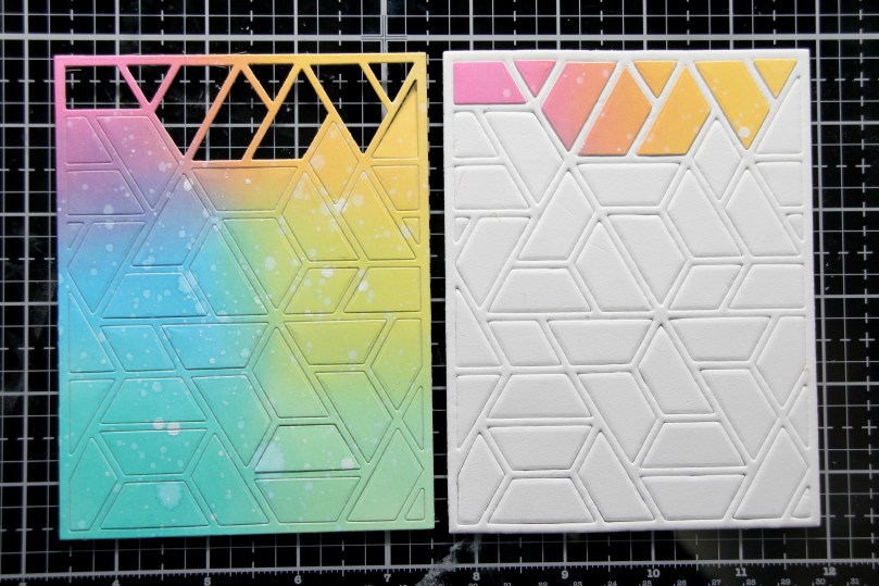 Den neste delen av jobben er litt pirkete. Her tok jeg ut hver bit av den svertede biten, fjernet beskyttelsespapiret fra den dobbeltsidige teipen på baksiden og limte den på tilsvarende bit mosegummi. Da alle bitene var på plass tok jeg flytende lim på baksiden av hver mosegummibit (forsiktig, så jeg ikke fikk lim på rammen) og limte det på frontpanelet på kortet mitt. Jeg la noe tungt oppå og sørget for at alt tørket ordentlig.
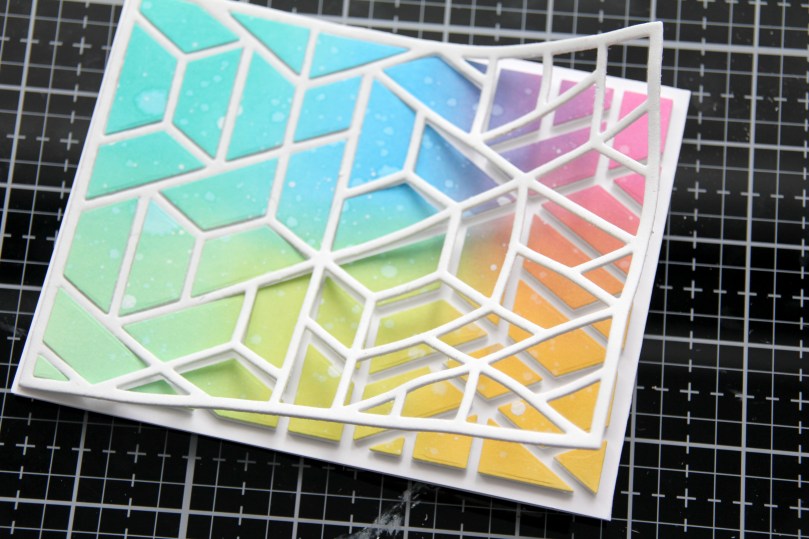 Deretter kunne jeg fjerne mosegummirammen forsiktig fra resten av kortet, og bitene ligger igjen der de skal.
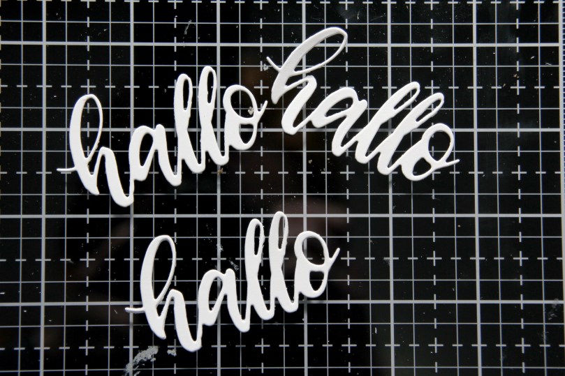 Jeg stanset ut en hallodie fra Papirdesign flere ganger i hvit kartong og limte dem oppå hverandre for dimensjon.
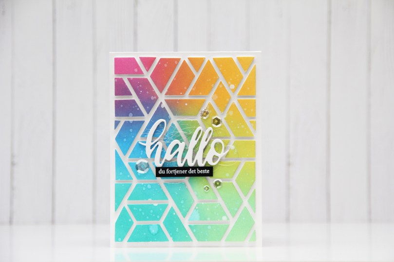 Da var det bare igjen å lime hallo på kortet, også her brukte jeg flytende lim, og lurte litt englehår fra Mester Grønn under for å lage litt mer liv i kortet.
 Jeg stemplet også en undertittel på svart kartong og embosset i hvitt. Det blir et ordentlig blikkfang på et såpass fargerikt kort. Jeg satte på tekststripen min med 3D-teip.
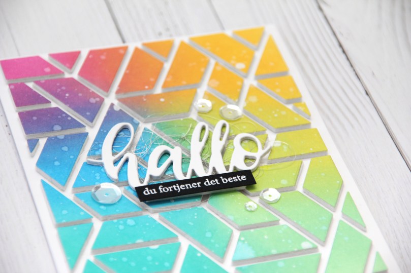 Noen paljetter fra Pretty Pink Posh er siste lille finish.
 Takket være at jeg limte alle bitene på kortet mens jeg fortsatt hadde rammen rundt er de nå perfekt plassert, og kortet er veldig rent selv om jeg har brukt mange farger.
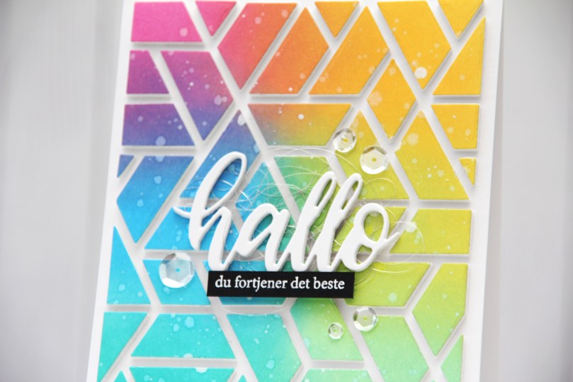 Det er ingen hemmelighet at jeg digger å fargelegge, men jeg digger også å lage kort som dette, selv om det er litt pirk å lime alle bitene sammen. Jeg er faktisk ganske glad i pirk også!
 Anyone who knows me knows that I’m terrible at sticking to schedules. Seriously awful. And every year I tell myself to get started on Christmas cards early and make them throughout the year to avoid being swamped come November. Every year I’m swamped in November because I fail to make them throughout the year. I’m off to a good start this year though, I’m starting with this
 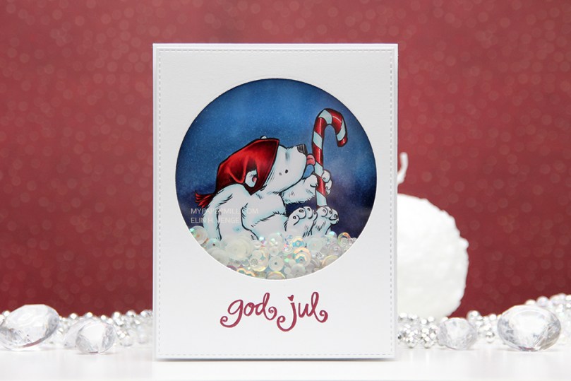 I printed my bear onto X-Press It blending card (the best paper for Copic coloring) and colored it with Copics. Normally, I probably would have made his hat blue, but I wanted a dark blue background, so I needed a color that would pop against it. Anyone who knows me would also know that I’m not a fan of red for Christmas cards, but in 2019 I made quite a few Christmas cards with red in them anyway, and I guess I’m starting the new year with it, too. Not to worry, though, I’ll get back to my regular blue eventually, it IS the color of the year, after all.
 I diecut a front panel with faux stitching around the edges and a nice big window in the top center. I stamped a Norsk Stempelblad AS sentiment using Papertrey Ink Scarlet Jewel Ink, added acetate behind my window and glued it to the front of my card using two layers of craft foam to really make those sequins and other few elements inside the window shake!
 I love the dimension you get on such a simple card by doubling up the foam, it makes a big difference, and everything inside the window moves more freely.
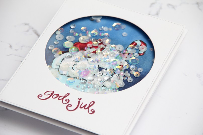 I’m a bit of a perfectionist, so I made sure all the sequins were turned the right way before I glued my shaker shut. I used a combination of two different mixes from Little Things from Lucy’s Cards. Most of the elements are from the
  Not a whole lot of colors on this image. I also used R52, which is a color I’ve made myself.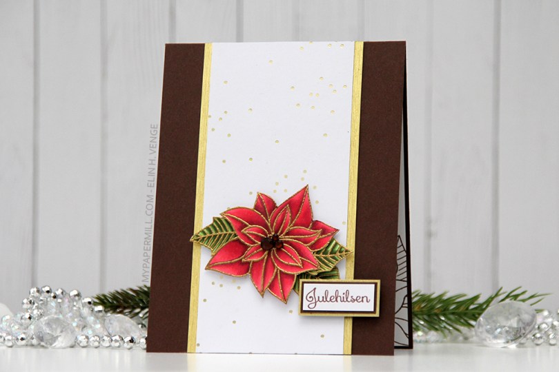
 Noen som husker
  Som på det forrige kortet har jeg brukt et hvitt ark med folierte gullprikker. Jeg syns den diskrete effekten er veldig fin, og det at prikkene er litt vilkårlig i arket gjør at det ikke blir altfor strukturert og strengt selv om jeg har mange rette linjer.
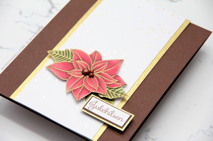 Julestjernen har jeg satt på 3D-puter, det samme har jeg gjort med teksten, som er et stempel fra Papirdesign. Gullfargen fra prikkene i arket og embossingen på blomstene har jeg plukket opp ved å bruke en stripe av
 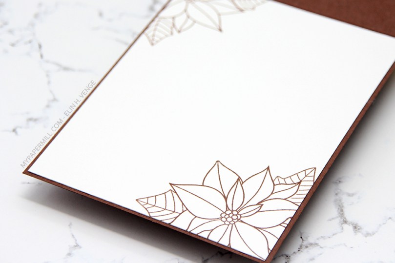 Siden kortbasen min er såpass mørk ville jeg sette på et eget panel på kortets innside til å skrive personlig hilsen på. Det ga meg en ypperlig anledning til å stemple blomsten på nytt, bare for å pynte litt opp. Maskerte blomsten og stemplet bladene også. Man trenger ikke engang å fargelegge, selve stempelet er pynt nok i seg selv.
 Her er fargene jeg brukte på blomsten min. Når man skal embosse og bruke Copics er det viktig at man stempler som normalt og fargelegger først, så stempler på nytt og embosser. Du vil ikke fargelegge etter at du har embosset, det kan nemlig skade tuppen på tusjen. Ved å fargelegge først og embosse etterpå unngår du hele problematikken.
 It’s Mo day (aka Wednesday). One of the last things I did in 2019 was to clear away all the jars of flowers from the desk in my craft room (I had about 50 of them). I figured I don’t really use flowers all that much on my cards anymore, so I didn’t need them to be easily accessible and take up space on my desk. I put them in a cabinet right below the ceiling, I was able to cram all of them into one single cabinet. The last card I made in 2019 had flowers on it. We’re barely two weeks into the new year, and I’ve made another one with flowers. For both cards I had to climb on a ladder and pull out a bunch of jars to get to the flowers I wanted. Maybe removing those jars wasn’t such a good idea after all?
 Good idea or not, this was the card I made. I colored up Mo’s
  I partially die cut my image with some of the bubble hanging out, and glued it to my card using lots of foam tape. I haven’t used my frame dies from GoKreate in a while, so I thought I’d break them out for this one. I usually make my card from the third largest die in the set (the XXL Square Frilly Frames #10 set), but I want to see how far into 2020 I can get with using just scraps, and the third largest die in the set requires a full sheet of paper to die cut two pieces (front and back of the card). The next size down was the perfect size for this scrap of Maja Design patterned paper, and it was also a good size for the green patterned paper from Papirdesign that I used behind my image and on the insides of the card.
 Speaking of insides – I diecut an eyelet circle with a Cottage Cutz die, stamped a Norsk Stempelblad AS sentiment using Memento Sweet Plum ink and again used lots of foam tape. I even diecut a scrap strip of another purple piece of Maja Design patterned paper to go across.
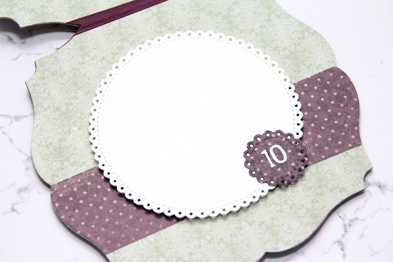 The second inside has plenty of space for a personal message, and I diecut another eyelet circle from patterned paper and added a couple of diecut numbers from Scrapmagasinet to my circle. I thought this card would be the perfect birthday card for my niece, she turns 10 in June!!
 I used the same design on the back, but used a green strip instead of a purple one. Another NSB sentiment, once again stamped in Memento Sweet Plum ink, and once again glued on with lots of foam tape.
 There’s quite a bit of dimension in this card, and with that great image as the focal point, I think this will be perfect for my niece!
 Lots and lots of Copics used for this one, but there are 15 colors in the heart bubble alone.
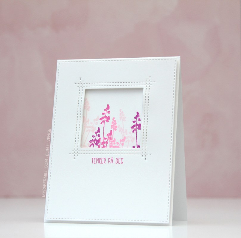 Jeg stemplet blomsterstempler fra Larger Than Life-settet til Papertrey Ink rett på kortbasen med rosafargene som er i Rose Petal-settet med stempelputer fra Altenew (fargene Cosmic Berry, Purple Wine, Puffy Heart og Rose Quartz).
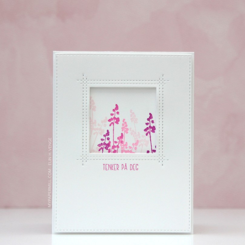 Jeg stanset ut et hvitt panel med juksesøm ved hjelp av en die fra My Favorite Things, og stanset ut et vindu fra dette panelet, også med en die fra My Favorite Things. Til slutt stemplet jeg en tekst fra Huldra designstudio med en av fargene jeg brukte på blomstene mine, limte hele panelet på kortets front med 3D-teip og kortet var ferdig. Enkelt, ikke sant?
 Papirmølla