Hi!! The July release from My Favorite Things just went live, and you can read all about it here. I’m guest designing for this release and it’s a good one. I’ve made plenty of cards that I want to share. This is a loooong blog post, so you might want to grab a cup of coffee before you start reading.

I’m starting with some adorable penguins from Stacey Yacula. I love Stacey’s critters, and these guys are ready to party!

I colored up my penguin with Copics and die cut him with the coordinating die.

There are three new stencil sets in this release, and they come with stencils and the corresponding mask. For this card I used the mask, and ink blended around it with blues, teals and greens.

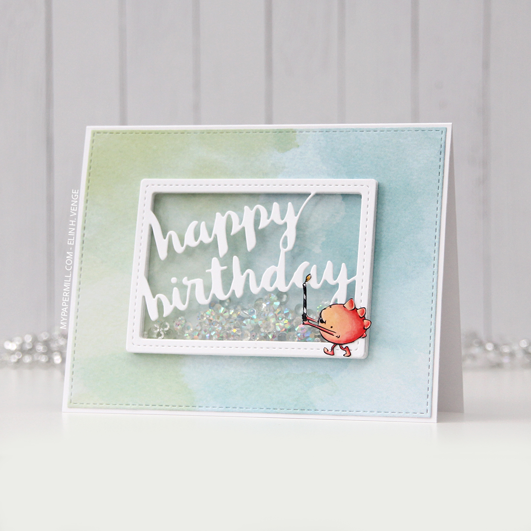
The Happy Birthday dies are also new. The die set comes with a scripty, handwritten word and a shadow layer. I ink blended some warm colors onto a piece of cardstock and die cut the word itself from that and adhered it onto the shadow layer, which I die cut from white cardstock. Behind the shadow, I have a few more layers of the actual words for some lift off the front.

I white heat embossed part of a sentiment onto black cardstock and added it with a little bit of dimension to the card front, before finishing off the card with some sequins scattered around and a thick coat of Glossy Accents to my balloon.

There’s quite a bit of dimension on this one. Nothing like coordinating dies to help with that and still keep the look clean. Foam tape just isn’t the same, in my opinion.

I may have gone overboard with this many colors for such a tiny image, but boy, is it fun!

Next up is a similar, yet different card. A landscape orientation this time!

I used the watercolor wash free form stencil to ink blend straight onto the cardbase using warm tones.

I used the Happy birthday dies on this card too, but in a different way. I ink blended a piece of cardstock, die cut the shadow layer from that, another shadow layer in white, which I then die cut the words out of. This is fiddly, and it takes time to get all those pieces glued back on, but the result is so worth it.

I adhered my colored, stacked die cut penguin to the bottom right corner and added a white heat embossed sub sentiment on this card too.

I finished off the card by adding a couple of enamel dots in colors that matched. In this photo, the die cut technique I used is a little bit easier to see.

Less colors for this one.

I’m sharing one more card with this set.

I colored and die cut these two cuties, and added another three layers of die cuts behind them for dimension, I wanted them to stand out against the background.

I thought the size of this image would go well with a mini slimline format, and made my card base out of Ripe Raspberry cardstock. I used the same color cardstock for my little white heat embossed sub sentiment.

On the white background, I stamped the new Polka Dot Party Background stamp in colors that matched my image. I like the ombré effect. I mounted the white cardstock onto the card base using foam tape.

I added some sequins to finish off the card, I wanted it to be extra festive and sparkly.

Limited color palette on this one.

Out of all the cards I’ve made with the release so far, this next one might be my favorite.

The Something to Squawk About set is full of different birds and tropical foliage. This toucan was just too good to pass up.

I colored the toucan, the flowers in the stamp set (there are two), the branch and about 20 leaves for this card (there are five different leaves in the set).

I created a frame with the leaves going around the edges of the card, adding additional die cuts behind some of them for a super textured, very dimensional card.

I put the toucan right in the center, cut one of the sentiments in the stamp set in two and stamped it on two lines in bright pink to match his bill and also the flowers.

You can sort of see all the layers here. I think there’s 12 in total in that top left corner where the flower sits. I added three pairs of raindrops, I figured that would be appropriate for a tropical card.

Lots and lots of dimension. That toucan is 10 layers thick. Dimension is life?

Colorful palette because of the bill.

A shaker card up next. I stamped a background using three of the leaves in the stamp set. I used Sour Apple ink on Sour Apple cardstock for a tone on tone look.

I decided to create a shaker card and added a sky in my window, ink blended a few soft clouds and added some diamonds inside.

In this release there’s a new alphabet die set. In a previous release, the same style was released in uppercase letters. This time, there’s lowercase to compliment, and also a set with numbers and punctuation. I die cut the letters to spell hi from four layers of blue card stock, and added another layer on top that I colored with Copics to match the bird.

Turning this into a shaker card was kind of an afterthought after having glued on the frame and the parrot, so I had to get creative, but it worked out in the end.

Definitely a limited color palette for this one.

More parrots. This is a very clean and simple one, but with lots of dimension still, and lots of die cutting.

I colored the birds and the branch, die cut them all and added an additional two layers behind the red and blue bird, 5 more layers behind the branch and 8 more layers behind the teal and blue bird. There’s a lot of dimension here.

Onto the cardbase I stamped the Polka Dot Party Background in an ombré effect, I really liked the look of the first one and thought I’d repeat it with different colors.

I added a strip of Caribbean Sea cardstock toward the right side of the card, and mounted my panel with the birds using foam tape.

I stamped the sentiment using Caribbean Sea ink and decided not to embellish this one at all. It has a ton of dimension, I thought that’d be enough.

Next up is this monkey from the Summer Safari set. I thought he was too cute for words.

I stamped and colored the monkey and the palm tree, die cut them both and added additional layers of die cuts behind each.

I created a card base out of Summer Splash card stock and decided I wanted to do something special with the popsicle image that is in the stamp set. I stamped the popsicle about a million times on a piece of X-Press It blending card and colored each one using the same colors as I used for the popsicle the monkey’s holding.

I die cut a window from the colored popsicle panel to place my monkey in, but decided that my panel was too bright, and decided to mute it down a bit with vellum. The problem with vellum, however, is that glue shows through, so I added a stacked die cut frame on top, made out of three layers of Summer Splash cardstock and one layer of white on top.

I stamped and white heat embossed a sentiment from the stamp set onto Eiffel Tower cardstock, cut it down to a strip and let it span across the frame.

I added a couple of leaves, some enamel dots for dimension and Glossy Accents to the popsicle, and my card was complete.
 Not a lot of colors for this one.

I wanted to use the crocodile from the stamp set as well, and decided to make a quick, simple birthday tag. Onto a piece of Bristol Smooth cardstock, I ink blended some very soft clouds using Lazy Day ink, before adding a couple of colored card stock pieces to create a scene. I put vellum on top of the Summer Splash cardstock that I used for my water, adhering it in strategic spots and adding a slit for the crocodile to swim out of. I white heat embossed a sentiment from the stamp set and added an eyelet and twine to the top of the tag to finish off the tag.

A Pure Innocence girl rounds out today’s little collection of cards.

I colored the image, die cut her and an additional two layers and decided to go for a landscape orientation once again.

I die cut a white panel using a die from the A2 Stitched Rectangles STAX 1 set and ink blended some ground and some clouds behind her using Gravel Gray and Blue Yonder inks.

On the right hand side of the card I added a mini cluster, if you can even call it that. Part of a mini paper doily, some die cuts using the Fishtail Flag Frames die set and a few enamel dots. The patterned paper is from the Party Patters paper pad, and the pink is Ripe Raspberry cardstock. I white heat embossed a sentiment from the stamp set onto that.
I want to thank My Favorite Things for having me on as a guest designer this month, I’ve had a blast with these stamps, dies and stencils!
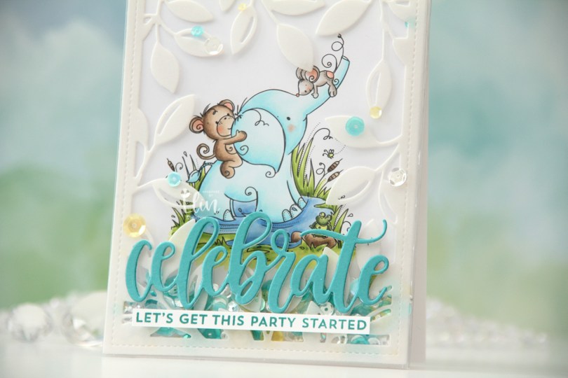
 I actually decided to create a shaker card this time. I colored in the Wild & Wonderful image using a fairly soft color palette, then put it aside while I worked on the rest of the card.
 I put an adhesive sheet from Altenew on the back of a piece of heavyweight translucent vellum from My Favorite Things, before using the Leafy Cover die from Mama Elephant to die cut a frame to put on my card front. I cut off a couple of leaves where I thought they covered up too much of the image and adhered the rest directly onto the bottom of a large stamp storage pocket from Avery Elle. The storage pocket was just wide enough for my colored panel to fit when I turned it 90 degrees. I trimmed off a tiny bit of my panel (1/16″) so it would be less snug in the pocket, and cut off a couple of inches from the top of the pocket. This way I could put the panel inside the pocket, and there would only be one side of the pocket that needed to be sealed once my shaker bits were in place.
 I adhered my shaker pocket to a top fold card base I created from Stamper’s Select White cardstock from Papertrey Ink. I die cut the sentiment using the Celebrate die from My Favorite Things. I used Caribbean Sea cardstock from My Favorite Things for the top layer and a few layers from white cardstock behind it for dimension. I also stamped a sentiment from the Bitty Birthday Wishes stamp set from My Favorite Things onto white cardstock using Caribbean Sea ink, also from My Favorite Things, turned it into a strip and placed it directly underneath the die cut word. To finish the card, I adhered some sequins from the Seashore mix from Little Things from Lucy’s Cards, as well as from the Seaglass mix from Simon Says Stamp. These two mixes work really well together, and they’re also what I used to fill my shaker.
 Speaking of, here they are. Full shaker cards are fun, and I’d say they’re a lot easier to create than regular shaker cards, where you need to create dimension for the shaker bits to shake around.
 The storage pocket works so well as a shaker pouch, and because of it, it gives everything a bit of a lift off the card. It looks like the vellum and the die cut sentiment both float on top, even though they’re both adhered directly to the pocket.
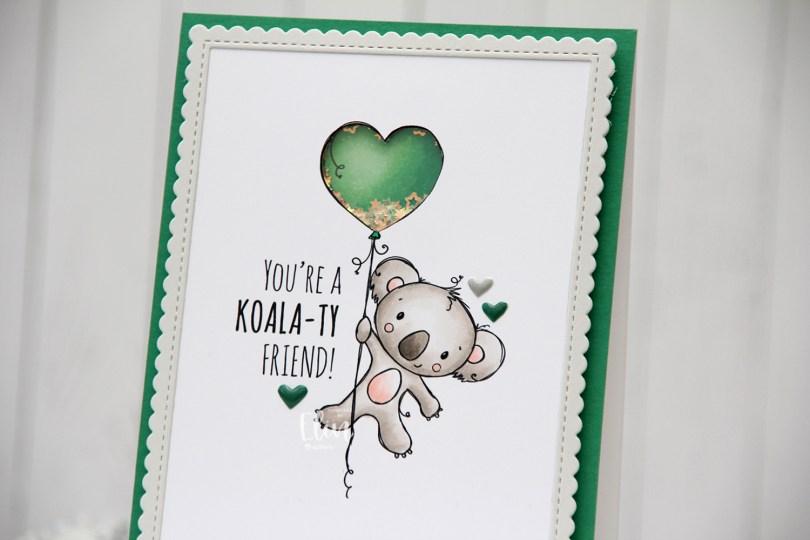
 I’m using the new
  I adopted Laura Bassen’s new coloring motto for 2023 for this card: “no muss no fuss coloring”. This was very simple, a few grays and a little bit of pink for the cheeks, the inner ears and the belly. I used a craft knife to cut out the interior of the balloon and printed another panel with just the balloon in the same size. I colored that balloon in green (thanks for the color suggestion, Liz) and added foam strips along the outer edge of the balloon, before filling it with tiny iridescent stars from the Icicle sequin mix from Hero Arts. I then added a piece of acetate on top to complete my shaker, and adhered the koala panel to the shaker, making sure to line up the window with my shaker heart balloon as best I could.
 I added foam tape on the back of the rest of the panel and adhered it to a top fold card base. The card base is actually Stamper’s Select White cardstock from Papertrey Ink, but I adhered a panel of Clover cardstock from Concord & 9th on top to create the green front. The color matched with my green balloon, but I don’t have unlimited amounts of Concord & 9th cardstock, so I’m trying not to use it all at once. Also, it’s a thinner cardstock, and not sturdy enough on its own to hold the weight of lots of foam tape and a shaker.
 Using the largest of the dies in the Stitched Rectangle Scallop Edge Frames die set from My Favorite Things, I die cut a frame from Soft Stone cardstock from Papertrey Ink. This is such a perfect soft grey, I love it. I finished off the card with a few enamel hearts from Altenew, from the Green Fields pack and the Rock Collection.
 The iridescent stars inside the shaker heart really catch the light nicely.
 Super simple color palette, as I mentioned.
 As soon as I saw this stamp set, I knew these snow globes would make the perfect shaker cards. The stamp set comes with the snow globe and six different scenes you can stamp inside. I, of course, opted for the penguin, but there’s also a snowman, a car with a tree on the roof, a house, a tree with presents and a village, as well as a few sentiments.
 I stamped and colored the empty snow globe on a quarter sheet of X-Press It blending card. I stamped the penguin on a separate piece of blending card and colored that for the inside of my snow globe. I glued a few Kort & Godt pearls around the penguin and put him aside while I worked on the rest of the card.
 I cut the center out of the snow globe and adhered a piece of acetate to the back of the white cardstock, before adding foam tape on the back of the shaker area, making sure not to leave any gaps. With glitter inside the shaker window, you don’t want it to escape.
 I put a mix of clear Distress glitter from Ranger and some micro beads inside the shaker area, before adding my colored penguin to the exposed adhesive of the foam tape to close the shaker.
 I initially put too much inside (I always seem to put too much inside) and had to pour some out to get the perfect amount. I then adhered my popped up snow globe to a card base I created from Enchanted Evening cardstock from Papertrey Ink. I used the merry script die from Mama Elephant to cut the word merry three times from Blue Breeze cardstock from My Favorite Things, stacking the die cuts for a dimensional look. Near the bottom of the letters I softly ink blended a bit of Blueberry Sky ink from Papertrey Ink to add a little bit of a gradient. I stamped the word Christmas from the
  This is a fairly simple looking card, but it’s got tons of dimension and a shaker card is always fun, right?
 I decided to create a full card shaker this time. They’re fun to make, and a lot easier than you’d think. Even easier (and way faster) than regular shaker cards! At least they are to me.
 This is the
  This cool, deep pink is so much fun to use for Christmas cards, it’s unexpected and fun, and matches the Autumn Rose color cardstock from Papertrey Ink sooo well.
 I created my shaker pocket from half a stamp storage pocket from Avery Elle. I created score lines and folded so my panel would fit inside, used score tape on the back of the bottom and sides of the pocket and filled it before folding over the top flap and sealing it shut.
 I used the Icicle Sequin mix from Hero Arts to fill my pocket. This mix has clear sequins, matte white sequins and iridescent star confetti, just enough to create interest, while not being too distracting. It’s a perfect mix for wintery shaker cards.
 For the die cut word, I used the Believe die set from Simon Says Stamp. I die cut the shadow from Stamper’s Select White cardstock from Papertrey Ink and the word itself from Autumn Rose cardstock, also from Papertrey Ink. I adhered the two together and then directly onto the shaker pocket. If you’ve never created a full card shaker before, I urge you to try, it’s so much fun!
 I colored the scene in using my Copics, before using Iceberg ink from Altenew with the Slimline Cloud Edges stencil from My Favorite Things to create soft clouds in the background. I then sacrificed one of my stamp storage pockets from Avery Elle, using about half of it for this card to create the pocket for the colored panel to slip into. I know there are full shaker covers on the market, but I don’t have any, and the storage pocket was easy enough to alter.
 I filled my shaker pocket with sequins and gems from the Candy Corn mix from Little Things from Lucy’s Cards. This is a great Halloween mix with clear, yellow and orange sequins, as well as some little gems and even acetate ghosts. I loooove the ghosts, but of course I removed them from the part of the mix I used for this birthday card.
 I die cut the word Gratulerer twice from white cardstock and once from Pure Poppy cardstock from Papertrey Ink using the Gratulerer 8 die from Papirdesign, stacked them and used liquid glue to add the die cut to the front of the window.
 I stamped a sub sentiment from the Go’klem stamp set from Norsk Stempelblad AS onto a separate piece of Pure Poppy cardstock using VersaMark. I heat embossed it using super fine detail embossing powder from Ranger in white, cut the sub sentiment down to a strip and added a couple of additional cardstock layers behind it, before adhering it to the front of the shaker using score tape.

 Using a couple of dies in a set of nesting squares from Lifestyle Crafts, I created a frame to go around my image. I taped the two squares together, so I could run them through my die cutting machine several times and be sure that the size of the frame would be the same with each pass through the machine. I die cut 8 of these frames, I wanted a very dimensional shaker card. I stacked 7 of them, glued them to my colored piece, added lots of sequins from the Icicle sequin mix from Hero Arts and glued the last die cut frame on top.
 That’s when I ran into trouble. I wasn’t able to glue the frame onto the acetate so that it lined up with the others. I’d adhered it with score tape, so there was no way to remove it without ruining it. My solution was to die cut a new, larger frame with a slightly smaller window. I went one die larger for the outside and one die smaller for the inside for this frame, and adhered it directly onto the ones that were already there. It was a happy accident, because I’m really happy with the chunkier frame.
 I added the shaker to a 5 1/2 x 5 1/2″ card base I created from Wild Cherry cardstock from My Favorite Things, before stamping and white heat embossing a se23ntiment from Norsk Stempelblad AS to a separate piece of the same color cardstock, which I then die cut using a die from the Gemini Extra Deep Loving Tags die set from Crafter’s Companion. I adhered it directly to the inside top right corner of my shaker frame, and my card was finished.
 Not a whole lot of colors for this card, in spite of all those stripes on the snowmen’s accessories.