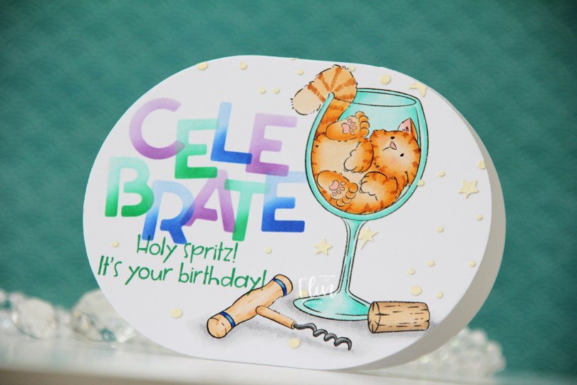
Hi, crafty friends! Have you seen the new release from Purple Onion Designs? Pei has outdone herself with the Sunshine & Daydreams collection, and today, I have a fun shaped card to share, featuring Bottoms Up!
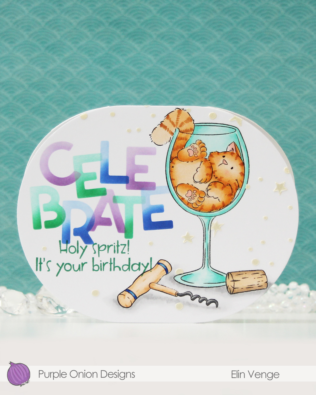 Isn’t this image fun? I love that Tofu somehow fits in this wine glass. There was an image in last year’s summer collection with a similar vibe. That one had a corgi hanging on to a margarita glass. So fun!
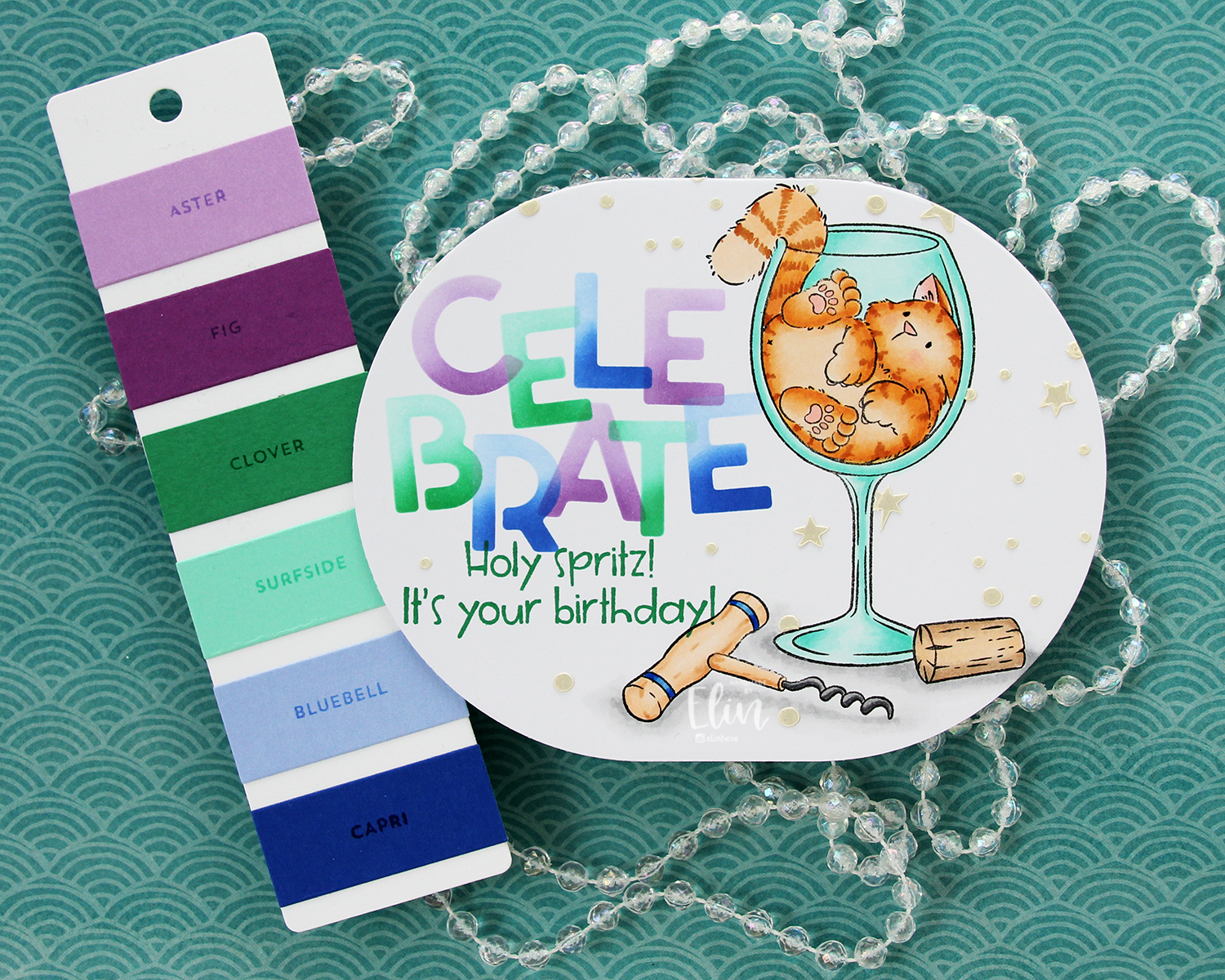
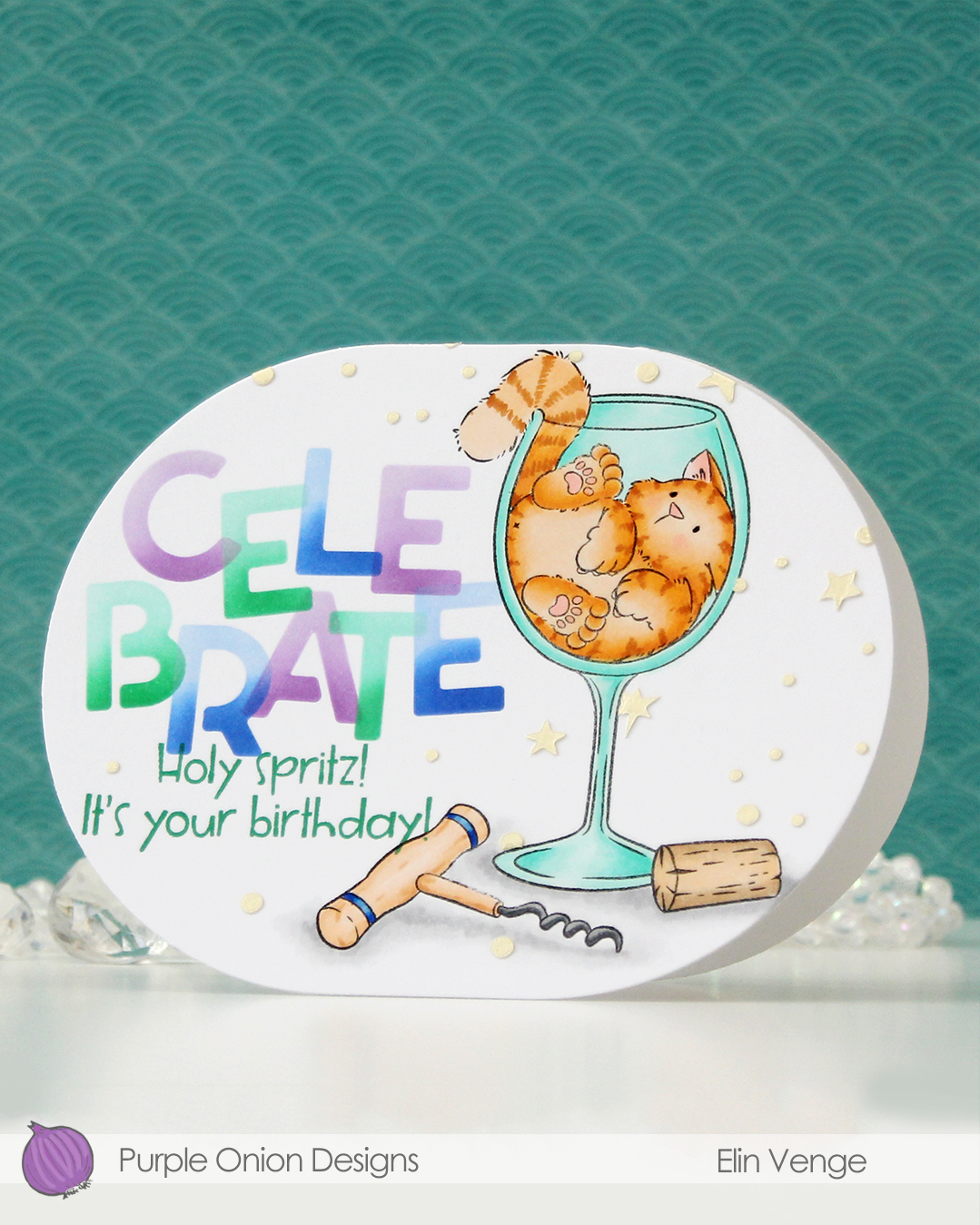 For this card, I simply colored my image with Copics, placed a mask on top of my mage and did some ink blending with C9 inks and the Celebrate stencil set from Kristina Werner. I used purple voluntarily, can you believe it? The purple is Fig faded into Aster, the green is Clover faded into Surfside, and the blue is Capri blended into Bluebell. I can’t take credit for the color palette, though, it was one Jennifer McGuire shared in the C9 Winter Retreat back in January, when they revealed the new colors to the retreat attendees. I’ll take my color inspiration wherever I can get it, and this was a fun one to try. Capri has stolen my heart!
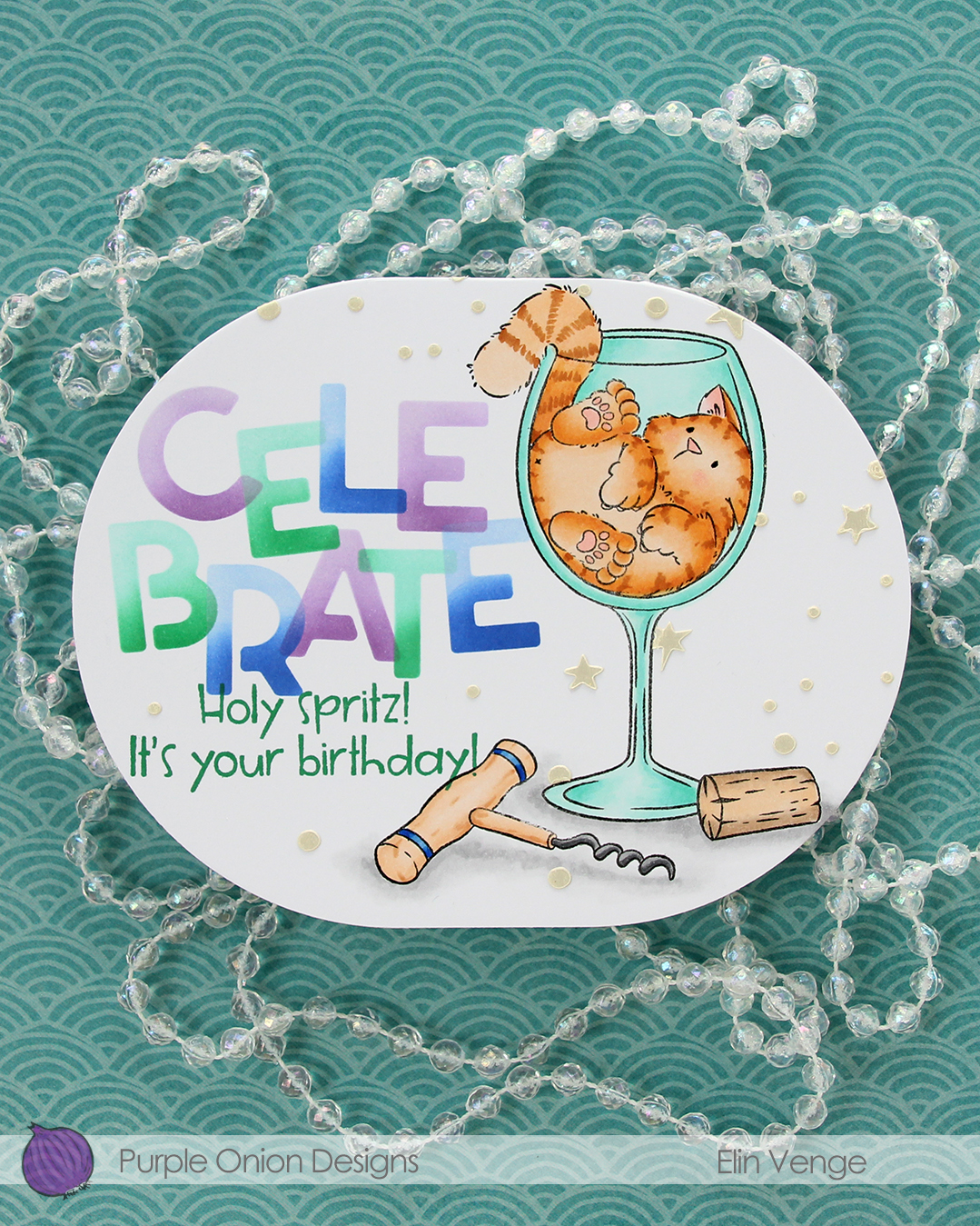 Back to the card. I removed the mask on the corkscrew before stamping the sentiment in Clover ink from Concord & 9th.
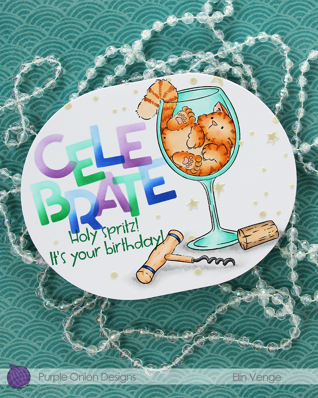 I wanted a little bit more interest in the background and decided to use paste, but before I put the paste on, I die cut my panel using the largest die in the A2 Oval Basics die set from Kristina Werner.
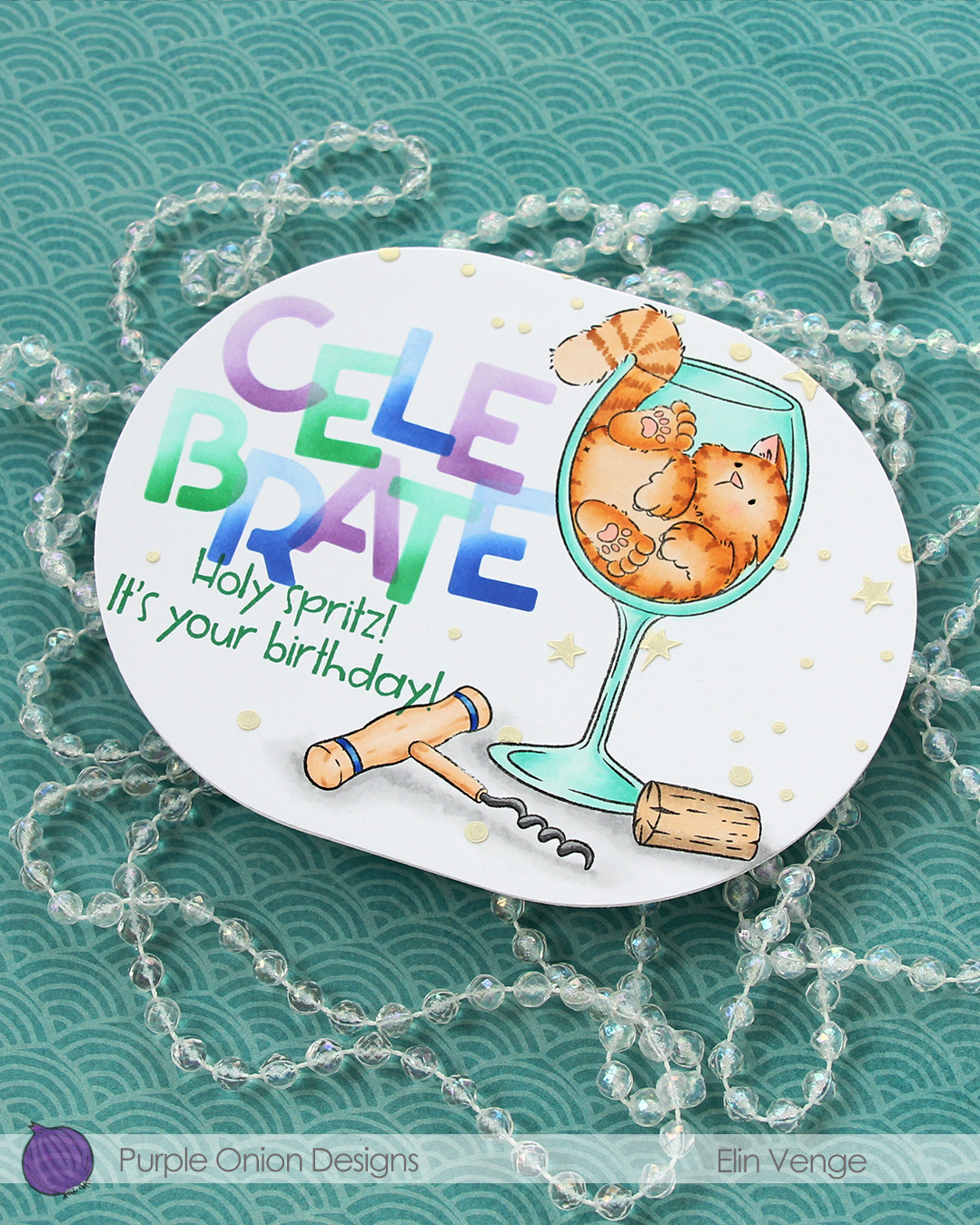 Once my panel was the finished size of the card, I placed the corkscrew mask back on, then used another stencil in the Celebrate stencil set from Kristina using Golden Hour Solar Paste from Simon Hurley. I made sure to cover the sentiment before adding the paste, so it wouldn’t end up where I didn’t want it. The paste adds texture and a little bit of shine in addition to breaking up all the white space in the background.
There you have it, a fun shaped card with Tofu in a glass and a color combo I never would have come up with on my own.
 Last, but not least: the Copics I used. Fairly neutral palette for this one.
For a limited time, the entire Sunshine & Daydreams collection is available as a discounted bundle. The discount for the bundle is over 30 %, so if you love Pei’s work as much I do, it’s available until June 24th 2026.
 I colored the image and die cut it using one of the circle dies in the Stitched Circle STAX die set from My Favorite Things. I also die cut circles from grey cardstock and patterned paper from the Denim & Friends collection from Maja Design using the Nesting Circles die set from Lifestyle Crafts. The shape of the card is created with the Nesting Frames #8 die set from Lifestyle Crafts.
 I popped some pieces up using foam tape, die cut the letters for the name using an alphabet die set from Scrapmagasinet and adhered the letters to a banner I die cut with an old die from Spellbinders. I used an old die from Marianne Design for the spriggy things on the left, and used some old Blueberry Sky buttons from Papertrey Ink to embellish.
 Very limited color palette for this one.
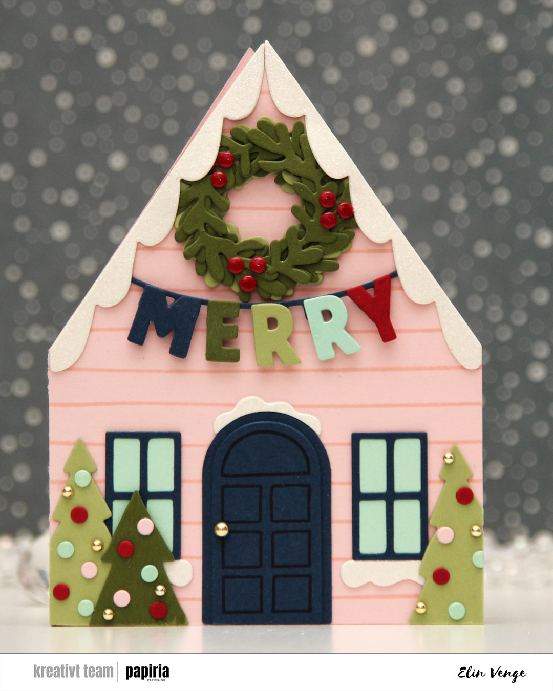 The Yuletide Lane bundle caught my eyes as soon as I saw it. It’s easy to create a big row of houses with the die set, but I opted for a simple shaped card for this one. If you love putting together die cuts, this is the set for you. I cut two houses from Ballet Slipper cardstock. Onto one of them, I stamped one of the stamps in the coordinating stamp set using Ballet Slipper ink for a tone on tone look. this particular stamp is very forgiving. It’s just two lines spaced about half an inch apart, but they’re not completely parallel or straight, which means you don’t need to be too precise when stamping. I glued the two houses together on one flap and cut the other flap off, leaving a standard side fold card base.
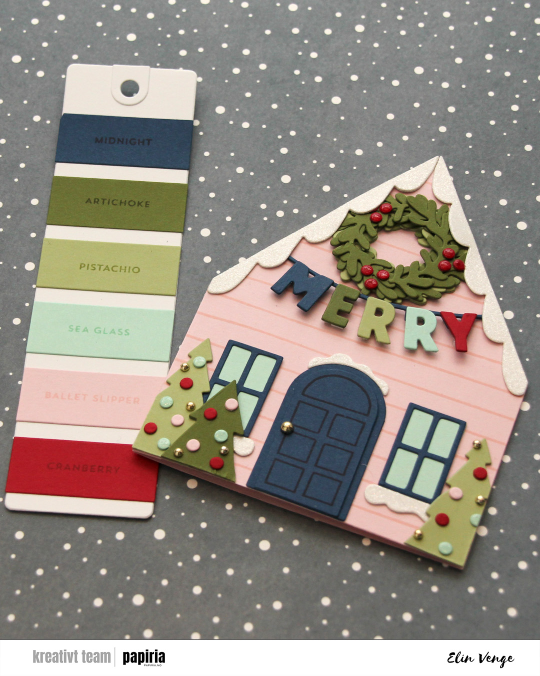 Time for the bells and whistles. This die set is packed full of so much stuff you can add, there’s really no limit to what you can do. I chose a fun color combo of Cranberry, Midnight, Artichoke, Pistachio and Sea Glass to match the Ballet Slipper nicely. I doubled up the die cuts on nearly everything, even adding white glitter cardstock from Kort & Godt for the snow. On the door, I stamped the coordinating door stamp in Midnight ink, I popped up the letters, added a thick layer of Glossy Accents to the berries on the wreath, a somewhat thinner layer on the Sea Glass ornaments and some gold enamel dots to finish. I even used a gold enamel dot for the doorknob.
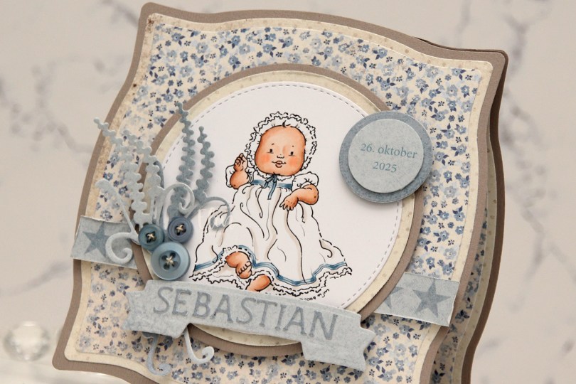
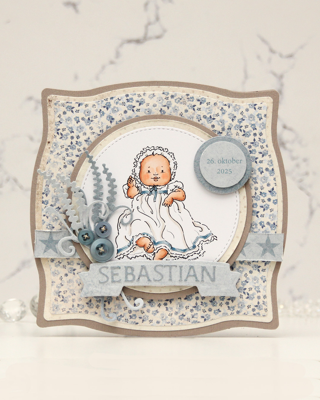
 I made a
  I created a shaped card using the Nesting Frames 8 die set from Lifestyle Crafts, and used a few sizes of this die for the patterned paper panels on my card, which are all created from the Vintage Spring Basics collection from Maja Design. I die cut a white doily using the English Tea Party die from Cheery Lynn, mounted it in the center of the card and added my circles on top. I die cut the letters to spell the boy’s name using Die 304 from Kort & Godt and adhered them to a strip I die cut with the Essential Stitched Sentiment Strips die set from My Favorite Things. I added some Studio Calico veneer stars to embellish and a button from Kort & Godt that I put on top of a bow I created from Chalk White seam binding which I’d colored with Copic B95 and B91. This took me back – I used to color seam binding with Copics to match my card sooo often back in the day, and it honestly made me a little nostalgic doing this.
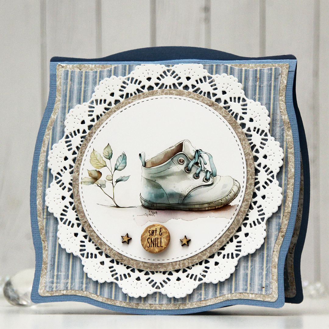 The insides of the card have the same basic layout as the front, just different patterns, and I left the stitched circles plain white for the personal message. On the back of the card, I die cut a pre printed image from Kort & Godt, found another button and added a star on each side of it to finish.
 Very limited color palette for this one, there wasn’t much to color.
 The cold weather’s been perfect for Christmas in July, though, and this
  I colored both the penguin and the letters with Copics and fussy cut them. I left a white border around the penguin, but cut the letters up to the black lines.
 I created a circular card base from Stamper’s Select White cardstock from Papertrey Ink, and added a circle on top that I created from Sno Cone cardstock from My Favorite Things. I dry embossed the Magic Snow Cover die from Mama Elephant onto the colored cardstock for a little bit of added interest in the background, before mounting the penguin in the center of the card and adding the letters around him.
 To finish off the card I added a few Snowdrift sprinkles from Little Things from Lucy’s Cards to the letters. I tried using pearls first, but these worked better with the card. She’s stopped selling these clay sprinkles, so I kind of hoard the ones I have.
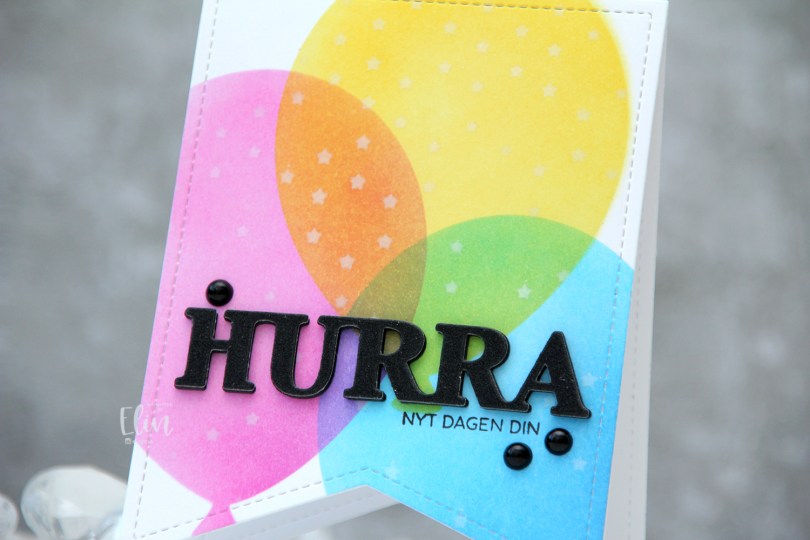
 I used a banner die with faux stitching to create a shaped card. This banner die is about 4″ wide, making it the perfect size for a decent size card. I used partial die cutting to create the card base, but die cut a separate piece that I used for my ink blending, which I then adhered to the card base once finished.
 I used the Big Balloon stencil set from My Favorite Things to create my balloons, and used Distress Inks for my ink blending. Faded Jeans, Mermaid Lagoon and Salty Ocean for the blue balloon, Picked Raspberry for the pink balloon and Mustard Seed and Squeezed Lemonade for the yellow balloon. Where they overlap, they create new colors, which is half the fun of ink blending, right? With the balloon stencil still in place, I added the Falling Stars stencil from Simon Says Stamp on top and ink blended white stars onto the balloons using Fresh Snow hybrid ink from Papertrey Ink.
 I stamped a sentiment onto the front using Obsidian ink from Altenew and added a stacked die cut HURRA above it. I layered six black die cuts, before adding this glitter one on top and finished off the card with a few black pearls.
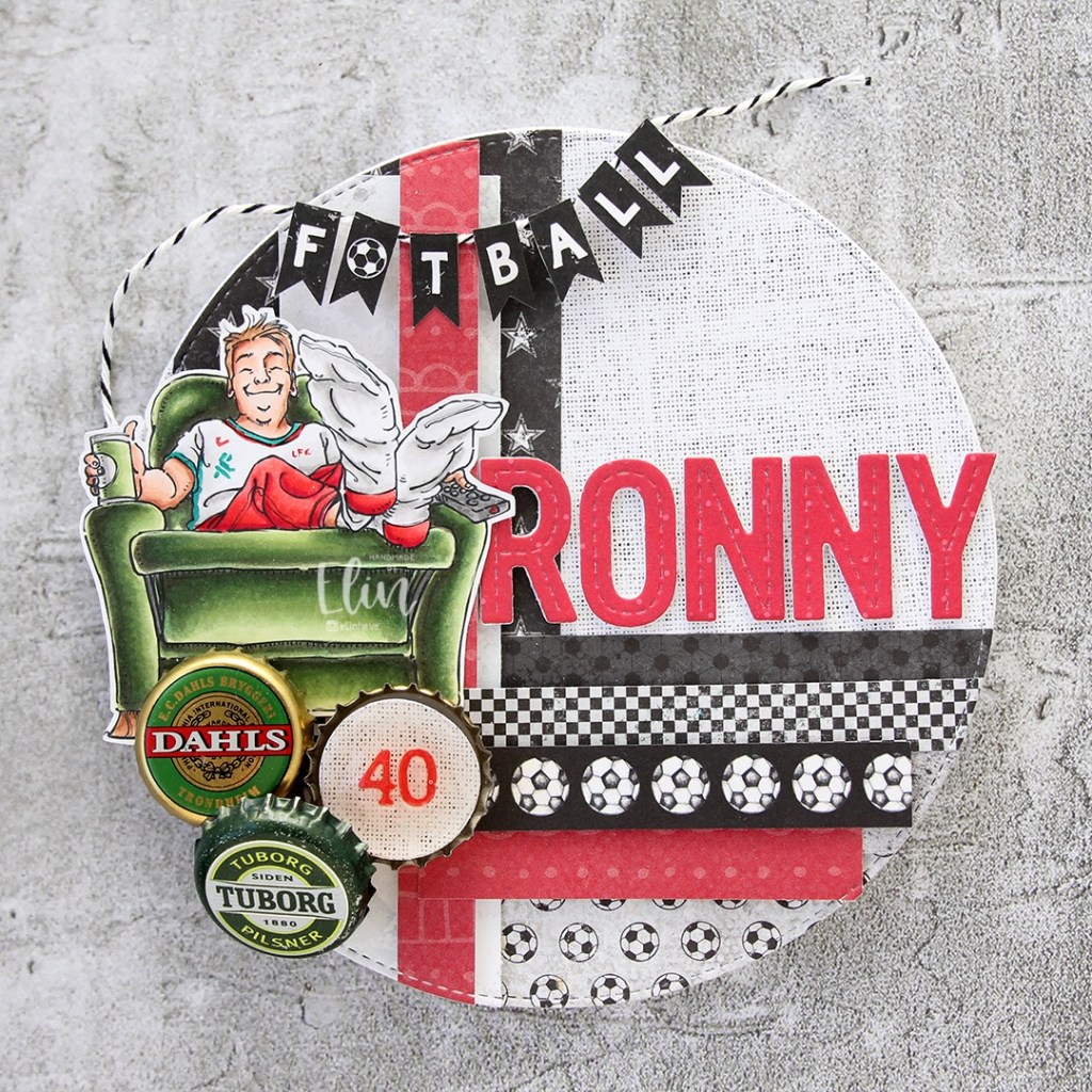
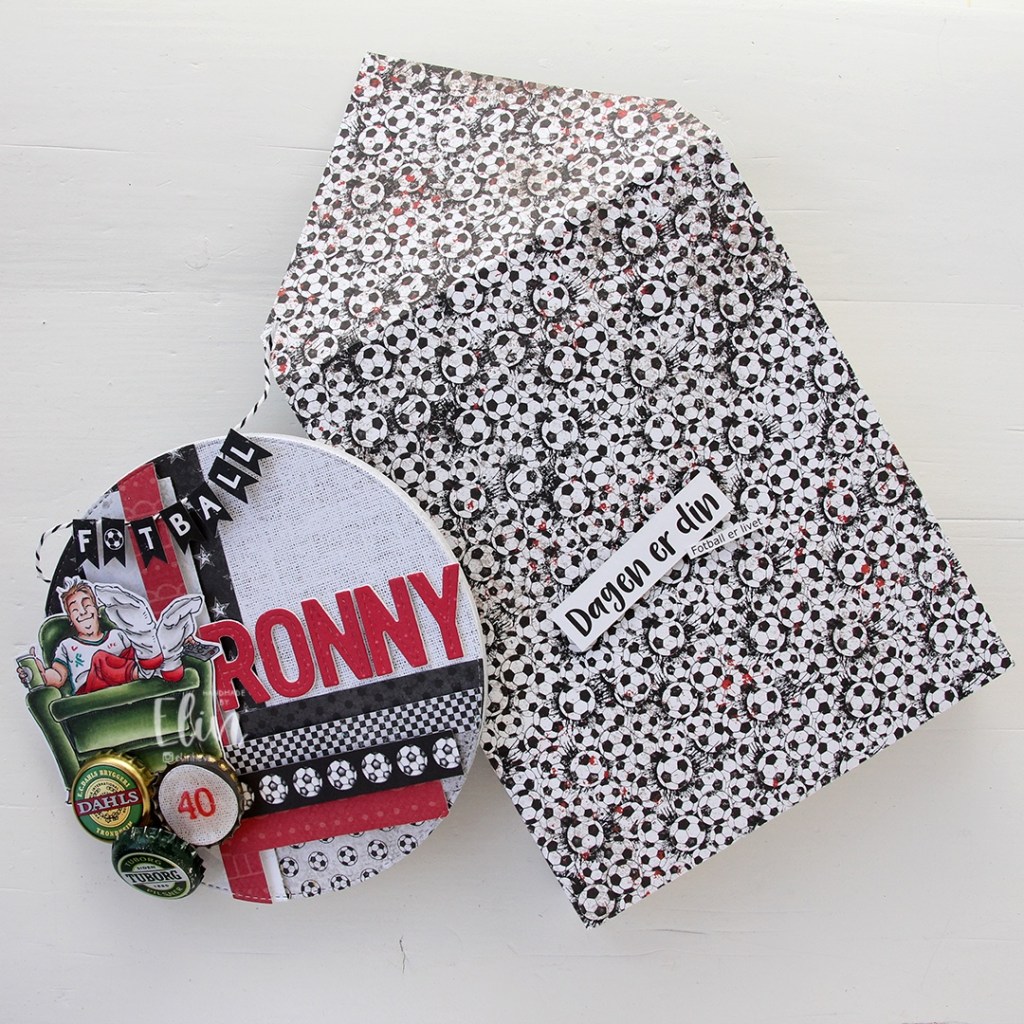
 The card was made on order for a superintendent turning 60. I was told he likes wine, good food, sunny, warm weather and enjoying life and was given free reign to do as I pleased.
  I rarely use patterned papers on my cards anymore, and certainly not pieces this big, but I love the XXL Square Frames Frilly #10 die set from GoKreate, the dies in the set are perfect for creating shaped cards. I use two 12×12″ sheets of patterned paper to make one of these cards, and this time I used the Drivers License patterned paper from the Denim & Friends collection as well as the Tough but sweet sheet from the Denim & Girls collection, both from Maja Design. I can cut two of the larger shapes and two of the smaller shapes from one sheet, so the insides of the card are reverse.
 I colored the image in colors that went with the patterned paper, adding a bit of red to catch the eye and writing the words on his t shirt with a black Copic friendly pen. I thought the pun would tick the “loves wine” box.
 I used foam tape to add the smaller shape to the larger one, and also to add the die cut circle to the smaller shape. I stamped postmarks from various cities in the world using Memento Rich Cocoa ink to add a little bit of interest to the circle and the panel behind it. I figure if the guy loves warm, sunny weather, he probably also loves to travel, there’s not a whole lot of warm days in Oslo over the course of a year.
 I added some metal embellishments from Tim Holtz in a bit of a cluster near the bottom left “corner”, as well as his age, die cut and put on a 1″ circle with an epoxy sticker on top for a bit of added dimension.
 I hid a die cut tag behind my image. I used to do this all the time, and it’s a fun way to add a sentiment without having to find space for it on the front of the card. The sentiment is from the Til mannen stamp set from Norsk Stempelblad AS. The dies I used for the tag and reinforcer are old ones from Magnolia. I tied a bow from twill onto the tag, and some cutlery charms to the twill bow using natural twine from May Arts. I thought the cutlery was perfect for a food lover, I have so many treasures in my stash that I forget about until I go looking for something to use.
 The inside of the card are pretty simple. The same patterned paper as the front, only with the reverse size. I used more of the postmark stamps from Marianne Design, as well as a sentiment from the Gratulerer stamp set from Norsk Stempelblad AS. There’s plenty of space for a personal message on the second circle, which only has the postmark stamps on the edges.
 The back of the card is also simple. Another sentiment from Norsk Stempelblad AS, this time it’s the B03 stamp set. I love their stamp sets and use them more than any other of my Norwegian sentiment stamps. They’re hard to get your hands on because the company is no longer in business, but they’re the best sentiments out there.
 Simple color palette.


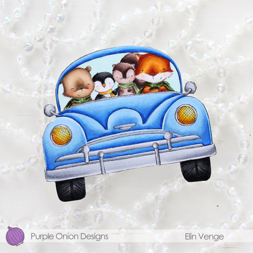
 The shape of the car actually dictated the shape of the card. I love shaped cards, and aside from the side mirrors, this one was pretty easy to fussy cut.
 I colored in the car with the critters using my Copics, fussy cut right up against the black lines and added the car onto a top fold white cardbase. I then fussy cut that, making sure to temporarily glue the card shut for the cutting to be a little bit easier. Those side mirrors are fussy, but the rest was a cinch.
 To create a truly one layer card would have been easier than having to fussy cut the car, adhere it to the card base and then fussy cutting again, but I didn’t think of it when I stamped my image, so I did it the hard way. Simon Says Stamp has a 120 lb cardstock that’s great for one layer cards with Copic coloring. Copics bleed through on most cardstocks, but the 120 lb from Simon doesn’t and would have been perfect for this card if I’d only thought of it before I was finished. Onto the headlights I put a thick layer of Glossy Accents for shine, and my tiny car card was finished.
 Not a whole lot of colors used for this one. I’m loving the green combo I used for this, it’s giving me life. The entire collection can be purchased as a discounted bundle for a limited time, the offer is available until Friday, November 12th, and you can read all about it on the Purple Onion Designs blog
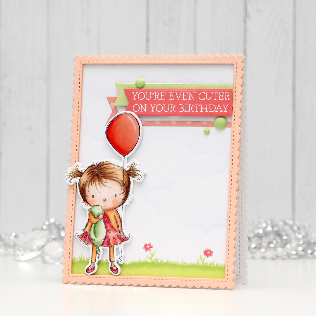 I don’t often purchase coordinating dies for stamp sets, but boy, they make it easy to add dimension. Once I’d colored up the little girl with the balloon, I die cut her and four additional pieces from white card stock to add dimension behind her. Way more sturdy than foam tape.
 I wanted to use lots of other goodies from MFT on this card, so I used the cloud stencil with a very light blue ink (Iceberg from Altenew) to create a barely there puffy cloudy sky behind her. It’s really soft, but shows up better in real life than in photos. I used a couple of elements from the Scene Builder stamp set and stamped those near the bottom using Fadeout ink from Inkon3 for a little bit of no line coloring. I die cut the largest of the Stitched Rectangle Scallop Edge Frames four times from Peach Bellini card stock and glued them together for dimension.
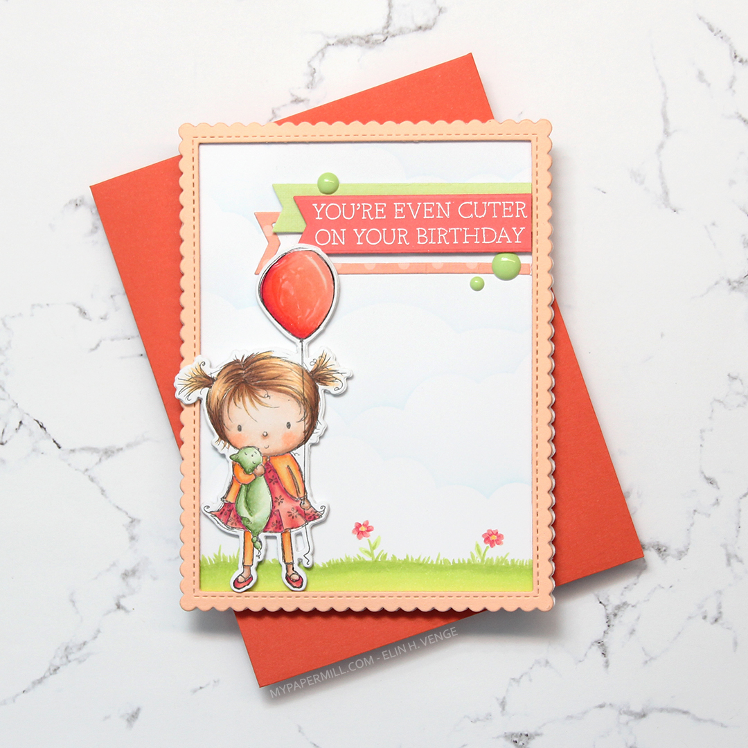 I added clear Wink of Stella glitter and a thick layer of Glossy Accents on the balloon, before stamping and white heat embossing one of the sentiments in the Birthday Cutie stamp set onto Berry Sorbet card stock from Papertrey Ink. I die cut the sentiment using one of the Fishtail Flag Frames dies from MFT, and found some scraps in my stash that I’d already die cut using dies from the same set. I use that die set a lot. I added three green enamel dots from the Tropical Forest set from Altenew and my card was finished. I paired the card with a Persimmon envelope, also from MFT. I love their envelopes!
 Lots of colors for this one! I was going for a peachy pink jacket and leggings, but it was too close to the pink I’d used for the rest of her, so I added some yellows on top. I also decided to go for a brighter green on the grass than her little stuffie.