
Hi, crafty friends. I’m back with another Mo Manning cutie, and this time I’ve chosen the kid eating the corn from the 3 on a bench set. The set includes three kids (one eating a popsicle, one eating a watermelon, and this one eating corn). There’s also a merged version of this image with all 3 kids sitting next to each other on the bench, but I tend to opt for the separated versions, like I did here.
 I printed the image near the bottom left of my panel and colored it up with my Copics, before trimming off a little bit on one side. I used the Slimline Cloud Edges stencil from My Favorite Things, along with Eastern Sky ink from Altenew, to softly ink blend the clouds in the background.
 I stamped a couple of sentiments from the Bitty Birthday Wishes stamp set from My Favorite Things using Obsidian ink from Altenew. I adhered my panel directly to an A2 card base I created from Periwinkle cardstock from Hero Arts. I then used a scripty die from Mama Elephant to die cut the word wishes four times from Amarena Cherry cardstock from My Favorite Things. I stacked them together and added the word to the card, nestled in between the stamped sentiments, before finishing off the card with a few sequins from the White Orchid sequin mix from Little Things from Lucy’s Cards.
 Some vivid colors for this one.

 I colored and fussy cut the sloth, colored in the party hat and fussy cut that, before putting both pieces aside while I worked on the rest of my card. I created a card base from Blue Breeze cardstock from My Favorite Things and created a wall for the sloth to hang onto using Stamper’s Select White cardstock from Papertrey Ink. To create a bit of texture to the wall, I stamped the Touch of Texture background stamp from My Favorite Things using Soft Stone ink from Papertrey Ink. It’s subtle, but still adds a little bit of interest.
 I stamped a sentiment from the Anything-but-Basic Birthday Wishes stamp set from My Favorite Things using Obsidian ink from Altenew, before adding the wall to the card base with 1 mm foam squares. I added the sloth using foam tape and finished off the card with a few Starry Sky Ombré Glitter Drops from Pinkfresh Studio. I also added a dot of Black Glaze pen to his eyes for a bit of shine and dimension, which is easy to see in real life, but tricky to photograph.
 This was initially a very muted, very simple color palette. Let’s just say things changed when I decided to add the party hat 🙂
 I decided to cut off about half of the bench. Since I’m only using one of the kids, I didn’t need the whole thing. If you want, there’s also a
  I adhered my panel directly to a card base I created from Green Parakeet cardstock from Papertrey Ink. I stamped a sentiment from Norsk Stempelblad AS onto a strip of the same color cardstock using Green Apple ink from Simon Says Stamp and put the sentiment aside while I worked on the rest of my card.
 I die cut the word hipp 8 times from Tropical Teal cardstock from Papertrey Ink using a die from Kort og Godt, and created two stacks of four each for a dimensional look. I adhered my stacked die cuts to the card and put the green cardstock strip on top of the bottom hipp.
 To finish off the card I added a few enamel dots from Papirdesign. I decided to go for orange ones to pick up the color from the little boy’s ice cream.
 It’s a fairly simple card, but the clouds add a little something to the white space, and the die cuts and dots add dimension.
 For such a small image, I used a lot of colors.
 I colored the image in a very pastel color palette, before trimming the panel down to 3 7/8 x 5 1/2″, added foam tape on the back and mounted it on an A6 (4 5/8 x 6 1/4″) top fold white card base that I covered with a piece of Aqua Sky cardstock from Concord & 9th.
 This card was a bit of an evolution. I originally wanted to use a bigger kite and a different sentiment, but the larger kite was too big for my image (AND for my card) and the sentiment I initially wanted to use was too big for this smaller kite, so I had to improvise. I used a die from the kite builder die set from Concord & 9th, and stamped a sentiment from the Kite Strings stamp set, also from Concord & 9th, using VersaFine Onyx Black ink. I then die cut the word hello twice from white cardstock using the Sweet Sentiments die set from Altenew, stacked the two together and added the word above the stamped sentiment and popped the kite on some 1 mm foam squares for a tiny bit of dimension.
 My card felt kind of empty at this point, I had even more white space than I wanted, and I needed a fix. My color buddy and general crafty assistant Liz suggested adding clouds. Using the Cloud 1 & 2 die set from Papertrey Ink, I die cut three clouds from vellum. I tucked one behind the kite and added tiny slivers of 1 mm foam squares behind the other two for a little bit of dimension, before strategically placing sequins from the Ice Water mix from Little Things from Lucy’s Cards to hide the foam squares and finish the card.
 This card didn’t turn out the way I planned, but sometimes, that’s actually a good thing. I like the clouds, the sequins and my other revisions to my original idea. And I will never cease to be amazed at how good clouds always look die cut from vellum. It’s the best!
 I didn’t use a lot of markers for this one.

 I used the largest die in the A2 Double Stitched Rectangle STAX die set from My Favorite Things to give the edges of the panel a little bit of detail. Onto a white top fold card base, I adhered a quarter panel of Blueberry cardstock from My Favorite Things. I put foam tape on the back of my colored, die cut panel, tied some Blueberry divine twine from Whisker Graphics around the panel and adhered it to the center of the blue card front, before finishing off with a few enamel dots from Papirdesign.
 This image is super fast and easy to color. It’s just a head, a hat and a couple of mittens. I wanted a green and gold card, so I colored her hat and mittens green and fussy cut her.
 Onto a white top fold card base, I adhered a panel of brushed gold cardstock. Actually I cheated a bit and only added a frame. I die cut the center out of it, so I can use that for something else. No one will ever know I cut a chunk out of it to save for later.
 Using the Stitched Snowflake Backdrop die from Lawn Fawn, I created a snowflake background from white cardstock. Once I’d die cut, I ran the panel through my Gemini Jr a second time with an embossing mat to add extra depth to the texture the die made. It really makes a huge difference, as opposed to just running it through once with the die.
 I used the Merry Christmas die from My Favorite Things to die cut from the same gold cardstock I used on the base. I die cut six additional layers from white cardstock, adding three of those behind the gold and three behind the shadow I cut from heavyweight translucent vellum from My Favorite Things. All these layers add a ton of dimension to an otherwise simple card.
 I added my image to the card using foam tape. Her hands hover just above the merry, it’s like she’s peeking in from behind the sentiment.
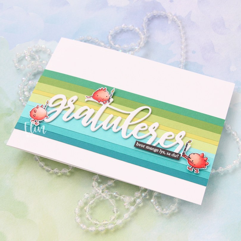
 I colored my monsters with Copics and fussy cut them leaving a thin white border. I covered my A7 card base with a band of solid colored cardstock strips. From top to bottom they are Concord & 9th Clover, Concord & 9th Parsley, Papertrey Ink Green Parakeet, Papertrey Ink Limeade Ice, Concord & 9th Sprout, My Favorite Things Summer Splash, Papertrey Ink Hawaiian Shores, Concord & 9th Oceanside and My Favorite Things Tropical Teal.
 I die cut the word gratulerer three times from white cardstock using the Flasketag, gratulerer die set from Papirdesign. The cardstock I used is Stamper’s Select White cardstock from Papertrey Ink, which is the same cardstock I used for my card base. I want my whites to match, and this is the perfect white cardstock, I love it.
 I added my stacked white die cut to the center of the striped background, mounted the monsters on foam tape and white heat embossed a sentiment from the A06 stamp set from Norsk Stempelblad AS onto Smokey Shadow cardstock from Papertrey Ink and adhered it to the stacked die cut word to finish the card. I decided against adding embellishments, I wanted the monsters to really steal the show.
 Very limited Copic selection for this one.
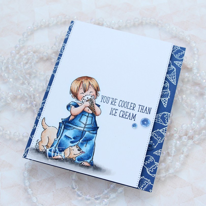
 I’ve colored this image before, but never using blue for his overalls. That feels crazy, but it’s also true. I obviously used blue this time, and gave him blond hair too. I stamped a sentiment from the Double Scoop of Cute stamp set from My Favorite Things, using Blue Beyond ink, also from My Favorite Things.
 On the sides of the panel, I used a die from the Stitched Borders die set from Lawn Fawn to create a tiny bit of interest.
 On a quarter piece of Blueberry cardstock from My Favorite Things, I repeatedly stamped the ice cream cones in the Double Scoop of Cute stamp set and white heat embossed them all. I adhered the blue panel to a card base and mounted my colored panel on top using foam tape.
 To finish off the card I added three sequins from the Denim mix of sequins from Little Things from Lucy’s Cards. I tend to put my embellishments near the sentiment, it’s a good way to draw the eye to the sentiment.
 It doesn’t get much cuter than a boy with a puppy. And I wish the temps were good enough for ice cream outdoors. We still have snow on the ground, it’s cold and there’s more snow in the forecast. I want summer, when’s it coming?
 Lots of Copics despite a very limited color palette. It happens.
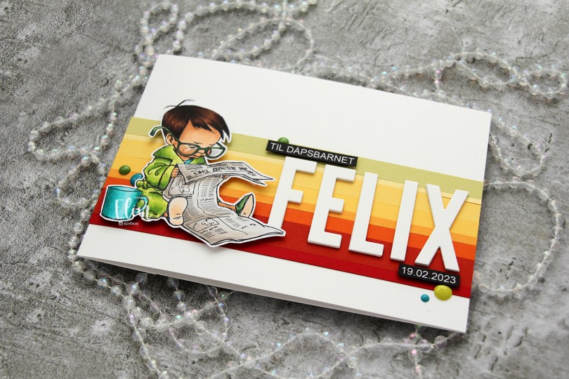
 I colored the image with My Copics and decided to fussy cut around it this time. I tend to turn my colored pieces into panels for my card and work from there, but I wanted to do something a little different today.
 I left a white border around the image to make it easier on myself. You tend to lose some of the details in the hair if you cut up close to the line, and I wanted to keep the hair intact. I also added Glossy Accents to his glasses for shine and a touch of dimension.
 I wanted to include his name on the card, but had printed my image fairly large. My solution was to make a landscape A7 card (7×5″). I rarely make landscape cards (trickier to photograph) and the same goes for A7, but it’s fun to shake things up. I also shook things up by adding cardstock strips going across the card. I tried with cool colors first, but the image got lost, so I went through my solid colors of cardstock again and made a version with warm tones. From top to bottom they are:
 I used the Impact Alphabet die set from My Favorite Things to spell the name. I die cut four of each letter and stacked them for a dimensional look, gluing them right onto the stripped background, before adding the sentiment and date in white on black.
 I mounted the image on foam tape and added a few enamel dots from Altenew (teal dots from the Cool Summer Night pack) and Papirdesign to finish the card.

 This
This  I stamped a sentiment from the Definisjoner stamp set from Norsk Stempelblad AS with Melon Berry ink from Papertrey Ink, chopped off a bit of the panel and adhered it to a card base I created from Melon Berry cardstock, also from Papertrey Ink.
 I added a couple of sequins from Little Things from Lucy’s Cards. The larger sequin is from the Sweet Shop mix, the smaller one from the Iced Sherbet mix.