Hi, crafty friends! Today is Mother’s Day in Norway, and I probably should have thought ahead enough to make a Mother’s Day card to share today, but I’m not always a good thinkaheader and have a birthday card to share instead. My design is pretty generic, though, and it would be easy to swap out “birthday” for “Mother’s Day”. I even think the color scheme is perfect for mother’s day.

So many things went wrong in the creation of this card, but I fixed/covered up most of my mistakes and I’m pretty happy with the end result. I started by stamping birthday from the All the birthdays stamp set from Concord & 9th onto an A6 panel of Stamper’s Select White cardstock from Papertrey Ink, as well as onto a piece of Nectar cardstock from Concord & 9th that was large enough to cover the shaker area. I didn’t want to stamp it directly onto the card base, that would have made it harder to line up. More on that later. So far, so good, right? I then die cut the HAPPY from the Happy Birthday words dies from Kristina Werner into my white panel, and kept the counters of the A and the Ps to put back in later. Things were still going according to plan. There’s a small asterisk looking stamp in the All the birthdays stamp set. I wanted to stamp that randomly across my white panel and pulled out an acrylic block. We used to stamp with acrylic blocks all the time before the Misti was invented. I’m not a ding dong, surely, I’m capable of stamping this tiny stamp a few times with an acrylic block without messing up, right? Turns out I AM a ding dong and royally messed up on the Eucalyptus colored asterisk above the A and P. Pretty much in the middle of the card, isn’t that typical? I knew I was going to add sequins, and I could strategically place one to cover up my boo boo. I cut off 3/16″ on all sides to allow the card base color to work as a frame once the card was complete.
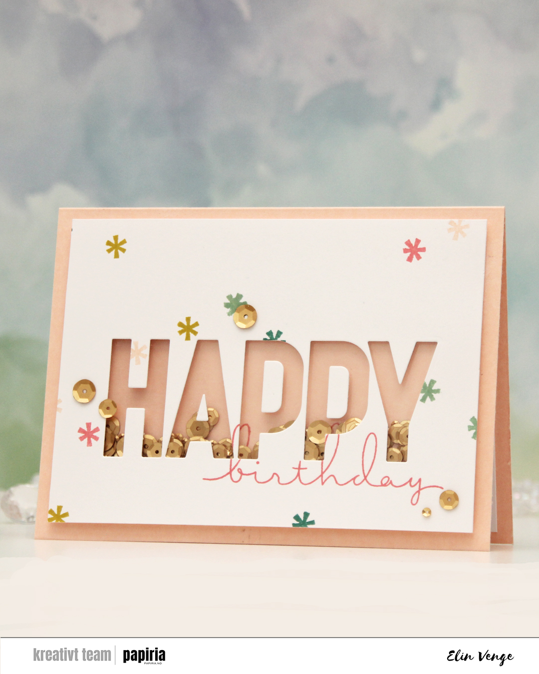
I then adhered a piece of acetate behind my letters, glued the counters (interior pieces of the letters) back in onto the acetate, flipped the panel over and added tons of foam tape around the shaker window pretty close to the window, even putting tiny strips behind the counters of the Ps, before putting a few sequins from Altenew into the shaker well before sealing it shut with another piece of acetate. I made sure to add the sequins the right side up. That was not a good idea, but I didn’t realize at the time and adhered my shaker piece onto the stamped piece of Nectar cardstock to line up the stamping on the two pieces. The problem with the sequins all facing the same way is that once they shook around, they clumped together like stacks and were pretty much impossible to separate by flicking the card. The other mistake? Adding the foam tape so close to the letters and behind the counters, my sequins didn’t really have a chance to move much. I had adhered everything to the card base at this point.
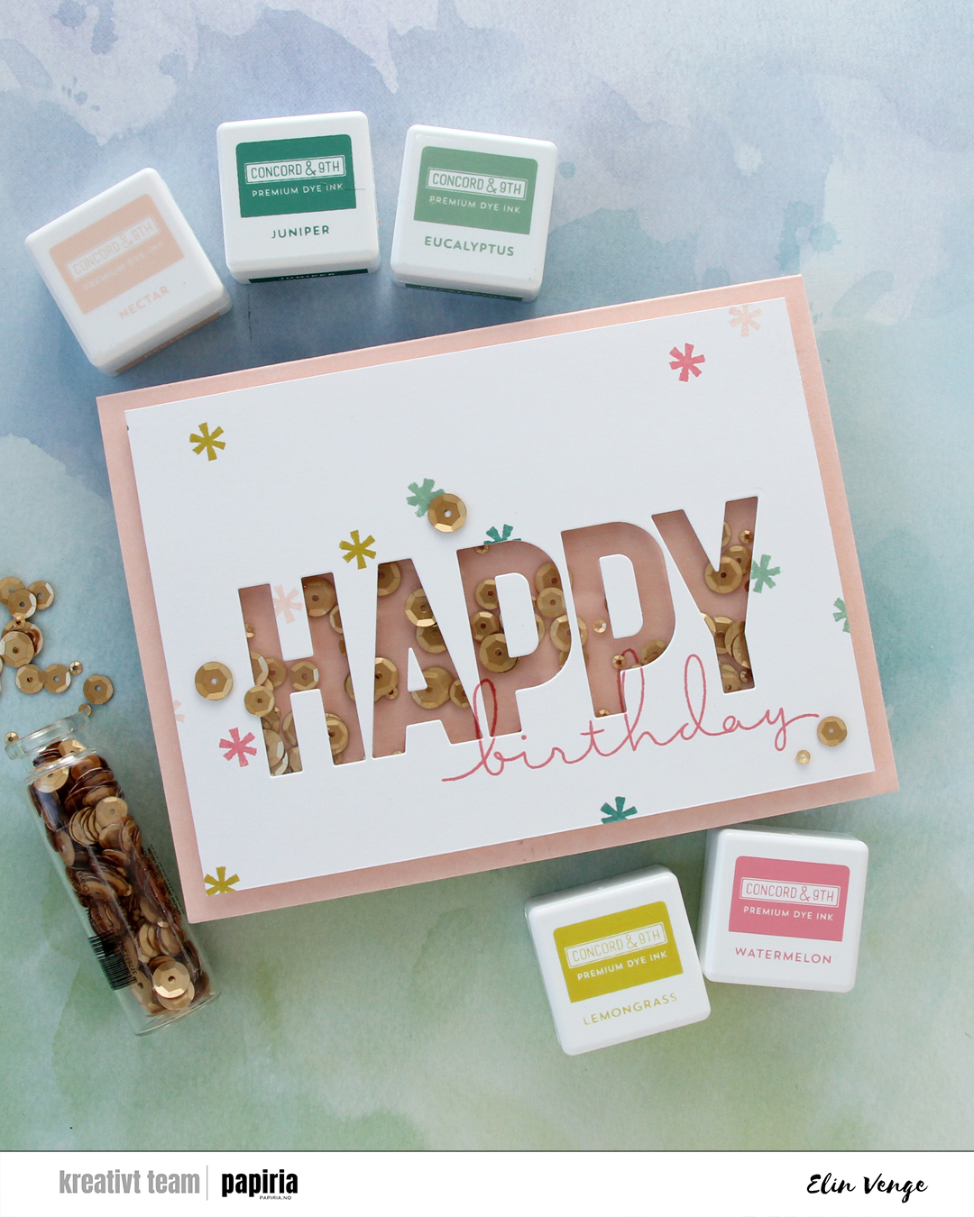
I’m not shy with glue when adhering things, but I was able to slide a thin 6″ steel ruler under my shaker panel and basically used it as a saw to cut it away from the card base, cutting horizontally so I would preserve the card base as well as I could. I didn’t have another sheet of Nectar cardstock to create a new A6 card base, so this was the way to fix it. I then pulled off the nectar piece with the stamping, then the back acetate piece, which took with it a few of the small pieces of foam tape that were in the way anyway, and then I emptied out the sequins, made sure there were no sticky pieces left behind, put sequins back into the now rectangular shaker window, this time randomly with some upside down and some right side up – and I added way more sequins too, before sealing it shut with a new piece of acetate. The piece of Nectar cardstock I’d stamped on initially had crease lines after being pulled off, so I had to restamp birthday on a new piece of Nectar. Evidently, I didn’t put the stamp into the Misti the same way as I had the first time, because the new stamping wouldn’t really line up with the old stamping – part of the nature of photopolymer stamps, they’re soft and can be curved. The loops on the b and h don’t perfectly line up with the stamping on the white panel the way they initially did, but this is me embracing imperfection, I wasn’t redoing the white panel too.
 I adhered my shaker panel to the card base and cut a couple of additional white panels to put on the inside of the card. This means I have a white panel to write my personal message, the card is a little sturdier because it’s now thicker, and the piece I adhered on the back of the front covers up the fact that I could actually see through parts of the card base after my little sawing earlier. Not shy about glue, remember? Yeah, the glue does its job, and I tore parts of it down to almost printer paper thickness. I added sequins to the front of the card (one covering up my stamping mishap) and I was done. At least I thought so… I was happy with the card, but then noticed as I was writing up the blog post for Papiria that the counter of the second P had slipped a little and wasn’t in the right spot anymore. It was bugging me. It was *really* bugging me, so I peeled it off, die cut a new one that I adhered in the right spot and took a couple of new photos. You can still see the droopy counter in the first two photos here, but that’s my card. I got there in the end.

 Play really is the right word to use, because this is the Pattern Play die set from Concord & 9th. It’s one of those die sets where you have a large die that creates a road map and several smaller dies that cut out the shapes to go on top of the map. It’s like a puzzle, and I love playing with tiny pieces of paper, so this is right up my alley.
 I die cut the smaller pieces from Pebble, Sprout, Sunflower, Sorbet and Harbor cardstocks, all C9 colors. I stacked the Sprout four layers thick for dimension, the Harbor three layers and the Sorbet two, while gluing the Sunflower and Pebble directly to the map. This creates more movement and interest to the background, and it makes the card very tactile. I cut off 1/4″ from each side, popped the panel onto foam tape and adhered it in the center of my top fold A2 card base.
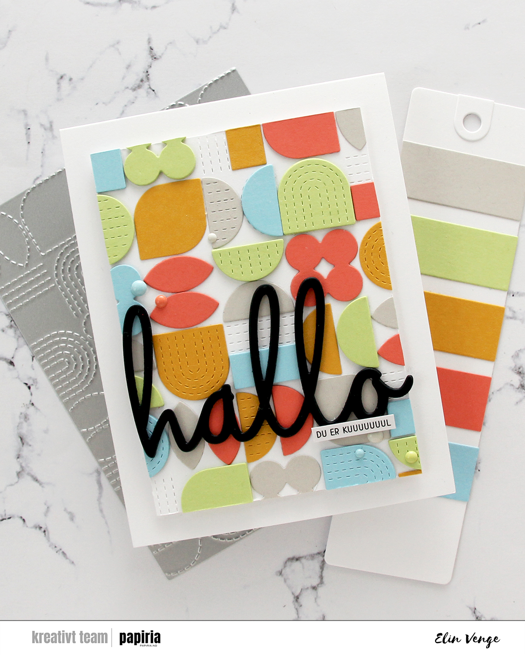 With such a colorful background, I knew I needed a bold black sentiment. I chose this hallo (hello) die from Kort & Godt, which I die cut four times from black cardstock and layered for dimension. I also added a tiny sentiment sticker strip (you are cooooooool) on top of the die cut word.
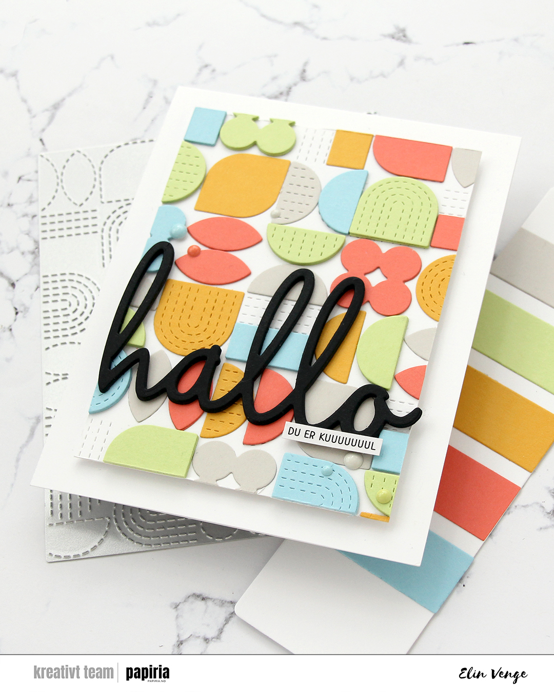 To finish off the card I added enamel dots in colors that match the cardstock. Since they’re the same color as the cardstock behind them, they don’t distract from the sentiment or the background, but they do still add interest to the card.
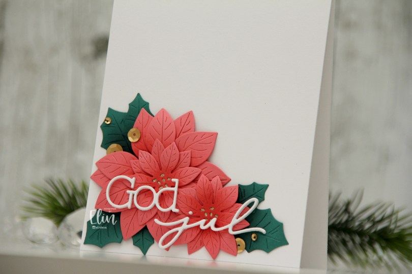
 I actually shared this one on the Papiria blog back in December, but I thought I’d share here, as well. I die cut the parts for the florals from Watermelon cardstock and the leaves from Juniper cardstock, both are C9 colors. I ink blended the petals with Watermelon ink and the leaves with Rainforest ink, which is a darker green than the Juniper color. I curled all the petals and leaves back before assembly, and adhered them all to a white card base. I used gold glitter cardstock from Kort & Godt for the centers of the flowers.
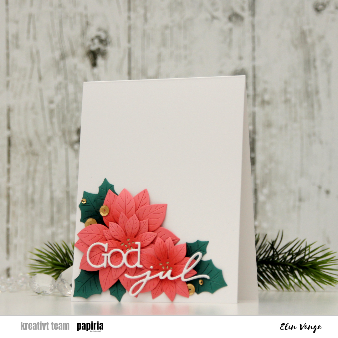 I used a die set from Kort & Godt to create my sentiment. I stacked three of each die cut and used liquid glue to adhere the sentiment to the florals, before finishing off the card with Satin Gold sequins from Altenew. Super simple, and I love all the white space!!
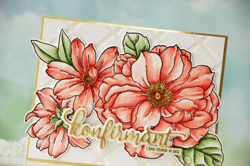
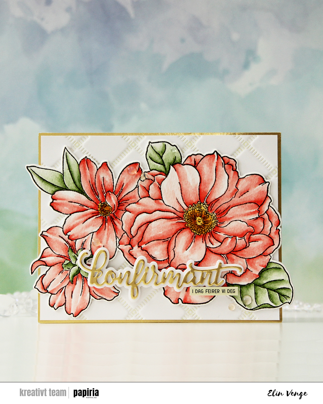 I started by stamping the big floral stamp in the Blooming Delight stamp set from Altewew using Altenew Obsidian ink onto watercolor paper (cold pressed Fabriano Artístico), before coloring with Zig Clean Color Real Brush markers. When my coloring was complete, I die cut the flower with the coordinating die and also cut a few extra from white cardstock to build dimension.
 I used the Stippled Plaid press plate from Pinkfresh Studio with Pistachio ink from Altenew to create a subtle background. I matted it with some gold shine cardstock from My Favorite Things and adhered my florals pretty much in the center. The flowers stick out on both sides, but I just made a larger envelope to accomodate the larger size.
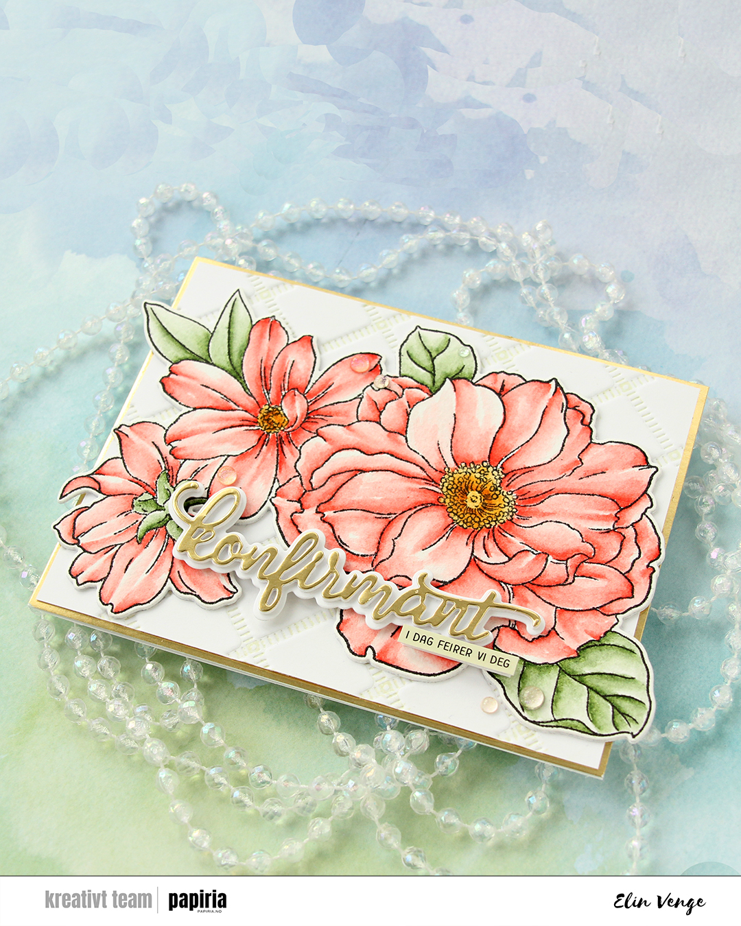 For the sentiment, I used a konfirmant die set from Papirdesign. I die cut the shadow layer from white cardstock and the word itself from the same gold cardstock that I used previously, with a few white die cuts stacked behind it for dimension. I even stacked a few behind the shadow, so it looks like the shadow floats on top of the flowers. For a sub sentiment, I used a sentiment sticker strip from Kort & Godt that I ink blended with Misty Sage ink from Altenew, before finishing off the card with a few Iridescent Dew Drops from Pinkfresh Studio.
 I used a couple of the brand new cardstock colors from Concord & 9th (Brickyard and Pimento), along with a bunch of older ones (Sorbet, Grapefruit, Nectar, Eucalyptus, Rainforest) for the rest of the florals. I also used a little bit of vellum and some gold shine cardstock for the flower centers.
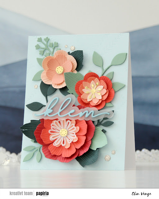 Once you’ve die cut the florals and greenery, you can use the embossing folder that coordinates to create texture on the petals and large leaves. They come out looking like crepe paper, and I love the look. There are many ways to assemble these flowers, and I created a bunch more that I wasn’t able to fit on this card. For the circular centers, I stacked some white die cuts behind the gold ones for dimension, and I curled all the petals and “crepe paper” leaves before assembly.
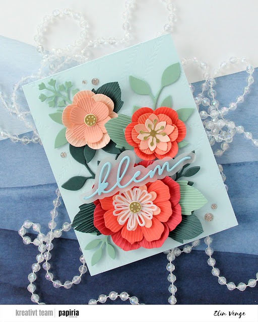 On the Powder panel that covers the card base, I wanted a little bit of texture. I used the Leafy Lattice press plate from Pinkfresh Studio with Polar Bear ink from Altenew for a subtle background – it’s so subtle it barely shows in the photos, it’s definitely more noticeable in real life. I probably could have gone a little bit darker with the ink, or ink up the press plate a second time and run it through again if I wanted it darker.
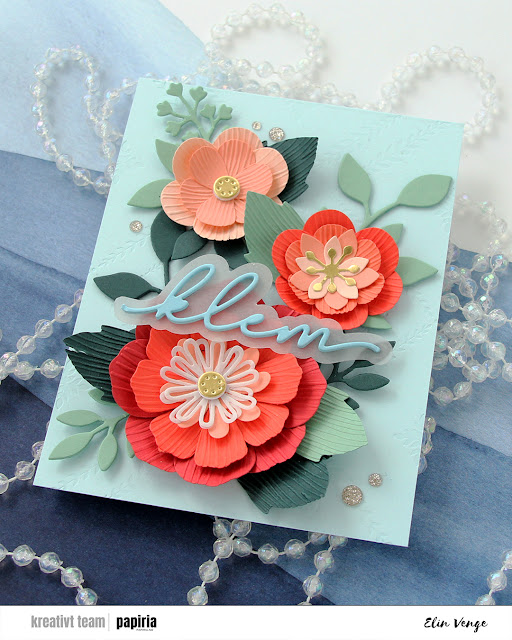 I adhered all my flowers and leaves with liquid glue, stacking the pieces in the background for strength and dimension. They’re only attached at the base of the sprigs, so they have som lift at the tips. I die cut a sentiment die from Kort & Godt four times from Harbor cardstock, stacked them, added a vellum shadow layer behind and glued my sentiment on top of the larger flower, before finishing off with a few champagne glitter drops from Pinkfresh Studio.
 It’s no secret that I’m a fan of anything and everything Concord & 9th comes up with. This Blended petals set is an older one, a quick google search revealed a July 2022 release, but I hadn’t seen it before and picked it up just a few weeks ago. There’s a stamp set, a die set and a stencil set that all coordinate. I didn’t use the stencils today, but I definitely will in the future!
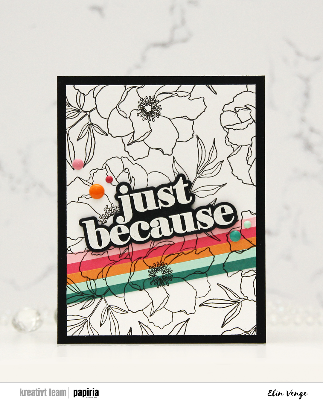
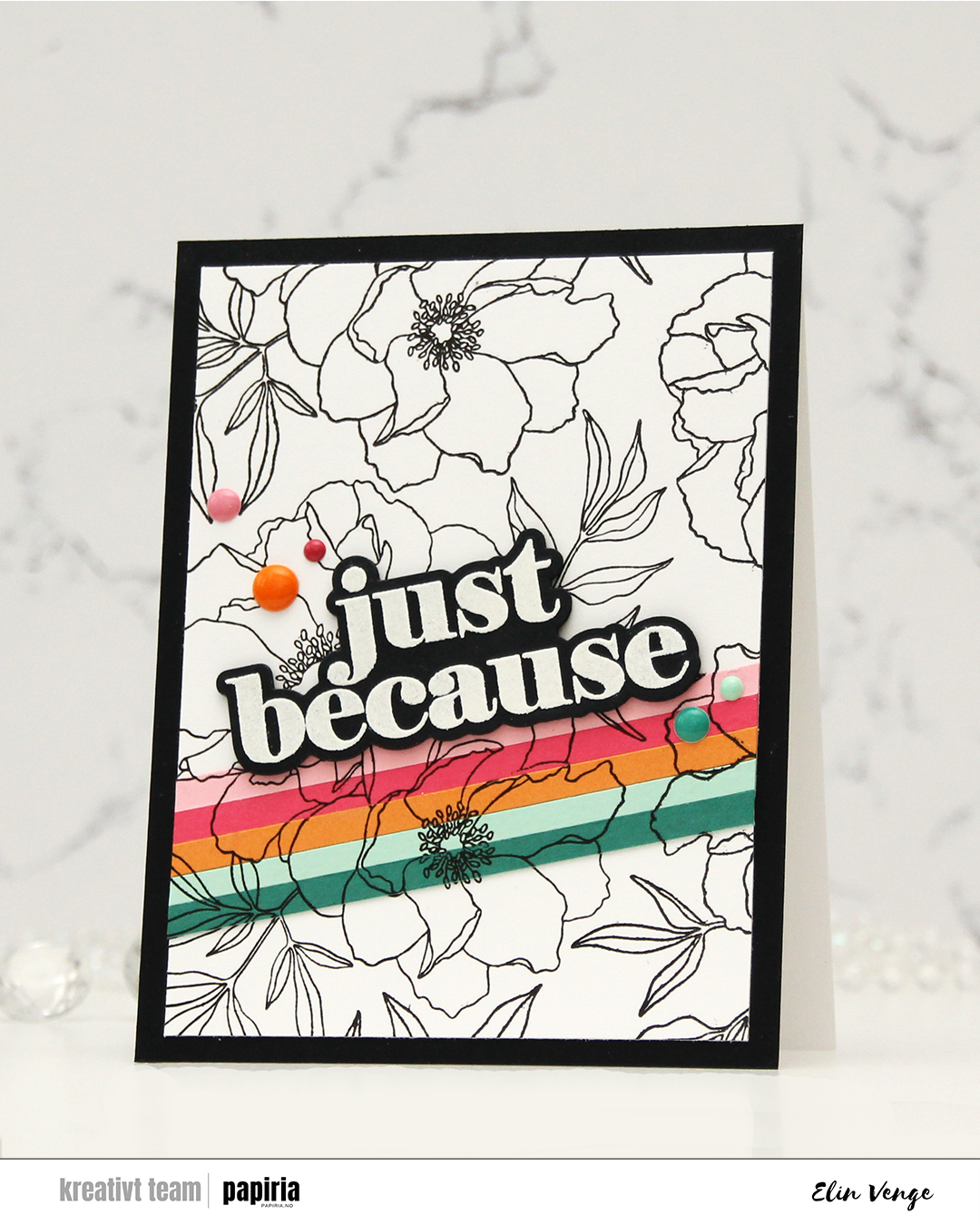 I started by stamping the big floral image on a panel of white cardstock using Altenew Obsidian ink. This ink is very dark black and very crisp, and it’s perfect for outlines like this. I then “stripped it up” (thank you, Laura Bassen, for this term) with cardstock colors from C9. I cut 3/16″ strips from Juniper, Sea Glass, Clementine, Honeysuckle and Pink Lemonade cardstock. I butted the strips together and glued them to Post-it tape, which I then adhered temporarily to the white panel, so I could stamp in the exact same spot on my stripped piece.
 Once I’d completed my stamping, I adhered the Post-it tape with my strips properly with liquid glue and trimmed the panel down slightly, before adhering it to a black panel that covers the front of an A2 white card base. I stamped and heat embossed the large sentiment in the stamp set and cut it out with the die from the coordinating die set. I stacked another four black die cuts behind it for dimension, and adhered it to the top of my cardstock strips.
 To finish off the card, I rummaged through my enamel dots in search of colors to match. I have all the colors of the C9 enamel dots on their way to me. They would match perfectly, but the last time I tracked the shipment, they were in the UK. I used the Sea Shore enamel dots from Altenew for the ones that matched Juniper and Sea Glass, the Tea Party set from Altenew to sort of match the pinks and the orange one is from the Boy Crazy pack from My Mind’s Eye from 2013. I’ve loved enamel dots for a loooong time!
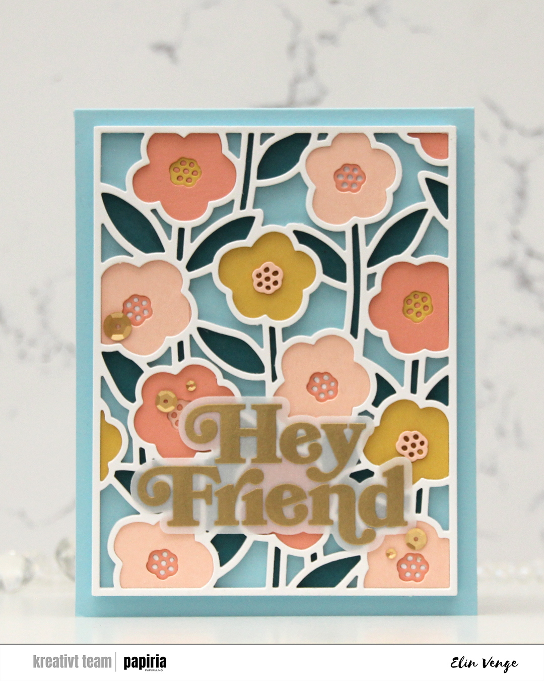 I love this Sweet Stems die set from Concord & 9th. It was part of their February release, and it’s so versatile. It has a separate coordinating stencil set (which I didn’t use for this card), which is great if you want lots of color, but not spend 512 hours on a card. The die set consists of a cover die, which is what I used here, and seven smaller dies. One of them cuts the outline for Hey Friend, which is a sentiment in the coordinating stamp set. I love when you can mix and match products like this.
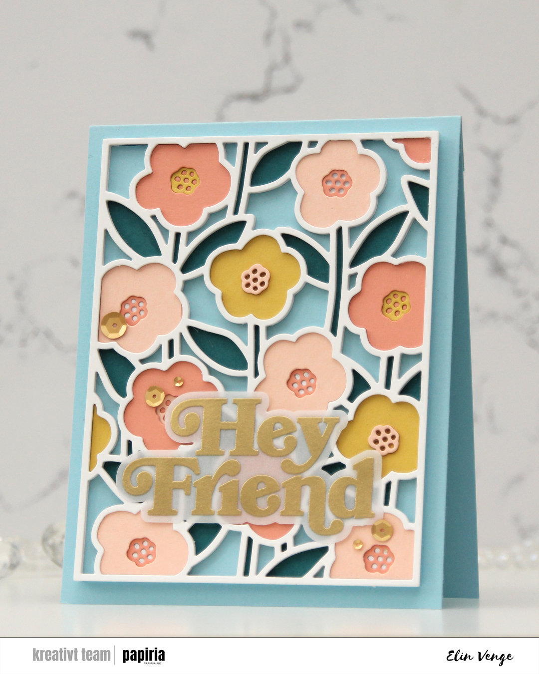 I used the cover die to cut a bajillion pieces from white cardstock (Stamper’s Select White from Papertrey Ink), then cut one panel each from Peacock, Honeycomb, Nectar and Grapefruit cardstock, all Concord & 9th colors. I started with one of the white outlines adhered to a piece of Harbor cardstock (also a C9 color), and puzzle pieced the stems and leaves into it with the Peacock color.
 In total, I stacked 6 white outlines and added the flowers and the flower centers at varying depths. The flowers are all slightly different shapes, but the centers are all the same, making them easy to stack.
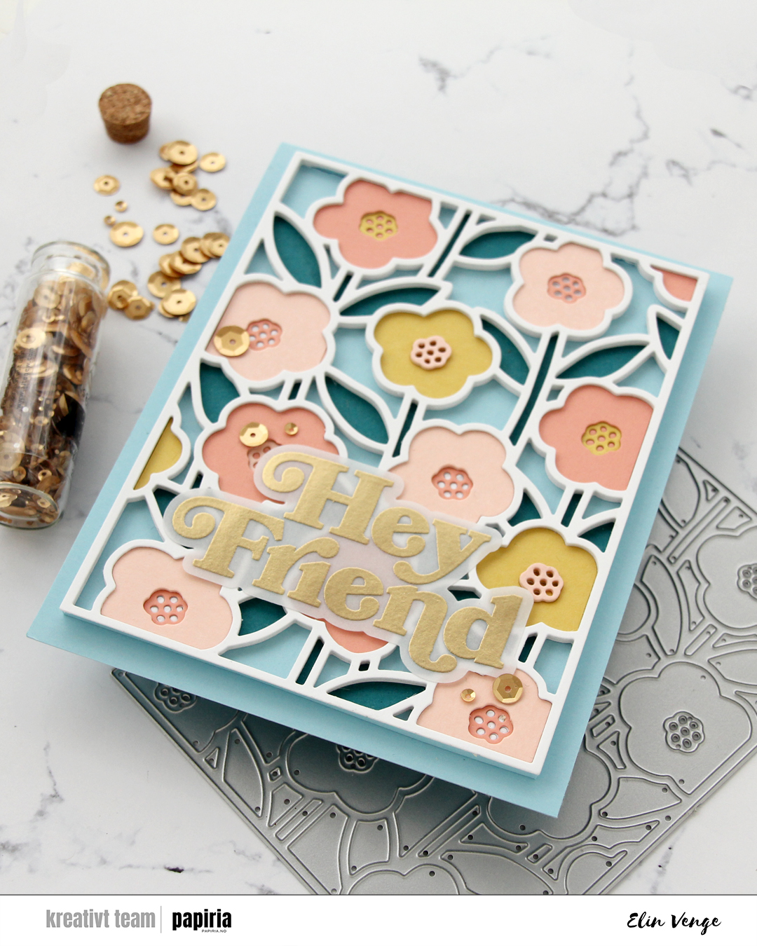

 I started by stamping the large flower in the Pristine Peonies stamp set from Altenew using VersaMark ink. I added Gilded embossing powder from Brutus Monroe and melted the powder before die cutting the flower and then using the coordinating stencils to quickly color in the flower and leaves. I used Nectar, Grapefruit, Sorbet and Cayenne inks from Concord & 9th for the florals, and Pistachio, Misty Sage, Mossy Meadow and Green Opal Fresh dye inks from Altenew for the leaves and buds.
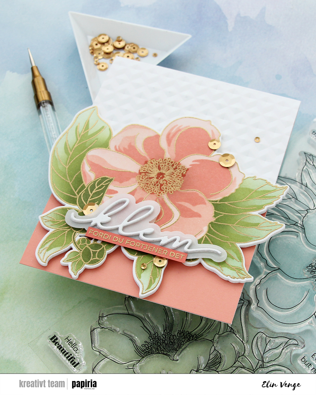 I die cut an additional three layers of the floral from white cardstock to glue behind my colored one, did partial die cutting on the card base using the same die and then ran the base through my Gemini Jr. with the Angled Mosaic embossing folder from Altenew to create some texture to the card front.
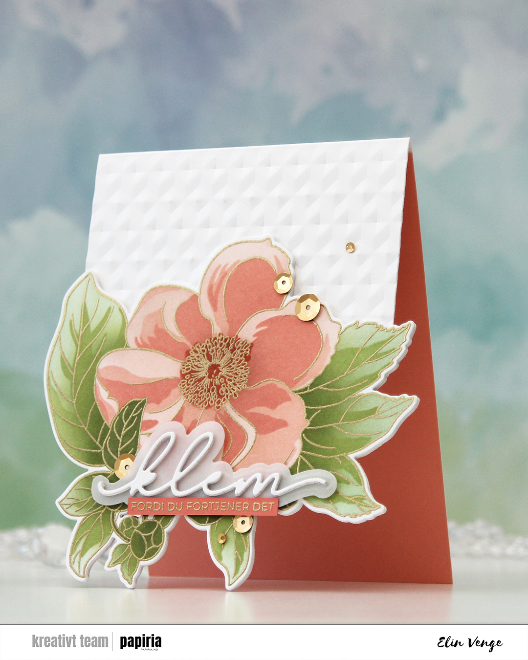 I adhered a panel of Grapefruit cardstock from Concord & 9th to the inside to accentuate the look of the open front, and added my stacked die cuts to the front of the card base. Even though the tips of the leaves touching the table when the card is on display are pointy, all the layers make for a very sturdy front, so they won’t bend.
 I actually used a Christmas die for the sentiment. The die cuts out the word juleklem (Christmas hug), but by omitting the first four letters, I was left with klem (hug). I die cut two stacks of three layers each and die cut the shadow layer from Heavyweight Translucent vellum from My Favorite Things. I sandwiched the vellum between the two stacks and adhered my stacked die cut on top of the flower. I stamped and gold heat embossed a coordinating sentiment (translation: because you deserve it) onto a strip of Sorbet cardstock from Concord & 9th, adhered it to the vellum and added a few more layers on the back for strength and dimension, before finishing off the card with satin gold sequins from Altenew.
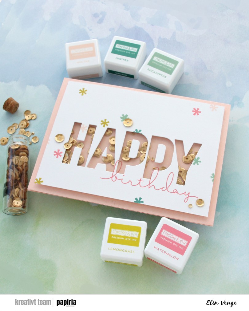
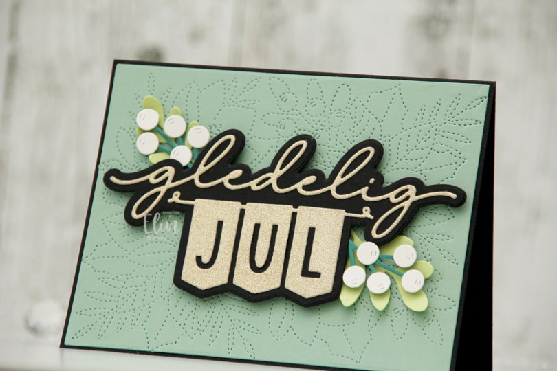
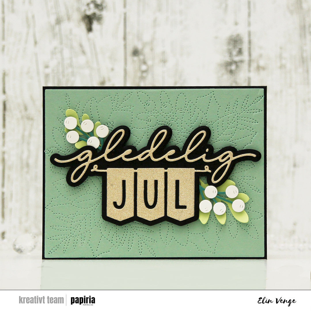 I started by die cutting the sentiment. I cut the shadow layer from True Black cardstock from Papertrey Ink and the top layer from gold glitter cardstock from Kort & Godt. I love their glitter cardstock, it’s so smooth and nothing rubs off. I used the largest die in the Additional A2 Layers die set from Waffle Flower on a piece of Eucalyptus cardstock from Concord & 9th, before using the faux stitch die in the Festive Blooms die set from Concord & 9th to dry emboss the panel, which I then adhered to my black card base. I love that there’s a tiny little black border.
 I die cut leaves and sprigs from the Festive Blooms die set and the Joyful Season die set (also from Concord & 9th) to frame my sentiment. I used Sprout and Juniper cardstocks from Concord & 9th for the leaves and sprigs, and a little bit of Rustic White cardstock from Papertrey Ink for the berries. I curled up the ends of the leaves, added foam tape on the back of the berries and adhered it all to flank my popped up sentiment. There you have it, a Christmas card with what I believe to be a very modern palette.
 I started with a panel of white cardstock (Stamper’s Select White from Papertrey Ink) that I cut down slightly from a quarter sheet. I used a couple of dies from Papirdesign to do a dry emboss on my cardstock. I covered a white top fold card base with a quarter sheet of Harbor cardstock from Concord & 9th and layered my white dry embossed panel on top.
 I die cut the banner pieces in the Joyful Season die set from Concord & 9th from Harbor and Powder cardstock, before stamping a sentiment from the Merry Greetings builder stamp set from Kristina Werner onto the banner pieces using Harbor ink. I assembled the banner and added a few layers of cardstock behind it for dimension. I die cut a tree and a snowflake from the same dies that I used for my dry emboss background, both from Powder cardstock. I stacked two of each and glued them on top of its actual position in the embossed background, before finishing off with Opal gems from Spellbinders. Very simple.