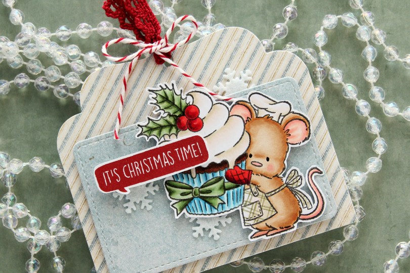
Hi, crafty friends! It’s the first Sunday of Advent, and I have a fun gift tag to share today featuring the adorable Baking Fun image from Purple Onion Designs, illustrated by Pei – I’m such a big fan of her illustrations!! I did a lot of baking last year for Christmas – SO many different types of Christmas cookies and sweets. This year, I haven’t even started yet. I have a few favorites I might end up making, I haven’t decided yet. Anyway, back to the gift tag.
 I colored up the cute little mouse with Copics, adding a plaid pattern to the apron using a Zig watercolor brush marker (No. 98 Pale Dawn Gray), before fussy cutting the image leaving a white border. I used the Gift Pocket Tag die set from Mama Elephant to die cut from patterned paper from the Christmas Nostalgia collection from Maja Design to create my tag. I mounted the smaller piece with foam squares and did the same with the cute little mouse.
 I stamped a sentiment from the Holiday Blurbs I stamp set from Purple Onion Designs using Amarena Cherry ink from My Favorite Things, fussy cut leaving a white border and mounted it on top of my image, doubling up on the foam squares on the left half. I tucked a few felt snowflakes from Kort & Godt under my element, added a bit of black glaze pen to the eyes and tied ribbon and twine at the top of the tag to finish.
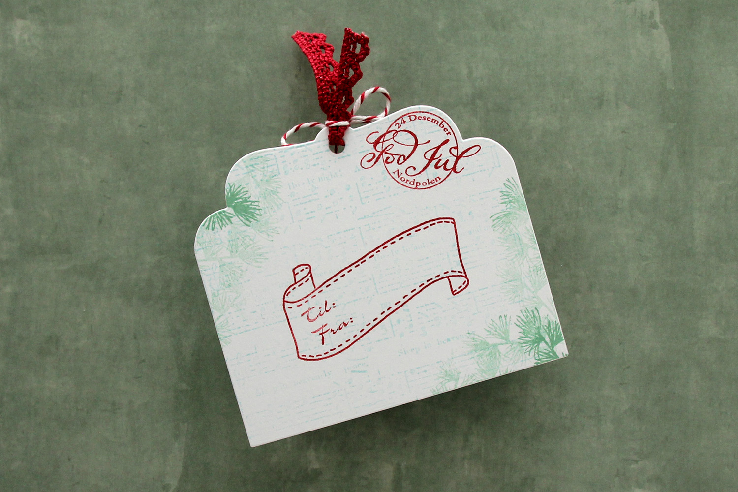 I die cut the tag a second time from white cardstock and did quite a bit of stamping on it. I used second generation stamping of an old sheet music stamp from Magnolia using Powder ink from Concord & 9th – I wanted it to be very soft. The sheet music is actually for Silent Night, making it extra Christmas-y – not that you can really tell. I used first and second generation stamping of a branch from a Mathia Design stamp set using Eucalyptus ink from Concord & 9th to add a little something to the corners. I stamped a postmark stamp from Ladybug & Friends, as well as a to/from stamp from Norsk Stempelblad AS using Amarena Cherry ink from My Favorite Things. I don’t think Ladybug & Friends is in business anymore. Neither is Norsk Stempelblad, but I love their stamps and can’t bring myself to stop using them.
![]() I didn’t use too many colors on this one.
I didn’t use too many colors on this one.
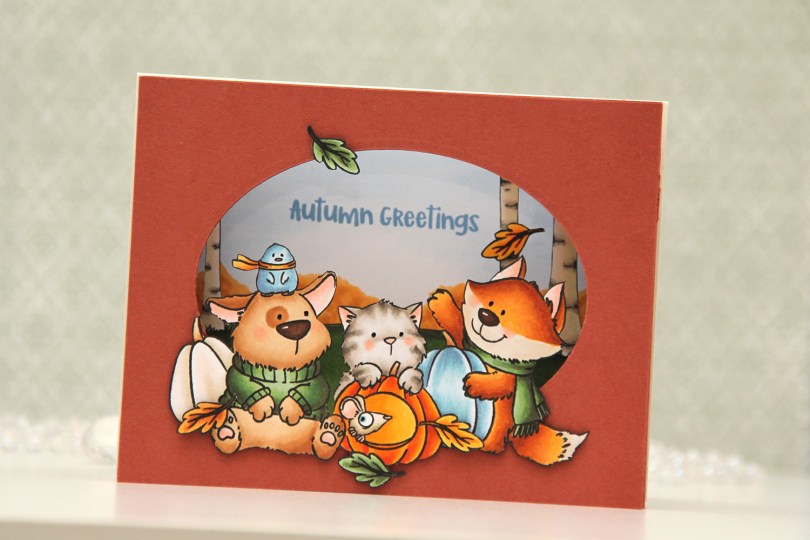
 I stamped my images (both the critters and birch tree background) on separate panels of X-Press It blending card with Copic friendly ink, colored them in and fussy cut them. Before fussy cutting the critters, I actually stamped over my initial stamping with Obsidian ink from Altenew, which gives super black lines that are extra crisp. It’s a pigment ink, though, so it needs to be stamped after the coloring. I also colored a sky and some bushes on a separate panel, where I stamped my sentiment in Blueberry Sky ink from Papertrey Ink. I cut an oval into a panel of Americana cardstock from Papertrey Ink using an old oval die from Spellbinders (Petite Ovals Large) and then created two pieces of accordion folds in the same color cardstock. I glued my background with bushes and sky to the back of the accordion pieces, the birch trees in the center, and the panel with the oval window in front. I mounted my critters using foam tape and used black glaze pen for the eyes. I then adhered my accordion to a top fold card base I created from Rustic Cream cardstock from Papertrey Ink.
 I used a lot of Copics for this one. I even used B20, which is a color I’ve created myself using an empty marker, B21 reinker and blender reinker.
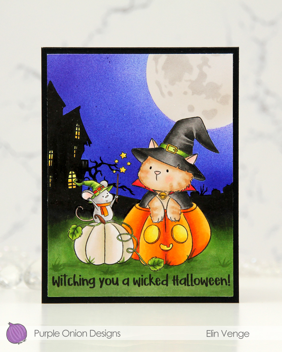 I stamped the image near the bottom center of a panel of X-Press It blending card using Extreme Black ink from MFT, which is a Copic safe hybrid ink. I colored the image and created a spooky silhouette background which fades from black in the distance to green as you get closer to the front of the image.
 I masked off the scene and put a moon mask from an old Simon Says Stamp Stamptember collaboration with Tim Holtz into the top right corner, before I went in with Copics and an airbrush to create the sky. I used three colors of blue, trying to make it a bit lighter near the moon and darker further away. I took off the moon mask, masked the sky and airbrushed into the circle opening using E40 for a very pale moon. I then added the detail mask for the moon and airbrushed the openings with T1, which is a very light grey that I also used for the mouse. Once all the coloring was complete, I removed all the masks, added a bit of black glaze pen to their eyes and stamped a sentiment at the bottom using Obsidian ink from Altenew, before trimming the panel down a little and adhering it to a card base I created from Black cardstock from Concord & 9th to finish.
 I used quite a few markers for this. The ones after the gap are the ones I used for the airbrushing of the moon and sky.
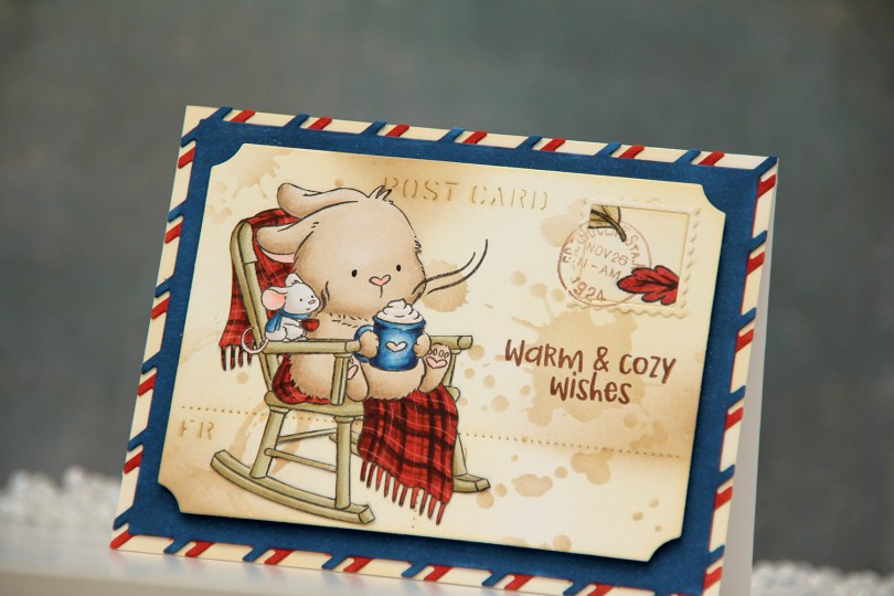
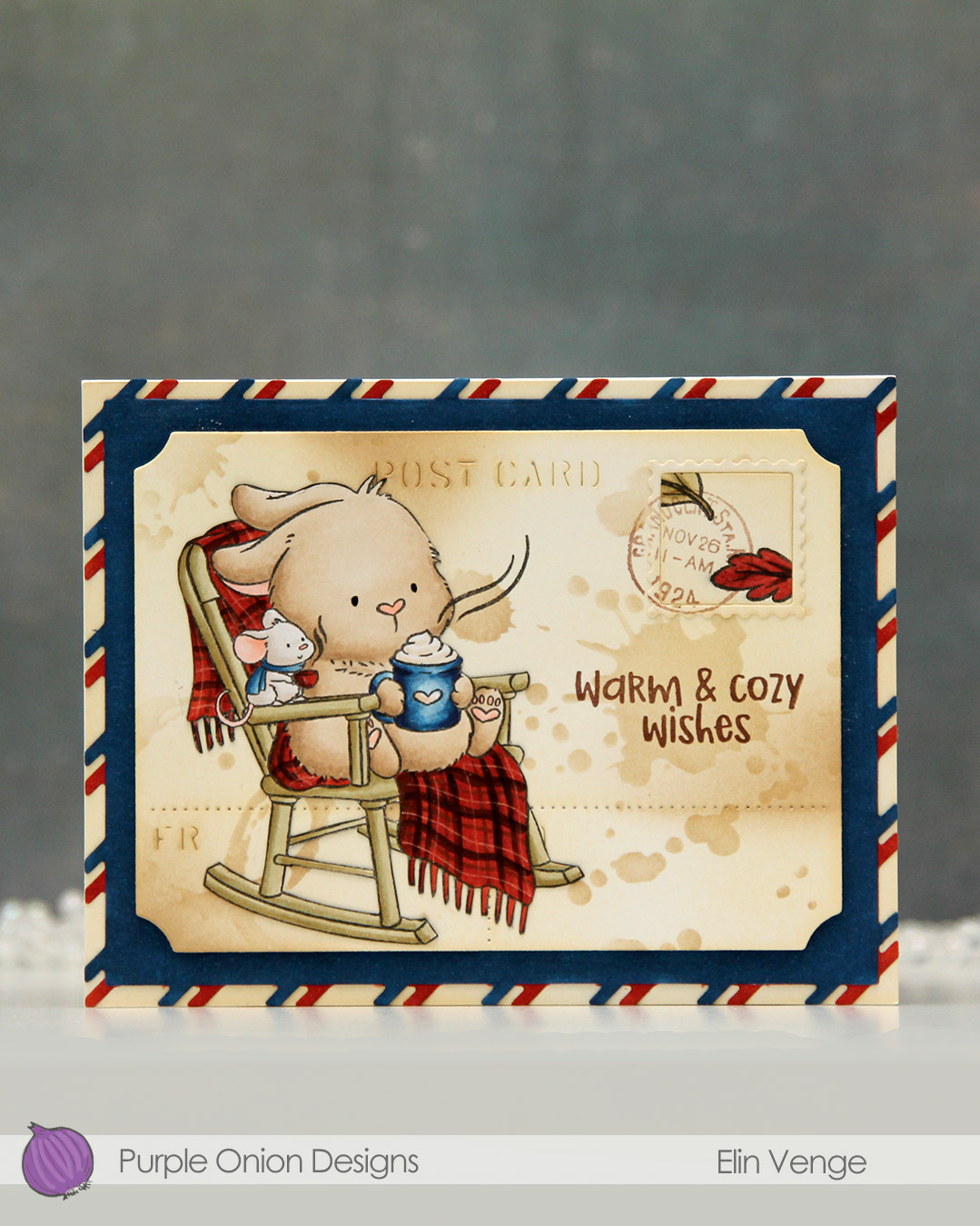 I colored the image with Copics onto X-Press It blending card and fussy cut it right up against the black lines. From another piece of X-Press It, I die cut the postcard shape using the Postcard combo die set from Mama Elephant. I used Peachy Glow ink from Altenew to ink blend across the panel, giving it a vintage feel. I then went in with a stencil from the mini stencil set 3 from Tim Holtz and added the splatter texture using Classic Kraft ink from Papertrey Ink along with a blending brush. In some areas, I added ink with the blender brush without using the stencil.
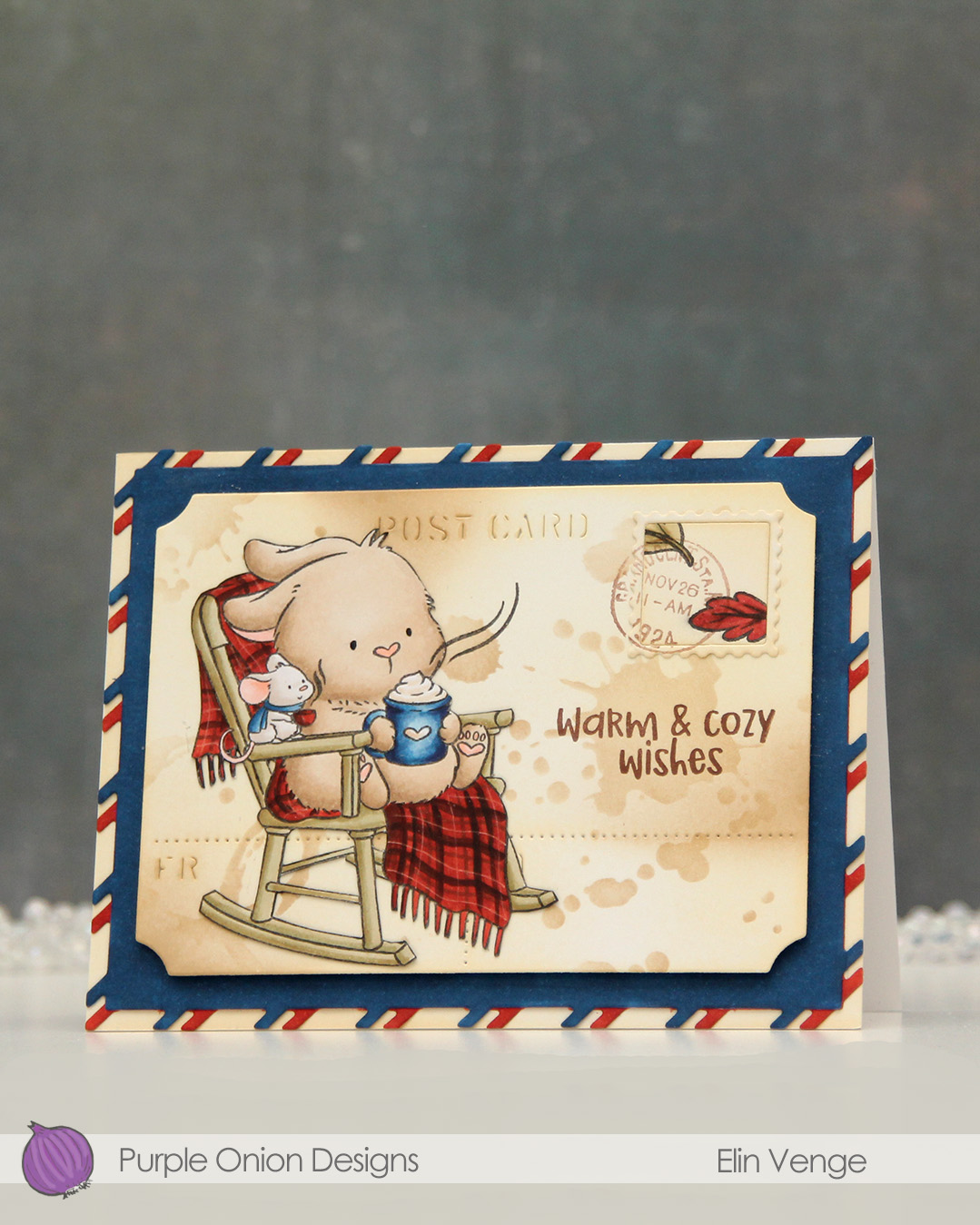 I stamped the leaves from the
 I stamped the
 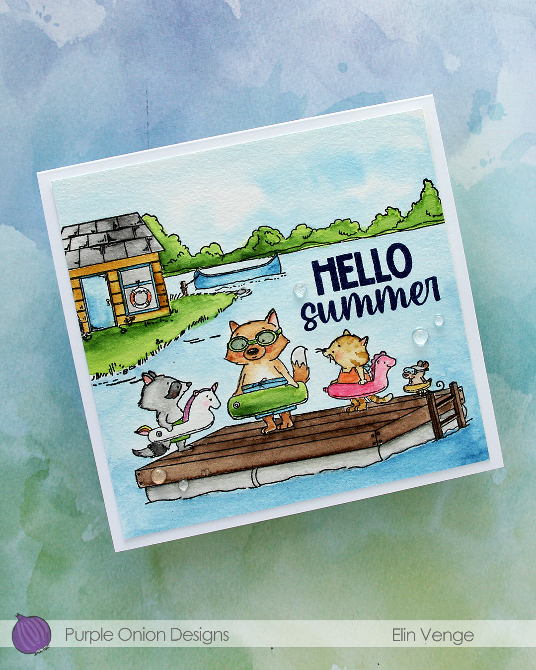 I used my Mijello Mission Gold watercolors and brushes in varying sizes to color in my scene, cut it down and stamped a sentiment from the
  I adhered the panel to a 5 3/4 x 5 1/2″ top fold card base I created from Stamper’s Select White cardstock from Papertrey Ink, before finishing off with a few Raindrops from Little Things from Lucy’s Cards.
 I stamped the image with black ink onto X-Press It blending card and colored it with Copics.
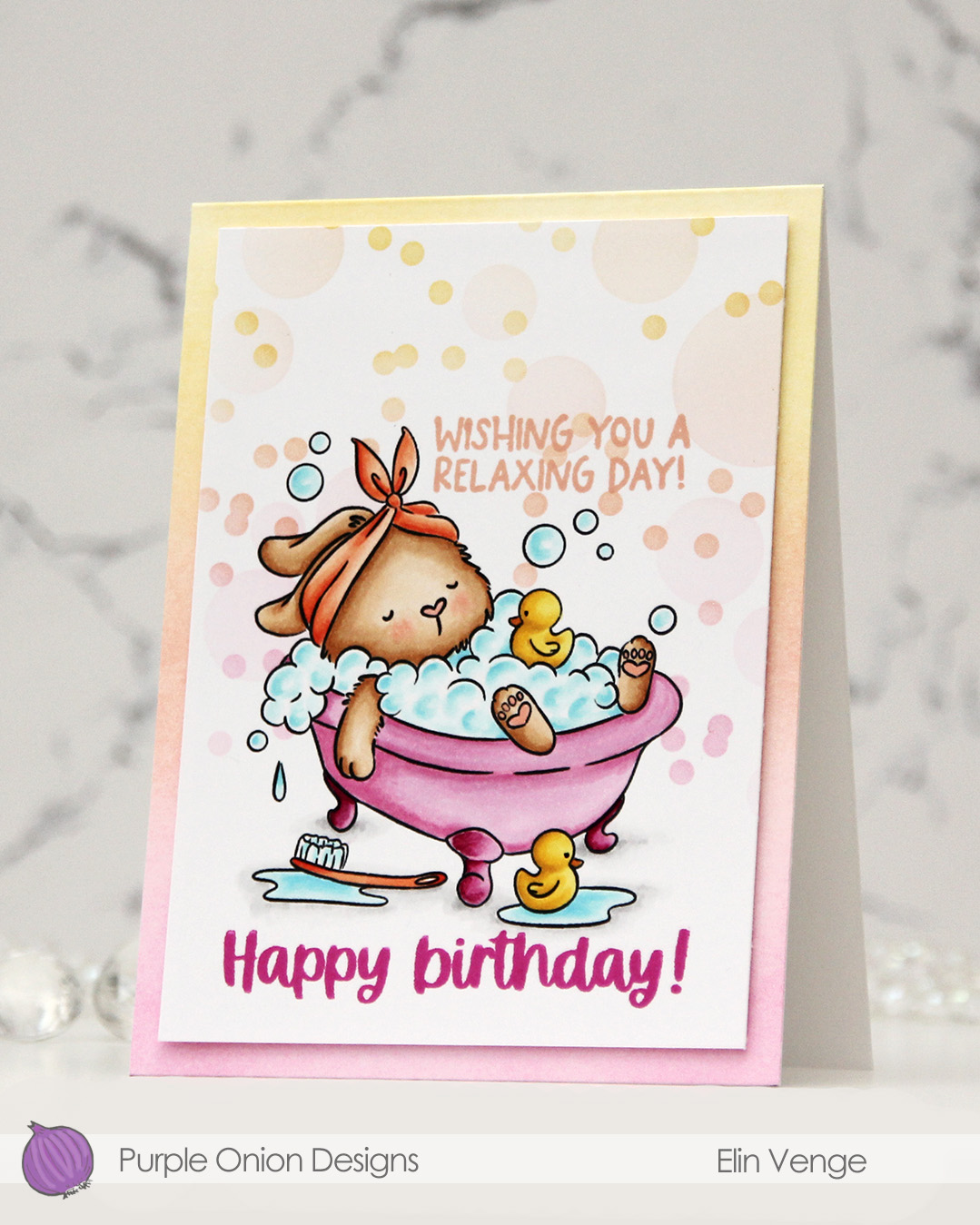 I added a mask to my image, then used the Bokeh Elements stencil duo from Waffle Flower to softly ink blend additional bubbles in an ombré effect in the background. I used Sweet Pea, Grapefruit and Buttercup inks, all colors from Concord & 9th, making sure to add slightly more color on the smaller circles than the large ones, while still keeping it fairly light.
 I stamped a sentiment from the
  I trimmed my panel down slightly and added it with of dimension to a top fold white card base that I ombré ink blended using the same three colors I used with the stencils. I did also add a dot of black Glaze pen to the eyes of the ducks for a finishing touch.
 Simple color palette for this one.
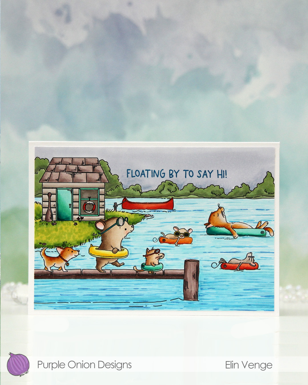 I fit a lot of images into this scene.
  I colored in my scene with Copics, opting for very vibrant colors for all the floating elements and the details on the boat house, while keeping the rest fairly muted. The lake is lighter the further back you get, and the sky is a bit moody off in the distance. I added a bit of black glaze pen to the eyes of the gang on the pier for a little bit of dimension and shine.
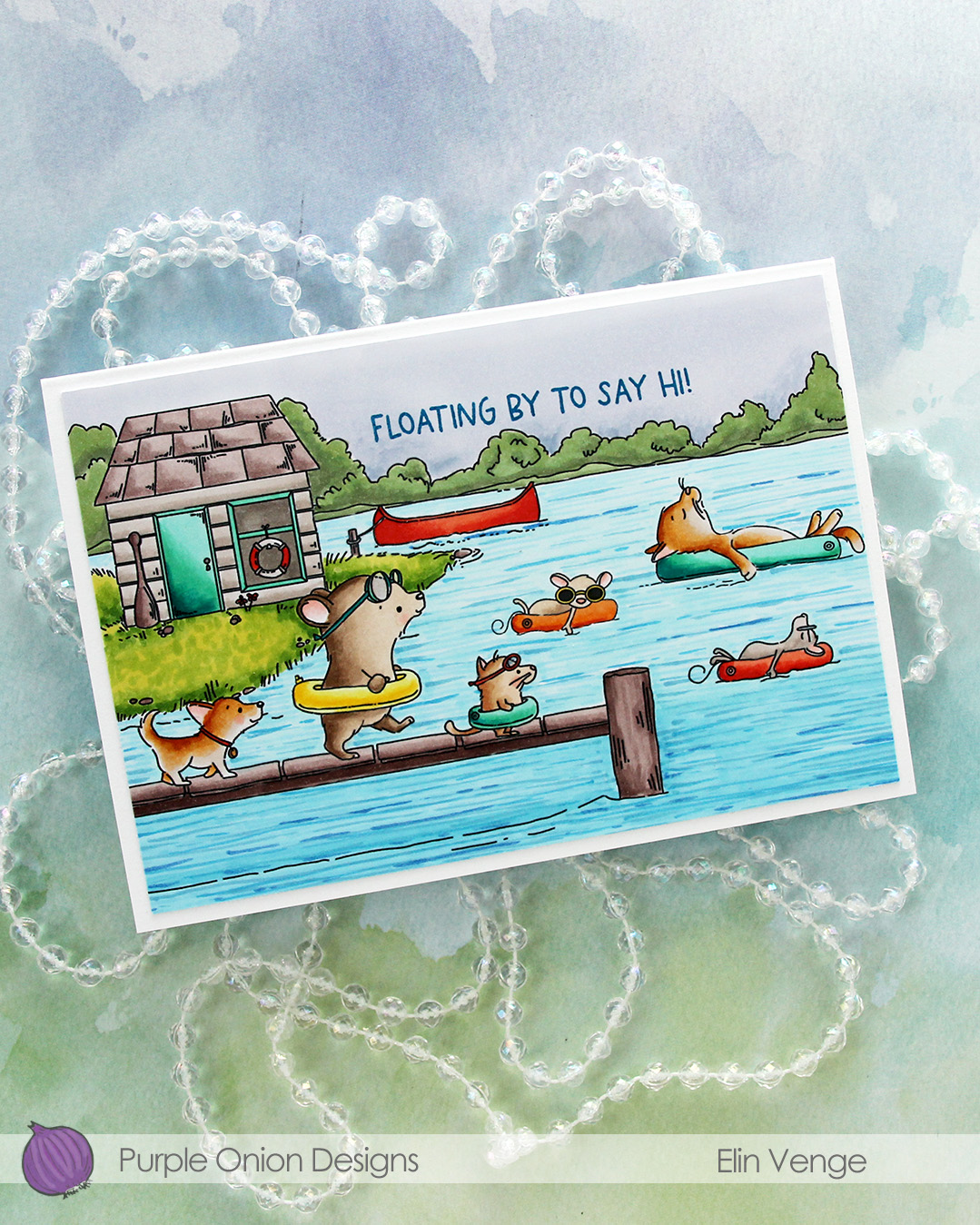 I stamped a sentiment from the
 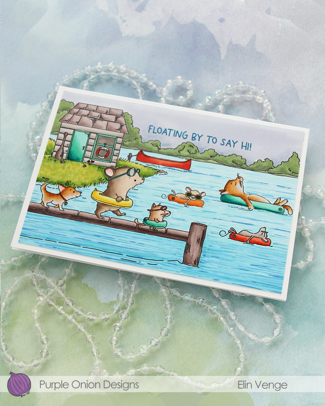 I adhered the panel to a card base that measures 6 1/8″ x 4 1/4″. This is an irregular size for a card, but when I create scenes like this, I let the scene dictate the size of the card. I can always make a custom envelope to fit.
 I used lots of Copics for this one.
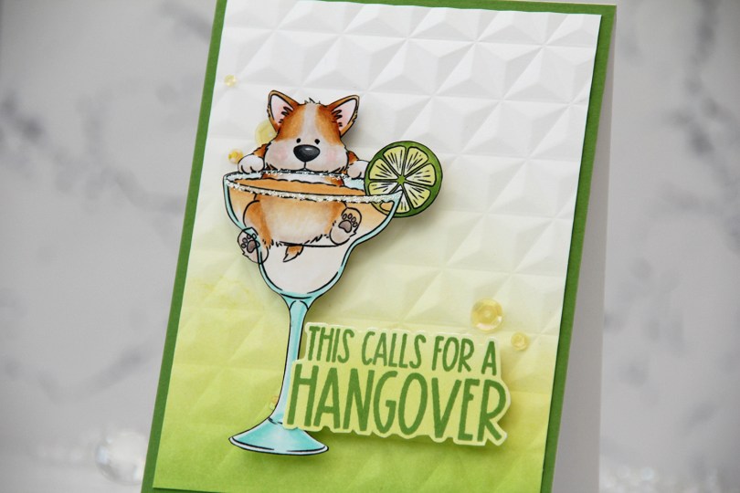
 I knew I had to color up this image as soon as I saw it. This is so adorable with the corgi hanging off the top of the glass. And so funny, and very typical of Pei’s illustration style. I love it!
 I colored the image with Copics, fussy cut him, then added VersaMarker pen to the rim of the glass and used white puff embossing powder from Wow! to mimic a salt rim. The embossing also adds some fun texture to the glass. I also used a black glaze pen to add a little bit of shine and dimension to his eyes.
 I ink blended Parsley and Starfruit inks from Concord & 9th onto a white cardstock panel for an ombré effect, then used the Geometric embossing folder from WRMK to create some subtle dimension. I added the panel to a card base I’d covered with Parsley cardstock from Concord & 9th, before mounting the image using foam tape.
 In this release there are also a few sentiment sets, and this one from the
  Simple color palette for this one. This was so fun to color!!!
 I actually decided to watercolor this one with my Zig Clean Color Real Brush markers. I prefer using a paintbrush with water with these, but there’s also a blender that you can use. Marcel is small, but I still used three different browns and a pink for him (064 Oatmeal, 607 Milk Tea, 068 Deep Brown and 200 S. Almond Pink). For Elliot and the die cut letters I used 312 Overcast Sky only. I did use a little pink for the bow on his tail, but for the actual elephant, it was just the one blue. I love the movement you get with watercolor, it’s something you can’t really achieve with Copics.
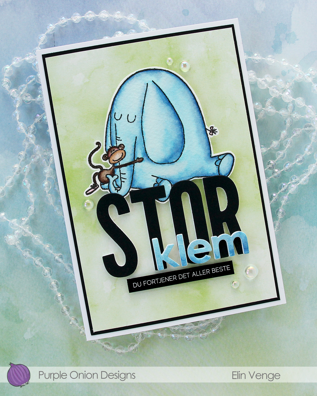 I fussy cut my image, leaving a thin white border. Using the Impact Alphabet die set from My Favorite Things, I die cut the letters to spell out STOR (big) four times from white cardstock and once from Black cardstock from Concord & 9th. I used the Parker lowercase alphabet die set from Memory Box to die cut the letters for klem (hug), again four layers of white, this time topped by a layer of the watercolor paper.
 I stacked my layers, and sandwiched the image between the white and black letters for the large word. I created a black mat on the card front, covered that with a piece of green patterned paper from the Watercolor Wash 6×6″ paper pad from My Favorite Things and mounted the letters and image in the center. I adhered the klem letters directly on top of the larger letters and added a sub sentiment sticker strip from Kort & Godt below it. I popped it up a bit to level it with the black letters, before finishing off with a few dew drops from the Spring Leaves embellishment mix from Little Things from Lucy’s Cards.
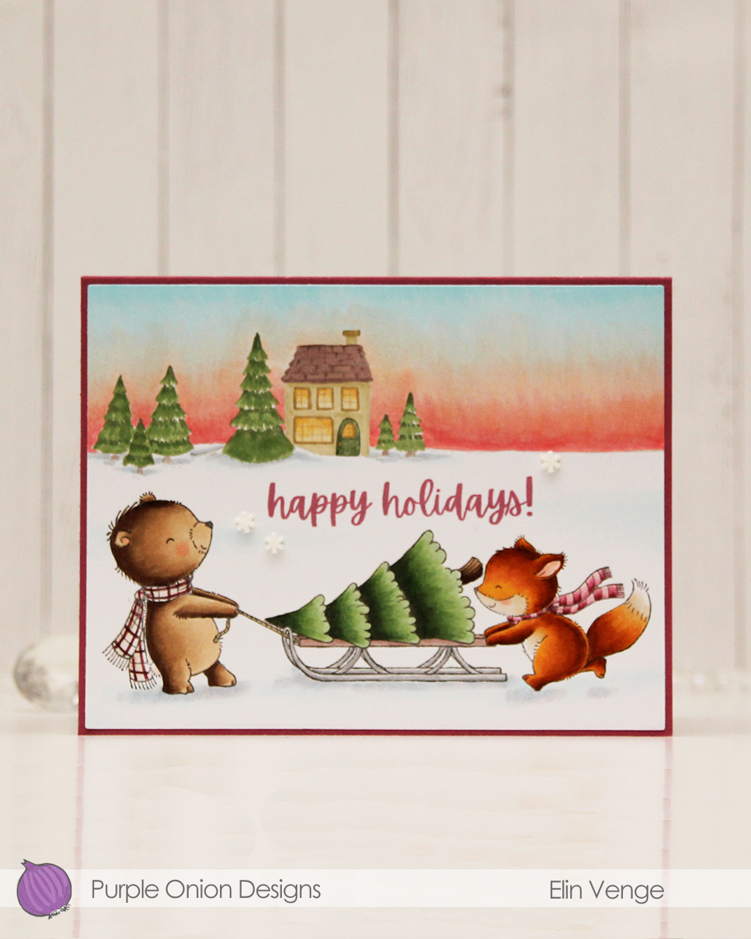 I colored these cuties with my Copics and did the same with
  I used the Additional A2 Layers die set from Waffle Flower to cut my panel down slightly, then adhered it to a card base I created from Autumn Rose cardstock from Papertrey Ink, before I added a few snowdrift sprinkles from Little Things from Lucy’s Cards.
 Lots of Copics for this one. I even created a new combo for the fox which requires less markers than the one I used to use.