
Hi, crafty friends. It’s time for a Christmas card, right? I love Rachelle Anne Miller’s Polar Bears, and I’ve made a fairly monochromatic card with a little bit of no line coloring, some ink blending, and a stamped sentiment. Super simple.
 Isn’t this image the sweetest, with mama bear and her two cubs? For some reason, I love coloring polar bears, and to make them look “white” (although real polar bears aren’t really white), I always do no line coloring whenever I create cards with polar bears.
 Once my coloring was complete, I made a quick mask from Post-it tape to cover up my polar bears before I used my Wintry Forest stencil set from Pinkfresh Studio along with inks from Altenew (the colors are Misty Morning, Cloudy Sky and Nimbus) to create my background.
 I die cut my panel using the second largest die in the Additional A2 Layers die set from Waffle Flower Crafts, adhered it to a panel of Enchanted Evening cardstock from Papertrey Ink and then onto the card base.
 I stamped a sentiment from the Scripty Xmas stamp set from Mama Elephant using Enchanted Evening ink from Papertrey Ink and added some white dots to the cub’s hat with a white Gelly Roll 05 pen. And that finishes the card. I decided not to add any embellishments to it.
 Oh, how I love blue for Christmas cards.
![]() Naturally, lots of blue for the coloring, too.
Naturally, lots of blue for the coloring, too.
 I used the
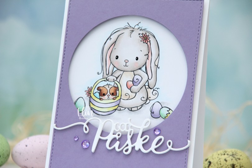
  I wanted a pastel look for my card, and this is probably the lightest wash of color I’ve ever done with my Copics. Except for E25 on the guinea pig, I’ve only used markers ending in numbers that are 3 or lower. That’s super light for someone who doesn’t shy away from using markers ending with 9. Once the coloring was complete, I used a black glaze pen to create shine in their eyes, and I went over it with a dot of white Gelly Roll 05 on the bunny.
 From a piece of Winter Wisteria cardstock from Papertrey Ink, I die cut a circle opening and also used a faux stitch rectangle die from My Favorite Things to create a little bit of extra interest around the edge of the panel, before mounting it on foam tape.
 I used a die from Papirdesign to make my God påske (Happy Easter in Norwegian) sentiment, and made it dimensional by stacking four white die cuts on top of each other, before finishing off the card with a few crystals from Papirdesign that match the Winter Wisteria cardstock nicely.
 Here it is, the softest color palette ever.
 I colored the image with Copics and fussy cut around it, leaving a white border. This image is pretty easy to fussy cut, so it didn’t take long. I’m trying to get out of my standard “full panel with cluster” mode, and fussy cutting the image gives me endless possibilities.
 I needed something in the background behind my image, and decided to create a circle stencil to ink blend into. I used Distress Ink from Ranger in Abandoned Coral, Spiced Marmalade and Squeezed Lemonade, before I removed the stencil and looked through my stash of background stamps I could use to add some more interest. I wound up with a mixture of stamps from Inkido, Tim Holtz and My Favorite Things, and used Distress Ink once again for the stamping. This time Spiced Marmalade and Mustard Seed for a bit more of an intense yellow on top of the ink blending.
 I mounted the image using foam tape, and die cut the word happy from the Bold Happy Birthday die set from My Favorite Things. I die cut four of each letter and stacked them for a dimensional look, overlapping them on my card to make them fit.
 I stamped and white heat embossed a sentiment from the Anything-but-Basic Birthday Wishes stamp set from My Favorite Things onto a piece of Caribbean Sea cardstock, also from MFT. The sentiment actually says Commencing Happy dance, but since I already had a diecut happy, I only needed the first and last word for my card. I added three additional strips of cardstock behind the words for dimension, and finished off the card with a few enamel dots. The teal ones are from the Cool Summer Nights pack from Altenew, the orange ones from a Halloween pack from Papirdesign. I also added a dot of black Glaze pen to the kittens’ eyes and the boy’s eyes, then a white dot using the Gelly Roll 05 from Sakura once the black had dried on the boy.
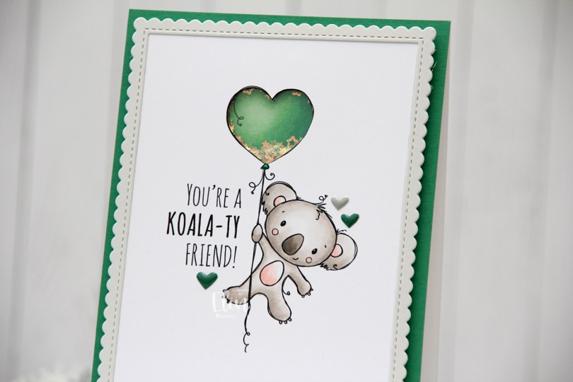
 I’m using the new
  I adopted Laura Bassen’s new coloring motto for 2023 for this card: “no muss no fuss coloring”. This was very simple, a few grays and a little bit of pink for the cheeks, the inner ears and the belly. I used a craft knife to cut out the interior of the balloon and printed another panel with just the balloon in the same size. I colored that balloon in green (thanks for the color suggestion, Liz) and added foam strips along the outer edge of the balloon, before filling it with tiny iridescent stars from the Icicle sequin mix from Hero Arts. I then added a piece of acetate on top to complete my shaker, and adhered the koala panel to the shaker, making sure to line up the window with my shaker heart balloon as best I could.
 I added foam tape on the back of the rest of the panel and adhered it to a top fold card base. The card base is actually Stamper’s Select White cardstock from Papertrey Ink, but I adhered a panel of Clover cardstock from Concord & 9th on top to create the green front. The color matched with my green balloon, but I don’t have unlimited amounts of Concord & 9th cardstock, so I’m trying not to use it all at once. Also, it’s a thinner cardstock, and not sturdy enough on its own to hold the weight of lots of foam tape and a shaker.
 Using the largest of the dies in the Stitched Rectangle Scallop Edge Frames die set from My Favorite Things, I die cut a frame from Soft Stone cardstock from Papertrey Ink. This is such a perfect soft grey, I love it. I finished off the card with a few enamel hearts from Altenew, from the Green Fields pack and the Rock Collection.
 The iridescent stars inside the shaker heart really catch the light nicely.
 Super simple color palette, as I mentioned.
 I love these animal number images from Rachelle, and these ducks are sooo cute. Perfect for a birthday card, I think. I colored the image with my Copics, before temporarily adhering the Watercolor Wash Free Form stencil from My Favorite Things and ink blending with Harvest Gold ink from Papertrey Ink. I then stamped a sentiment from the A06 stamp set from Norsk Stempelblad AS using Shadow Creek ink from Altenew.
 I used the largest of the Wonky Stitched Rectangle STAX dies from My Favorite Things to create a quirky faux stitch interest around the edge and adhered my panel to a top fold card base I created from Meadow cardstock from Hero Arts.
 To finish off the card I added a few raindrops from Little Things from Lucy’s Cards, I thought they fit well with the water theme in the image.
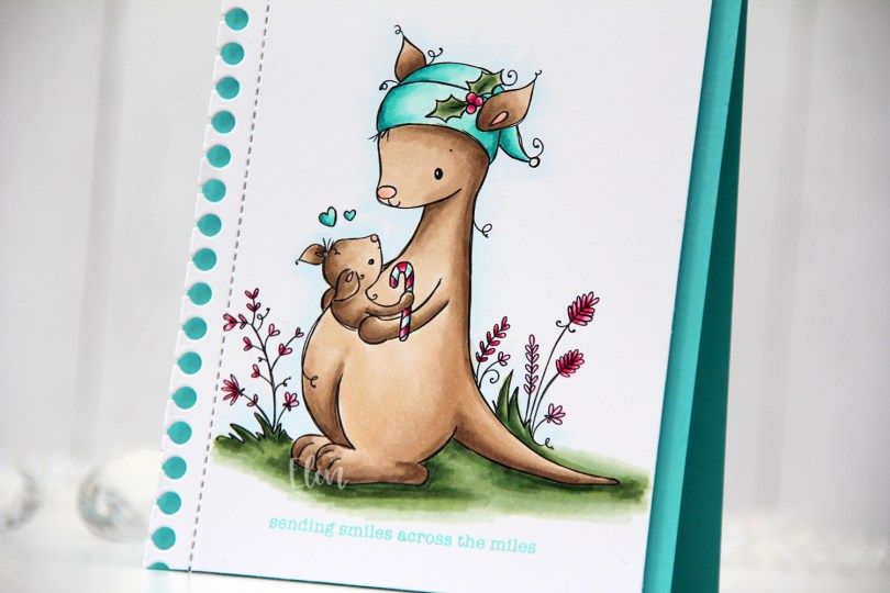
 I love teal for Christmas cards. I actually love teal for anything, but it’s the perfect color to pair with the dreaded traditional red. I’m not a fan of complementary colors, so red and green don’t really work for me, but red and teal totally do. As does red and light blue, or red and grey, but that’s pretty much my entire list for what goes with red at Christmas. I’m weird, I know.
 Once my coloring was done I used the Notebook Edge die from My Favorite Things to die cut from the left hand side of the panel. Below the image, I stamped a sentiment from the Holiday Messages stamp set from Mama Elephant using Hawaiian Shores Ink from Papertrey Ink.
 I thought about adding some sort of embellishment to the card, but in the end, I decided to keep it simple.
 I colored up the scene using Copics, then used the largest die in the Slimline Double Stitched Rectangle STAX die set from My Favorite Things to add faux stitching to both sides. There’s no reason you can’t use slimline dies for an A2 sized card, and this worked out really well, the die was the perfect width for my image.
 I used a black glaze pen from Sakura to get some shine and dimension into the eyes of these cute critters (you can see it in real life when you tilt the card in the light, I promise), then sprinkled on Stampendous chunky white embossing enamel that I melted from the back of the panel.
 Using lots of foam tape, I adhered my panel to a top fold card base I created from Blueberry Sky cardstock from Papertrey Ink. This blue is gorgeous, and it’s perfect for the B90 Copic family.
 I white heat embossed a sentiment from the Christmas Greetings stamp set from Lili of the Valley onto a piece of Amarena Cherry cardstock from My Favorite Things. I cut the sentiment down to a strip and added it to the card using foam tape.
 To finish off the card I added a few die cut heart outlines. These are from the Wax Seals die set from Waffle Flower. There are two different sized hearts in the die set, I used both for this card and cut them from Amarena Cherry cardstock before adhering them to the card.
 Simple color palette for this one. Lots of colors used for the snow, that’s pretty much a given when I color snow.
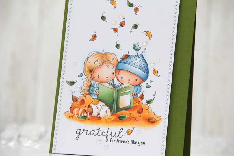
 The sentiment comes with the image. You can omit it if you want to, but I really like both the placement and the mix of the handwritten style with the playful print style. I decided to also add a few additional leaves above their heads. Aside from the green leaf to the left of the bird and the one leaf that’s landed on the hat, all the leaves above their heads are ones I added. I did that by copying the leaves already in the image and placing them where I wanted them; it’s one of the many advantages of working with digital stamps.
 I colored everything with my Copics and went for a much warmer color palette than I usually choose. Their clothes are cool tones, but everything else is in warm tones.
 I used one of the dies in the Stitched Borders set from Lawn Fawn to create the faux stitching on the sides of my colored piece, before I adhered it to a top fold card base I created from Jalapeño Popper cardstock from My Favorite Things. I did add a few additional layers of cardstock behind the panel for dimension, though.
 I wanted to keep the focus on this cute image, and scattered a few iridescent gems from the Glass Crystal collection from Little Things from Lucy’s Cards to finish it off.
 The gems catch the light and add to the warm feel of the card.
 I used quite a bit of Copics for this card, even though my coloring is pretty simple.
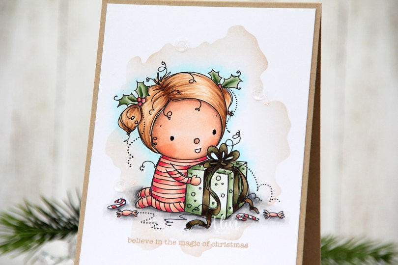


 I colored the image with the colors she suggested, adding different colors only to bear. I trimmed my panel down slightly and stamped a sentiment from the Mini Messages stamp set from Mama Elephant using Sour Apple ink from My Favorite Things.
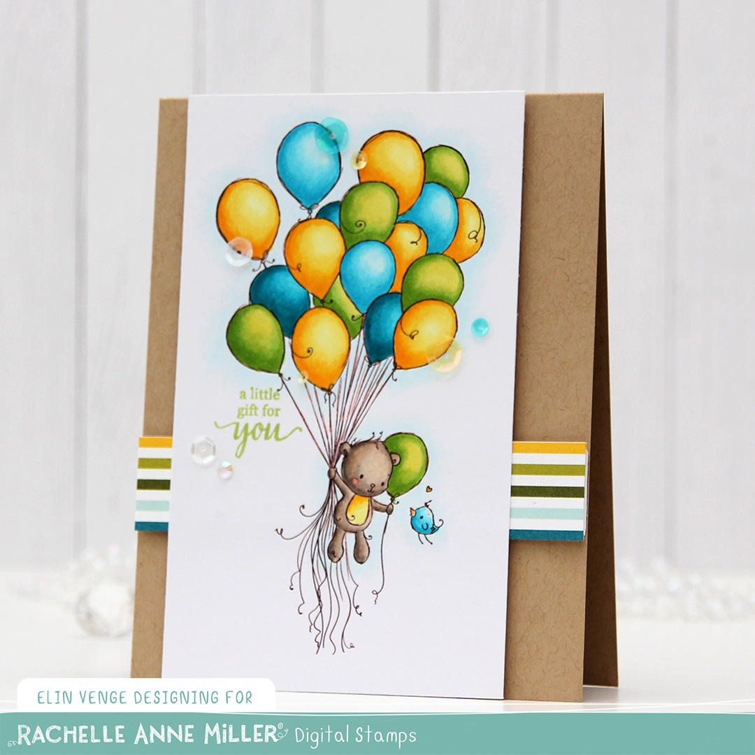 I created my card base from Classic Kraft cardstock from Papertrey Ink. I trimmed a piece of patterned paper from the Party Time 6×6″ paper pad from My Favorite Things down to a strip, and it had just the right colors for my card. I put four layers of white cardstock scraps behind it for dimension, and adhered it to my card. I did the same thing with my colored piece, adhering it to the card left of center, before using the Seashore mix of embellishments from Little Things from Lucy’s Cards to finish off the card.
 This color palette makes me happy!