
Hi, crafty friends! Summer solstice in the Northern hemisphere was yesterday, which means that the days will get shorter and shorter, and before we know it, Christmas will arrive. It’s no secret I love creating Christmas cards (no matter how much I despise cold weather), and it’s also not a secret that I love blue, so today, I’m sharing with you a blue monochromatic Christmas card.
 I started with a quarter sheet of Stamper’s Select White cardstock, the Wintry Forest stencil set from Pinkfresh Studio and the Northern Shore color family from Altenew. The stencil set has 6 different stencils that you layer to create a gorgeous wintry forest. I started with stencil number 1 (the Pinkfresh Studio stencils are numbered, which makes it really easy) and Polar Bear ink, which is the lightest of the four colors in the Northern Shore color family. I then moved on to stencil number 2, but didn’t change the color. Since I had to stretch my four colors and use them on five stencils (the last stencil adds snow on the trees), I kept the lightest one for this second layer and ink blended with a heavier hand, which makes the color appear darker. I used stencil number 3 with Icy Water ink, which is the next shade, then stencil number 4 with Winter Lake ink, and finally stencil number 5 with Arctic Mountain ink, which is the darkest color in this set of four gorgeous blues.
 On top of the ink blending, I stamped a snow flurry background stamp from Kort & Godt (M-428) using Fresh Snow hybrid ink from Papertrey Ink, which added lots of white snowy dots to my background. I then used a die in the DIE240 set from Kort & Godt to die cut the banner directly from my background. I put it to the side, placed the last stencil on my background and spread a layer of Light & Fluffy modeling paste from The Crafter’s Workshop through the stencil, before sprinkling on Rock Candy Distress Glitter and let that dry. Onto my banner, I stamped a sentiment from the M-467 stamp set from Kort & Godt using Arctic Mountain ink. I ink blended a little bit of Winter Lake ink to the edges to make it stand out a little bit more, added a stack of white die cuts behind it for dimension and adhered a couple of faceted iridescent pearls (ST178) to finish off the card.
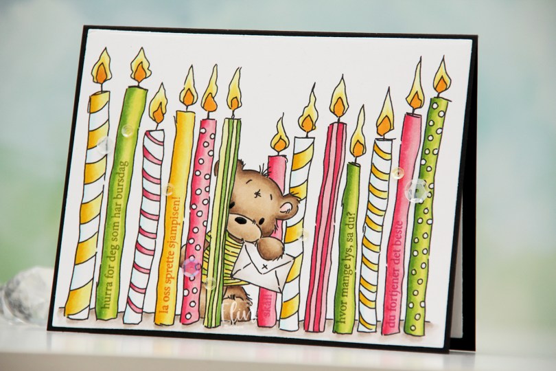
 I printed the image fairly large and chose a summery color palette of hot pink, apple green and bright yellow. I colored the image with Copics and used the largest die in the Additional A2 Layers die set from Waffle Flower to turn it into a nice rectangular panel. I put the panel in my MISTI, and used the A06 stamp set from Norsk Stempelblad AS to stamp sentiments on the plain candles. I used Jalapeño Popper ink from My Favorite Things for the green candles, Raspberry Fizz ink from Papertrey Ink for the pink candles and Spiced Marmalade distress ink from Ranger for the yellow candle, with a little bit of help from VersaMark to prevent the distress ink from beading up on the photopolymer.
 Once all my stamping was done, I adhered the panel onto a black card base I created from True Black cardstock from Papertrey Ink. I also die cut a panel to go on the inside from Stamper’s Select White cardstock from Papertrey Ink for a place to write my personal greeting. I used my black Glaze pen from Sakura to create a little bit of shine to the eyes and the nose of the bear, and added sequins from the Seashore and Iced Sherbet mixes from Little Things from Lucy’s Cards for a finishing touch.
 Simple color palette for this one 🙂
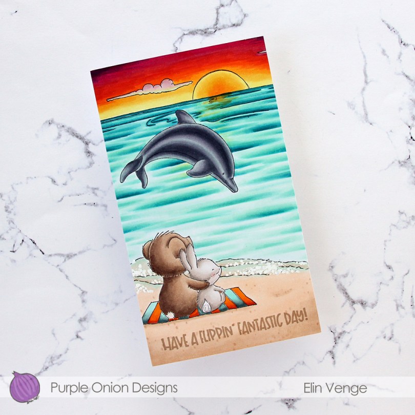
 I wanted a bit of a dramatic sunset for this card, and also for the critters (
 I adhered my colored panel to a card base I created from Stamper’s Select White cardstock from Papertrey Ink, stamped a sentiment from the
  Lots of colors for this one.
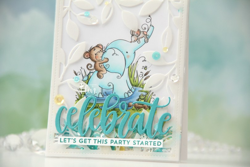
 I actually decided to create a shaker card this time. I colored in the
  I put an adhesive sheet from Altenew on the back of a piece of heavyweight translucent vellum from My Favorite Things, before using the Leafy Cover die from Mama Elephant to die cut a frame to put on my card front. I cut off a couple of leaves where I thought they covered up too much of the image and adhered the rest directly onto the bottom of a large stamp storage pocket from Avery Elle. The storage pocket was just wide enough for my colored panel to fit when I turned it 90 degrees. I trimmed off a tiny bit of my panel (1/16″) so it would be less snug in the pocket, and cut off a couple of inches from the top of the pocket. This way I could put the panel inside the pocket, and there would only be one side of the pocket that needed to be sealed once my shaker bits were in place.
 I adhered my shaker pocket to a top fold card base I created from Stamper’s Select White cardstock from Papertrey Ink. I die cut the sentiment using the Celebrate die from My Favorite Things. I used Caribbean Sea cardstock from My Favorite Things for the top layer and a few layers from white cardstock behind it for dimension. I also stamped a sentiment from the Bitty Birthday Wishes stamp set from My Favorite Things onto white cardstock using Caribbean Sea ink, also from My Favorite Things, turned it into a strip and placed it directly underneath the die cut word. To finish the card, I adhered some sequins from the Seashore mix from Little Things from Lucy’s Cards, as well as from the Seaglass mix from Simon Says Stamp. These two mixes work really well together, and they’re also what I used to fill my shaker.
 Speaking of, here they are. Full shaker cards are fun, and I’d say they’re a lot easier to create than regular shaker cards, where you need to create dimension for the shaker bits to shake around.
 The storage pocket works so well as a shaker pouch, and because of it, it gives everything a bit of a lift off the card. It looks like the vellum and the die cut sentiment both float on top, even though they’re both adhered directly to the pocket.
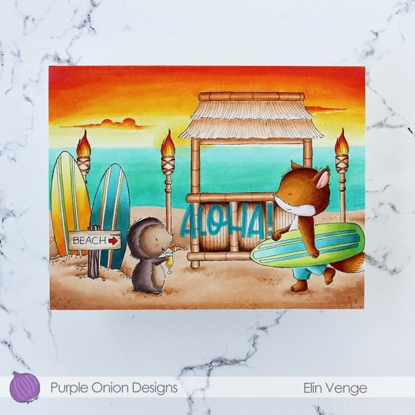
 I did a ton of masking for this card. I love creating stories in my head with these images, then stamping them and making them come to life.
  I colored in my scene using Copics, then stamped the
  I used a lot of colors for this card.
 I created a white card base from Stamper’s Select White cardstock from Papertrey Ink, and on the left side of the card, between the center and the bottom, I placed a circle I die cut from the Watercolor Wishes paper pack from Lawn Fawn. I cut off the piece of the circle the left of the fold, I actually created a side fold card this time. I die cut a leaf cluster from heavyweight translucent vellum from My Favorite Things using a die from Kort & Godt, and I also die cut for you from the Sweet Sentiments die set from Altenew from Berry Sorbet cardstock from Papertrey Ink. I stacked four die cuts for each of the words, so they’d stand out on my card. I put foam tape on the back of my colored vase, added the vellum behind it and adhered it to my die cut patterned paper circle. The vellum leaves are only adhered to the card behind the vase, the rest is floating. I added my die cut sentiment and finished off the card by adding Nuvo Jewel Drops in the Limoncello color to the yellow berries in my vase.
 Super simple color palette for this one.
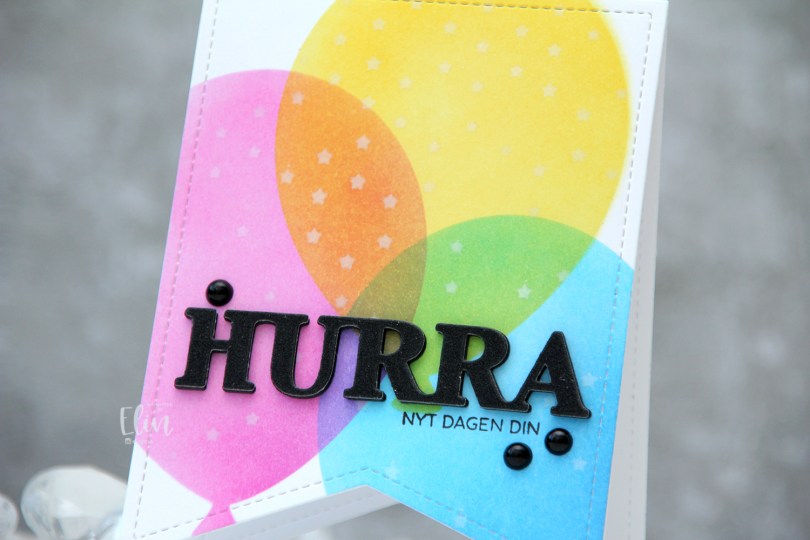
 I used a banner die with faux stitching to create a shaped card. This banner die is about 4″ wide, making it the perfect size for a decent size card. I used partial die cutting to create the card base, but die cut a separate piece that I used for my ink blending, which I then adhered to the card base once finished.
 I used the Big Balloon stencil set from My Favorite Things to create my balloons, and used Distress Inks for my ink blending. Faded Jeans, Mermaid Lagoon and Salty Ocean for the blue balloon, Picked Raspberry for the pink balloon and Mustard Seed and Squeezed Lemonade for the yellow balloon. Where they overlap, they create new colors, which is half the fun of ink blending, right? With the balloon stencil still in place, I added the Falling Stars stencil from Simon Says Stamp on top and ink blended white stars onto the balloons using Fresh Snow hybrid ink from Papertrey Ink.
 I stamped a sentiment onto the front using Obsidian ink from Altenew and added a stacked die cut HURRA above it. I layered six black die cuts, before adding this glitter one on top and finished off the card with a few black pearls.
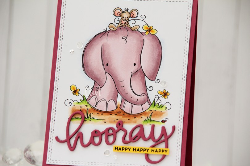
 Aren’t these guys cute? The image is called
  Using the Hooray Script die from Mama Elephant, I die cut the main sentiment from the same color cardstock. I stacked four layers for a dimensional look and stamped a sub sentiment from the Itty Bitty Birthday stamp set from My Favorite Things onto Bright Buttercup cardstock from Papertrey Ink using Obsidian ink from Altenew. To finish off the card I added a few sequins from the Seaglass mix from Simon Says Stamp, as well as a dot of black glaze pen to their eyes.
 A bit of a different color palette for me. Years and years ago, I used the RV90 family a lot, I rarely do anymore. It’s a nice one, though, so I don’t know why I stopped using it. Maybe I should use it more often again.
 I actually made a 4 Bar card this time, which is a smaller size than my regular A2 cards. It’s 3 1/2 x 4 7/8″ and it’s basically a one layer card. I admit I added my panel to a card base, but I don’t like working directly on my card base, and Copics bleed through most cardstocks. I don’t want my coloring to be visible from the inside of the card, and adhering the full size panel to the card keeps that from happening.
 I colored the image with Copics and added a watercolor circle around it to fill in some of the white space on the card. There’s still plenty of white space left. I added a sentiment from the stamp set and finished off with a couple of sequins from the Seaglass mix of sequins from Simon Says Stamp.
 Super simple color palette to go with this super simple card.
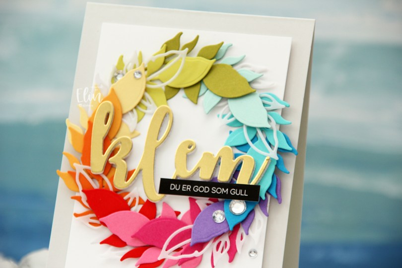
 Kort & Godt Die 335 is a die set with two leaves. One is an open outline, the other closed, and I actually used both for this card. I die cut the open one a few times from Heavyweight Translucent vellum from My Favorite Things, and nestled them in between the solid colored ones, which are (in order from the top going clockwise) Papertrey Ink (PTI) Simply Chartreuse, PTI Aqua Mist, PTI Hawaiian Shores, Simon Says Stamp Island Blue, PTI Amethyst Allure, PTI Raspberry Fizz, PTI Hibiscus Burst, Concord & 9th Poppy, PTI Orange Zest, PTI Summer Sunrise, PTI Harvest Gold, PTI Limeade Ice.
 I lightly traced a circle die onto a white cardstock panel that I needed to adhere my wreath to. I only glued down the end of the stem for each of the leaf die cuts and did my best to arrange them evenly around the circle, with the vellum pieces after every third colored leaf.
 Using foam tape, I adhered the white panel with my wreath onto a card base I created from Soft Stone cardstock from Papertrey Ink for a neutral on neutral look.
 Using Kort & Godt DIE 244, I die cut the word klem (translation: hug) from gold cardstock (Gold Shine cardstock from My Favorite Things), as well as four additional ones from white cardstock to stack behind the gold for added strength and dimension.
