
Hi, crafty friends! My blogging has been sporadic lately. Madness (the good kind) at work and the world cup are the reasons behind my absence, but now that we’ve been kicked out of the world cup because FIFA didn’t want us advancing to the semi finals, I can focus on other things. Vacation time is also right around the corner, so I’m hoping to share lots of cards! I’m starting with this cute ice cream truck from Purple Onion Designs, brilliantly illustrated by Pei. This is Happy Cone Mobile, and it’s from the Sunshine & Daydreams collection that was released a few weeks back. The Woodsy Background is from the same collection.
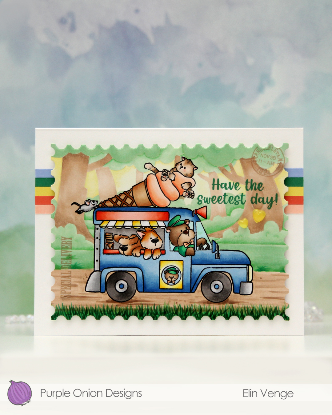 I wanted a storybook look to this, and the ice cream truck is a fairly busy image, so I decided to stamp the background in fadeout ink from Inkon3 for a no line look.
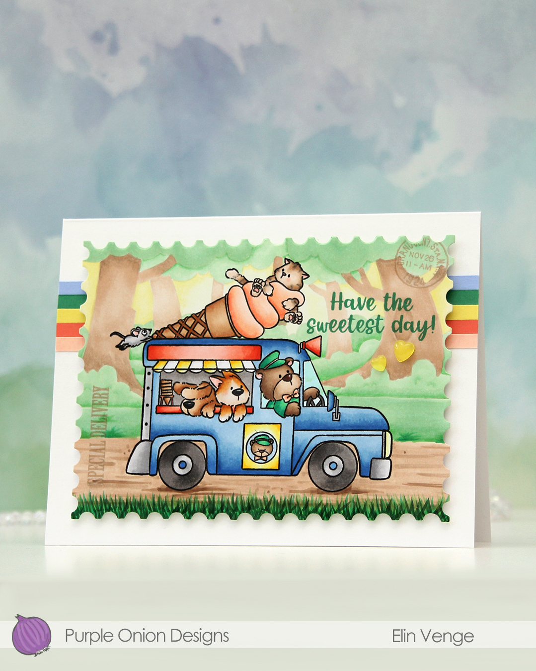 I colored my scene with Copics, and when the coloring was complete, I put the panel back in my Misti and stamped the truck again, this time in Obsidian ink from Altenew. It gives such crisp, dark black lines, but it’s not Copic friendly, so I need to do this step once the coloring is complete. I tend to hold my breath hoping I don’t offset the stamping, as I don’t want to have to start all over again. This time it worked. I stamped SPECIAL DELIVERY and the postmark stamp using Classic Kraft ink from Papertrey Ink. The stamps are from the Vintage PostCARD and the Vintage PostCARD Add-On stamp sets, which are both older sets from Purple Onion. I also stamped a sentiment from the Sunshine & Rainbows sentiment set using Clover ink from Concord & 9th.
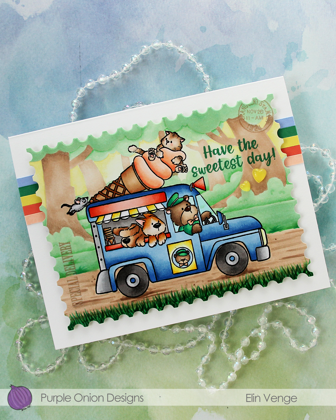
I used the largest die in the Nesting Postage Stamps die set from Hero Arts to turn my panel into a large postage stamp.
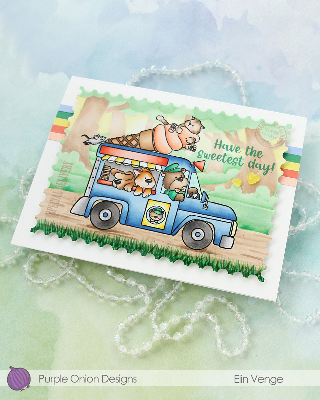 I adhered strips of solid color cardstock towards the top of my 6 1/2 x 5″ card base, before mounting my huge postage stamp scene in the center with foam tape. The colors I used are Nectar, Sorbet, Starfruit, Clover and Bluebell, all from Concord & 9th.
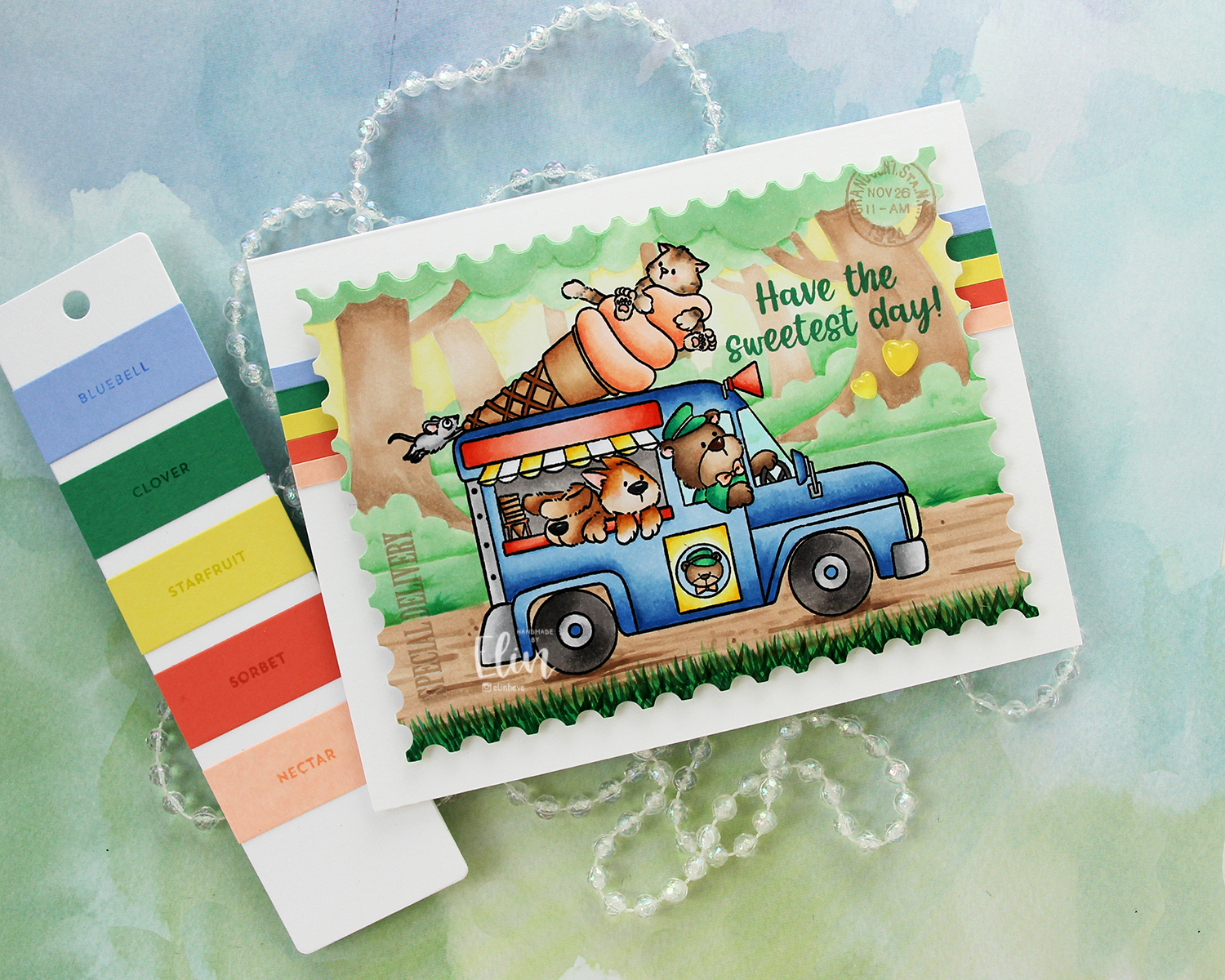 To finish off the card I added a couple of yellow hearts from the Beach Dreams Crystal collection from Little Things from Lucy’s Cards.
 I used a LOT of colors for this one. Very few colors for the background, but a lot for the truck and these cute friends!!

 I took a quick look at the colors I’ve focused on recently to try to choose something different and opted for this blue green combo. I colored the image with Copics and added a horizon in the distance with a few trees scattered about.
 I made sure not to add to many trees so there would be room for the sentiment, which I stamped in Oceanside ink from Concord & 9th. The sentiment itself is from the Snøstorm stamp set from byCino. I die cut my panel using the lartest die in the A2 Stitched Rectangle STAX 1 set from My Favorite Things, before I sprinkled on chunky white embossing enamel from Stampendous. I made sure that none of the granules covered the sentiment or the eyes of the polar bears before melting the powder from the back.
 I adhered my panel to a card base I’d covered with a quarter sheet of Oceanside cardstock from Concord & 9th. This is actually a side fold card. I usually make top fold cards, but I didn’t have any landscape oriented card bases on hand and didn’t feel like breaking open a new pack of cardstock. Long live lazy crafting, right?
 Very cool color palette for this one.
 I created a fun water scene with
 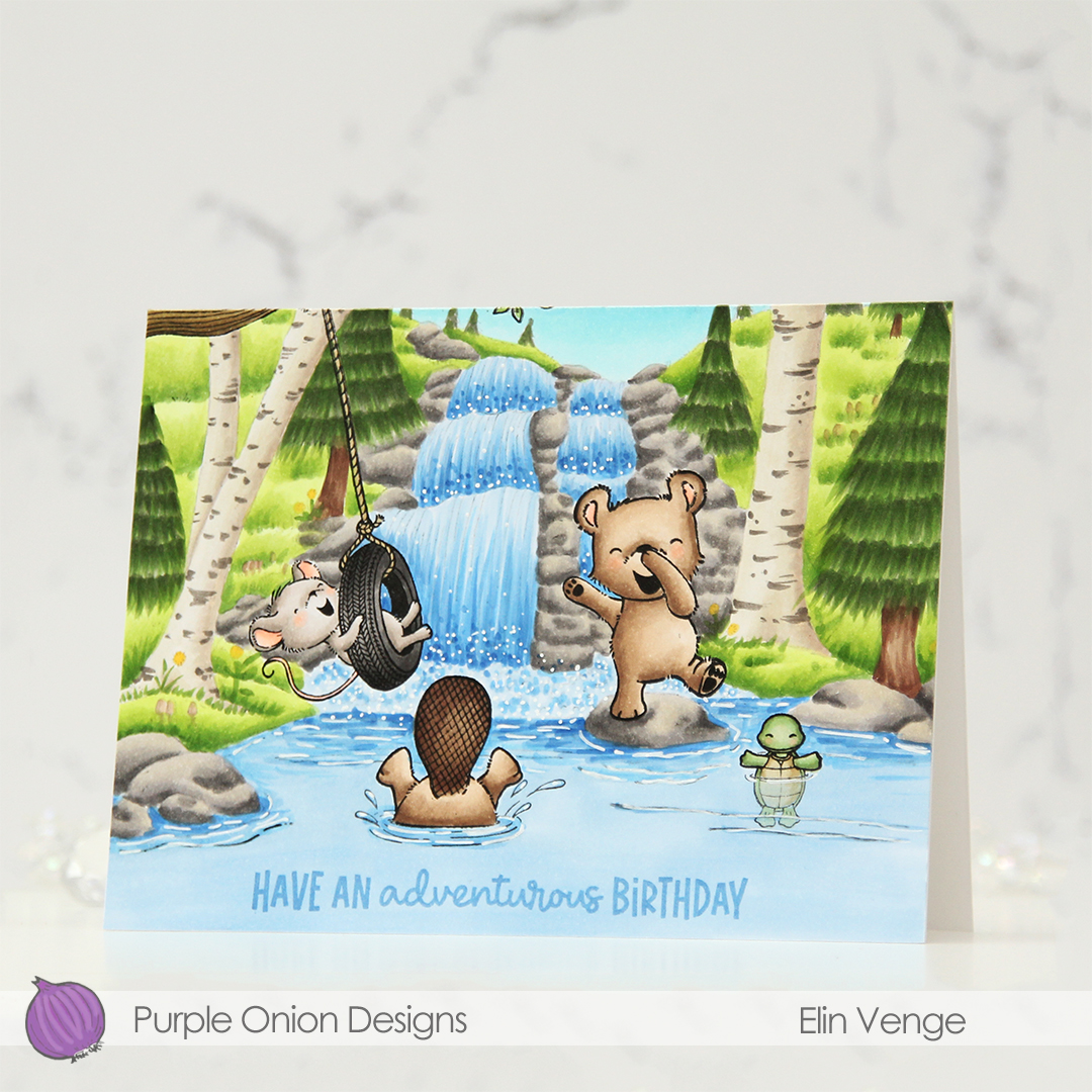 I stamped a sentiment from the coordinating
  Considering I colored the entire card front on this card, I don’t think I used too many markers.
 Isn’t this image the sweetest, with mama bear and her two cubs? For some reason, I love coloring polar bears, and to make them look “white” (although real polar bears aren’t really white), I always do no line coloring whenever I create cards with polar bears.
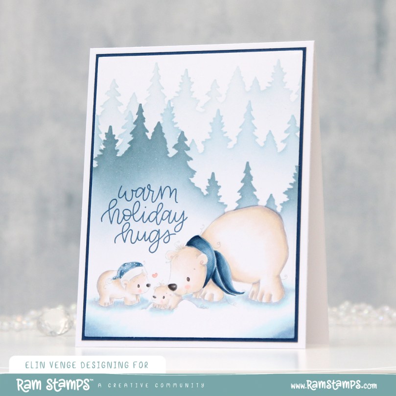 Once my coloring was complete, I made a quick mask from Post-it tape to cover up my polar bears before I used my Wintry Forest stencil set from Pinkfresh Studio along with inks from Altenew (the colors are Misty Morning, Cloudy Sky and Nimbus) to create my background.
 I die cut my panel using the second largest die in the Additional A2 Layers die set from Waffle Flower Crafts, adhered it to a panel of Enchanted Evening cardstock from Papertrey Ink and then onto the card base.
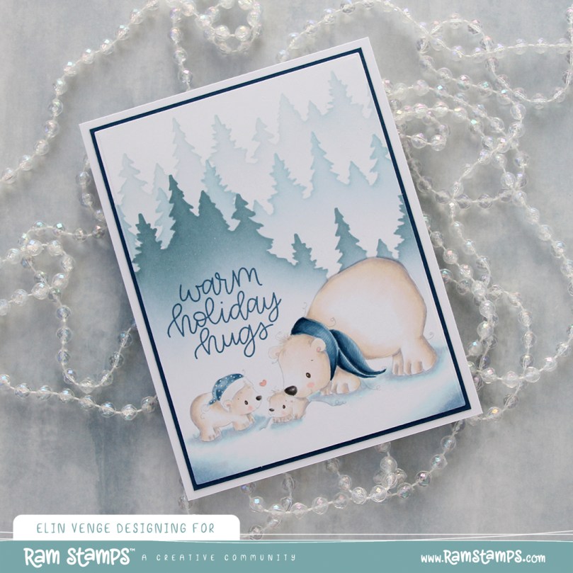 I stamped a sentiment from the Scripty Xmas stamp set from Mama Elephant using Enchanted Evening ink from Papertrey Ink and added some white dots to the cub’s hat with a white Gelly Roll 05 pen. And that finishes the card. I decided not to add any embellishments to it.
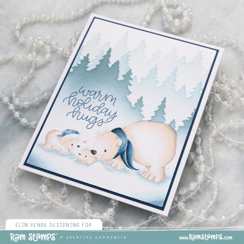 Oh, how I love blue for Christmas cards.
 Naturally, lots of blue for the coloring, too.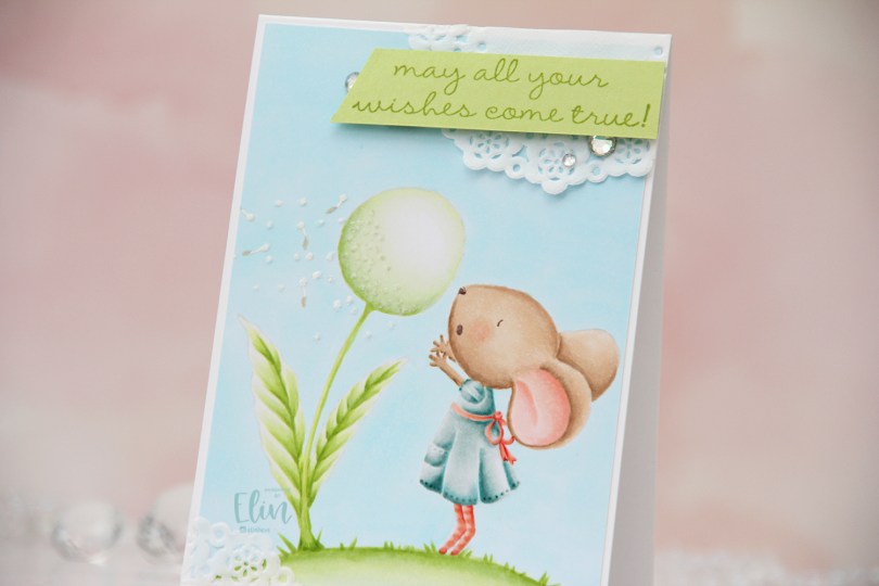
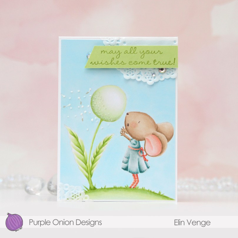 This is
  I love no line coloring, and no line is perfect for an image like this, which has just enough detail to make it interesting, but it’s still large enough to get soft gradient in colors and not too fiddly.
 Once I finished my coloring, I added my panel to a 4 bar card base I created from Stamper’s Select White cardstock from Papertrey Ink. I created some texture to the dandelion fluff by using my Quickie glue pen and sprinkling on Rock Candy Distress glitter.
 I adhered scraps of a Doodlebug mini paper doily to opposite corners of the card to add to the soft, delicate look I was aiming for. Using Sour Apple ink from My Favorite Things, I stamped a sentiment from the
  Very soft color palette.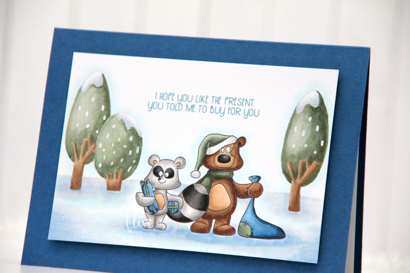
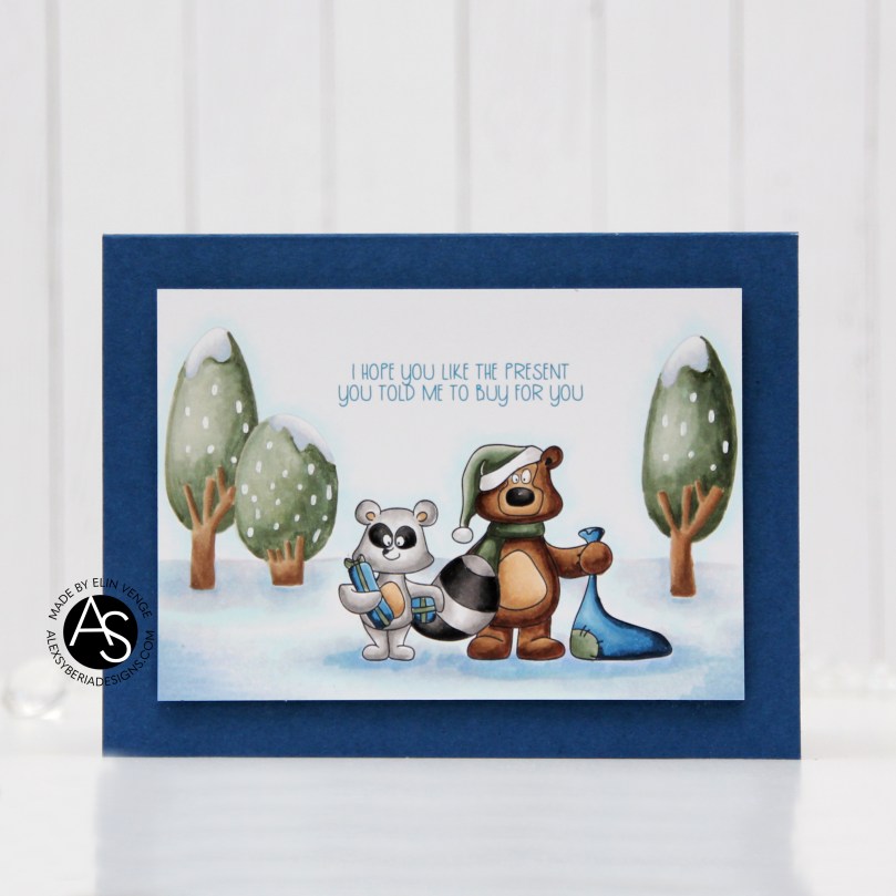 For my final card I’m focusing on the Birthday Wonderland stamp set, and I used both trees, the raccoon and the bear for my card, in addition to one of the sentiments.
 I decided to go for a no line look in the background with the trees and used black lines for the two cute critters.
 Once my image was stamped and colored I cut it down significantly and mounted it on foam tape to a top fold landscape card base I created from Enchanted Evening cardstock from Papertrey Ink.
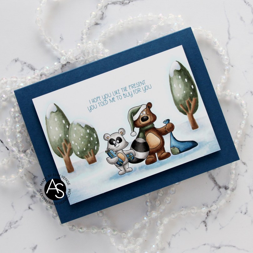 There’s something about this bear that reminds me of Yogi. That might actually be the reason I colored his hat green. These two have such character, but the bear’s my favorite, just don’t tell the raccoon.
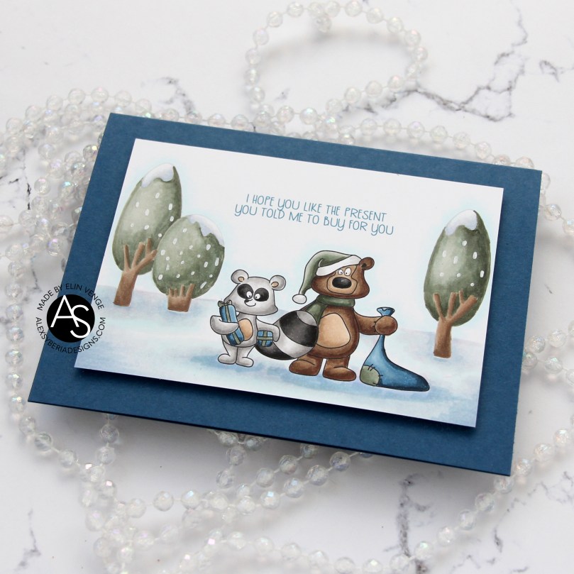 I used a white Sharpie with an extra fine tip for the dots of snow (is it snow?) on the trees.
 Simple, subdued color palette for this card.
 I created a very simple scene for this card, stamping the snowman in Fadeout ink from Inkon3 before adding a mask, then stamping the
  Every once in a while, I break out my airbrush system. I actually keep it out on my desk, but I have a big desk and don’t usually sit close to it. I love the airbrush system, it’s such an awesome way to get a layer of color quickly. Coloring an entire nighttime sky with Copics takes a while, airbrushing it is faster. Use colors that are darker than what you think you want, and make sure there’s enough ink in the marker before starting. I used B99 and B97 for this sky, and it’s wonderfully dark and the perfect backdrop for the lighter colors of the snowy scene in front.
 Once I finished the airbrushing, I carefully removed the masks and did no line coloring of the rest of the scene. At this point, I’ve colored snow so often, I can do it in my sleep. This snowman is pretty easy to color too, most of the areas are pretty big surfaces, so it’s a very forgiving image.
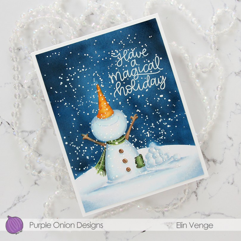 After I finished my coloring, I stamped and white heat embossed a sentiment in the sky. The sentiment is actually from the Scripty Xmas stamp set from Mama Elephant, I kind of forgot for a second that I was creating a Purple Onion card, I was a little lost in a creative zone. After heat embossing the sentiment, I sprinkled on chunky white embossing enamel from Stampendous to create my super snowy scene, making sure to remove any granules that landed on top of the embossed letters before melting the granules from the back.
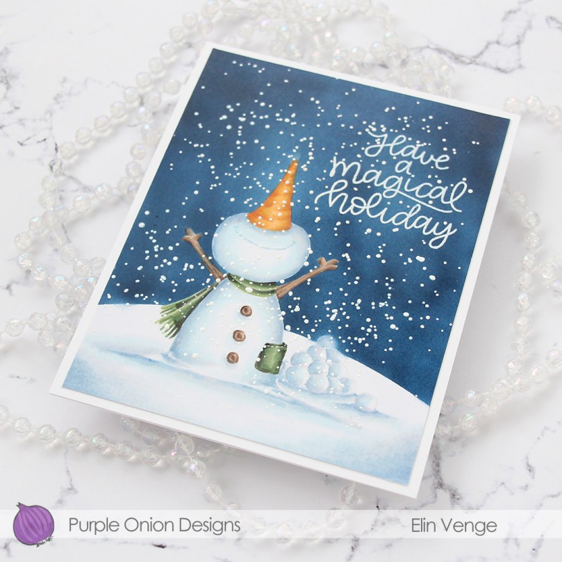 I trimmed 1/8″ off each side of my scene and adhered it to a white card base I created from white cardstock from Papertrey Ink, deciding not to add any embellishments. I figured there was enough going on already with all the snow.
 As usual – lots of colors used for the snow. The two blues at the very bottom after the break are the colors I used for the airbrushed sky.
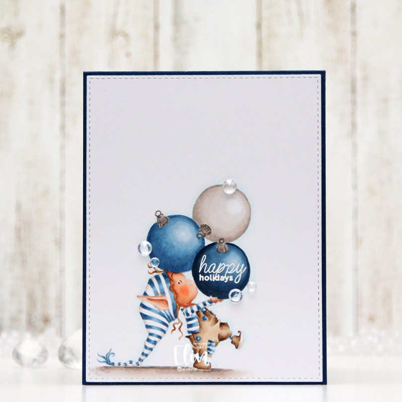 I love Mo’s elves, and this is
  Once the image was colored, I used the largest die in the A2 Stitched Rectangles STAX 1 set from My Favorite Things to create a faux stitch border. I then white heat embossed a sentiment from the Mini Messages stamp set from Mama Elephant in the center of the darkest bauble, before adhering the panel onto a top fold card base I created from Enchanted Evening cardstock from Papertrey Ink. I added a few diamonds from the Urban Chic mix from Little Things from Lucy’s Cards to finish off the card.
 Simple color palette for this one. It was super fast to color too, which isn’t usually the case with no line coloring.
 I printed the image with a 10% opacity onto X-Press It blending card before coloring. Whenever I want to color things that are supposed to look close to white (ice, snow, polar bears +++), I prefer doing a no line version. To me, there’s something very distracting about black lines on an image that’s supposed to look white, so I prefer the softer no line version. I colored the image with Copics, starting with the sky, then ocean, ice floe, polar bear and finally the penguin and his little scarf. I prefer doing the black towards the end, it’s just good practice to avoid getting it into nearby areas where you don’t want it.
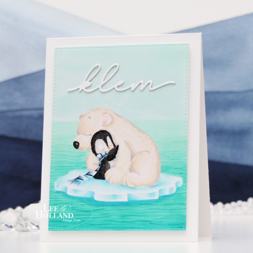 Once I finished the coloring, I die cut the panel using the second largest die in the A2 Stitched Rectangles STAX 1 set from My Favorite Things, before mounting it on foam tape onto a white card base I created from white cardstock from Papertrey Ink. I die cut the word klem (hug) twice from white cardstock using a die from Kort & Godt. It’s actually a Christmas die that says juleklem (Christmas hug), but by using only the latter part of the word, I have a completely different use for the die, which I love. That’s the whole card, I decided not to add any embellishments, I wanted to keep the focus on the image.
 Loooots of Copics for this deceptively simple scene.
 I stamped April (the bunny on the swing), masked off the rope of the swing, stamped the
  When I color full panels like this, I usually color the sky blue, but I wanted to shake things up a little for this card and gave it a soft sunset vibe instead. I live far enough north that the sun doesn’t really set until really late at night in the summer, but a girl can pretend, right? Anything goes when it’s a card, it doesn’t have to be very realistic – not that a bunny on a swing (or one holding a flower for that matter) is very realistic to begin with.
 I lost track of how many layers of green I added for the grass. I wanted it to be light and soft looking almost fading into white in the background to make the foreground stand out, and darker in the foreground so the critters would look like they belonged to the scene. I started with the lighter colors for my blends, then kept introducing darker greens towards the bottom and fading up into the background until I found the intensity I was after.
 Once I finished coloring in the scene, I added a sentiment from the
 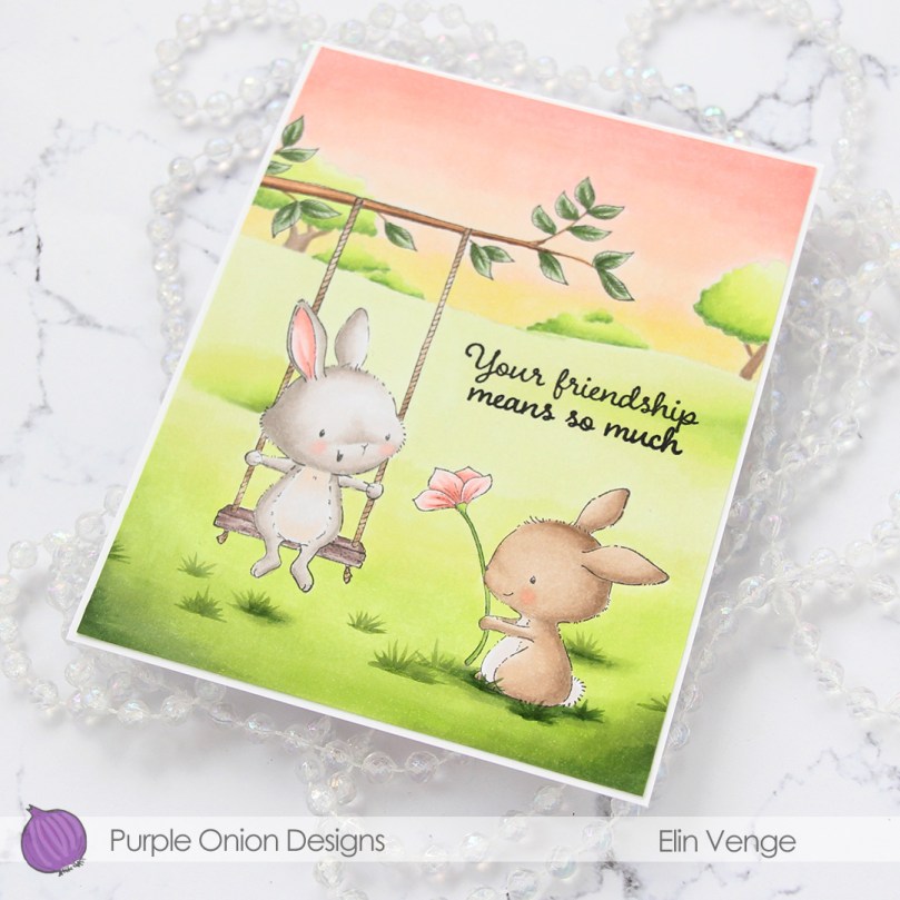 I trimmed off 1/16″ on all four sides of my colored panel and adhered it to a white card base I created from Stamper’s Select White cardstock from Papertrey Ink. I thought about leaving the panel a full size, but I really like the border the white cardstock gives, it’s a nice little frame.
 I find it odd that I rarely use more colors for full panels like this than just a simple image, but that tends to be how it is around here.
