Hi, everyone! I have a few cards to share today, all of them using just a few products. The Happy Birthday collection from P13 has some great images that are perfect for quick, easy birthday cards.
 I’m starting with this bear, ready for a party! The papers in the P13 collections don’t have individual names, they just have numbers, and I fussy cut this bear from 05. I die cut a piece of 01 using a die from Papirdesign, tearing the edges for an uneven look and glued it straight onto my 4 bar top fold card base, before adding the bear with foam tape for dimension.
 03 in this collection from P13 has wide, diagonal stripes in different colors. I cut it down to strips, and used them to emboss my sentiments to get the perfect color matches. The sentiment on this card is from the Bitty Bears stamp set from My Favorite Things. I added the sentiment strip using foam tape, and finished off the card with some sequins from the White Orchid Sequin mix from Little Things from Lucy’s Cards.
 For my second card I covered the entire card front with the back of the 05 sheet. Most of the papers in this collection have lots of images on the front, and are more plain on the back, of course with colors that coordinate. The little mouse on a unicycle is from the 02 sheet, and again I used 03 to stamp my sentiment on. This sentiment is also from My Favorite Things, it’s from the Pawty Time stamp set.
 I die cut a chevron pattern from white card stock using a die from Papirdesign and adhered it directly to my patterned paper card front, before popping up the image on foam tape, and the sentiment on even more foam tape. Again I added sequins from the White Orchid Sequin mix to finish the card.
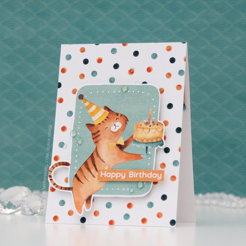
 Card number 3. Now, I’m not sure whether this is a cat or a tiger, but whatever he is, he’s definitely ready to party. I fussy cut him from the 02 sheet, and I used the back of the same sheet to cover the card front. Once again, I popped the image on foam tape for dimension.
 I used the Happy Birthday sentiment from the Bitty Bears stamp set again, and this time I used some clear gems from the Crystal Glass collection from Little Things from Lucy’s Cards to embellish.
 I made the last card for today very simple. I die cut the same hole pattern as I used for the first card, only this time in white card stock for a bit of textured interest in the background. The cat is from the 05 sheet, which I used a lot of for these cards.
 I added the cat using foam tape, the sentiment using more foam tape and those white sequins once again. These cards were so much fun to create, and I’ve got more in upcoming posts.
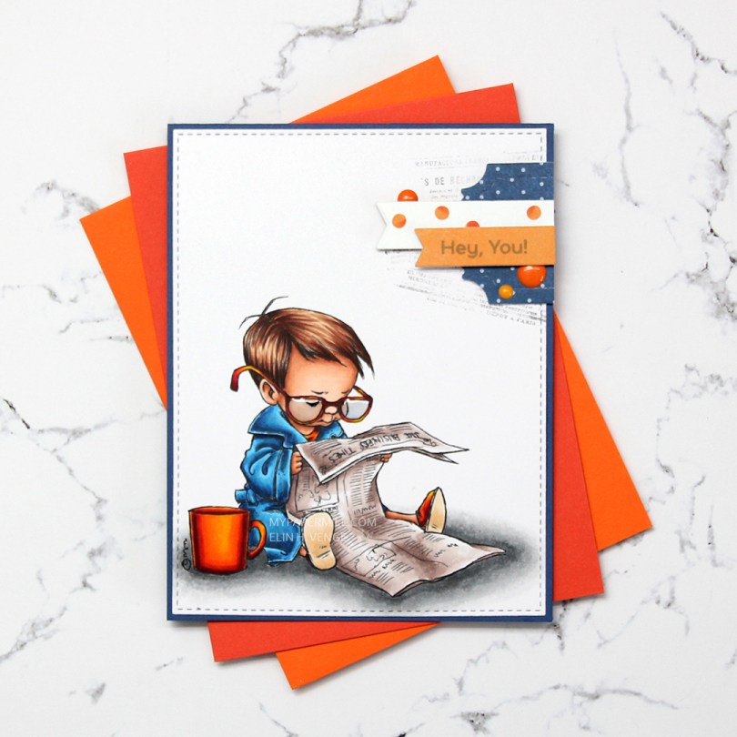
 I colored up the boy version of
  Near the top right corner, I randomly stamped part of an old background stamp from Tim Holtz and Stampers Anonymous. I thought the small text on the stamp would pair well with the newspaper in the image and stamped pieces of it at an angle with Memento Espresso Truffle ink. I didn’t even put the stamp in my Misti or on an acrylic block, I bunched it in my hand and stamped, giving it less of a rigid feel, since the stamping is uneven. I added my colored and stamped panel onto a card base made from Blueberry card stock from My Favorite Things, and a small cluster on top of my stamping.
 I die cut some patterned paper scraps with a couple of dies from XCut and My Favorite Things to create my cluster. The blue piece is from Papirdesign, the other two from the Happy Birthday collection from P13. I stamped a sentiment from the Bitty Bears stamp set from My Favorite Things onto the orange banner using Hero Arts Soft Granite ink. I finished off with three enamel dots from Papirdesign and added Glossy Accents to the boy’s glasses.
 Not a huge amount of colors. For the soles of his slippers I actually used the two lightest colors that I used for his hair (E31 and 30).
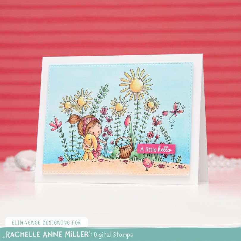
 As usual, I printed the image on X-Press It blending card and colored it in using my Copics. Once done coloring, I took the second largest die in the A2 Stitched Rectangles STAX 2 set from My Favorite Things to turn it into a panel with nice faux stitching along the edges. I mounted it with foam tape onto my card base.
 I stamped and white heat embossed a sentiment from InkyWings onto a tiny scrap of Raspberry Fizz card stock from Papertrey Ink. It was so small I barely even cut it smaller before adhering it to my card using Gina K foam tape, which isn’t as thick as the foam tape I used for my colored piece. I added some gems and sequins from the Iced Sherbet mix from Little Things from Lucy’s Cards, and my card was finished.
 Colors. Not a lot, but some, with an added confession. I made a very similar card to this about six months back, and I’ve used the exact same colors on this one, except for one. Being a little lazy this time, I didn’t want to redo the entire graphic because of one single marker, so this graphic is one I’ve used before. The only color in there that I didn’t use for this card was E13, simply because I forgot.
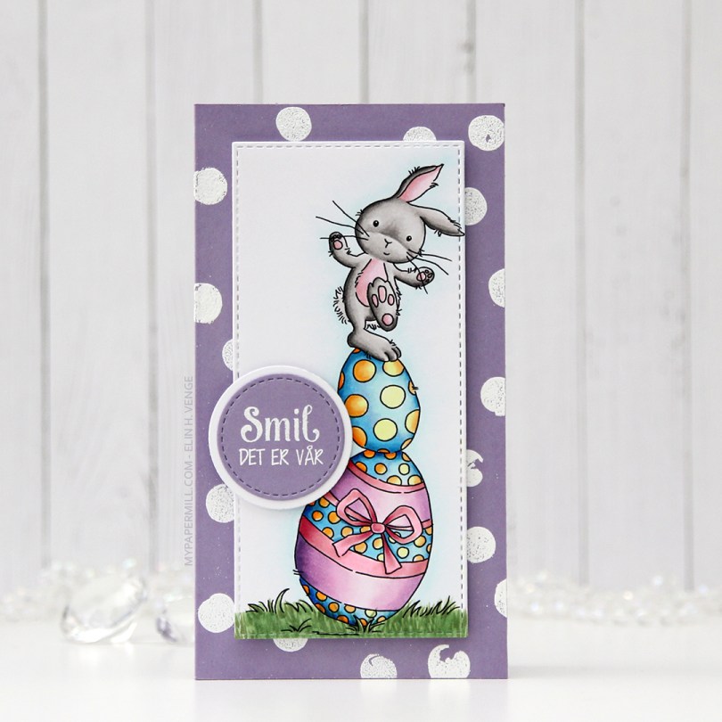
 I colored the image in with my Copics and used partial die cutting with a die from My Favorite Things to turn it into a tall, slim panel. I stamped and white heat embossed a stamp from the Pinstripe stamp set from Altenew repeatedly on a card base I made out of Winter Wisteria card stock from Papertrey Ink, and added my colored piece in the center using foam tape. I stamped and white heat embossed a sentiment from Papirdesign onto a scrap piece of card stock, die cut it and matted it with a white circle, before using 1 mm foam squares to pop it off the colored piece just a bit. And that finished the card for today. Super simple.
 Lots of colors used for this one, for some reason.
 Soft, pastel colors throughout this one. I die cut the panel into a rectangle by doing partial die cutting twice with a stitched rectangle die from My Favorite Things. I don’t have any dies for mini slimline cards, but partial die cutting definitely works.
 I added the panel to a card base made from Lavender Moon card stock from Papertrey Ink. I die cut God påske (die from Papirdesign) four times; three from white card stock and once from Lavender Moon. I stacked them and centered my dimensional die cut as best I could above the image, before finishing off with some sequins from the White Orchid Sequin Mix from Little Things from Lucy’s Cards. I love her mixes, they’re awesome!
 My light Copic palette shouldn’t come as a surprise, pastels and spring go hand in hand.
 I colored the image with my Copics, cut the panel down quite a bit and put lots of foam tape on the back. I dug through my patterned paper Christmas scraps and found a blue piece from Papirdesign that was large enough to cover the card front, as well as a couple of smaller pieces from Maja Design.
 I stamped and white heat embossed a sentiment, before die cutting it with the mid size fishtail flag frame die from My Favorite Things. I added a few snowdrift sprinkles from Little Things from Lucy’s Cards, and my card was all done. Super simple, and one more card in the Christmas 2021 box. Feels good to have the pile grow!
 Nothing too fancy in my coloring today. The combo I used for the cat happens to be nearly identical to the one I used for the girl’s hair, I just omitted the darkest one.
 These peas are part of an upcoming stamp set from
  Once I’d colored the peas, I masked off each individual pea and did some ink blending across the entire panel using distress inks. I went for an orange to yellow ombre combo with Spiced Marmalade, Mustard Seed and Squeezed Lemonade. I placed a stencil (Dotted Flowers) from Ranger on top and ink blended again using the same colors, going in with a heavier hand. I adhered the panel to a mini slimline card base I made from Stamper’s Select White cardstock from Papertrey Ink and used foam tape for a little bit of dimension behind the sentiment, before finishing off with some sequins from Little Things from Lucy’s Cards.
 Simple coloring leads to a simple color palette.
 I colored the penguin with my Copics, fussy cut him and added 1 mm foam squares to the back. I created a fold over tag using the second largest die in the fold over tags nesting die set from We R Memory Keepers and some really old pink patterned paper from Magnolia.
 I created a tag to go inside the folded over tag using scraps of patterned paper from Papirdesign. Using one of the dies in the Tag Builder Blueprints 6 die set from My Favorite Things, I created the to/from circle using that pink patterned paper, and matted it with a white die cut circle. I probably didn’t need the white circle, I’m thinking the letters would have stood out more against the grey patterned paper, but what’s done is done. I still like the white.
 Fairly quick coloring on such a small image means I didn’t use a lot of markers. I originally colored his feet and beak orange/yellow, but didn’t like the look and covered it with grey. You can still see the orange shining through in the finished coloring. That, I don’t mind, for some reason, I just didn’t like the look of the orange alone. Some species of penguins have black feet anyway 😉
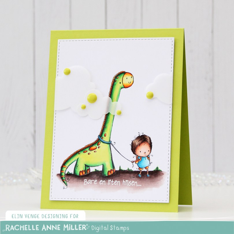
 I colored up
  I added two layers of cardstock behind my colored piece, so it would stand out a little from my Limelight card base (colored card stock from My Favorite Things).
 I added some vellum clouds on tiny pieces of foam tape, so it looks like the dinosaur’s neck is really long, I thought that was a fun little detail to add. Placed some enamel dots from Papirdesign in strategic places to cover the foam tape, and made an envelope from Papirdesign patterned paper using the A2 V flap envelope dies from Simon Says Stamp for the card to go in.
 Bright, bold Copics!
 I wasn’t sure what to do at first, but wound up fussy cutting the image, leaving a white trim. I usually prefer cutting right up against the edge, but I didn’t want to cut off the sketchy lines on the perimeter of the image, and decided to leave the white border. I ran a piece of white card stock through my die cutting machine using a geometric embossing folder from We R Memory Keepers. It gives the background a nice texture without being too distracting from the image.
 After die cutting an eyelet circle from a Cottage Cutz die set using a piece of patterned paper from DCWV, I did some aggresive cropping to one side and mounted the remainder of the circle on my dry embossed white card stock using 1 mm foam squares. I added the white panel to the card base using regular foam tape, and added the girl on top of the circle, before finishing off the card with a heat embossed sentiment from an Altenew stamp set and a few sequins from the White Orchid sequin mix from Little Things from Lucy’s Cards. The blue card stock is Blueberry from My Favorite Things.
 Last, but not least, the colors I used for my coloring.