Hi, crafty friends! Today, I’m stretching my supplies today, using a Christmas die set for a non holiday card. When we invest in die sets, we want to get a lot of use out of them, right? I’ve used the die set on Christmas cards in the past (here, here and here), but this time I felt like doing something else. We’ve officially survived winter and reached spring, we can certainly make springtime floral cards instead of holiday floral cards, right?
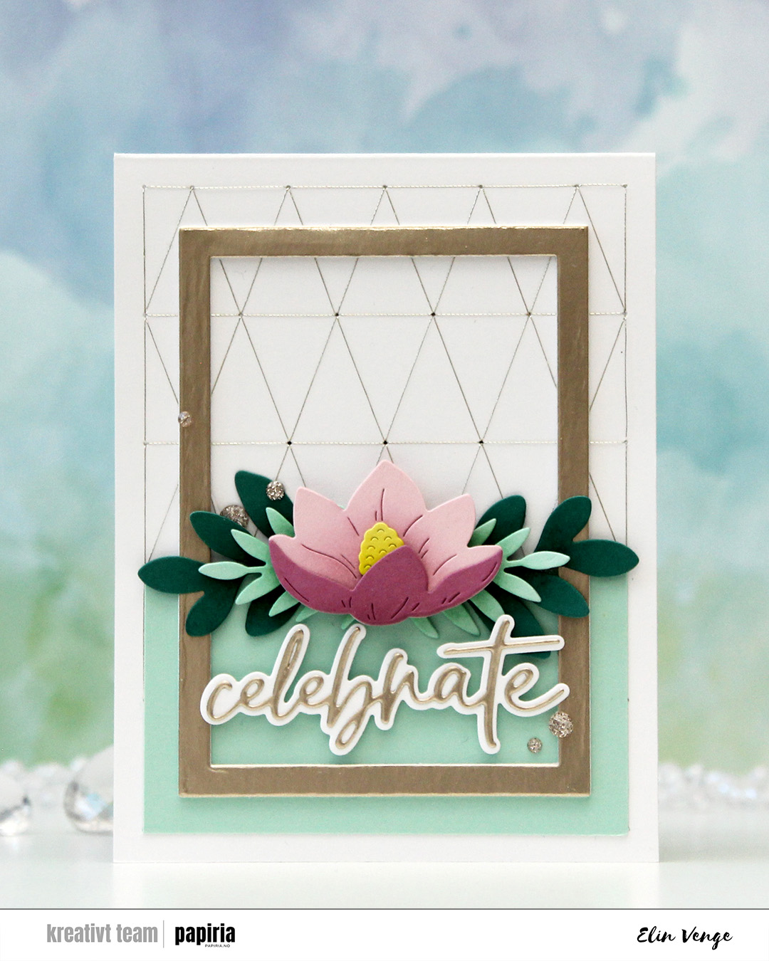
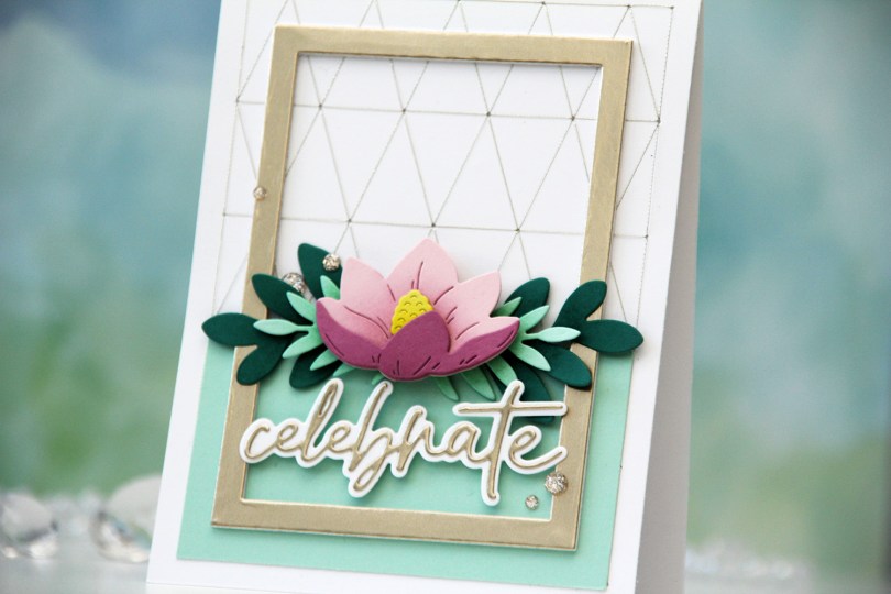
I started by choosing a color palette, this time opting for one that Concord & 9th put together. They have lots of color resources on their website, and even a color club. This is the Spring Meadow palette: Ballet Slipper, Briar Rose, Starfruit, Sea Glass and Juniper. I die cut the pieces and ink blended on top with the same color ink to create additional interest on the die cuts. I actually used Briar Rose on the Ballet Slipper for a cohesive look on the flower, but the rest of the die cuts are inked with the same color ink as the cardstock color. I love that the C9 ink colors match the cardstock colors so well.
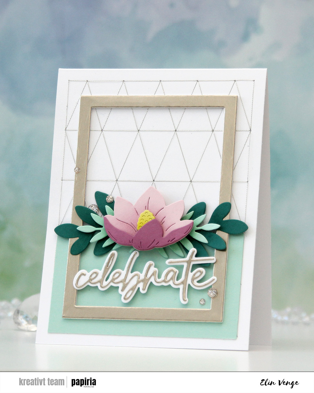 I used the Triangle Piercing die from C9 to cut into the card base. I then used Sulky metallic sewing thread in color 7003 and a size 26 tapestry needle for my stitching. I was initially planning on having the floral swag span the width of the card and adhering it directly to the stitched background with a sentiment below, but somehow it evolved into something else, I was just along for the ride. I trimmed a piece of Sea Glass cardstock to cover the bottom two rows of rectangles and adhered this to the card base, planning on adhering the flower where the panel ends. Then I found an already die cut frame (I realize now that this is the Classic Rectangle Frames die set from My Favorite Things) in my stash cut from Champagne cardstock from C9, which was the perfect size to add to the card.
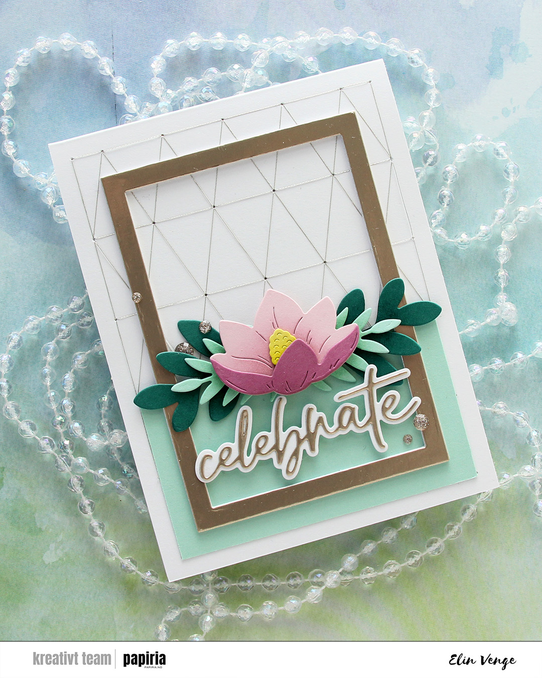 I adhered the Juniper die cuts directly to the line that separates the Sea Glass from the card base, then mounted the Sea Glass ones on top, before finishing off with the flower on another layer of foam squares.
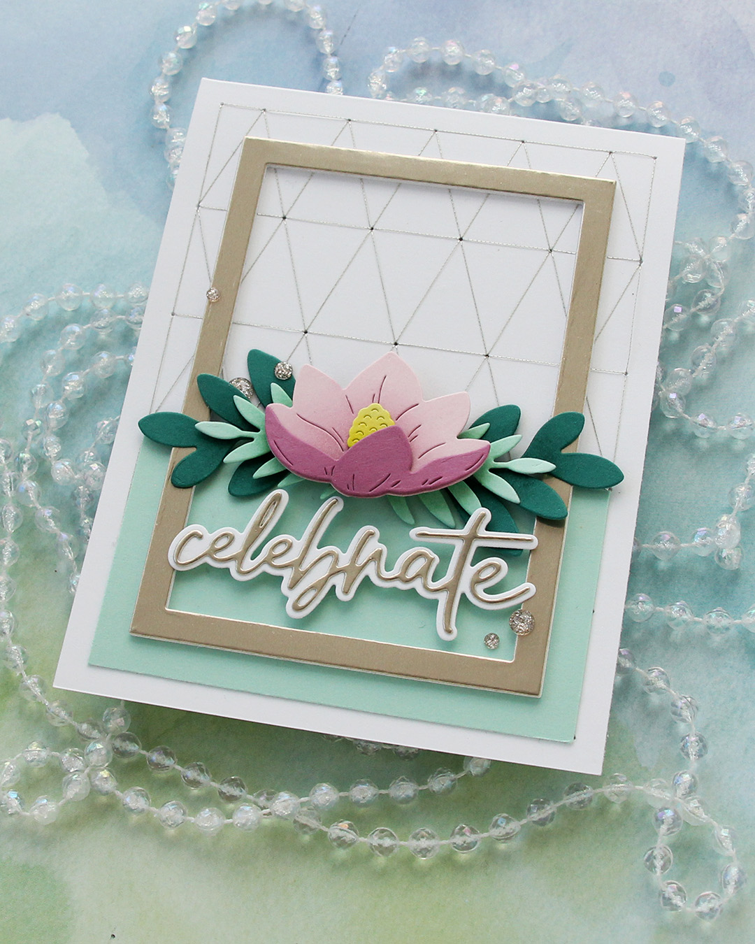 I die cut the word celebrate from Champagne cardstock from C9 using the Sweet Sentiments die set from Altenew. I die cut the shadow from white and mounted it on foam squares to make it float across the frame. I usually stack die cut words, but this gives a different look and worked better for this card. I finished very simply with a few champagne glitter drops from Pinkfresh Studio.
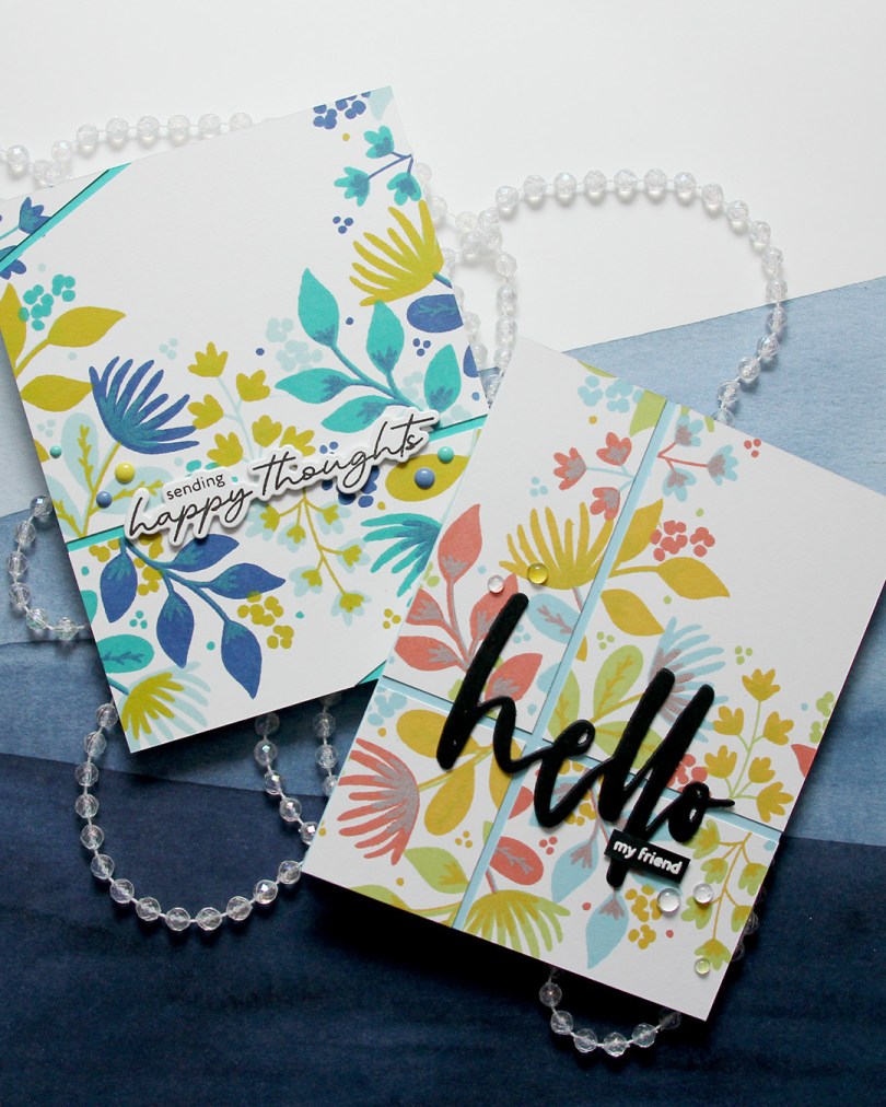
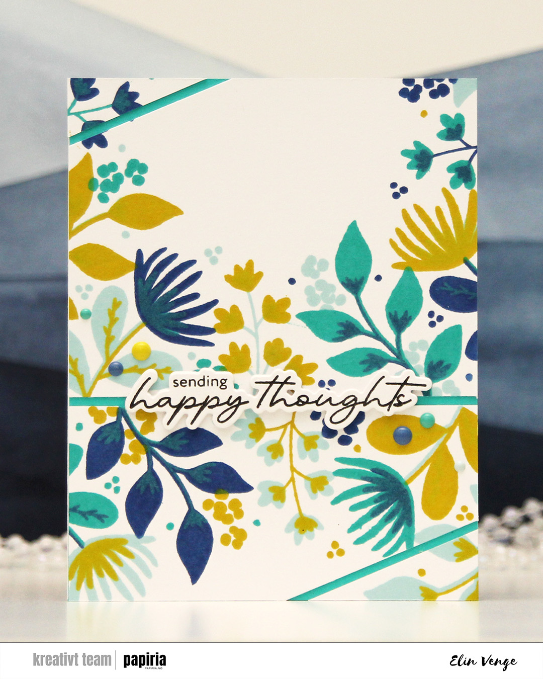 First up is this one. I chose an analogous color combo of Powder, Blueberry and Oceanside inks from C9, and a pop of Lemongrass for a somewhat contrasting color as my fourth. I cut the stamped panel in two, and then cut diagonal lines on each of my two pieces.
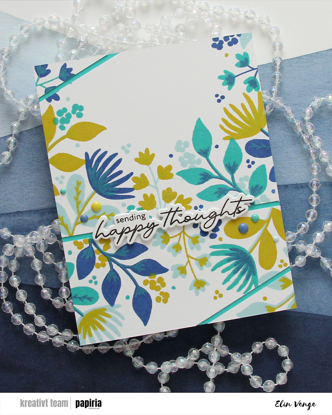 I covered a card base with Oceanside cardstock and adhered my panel pieces on top, leaving a gap between them so the Oceanside cardstock would show through.
 I stamped a sentiment from the Serene Blooms stamp set from Altenew using Obsidian ink from Altenew, and die cut it using the coordinating die. I stacked another three die cuts behind the sentiment for some dimension, and adhered my stack on top of the opening between the two largest pieces of the stamped background, before finishing off with enamel dots from C9 in the same colors that I used for the stamping.
 My second card features the same technique of cutting up the finished piece into smaller bits. Here, I used Sprout, Sunflower, Sorbet and Harbor inks, which makes for a way more colorful background (it’s basically a green, a yellow, a red and a blue).
 I used the Waterbrush Hello die from Altenew to create my sentiment for this card. I stacked three black die cuts for a bit of dimension and stamped and white heat embossed the sub sentiment from the Serene Blooms stamp set from Altenew. I’ve just replaced my VersaMark pad, so the letters are a bit thicker than I’d like, but i really did need a new pad. I finished off with a few dew drops from C9. There was a lot going on with the background already, and the dew drops are a bit more subtle.
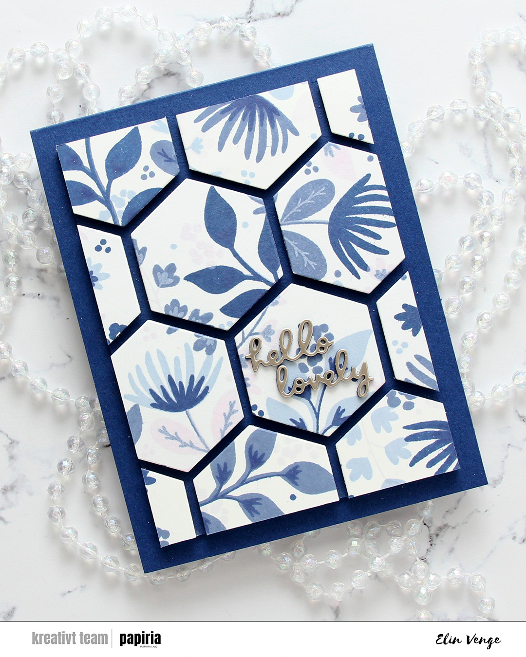 The final card is very different. For this one I had two full panels that I’d stamped with the Northern Shore bundle of fresh dye inks from Altenew (Polar Bear, Icy Water, Winter Lake and Arctic Mountain). I used the hexagon die in the Wild Meadow die set from C9 to cut as many hexagons as I could from the two panels and mounted them on foam tape to a piece of Blue Beyond cardstock from My Favorite Things. I then chopped off a bunch on all four sides for a nice border and adhered it to a card base I created from the same color.
 The die cut sentiment is from the Just picked die set from C9. I die cut two layers from blue cardstock and the top layer from Champagne cardstock from C9, adhered my sentiment in the center of one of the hexagons and decided to skip embellishments for this card. There’s a lot going on already with all the hexagons and dimension, I felt like the card really didn’t need more.
 This all started with patterned paper from Maja Design and the Sleigh full of cheer dies from Concord & 9th. Die cutting presents like this is a great way to use scraps. I used the Christmas Nostalgia collection for this. I’m a sucker for anything blue, so I wanted a dark-ish blue at the bottom, a lighter blue at the top and a contrast in the center. You could do this with any color, even plain cardstock. There are actually some images in the coordinating stamp set that will allow you to add patterns to your die cuts using just ink, but I opted for the patterned paper version here. I die cut the bow, the ribbon for the presents and the sleigh using champagne foil cardstock from Concord & 9th and added those for a touch of shine. The sleigh itself is a few layers thick to make it stand out against the background, and I did some ink blending on the seat using Wheat ink to make it stand out even more, as I have the same cardstock color for the seat as my background.
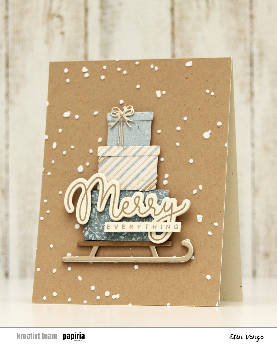 Speaking of backgrounds – I used one of the stencils in the Splatter Textures stencil set from Kristina Werner on a panel of Wheat cardstock from Concord & 9th. I added Altenew embossing paste through the openings and sprinkled on rock candy distress glitter while the paste was still wet. It’s important to clean your stencils quickly when using paste, or you’ll have a really hard time making it come off. Nobody wants to clean, but when dealing with pastes, you need to. I stamped my sentiment from the Joyful and merry stamp set from Kristina Werner using Wheat ink on Rustic Cream cardstock from Papertrey Ink. I used the coordinating die set to cut out my merry, and added another three die cuts on the back for dimension. I cut down everything to a nice strip, added another strip on the back for strength and adhered the sentiment to the largest present to finish the card.
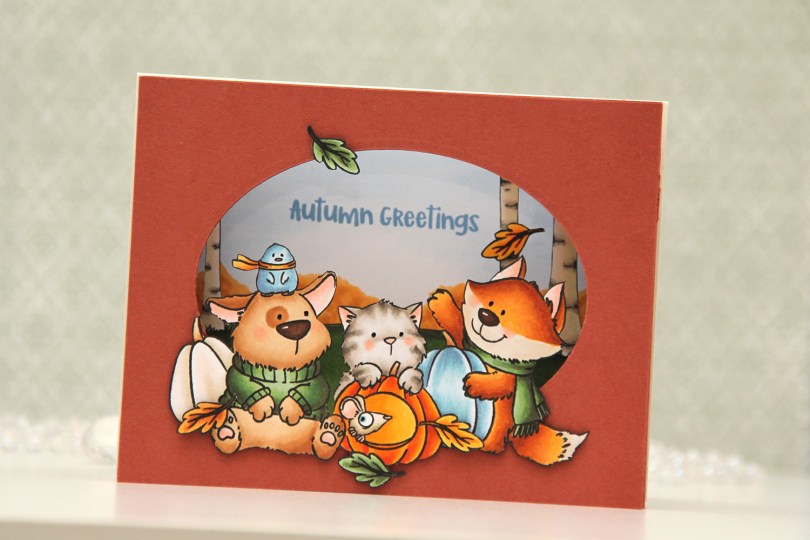
 I stamped my images (both the critters and birch tree background) on separate panels of X-Press It blending card with Copic friendly ink, colored them in and fussy cut them. Before fussy cutting the critters, I actually stamped over my initial stamping with Obsidian ink from Altenew, which gives super black lines that are extra crisp. It’s a pigment ink, though, so it needs to be stamped after the coloring. I also colored a sky and some bushes on a separate panel, where I stamped my sentiment in Blueberry Sky ink from Papertrey Ink. I cut an oval into a panel of Americana cardstock from Papertrey Ink using an old oval die from Spellbinders (Petite Ovals Large) and then created two pieces of accordion folds in the same color cardstock. I glued my background with bushes and sky to the back of the accordion pieces, the birch trees in the center, and the panel with the oval window in front. I mounted my critters using foam tape and used black glaze pen for the eyes. I then adhered my accordion to a top fold card base I created from Rustic Cream cardstock from Papertrey Ink.
 I used a lot of Copics for this one. I even used B20, which is a color I’ve created myself using an empty marker, B21 reinker and blender reinker.
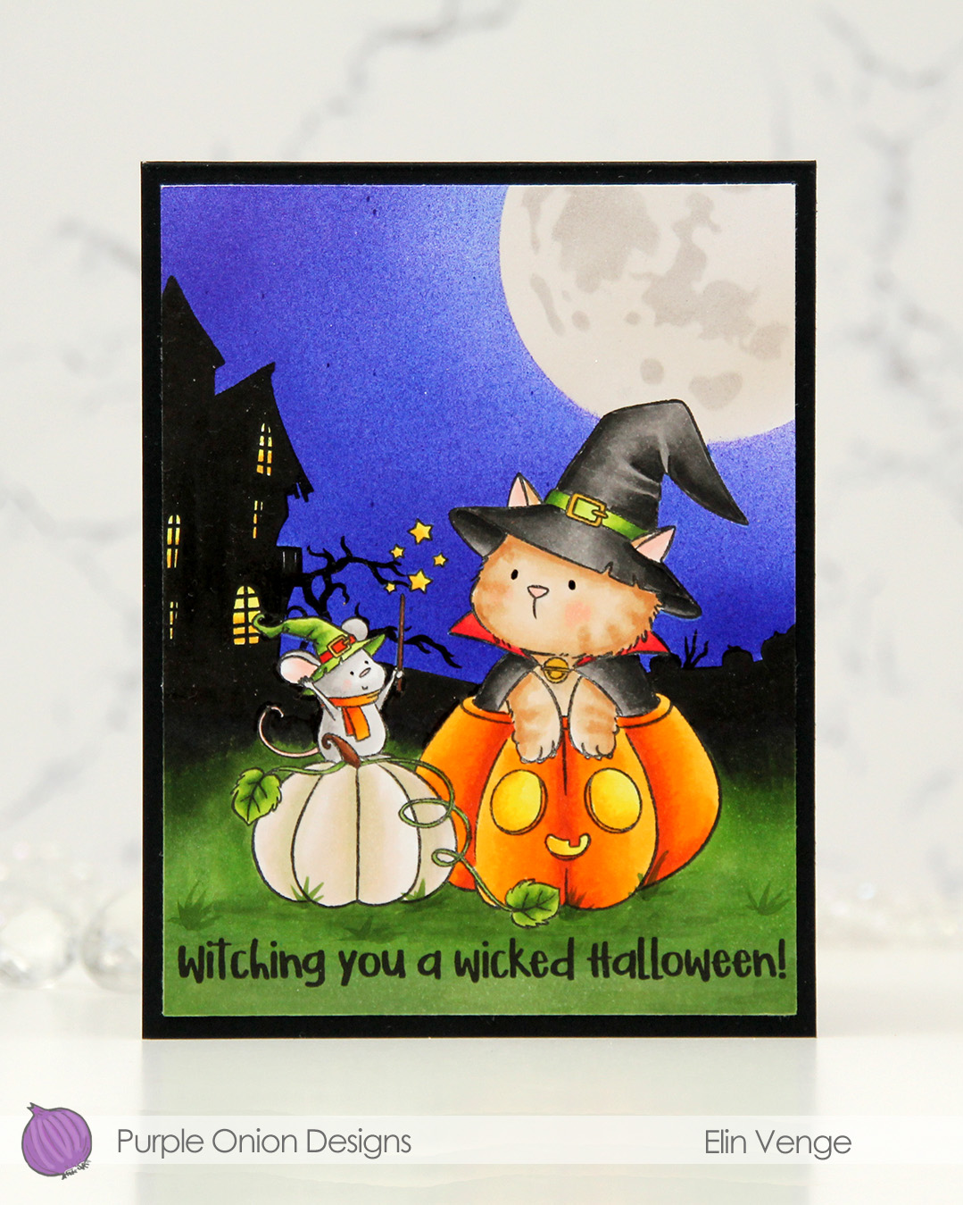 I stamped the image near the bottom center of a panel of X-Press It blending card using Extreme Black ink from MFT, which is a Copic safe hybrid ink. I colored the image and created a spooky silhouette background which fades from black in the distance to green as you get closer to the front of the image.
 I masked off the scene and put a moon mask from an old Simon Says Stamp Stamptember collaboration with Tim Holtz into the top right corner, before I went in with Copics and an airbrush to create the sky. I used three colors of blue, trying to make it a bit lighter near the moon and darker further away. I took off the moon mask, masked the sky and airbrushed into the circle opening using E40 for a very pale moon. I then added the detail mask for the moon and airbrushed the openings with T1, which is a very light grey that I also used for the mouse. Once all the coloring was complete, I removed all the masks, added a bit of black glaze pen to their eyes and stamped a sentiment at the bottom using Obsidian ink from Altenew, before trimming the panel down a little and adhering it to a card base I created from Black cardstock from Concord & 9th to finish.
 I used quite a few markers for this. The ones after the gap are the ones I used for the airbrushing of the moon and sky.
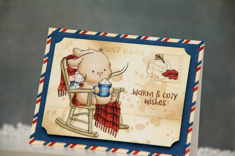
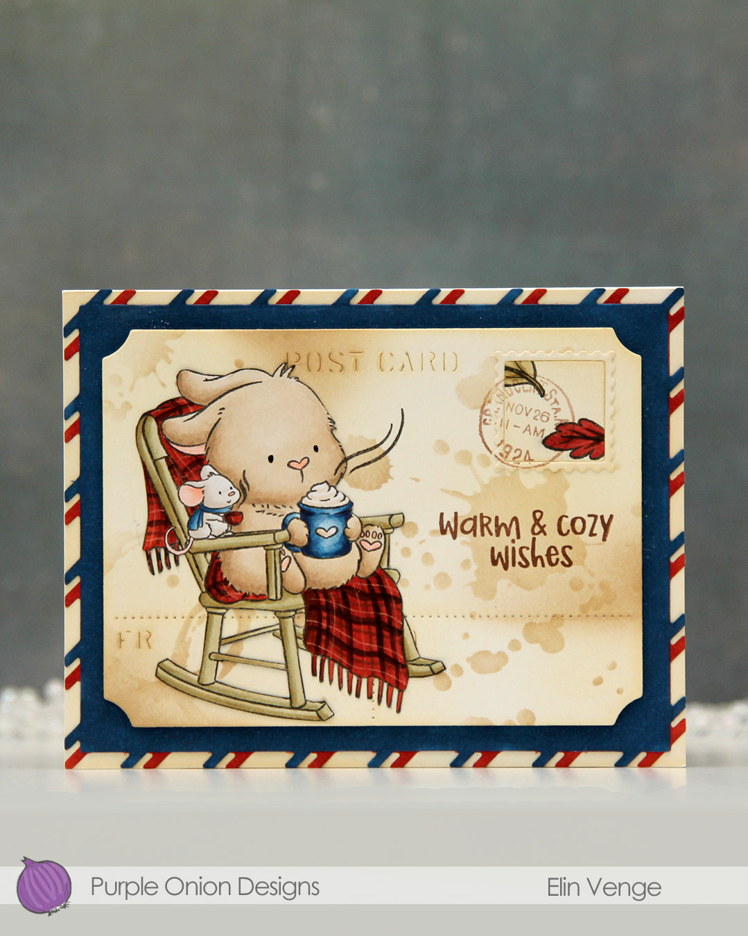 I colored the image with Copics onto X-Press It blending card and fussy cut it right up against the black lines. From another piece of X-Press It, I die cut the postcard shape using the Postcard combo die set from Mama Elephant. I used Peachy Glow ink from Altenew to ink blend across the panel, giving it a vintage feel. I then went in with a stencil from the mini stencil set 3 from Tim Holtz and added the splatter texture using Classic Kraft ink from Papertrey Ink along with a blending brush. In some areas, I added ink with the blender brush without using the stencil.
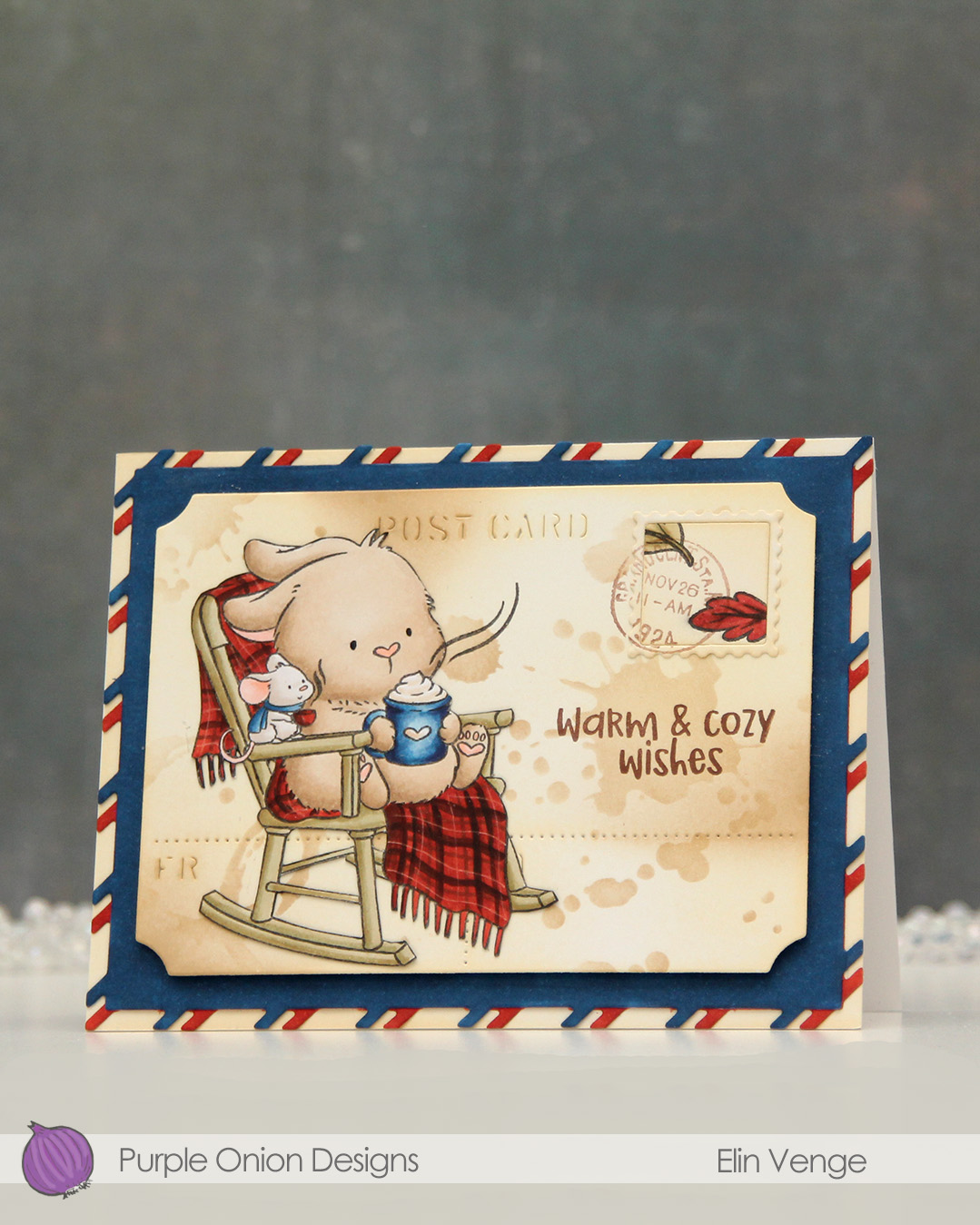 I stamped the leaves from the
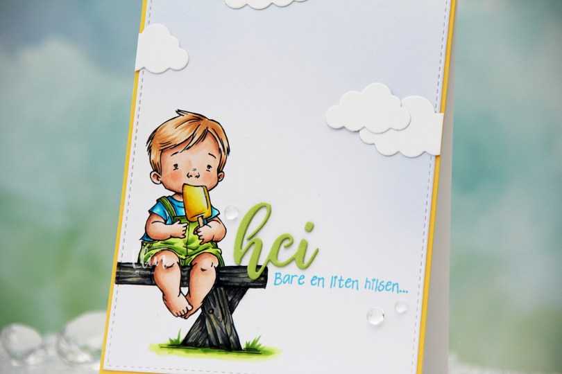
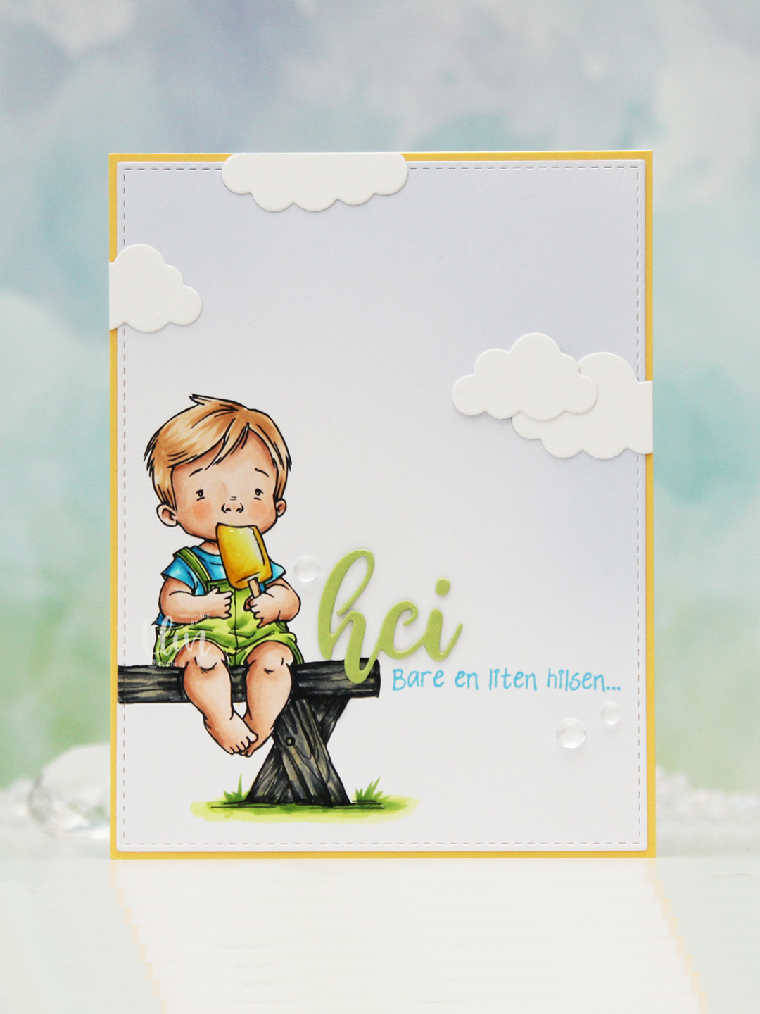 I colored the image with Copics, opting for the cool grays for the bench. I wasn’t planning on making it this dark originally, but when my C9 made a blob, dark was the only way to go. It still works, and I don’t think you can really see where the blob was. I used the largest die in the A2 Stitched Rectangles STAX 1 set from My Favorite Things to trim the panel down a little, then a large blending brush to add some soft blue to the background. I didn’t add any ink to the brush, I simply used whatever was left from a previous project.
 I stamped a sentiment from the Småtekster stamp set from Norsk Stempelblad AS next to the bench using Tide Blue ink from Altenew. I added my colored piece to a panel of Buttercup cardstock from Concord & 9th, which I then adhered to a top fold white card base. I die cut the word hei twice from Green Parakeet cardstock from Papertrey Ink, stacked them and adhered my double die cut next to the boy on the bench before adding a few die cut clouds and some dew drops. Both the cloud dies and dew drops are from Concord & 9th.
 I used quite a few colors for this very simple image.
 I stamped the
 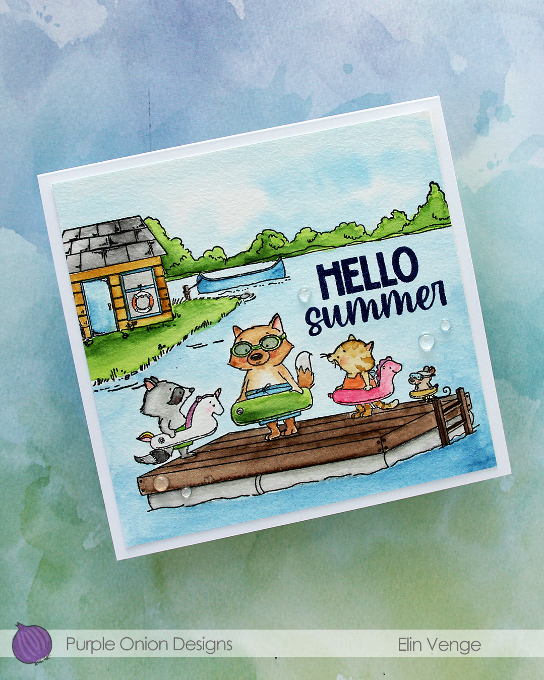 I used my Mijello Mission Gold watercolors and brushes in varying sizes to color in my scene, cut it down and stamped a sentiment from the
  I adhered the panel to a 5 3/4 x 5 1/2″ top fold card base I created from Stamper’s Select White cardstock from Papertrey Ink, before finishing off with a few Raindrops from Little Things from Lucy’s Cards.
 I stamped the large floral image using Memento Espresso Truffle ink, which sits somewhere between brown and grey, it’s a nice color to use when you don’t want black. I then die cut the image, before I used the coloring stencils and fresh dye inks from Altenew to do the “coloring”. I used the North Shore set for the blues, Sun-kissed Delights for the yellows, Jade Dreams for the greens and Warm Gray for the gray (which I covered up with the green). I didn’t want the centers green, so I started out with grey, which got very flat and dull. I covered it with green, which then made it very dark, and still pretty flat, so in the end, I went over with lots of dots of a white Sharpie paint marker and a black glaze pen. It turned out okay in the end, but if I were to remake this card, I think I’d go in with a couple of greens anyway. Live and learn, I guess.
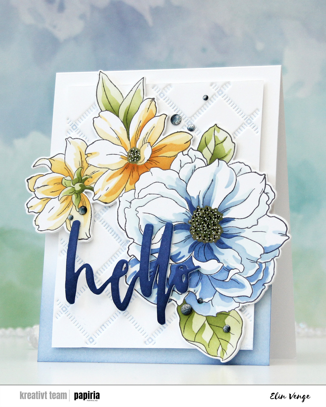 I created a large card base (5 x 6 1/4″) and ink blended Winter Lake ink onto the bottom for a nice, gradient effect. I used the Stippled Plaid press plate from Pinkfresh Studio to create some subtle interest in the background on a separate piece of paper. I inked up the plate with Icy Water ink, spritzed water on the back and front of the piece of white cardstock, then ran it through my die cutting machine with an embossing mat to create some deep texture. I then adhered this panel in the center of the card base using foam tape.
 Behind my die cut floral, I stacked another 3 die cuts from white cardstock and adhered my stack to my card, letting equal amounts hang off the sides on the left and the right. I also die cut the Waterbrush Hello die from Altenew four times from white cardstock. I inked up the top layer with Arctic Mountain ink and adhered it to my flowers.
 To finish off the design, I added some ombré glitter drops from Pinkfresh Studio in a visual triangle across the card.
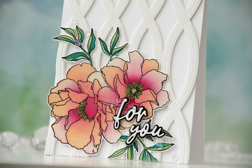
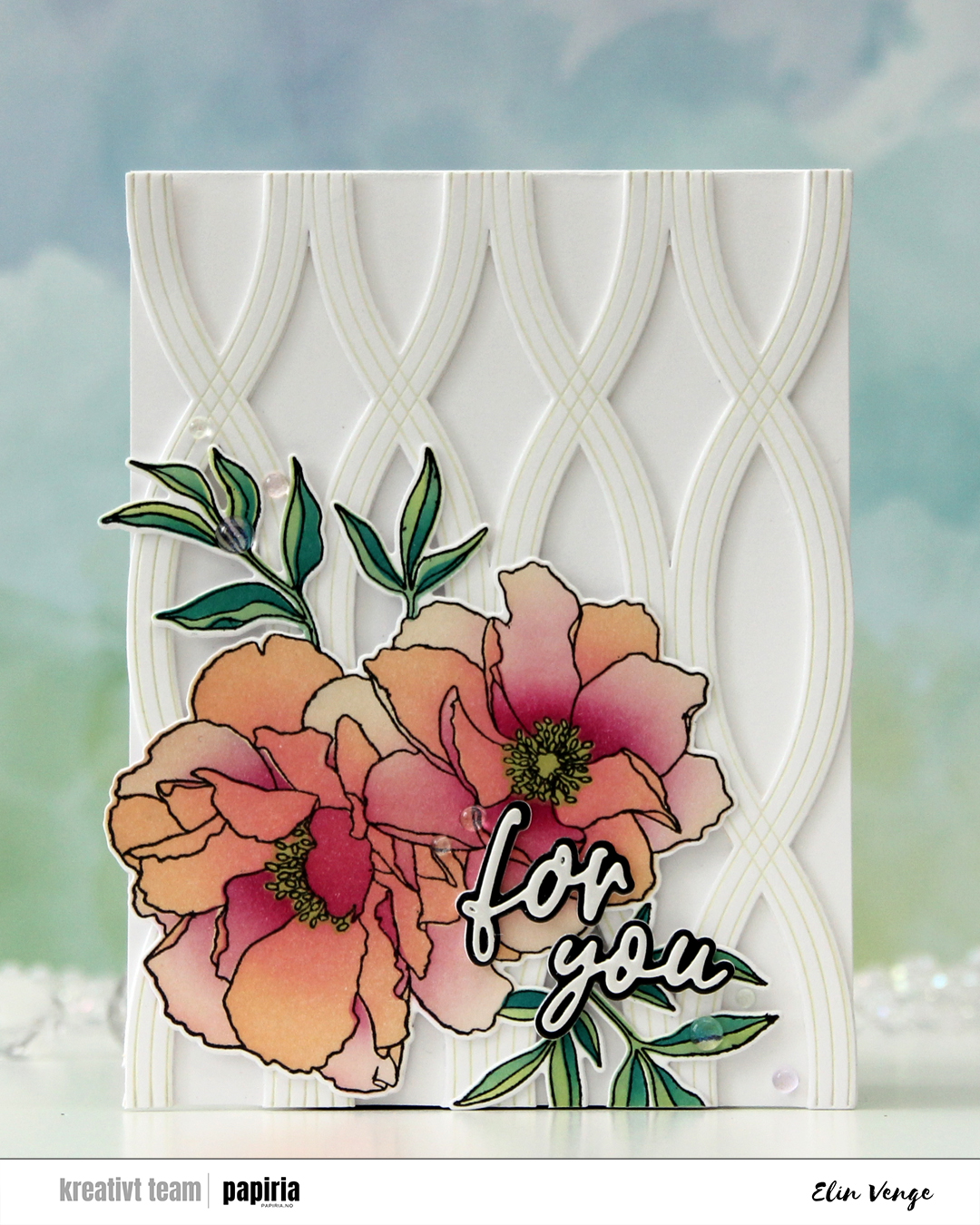 The Blended petals set from Concord & 9th is a very versatile one with a large flower image that you can color up any way you’d like. There are even coordinating stencils that let you add color very easily, which is what I used for my card. As much as I love coloring, stencils make everything go so much faster!
 I stamped the image in black ink, let it dry and used the coordinating stencils to color it in using Creamsicle, Sweet Pea, Wildberry, Sprout, Tidepool and Peacock inks, all Concord & 9th colors. I then used the coordinating die to cut out the image, adding a couple of blank die cuts behind it for dimension.
 I used the Twist Pattern press plate from Pinkfresh Studio along with some Pistachio Fresh Dye ink from Altenew to create a subtle pattern in the background. I die cut it using the coordinating die and added two more die cuts behind it before adhering it to the front of a top fold card I created from Stamper’s Select White cardstock from Papertrey Ink, which is the same white cardstock I used for everything except the sentiment.
 Speaking of the sentiment – I used the Sweet Sentiments die set from Altenew. The top layer is from white mirror cardstock from Kort & Godt, the black is black mirror cardstock from Kort & Godt, and then I put three additional die cuts of the shadow die behind for dimension. I finished off the card very simply with Iridescent Dew Drops from Pinkfresh Studio.