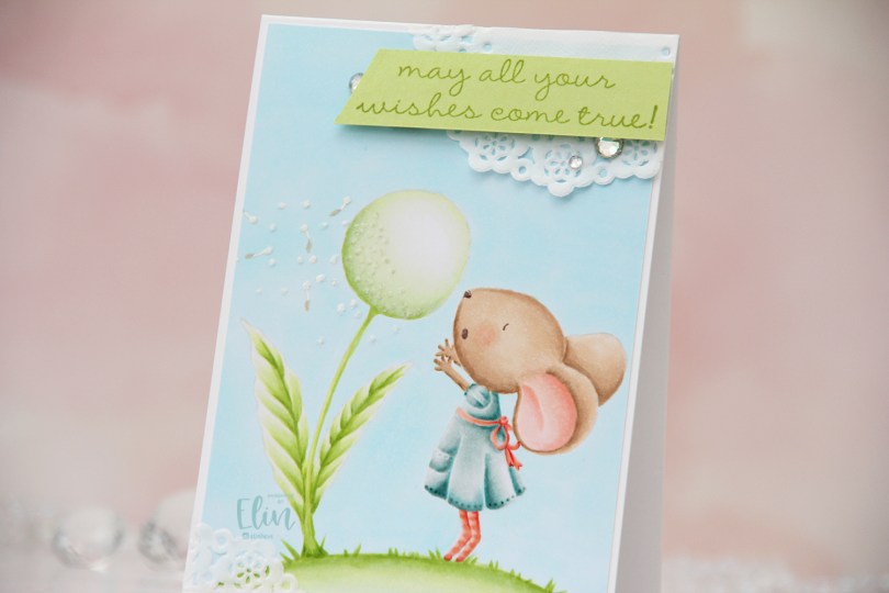
Hi, crafty friends. I’m here today sharing a 4 bar card. I love creating cards of all sizes, and this is a fun one, I enjoy the smaller format.
 This is Wishing from Purple Onion Designs, illustrated by Stacey Yacula. It’s one of the larger stamps from Purple Onion, and it’s actually the first Purple Onion stamp I ever colored up, which means it holds a special place in my heart. I wanted a soft look and stamped the image in Fadeout ink from Inkon3 before coloring.
 I love no line coloring, and no line is perfect for an image like this, which has just enough detail to make it interesting, but it’s still large enough to get soft gradient in colors and not too fiddly.
 Once I finished my coloring, I added my panel to a 4 bar card base I created from Stamper’s Select White cardstock from Papertrey Ink. I created some texture to the dandelion fluff by using my Quickie glue pen and sprinkling on Rock Candy Distress glitter.
 I adhered scraps of a Doodlebug mini paper doily to opposite corners of the card to add to the soft, delicate look I was aiming for. Using Sour Apple ink from My Favorite Things, I stamped a sentiment from the A Beautiful Day sentiment set from Purple Onion Designs onto Sprout cardstock from Concord & 9th, cut it down to a strip and mounted it on foam tape and adhered it to the top right corner of the card, before finishing off with a trio of crystals from Papirdesign.
 Very soft color palette.
 These guys are from the
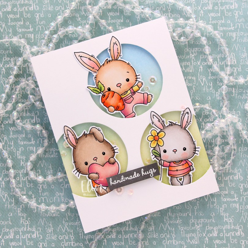
  Onto the card base, I ink blended Fresh Leaf and Eastern Sky inks from Altenew to create a soft background that went from green to blue. I then added splatters of my sheer shimmer spray from Imagine. It’s not really visible in the photos, but in real life it adds a bit of sparkle.
 I die cut three circle openings in a quarter piece of white cardstock and mounted it with foam tape to the card base.
 I added foam tape to the back of my critters, popping each of them into the circle openings. I stamped and white heat embossed a sentiment from InkyWings onto a piece of Mushroom cardstock from Concord & 9th, mounted it on foam tape and added it to the card.
 To finish off the card I added sequins from the Rosy Glow mix from Little Things from Lucy’s Cards.
 Such a simple color palette for this one. Aside from the colors of the fur, which differ for each bunny, I used the same colors throughout.
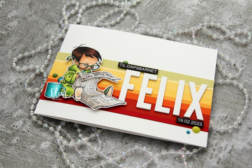
 I colored the image with My Copics and decided to fussy cut around it this time. I tend to turn my colored pieces into panels for my card and work from there, but I wanted to do something a little different today.
 I left a white border around the image to make it easier on myself. You tend to lose some of the details in the hair if you cut up close to the line, and I wanted to keep the hair intact. I also added Glossy Accents to his glasses for shine and a touch of dimension.
 I wanted to include his name on the card, but had printed my image fairly large. My solution was to make a landscape A7 card (7×5″). I rarely make landscape cards (trickier to photograph) and the same goes for A7, but it’s fun to shake things up. I also shook things up by adding cardstock strips going across the card. I tried with cool colors first, but the image got lost, so I went through my solid colors of cardstock again and made a version with warm tones. From top to bottom they are:
 I used the Impact Alphabet die set from My Favorite Things to spell the name. I die cut four of each letter and stacked them for a dimensional look, gluing them right onto the stripped background, before adding the sentiment and date in white on black.
 I mounted the image on foam tape and added a few enamel dots from Altenew (teal dots from the Cool Summer Night pack) and Papirdesign to finish the card.

 Aren’t these bunnies cute? I paired the three bunnies in the Teacup Bunnies stamp set with a digital sentiment. The sentiment will be a freebie digi, along with a few others in the same style and sub sentiments to pair with it.
 I colored the bunnies and letters with Copics and did some fussy cutting, leaving a thin white border to preserve the “fuzzies” that are part of the signature Lili of the Valley style. I used a black glaze pen for their eyes to make them pop and shine, and once dry, added a tiny white dot to each eye using a white Gelly Roll 05 pen.
 I used the Crystal Distortion Embossing folder from Simon Says Stamp on a piece of Lemon Tart cardstock from Papertrey Ink to create a little bit of interest in the background. Below the yellow panel, I added a strip of Sprout cardstock from Concord & 9th for a little bit of extra green.
 I adhered the cardstock pieces to a white top fold card base and mounted the teacup bunnies and sentiment on foam tape for dimension, before finishing off with a few enamel dots from the Tropical Forest set from Altenew.
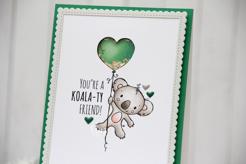
 I’m using the new
  I adopted Laura Bassen’s new coloring motto for 2023 for this card: “no muss no fuss coloring”. This was very simple, a few grays and a little bit of pink for the cheeks, the inner ears and the belly. I used a craft knife to cut out the interior of the balloon and printed another panel with just the balloon in the same size. I colored that balloon in green (thanks for the color suggestion, Liz) and added foam strips along the outer edge of the balloon, before filling it with tiny iridescent stars from the Icicle sequin mix from Hero Arts. I then added a piece of acetate on top to complete my shaker, and adhered the koala panel to the shaker, making sure to line up the window with my shaker heart balloon as best I could.
 I added foam tape on the back of the rest of the panel and adhered it to a top fold card base. The card base is actually Stamper’s Select White cardstock from Papertrey Ink, but I adhered a panel of Clover cardstock from Concord & 9th on top to create the green front. The color matched with my green balloon, but I don’t have unlimited amounts of Concord & 9th cardstock, so I’m trying not to use it all at once. Also, it’s a thinner cardstock, and not sturdy enough on its own to hold the weight of lots of foam tape and a shaker.
 Using the largest of the dies in the Stitched Rectangle Scallop Edge Frames die set from My Favorite Things, I die cut a frame from Soft Stone cardstock from Papertrey Ink. This is such a perfect soft grey, I love it. I finished off the card with a few enamel hearts from Altenew, from the Green Fields pack and the Rock Collection.
 The iridescent stars inside the shaker heart really catch the light nicely.
 Super simple color palette, as I mentioned.
 I didn’t know what color scheme to go for, and my color buddy Liz suggested purple, knowing I’d kind of hate her for it. 😉 I struggle with purple. It’s not my favorite color to begin with, it’s tricky to photograph well, and also difficult to find good matches with ink and cardstock for. AND it’s even hard to find colors that pair well with it. It’s not something I’d normally use for a Christmas card, but I love a good challenge, so I grabbed a bunch of purple Copics and started coloring.
 I kind of tried to chicken out a bit by asking Liz if it’d be okay if I added some aqua tones. “Only if purple is the dominant color,” was her answer. With no chance to weasel my way out of purple and into something I’m more comfortable with, there was only one thing to do… keep coloring purple.
 I did add a little bit of aqua to not have everything purple. I even tried some blue, but that didn’t really work and I actually covered up the blue… with more purple. Once I finished my coloring, I added a sentiment from the
  I used a black glaze pen to get their eyes extra black and shiny, added a tiny white dot to each eye using the 05 white Gelly Roll, and covered Rudolph’s nose with Glossy Accents. Once dry, I sprinkled on lots of chunky white embossing enamel from Stampendous and melted the granules from the back of the panel for a snowy look.
 I adhered my colored panel to a top fold landscape card base I created from Royal Velvet cardstock from Papertrey Ink, and added a thin strip of Sea Glass cardstock from Concord & 9th below the sentiment for an additional element that wasn’t purple.
 I used so many colors for this, it’s ridiculous. I used different colors for all the animals, only keeping cheeks, noses and inner ears the same throughout.
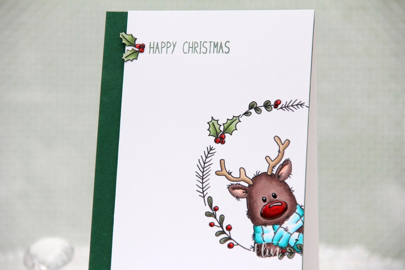
 There’s a stamp set in the release which includes a wreath and six different critters you can put inside, as well as a few individual stamps that go well with the wreath. I chose the wreath and the reindeer in the set for this card, making sure Rudolph was stamped a little crooked peeking into the front of the card from the side, I thought that made for a dynamic card design.
 Using my Copics, I colored Rudolph and the wreath and also one of the smaller images, which I also fussy cut.
 I trimmed my panel down so that it was 1/2″ more narrow than the card base and mounted it on foam tape onto a 4 1/4 x 5 1/2″ piece of Clover cardstock from Concord & 9th. They have the most gorgeous color range! Their cardstock isn’t very thick, so I don’t use it for card bases, but their colors are magical. This panel I adhered to a top fold card base I created from Stamper’s Select White cardstock from Papertrey Ink.
 I stamped a sentiment from the
  To finish off the card, I decided to add a layer of black glaze pen to Rudolph’s eyes. This makes them shiny and also adds a tiny bit of dimension. Once dry, I put a white dot in each eye using a 05 Gelly Roll pen. I also added Glossy Accents from Ranger to the berries and Rudolph’s nose for some extra shine.
 Rudolph and his shiny nose say hi. It’s really shiny!
 Fairly simple color palette. This card was so much fun to make, I love the playfulness of Rudolf with his head tilted in from the side of the card.
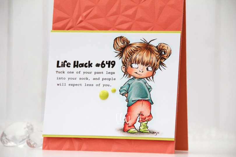
 Meet
Meet  I colored the image with Copics, trimmed my panel down and added a thin strip of Limeade Ice cardstock from Papertrey Ink above and below for a little bit of extra color and definition.


 I used more Copics than I thought I would for this. I even used BG71, which is a color I’ve created myself.
 This was a BIG image. It came into Photoshop as a full A4, and it’s kind of perfect for the front of a party invitation (which is what it’s actually intended for), but I wanted to create a regular size card from it. The tag tied to the a in Party actually says RSVP, but I erased that digitally before printing my image.
 I was worried this would take a long time to color, but it wasn’t that bad, actually. I used a fairly limited color palette, I think that helped.
 I colored the entire panel using my Copics, before using my scissors to cut around the edge. I usually use a trimmer or a steel ruler and a craft knife for this, but the frame has a fun, uneven line, and I wanted my cutting to be uneven too, so scissors were the way to go.
 I adhered my panel onto a card base I created from Sorbet cardstock from Concord & 9th, stamped and white heat embossed part of a sentiment from the Bitty Birthday Wishes stamp set from My Favorite Things onto a strip of Sorbet cardstock and glued a few additional cardstock strips behind it for dimension before adhering it to the card.
 To finish off I added a layer of Glossy Accents to the letters. I didn’t want to add any embellishments to this card, it had enough going on already with the busy scene, but a little bit of shine is never a bad idea.
 See? Not that many Copics considering how busy this scene is.

 I wanted to add a little bit of interest to my flowers and did some simple ink blending. I used Mustard Seed and Spiced Marmalade Distress inks for the yellow, Fresh Leaf ink from Altenew for the green and Vintage Timber from My Favorite Things for the brown. I also added additional diecuts to build dimension and interest to these flowers.
 Onto a white card base I created from Stamper’s Select White cardstock from Papertrey Ink, I stamped a sentiment from the
  This is a very simple card, and in hindsight I kind of wish I’d used a different color for my card base, or even ink blended a gradient blue with on the card base, but the white makes the yellow pop and is very clean, which is usually my preference on simple cards.
 Here you can see a little bit of the dimension on the card. I used white diecuts behind the the yellow ones (I don’t have a lot of that Buttercup cardstock and wanted to use as little of it as possible), which worked out great. The white almost disappears against the white of the background, making it look like the flowers are floating on the card, it’s such a cool effect!