
Hi, crafty friends! Sometimes you need a big hug, and this Hugs image featuring Elliot & Marcel from Purple Onion Designs is the perfect one to use.
 I actually decided to watercolor this one with my Zig Clean Color Real Brush markers. I prefer using a paintbrush with water with these, but there’s also a blender that you can use. Marcel is small, but I still used three different browns and a pink for him (064 Oatmeal, 607 Milk Tea, 068 Deep Brown and 200 S. Almond Pink). For Elliot and the die cut letters I used 312 Overcast Sky only. I did use a little pink for the bow on his tail, but for the actual elephant, it was just the one blue. I love the movement you get with watercolor, it’s something you can’t really achieve with Copics.
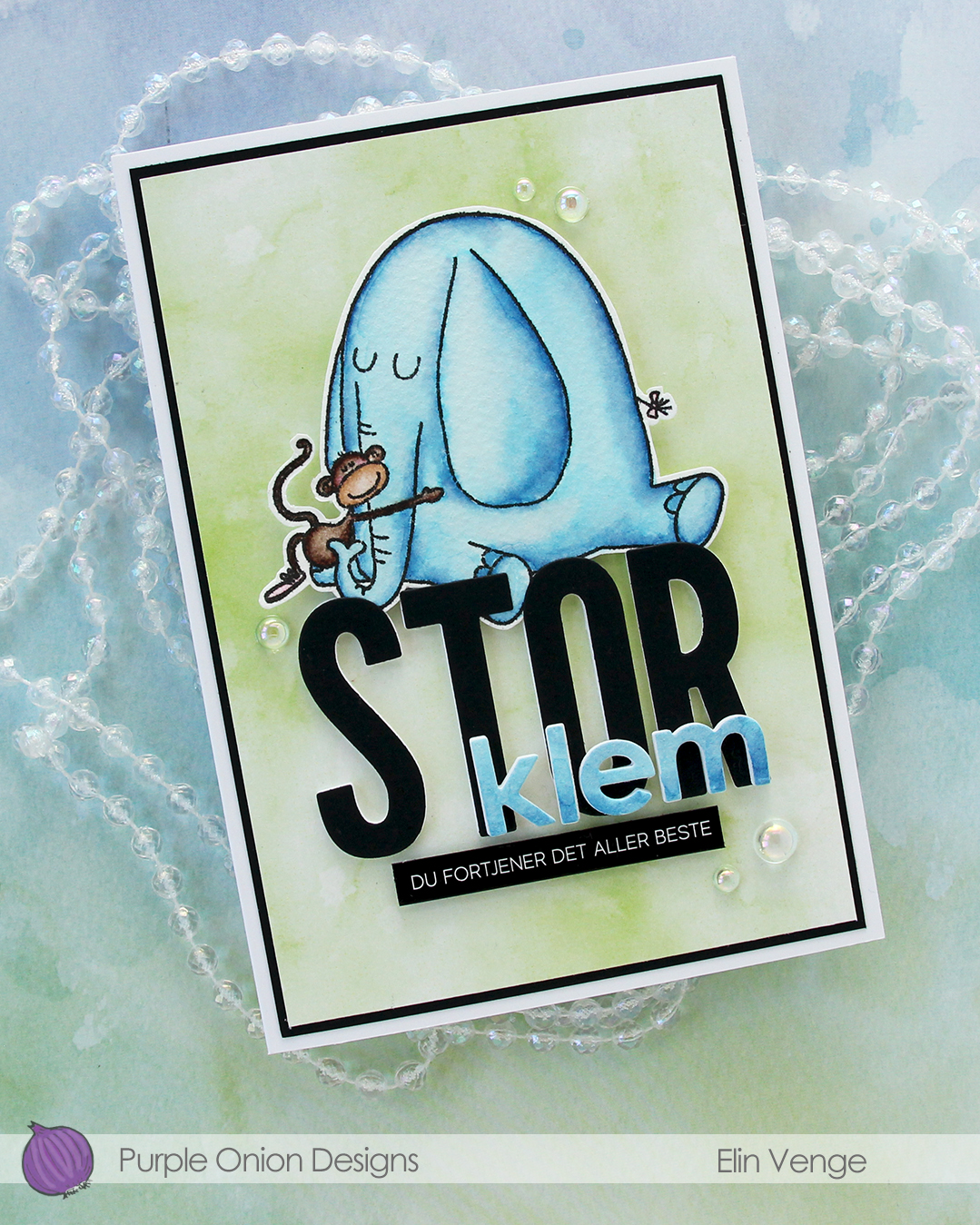 I fussy cut my image, leaving a thin white border. Using the Impact Alphabet die set from My Favorite Things, I die cut the letters to spell out STOR (big) four times from white cardstock and once from Black cardstock from Concord & 9th. I used the Parker lowercase alphabet die set from Memory Box to die cut the letters for klem (hug), again four layers of white, this time topped by a layer of the watercolor paper.
 I stacked my layers, and sandwiched the image between the white and black letters for the large word. I created a black mat on the card front, covered that with a piece of green patterned paper from the Watercolor Wash 6×6″ paper pad from My Favorite Things and mounted the letters and image in the center. I adhered the klem letters directly on top of the larger letters and added a sub sentiment sticker strip from Kort & Godt below it. I popped it up a bit to level it with the black letters, before finishing off with a few dew drops from the Spring Leaves embellishment mix from Little Things from Lucy’s Cards.

 Play really is the right word to use, because this is the Pattern Play die set from Concord & 9th. It’s one of those die sets where you have a large die that creates a road map and several smaller dies that cut out the shapes to go on top of the map. It’s like a puzzle, and I love playing with tiny pieces of paper, so this is right up my alley.
 I die cut the smaller pieces from Pebble, Sprout, Sunflower, Sorbet and Harbor cardstocks, all C9 colors. I stacked the Sprout four layers thick for dimension, the Harbor three layers and the Sorbet two, while gluing the Sunflower and Pebble directly to the map. This creates more movement and interest to the background, and it makes the card very tactile. I cut off 1/4″ from each side, popped the panel onto foam tape and adhered it in the center of my top fold A2 card base.
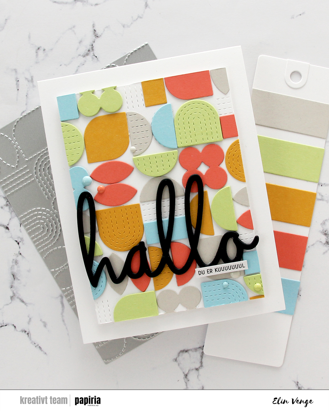 With such a colorful background, I knew I needed a bold black sentiment. I chose this hallo (hello) die from Kort & Godt, which I die cut four times from black cardstock and layered for dimension. I also added a tiny sentiment sticker strip (you are cooooooool) on top of the die cut word.
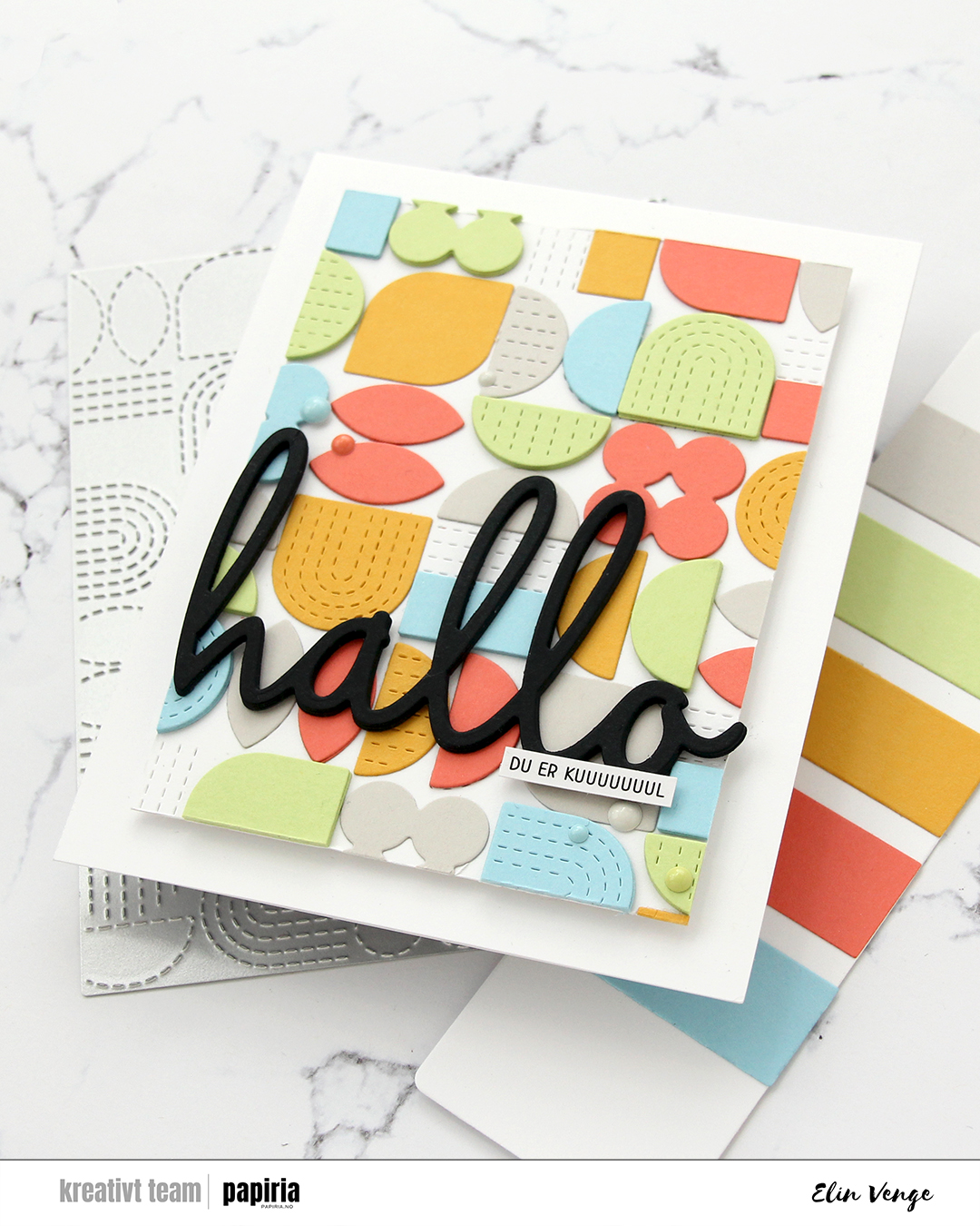 To finish off the card I added enamel dots in colors that match the cardstock. Since they’re the same color as the cardstock behind them, they don’t distract from the sentiment or the background, but they do still add interest to the card.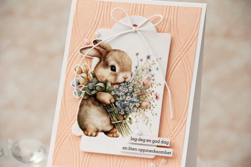

 I used the Twist pattern press plate from Pinkfresh Studio with Nectar ink from Concord & 9th on a piece of Nectar cardstock from Concord & 9th to create a subtle background. I adhered the panel to a top fold card base I created from Stamper’s Select White cardstock from Papertrey Ink.
 I mounted the tag in the center using foam tape and added a bow with white cotton thread from Kort & Godt. I adhered a couple of sentiment sticker strips with foam tape.
 To finish off the card I adhered a few faceted pearls. This card is so simple, and the soft colors really are perfect for spring.
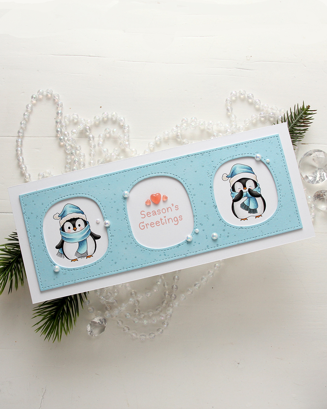 I colored the penguins with my Copics, making sure to add blue for their hats and scarves. Nothing beats blue for Christmas, right? I left plenty of space between the penguins for a greeting, which is from the
  I used a die in the Slim card basics die set from Mama Elephant to die cut the frame with openings from Harbor cardstock from Concord & 9th. I also cut two from white to add behind it for dimension. I stamped the Paint Splatter background stamp from My Favorite Things onto the blue using VersaMark ink, then sprinkled on White Satin Pearl embossing powder from Hero Arts and heat set.
 I added pearls from the Glossy Porcelain mix from Little Things from Lucy’s Cards here and there around the openings and also three Coral Heart Droplets, also from Little Things from Lucy’s Cards.
 Limited color palette for these two penguins.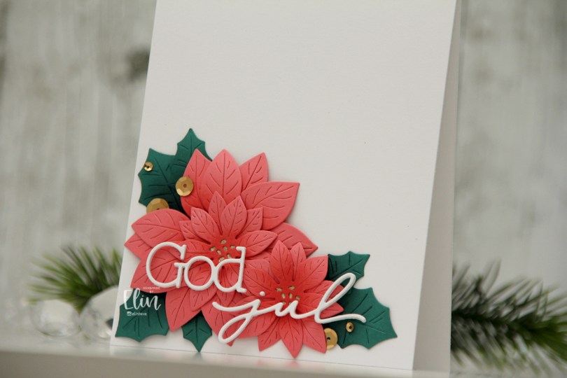
 I actually shared this one on the Papiria blog back in December, but I thought I’d share here, as well. I die cut the parts for the florals from Watermelon cardstock and the leaves from Juniper cardstock, both are C9 colors. I ink blended the petals with Watermelon ink and the leaves with Rainforest ink, which is a darker green than the Juniper color. I curled all the petals and leaves back before assembly, and adhered them all to a white card base. I used gold glitter cardstock from Kort & Godt for the centers of the flowers.
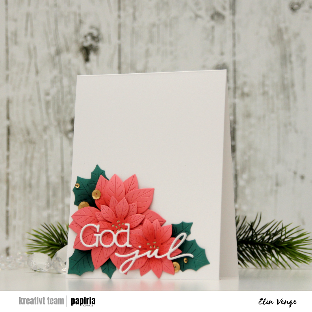 I used a die set from Kort & Godt to create my sentiment. I stacked three of each die cut and used liquid glue to adhere the sentiment to the florals, before finishing off the card with Satin Gold sequins from Altenew. Super simple, and I love all the white space!!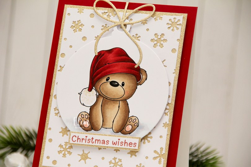
 I colored the bear with Copics and used the Snowflakes and Ornament die set from Hero Arts to turn him into a Christmas ornament. Isn’t he adorable with his head tilted to the side? I covered the card base with a piece of Cranberry cardstock from Concord & 9th. This is the perfect Christmas red, and it goes really well with the colors on his hat, as well as the color I chose for the
 For such a simple image, I sure used a lot of Copics.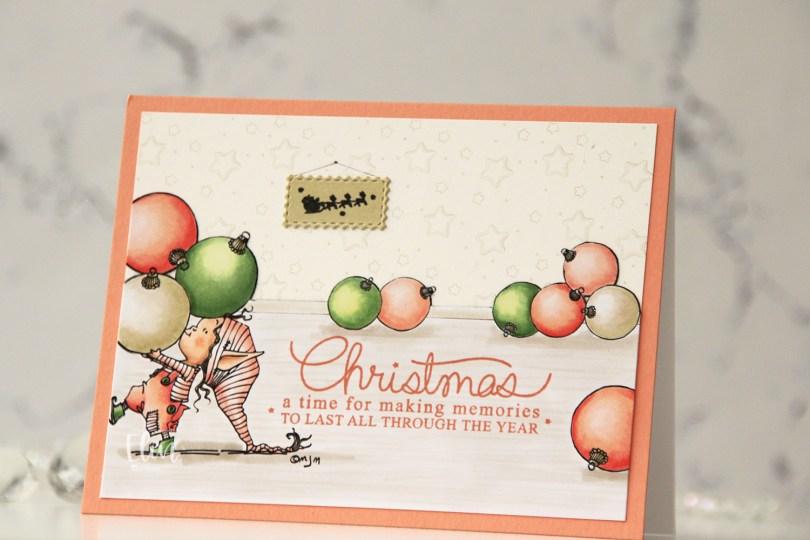
 I separated out the baubles from the image and did some copy paste work to create my scene. It’s one of the advantages of using digital stamps, and it makes them super versatile. I drew in a base board at the back with a black Copic multiliner and colored my scene.
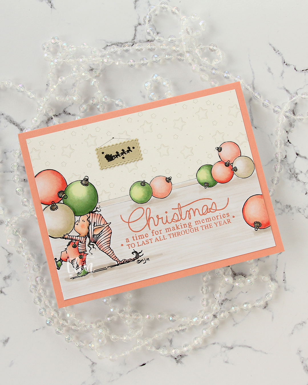 I fussy cut around the back bauble and base board and adhered my colored piece onto a piece of patterned paper from ModaScrap that acts as a wall paper for my background. To make it even more obvious that it’s supposed to be a wall, I stamped part of the Window Signs image from Purple Onion Designs using Altenew Obsidian ink onto a scrap piece of X-Press It blending card that I’d colored with one of the neutral colors (E81) I used for my baubles. I then die cut that using the Postage Collage Die set from Waffle Flower and adhered it to my wall, drawing in strings and a nail on the wall for it to hang from.
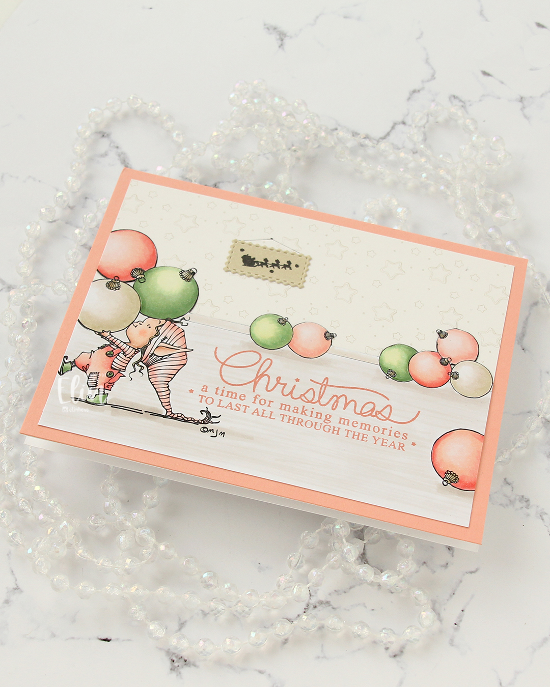 I stamped a sentiment from the Merry Greetings stamp set from Mama Elephant using Melon Berry ink from Papertrey Ink. It matches really well with the coloring. I adhered my scene to a card base covered with a quarter sheet of Grapefruit cardstock from Concord & 9th to create a matching frame and my card was finished.
 Limited Copic color palette for this one. I also used W3, W1 and W0, but I see now that I cut my graphic off too short, so they’re missing here.
 I started by running a panel of Stamper’s Select White cardstock from Papertrey Ink through my die cutting machine with the Kaleidoscope embossing folder from Simon Says Stamp for a subtle, textured background. I love white space on my cards, but that doesn’t mean it needs to be flat.
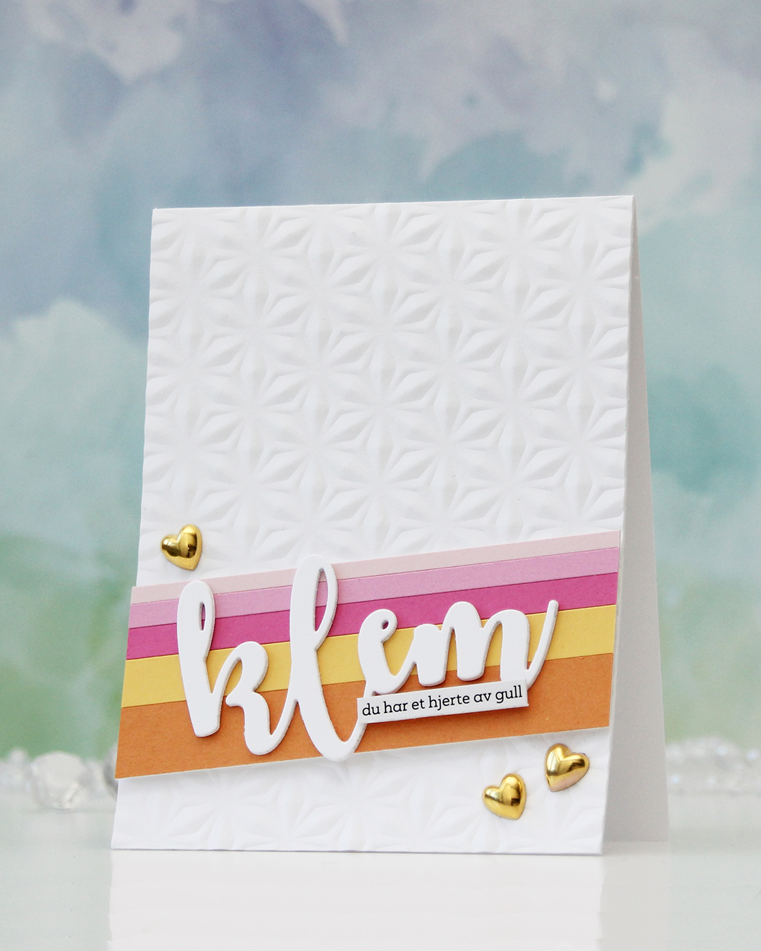 Next, I did some stripping. Cardstock stripping, that is. I cut a few colors of cardstock into different width strips. The colors I used are (top to bottom – all Concord & 9th cardstock): Ballet Slipper, Carnation, Sweet Pea, Buttercup and Clementine. I added the strips to a scrap of cardstock to keep them all together and mounted them at an angle using foam tape.
 I die cut the word klem (hug) three times from white cardstock and stacked them for dimension. I usually stack four, but I was using a scrap to die cut from and there was only room for three with the piece I used. Three layers work too!
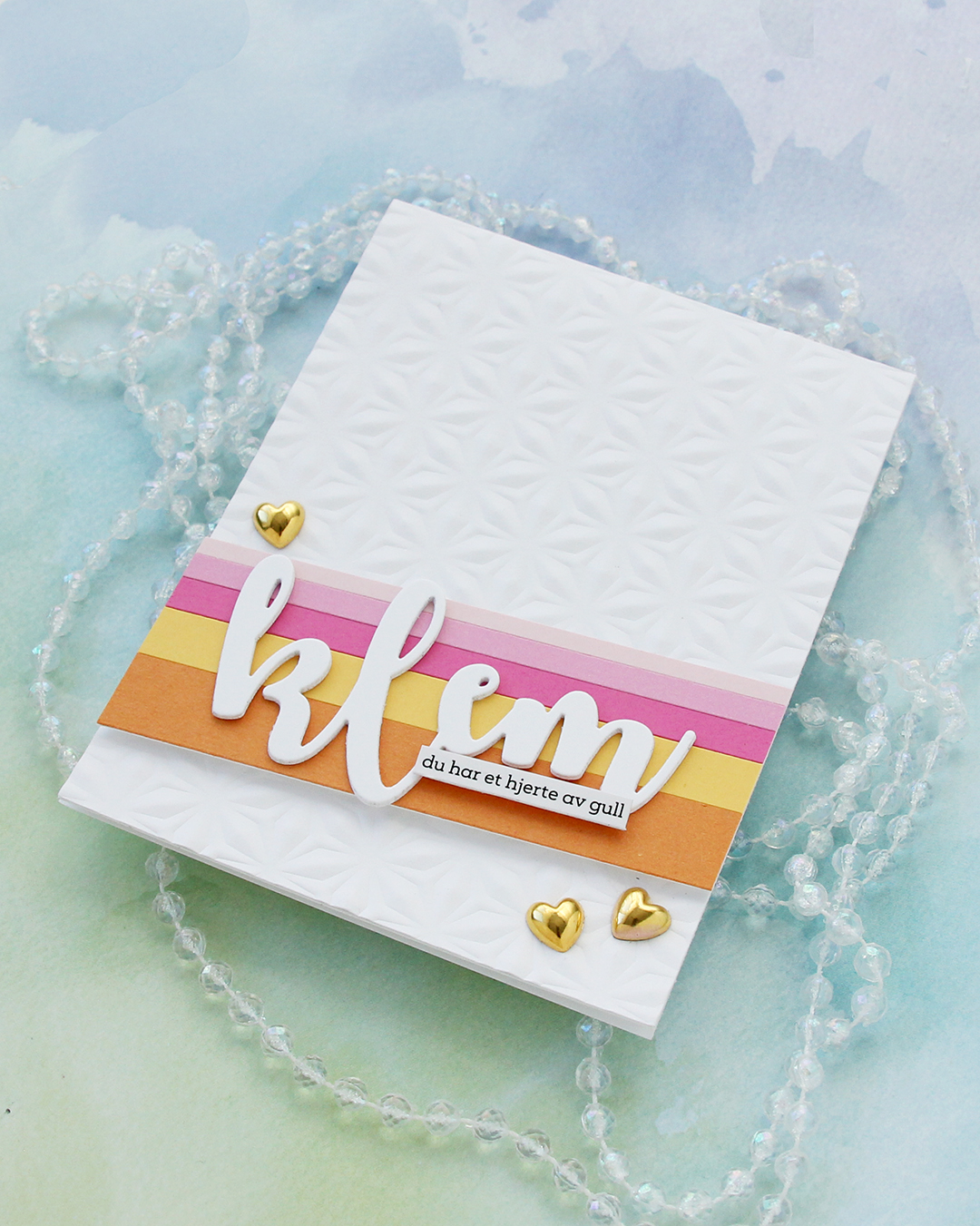 I love how this word die creates a space for a sub sentiment strip. You can put pretty much anything on the bottom of the last part of the die cut and still see the whole word. For this one I used a sentiment sticker strip and adhered a couple of layers of cardstock strips behind it for even more dimension, so it pops off the die cut a little. To finish off the card, I added a few gold heart, I thought they matched the sub sentiment (you have a heart of gold) nicely.
 I used a couple of the brand new cardstock colors from Concord & 9th (Brickyard and Pimento), along with a bunch of older ones (Sorbet, Grapefruit, Nectar, Eucalyptus, Rainforest) for the rest of the florals. I also used a little bit of vellum and some gold shine cardstock for the flower centers.
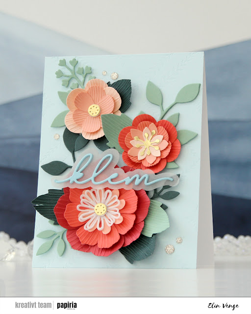 Once you’ve die cut the florals and greenery, you can use the embossing folder that coordinates to create texture on the petals and large leaves. They come out looking like crepe paper, and I love the look. There are many ways to assemble these flowers, and I created a bunch more that I wasn’t able to fit on this card. For the circular centers, I stacked some white die cuts behind the gold ones for dimension, and I curled all the petals and “crepe paper” leaves before assembly.
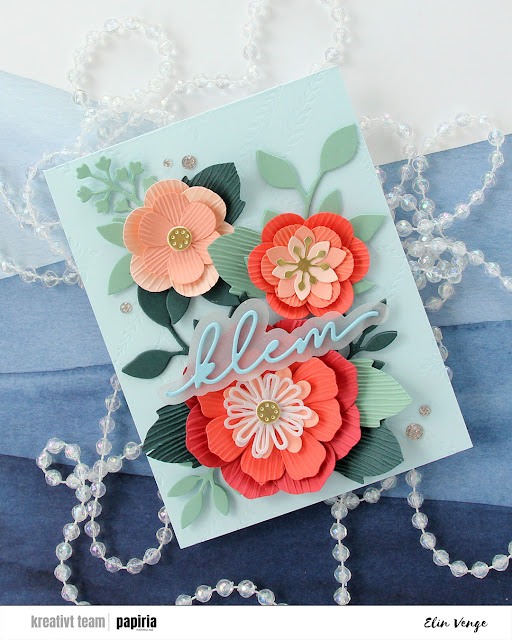 On the Powder panel that covers the card base, I wanted a little bit of texture. I used the Leafy Lattice press plate from Pinkfresh Studio with Polar Bear ink from Altenew for a subtle background – it’s so subtle it barely shows in the photos, it’s definitely more noticeable in real life. I probably could have gone a little bit darker with the ink, or ink up the press plate a second time and run it through again if I wanted it darker.
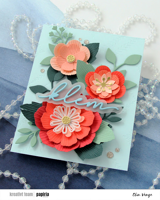 I adhered all my flowers and leaves with liquid glue, stacking the pieces in the background for strength and dimension. They’re only attached at the base of the sprigs, so they have som lift at the tips. I die cut a sentiment die from Kort & Godt four times from Harbor cardstock, stacked them, added a vellum shadow layer behind and glued my sentiment on top of the larger flower, before finishing off with a few champagne glitter drops from Pinkfresh Studio.
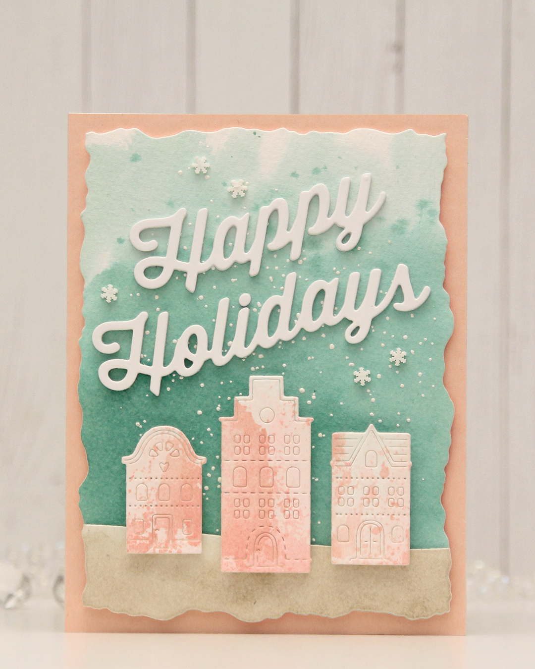 For this card, I really tried. I chose a color combo of Pebble, Ballet Slipper, Brickyard, Cranberry, Cobblestone and Tidepool from C9. I wanted to focus on Ballet Slipper, Cranberry and Tidepool for the Gummiapan diecut houses, but Tidepool and Ballet Slipper created mud when they mixed, while ink smooshed Cranberry looked like an episode of Dexter. I switched gears and ink smooshed Ballet Slipper on its own on watercolor paper. When it dried it looked like Grapefruit. So much for not using peach tones. I watercolored a background using Tidepool reinker and did the same with Pebble reinker on a separate piece of watercolor paper. Once dry, I die cut the Pebble piece with a curved landscape die from the Slim Card Basics die set from Mama Elephant, then layered the two pieces together and die cut them using the largest die in the Watercolor Rectangle STAX die set from My Favorite Things.
 I sprinkled on Chunky white embossing enamel from Stampendous onto the background, heat set it so the granules melted to look like snow, adhered the slope with 1 mm foam squares and mounted the entire panel onto a card base that I covered with a piece of Nectar cardstock from Concord & 9th. I tried Grapefruit first, but felt it was too dark against the background. I mounted the houses using foam tape, die cut and stacked four layers of Happy Holidays from the Jolly Holidays Greetings die set from Concord & 9th and adhered the greeting at an angle above the houses, before finishing off with Snowdrift Sprinkles from Little Things from Lucy’s Cards.
