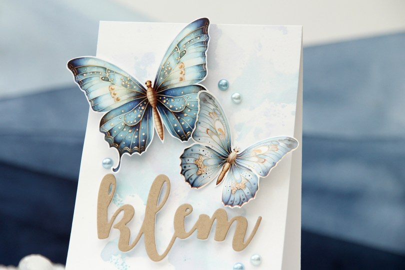
Hi, crafty friends. I’m back today with a card made for the Kort & Godt galleri blog. They’ve just released some new image sheets, and these butterflies stole my heart, I love them! And they’re blue (there’s one with a more green vibe too)!!!
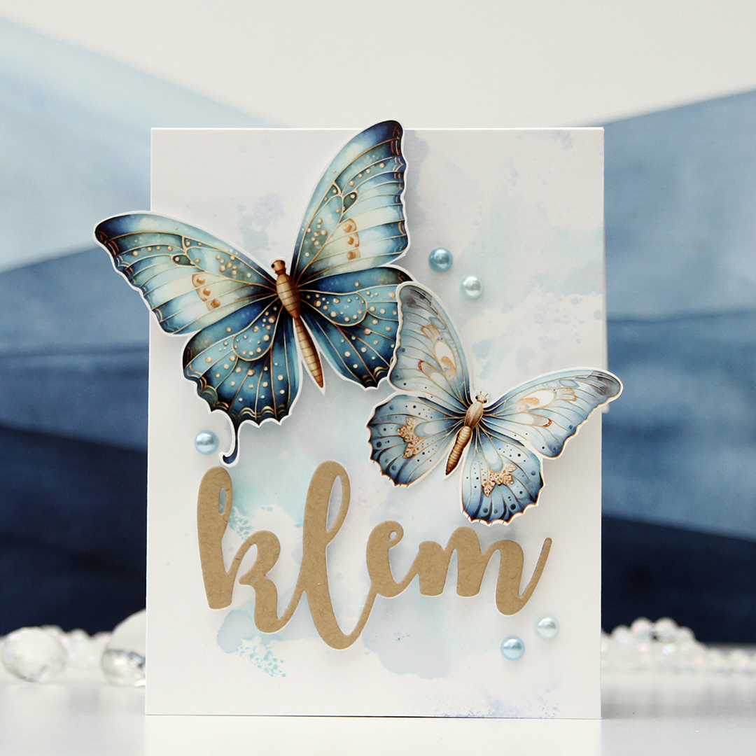 I started by ink smooshing Harbor ink from Concord & 9th onto a panel of Stamper’s Select White cardstock from Papertrey Ink. This ink color is very interesting when you get it wet, it shatters into a sky blue and a very purply blue, making it look like I used more than just the one color of ink. The butterflies look painted, so I thought the ink smooshed background was a natural choice.
 I fussy cut the butterflies and bent the wings backwards. I glued the bodies directly to the card front and put foam squares on the back of the wings to give them a little lift (since taking these photos, I’ve adhered the body of the big butterfly directly to the card front, but it’s kind of floating here). I used a hug die (die 244 Klem) to die cut twice from white cardstock and once from Wheat cardstock from Concord & 9th. I stacked them together, but I felt like there wasn’t enough dimension, so I added foam squares to the back of the layered die cut and adhered it to the card. This gives it more lift and a floating effect that you can’t achieve by stacking die cuts alone. I finished off the card with a visual triangle of pearls that match the butterflies and the inked background.
Kort & Godt products used:
MA1013 (butterflies)
Die 244 (klem – hug)
ST203 (pearls)

 This card started out with me playing with the cotton thread from Kort & Godt. I wanted to something with it besides tying it in bows, and crocheting came to mind. I crocheted three flowers in different colors, and that was my starting point. I created a subtle background using the Watercolor Stripes stencil from Altenew with VersaMark ink, Sticky embossing powder and Distress Glitter in the Rock Candy color. This gives a soft tone on tone sparkle on the white cardstock and doesn’t distract too much from the flowers. I thread the flowers through to the back of the panel, used some tape to hold the thread down on the back and mounted it using foam tape onto a top fold white card base.
 I die cut the leaf circle die twice; once from vellum (I used Heavyweight translucent vellum from My Favorite Things), and once from Sprout cardstock from Concord & 9th. I offset them a bit, and used small amounts of liquid glue to adhere them to the card. I also die cut Konfirmant a few times from pink cardstock and adhered them together for a stacked, dimensional look. Once I added my die cut to the card, however, it got lost, so I die cut a layer from black cardstock from Papertrey Ink and glued that on top. That did the trick. I used a sentiment sticker to complete the sentiment and added some faceted pearls as a finishing touch.
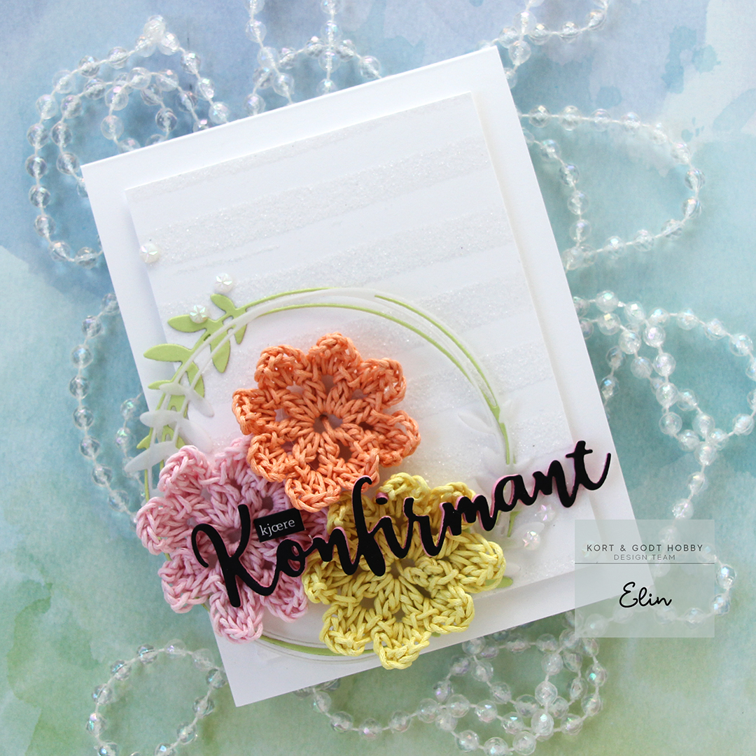 This was a fun way to use the cotton thread, and I still have heaps more!
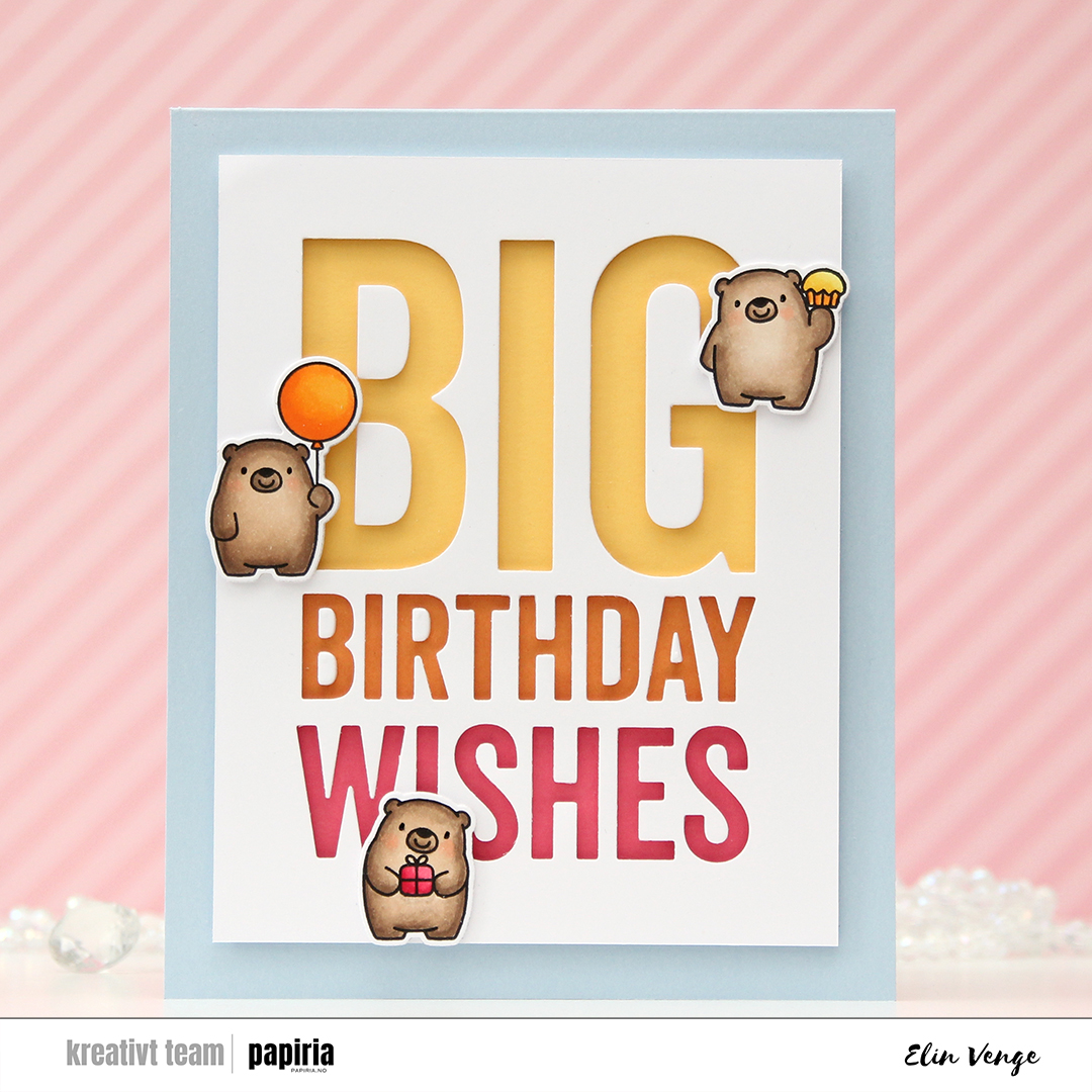 I love the super sized sentiment dies from My Favorite Things. They have several in this style, and they’re great for all sorts of techniques. Today I used the negative of the Big Birthday Wishes die, cut into X-Press It blending card. I normally use this paper for coloring only, but I wanted the white background to match the white trim on my die cut bears, which are colored on the same paper. I added foam tape to the back of my negative die cut for dimension, making sure to keep the counters so I could put them back in. I added a strip of solid colored cardstock from Concord & 9th behind each of the lines in the die cut. I used Honeysuckle at the bottom, Clementine in the center and Buttercup for the top. I then adhered everything to a card base I created from Blue Breeze cardstock from My Favorite Things.
 I stamped the bears from the Bitty Bears stamp set from My Favorite Things and colored them in with Copics and used the coordinating dies to cut them out. I added three white die cuts behind each of the bears for dimension and placed them on the card. I didn’t want to cover up too much of the letters, so I made sure to create a wide border around the die cut words. I also wanted a chunky border around the white, so this card is quite large and measures about 5 1/4 x 6 1/2″.
 At first, I wasn’t sure how to add dimension behind the small counters, especially on the triangle in the A, because it’s very very small, but I wound up putting foam tape behind some X-Press It, then die cut the letters I needed once more to get counters with dimension. It worked really well, so I’ll remember this trick in case I need to do something similar in the future.
 Yellows, oranges and pinks, just like the strips of cardstock behind the letters.
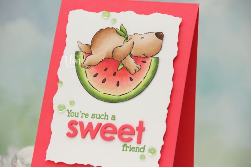
 I colored the image with Copics, fussy cut right up against the black lines and put the image aside while I worked on the rest of my card. I used the second largest die in the Watercolor Rectangle STAX die set from My Favorite Things to cut my white panel down with a fun border. I also used a small circle die to cut a hole behind where I wanted the image to go, as this is a pendulum card. The watermelon rocks back and forth when you tilt the card, which adds a fun element to an otherwise simple design. I stamped part of the sentiment from the
  I used a strip of acetate with a washer at one end to create my pendulum mechanism. On the other end of the acetate strip, I added a button. I lined up my acetate piece on the back of my white die cut panel so the button would go through the hole and adhered the image to the button using liquid glue. I put foam tape on the back of the panel, making sure to leave enough open space for the pendulum to swing freely, then adhered everything to a top fold note card I created from Fire Coral cardstock from My Favorite Things, which is the same color cardstock that I used for the die cut letters. To finish off the card, I added sequins from the Waterfall mix from Little Things from Lucy’s Cards, making sure to place the top ones so Flappy wouldn’t catch when he rocks. Of course, you can’t see him rock in still photos, but if you head to my post on
  Simple color palette for this one.
 I stamped one of the images in the stamp set using black ink and used the coordinating layering stencils to color it in. It’s no secret I’m a fan of Copic coloring, but this was soooo much faster, and maybe it’s okay to cheat a little once in a while. I used the Dried Petals set of inks for the pink in the flowers and the Forest Trail set for the green. For the yellow I used Sunflower and Buttercup inks from Concord & 9th, as I don’t have yellow inks from Altenew.
 I created a card base from Sno Cone cardstock from My Favorite Things and used the Angled Mosaic 3D embossing folder from Altenew to add some texture and interest. I mounted my flowers in the bottom center using foam tape, then added a black sentiment sticker strip from Kort & Godt with a couple of layers of cardstock behind it for a little bit of lift, before finishing off the card with Sparkle & Shine ombré glitter drops from Pinkfresh Studio.
 The RAM Stamps digital images always come in sets of two, where one has black lines and the other has grey lines to make it easier to print images for no line coloring. I wanted to change things up for this card and decided to pair the two versions. I layered them in Photoshop (the black lined one on top) and erased the background in the black lined version, only keeping the lines for the duck, the fairy and the large flower. I kept the no line version intact and printed my image. This way, I had dark lines for the focal point and soft grey for the remaining scene. I love the look of this.
 I colored the part of the image that had the black lines using Copics, keeping the rest uncolored. I stamped a sentiment from the Itty Bitty Gifting stamp set from My Favorite Things directly on the panel using Obsidian ink from Altenew, then added a hugs word above, created using the Sweet Sentiments die set, also from Altenew. I die cut a few from white and one from a piece I’d colored with one of the Copics I used for the image. I still had the sentiment stamp mounted in my Misti, so I could stamp on top of the die cut for a continuous sentiment. I cut my panel down slightly and adhered it to a panel of Wildberry cardstock from Concord and 9th, adhered it all to a white card base and finished off the card with a few sequins from the Starry Night mix from Little Things from Lucy’s Cards.
 The image is simple, but I still went overboard with the coloring for this. It happens.
 The weather’s finally improving, and things grow greener and greener with every passing day, so I thought a floral background would be perfect for this card. I die cut masking paper using the Lenten Rose mini slimline die from Crafty Meraki. I had to do quite a bit of puzzle piecing of the masking paper to ink up the different sections in different colors, but I think the end result is worth it. The colors I used are all from Concord & 9th, they are Wildberry, Sweet Pea, Sunflower and Harbor.
 I printed the image on X-Press It blending card and colored it with my Copics. I pulled out my RV90 series, which I used to use a lot ages ago, but haven’t really used much in recent years.
 Once my coloring was complete, I decided to cut off quite a bit on the right hand side of the panel, which meant doing some fussy cutting around the flowers. I don’t mind fussy cutting, and cutting on the border like this makes for a more dynamic design. Along the right hand side of a top fold card base, I adhered a scrap strip of patterned paper from the Vintage Romance collection from Maja Design, then popped my colored panel on the left.
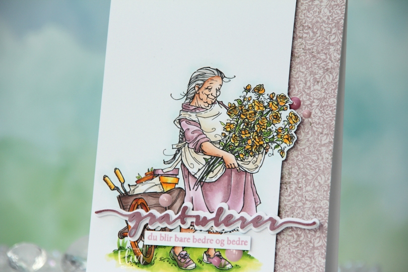
 I die cut the Gratulerer 6 die from Papirdesign a few times. I die cut the shadow layer in white, then a few stacked of the word, before finishing off with a colored one. I actually colored this one with Copics on the scrap I cut off the panel. This is a neat trick if you want your colors to match, but don’t have the right cardstock color. I stamped a sentiment from the A06 stamp set from Norsk Stempelblad AS using Briar Rose ink from Concord & 9th, cut it down to a strip and adhered it below the die cut, adding a few strips of cardstock behind it for dimension. I finished off the card with a few enamel does from the Shades of Purple pack from Altenew.
 Using patterned paper from Craft Consortium along with a stamp, die and a few sentiment sticker strips from Kort & Godt, I created an envelope to match.
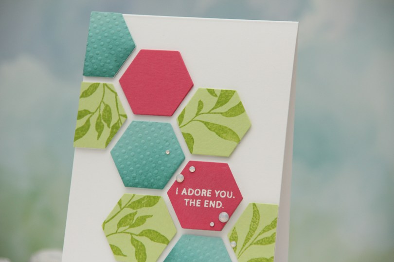


 After adhering everything to my card base, I cropped the card down slightly. It matched my design better, so this card is 4 x 5 3/8″. I added
  The dimension makes it look like these hexagons are floating on the front of the card, and the pink one with the sentiment is floating a bit more than the rest.
 I separated the image into two, so I could create staggered postage stamps on my final card. I colored the images with Copics, and used the Postage Collage die from Waffle Flower to turn them into postage stamps. I also die cut a third postage stamp and stamped the sentiment in the center of it using Obsidian ink from Altenew. The sentiment itself is from the Easter Bunnies stamp set from Simon Hurley. Once I knew the sentiment was dry, I masked off the edges of the postage stamp and ink blended the center rectangle using Grapefruit ink from Concord & 9th.
 I cut down a sheet of Powder cardstock from Concord & 9th to fit the front of an A2 card, and used the Linen & Canvas impression plate from Papertrey Ink to add some subtle texture to the background. I adhered it to a white top fold card base and arranged my postage stamps, adding various thicknesses of dimension behind each for some interest, before finishing off with a few pearls from Little Things from Lucy’s Cards.