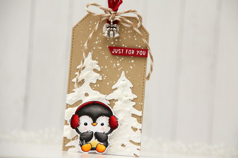
Hi, crafty friends. I thought I’d share a gift tag today, featuring this adorable penguin from Lili of the Valley. If you know me, you know I can’t resist a penguin, and the Lili of the Valley penguins are soooo darn cute!!
 I colored him with Copics and fussy cut him leaving a white trim around the edges. This particular image would be easy to cut up against the lines, but the wispy lines so characteristic of Lili of the Valley images would be lost, so I opted for the white border. I put black glaze pen in his eyes for shine, and then a dot of white using a 05 Gelly Roll, and put him aside while I worked on the rest of my tag.
 I used a die from the Stitched Traditional Tag STAX die set from My Favorite Things to die cut from Classic Kraft cardstock from Papertrey Ink. I sprinkled Chunky White embossing enamel from Stampendous on top and melted it from behind for a snowy background look.
 I used the Silhouette Snow Trees die set from Mama Elephant to die cut trees from Stamper’s Select White cardstock from Papertrey Ink, before I added some snowy texture to them using a Snow Pen from Rayher.
 I stamped and white heat embossed Just for you from the Christmas Greetings stamp set from Lili of the Valley onto a piece of Amarena Cherry cardstock from My Favorite Things, before using a banner die in the Everyday Gift Box die set from My Favorite Things to turn it into a nice strip. I added a couple of layers of cardstock behind it for dimension and adhered it to the top right of my tag.
 I used some ribbon and twine from my stash, as well as a charm, to finish off the front of this tag. The ribbon, banner and the penguin’s earmuffs create a visual triangle of red elements on this otherwise very neutral tag.
 I die cut the same tag from white cardstock to use on the back. I added a couple of kraft colored branches that I die cut with the Pine Branches die set from Craft Emotions, as well as a to/from from the Tag Builder Blueprints 6 die set from My Favorite Things.
![]() Lots of colors for this little penguin.
Lots of colors for this little penguin.

 I colored the strawberries and fussy cut them right up against the black lines. I put them aside while I worked on the rest of my card. I created a top fold landscape A2 card from Stamper’s Select White cardstock from Papertrey Ink, used the Number Jumble background stamp from My Favorite Things to stamp on the front with VersaMark ink, then heat embossed using Iridescent Sparkle embossing powder from Judikins. I ink blended on top of the embossing in the center using Grass Field and Limeade inks from Altenew, as well as Squeezed Lemonade Distress Ink from Ranger.
 Into a separate panel of white cardstock, I die cut the letters SWEET using the Impact Alphabet dies from My Favorite Things. I stamped a sentiment from the Scripty Bday stamp set from Mama Elephant below using Wild Cherry ink from My Favorite Things. I cut the panel down slightly, added two more layers of cardstock behind it for dimension and adhered it to the card front. I adhered one of the strawberries using liquid glue, popping the other one up using foam tape for dimension, before finishing off the card with a few bubbles from the Festivities mix from Little Things from Lucy’s Cards.
 I knew I wanted lots of green on this card, and as soon I was done coloring skin, hair and the ground, I grabbed a few green combos and colored in all the elves. I hit a bit of a snag when I got to Mrs. Claus’ dress, because I felt like there were no good color options. Grey would have been boring, brown would have been sad, red wouldn’t work with the amount of green I had and I felt a little lost, to be honest. Color buddy Liz to the rescue. She suggested the RV90s, and they worked beautifully. I’ve combined RV90s with green plenty of times in the past, but usually for florals, and I have to admit it’s been a while, so it was fun to use an old classic again.
 Once the coloring was complete, I used the largest die in the A2 Double Stitched Rectangle STAX die set from My Favorite Things to create a nice detailed edge around my panel and adhered it to a top fold card base I created from Autumn Rose cardstock from Papertrey Ink. I used most of a mini doily from Doodlebug in the top right corner of the card for a little bit of soft texture, and added a small scrap of the same doily in the lower left corner for a little bit of balance. I used a tag die from the Everyday Gift Box die set from My Favorite Things to create my tag, and stamped and white heat embossed a sentiment from the Mini messages stamp set from Mama Elephant in the center of it. I tied some Green Apple Divine twine into a bow and mounted the tag using a couple of foam squares before finishing off the card with a few gems from Crafty Meraki. These are the Green Illusion Sparkle and they change color when you tilt them in the light. They appear green and somehow shift to a pink/purple tone, they’re really cool, and the colors worked perfectly for this card.
 Lots of green for this one. I used four different green combos to color in the elves so they wouldn’t all look the same. I also used RV97, a color I’ve created myself, for the dress on Mrs. Claus.
 I colored the characters with Copics, fussy cut them leaving a white border, then added black glaze to their eyes and then a white dot on top with a Gelly Roll 05. Rudolph got special treatment with a little bit of Glossy Accents on his nose for additional shine.
 I used the Slim Card Basics die set from Mama Elephant to create my window panel. I die cut one from Blueberry Sky cardstock from Papertrey Ink and four white ones that I adhered behind it for dimension. I die cut the bigger scalloped rectangle in the Slim Card Basics set from Spring Rain cardstock, also from Papertrey Ink, and adhered it to a white card base.
 I used the Silhouette Snow Trees die set from Mama Elephant to create white trees to go into the window openings behind my characters.
 I stamped a sentiment from the
  I finished off the card with a few pearls from the Glossy Porcelain mix from Little Things from Lucy’s Cards.
 I love dimension on my cards, and this one certainly has that.
 Between the shine on Rudolph’s nose, all the blue and all the dimension, this card makes me happy. I just wish it was easier to photograph slimline cards.
 I used way too many Copics for these three.
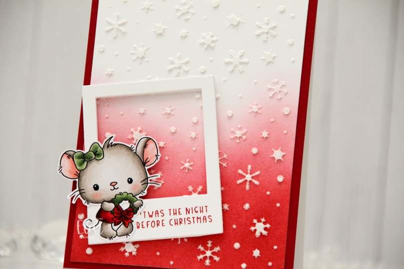
 I colored the mouse with Copics and fussy cut her, leaving a thin white border. I used a black Glaze pen to create some shine in her eyes, and once the black was dry I added a dot of white using a Gelly Roll 05.
 Onto a white cardstock panel, I ink blended Amarena Cherry and Wild Cherry inks from My Favorite Things for an ombre effect. I then used a die cut as a stencil to add some snowflakes to the background with modeling paste from The Crafter’s Workshop. The die I used to die cut the makeshift stencil is the Snowflake Confetti fancy die from Hero Arts, which is one of my all time favorite Christmas/winter dies.
 I cut the ink blended panel down a little and adhered it to a panel of Amarena Cherry cardstock from My Favorite Things that covers the front of a top fold white card base I created from Stamper’s Select White cardstock from Papertrey Ink.
 From white cardstock, I die cut the Polaroid Shaker Frame die from My Favorite Things five times for a stacked look, stamping a sentiment from the Christmas Greetings stamp set from Lili of the Valley to the top layer using Amarena Cherry ink from My Favorite Things. I added the cute little mouse on top of the frame, and my card was complete.
 If you look closely, you can see the shine in the eyes in this photo.
 I changed the color of the words monkey see in Photoshop before printing the image. I then colored the image and letters with Copics and used the largest die in the Wonky Stitched Rectangle STAX die set from My Favorite Things to create some interest to the edges, as I was planning on leaving lots of white space.
 I adhered the panel to a top fold A2 card base I created from Ocean Tides cardstock from Papertrey Ink. I love this cardstock color, it’s great for every kind of card.
 I used the Fab Foliage die set from My Favorite Things to die cut different leaves in different colors of cardstock. I used Ocean Tides (it really works for everything), Green Parakeet and Spring Moss, all from Papertrey Ink. I even threw in some that I die cut from Heavyweight Translucent vellum from My Favorite Things.
 I cut some of the leaves down to fit my card and used a tiny bit of liquid glue at the base of each stem. This way the leaves have a bit of lift off the card, which also adds a little bit of interest.
 I finished off with crystals, sequins and pearls from the Starry Night mix from Little Things from Lucy’s Cards.
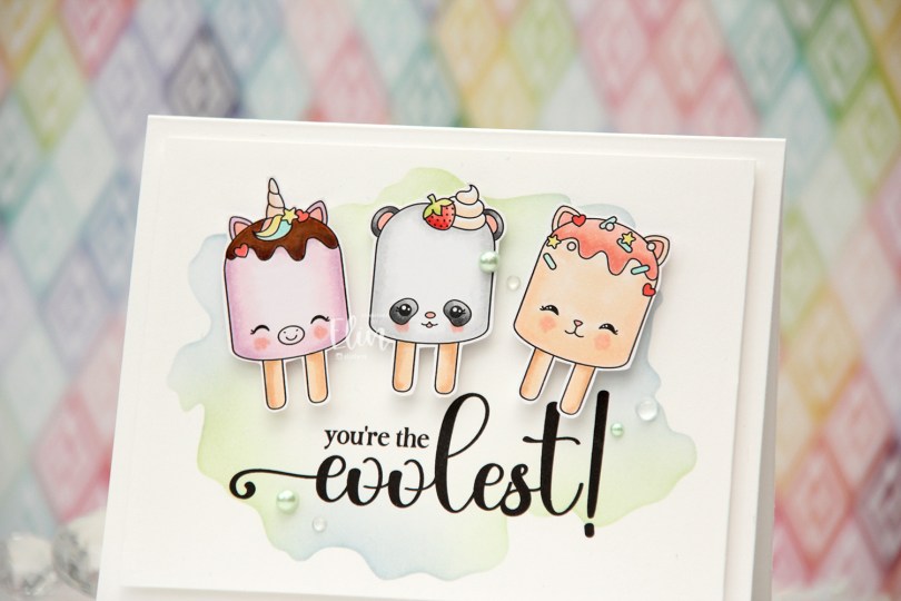
 I’ve made a cool card (pun intended) with the
  Using the Watercolor Wash Free Form stencil from My Favorite Things along with Icy Water and Frayed Leaf inks from Altenew, I did some very soft ink blending to create a little bit of interest to my background. I then ran the panel through my printer to add the sentiment, chopped off a little on each side of the panel and mounted it onto a top fold card base I created from Stamper’s Select White cardstock from Papertrey Ink.
 I put foam tape on the back of each of my popsicles and adhered them above the sentiment.
 I finished off the card with pearls, crystals and dew drops from the Fresh Mint mix from Little Things from Lucy’s Cards.
 Soft color palette for this one.
 The design of these snowmen peeking out from behind something offers so many possibilities for fun card designs. For my previous card using one of these, I created a tri fold card with the snowman peeking out behind one of the flaps. This time, I have a snowman sticking out above the top of the card.
 I colored my snowman with Copics, cut away everything below the line in the image and adhered him to the top of a quarter sheet of Stamper’s Select White cardstock from Papertrey Ink, before cutting around him.
 I adhered my panel to a top fold white note card I created from Stamper’s Select White and cut off the bottom of the card, so that it’s 5 1/2″ tall including the snowman.
 I glued on white snowflakes all across the front. I used the Snowflake Confetti Fancy die from Hero Arts and die CR1335 from Marianne Design to create the snowflakes. I like the white on white look. This adds a tiny bit of dimension and interest to the background.
 I then used the Big Happy Holidays die from Mama Elephant to die cut five times from Blue Yonder cardstock from My Favorite Things, before stacking them and adhering my chunky die cut in the center of the card.
 I stamped and white heat embossed Let’s be jolly! onto a strip of Enchanted Evening cardstock from Papertrey Ink. The sentiment is from the
 Meet
Meet  I paired them with sentiments from the
  There are some differences between these. Kale is stamped and colored on the tag, while Flo is fussy cut and popped up. I used similar techniques for the background, but kept a lot of the same elements across both tags.
 For Kale, I masked him off and ink blended around him using Coral Bliss and Pink Pearl inks from Altenew, as well as Scattered Straw Distress ink. I used the largest die in the Stitched Traditional Tag STAX set from My Favorite Things to turn him into a tag and then used the Falling Snow stencil from Simon Says Stamp with Light & Fluffy Modeling Paste from The Crafter’s Workshop to create snow coming down. I used Snowfall Grit-Paste from Ranger at the bottom of the tag and sprinkled on Rock Candy distress glitter before the paste dried. I then added a snowflake charm and some ribbon at the top of the tag and tied it together with Cotton Candy twine from Whisker Graphics.
 On the back of the tag I did soft ink blending using the same colors and stamped a to/from stamp from the B06 stamp set from Norsk Stempelblad AS using Coral Bliss ink from Altenew.
 Not a lot of colors used for this adorable bunny.
 I used the same tag die, stencil, paste and inks for blending on this tag, but decided to add a little extra. I die cut the Silhouette Snow Trees from Mama Elephant from Stamper’s Select White cardstock from Papertrey Ink, and on the trees I added Grit-Paste and Rock Candy Distress Glitter.
 I let the trees dry, used liquid glue to adhere them to the tag and added Flo on top using foam tape.
 I also used foam tape on the back of the speech bubble and used ribbon, a snowflake charm and some twine at the top for this one too.
 Another stamp from the B06 stamp set from Norsk Stempelblad AS on the back of this one.
 I used very bright colors for Flo.
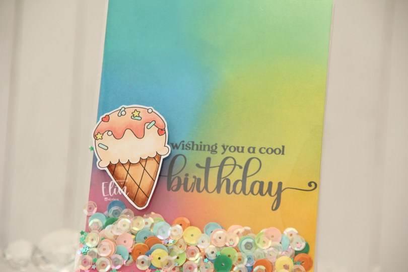
 Everyone loves ice cream, right? I colored up this one using my Copics, and fussy cut around it leaving a thin white border. The border makes it stand out against the colorful ink blended background.
 Speaking of backgrounds – I ink blended Distress Oxide Inks (Peacock Feathers, Cracked Pistachio, Twisted Citron, Fossilized Amber, Picked Raspberry and Salty Ocean) across a quarter sheet of Stamper’s Select White cardstock from Papertrey Ink. I heat set the panel to make sure it was dry, before running it through my printer to add the sentiment.
 The large stamp storage pockets from Avery Elle are 5 1/2″ wide, making them perfect for full A2 size shaker cards. I cut slivers off the panel to make it go in a little easier, then turned it on its side and put it at the bottom of the storage pocket. I cut the pocket down to about 5″, scored at the 4 1/4″ mark and folded it over. I actually cut the back of the storage pocket at the 4 1/4″ point to make it easier to fold. I cut the corners of the remaining flap, filled the pocket with sequins and confetti and glued the pocket shut on the back, before adhering it to a top fold card base I created from Stamper’s Select White cardstock from Papertrey Ink.
 I added the ice cream on top of the shaker pocket using foam tape, and that finishes the card. The sequins and confetti I used are a mix of different brands. The opaque ones are from Studio Calico, and I’ve probably had them for almost 10 years, the same with the iridescent cream colored sequins. Those are from UiT Hobby, and the little star confetti is from Søstrene Grene, they’ve also been in my stash for many years.
 Simple color palette for this one.