Hi, crafty friends! I’m back today with a confirmation card I made on commission. I was told that the recipient does kickboxing, likes car races, swimming (lake or beach doesn’t matter as long as it’s water) and is a bit of a prankster. Lots of interests that I tried to incorporate into my card. They’re all very different interests, so I had a tough time figuring out what to do, but the card was a huge hit with the recipient, and that’s never a bad thing.
 I looked for a kickboixng image I could color up, as I wanted that to be the main focus on the card – it was his main hobby. I didn’t have one, nor could I find one, but I found this greyscale sketched image with boxing gloves that was perfect.
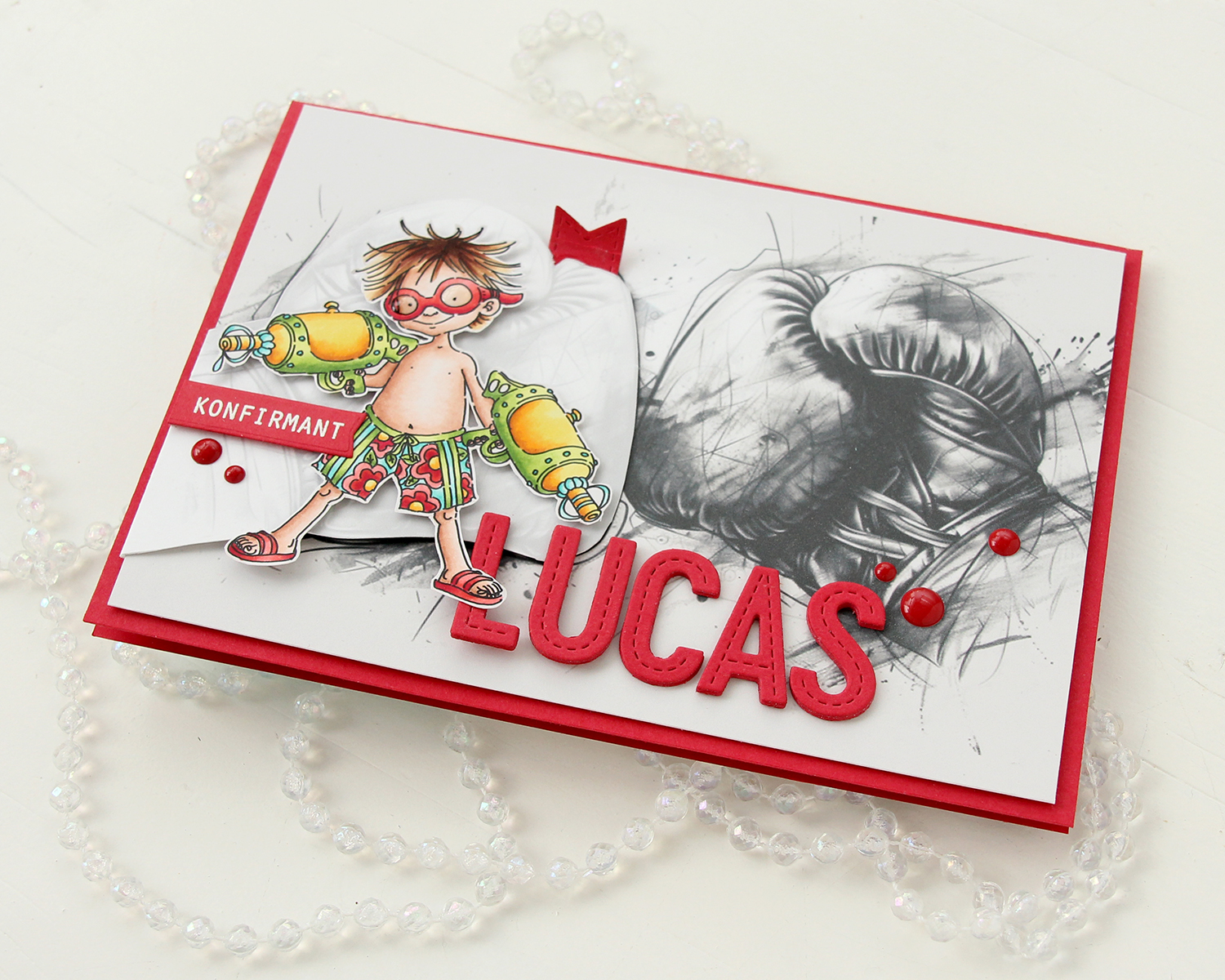
 The gloves cover the entire front of the card. I still needed something to color, because a black and white image isn’t very interesting on its own. I settled on Blast from Mo Manning, which was the perfect image for a prankster who loves water. I colored it up in very vibrant colors, making sure to include some red, which I thought would work great with the boxing theme AND the car racing theme. I fussy cut him and placed him on top of one of the gloves. He blended in with the background a little too much, so I decided to print the gloves again, this time with a very low opacity. I fussy cut the glove, scored it on one side and made it into a flap that opens. Put the colored image on top of this one, and now it didn’t get lost in the background. I also added a bit of Glossy Accents to the goggles for a bit of shine.
 I mounted the colored image on pieces of foam tape, making sure to add a magnet in a strategic spot to keep the flap from opening on its own. I put another magnet behind the image of the gloves to keep both magnets hidden. They’re still plenty strong enough to work through a couple of layers of cardstock.
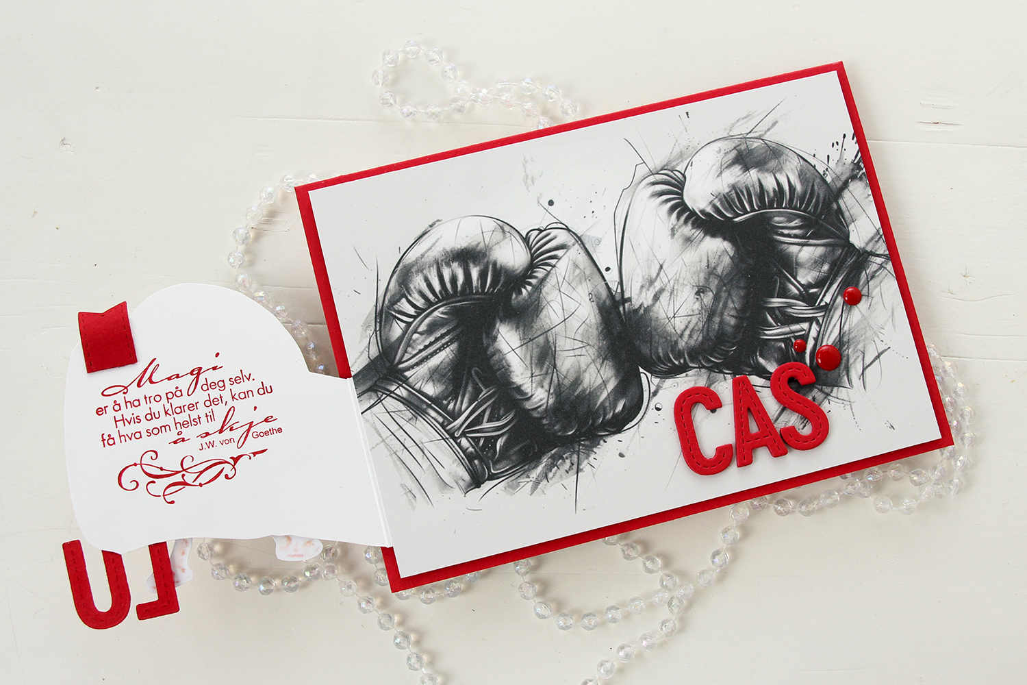 Once you open the glove fully, there’s a sentiment from an old confirmation stamp set from Stempelglede, stamped in Wild Cherry ink from My Favorite Things. I used one of the dies in the Essential Stitched Sentiment Strips die set from My Favorite Things to create a flag end to pull the glove open when the card is closed. The magnets are so strong, it won’t open on its own, and by adding the little flag end, it gives the recipient a little clue to look behind the glove.
 Back to the front of the card when it’s closed. I stamped an white heat embossed the word KONFIRMANT from the A05 stamp set from Norsk Stempelblad AS onto a piece of Red Hot cardstock from My Favorite Things, and then die cut it using a banner die from MFT – they have lots! I popped it up and made sure the end crossed into the image, to tie the two together. I did the same thing with my letters, die cut using the In Stitches Alphabet die set from My Favorite Things, also from Red Hot cardstock. I stacked a few layers for dimension and stability, the L and the U are only barely attached to the glove and the back of his left leg, so they needed a little bit of strength.
 I finished off the front with a few red enamel dots from Papirdesign.
 On the inside, I printed and cut out a checkerboard pattern, which I thought worked well with the car racing theme. There’s still plenty of room to write a personal message. I also used the Wax Seals die set from Waffle Flower to create a rosette badge with a Norsk Stempelblad AS confirmation sentiment heat embossed in the center. I used the Itty Bitty Strips dies from My Favorite Things to create the ribbon ends hanging down from the actual rosette.
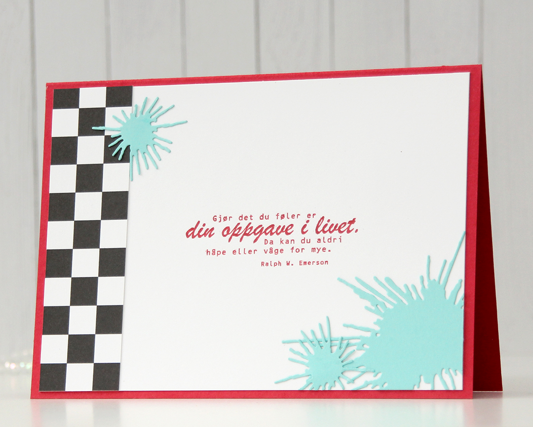 On the back of the card, I used more of that checkerboard pattern, stamped another confirmation sentiment (it’s actually an Emerson quote) and used the Splash die set from Papirdesign to create some water splashes from Summer Splash cardstock from My Favorite Things. I thought they tied in well with the super soakers in the colored image on the front of the card.
 A simple color palette to finish off. This card was a hard nut to crack, but once I got going I had a blast (no pun intended) creating it.
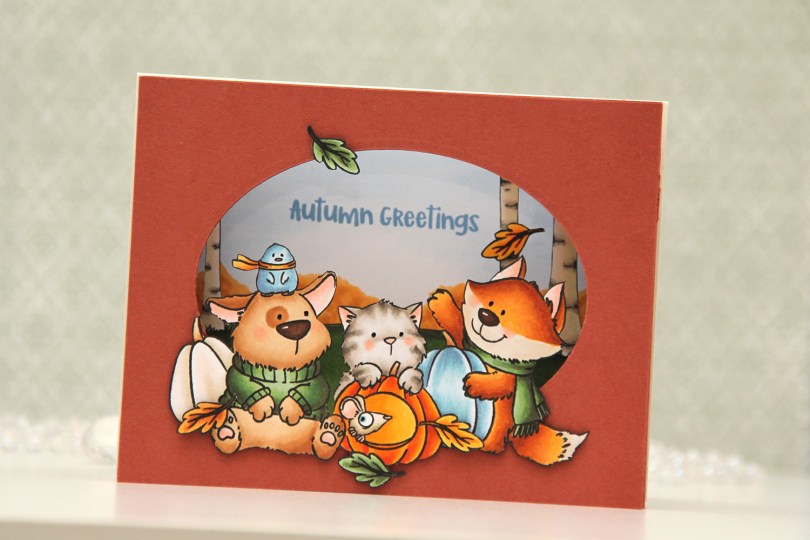
 I stamped my images (both the critters and birch tree background) on separate panels of X-Press It blending card with Copic friendly ink, colored them in and fussy cut them. Before fussy cutting the critters, I actually stamped over my initial stamping with Obsidian ink from Altenew, which gives super black lines that are extra crisp. It’s a pigment ink, though, so it needs to be stamped after the coloring. I also colored a sky and some bushes on a separate panel, where I stamped my sentiment in Blueberry Sky ink from Papertrey Ink. I cut an oval into a panel of Americana cardstock from Papertrey Ink using an old oval die from Spellbinders (Petite Ovals Large) and then created two pieces of accordion folds in the same color cardstock. I glued my background with bushes and sky to the back of the accordion pieces, the birch trees in the center, and the panel with the oval window in front. I mounted my critters using foam tape and used black glaze pen for the eyes. I then adhered my accordion to a top fold card base I created from Rustic Cream cardstock from Papertrey Ink.
 I used a lot of Copics for this one. I even used B20, which is a color I’ve created myself using an empty marker, B21 reinker and blender reinker.
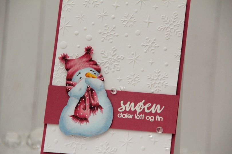
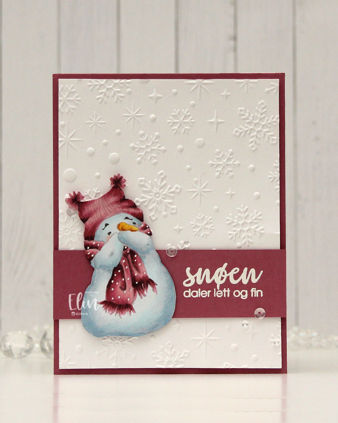 I went for a no line version this time. This is probably my most used image from Mo, and I love how easy he is to color. I chose a pink color combo that I really like, and I think this could work both as a holiday card and as a general winter card. I added the dots back into his scarf using an extra fine white Sharpie, and then fussy cut him. He’s pretty easy to fussy cut, too. I used the Sparkling snow embossing folder from Simon Hurley (Spellbinders) on the background for some texture. I love the detail this embossing folder gives, and they’re proper six pointed snowflakes and not the weird 8 pointed ones that some companies make. Real snowflakes never have eight points, they always come in multiples of six. It has to do with the way water molecules are formed and then bind together. Anyway, it’s a great embossing folder and it adds interest to an otherwise plain background.
 I trimmed my embossed panel slightly, added a couple of layers behind it and adhered it to a card base covered with a panel of Autumn Rose cardstock from Papertrey Ink. On a separate piece of Autumn Rose cardstock, I stamped a sentiment from the Snøstorm stamp set from byCino using VersaMark ink, before sprinkling on super fine detail embossing powder from Ranger and melting it until it was smooth. I cut my sentiment down to a wide strip, added a layer to the back of it for a little bit of dimension, then put a couple of additional layers behind the snowman before gluing him down and finishing the card with a few sequins from the Assorted Moonshine mix from Simon Says Stamp.
 Simple color palette for this one.
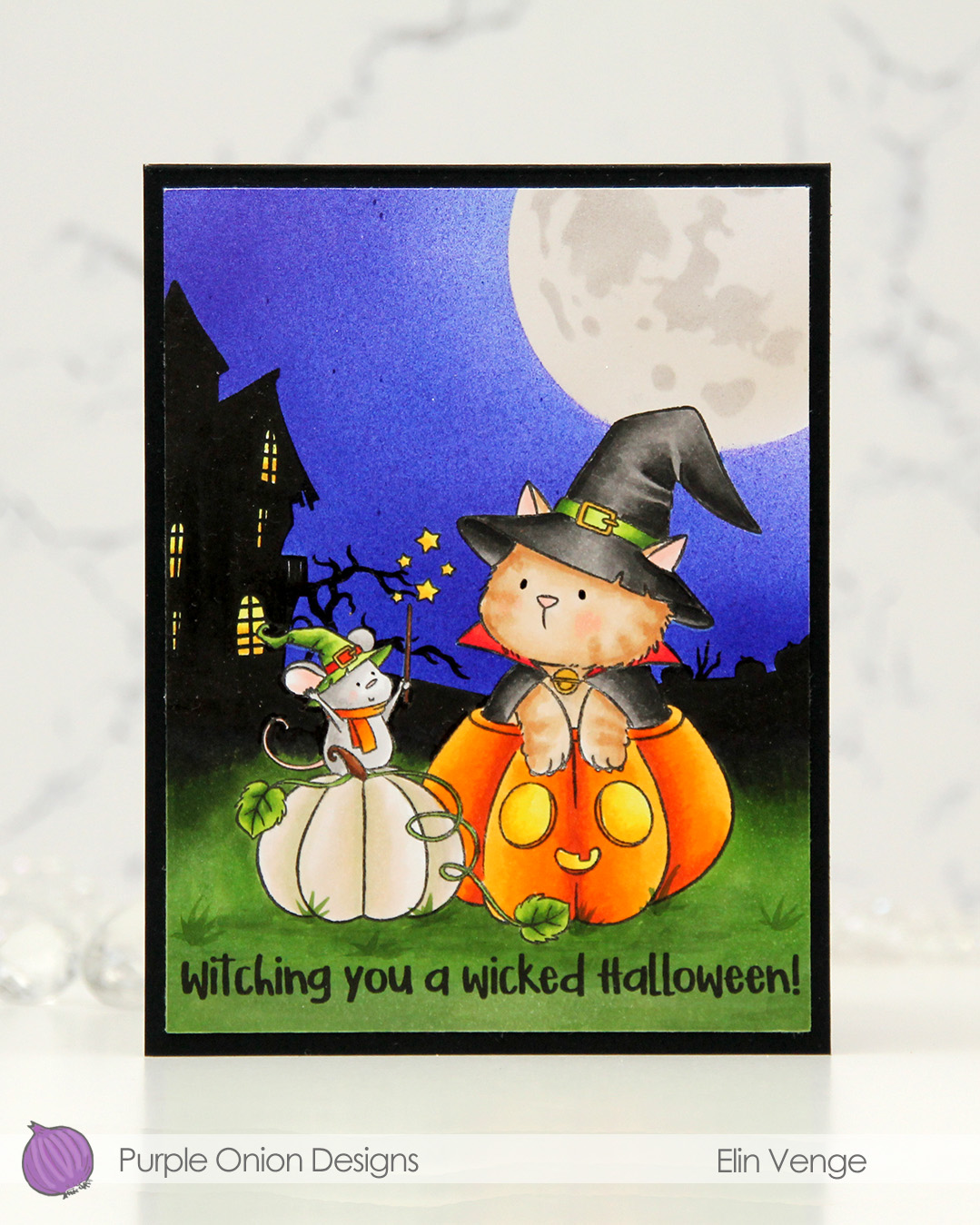 I stamped the image near the bottom center of a panel of X-Press It blending card using Extreme Black ink from MFT, which is a Copic safe hybrid ink. I colored the image and created a spooky silhouette background which fades from black in the distance to green as you get closer to the front of the image.
 I masked off the scene and put a moon mask from an old Simon Says Stamp Stamptember collaboration with Tim Holtz into the top right corner, before I went in with Copics and an airbrush to create the sky. I used three colors of blue, trying to make it a bit lighter near the moon and darker further away. I took off the moon mask, masked the sky and airbrushed into the circle opening using E40 for a very pale moon. I then added the detail mask for the moon and airbrushed the openings with T1, which is a very light grey that I also used for the mouse. Once all the coloring was complete, I removed all the masks, added a bit of black glaze pen to their eyes and stamped a sentiment at the bottom using Obsidian ink from Altenew, before trimming the panel down a little and adhering it to a card base I created from Black cardstock from Concord & 9th to finish.
 I used quite a few markers for this. The ones after the gap are the ones I used for the airbrushing of the moon and sky.
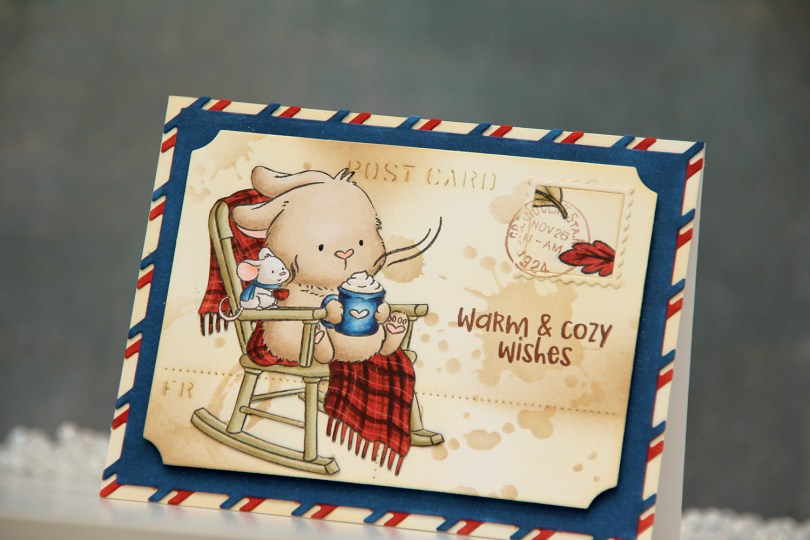
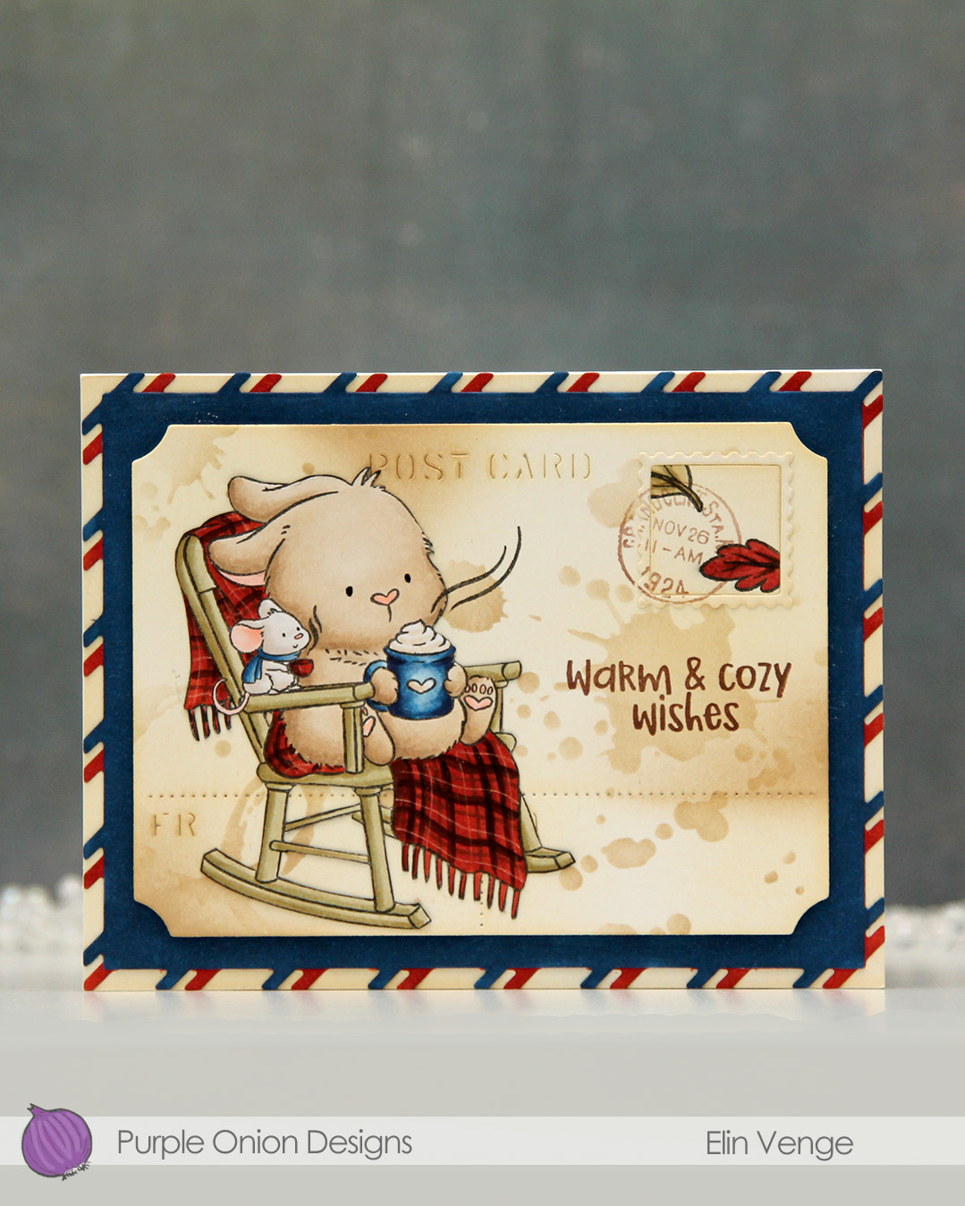 I colored the image with Copics onto X-Press It blending card and fussy cut it right up against the black lines. From another piece of X-Press It, I die cut the postcard shape using the Postcard combo die set from Mama Elephant. I used Peachy Glow ink from Altenew to ink blend across the panel, giving it a vintage feel. I then went in with a stencil from the mini stencil set 3 from Tim Holtz and added the splatter texture using Classic Kraft ink from Papertrey Ink along with a blending brush. In some areas, I added ink with the blender brush without using the stencil.
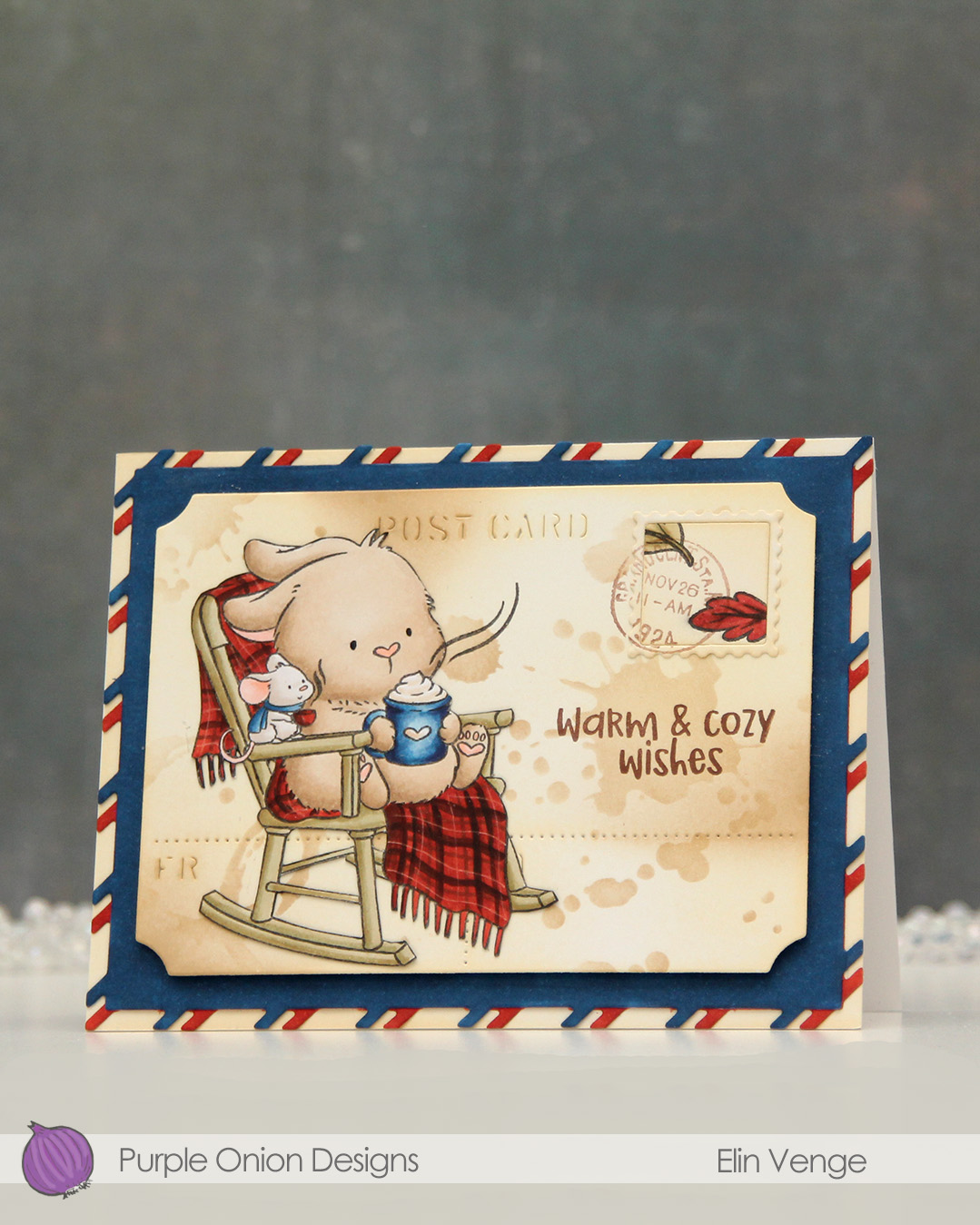 I stamped the leaves from the
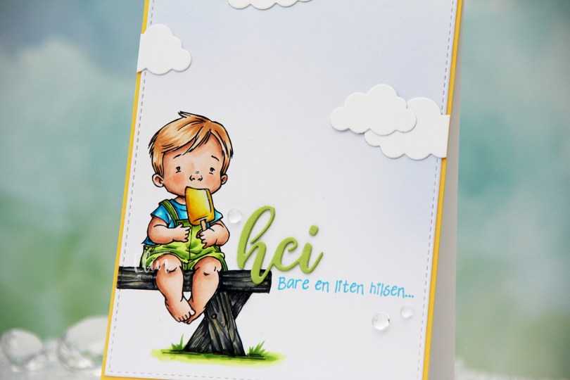
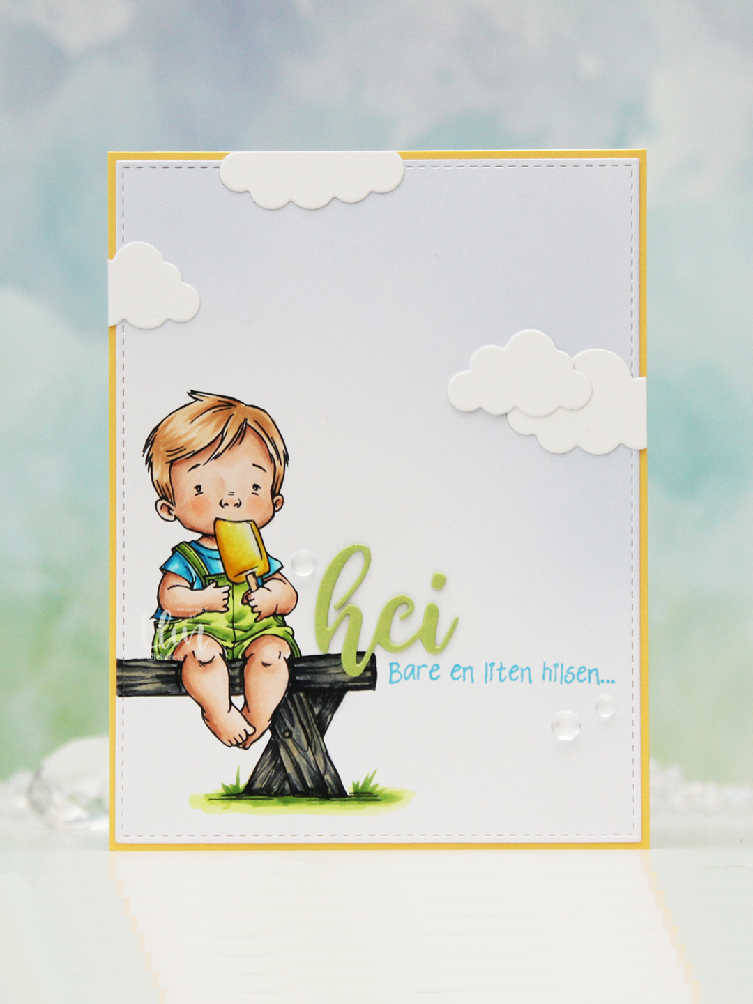 I colored the image with Copics, opting for the cool grays for the bench. I wasn’t planning on making it this dark originally, but when my C9 made a blob, dark was the only way to go. It still works, and I don’t think you can really see where the blob was. I used the largest die in the A2 Stitched Rectangles STAX 1 set from My Favorite Things to trim the panel down a little, then a large blending brush to add some soft blue to the background. I didn’t add any ink to the brush, I simply used whatever was left from a previous project.
 I stamped a sentiment from the Småtekster stamp set from Norsk Stempelblad AS next to the bench using Tide Blue ink from Altenew. I added my colored piece to a panel of Buttercup cardstock from Concord & 9th, which I then adhered to a top fold white card base. I die cut the word hei twice from Green Parakeet cardstock from Papertrey Ink, stacked them and adhered my double die cut next to the boy on the bench before adding a few die cut clouds and some dew drops. Both the cloud dies and dew drops are from Concord & 9th.
 I used quite a few colors for this very simple image.
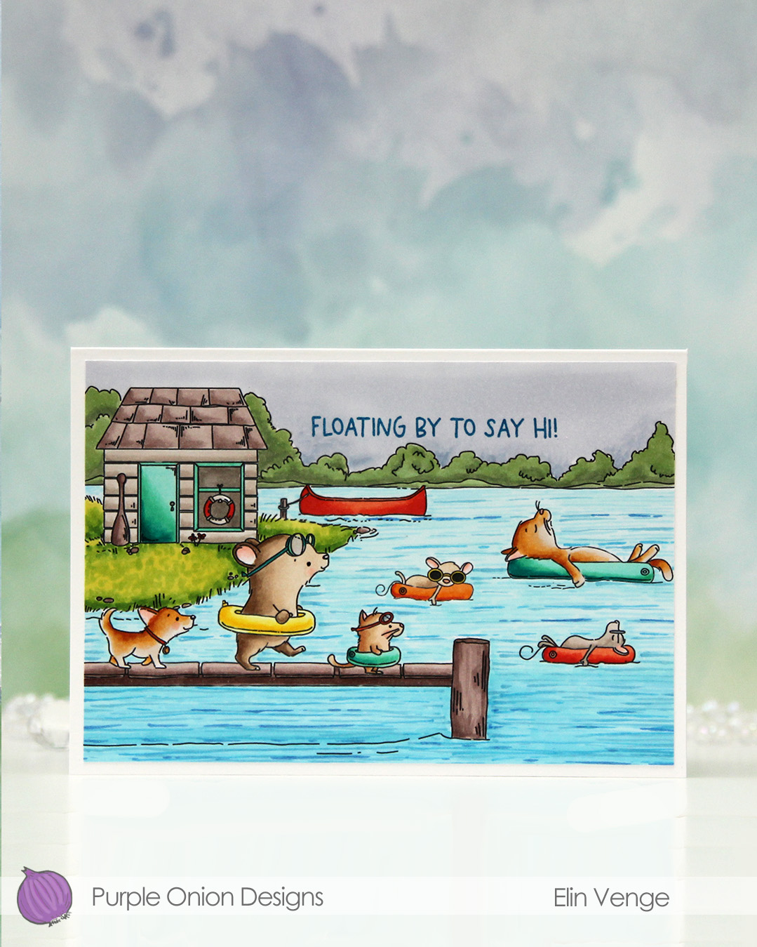 I fit a lot of images into this scene.
  I colored in my scene with Copics, opting for very vibrant colors for all the floating elements and the details on the boat house, while keeping the rest fairly muted. The lake is lighter the further back you get, and the sky is a bit moody off in the distance. I added a bit of black glaze pen to the eyes of the gang on the pier for a little bit of dimension and shine.
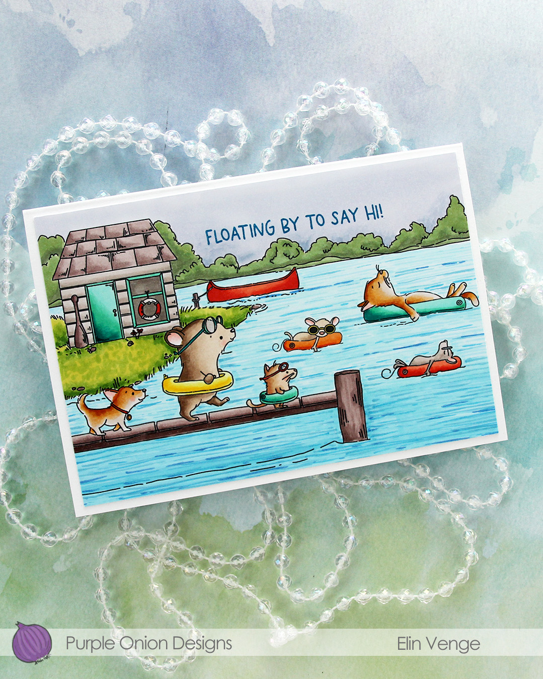 I stamped a sentiment from the
 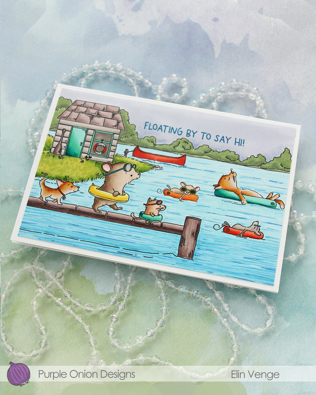 I adhered the panel to a card base that measures 6 1/8″ x 4 1/4″. This is an irregular size for a card, but when I create scenes like this, I let the scene dictate the size of the card. I can always make a custom envelope to fit.
 I used lots of Copics for this one.
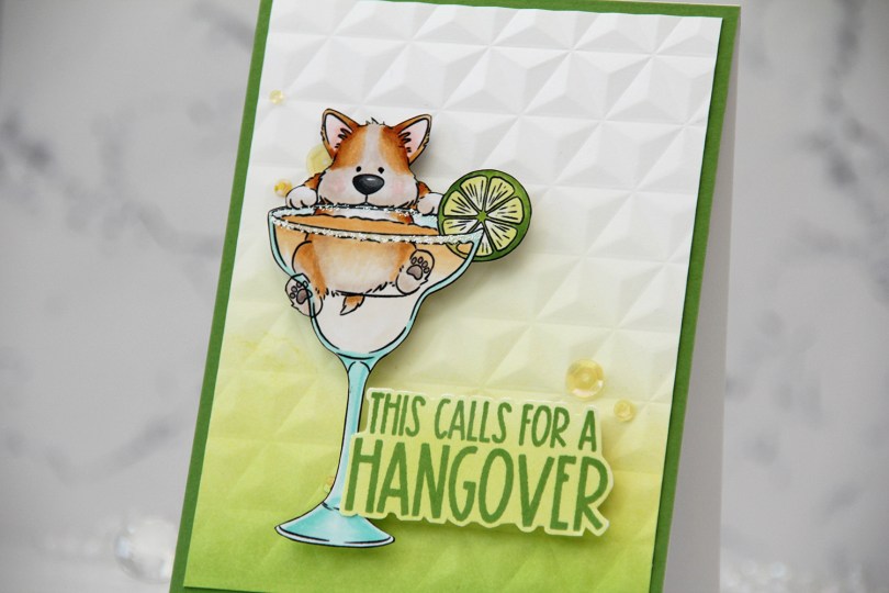
 I knew I had to color up this image as soon as I saw it. This is so adorable with the corgi hanging off the top of the glass. And so funny, and very typical of Pei’s illustration style. I love it!
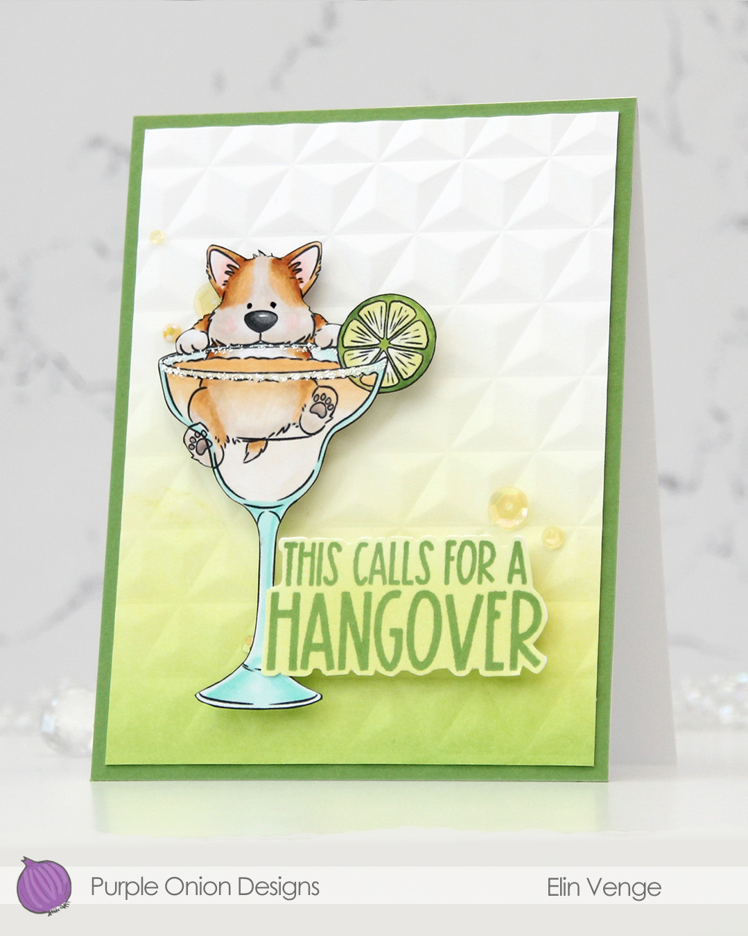 I colored the image with Copics, fussy cut him, then added VersaMarker pen to the rim of the glass and used white puff embossing powder from Wow! to mimic a salt rim. The embossing also adds some fun texture to the glass. I also used a black glaze pen to add a little bit of shine and dimension to his eyes.
 I ink blended Parsley and Starfruit inks from Concord & 9th onto a white cardstock panel for an ombré effect, then used the Geometric embossing folder from WRMK to create some subtle dimension. I added the panel to a card base I’d covered with Parsley cardstock from Concord & 9th, before mounting the image using foam tape.
 In this release there are also a few sentiment sets, and this one from the
  Simple color palette for this one. This was so fun to color!!!
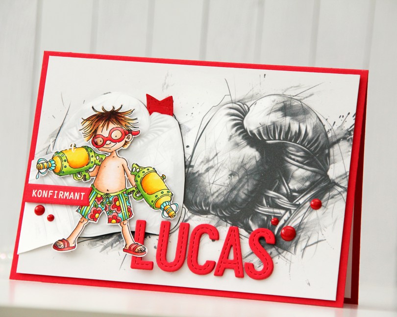

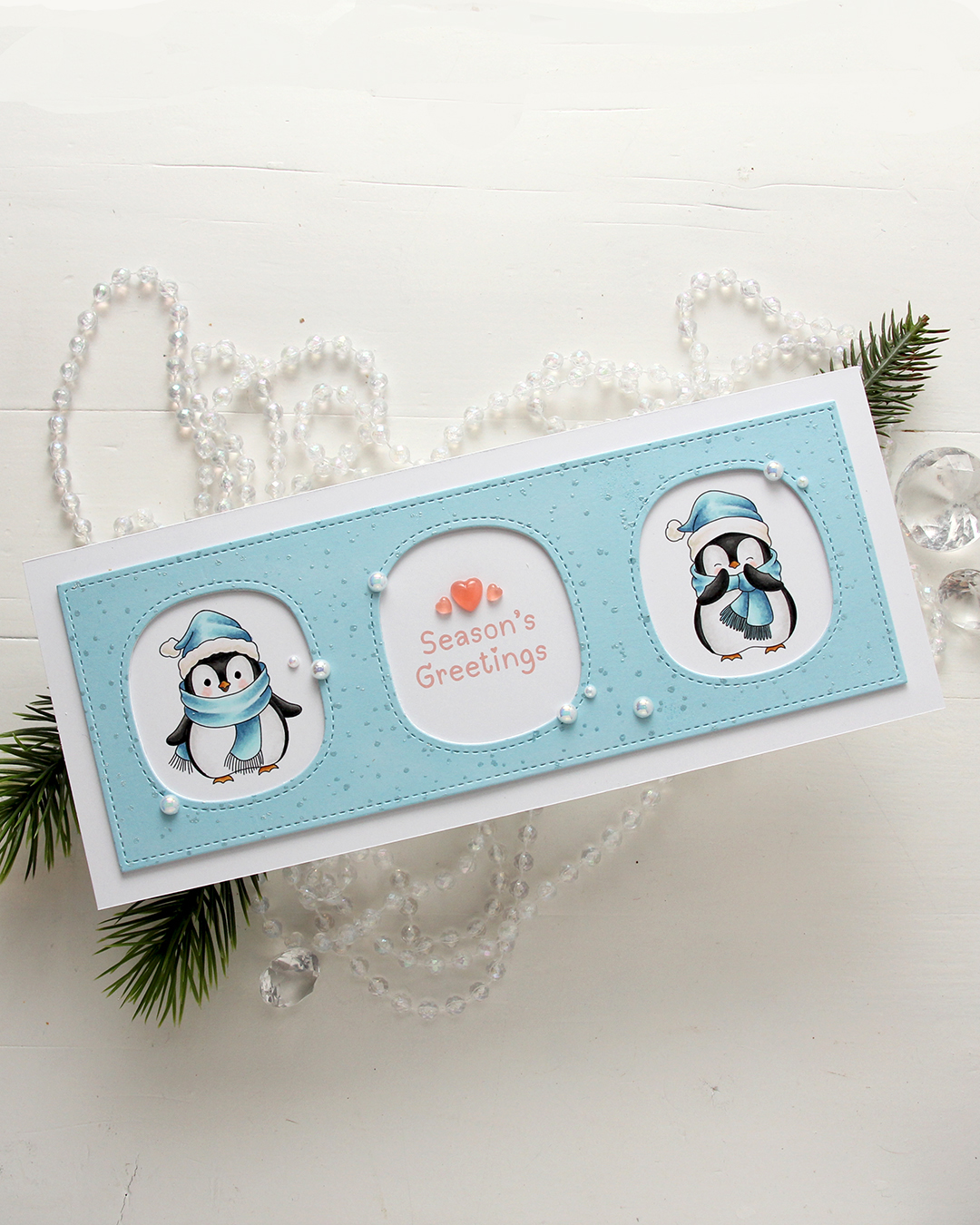 I colored the penguins with my Copics, making sure to add blue for their hats and scarves. Nothing beats blue for Christmas, right? I left plenty of space between the penguins for a greeting, which is from the
  I used a die in the Slim card basics die set from Mama Elephant to die cut the frame with openings from Harbor cardstock from Concord & 9th. I also cut two from white to add behind it for dimension. I stamped the Paint Splatter background stamp from My Favorite Things onto the blue using VersaMark ink, then sprinkled on White Satin Pearl embossing powder from Hero Arts and heat set.
 I added pearls from the Glossy Porcelain mix from Little Things from Lucy’s Cards here and there around the openings and also three Coral Heart Droplets, also from Little Things from Lucy’s Cards.
 Limited color palette for these two penguins.
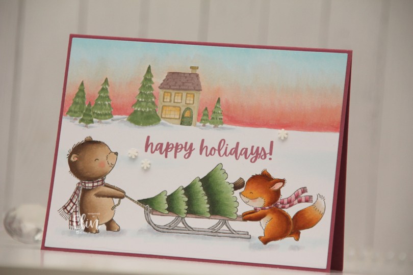
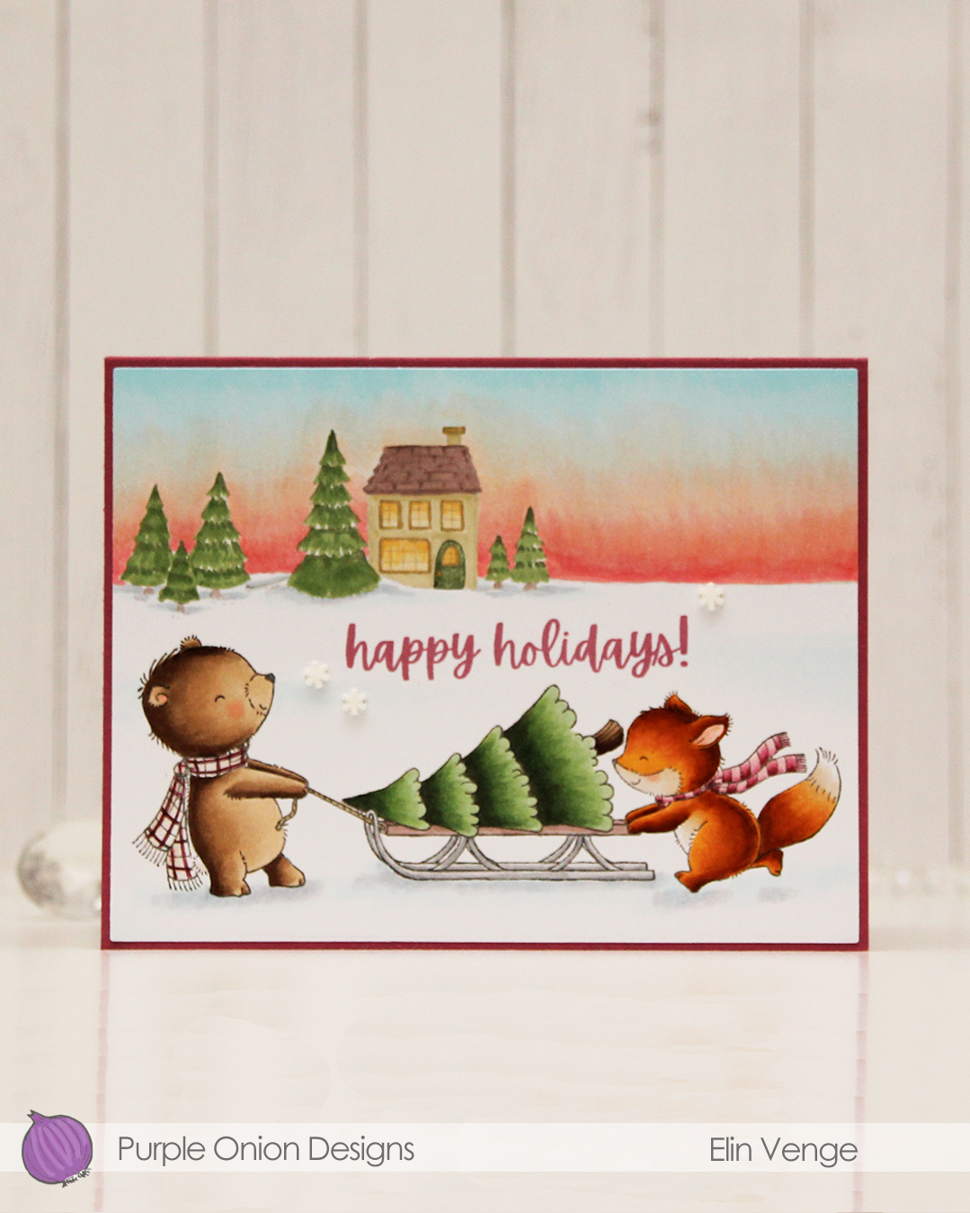 I colored these cuties with my Copics and did the same with
  I used the Additional A2 Layers die set from Waffle Flower to cut my panel down slightly, then adhered it to a card base I created from Autumn Rose cardstock from Papertrey Ink, before I added a few snowdrift sprinkles from Little Things from Lucy’s Cards.
 Lots of Copics for this one. I even created a new combo for the fox which requires less markers than the one I used to use.