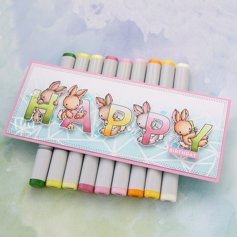
Hi, crafty friends. I’m here today sharing a slimline card, featuring the new Bunny Alphabet stamp set from Lili of the Valley.
 This set offers so many possibilities for customizing your card to suit your needs. I colored the letters to spell happy and fussy cut them, leaving a thin white border and put them aside while I worked on the rest of the card.
 Onto a piece of Stamper’s Select White cardstock from Papertrey Ink, I ink blended Sno Cone ink from My Favorite Things using the Geometric Landscape stencil from Altenew. It’s a 6×6″ stencil, but it was easy to create a longer section with a little bit of masking and moving the stencil. I then diecut the panel using the Slimline Double Stitched Rectangle STAX die set from My Favorite Things and adhered it to a card base made from Cotton Candy cardstock, also from My Favorite Things.
 I popped my colored, fussy cut letters on foam tape in the center of the card, heat embossed a sub sentiment from the Bitty Birthday Wishes stamp set from My Favorite Things and finished off the card with drops and sequins from the Ice Water mix from Little Things from Lucy’s Cards.
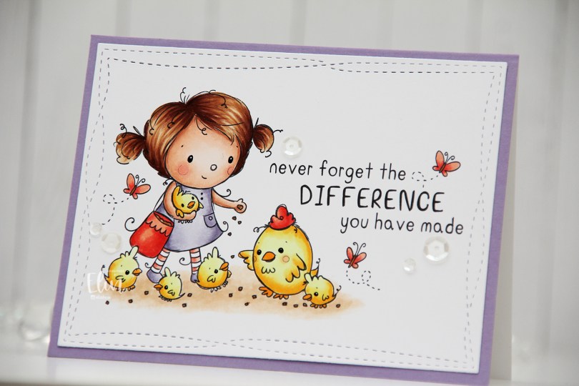
 I did fairly simple Copic coloring for this, die cut my panel and added it to a white card base I’d covered with a quarter sheet of Winter Wisteria cardstock from Papertrey Ink.
 This image with its sentiment deserved to steal the show on its own, so I embellished very sparingly with a few sequins from the White Orchid sequin mix from Little Things from Lucy’s Cards.
 This image is super fast and easy to color. It’s just a head, a hat and a couple of mittens. I wanted a green and gold card, so I colored her hat and mittens green and fussy cut her.
 Onto a white top fold card base, I adhered a panel of brushed gold cardstock. Actually I cheated a bit and only added a frame. I die cut the center out of it, so I can use that for something else. No one will ever know I cut a chunk out of it to save for later.
 Using the Stitched Snowflake Backdrop die from Lawn Fawn, I created a snowflake background from white cardstock. Once I’d die cut, I ran the panel through my Gemini Jr a second time with an embossing mat to add extra depth to the texture the die made. It really makes a huge difference, as opposed to just running it through once with the die.
 I used the Merry Christmas die from My Favorite Things to die cut from the same gold cardstock I used on the base. I die cut six additional layers from white cardstock, adding three of those behind the gold and three behind the shadow I cut from heavyweight translucent vellum from My Favorite Things. All these layers add a ton of dimension to an otherwise simple card.
 I added my image to the card using foam tape. Her hands hover just above the merry, it’s like she’s peeking in from behind the sentiment.
 I added a bunny to the top of the teacup stack and colored the image with Copics, before fussy cutting, leaving a thin white border around the edge. I used a black glaze pen from Sakura to add shine and a tiny bit of dimension to the bunny’s eyes, then a white dot of Gelly Roll 05 on top of the black, once the black was dry. The glaze pen dries fairly quickly once applied, so I didn’t have to wait long.
 I adhered a panel of Blueberry cardstock from My Favorite Things to my white card base. Using a die in the A2 Double Stitched Rectangle STAX die set, also from My Favorite Things, I die cut a piece of patterned paper from Sunny Studio to adhere on top of the blue. This patterned paper is from the Subtle Grey Tones pack, and it really is subtle.
 I realized I hadn’t made any of my signature clusters in a while, and decided to pull out my die cut scraps of patterned paper and have a play. These patterned papers are from Sunny Studio (more from the subtle grey pack), Kaisercraft (light blue with dots), Papirdesign (dark blue with smaller dots) and Maja Design (pink floral), all die cut using a combination of the Happy Days Ticket Stubs die from XCut and the Fishtail Flag Frames dies from My Favorite Things. I used a mini paper doily from Doodlebug to mat my little clusters, and embellished with sequins from Pretty Pink Posh and Simon Says Stamp.
 The sentiment is from the Coffee and Chocolate stamp set from hÄnglar & Wings, white heat embossed on a strip of the same color cardstock I used for the card front. I then die cut it using one of the dies in the Itty Bitty Banners die set from My Favorite Things.
 The interactive element that I mentioned at the beginning of the post is actually the image. As you can see in this photo, it sits pretty high off the base. The reason for that is that it’s on an action wobble, so it’ll shake and move once you help it along a tiny bit.
 Fairly simple color palette for this one.
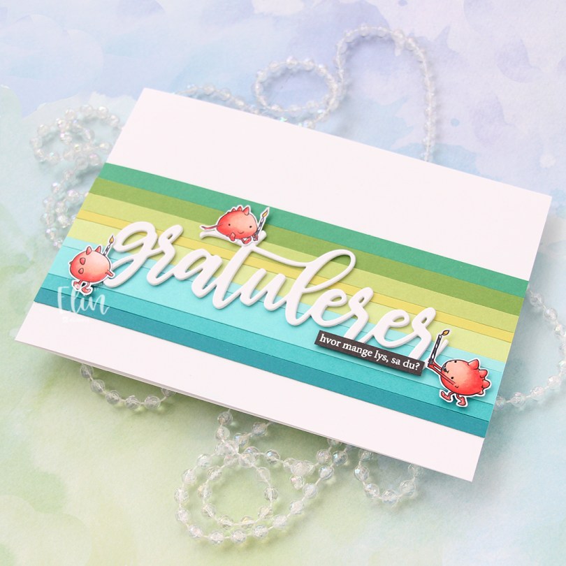
 I colored my monsters with Copics and fussy cut them leaving a thin white border. I covered my A7 card base with a band of solid colored cardstock strips. From top to bottom they are Concord & 9th Clover, Concord & 9th Parsley, Papertrey Ink Green Parakeet, Papertrey Ink Limeade Ice, Concord & 9th Sprout, My Favorite Things Summer Splash, Papertrey Ink Hawaiian Shores, Concord & 9th Oceanside and My Favorite Things Tropical Teal.
 I die cut the word gratulerer three times from white cardstock using the Flasketag, gratulerer die set from Papirdesign. The cardstock I used is Stamper’s Select White cardstock from Papertrey Ink, which is the same cardstock I used for my card base. I want my whites to match, and this is the perfect white cardstock, I love it.
 I added my stacked white die cut to the center of the striped background, mounted the monsters on foam tape and white heat embossed a sentiment from the A06 stamp set from Norsk Stempelblad AS onto Smokey Shadow cardstock from Papertrey Ink and adhered it to the stacked die cut word to finish the card. I decided against adding embellishments, I wanted the monsters to really steal the show.
 Very limited Copic selection for this one.
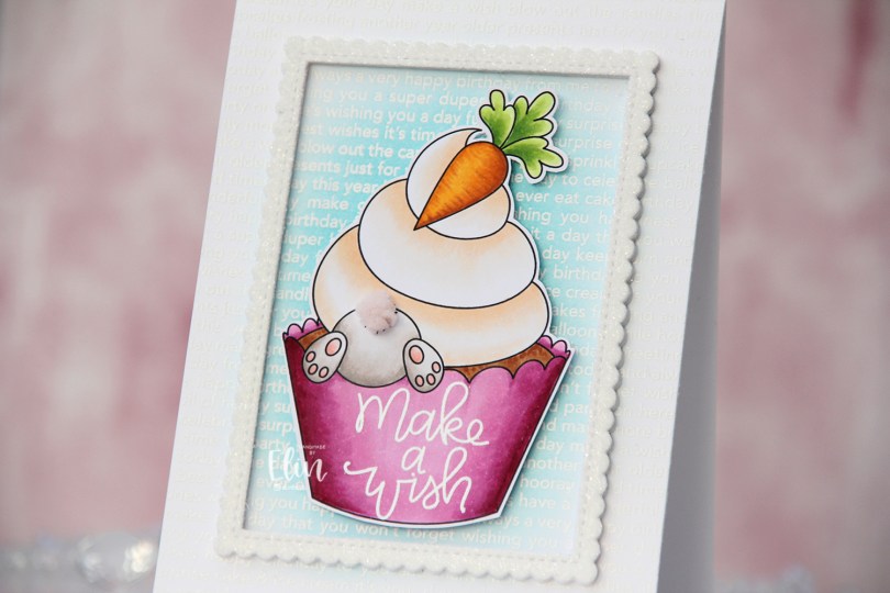
 When I first saw the
  I just knew this bunny had to be digging for treasure somewhere and decided to pair it with the carrot cupcake. I colored my image with Copics, stamped and white heat embossed a sentiment from the Scripty Bday stamp set from Mama Elephant, before adding a fluffy tail from part of a ribbon from Papirdesign. I felt the soft pink worked with the rest of the image. I fussy cut around my colored piece leaving a thin white border and put it aside while I worked on the rest of the card.
 Onto the card base, I stamped and white heat embossed the Happy Birthday background stamp from My Favorite Things, before ink blending in the center with a blender brush and Summer Splash ink, also from My Favorite Things.
 Using a die from the Stitched Rectangle Scallop Edge Frames die set from My Favorite Things, I die cut 5 frames from white cardstock and stacked them for dimension. I covered a sheet of white cardstock with a double sided adhesive sheet from Altenew, before using the same frame die to die cut one more from that. I added it on top of my stacked frames, removed the release paper from the top and covered it with rock candy distress glitter from Ranger for a bit of sparkle.
 I centered the frame on my card base and added my colored image in the center using foam tape. This card is fairly simple, and that tail totally steals the show.
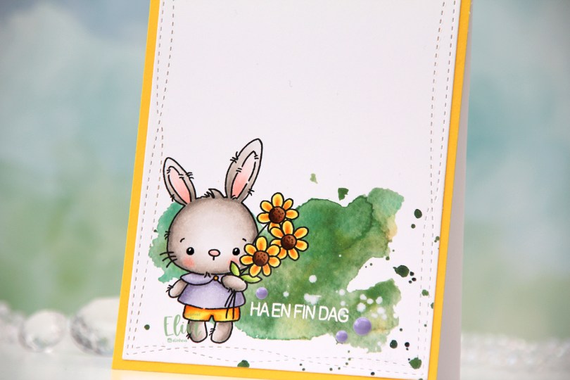
 How adorable is this little bunny holding a bouquet of flowers? I definitely used spring colors for this, and even went complementary with my Copics. I’m not really a fan of complementary colors, so I tend to stay away from them, but it worked for this card. Adding the green watercolor in the background helps too, that way the purple and yellow aren’t competing as much for the attention.
 I die cut my finished panel using the largest die in the Wonky Stitched Rectangle STAX set from My Favorite Things. I then stamped and white heat embossed a sentiment from Huldra Designstudio right onto the green watercolor.
 I adhered the panel onto a piece of Bright Buttercup cardstock from Papertrey Ink, and adhered that to a top fold white card base, also created using Papertrey Ink cardstock. They have the best cardstock!
 To finish the card I added a few enamel dots from the Enchanted Garden pack from Altenew, and created shine and a tiny bit of dimension to the bunny’s eyes by first using a black glaze pen, then a white Gelly Roll 05 once the black was dry.
 The eyes really shine. I love adding these tiny details, especially on cards that are this simple.
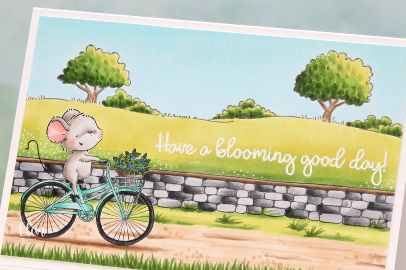
 I love how happy this mouse looks riding that bike. Stacey Yacula has a way of creating characters that really come to life, I’m such a big fan of her style.
 I stamped Anna, added a mask, then stamped the stone wall. Both were stamped with Extreme Black ink from My Favorite Things, which is a Copic friendly ink. I then used second generation stamping with the country side background, this time with Memento Espresso Truffle ink for a somewhat softer look.
 I colored in my scene using Copics, then stamped and white heat embossed a sentiment from the
  I used a white Gelly Roll 05 to create the white dot “flowers” in the background and added my panel to a top folding white card base I created. The finished card measures 6 x 4″.
 This is a very mail friendly card. No embellishments, it’s almost one layer and sooo simple.
 Quite a few Copics, but that usually happens with these full scene cards I create with Purple Onion stamps.
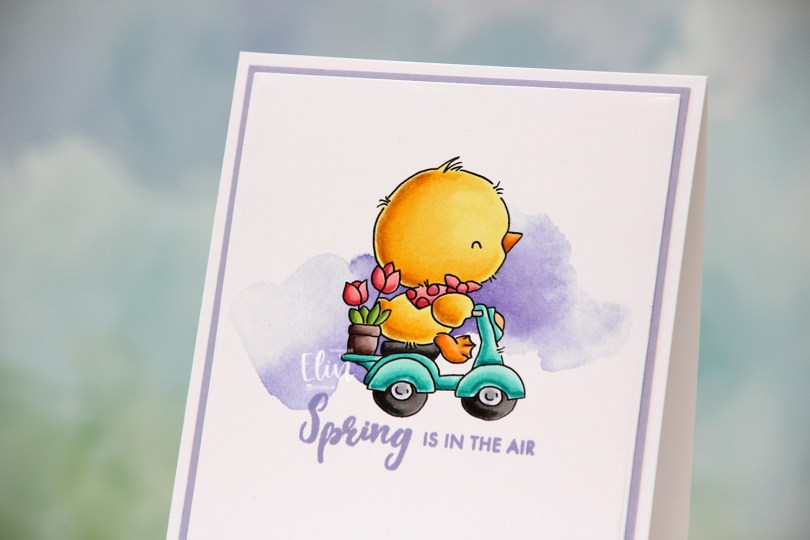

 Just below the image, I decided to stamp a sentiment. This one is from the Paint-A-Flower: Hydrangea stamp set from Altenew, inked up in Wild Wisteria ink from Gina K Designs AND Winter Wisteria ink from Papertrey Ink. The Gina K ink is a little too blue for what I for this card, while the Papertrey Ink color is a little too pink. By stamping them on top of one another, I get the perfect color for my card.
 Using the Additional A2 Layers dies from Waffle Flower Crafts, I turned my simple colored piece into a slightly smaller panel, which I adhered to a panel of Wild Wisteria cardstock from My Favorite Things.
 I added my double panel to a white card base, and my card was complete. I wanted my whites to match, and actually covered up the card base with another piece of X-Press It blending card, which is what I use for my Copic coloring.
 This is a very flat, very mail friendly card. I don’t make many of those, but I really wanted the chick to shine.
 Simple, springy color palette, even though it doesn’t really feel like spring. It started snowing Friday night, snowed all through the night and a good chunk of yesterday, before the snow turned into rain, and then later fog. It’s so foggy right now I can barely see the buildings across the street. 18 days into spring, and it feels more like winter than ever before.
 Isn’t this image the sweetest, with mama bear and her two cubs? For some reason, I love coloring polar bears, and to make them look “white” (although real polar bears aren’t really white), I always do no line coloring whenever I create cards with polar bears.
 Once my coloring was complete, I made a quick mask from Post-it tape to cover up my polar bears before I used my Wintry Forest stencil set from Pinkfresh Studio along with inks from Altenew (the colors are Misty Morning, Cloudy Sky and Nimbus) to create my background.
 I die cut my panel using the second largest die in the Additional A2 Layers die set from Waffle Flower Crafts, adhered it to a panel of Enchanted Evening cardstock from Papertrey Ink and then onto the card base.
 I stamped a sentiment from the Scripty Xmas stamp set from Mama Elephant using Enchanted Evening ink from Papertrey Ink and added some white dots to the cub’s hat with a white Gelly Roll 05 pen. And that finishes the card. I decided not to add any embellishments to it.
 Oh, how I love blue for Christmas cards.