Hi, crafty friends. I’m here today sharing a 4 bar card. I love creating cards of all sizes, and this is a fun one, I enjoy the smaller format.
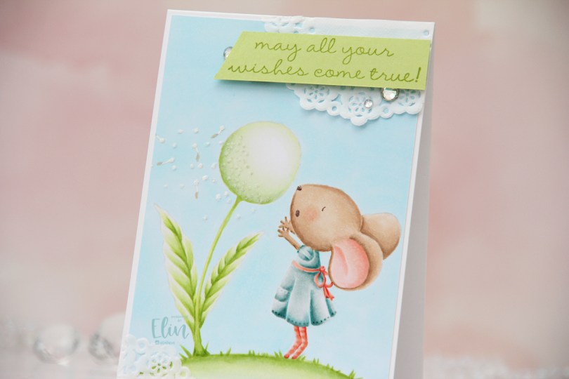
 This is Wishing from Purple Onion Designs, illustrated by Stacey Yacula. It’s one of the larger stamps from Purple Onion, and it’s actually the first Purple Onion stamp I ever colored up, which means it holds a special place in my heart. I wanted a soft look and stamped the image in Fadeout ink from Inkon3 before coloring.
 I love no line coloring, and no line is perfect for an image like this, which has just enough detail to make it interesting, but it’s still large enough to get soft gradient in colors and not too fiddly.
 Once I finished my coloring, I added my panel to a 4 bar card base I created from Stamper’s Select White cardstock from Papertrey Ink. I created some texture to the dandelion fluff by using my Quickie glue pen and sprinkling on Rock Candy Distress glitter.
 I adhered scraps of a Doodlebug mini paper doily to opposite corners of the card to add to the soft, delicate look I was aiming for. Using Sour Apple ink from My Favorite Things, I stamped a sentiment from the A Beautiful Day sentiment set from Purple Onion Designs onto Sprout cardstock from Concord & 9th, cut it down to a strip and mounted it on foam tape and adhered it to the top right corner of the card, before finishing off with a trio of crystals from Papirdesign.
 Very soft color palette.
 There’s something about the
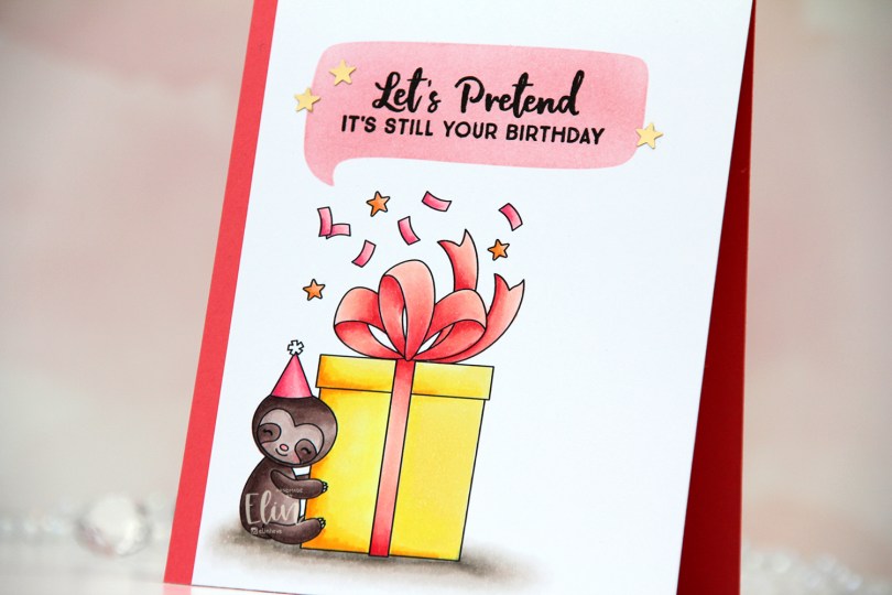
  I printed my image on a quarter of an A4 sheet of X-Press It blending card. A4 is narrower and taller than lettersize, so my quarter panel doesn’t quite cover an A2 card front. By letting a strip of the card base showing as a result, it adds a design element to the card.
 Once my coloring was complete, I ink blended Berry Sorbet and Melon Berry inks into one of the openings in the Say Anything stencil from My Favorite Things, before stamping a sentiment from the Anything-but-Basic Birthday Wishes stamp set (also from MFT) using VersaFine Onyx Black ink.
 I adhered the panel directly to the card base (Melon Berry cardstock from Papertrey Ink) and added a few confetti stars from the Rosy Glow mix from Little Things from Lucy’s Cards.
 The stars are matte gold, but they still shine in the light. And because they’re flat, and everything else on this card is also flat, this card is very mail friendly, which is a rarity for me.
 Quick, simple color palette.
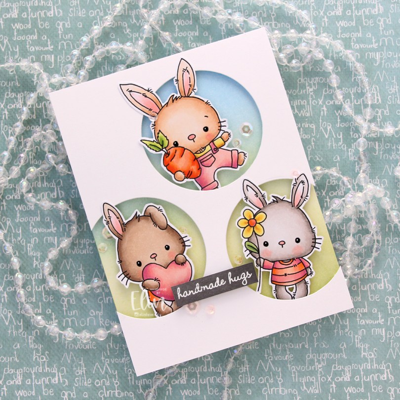
 These guys are from the
  Onto the card base, I ink blended Fresh Leaf and Eastern Sky inks from Altenew to create a soft background that went from green to blue. I then added splatters of my sheer shimmer spray from Imagine. It’s not really visible in the photos, but in real life it adds a bit of sparkle.
 I die cut three circle openings in a quarter piece of white cardstock and mounted it with foam tape to the card base.
 I added foam tape to the back of my critters, popping each of them into the circle openings. I stamped and white heat embossed a sentiment from InkyWings onto a piece of Mushroom cardstock from Concord & 9th, mounted it on foam tape and added it to the card.
 To finish off the card I added sequins from the Rosy Glow mix from Little Things from Lucy’s Cards.
 Such a simple color palette for this one. Aside from the colors of the fur, which differ for each bunny, I used the same colors throughout.
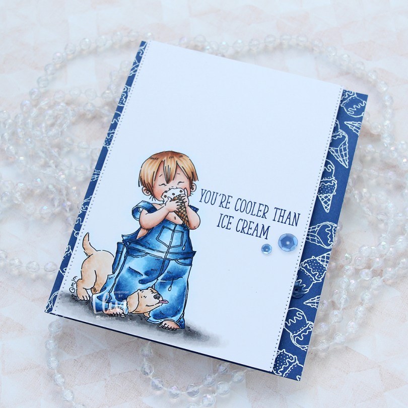
 I’ve colored this image before, but never using blue for his overalls. That feels crazy, but it’s also true. I obviously used blue this time, and gave him blond hair too. I stamped a sentiment from the Double Scoop of Cute stamp set from My Favorite Things, using Blue Beyond ink, also from My Favorite Things.
 On the sides of the panel, I used a die from the Stitched Borders die set from Lawn Fawn to create a tiny bit of interest.
 On a quarter piece of Blueberry cardstock from My Favorite Things, I repeatedly stamped the ice cream cones in the Double Scoop of Cute stamp set and white heat embossed them all. I adhered the blue panel to a card base and mounted my colored panel on top using foam tape.
 To finish off the card I added three sequins from the Denim mix of sequins from Little Things from Lucy’s Cards. I tend to put my embellishments near the sentiment, it’s a good way to draw the eye to the sentiment.
 It doesn’t get much cuter than a boy with a puppy. And I wish the temps were good enough for ice cream outdoors. We still have snow on the ground, it’s cold and there’s more snow in the forecast. I want summer, when’s it coming?
 Lots of Copics despite a very limited color palette. It happens.
 Meet
Meet  I stamped and masked both Parker and Walter before using the
  I didn’t want to mess up the card too much with my sentiment, so I decided to add a subtle one from the
  I cut the panel down to 6×4″ and mounted it in the center of an A7 card base using foam tape. And that’s it. Super simple.
 Not so simple; the coloring. A lot of Copics went into creating this card. It’s become the norm for me when creating these full scene cards using Purple Onion images.
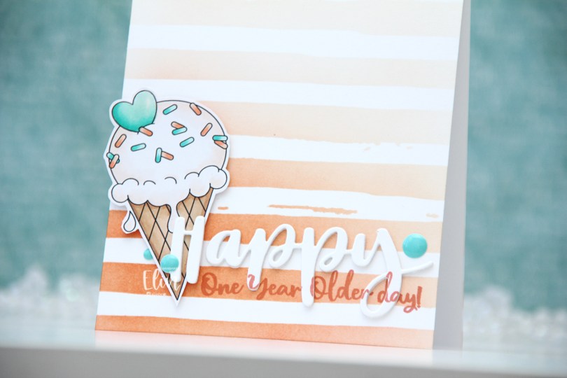
 I colored the ice cream with my Copics, fussy cut it leaving a thin white border and put it aside while I worked on the rest of the card. Using the Watercolor Stripes stencil from Altenew, I ink blended stripes using Melon Berry ink from Papertrey Ink, going heavy handed at the bottom with a soft gradient toward the top of my A2 card base.
 I used the Hand-Lettered Happy Birthday die from My Favorite Things to die cut the word happy from white cardstock from Papertrey Ink. I then did a little stamp surgery, by combining two sentiments in the Anything-but-Basic Birthday Wishes stamp set from My Favorite Things to stamp a sub sentiment to the lower part of the die cut word. I then stamped the same sentiment directly on my card base, still using Melon Berry Ink. I die cut two more of the happy to glue behind the stamped one, stacked all three together and adhered it to the card front, lining up the stamping on the die cut with the stamping on the card base. I then mounted the ice cream on foam squares, added a bit of Glossy Accents to the heart and some enamel dots from the Cool Summer Night pack from Altenew for a little bit of added interest and color.
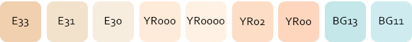 Very limited color palette.
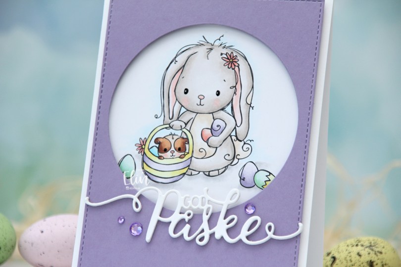
 I used the
  I wanted a pastel look for my card, and this is probably the lightest wash of color I’ve ever done with my Copics. Except for E25 on the guinea pig, I’ve only used markers ending in numbers that are 3 or lower. That’s super light for someone who doesn’t shy away from using markers ending with 9. Once the coloring was complete, I used a black glaze pen to create shine in their eyes, and I went over it with a dot of white Gelly Roll 05 on the bunny.
 From a piece of Winter Wisteria cardstock from Papertrey Ink, I die cut a circle opening and also used a faux stitch rectangle die from My Favorite Things to create a little bit of extra interest around the edge of the panel, before mounting it on foam tape.
 I used a die from Papirdesign to make my God påske (Happy Easter in Norwegian) sentiment, and made it dimensional by stacking four white die cuts on top of each other, before finishing off the card with a few crystals from Papirdesign that match the Winter Wisteria cardstock nicely.
 Here it is, the softest color palette ever.
 I colored the image with Copics and fussy cut around it, leaving a white border. This image is pretty easy to fussy cut, so it didn’t take long. I’m trying to get out of my standard “full panel with cluster” mode, and fussy cutting the image gives me endless possibilities.
 I needed something in the background behind my image, and decided to create a circle stencil to ink blend into. I used Distress Ink from Ranger in Abandoned Coral, Spiced Marmalade and Squeezed Lemonade, before I removed the stencil and looked through my stash of background stamps I could use to add some more interest. I wound up with a mixture of stamps from Inkido, Tim Holtz and My Favorite Things, and used Distress Ink once again for the stamping. This time Spiced Marmalade and Mustard Seed for a bit more of an intense yellow on top of the ink blending.
 I mounted the image using foam tape, and die cut the word happy from the Bold Happy Birthday die set from My Favorite Things. I die cut four of each letter and stacked them for a dimensional look, overlapping them on my card to make them fit.
 I stamped and white heat embossed a sentiment from the Anything-but-Basic Birthday Wishes stamp set from My Favorite Things onto a piece of Caribbean Sea cardstock, also from MFT. The sentiment actually says Commencing Happy dance, but since I already had a diecut happy, I only needed the first and last word for my card. I added three additional strips of cardstock behind the words for dimension, and finished off the card with a few enamel dots. The teal ones are from the Cool Summer Nights pack from Altenew, the orange ones from a Halloween pack from Papirdesign. I also added a dot of black Glaze pen to the kittens’ eyes and the boy’s eyes, then a white dot using the Gelly Roll 05 from Sakura once the black had dried on the boy.
 I colored the image with My Copics and decided to fussy cut around it this time. I tend to turn my colored pieces into panels for my card and work from there, but I wanted to do something a little different today.
 I left a white border around the image to make it easier on myself. You tend to lose some of the details in the hair if you cut up close to the line, and I wanted to keep the hair intact. I also added Glossy Accents to his glasses for shine and a touch of dimension.
 I wanted to include his name on the card, but had printed my image fairly large. My solution was to make a landscape A7 card (7×5″). I rarely make landscape cards (trickier to photograph) and the same goes for A7, but it’s fun to shake things up. I also shook things up by adding cardstock strips going across the card. I tried with cool colors first, but the image got lost, so I went through my solid colors of cardstock again and made a version with warm tones. From top to bottom they are:
 I used the Impact Alphabet die set from My Favorite Things to spell the name. I die cut four of each letter and stacked them for a dimensional look, gluing them right onto the stripped background, before adding the sentiment and date in white on black.
 I mounted the image on foam tape and added a few enamel dots from Altenew (teal dots from the Cool Summer Night pack) and Papirdesign to finish the card.

 This
This  I stamped a sentiment from the Definisjoner stamp set from Norsk Stempelblad AS with Melon Berry ink from Papertrey Ink, chopped off a bit of the panel and adhered it to a card base I created from Melon Berry cardstock, also from Papertrey Ink.
 I added a couple of sequins from Little Things from Lucy’s Cards. The larger sequin is from the Sweet Shop mix, the smaller one from the Iced Sherbet mix.