
Hi, crafty friends. I’m back with another super simple card. This time it’s an adorable mouse from the Merry Christmouse digi stamp set from Streamside Studios, and he’s gotten hold of Santa’s cookies.
 I colored up the image yesterday, actually, while watching Tim Holtz’ live on Instagram. Once the coloring was complete, I used the largest of the dies in the Wonky Stitched Rectangle STAX die set from My Favorite Things to give it a nice faux stitch edge.
 I adhered my colored and die cut panel to a quarter piece of Classic Kraft cardstock from Papertrey Ink, then adhered it all to a top fold note card I created from white cardstock, also from Papertrey Ink.
 I thought the sentiment was perfect for this little image, and decided to print it in brown onto Classic Kraft cardstock. I then used a 1″ circle punch from EK Success to cut it, then added it to the card using foam tape for a little bit of dimension.
 I kept the card very simple and decided to only add a few sequins. I love the sequin mixes from Little Things from Lucy’s Cards and use them very often on my cards. These particular ones are from the White Orchid sequin mix.
 A little bit of a side view shows the dimension and those sequins a little bit better.
![]() Not a lot of Copics used for this card, this came together really quickly.
Not a lot of Copics used for this card, this came together really quickly.


 I stamped the word happy repeatedly in a column on a piece of X-Press It blending card, stamped birthday close to the bottom and colored in all the individual happy words using Copics.
 I trimmed my panel down significantly, before adding plenty of foam tape to the back of it and mounting it to a card base I created from Soft Stone cardstock from Papertrey Ink.
 I wanted to add even more dimension by having one of the happy words popped up, but the letters are so narrow, they were too tricky to put foam tape on the back of. I decided to add dimension in another way by covering the green letters with Nuvo Jewel Drops in the color Key Lime. It makes the happy slightly raised and also gives it some shine.
 Clean, simple, colorful – what more could you want from a card?
 Lots of Copics used for this one.
 I’ve created a very simple card this time, featuring this cute little car from the new
  I did some simple no line coloring of the image. I hadn’t done no line in a while when I created this, so opting for this tiny image was perhaps not the most brilliant idea ever. It’s kind of what I do, though, I jump in. I used a grey Copic to give the illusion of someone sitting in the car, used a couple of blues for some simple shading near the tires and kept everything very simple.
 Using four different shades of blue ink (Distress Inks in the colors Chipped Sapphire, Faded Jeans and Stormy Sky, in addition to Iceberg ink from Altenew), I softly ink blended an ombre sky before sprinkling on Chunky White embossing enamel for a snowy effect that I love having on my cards. I heated the panel from the back, melting the granules and adhered the panel onto a top fold card base I created from white cardstock from Papertrey Ink.
 Using the sentiment die from The Penguin’s Waddle die set from Mama Elephant, I created a chunky sentiment by adding several die cuts together for a stacked, dimensional look. I adhered it to the top center of my card and finished it off by placing a few snowdrift sprinkles from Little Things from Lucy’s Cards near the car.
 I love a dimensional die cut sentiment, it kind of says I mean business and adds so much to a simple card!
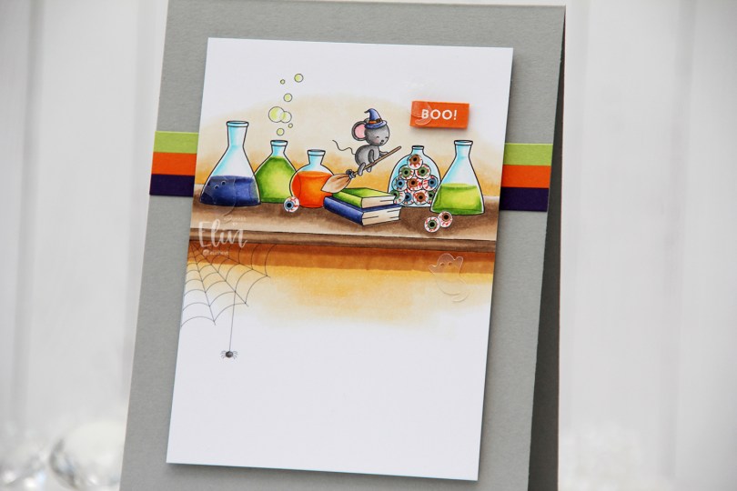
 This set comes with sooo many images, and I’ve actually used 11 different ones for this card. I added the lines for the shelf with a black pen, but everything else in the scene comes in the one stamp set.
 I’m known on the design team for occasionally printing my images very small. This time I might have set a new record, the mouse and the eyeballs in this scene were so small, they were tricky to color, but I really wanted them this size to fit the scene and the card design.
 Once I finished the coloring, I trimmed the panel down to 3 1/4 x 4 1/2″, and put it aside while I worked on the rest of the card.
 I created a card base from Cement Gray cardstock from My Favorite Things, added three 1/4″ strips of cardstock in colors that matched the scene (Royal Velvet from Papertrey Ink, Orange Zest from Papertrey Ink, Sour Apple from My Favorite Things), before I mounted the scene on top using plenty of foam tape.
 I stamped and white heat embossed the sentiment from the Itty Bitty Boos stamp set from My Favorite Things, added a few more layers of cardstock behind it for stability and dimension and finished off the card with a trio of acetate ghosts from the Candy Corn mix from Little Things from Lucy’s Cards.
 Lots of Copics for this little scene.
 As soon as I saw this stamp set, I knew these snow globes would make the perfect shaker cards. The stamp set comes with the snow globe and six different scenes you can stamp inside. I, of course, opted for the penguin, but there’s also a snowman, a car with a tree on the roof, a house, a tree with presents and a village, as well as a few sentiments.
 I stamped and colored the empty snow globe on a quarter sheet of X-Press It blending card. I stamped the penguin on a separate piece of blending card and colored that for the inside of my snow globe. I glued a few Kort & Godt pearls around the penguin and put him aside while I worked on the rest of the card.
 I cut the center out of the snow globe and adhered a piece of acetate to the back of the white cardstock, before adding foam tape on the back of the shaker area, making sure not to leave any gaps. With glitter inside the shaker window, you don’t want it to escape.
 I put a mix of clear Distress glitter from Ranger and some micro beads inside the shaker area, before adding my colored penguin to the exposed adhesive of the foam tape to close the shaker.
 I initially put too much inside (I always seem to put too much inside) and had to pour some out to get the perfect amount. I then adhered my popped up snow globe to a card base I created from Enchanted Evening cardstock from Papertrey Ink. I used the merry script die from Mama Elephant to cut the word merry three times from Blue Breeze cardstock from My Favorite Things, stacking the die cuts for a dimensional look. Near the bottom of the letters I softly ink blended a bit of Blueberry Sky ink from Papertrey Ink to add a little bit of a gradient. I stamped the word Christmas from the
  This is a fairly simple looking card, but it’s got tons of dimension and a shaker card is always fun, right?
 I printed the image with a 10% opacity onto X-Press It blending card before coloring. Whenever I want to color things that are supposed to look close to white (ice, snow, polar bears +++), I prefer doing a no line version. To me, there’s something very distracting about black lines on an image that’s supposed to look white, so I prefer the softer no line version. I colored the image with Copics, starting with the sky, then ocean, ice floe, polar bear and finally the penguin and his little scarf. I prefer doing the black towards the end, it’s just good practice to avoid getting it into nearby areas where you don’t want it.
 Once I finished the coloring, I die cut the panel using the second largest die in the A2 Stitched Rectangles STAX 1 set from My Favorite Things, before mounting it on foam tape onto a white card base I created from white cardstock from Papertrey Ink. I die cut the word klem (hug) twice from white cardstock using a die from Kort & Godt. It’s actually a Christmas die that says juleklem (Christmas hug), but by using only the latter part of the word, I have a completely different use for the die, which I love. That’s the whole card, I decided not to add any embellishments, I wanted to keep the focus on the image.
 Loooots of Copics for this deceptively simple scene.
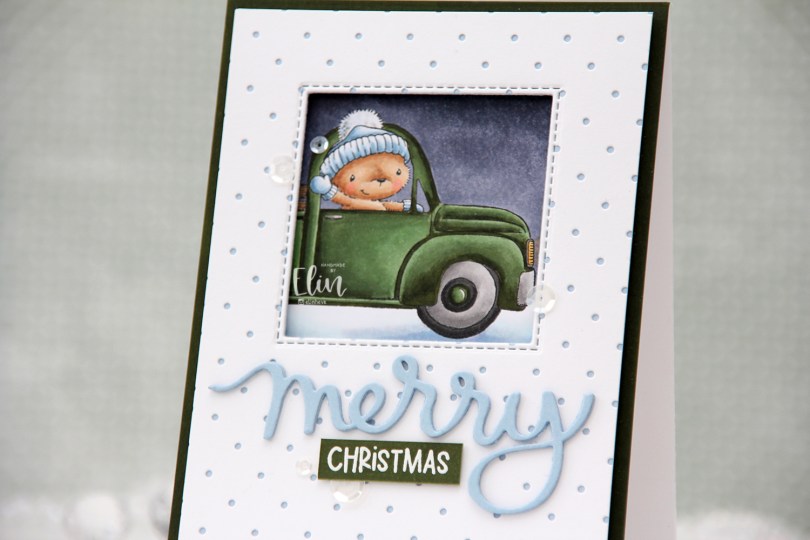

 Using the Itsy Bitsy Polka Dot Backdrop die from Lawn Fawn, I die cut a panel of white cardstock from Papertrey Ink to add a little bit of texture to the front of my card. I adhered it to a quarter panel of Blue Breeze cardstock from My Favorite Things, before using the Selfie Square die, also from My Favorite Things, to die cut a window in the top center.
 I put foam tape on the back of my polka dot panel and adhered it to my colored piece, making sure to line up the image so it would show trough the window the way I wanted it to. I then grabbed a quarter panel of Jalapeño Popper cardstock from My Favorite Things and used my G99 Copic marker and scribbled it close to the edge of the green cardstock to make the color match my car a little bit better. Green cardstock is tricky, and I don’t often find the right kind of green that I want for my projects. This was an easy hack, but if anyone out there has a suggestion for a green cardstock that is close in color to G99 (or G94), please let me know.
 I adhered my improved green cardstock to an A2 top fold white note card and mounted the polka dot piece with the colored window using foam tape – lots of it. I then used the same Blue Breeze cardstock that I used previously to cut the word merry three times using the Merry Script die from Mama Elephant. I love their script dies! On the top layer I spritzed sheer shimmer craft spray from Imagine for a bit of sparkle to the letters. Unfortunately, details like that are tricky to photograph, but it’s definitely noticeable in real life, trust me 🙂
 Onto a leftover scrap of X-Press It blending card, I scribbled an even layer of G99 to create a dark green cardstock that would match my colored image. Onto it, I white heat embossed the word
  I love my Copics and used quite a few for this rather simple image.
 I colored up
  Once the coloring was complete, I used the largest die in the A2 Double Stitched Rectangles STAX die set from My Favorite Things to turn my panel into a rectangle with a nice faux stitch around the edges. I then added a thick layer of Glossy Accents to the heart and let that dry.
 Using the Geometric Landscape stencil from Altenew, I ink blended a bit of yellow in the top right corner using Distress Inks in the colors Mustard Seed and Squeezed Lemonade, letting the lighter shade of the two fade to white. I then adhered my panel onto a top fold card base I created from Stormy Sea cardstock from Papertrey Ink.
 I die cut the word wishes four times from the same color cardstock using a die from Mama Elephant. I stacked the die cuts for a dimensional look and adhered them on top of my ink blended section.
 Using two stamp sets from My Favorite Things (Bitty Birthday Wishes and Itty Bitty Gifting), I heat embossed sub sentiments onto strips of Canyon Clay cardstock from Papertrey Ink. I die cut those using the Itty Bitty Strips dies, also from My Favorite Things, before finishing off the card with a few yellow enamel dots from the Pocketful of Sunshine pack of enamel dots from Altenew.
 This was a fun color palette to work with, and I think the finished card echoes that. I’d say it’s my usual style of card, just not my usual color palette. I need to branch out more often, I had a blast using these colors.
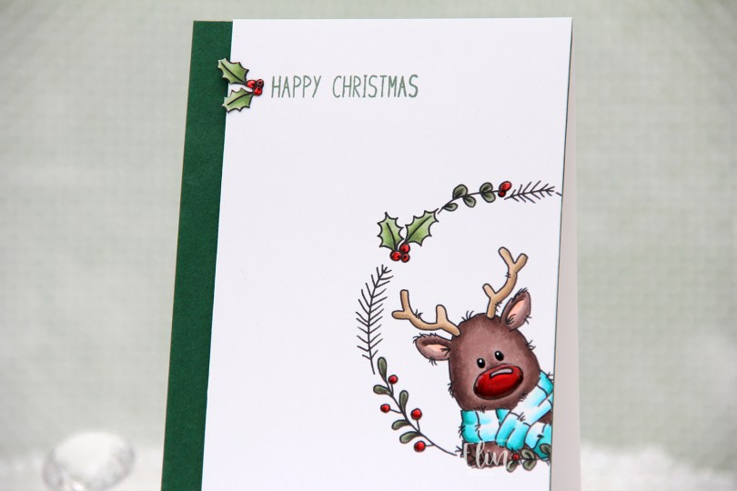
 There’s a stamp set in the release which includes a wreath and six different critters you can put inside, as well as a few individual stamps that go well with the wreath. I chose the wreath and the reindeer in the set for this card, making sure Rudolph was stamped a little crooked peeking into the front of the card from the side, I thought that made for a dynamic card design.
 Using my Copics, I colored Rudolph and the wreath and also one of the smaller images, which I also fussy cut.
 I trimmed my panel down so that it was 1/2″ more narrow than the card base and mounted it on foam tape onto a 4 1/4 x 5 1/2″ piece of Clover cardstock from Concord & 9th. They have the most gorgeous color range! Their cardstock isn’t very thick, so I don’t use it for card bases, but their colors are magical. This panel I adhered to a top fold card base I created from Stamper’s Select White cardstock from Papertrey Ink.
 I stamped a sentiment from the
  To finish off the card, I decided to add a layer of black glaze pen to Rudolph’s eyes. This makes them shiny and also adds a tiny bit of dimension. Once dry, I put a white dot in each eye using a 05 Gelly Roll pen. I also added Glossy Accents from Ranger to the berries and Rudolph’s nose for some extra shine.
 Rudolph and his shiny nose say hi. It’s really shiny!
 Fairly simple color palette. This card was so much fun to make, I love the playfulness of Rudolf with his head tilted in from the side of the card.
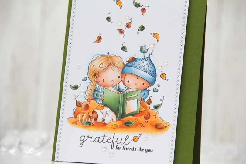
 The sentiment comes with the image. You can omit it if you want to, but I really like both the placement and the mix of the handwritten style with the playful print style. I decided to also add a few additional leaves above their heads. Aside from the green leaf to the left of the bird and the one leaf that’s landed on the hat, all the leaves above their heads are ones I added. I did that by copying the leaves already in the image and placing them where I wanted them; it’s one of the many advantages of working with digital stamps.
 I colored everything with my Copics and went for a much warmer color palette than I usually choose. Their clothes are cool tones, but everything else is in warm tones.
 I used one of the dies in the Stitched Borders set from Lawn Fawn to create the faux stitching on the sides of my colored piece, before I adhered it to a top fold card base I created from Jalapeño Popper cardstock from My Favorite Things. I did add a few additional layers of cardstock behind the panel for dimension, though.
 I wanted to keep the focus on this cute image, and scattered a few iridescent gems from the Glass Crystal collection from Little Things from Lucy’s Cards to finish it off.
 The gems catch the light and add to the warm feel of the card.
 I used quite a bit of Copics for this card, even though my coloring is pretty simple.