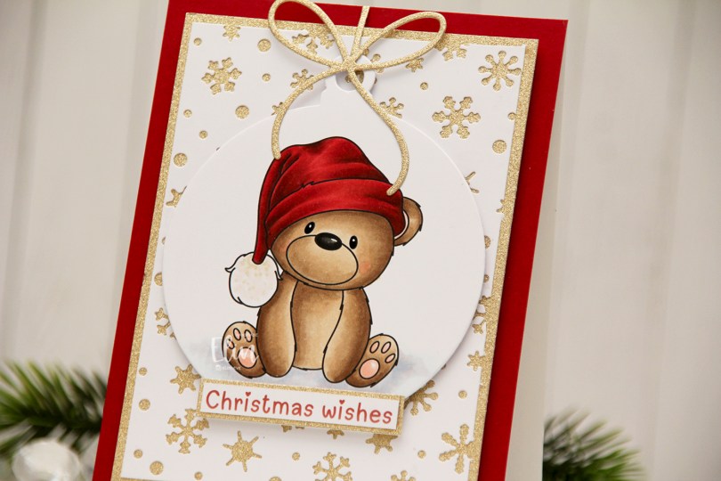
Hi, crafty friends! It’s the third Thursday of the month, which means it’s #getcrackingonchristmas. This is an initiative from Jenn Shurkus to get us creating holiday cards all year instead of having to scramble last minute to get them done in November and December. This lets us use our holiday products, try out new things and enjoy the process! My card today features an adorable Christmas bear from a digi stamp set from Amanda Jayne Designs, as well as some other goodies.
 I colored the bear with Copics and used the Snowflakes and Ornament die set from Hero Arts to turn him into a Christmas ornament. Isn’t he adorable with his head tilted to the side? I covered the card base with a piece of Cranberry cardstock from Concord & 9th. This is the perfect Christmas red, and it goes really well with the colors on his hat, as well as the color I chose for the sentiment, which is also from Amanda Jayne Designs.

I used the Snowflake Confetti Fancy Die from Hero Arts to create a white background of snowflakes. I cut the panel down and adhered it to a piece of gold glitter cardstock from Kort & Godt Hobby, giving shine and sparkle to the snowflake openings. I mounted my gold cardstock to the center of the card using foam tape and added my colored bear ornament with more foam tape – there’s a lot of dimension going on here. I used the Gift bows dies from Kristina Werner to add a gold glitter bow to the top of the ornament. I also used a little bit of the gold glitter cardstock to mat the sentiment, which I adhered directly to the ornament to finish the card.
![]() For such a simple image, I sure used a lot of Copics.
For such a simple image, I sure used a lot of Copics.
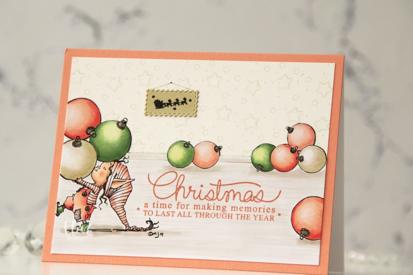
 I separated out the baubles from the image and did some copy paste work to create my scene. It’s one of the advantages of using digital stamps, and it makes them super versatile. I drew in a base board at the back with a black Copic multiliner and colored my scene.
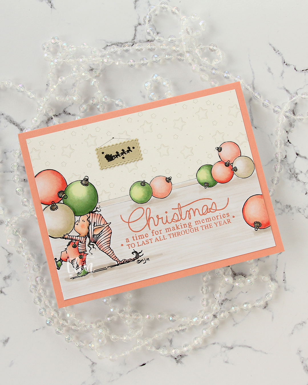 I fussy cut around the back bauble and base board and adhered my colored piece onto a piece of patterned paper from ModaScrap that acts as a wall paper for my background. To make it even more obvious that it’s supposed to be a wall, I stamped part of the Window Signs image from Purple Onion Designs using Altenew Obsidian ink onto a scrap piece of X-Press It blending card that I’d colored with one of the neutral colors (E81) I used for my baubles. I then die cut that using the Postage Collage Die set from Waffle Flower and adhered it to my wall, drawing in strings and a nail on the wall for it to hang from.
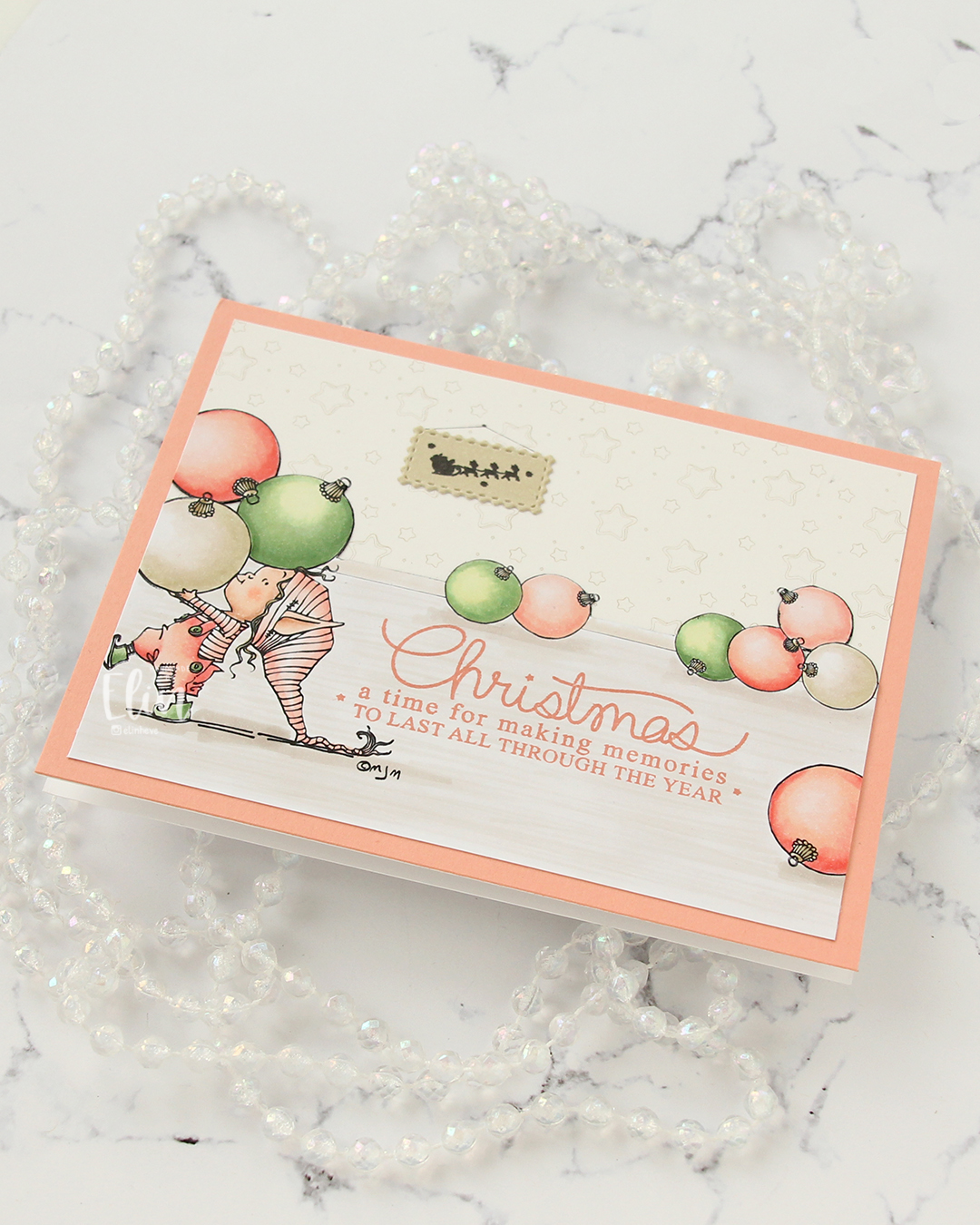 I stamped a sentiment from the Merry Greetings stamp set from Mama Elephant using Melon Berry ink from Papertrey Ink. It matches really well with the coloring. I adhered my scene to a card base covered with a quarter sheet of Grapefruit cardstock from Concord & 9th to create a matching frame and my card was finished.
 Limited Copic color palette for this one. I also used W3, W1 and W0, but I see now that I cut my graphic off too short, so they’re missing here.
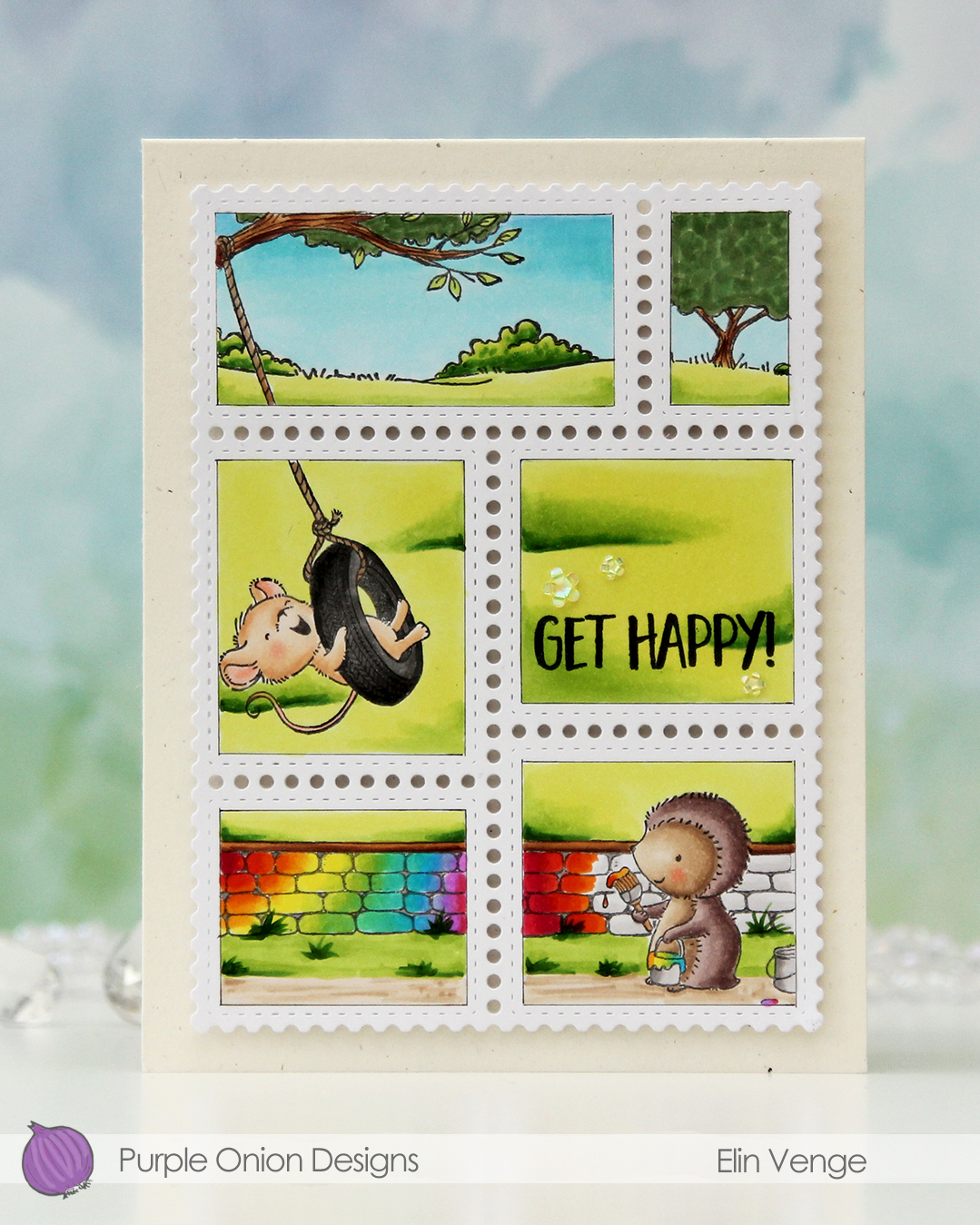 In addition to Polly and the stone wall, I also used
  Once my coloring was complete I stamped a sentiment from the Journey sentiment set from Purple Onion Designs using Altenew Obsidian ink.
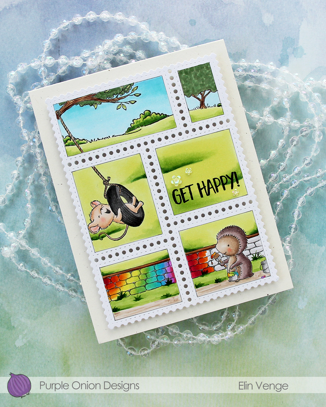 I stacked cardstock scraps behind each of the postage stamps for dimension and adhered everything to a card base I created from Rustic Cream cardstock from Papertrey Ink. I love this cardstock, I need to break it out more!!
 To finish off the card I embellished with iridescent flowers from the Spring Leaves mix from Little Things from Lucy’s Cards.
 Lots of Copics for this one.
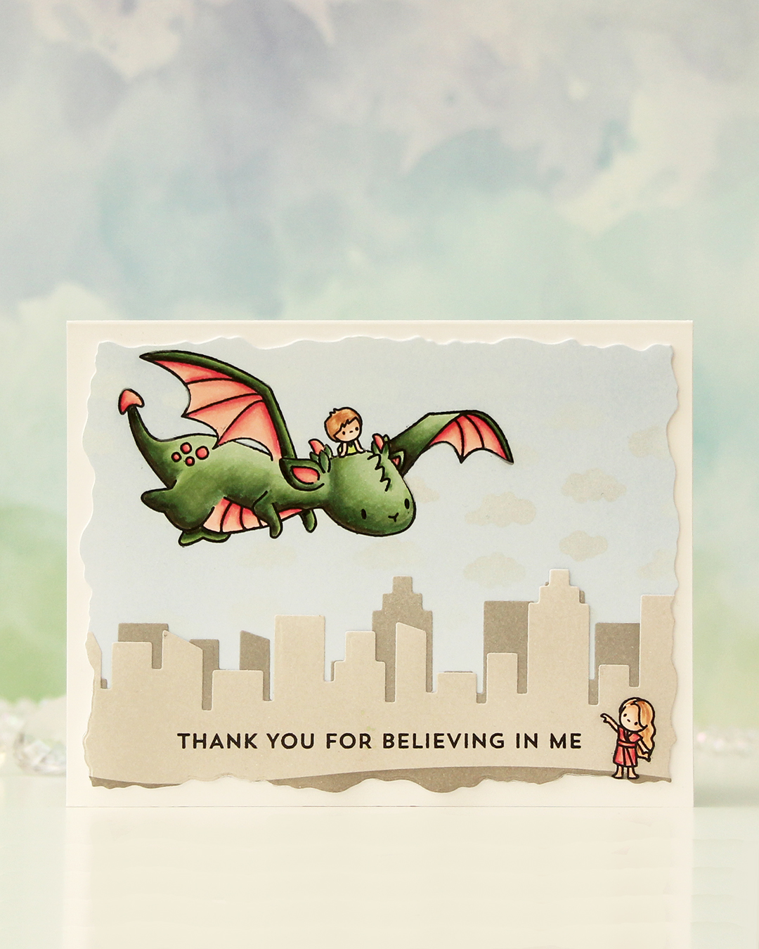 I started with two panels of X-Press It blending card and stamped the flying dragon and little boy on one of the panels, and the little girl in the corner of the other. I stamped in Copic friendly ink, colored up the images, then stamped on top with Altenew Obsidian ink, which gives really crisp black lines.
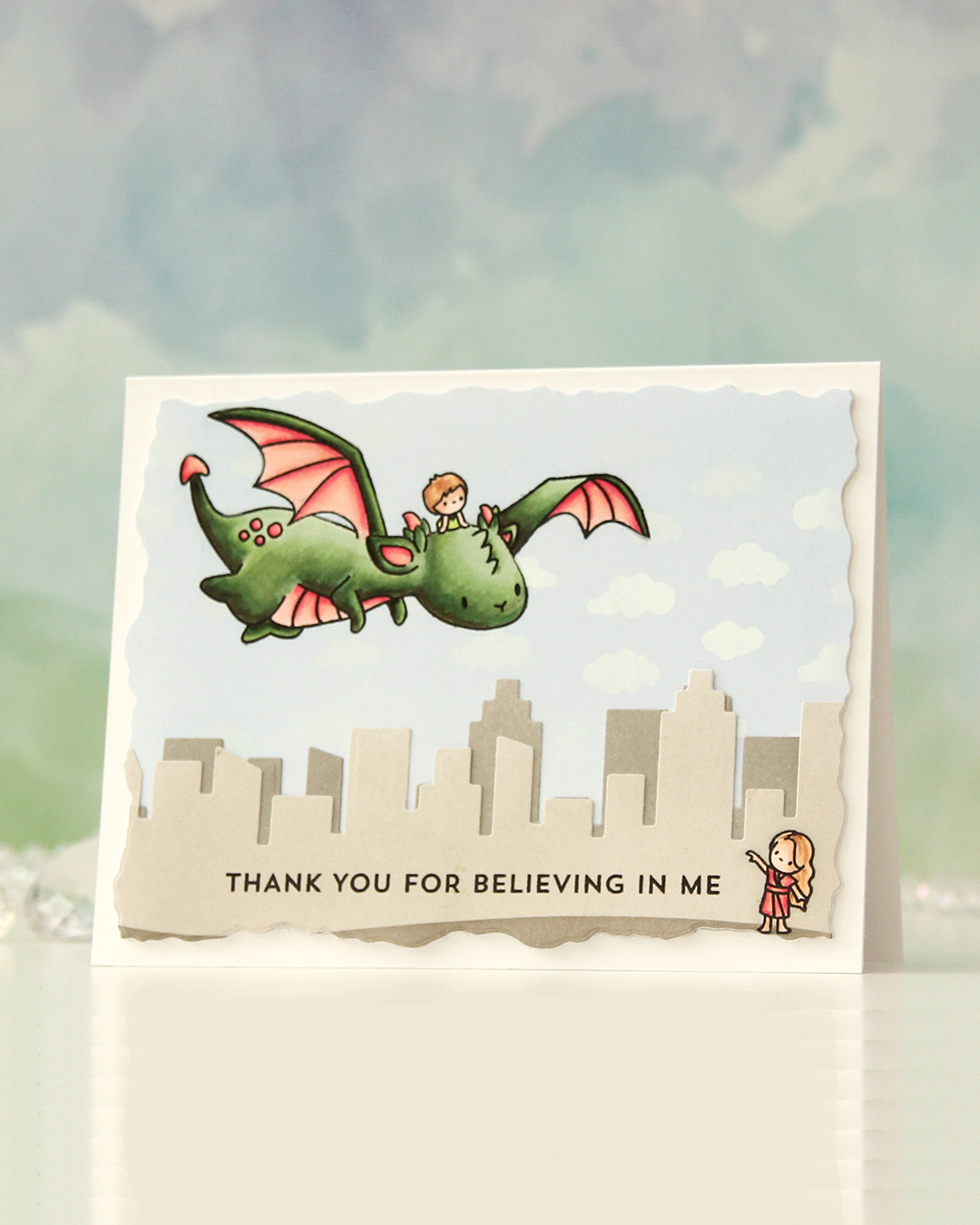 Once the coloring was complete, I put masks on top of my images and ink blended around them. For the piece with the little boy and the dragon, I used Icy Water fresh dye ink from Altenew, and for the panel with the little girl, I used Evening Gray ink, also fresh dye ink from Altenew. I also used Moon Rock at the very bottom to ground the little girl. In the sky, I also added clouds with Fresh Snow hybrid ink from Papertrey Ink through the Tiny Clouds stencil from My Favorite Things. This barely showed on my very pale blue sky, so I added Perfect Pearls powder on top, which makes the clouds stand out a little more, and it gives great shine when you tilt it in the light.
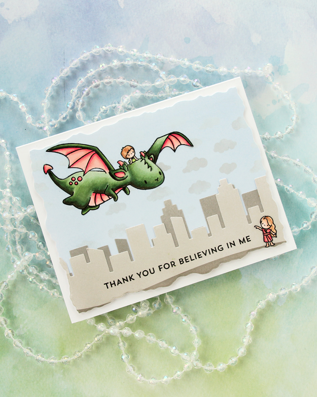 Using the Slim Film City die set from Mama Elephant, I die cut the city skyline from the panel with the little girl, and I also added a second skyline silhouette behind her that I die cut from the remainder of the panel, which I’d inked with Moon Rock ink.
 I stamped a sentiment from the Bitty Thanks & Gratitude stamp set from My Favorite Things using Altenew Obsidian ink, die cut the whole thing using a die from the Watercolor Rectangle STAX die set from My Favorite Things, added an additional three layers behind it for dimension and adhered it to a white card base. I decided not to add any embellishments to this, those clouds really do add quite a bit of shine in real life, and I didn’t think the card needed any more.
 I used a very basic color palette for this one.
 When I printed my image, I printed
  Once my coloring was complete, I used the Notebook Edge die from My Favorite Things to cut from the edge of the panel for a little bit of interest. I mounted my little scene using foam tape onto a card base I created from Cornflower cardstock from My Favorite Things.
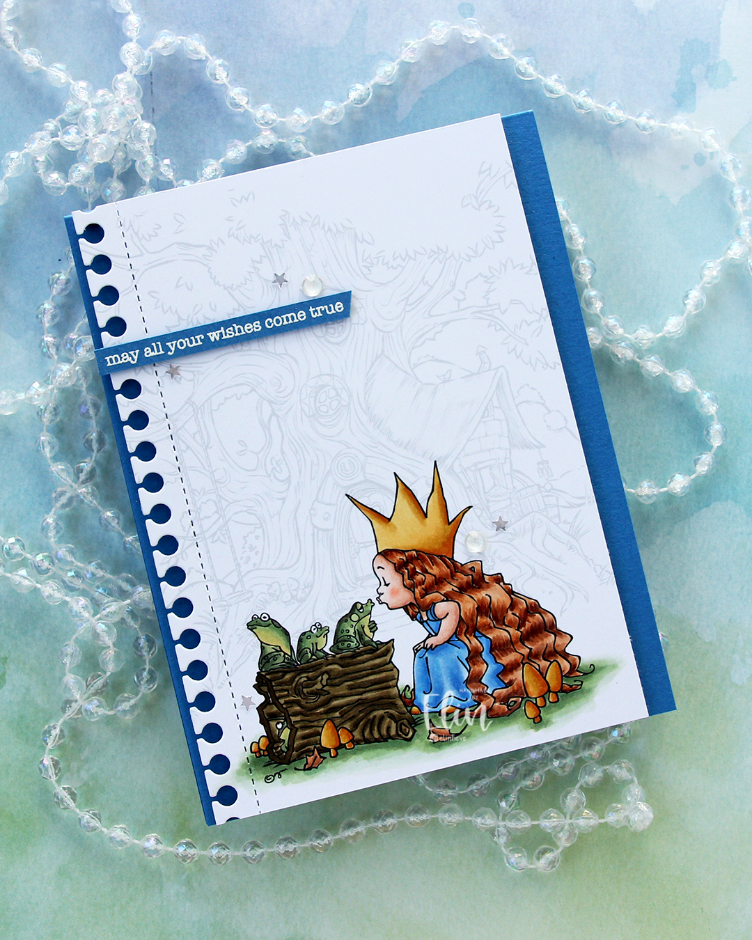 I stamped a sentiment from the Birthday messages stamp set from Mama Elephant using VersaMark ink onto a scrap of Cornflower cardstock, added super fine detail embossing powder from Ranger and heat embossed. I always heat emboss from the back of the back of the cardstock only, it gives a much better result than heat embossing from the front.
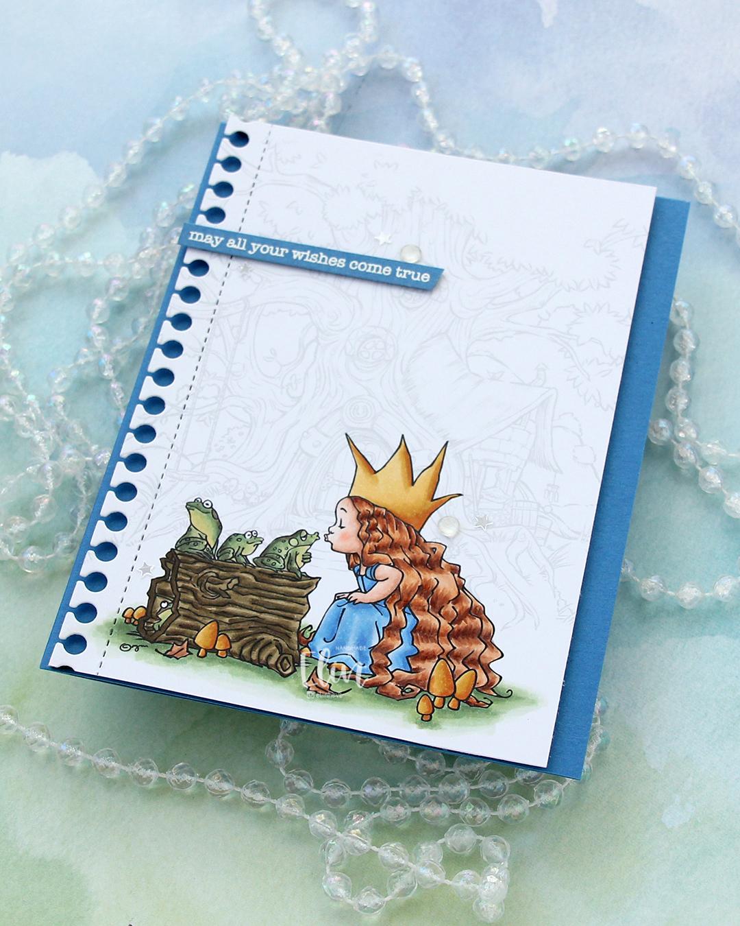 I cut my sentiment down to a strip, added a couple of layers of cardstock behind it for dimension and adhered it near the top left of the card, before finishing off with a few gems and confetti stars from the Starry Night mix from Little Things from Lucy’s Cards. The stars made me think of “When you wish upon a star”, which goes perfectly with the sentiment and the “Once upon a time” theme for the Coloring Club Challenge.
 I used a fairly limited color palette for this one, I feel.
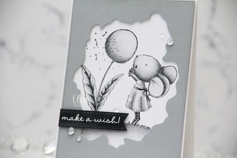
 I used grays for my coloring of this
 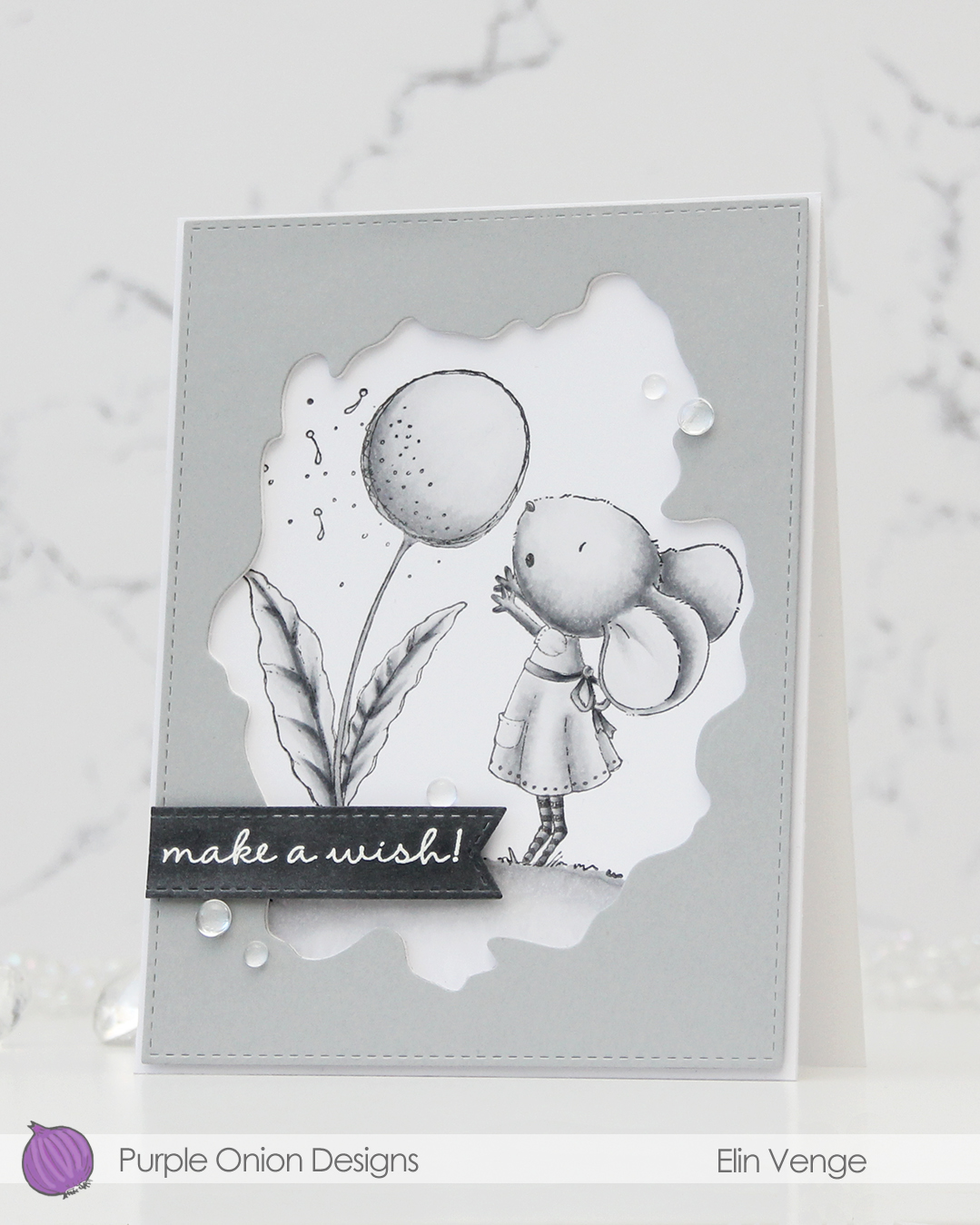 I used the Watercolor Wash Free Form die and the largest die in the A2 Stitched Rectangles STAX 1 set from My Favorite Things to cut a window opening and create the faux stitching on the edges of a piece of Dove cardstock from Concord & 9th. I used the Watercolor die to cut a few more layers from white cardstock to glue behind the grey for dimension.
 I scribbled a bit of N5 Copic marker on a scrap of Dove cardstock to make it a little darker, let it dry, then stamped and white heat embossed a sentiment from the A Beautiful Day Sentiment Set from Purple Onion Designs (unfortunately, I think the set’s discontinued, I couldn’t find it when searching the POD store). I then used one of the dies in the Essential Stitched Sentiment Strips die set from MFT to carry on the faux stitching look that I already had going. I added a few strips of cardstock behind it for even more dimension and adhered it in the bottom left of the card.
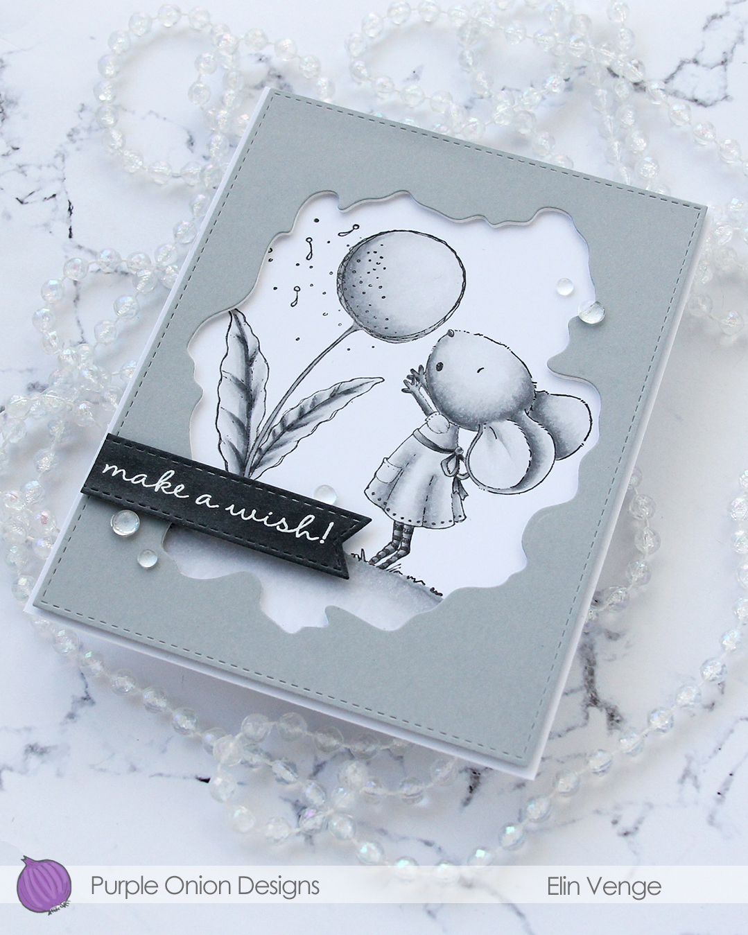 To finish off the card. I adhered a few Dew Drops from Concord & 9th. With greyscale coloring, grey cardstock, white heat embossing and clear dew drops, it looks like I took black and white photos of this card, but I promise I didn’t.
 I don’t think I’ve ever colored an image with less markers.
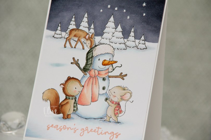

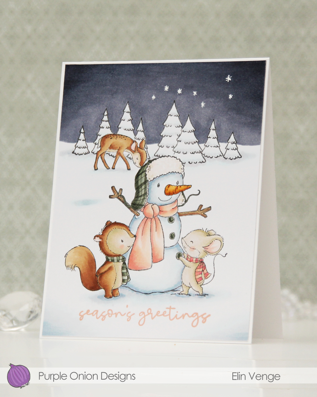 Once I removed the masks, I could color in my scene. I always start with the background elements before coloring in the focal point. I wanted a very wintery card, so I kept the trees pretty much white, only adding a little bit of the blues I used for the rest of the snow to make them look less flat.
 I stamped a sentiment from the
  I cut my panel down to 4 1/2 x 5 3/8″, which gave me an even 1/16″ border around the edge when I adhered it to my A2 card base. I love a think border like this. I also love a very chunky border, usually when I mount my panels with foam tape. To me, it seems silly to add foam tape to a panel that goes close to the edge of the card, but with a wide border, it really makes an impact. I finished off the card by drawing in the Big Dipper stars using an extra fine point Sharpie paint marker.
 Not a whole lot of markers used for this one, actually. Although I see that I missed the colors I used (BV29, 25, 23) for the sky in this graphic.
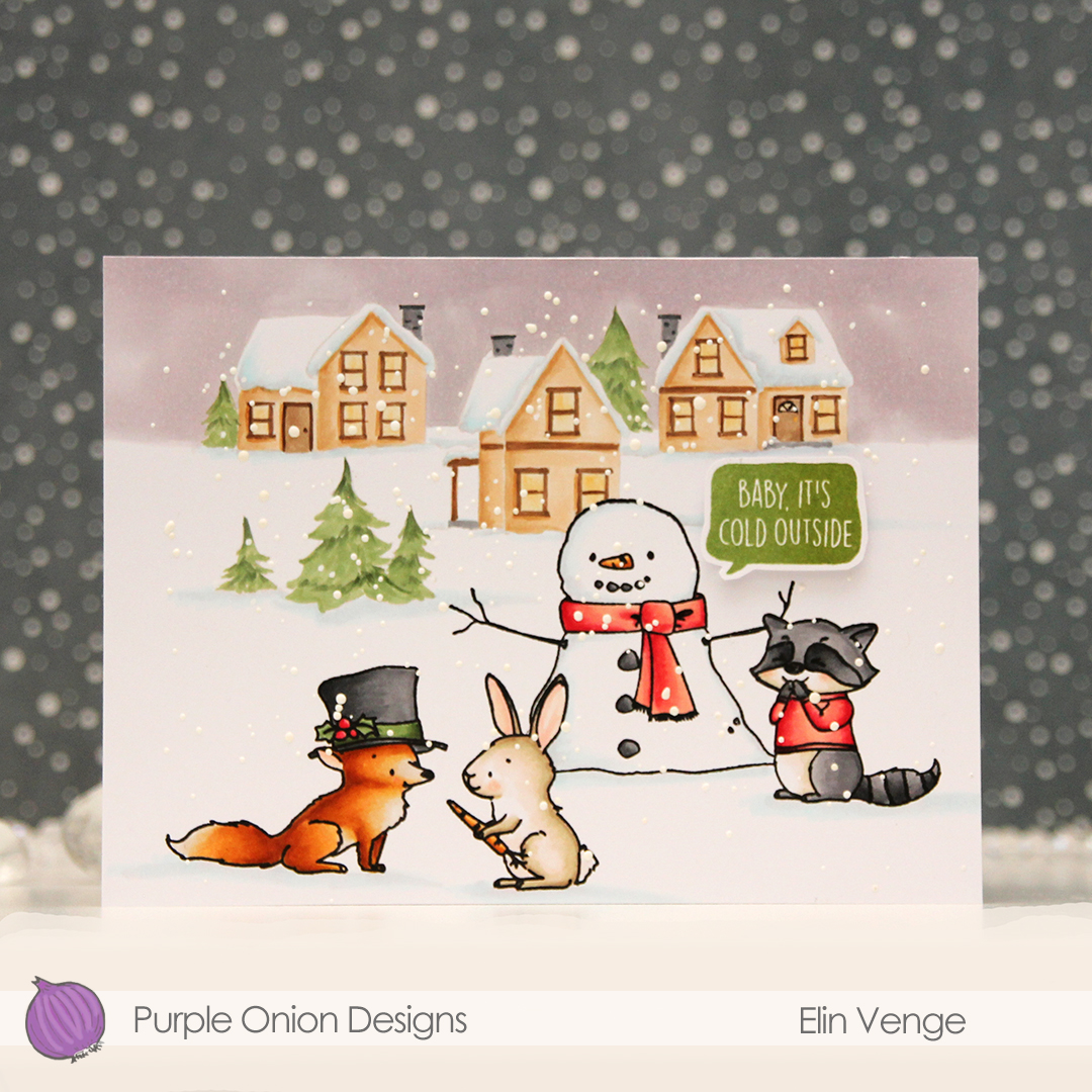 These images in this scene are all from the Winterwood collection from Purple Onion Designs, illustrated by Holly Mabutas. We have
  I colored the scene with Copics, then stamped the critters and the snowman again, this time using Obsidian ink from Altenew to get crisp black lines. This is a pigment ink, which doesn’t play nice with Copics, but as long as the coloring’s already complete, using this ink is totally fine. I sprinkled on Chunky White embossing enamel from Stampendous, melted the granules from the back of the paper and finished off the card with a sentiment from the
  Not a whole lot of colors used given the large scene, but I did use 7 for the fox alone. But he came out so cute, it was totally worth it!
 I haven’t done any coloring since December, so I felt rusty. Thankfully, these images from Lili of the Valley are easy ones for jumping back in! Once my coloring was complete, I fussy cut him, leaving a thin white border around the edge. I didn’t want to cut away the “fuzzies” that are so typical of LOTV images, so by leaving a white border, I could preserve the look. I used an embossing folder (Quilted embossing folder from Concord & 9th) to create some interest in the background without being too distracting.
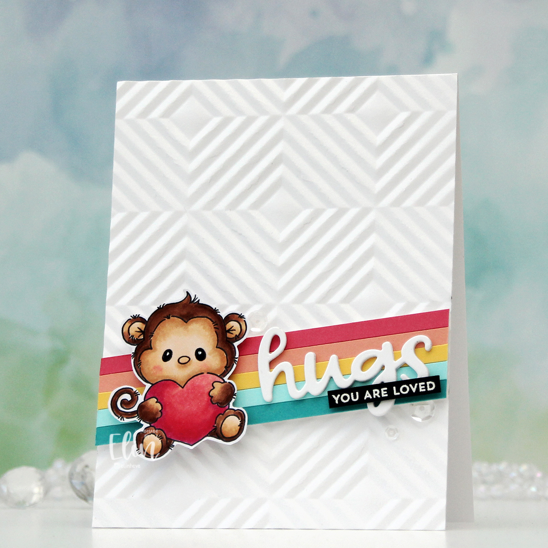 I cut down a few colors of cardstock from Concord & 9th to 3/16″ wide strips and glued them together on a scrap piece of white cardstock. The colors I used are Oceanside, Aqua Sky, Buttercup, Grapefruit and Honeysuckle. I mounted my stripped up panel at an angle, put a few foam squares behind the monkey and added him on top. I die cut hugs (Quilted die set from C9) three times from white cardstock, stacked them and adhered them on top of my strips next to the monkey. I then stamped and white heat embossed a sentiment from the Itty Bitty Gifting stamp set from My Favorite Things onto a black piece of cardstock from Concord & 9th. I added a couple of layers of black cardstock behind for strength and dimension and adhered it on top of the die cut word, before finishing off with a few sequins from the Starry Night mix from Little Things from Lucy’s Cards.
 Simple color combo this time.
 I love Stacey’s images, they all work so well together to tell stories. I colored my scene with Copics and cut my panel down ever so slightly.
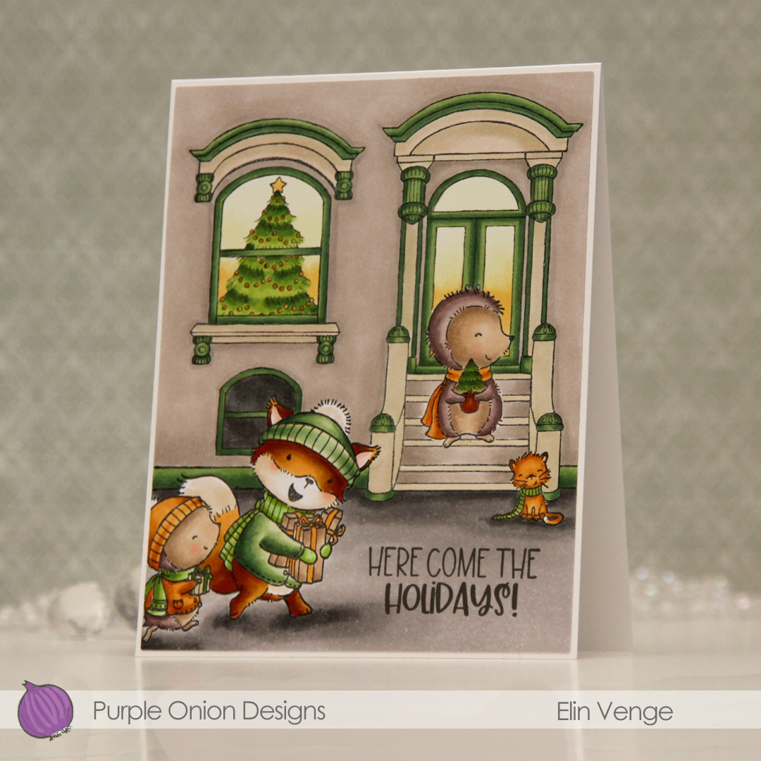 I stamped a sentiment from the
  Even with a fairly limited color palette on the card, I used quite a few Copics.