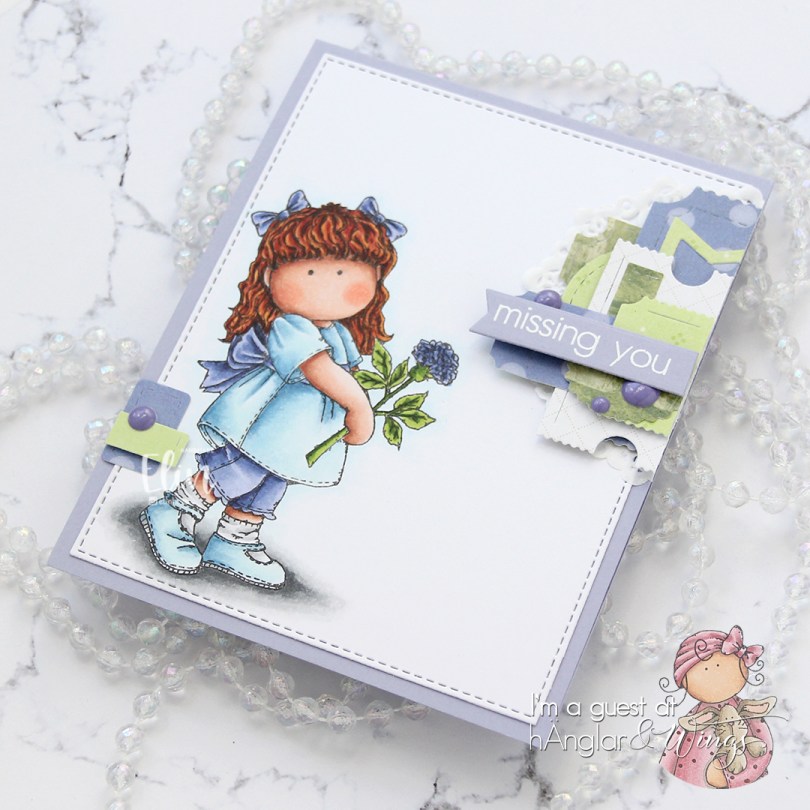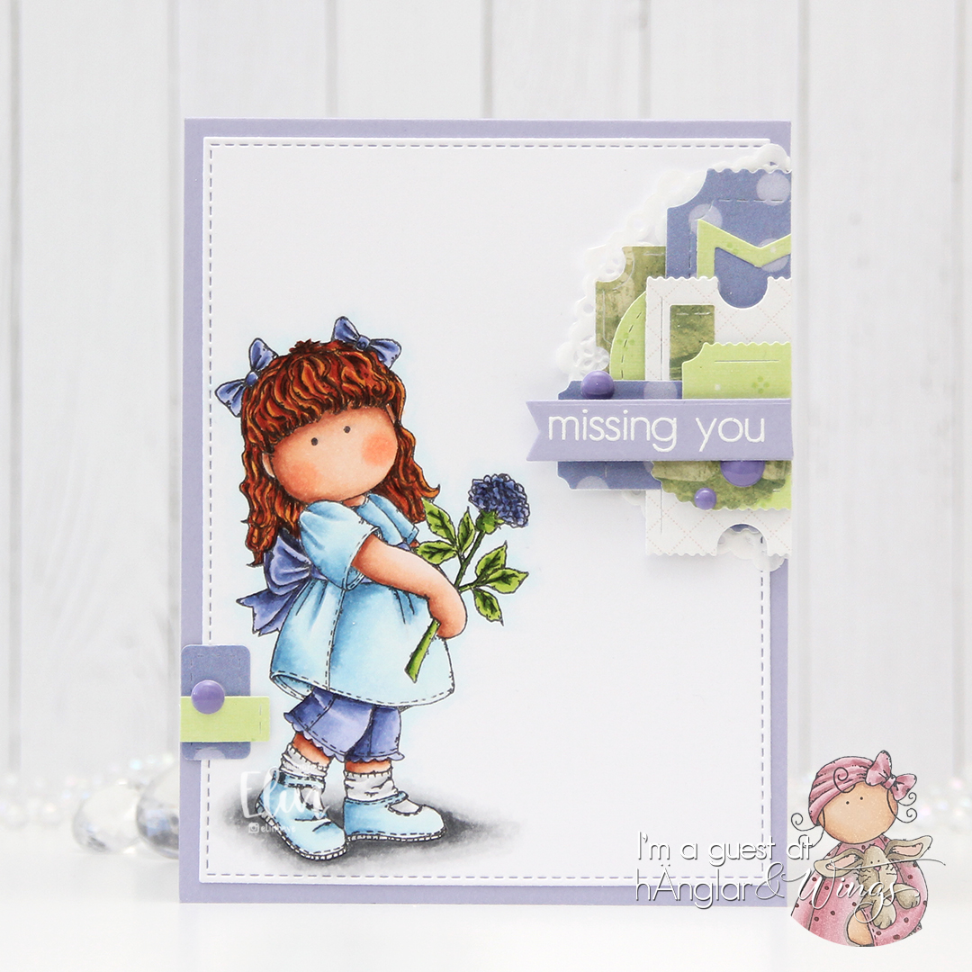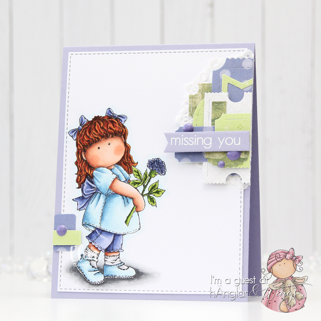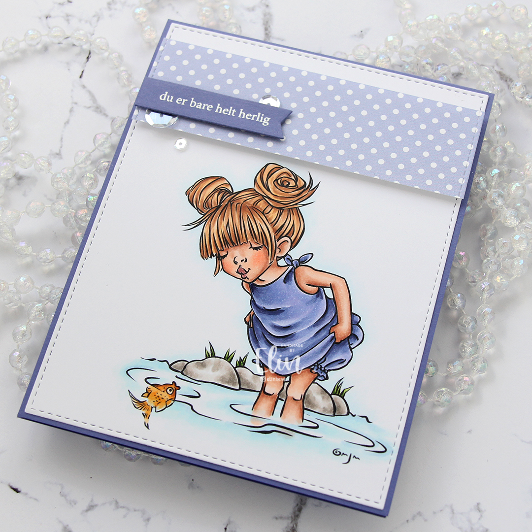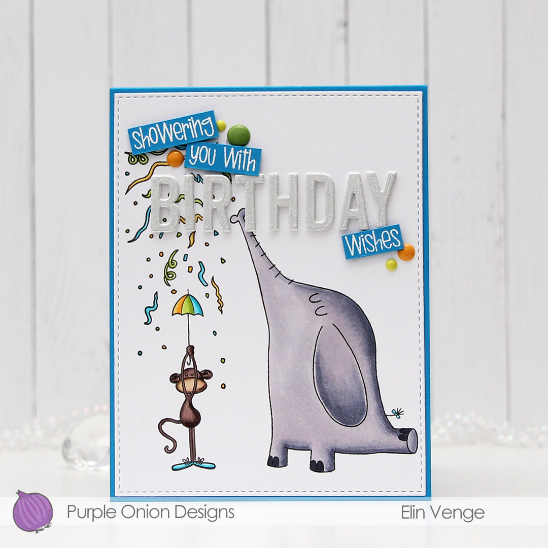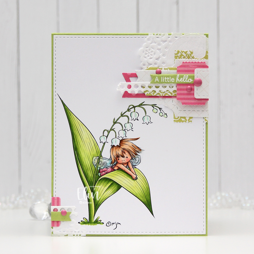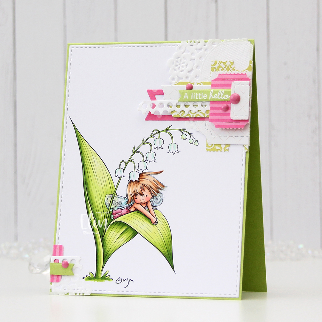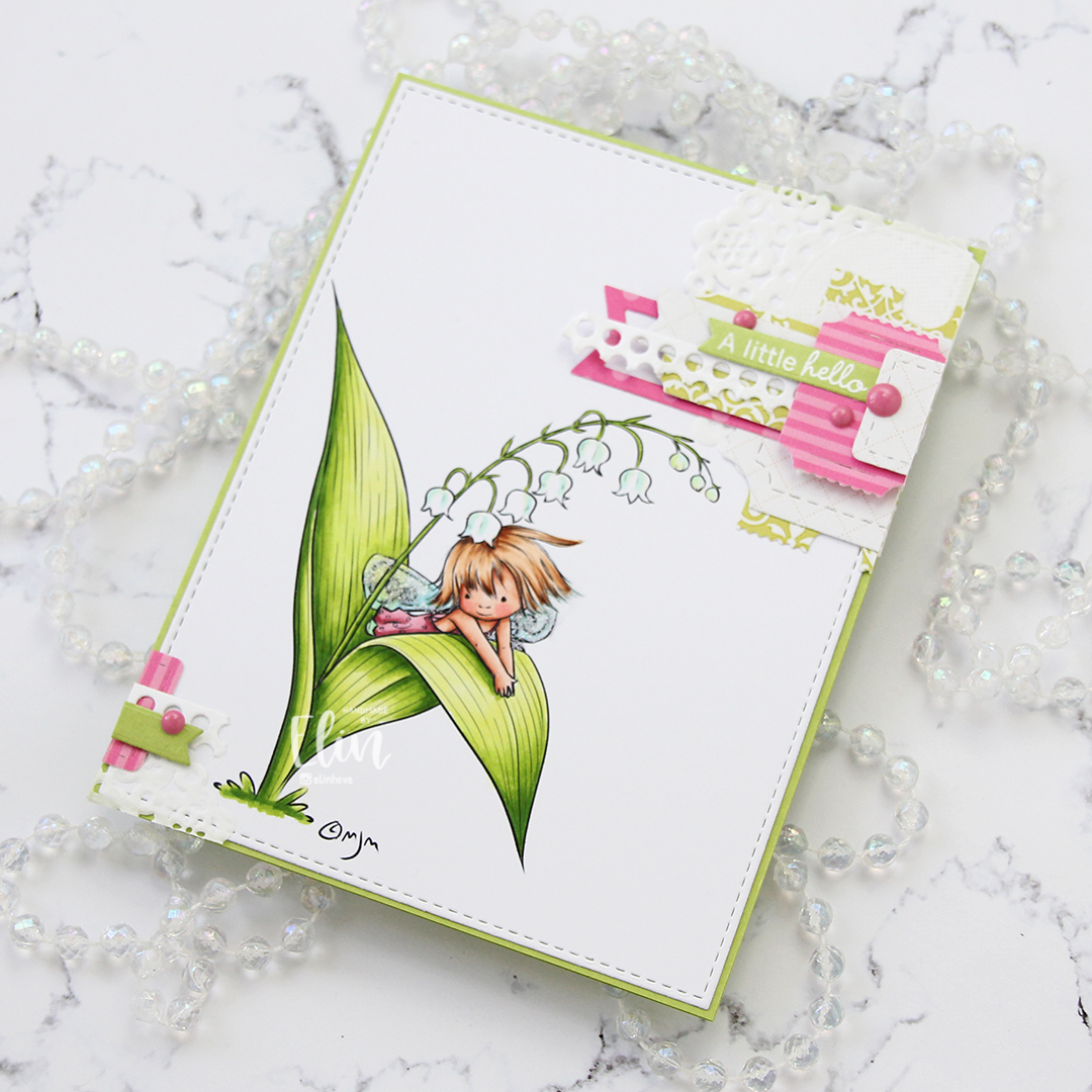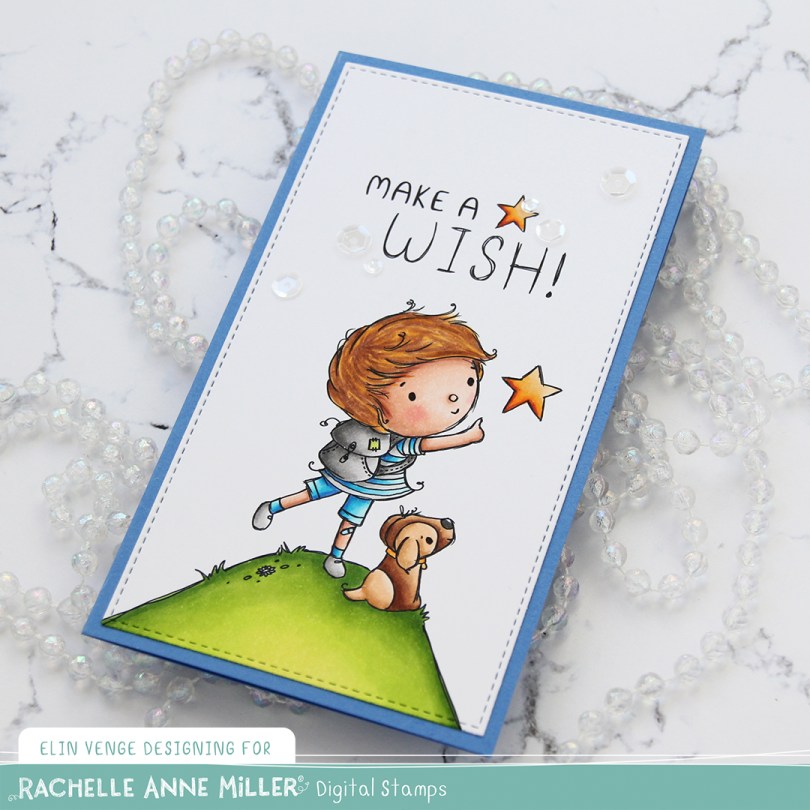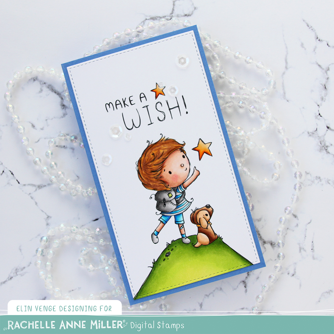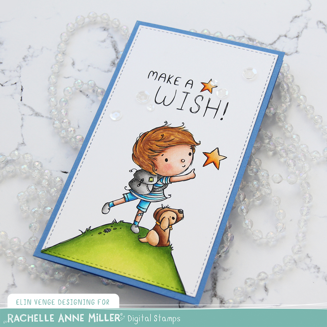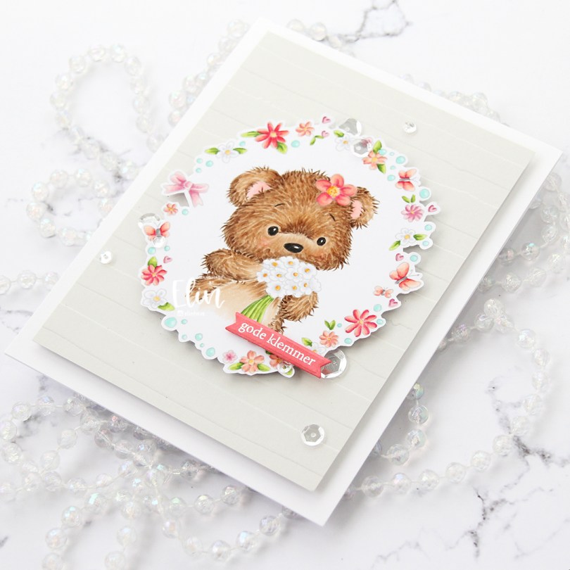
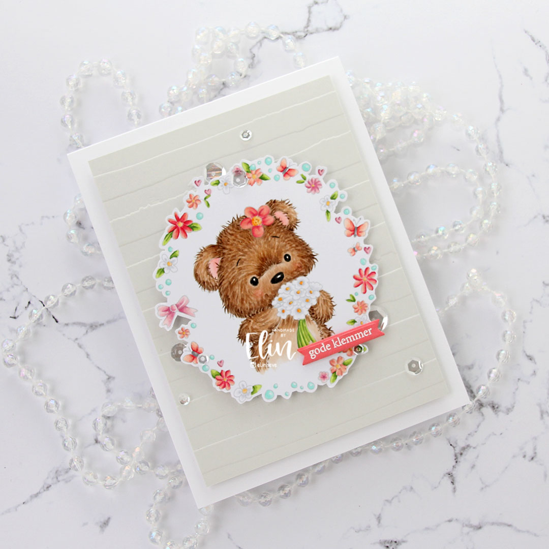
Hi! I have a simple card to share today, featuring Jenny floral border, which is an image from Lili of the Valley. I printed the image with a low opacity setting to get the no line look and colored in my image with Copics, drawing the facial features back in with a black pen.

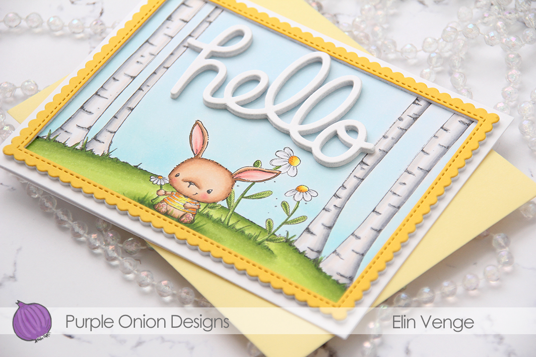
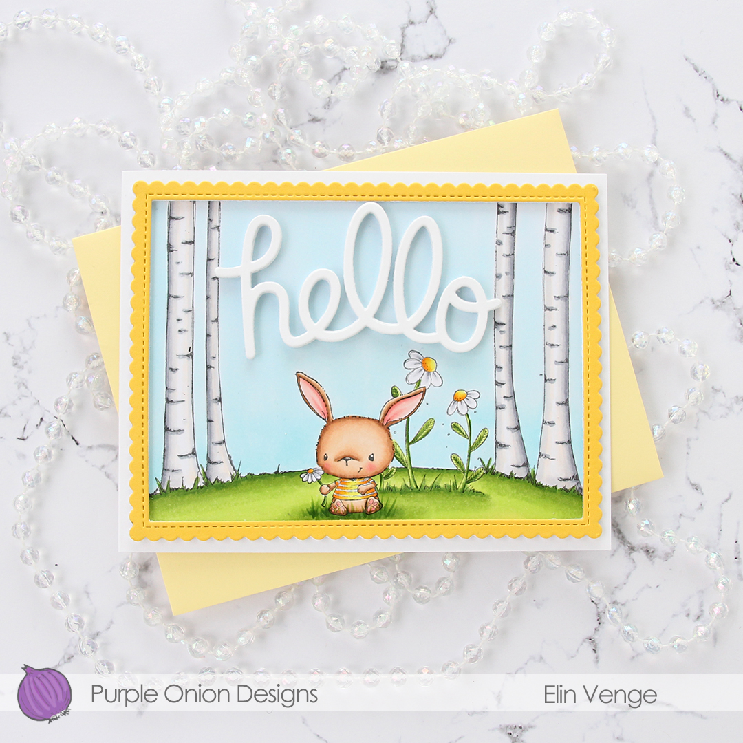
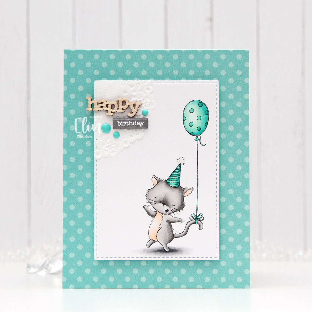
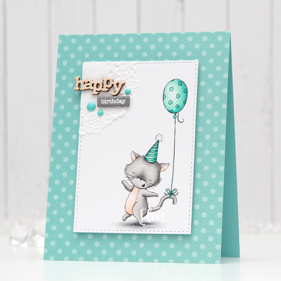
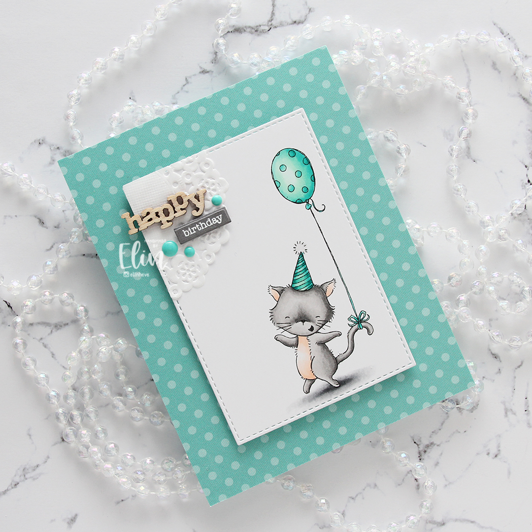
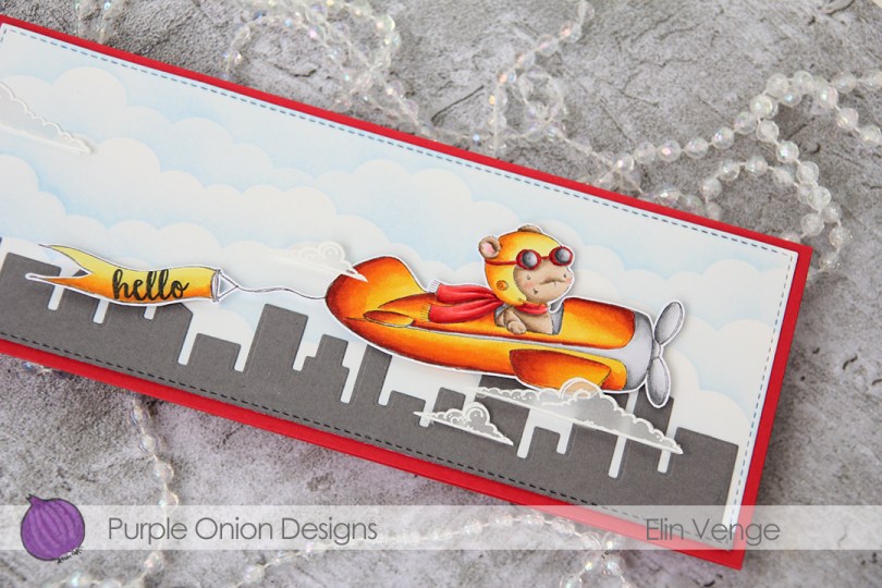
I don’t often color fur like this. It’s very relaxing to do and a very forgiving technique, but it’s a time consuming one, layering up all those fine lines isn’t done in five minutes, or fifteen, for that matter, so I don’t usually take the time to do it, but this cute little bear was begging for it.

Using the watercolor stripes stencil from Altenew, I dry embossed a piece of Soft Stone card stock from Papertrey Ink. I’ve had a love affair with the Papertrey Ink card stock for close to a decade now; it’s my favorite, and this particular grey color is so soft and perfect! I mounted it onto a top fold white card base (made out of Stamper’s Select White card stock, another one from PTI) using lots of foam tape, leaving a 1/4″ border around the edge. Using even more foam tape, I mounted my fussy cut colored piece in the center of the grey card stock for even more dimension.

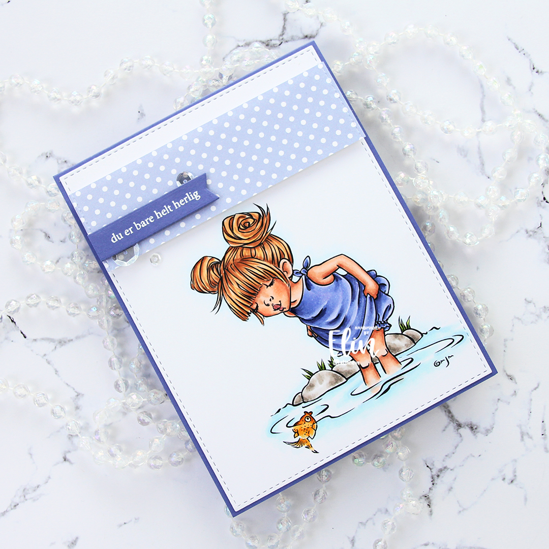
I stamped and white heat embossed a sentiment from Norsk Stempelblad AS onto a scrap piece of Berry Sorbet card stock from Papertrey Ink and turned it into a small banner with one of the dies in the Itty Bitty Strips die set from My Favorite Things. This particular pink card stock is another favorite of mine, and I only have tiny scraps left, I need to stock up! I mounted the banner onto my colored piece using 1 mm foam squares.
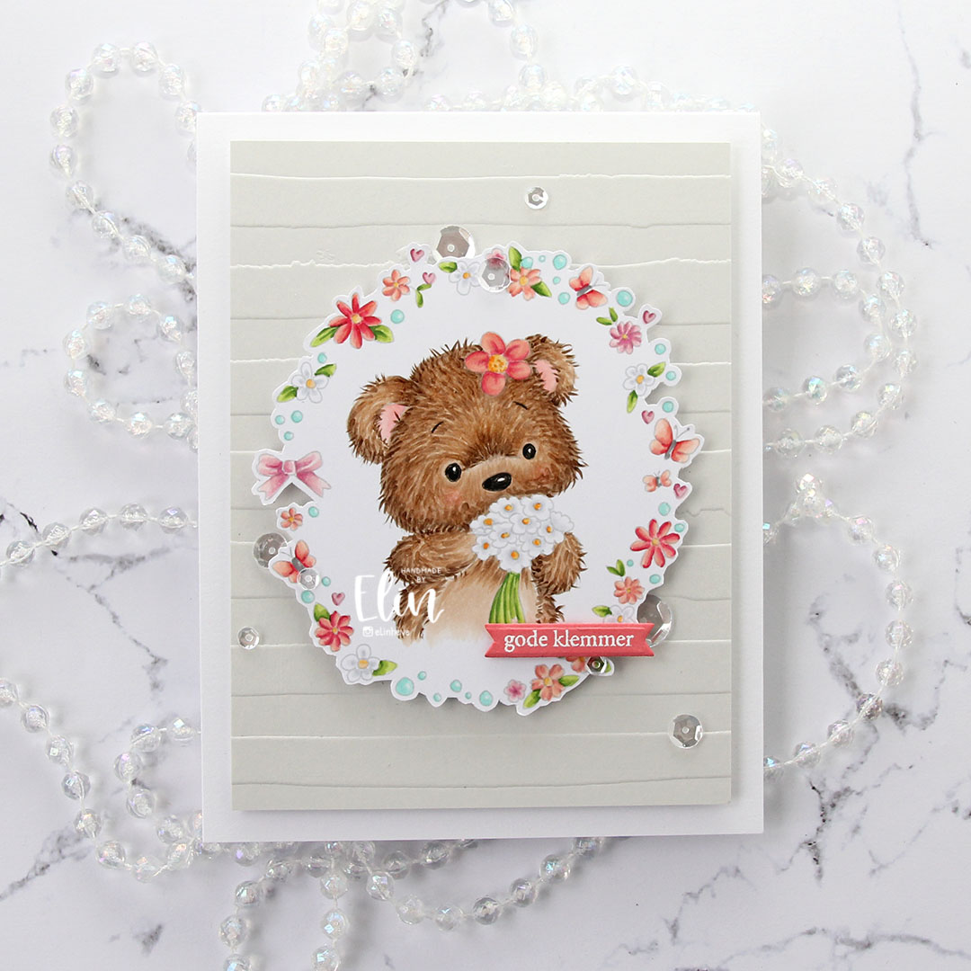
I added sparkling clear sequins from Pretty Pink Posh to finish off my card. Three groupings forming a visual embellishment triangle. I usually only place my embellishments near the sentiment to draw the eye to the sentiment, but for this one I staggered them elsewhere too. I love that these sequins come in a bag with four different sizes. I have other sequins I love too (the mixes from Little Things from Lucy’s Cards are awesome), but I still believe these are my favorites. If I could only buy one type of sequins for the rest of forever, these are the ones I’d choose.
I’m sending sparkling, dimensional, flowery bear hugs your way!