
Hei og hopp! De siste årene har jeg laget flere enkle kort enn de kvadratiske lag på lag-kortene jeg lagde “i gamle dager”. I dag har jeg virkelig gått tilbake til gamle kunster, her er det lag på lag (på lag), rufsing, litt maling med gesso (akkurat så mye (evt. lite) klin og klæsj som jeg liker), blomster, skjulte elementer og pynt på alle fire sider. Kortet er laget på bestilling til dåpen til en liten gutt.

Jeg har stemplet motivet Heaven Sent fra Lili of the Valley med Extreme Black blekk fra My Favorite Things og fargelagt med Copics. LOTV har ikke lenger gummistempler, men jeg ser at dette motivet nå finnes som digitalstempel.
 Jeg stanset ut motivet mitt med en die fra Spellbinders og satte på en perlebord fra Wild Orchid Crafts på innsiden av kanten. Pyntet med blomster fra WOC og Kort & Godt, i tillegg til knapper fra Papertrey Ink malt med bittelitt gesso. I midten av de hvite sweetheartblomstene har jeg satt blå diamanter fra Kort & Godt, og i midten av den blå har jeg limt på en liten hvit perle.
 Bak motivet har jeg gjemt en tag stanset ut med en die fra Magnolia. Jeg har satt en sløyfe med knapp i enden, og stemplet en tekst fra North Star Design på tagen med blekk fra Papertrey Ink. Bokstavene i navnet til dåpsbarnet er stanset ut i Maja Design papir med en Sizzix-die.
 Kantdieen jeg har brukt for å lage stjerneborden som går på tvers av kortet kommer også fra Magnolia, det samme gjør hjerteswirlen jeg har lagt under blomstene mine.
 På innsidene har jeg to identiske skrivefelt laget med den samme dieen som jeg brukte på forsiden til motivet mitt. Det gir en fin helhet til kortet. Den andre innsiden er lik denne. Veldig greit med ekstra god skriveplass på dåpskort, dåpsbarnet har jo hele livet foran seg.
 Baksiden har det samme oppsettet, en tekst fra NSD og enda flere blomster.
 Her syns relativt godt at det er en god del dimensjon på kortet. Spesielt postgangvennlig er det ikke, men dåpskort blir gjerne håndlevert, så jeg syns likevel det er innafor med såpass dimensjon.
 Siden kortet ikke fikk plass i en vanlig konvolutt lagde jeg en eske til å ha det i. En liten diecut med stemplet tekst får pryde utsiden av esken.

 Jeg stemplet robotene med Extreme Black blekk fra My Favorite Things på en kortbase av 120 lb Ultra Thick White kartong fra Simon Says Stamp. Kartongen er veldig tykk og laget på en måte som gjør at fargeleggingen ikke vises fra baksiden, som er veldig praktisk når man skal lage ettlagskort. Jeg sørget for at ca halvparten av hver robot faktisk ikke fikk plass på kortet, jeg syns det var en morsom vri.
 Fargeleggingen er veldig enkel, jeg har faktisk holdt meg til åtte tusjer (selv om den ene fargen ikke vises i oversikten under her, den har jeg nemlig laget selv)! Da jeg var ferdig med begge robotene stemplet jeg en tekst fra Norsk Stempelblad AS mellom dem med VersaFine Onyx Black blekk og embosset med klart embossingpulver.
 Her vises effekten man får med embossingen, teksten blir hevet og blank. På flere av boltene og øynene til robotene la jeg på Glossy Accents og Nuvo Crystal Drops i fargen Granite. LITT pynt må man jo ha, selv på et meget enkelt herrekort.
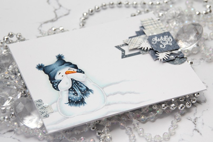

 I printed him out in soft gray lines to be able to color him up and get the lines disappearing, I love the soft look on no line coloring, espesially on snow. I glued my panel of X-Press It onto my top fold card base and added a very dimensional cluster of diecut patterned paper scraps from Maja Design. I stamped and white heat embossed a Norsk Stempelblad AS sentiment on that top ticket stub, and embellished very sparsely with some Sparkling Clear sequins from Pretty Pink Posh.
 I like making clusters like this, and it’s such a great way to use those tiny scraps, I’m sure we all have them. I rarely make my clusters this dimensional, but it’s kind of fun to see all the layers and view it from different angles.
 I didn’t use a lot of Copic colors for this one, it is a pretty simple image, after all. I hope you give clusters a try, they’re fun to make. And let’s not forget about that adorable snowman! Hope you have a nice day!
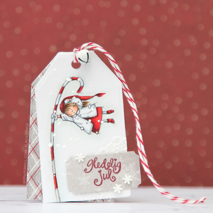
 I’ve made a tag for a Christmas present with the adorable
  I added snow with chunky white embossing powder, glued on the corner of a small paper doily and a diecut ticket stub from patterned paper on top of that with some 1 mm foam tape. I stamped a tiny Norsk Stempelblad AS sentiment with Scarlet Jewel ink from Papertrey Ink and decided to also add a few snowdrift sprinkles by Little Things from Lucy’s Cards. I love these tiny white clay snowflakes.
 Gift tags, by nature, need space for names. I stamped another Norsk Stempelblad AS stamp on another patterned paper ticket stub and mounted it to the back my tag using more of that 1 mm foam tape.
 Jeg stemplet blomstene og bladene i
  Jeg ville ha en enkel, men ikke altfor enkel bakgrunn på kortet mitt. Valget falt på et ark med folierte gulldetaljer. Prikkene går litt inn i arket og gir et letterpress-utseende som jeg virkelig liker.
 Jeg stemplet en tekst fra en stempelplate fra
  Her kommer gullprikkene i hovedpanelet på kortet godt frem.
 Jeg prøver å være flink til å få med hvilke tusjer jeg har brukt på motivene mine, veldig kort og enkel fargepalett denne gangen.
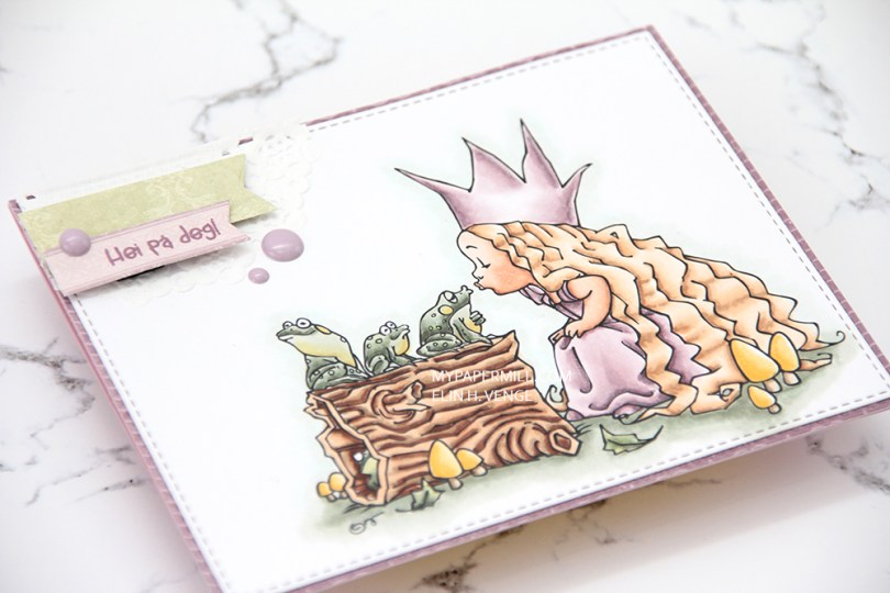
 I’m back! I’m slowly getting back to this paper crafting thing after fracturing my shoulder in April. And now that I’ve started, I’m finding inspiration everywhere. From stamp sets that aren’t my style, from patterned paper that’s not my style, from color combinations in sequin mixes, I just hope it will translate once I actually get around to playing with paper and making stuff.
 I’m rusty, there’s no doubt about that. So rusty, in fact, that I die cut the purple patterned paper behind my main panel instead of the main panel. The result is a slightly smaller card, and hopefully I’ll die cut the right pieces next time. I used Mo’s
  I love the line of frogs waiting to kiss the princess, and the frog peeking out from inside the hollow log is such a great detail!
 I added a piece of a small Doodlebug paper doily in the top left corner, along with some scraps of patterned paper by Pion design that I die cut using a couple of banner dies from My Favorite Things. Stamped a Huldra Designstudio sentiment in Memento Sweet Plum ink on one of the banners, and popped both banners up using foam squares. A few Papirdesign enamel dots, and my card is finished.
 I love how the patterned papers from both Papirdesign and Pion Design match both the soft coloring I did on the image and those purple Papirdesign enamel dots.
 Jeg stanset ut en die fra Papirdesign i fem lag av Berry Sorbet kartong fra Papertrey Ink og limte dem rett på lommen. Jeg pyntet enkelt med blomster og blader fra I am Roses og Wild Orchid Crafts, limte på noen perler fra Papirdesign og et par sommerfugler fra Snip Art.
 Kortet for øvrig er laget som et vanlig dobbelt kort, med paneler til skrivefelt inni. Kantene på selve bukselommen er ikke 100 % rette, så resten av målene måtte tilpasses deretter. Det var også en av grunnene til at jeg valgte å rufse kantene på papirene, da er det ikke så farlig at det ikke er helt perfekt. Av en bit mønsterark fra Summer Crush-kolleksjonen til Maja Design stanset jeg ut en sirkel med pyntekant med en die fra Cottage Cutz og stemplet en tekst fra Stempelglede med Espresso Truffle blekk fra Memento. Følte at jeg måtte ta igjen litt av pynten fra forsiden, så det ble en liten sommerfugl her også.

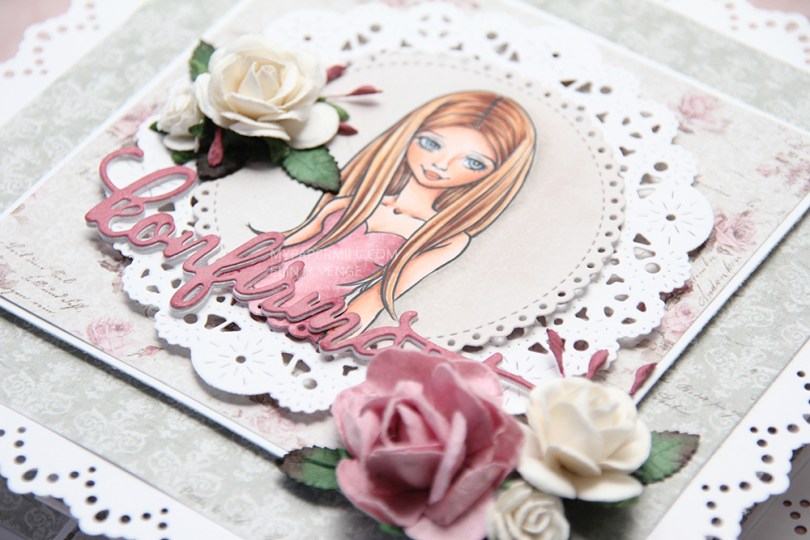
 I used Mo’s
  The pink I used for the dress matched perfectly with the roses in the Vintage Romance collection by Maja Design. I stacked white konfirmant diecuts on top of each other and finished off with a pink one on top colored with the darkest Copic I used for her dress. I’ve added dimension to pretty much all the panels, and a few flowers to embellish a little.
 When you pull on the front of the card, there’s a neat little suprise behind it, four accordian folded “walls”, one on each side. I stamped confirmation sentiments from Norsk Stempelblad AS in Papertrey Ink Autumn Rose ink on punched circles of patterned paper and added them to my accordian folds.
 Inside the “walls” of the card, I put a sentiment from Stempelglede, stamped in the same Autumn Rose ink from Papertrey Ink that I used on the punched circles.
 Jeg stanset ut et vindu med en die fra My Favorite Things til å ha alle bananene mine i. Det hvite panelet er satt på mosegummi, så bananene har litt spillerom. Jeg svertet Distress Oxide blekk i fargen Tumbled glass på en hvit bit kartong med hjelp av en skystensil (også fra My Favorite Things), så bananene ikke skulle flyte i hvitt tomrom. Under vinduet stemplet jeg en av tekstene fra
  Her syns det godt at det er god plass til bananene i vinduet, dybden på mosegummien gjorde dette shakervinduet veldig enkelt å lage.
 Den lille apekatten er stemplet med svart blekk (Extreme Black fra My Favorite Things), farget med Copics og så stemplet enda en gang, denne gangen med VersaFine Onyx Black. VersaFine Onyx Black er et supert blekk, det blir ordentlig svart når du stempler, men det kan ikke brukes med Copics. Ved å fargelegge først og stemple med VersaFine etterpå får jeg fine, svarte linjer. Det hvite panelet er limt på en kortbase jeg har laget av kartong fra Hero Arts i fargen Periwinkle.
 Enda en nærtitt på shakervinduet med bananene. Ved å farge noen bananer gule og noen grønne får man litt liv i shakerområdet også. Og alle bananer er jo ikke like, eller hva?
 Jeg følte behovet for en apekatt inni kortet også. På samme måte som med apekatten på fronten ble den stemplet, farget med Copics, stemplet på nytt og så skjært/klippet ut og limt på med flytende lim.
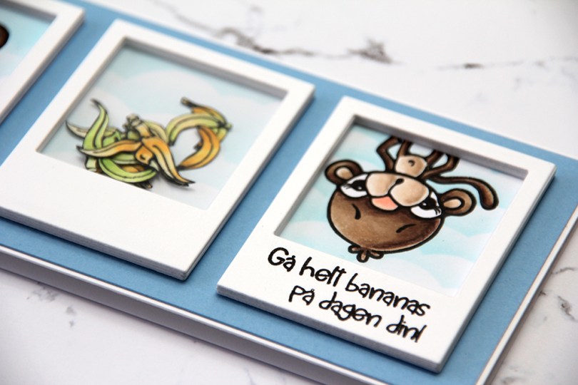

 Jeg klippet ut bananene og lagde en haug med polaroidrammer til både bananene og apekattene. Jeg tør nesten ikke å tenke på hvor mange rammer jeg har limt oppå hverandre for å få dimensjon. På rammen med bananene brukte jeg også en bit acetat for å lage shakerboks. Den øverste rammen på apekatten som er oppned ble stemplet med en tekst fra stempelplaten som passet perfekt både til apekatten, til bananene og også til rammen – størrelsen kunne ikke ha vært mer perfekt.
 Jeg stemplet så mange bananer at jeg hadde en del til overs, så jeg stemplet enda en tekst, denne gangen på kortets innside, og limte på noen flere bananer som pynt.