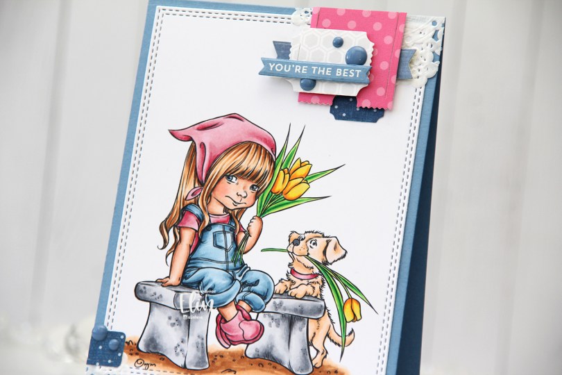
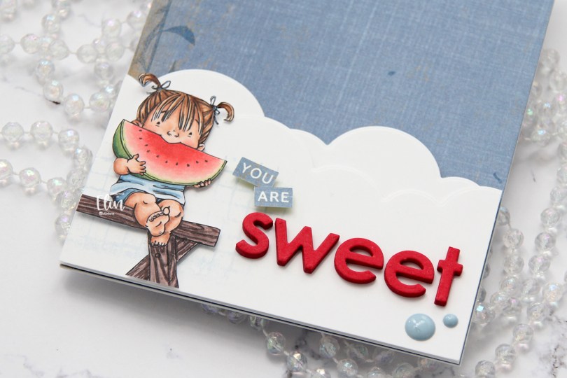
Hi! I’m back with another creation using one of Mo’s adorable images. This is Best of the Bunch, and it’s one of many favorites I have from her.
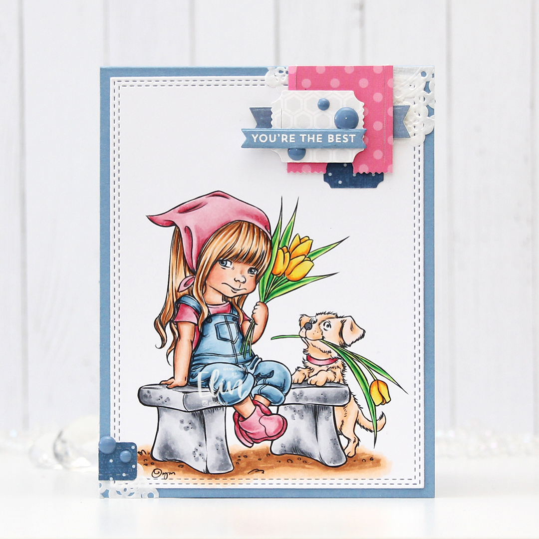
I colored the image with my Copics and used the largest of the A2 Double Stitched Rectangles dies from My Favorite Things to turn my colored piece into a panel with the faux stitch edges I love so much.
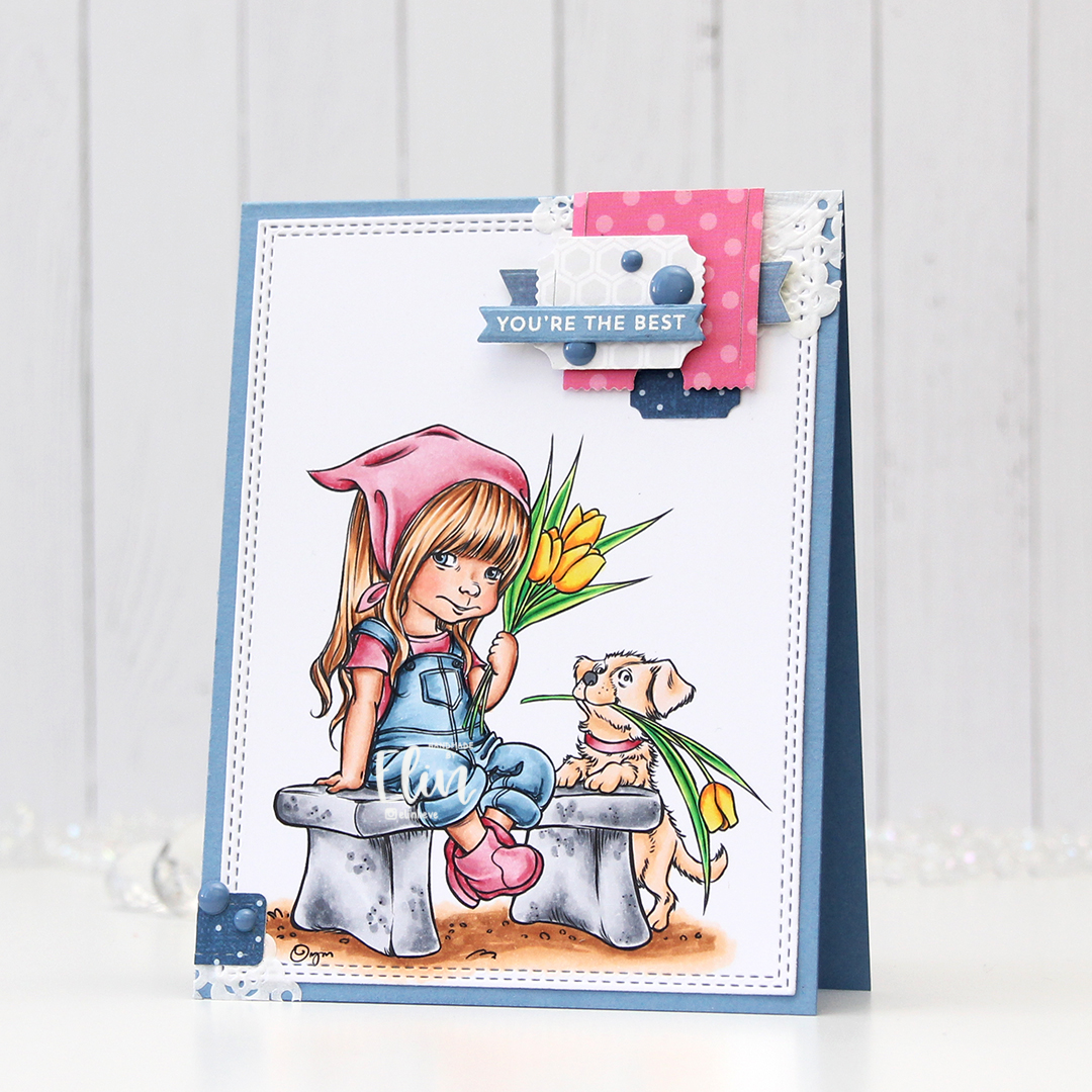
I adhered my panel onto a top fold A2 card base I made from Blue Yonder cardstock from My Favorite Things. It’s such a pretty blue color, I love it.

I decided to add one of my signature clusters to this card. A scrap piece of a paper doily from Doodlebug Design lays the foundation for all the other bits on top. I keep a bin on my desk with lots of die cut patterned paper scraps that are perfect for clusters like this.
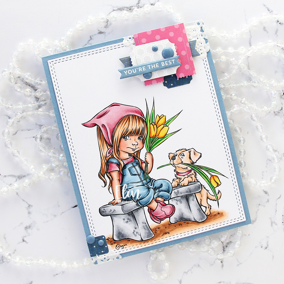
For this particular card, the scraps are from Papirdesign, Fancy Pants and Sunny Studio, and they’re all die cut using one of two die sets: the Happy Days Ticket Stubs die from XCut (one die which cuts out nine different tickets, it’s kind of awesome) and the Fishtail Flag Frames die set from My Favorite Things.

On top of the cluster I added a sentiment. I heat embossed a sentiment from the Itty Bitty Basics stamp set from My Favorite Things onto Blue Yonder cardstock, and die cut it using one of the dies in the Itty Bitty Strips die set. I added a few blue enamel dots from Papirdesign to finish, and my card was complete.

Lots of colors for this one.


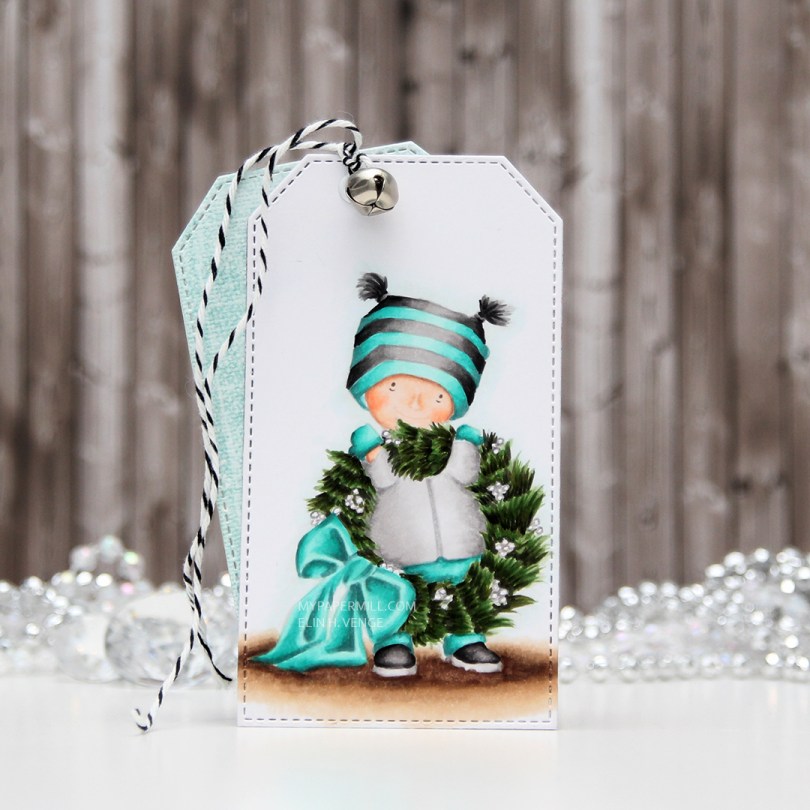
 I decided to go for a teal and gray color combo today, and white berries on the wreath instead of red ones. I just used a gray colored pencil to trace around the outline of the berries, everything else is noline colored using Copics. I used a stitched tag die from My Favorite Things to create the actual tag.
 I diecut a couple of pieces of scraps of patterned paper using the same die. I chose Julbukett from the Fröjdefull Jul collection from Maja Design and Good Cheer from the Christmas Magic collection from Fancy Pants Designs, which happens to be a collection from 2009, I have a lot of patterned paper. I stamped a to/from stamp from Norsk Stempelblad AS using Hawaiian Shores ink from Papertrey Ink straight onto the patterned paper. I made a hole at the top, added an eyelet, some twine and a bell, and my tag was done.


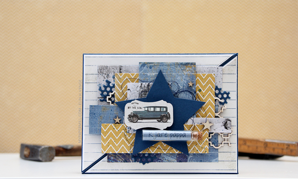 Jeg har brukt mørkeblå kartong fra Papertrey Ink (fargen heter Enchanted Evening) som kortbasen min, og lagd et lag på lag-kort som jeg likevel syns er ganske maskulint.
 Jeg har blandet ark fra mange forskjellige serier fra flere produsenter på dette kortet. Her er Skolestart-serien til Papirdesign (arket med linjer i bakgrunnen og også det som ser ut som betong), Julehilsen fra samme produsent (trevirke), Kaffepause (det sennepsgule med sikksakk), også fra Papirdesign, Pipeline fra Fancy Pants (det blå mønsterarket) og til slutt Maja Design (bilen).
 Arkene er limt litt småstrukturer, men likevel hulter til bulter, både rett oppå hverandre og med 3D-puter i forskjellige høyder for dimensjon. Det krevde litt planlegging, for all pynten måtte være limt fast i den ene halvdelen av kortet for at det skulle kunne åpnes. Jeg valgte den høyre halvdelen, og venstresiden av diagonalen har dermed ingen mønsterark, annet enn linjearket helt bakerst. Jeg har også limt magneter under et par av mønsterarkene, så kortet skal kunne lukkes ordentlig.
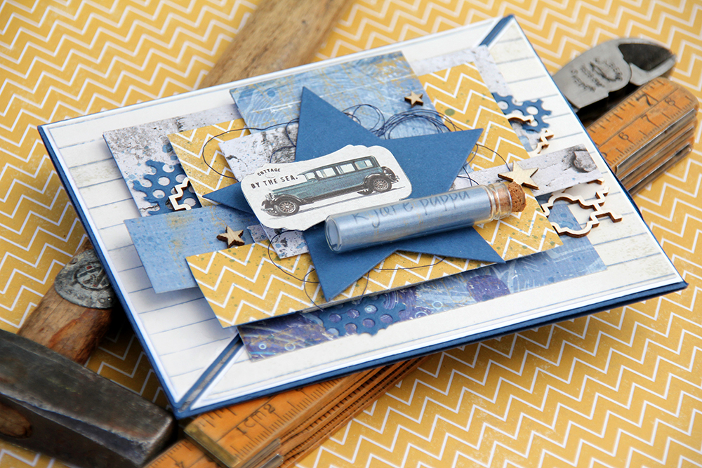 I tillegg til mønsterark brukte jeg noen andre elementer for å myke opp uttrykket litt. Jeg brukte en hullmønsterdie fra Papirdesign på en bit kartong og brukte biter av den her og der på kortet. Jeg stanset også ut en stor stjerne i kartong med en Spellbindersdie for å rydde opp litt, så ikke kortet så så rotete ut med alle mønsterarkbitene. Stjernen gjør også at bilen kommer bedre frem, og den er også en fin plass til å lime på glassrøret fra Tim Holtz med NSB-tekst stemplet inni med samme farge som kartongen.
 Jeg brukte også noen chipboardbiter fra Snip Art som jeg dyttet inn her og der og limte på plass, og også noen finérstjerner fra Studio Calico. En liten bit blå sytråd fra Mölnlycke myker opp enda litt mer, og jeg blandet blekkfargen med litt vann og sprutet over kortet for å få det enda litt mindre rigid.
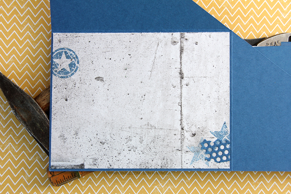 Siden kartongen er så mørk valgte jeg å bruke et mønsterark til skrivefelt inni kortet. Her stemplet jeg noen stjerner fra Stampers Anonymous med samme blekkfarge som jeg har brukt ellers, og den ene stjernen nede til høyre er andregenerasjonsstemplet for et litt dusere uttrykk. Jeg limte også på en bit av hullmønsteret mitt for en siste lille finish. Her syns også at arkene på kortets forside kun er limt på trekantpanelet til høyre.
 Jeg gikk litt amok med mønsterark, men jeg storkoste meg mens jeg lagde kortet. Det er et kort i A2-størrelse. Det i seg selv er ganske vanlig fra min kant, jeg liker størrelsen, men ofte er A2-kortene mine veldig enkle i utformingen. Dette er ikke akkurat det, her er det lag på lag, mønsterark fra flere produsenter, litt ymse pynt og flere ting i bruk som ikke er typisk meg.
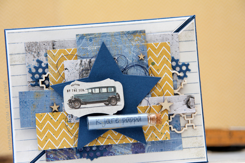 Mønsterarkene kommer fra tre forskjellige kolleksjoner fra Papirdesign (Skolestart, Julehilsen, Kaffepause), Vintage Romance-kolleksjonen til Maja Design (bildet av bilen) og Fancy Pants Designs (det blå mønsterarket).
 Jeg ville ha et veldig lag på lag-kort med ulike ark i ulike størrelser, så jeg skjærte til mønsterarkene mine i så mange ulike størrelser jeg klarte og la dem lagvis oppå hverandre. Noen er limt på med 3D-puter, andre ikke. Det viktige var å få alt til å harmonere, og samtidig måtte alt limes på den ene halvdelen av kortet. Det lille du kan se av mørkeblå kartong (Enchanted Evening fra Papertrey Ink) som går på skrått fra nederst til venstre og opp til høyre er nemlig åpningen på kortet. For at det skal kunne åpnes måtte derfor alt limes på den ene delen.
 Jeg har stanset ut et hullmønster i en bit av den blå kartongen med en die fra Papirdesign og limt den på litt her og der på kortet for litt mer interesse. Det samme har jeg gjort med litt chipboard fra Snip Art.
 Jeg har også limt på noen stjerner fra Studio Calico. Stjernetemaet blir hentet opp igjen av den store blå stjernen, som fungerer som bakgrunn for den lille bilen og glassrøret med den stemplede teksten.
 Kortets innside tar igjen elementer fra forsiden, både med betongarket fra Julehilsen-kolleksjonen til Papirdesign, det lille utstansede hullmønsteret og flere stjerner. Her er stjernene i stempelvariant fra Stampers Anonymous (Tim Holtz), stemplet i den samme blå blekkfargen (Enchanted Evening fra Papertrey Ink) som jeg brukte på stempelet i glassflasken på forsiden. Fargen matcher også kartongen. Den ene stjernen er generasjonsstemplet for et litt svakere uttrykk.