Hi, crafty friends! It’s never to early for holiday cards, right? Although, I did technically create this back in the first half of December. Things just got so hectic before Christmas I never found the time to share. That time is now, apparently! 🙂
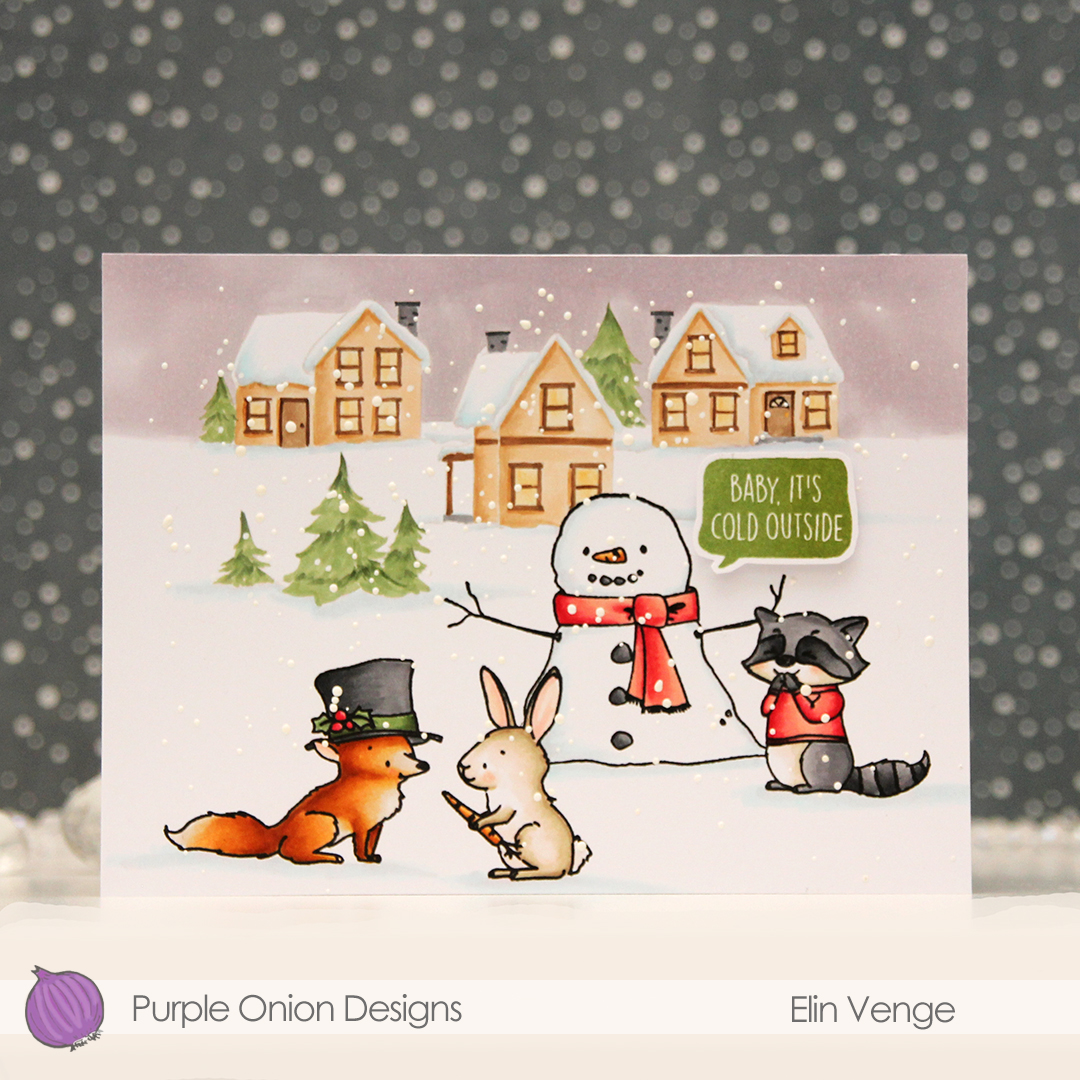 These images in this scene are all from the Winterwood collection from Purple Onion Designs, illustrated by Holly Mabutas. We have Frosty, Finn (with his tophat), Blossom the bunny and Will, who’s giggling next to Frosty. I stamped the Winter Neighborhood in fadeout ink for a no line effect in the background. Except for the holly on the tophat, there’s really nothing that screams holiday on this card, so it could easily work throughout the winter season and in my neck of the woods through the majority of spring, too, actually. Most of the snow is usually gone by mid May.
 I colored the scene with Copics, then stamped the critters and the snowman again, this time using Obsidian ink from Altenew to get crisp black lines. This is a pigment ink, which doesn’t play nice with Copics, but as long as the coloring’s already complete, using this ink is totally fine. I sprinkled on Chunky White embossing enamel from Stampendous, melted the granules from the back of the paper and finished off the card with a sentiment from the Holiday Blurbs I stamp set that I stamped in Jalapeño Popper ink from My Favorite Things. I added some foam tape on the back of the speech bubble for a tiny bit of dimension on the card. This is an A6 size card, measuring 6 1/4 x 4 5/8″.
 Not a whole lot of colors used given the large scene, but I did use 7 for the fox alone. But he came out so cute, it was totally worth it!
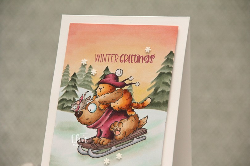
 This is one of those super simple cards. I stamped the image using Extreme Black ink from My Favorite Things and masked it before stamping the
  I stamped a sentiment from the
  I stuck to a pretty limited color palette, I feel, but there’s still a lot of markers.
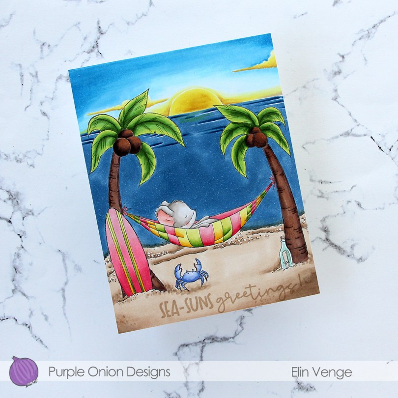
 Meet
Meet  Whenever I color scenes like this, I always start with the background elements. For this card, I started with the sky and sun, then colored the ocean, the sand and the palm trees, leaving the accessories and the mouse for last. These are the most colorful elements. I even opted to color the crab blue. I didn’t want it to be brown and not show up in the sand, so I decided a blue swimmer crab was a good fit for this scene. It stands out against the other elements in the foreground, but still works with the overall design, because there’s already lots of blue on the card with the ocean and sky. Three completely different blue combos, but they work together still. Also, the blue swimmer crab makes me want to move back to Australia, even though it’s winter in Australia at the moment, and soooo cold (at least winter’s cold in Adelaide, where I used to live)!
 I’ve used the sunrise sunset background on more than half the cards I’ve made with this release, and I’ve tried to color it differently for each card. I love love love the versatility of this stamp, and never in a million years did I guess in advance that this would wind up being my favorite stamp of them all, but there you go. It’s just THAT good.
 To finish off the card, I stamped a sentiment from the coordinating
  Lots of colors used for this one, and I realize I’ve even left out a few in my graphic. I used W3, W1 and W00 for the mouse, in addition to R21 and R000 for his cheek and ears.
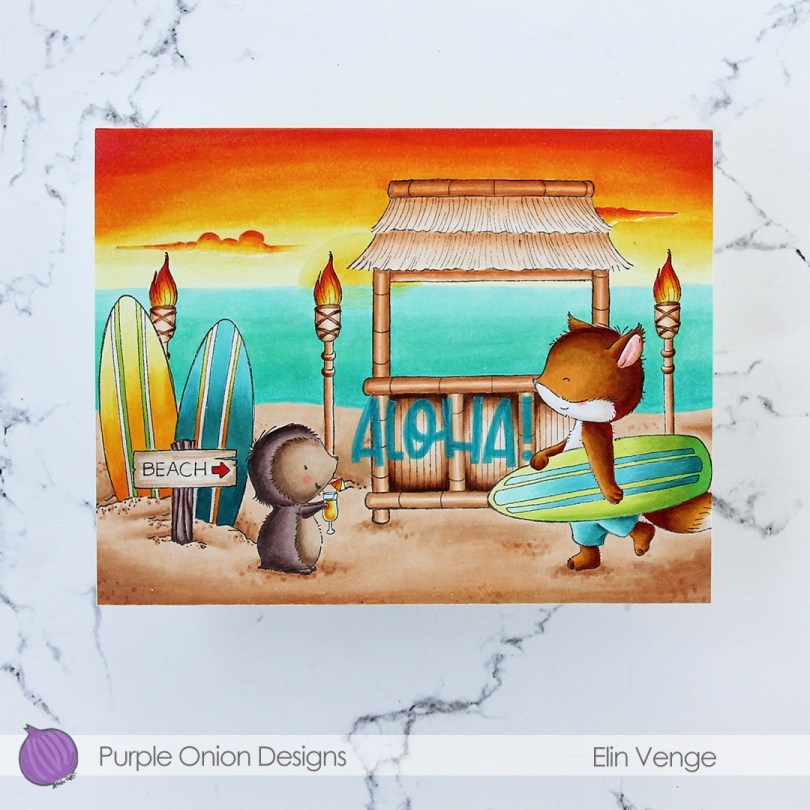
 I did a ton of masking for this card. I love creating stories in my head with these images, then stamping them and making them come to life.
  I colored in my scene using Copics, then stamped the
  I used a lot of colors for this card.
 I colored the scene with Copics, then used The Perfect Spot again to stamp on white cardstock (Stamper’s Select White from Papertrey Ink, my favorite white cardstock), this time using Memento Espresso Truffle ink. I wanted this to be more visible than the background without being stark black, and this color is perfect. I then die cut the white panel using two dies: a rectangle die from Waffle Flower to make it smaller and the Watercolor Wash Free Form die from My Favorite Things to create a window.
 I added foam tape on the back of my white panel for dimension and lined up the stamped lines on the two panels as best as I could, before adding my double panel to a card base I created from Soft Stone cardstock from Papertrey Ink. I then stamped a sentiment from the
  Fairly simple color palette for this one. I also used B90, which is a color I’ve made myself.
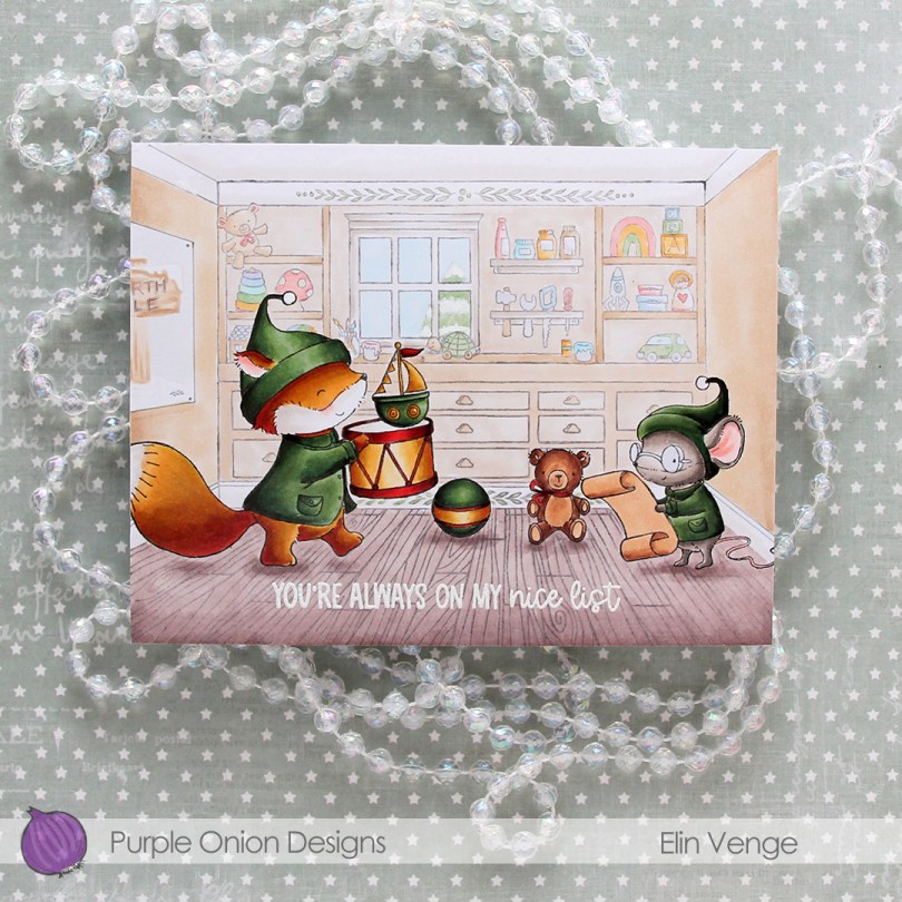
 Cue
Cue  I’ve always been a fan of creating blue Christmas cards, but in the past couple of years, green has grown on me, and I think I made more green Christmas cards this year than blue ones. It helps that I’ve found a green Copic combo that I really like.
 When all the coloring was done, I stamped and white heat embossed a sentiment from the
  Lots of Copics for this one.
 I created a very simple scene for this card, stamping the snowman in Fadeout ink from Inkon3 before adding a mask, then stamping the
  Every once in a while, I break out my airbrush system. I actually keep it out on my desk, but I have a big desk and don’t usually sit close to it. I love the airbrush system, it’s such an awesome way to get a layer of color quickly. Coloring an entire nighttime sky with Copics takes a while, airbrushing it is faster. Use colors that are darker than what you think you want, and make sure there’s enough ink in the marker before starting. I used B99 and B97 for this sky, and it’s wonderfully dark and the perfect backdrop for the lighter colors of the snowy scene in front.
 Once I finished the airbrushing, I carefully removed the masks and did no line coloring of the rest of the scene. At this point, I’ve colored snow so often, I can do it in my sleep. This snowman is pretty easy to color too, most of the areas are pretty big surfaces, so it’s a very forgiving image.
 After I finished my coloring, I stamped and white heat embossed a sentiment in the sky. The sentiment is actually from the Scripty Xmas stamp set from Mama Elephant, I kind of forgot for a second that I was creating a Purple Onion card, I was a little lost in a creative zone. After heat embossing the sentiment, I sprinkled on chunky white embossing enamel from Stampendous to create my super snowy scene, making sure to remove any granules that landed on top of the embossed letters before melting the granules from the back.
 I trimmed 1/8″ off each side of my scene and adhered it to a white card base I created from white cardstock from Papertrey Ink, deciding not to add any embellishments. I figured there was enough going on already with all the snow.
 As usual – lots of colors used for the snow. The two blues at the very bottom after the break are the colors I used for the airbrushed sky.
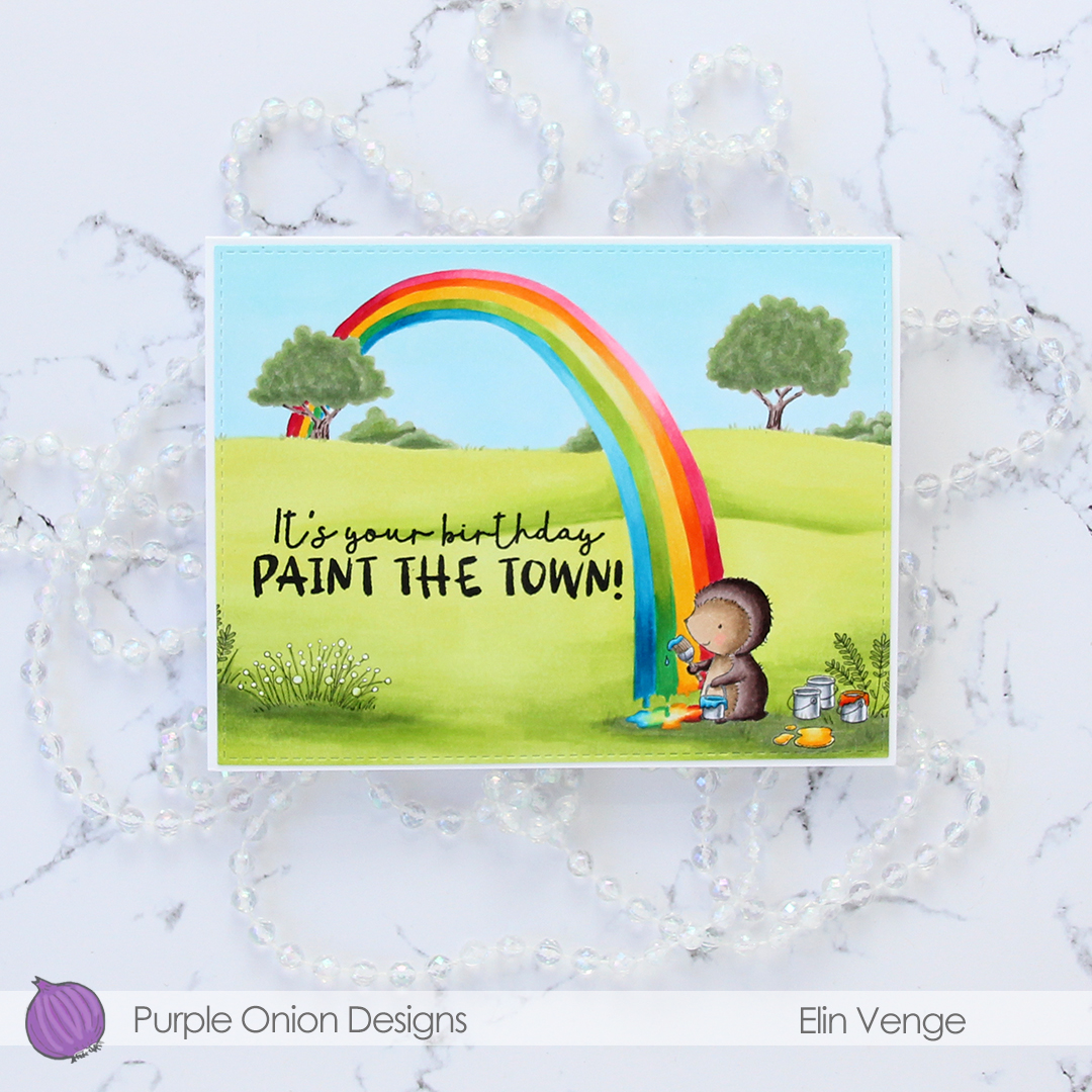
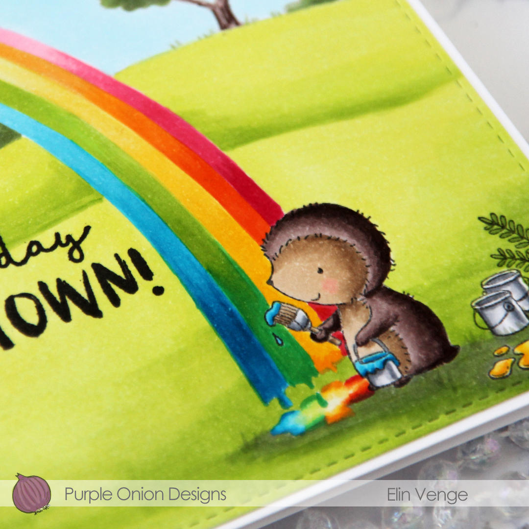
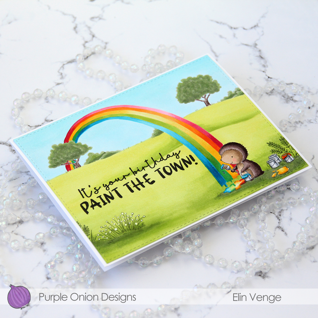
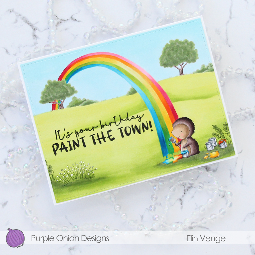
 This time I’m keeping the focus on
  I used a lot of green for this card. Not too many markers, but I feel like most of the card is green. I actually had to refill all the greens I used for the fields and trees halfway through. They hadn’t been refilled in a couple of years, so it was about time, I use these greens a lot.
 I needed a pop of color to counteract all the green and decided on a corally pink color combination that I used for the party hat and balloon. I dug through my colored cardstock looking for a match, and wound up with Fire Coral cardstock from My Favorite Things. I created a top fold A2 card base from it and adhered my colored panel onto it to the left side, it wasn’t wide enough to cover the entire card front.
 In the fall of 2020 I was running seriously low on X-Press It blending card, which is the only cardstock I use for my Copic coloring. It was hard to get hold of back then, but I lucked out and got a pack from Amazon UK. It was A4, which kind of blew my mind a little bit. Up until that point, I didn’t even know A4 X-Press It existed, I’ve always bought letter size. A4 is less wide and taller than letter size, which means I only get two panels that cover an A2 card front from one sheet. I used one of the narrower pieces on this card, which left me with about 1/4″ extra width on the card base. I debated cutting it off, but I feel like the pink strip on the right provides a little bit of balance, the card would be very green without it.
 Onto a separate piece of Fire Coral cardstock, I stamped and white heat embossed a sentiment from the Til mannen stamp set from Norsk Stempelblad AS, before die cutting it using a speech bubble die from Altenew. I popped it up on 1/16″ foam squares from Gina K for a tiny bit of dimension.