Hi, crafty friends. It’s the third Thursday of the month, which means it’s time to Get Cracking on Christmas. This is a series Jenn Shurkus created years ago. By creating holiday cards every month, there’s less stress when we reach the end of the year, because a bunch of cards are already ready to go. Also, stamp companies seem to have their best releases right when it’s crunch time for holiday cards. Get Cracking on Christmas is a great opportunity to use those holiday products that you love, but haven’t yet had a chance to use.
 I actually created two cards this time. No Copic coloring on these, which is rare for me. I bought the Wreaths and Mulled Wine stamp set from Ciao Bella last year, but didn’t have time to use it. Get Cracking to the rescue. I took one of the wreaths in the stamp set, stamped it in VersaMark ink onto watercolor paper (I used Fabriano Artistico Extra White 140 lb hot pressed paper for this) and created two similar, yet different cards.
 For this blue one I used Iridescent Sparkle embossing powder from JudiKins for my heat embossing. I used Prussian Blue paint from my Mijello Mission Gold watercolor set and watered it down quite a bit to get the light blue I was after. I used a 3/4″ flat brush across the surface, and the heat embossing resisted the watercolor I put on top. I love the edges of watercolor, so I just walked away and let this air dry, I didn’t want to mess with it.
 Using a more concentrated paint of the the same color, I did a flat wash on a scrap piece of watercolor paper that was big enough for me to die cut. I used the Merry Script die from Mama Elephant and die cut three layers of white and one layer from my painted blue piece and stacked them for dimension. I also white heat embossed part of a sentiment from the Itty Bitty Holiday stamp set from My Favorite Things and nestled that in below the merry using some clear foam tape.
 I could fiddle with placement of embellishments all day long. Color, size, I wanted everything to be just right, and wound up using a combination of the Igloo mix from Little Things from Lucy’s Cards (pearls and iridescent sparkle sequins), the Crystal Collection – Glass mix, also from Little Things from Lucy’s Cards (clear jewels), and a few blue diamonds from Kort & Godt to fill in the rest.
 I used a die from Waffle Flower to create a rectangle from the watercolored piece and mounted in on foam tape on a card base I created from Spring Rain cardstock from Papertrey Ink. It’s no secret that I love blue for Christmas cards, and I thought this soft background with the wreath and the embellishments was a nice combo.
 For my second card I used the same wreath stamp that I stamped in VersaMark ink. This time I embossed it in silver, painted the background with Van Dyke Green (also watered down quite a bit) and flipped the panel upside down to have the snowflake in the bottom right “corner” of the wreath instead of the top left.
 I used the same Waffle Flower die to create my rectangle from the watercolor piece and was a little unsure of what to do for a card base. I didn’t have any green cardstocks that matched my watercoloring, and I didn’t feel like pulling my paints back out to create a green wash that I could use (although that would have been pretty). I rummaged through my silver cardstocks, but none of them matched the silver heat embossing very well, so I wound up creating my own using the same silver embossing powder that I used for the wreath. I squished my VersaMark pad onto the edges of a 4 1/4 x 5 1/2″ piece of white cardstock, sprinkled on the embossing powder and repeated the process until the embossing was even and covered everything. I adhered my embossed panel onto a white top fold card base and mounted my watercolor cardstock on top using foam tape.
 Using the Hjerte 3 die set from Papirdesign, I die cut the words God jul three times and stacked them for a dimensional look. I made sure to cut the top layer from the watercolor paper I’d already used so that the whites would match. I adhered my die cut words to the center of the wreath using liquid glue.
 To finish off the card I added Kort & Godt diamonds in three different sizes in clusters around the wreath. They act as little berries and add a little bit of sparkle and shine.
 I made quite a few green Christmas cards last year. It’s a color that’s growing on me, and this Van Dyke Green from Mijello is the most perfect green ever.
 I had so much fun creating these cards. They’re very different from what I usually create, that might be part of the reason why. The simplicity of this design makes it easy to mass produce, too, if that’s your jam. Break out your embossing powders, different colors of paint and go to town.

 I printed the image onto X-Press It blending card and colored it with my Copics, going for a couple of different purple combos – one dark for the snowman’s hat and scarf, another for the cute little bird. I chose a deep pink combo for the present and the bird’s accessories to bring in another color. I die cut my panel using a rectangle die from Waffle Flower, then went in with a snowflake stencil from Ciao Bella and some Lilac ink from Concord & 9th. I then added VersaMark on top and sprinkled on Iridescent Sparkle embossing powder from JudiKins to turn the snowflakes sparkly once the powder melted.
 I stamped a sentiment from the Julehilsen stamp set from byCino using Autumn Rose ink from Papertrey Ink. The sentiment translates to “Express delivery from the North Pole” and was the perfect size for my chosen placement. I adhered a quarter sheet of Autumn Rose cardstock from Papertrey Ink onto a white card base and mounted the colored panel in the center, before finishing off with sequins and raindrops from the She’s So Lovely mix from Little Things from Lucy’s Cards.
 Lots of purple. I can do hard things (using purple is HARD).
 I colored Tofu with Copics and fussy cut him leaving a thin white border. Onto my card base I stamped the Touch of Texture background stamp from My Favorite Things in VersaMark ink, sprinkled on Iridescent Sparkle embossing powder from JudiKins and heat embossed for a subtle texture on the white card base.
 I wanted an angled panel near the bottom of my card, so I stamped a sentiment from the Bitty Thanks & Gratitude stamp set from My Favorite Things, using Sour Apple ink on Sour Apple cardstock, both from My Favorite Things. I glued a piece of patterned paper below it and mounted it to my card base. I wish I remember where this patterned paper was from, but it came in a mystery box from Simon Says Stamp and there was no label on the packaging, so I don’t know. I put my little cat on foam tape and finished off with a few sequins from the Waterfall mix from Little Things from Lucy’s Cards.
 I colored my emu and koala with Copics, and fussy cut the image leaving a white trim. Cutting around that string of lights was tricky, but worth it.
 Onto a piece of white cardstock, I stamped the Christmas Lights Bold Prints stamp from Hero Arts using VersaMark ink, and poured on Iridescent Sparkle embossing powder from Judikins, which I then heat embossed. It adds a sparkly, but subtle shine to the background and I love that the lights are just like the colored lights on the emu.
 I cut off a strip of the panel on each side and die cut a star in the top center using the Stars Five die set from Spellbinders. I mounted the panel on foam tape and added it to a card base I’d covered with the
  I mounted the emu in the star opening, making sure to adhere the delicate lights directly to the white panel, while the emu itself is backed with foam tape. I stamped an white heat embossed a sentiment from the Christmas Wishes stamp set from My Favorite Things onto a scrap piece of my gum leaves paper, before using the coordinating die to cut it out. I backed it with four white die cuts and adhered it underneath the emu’s feet and dangling lights, before finishing off with sequins and star confetti from the Starry Night mix from Little Things from Lucy’s Cards.
 You can see a little more of the sparkle in this photo.
 The emu and the koala are very muted, so I chose bright colors for the lights.
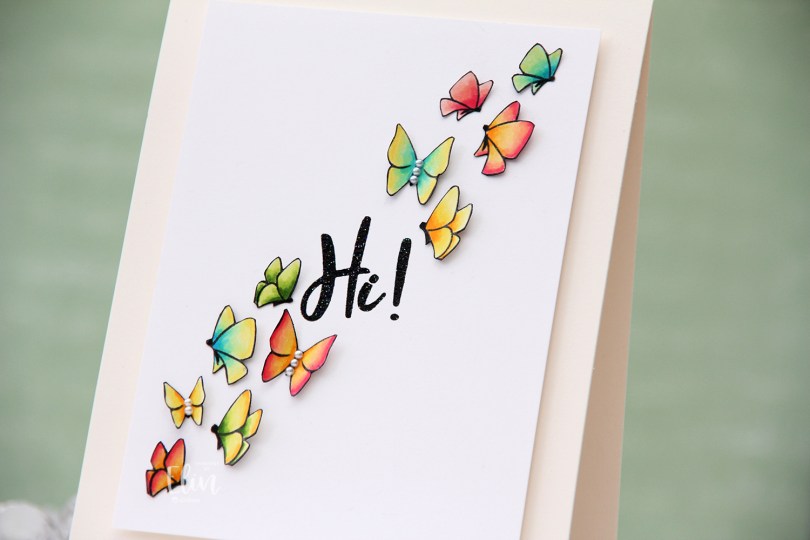
 I used the
  I fussy cut each of the butterflies right up against the stamped lines, going over the cut edge with a black pen so no white core would show from the sides. I then took a thin Copic multiliner to make the bodies of the butterflies more solid black (I suspect I might need a new black ink pad because my current one is starting to get dry).
 I added the butterflies to a 3 1/2 x 4 3/4″ panel of Stamper’s Select White cardstock from Papertrey Ink, lifting the wings and adding tiny pieces of 1 mm foam squares to the back of them for dimension. I didn’t want these to be flat. On some of the butterlies, I added 2 mm white pearls from Kort & Godt to the bodies.
 The sentiment is from the
  The sparkle of the embossing powder is visible in this photo, as is the wonderful lift the wings of the butterflies get by using tiny pieces of foam tape. I colored one more butterfly, but there was no more room on the front of the card, so I adhered it to the back of the card above my “Handmade by Elin” stamp.
 Not a lot of colors for this one, though I did use the yellow ones for all the two toned butterflies.
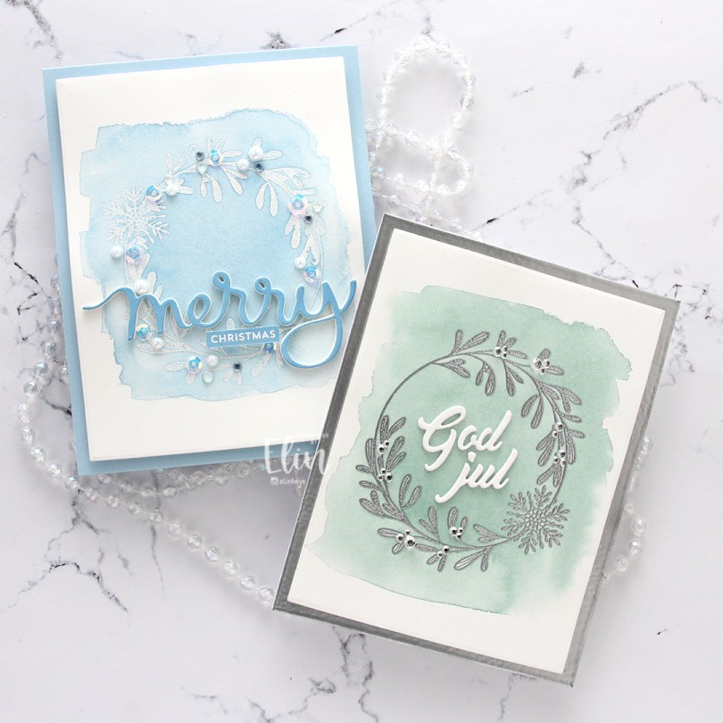

 As soon as I saw this train, I immediately thought of the movie The Polar Express, which happens to be my favorite animated Christmas movie. I colored my train in similar colors to the one in the movie, and I put a mask on top when my coloring was done and airbrushed the sky, moon and glow coming from the headlight.
 My best friend and I have a tradition where we sit down and watch this movie every year, and I thought the sentiment from the
  The sentiment is actually one long line, but I did some masking to create a staggered one, which I thought fit my card better. I stamped the sentiment in VersaMark ink and heat embossed it in white using Super fine detail embossing powder from Ranger.
 I created the moon by first masking off a circle as I airbrushed the sky, then I used the moon mask that was part of the Tim Holtz/Simon Says Stamp collaboration set for Stamptember 2021 to create my moon.
 Once I’d created my moon I covered the circle opening again with VersaMark ink and sprinkled on Iridescent Sparkle embossing powder from Judikins, which I then melted. It gives the moon a nice sparkly glow. I thought that would be a nice detail to add to what is otherwise a very simple card. I adhered the colored scene to a white top fold card base and decided not to embellish, I wanted the image to be the focal point on this card.
 Lots of Copics for this one. The ones after the white gap are the ones I used to airbrush the sky, moon and the glow from the headlight.
 Jeg svertet forskjellige farger Distress Oxide-blekk på en bit hvit kartong og lot det tørke (hjalp til litt med varmepistol, jeg er for utålmodig til å la det tørke på egen hånd). Jeg stanset ut panelet mitt med en sirkeldie fra My Favorite Things, stemplet en tekst fra Norsk Stempelblad AS med VersaMark og embosset med hvitt embossingpulver fra Ranger.
 For å gi litt interesse til bakgrunnen på mitt veldig enkle kort trykket jeg VersaMark gjennom en stensil fra Simon Says Stamp og embosset med iriserende embossingpulver fra JudiKins. Jeg limte tekstpanelet mitt på kortbasen med 3D-teip og satte på noen paljetter fra Pretty Pink Posh som en siste finish.
 Elin gjør ting hun ikke kan. Jeg er vant til å bruke Copic-tusjene mine, men det betyr at fargeblyantene mine blir neglisjert. Det har jeg lyst til å endre på, så jeg fant dem frem for dette motivet og farget i vei. Jeg er fortsatt nybegynner, men øvelse gjør mester.
 De rosatonene jeg brukte på blomstene passet perfekt til den rosa kartongen fra Papertrey Ink jeg valgte meg (fargen er Hibiscus Burst), og jeg klippet ut deler av motivet for å skape litt mer liv i både motivet og kortet.
 Hele det hvite panelet limte jeg på med masse 3D-teip for dimensjon, og den embossede tekststrimmelen limte jeg på litt lavere 3D-teip. Jeg pyntet kortet relativt enkelt med svarte krystaller fra Papirdesign.
 Midten av blomstene har jeg embosset med iriserende embossingpulver fra JudiKins, så de skinner litt.
 This time I chose
  I wanted to embellish the inside, too, but make it very simple. I took the diecut frame left from the banner on the front and glued it to my white cardstock before stamping a sentiment in red. I diecut a small yellow patterned paper circle for an extra bit of detail, and that’s it.