
Hi, everyone! I’ve got another card to share today featuring an adorable Rachelle Anne Miller digital stamp. This time, I used Snowman Hug and turned it into a wintery birthday card.
 I started by coloring my little snowman and his friend using my Copics. I went with a bit of a split complementary color scheme on this one. I’m no fan of complementary colors, but split complementary are infinitely better, and blue green (which I used for the snow on the snowman), purple and orange are split complementary colors. I didn’t want a bright orange, though, so I went more coral, and I love how it turned out.
 I used a faux stitch rectangle die from My Favorite Things to turn my colored piece into a nice panel. I love these dies, they add such a finished look. I sprinkled on a moderate amount of chunky white embossing enamel from Stampendous and melted the powder. I love the snowy look this gives.
 I mounted my die cut piece onto a card base made from Lavender Fields cardstock from My Favorite Things using plenty of foam tape. This color perfectly matched the purple in my image, something I always try to accomplish in my cards for a nice, cohesive design. I die cut and stacked four Hurra from Melon Berry cardstock from Papertrey Ink using a Kort & Godt die. I love stacking die cuts, it adds a super nice look of dimension. I also white heat embossed a sub sentiment from Norsk Stempelblad AS onto more of that Lavender Fields cardstock, and stacked that, as well, making it flush with the die cut word.
 I added a couple of sparkling clear sequins from Pretty Pink Posh and my card was complete. I cut a little bit off the largest one with my scissors to make it look like it’s tucked behind that sentiment strip.
 Last, but not least, the Copic markers I used to color my image. I also used B40 and BG71, which are colors I’ve made myself.

 I wanted most of the focus on the cute little parade, so I kept the rest pretty simple. I made a cardbase from Hibiscus Burst cardstock from Papertrey Ink. It matches the pinks in my image perfectly. I used a die from Kort & Godt to diecut the main sentiment from four layers of the same color cardstock, layering them for a dimensional effect.
 I white heat embossed a Norsk Stempelblad AS sentiment (time for balloons and soda) onto Stormy Sea cardstock (also from Papertrey Ink). I stacked four layers on this one too, making the sub sentiment flush with the diecut word.
 I added a couple of matte gold sequins from the Mint Gold sequins mix from Little Things from Lucy’s Cards as a finishing touch. They sort of match the cymbals the tiny squirrel is holding, and also the drumsticks. Simple, bright and cheerful. If this birthday card doesn’t put a smile on someone’s face, I don’t know what will.
 I leave you with the colors I used for this image. Not really a whole lot for this one.
 Cards like this come together very easily, it’s basically a bunch of diecutting and you’re done. I use two full 12×12 sheets of patterned paper for cards like this, and the beauty is that there are no scraps left when I’m done. For this one I used two sheets from Papirdesign, one is Roseduft, and the other is stemorsblomst, blå.
 I added flowers from Wild Orchid Crafts, Kort & Godt and Papirdesign along the edge of two opposite quadrants on my circle, used letter stickers from Papirdesign to spell her name and some diecut numbers for her age. I finished off the front of the card using diamonds from Kort & Godt.
 I kept the insides pretty simple, with plenty of room for a personal message for the birthday lady. I added some more diamonds to embellish a tiny bit.
 On the back of the card I used more flowers, more diamonds and stamped a Norsk Stempelblad AS sentiment using Autumn Rose ink from Papertrey Ink. “Happiness is the art of creating a bouquet of the flowers within reach.”

 I did what I usually do by diecutting the panel with the hippo using the largest of the stitched rectangle dies from MFT. This is the one die I use more than any other, and it gives such a nice look with that faux stitching around the edge and the 1/16″ border of the cardbase (in this case Berry Sorbet cardstock from Papertrey Ink) showing.
 I diecut a word die from Kort & Godt four times from Aqua Mist cardstock and glued them all together for a stacked look. There was just enough space above the head of that hippo for the word to fit nicely. I stamped and white heat embossed a Norsk Stempelblad AS sentiment on a piece of that Berry Sorbet cardstock and added three more layers behind that, so it’s flush with the word above.
 The small birds were also colored way back in 2018 for that same challenge as the hippo with the balloons. They didn’t have cheeks colored in, so I just went in with a couple of red markers and then a white pen on top to make them look like the first bird. I fussy cut both and added them to my sentiment to form a visual triangle. A few enamel dots from My Mind’s Eye finishes the card nicely. I usually know exactly where to put my enamel dots (or sequins or other small embellishments), but I was really stuck on this one and couldn’t find a good placement until
  Last, but not least, the Copics I used for this card.
 I colored her up with my Copics, focusing on the RV90s that go so incredibly well with the patterned paper from Papirdesign that I used, it’s ridiculous!
 I made a shaped card using the third largest die in the XXL Square Frames Frilly #10 set from GoKreate, and did a whole bunch of diecutting elsewhere on the card too. To break up the monotony of a diecut on top of a slightly larger diecut on top of a slightly larger diecut on top of a slightly larger diecut, I cut some Kort & Godt lace and put it across the card. The diecut heart banner, the word banner and all those Wild Orchid Crafts flowers also help. The flower berries and pearls are from Kort & Godt.
 There’s a banner hidden behind that image, diecut with a Magnolia die. I tied a bow of seam binding ribbon with the help of a DIY bow easy, I can’t make nice bows for cards to save my life (true story!), so the Bow Easy helps. I stamped a Papirdesign stamp using Memento Sweet Plum ink, which also matches the patterned papers beautifully. On top of the bow I added an old button from Melissa Frances.
 Is that an adorable little fairy or what? Those flower berries from Kort & Godt are really old, I think they might actually be from their first production of flower berries. They made some later on that had more of a greenish yellowy tint, but these are more creme colored and perfect for this card. I still have a few left, I only use them on very special cards.
 I added another Papirdesign sentiment stamp on the back of the card, along with a few more flowers. I removed the centers of the sweetheart blossoms and added back in some purple pearls from Papirdesign that once again matched the colors of everything else.
 As you can see from the above photo, this is a very dimensional card and not at all mail friendly, it’s super thick.
 Not too many Copics used for this one. Probably because it’s mostly that one dominating color.
 Jeg brukte rester fra en gammel serie fra Pion Design til å kle eksplosjonsesken min. Serien er Grandma’s School Book, og jeg brukte dies fra Cottage Cutz til å lage sirklene på toppen, og pyntet enkelt med kirsebærblomster fra Papirdesign og pyntegrener fra Kort & Godt.
 Sidene på boksen er hylser til skuffer, og skuffene har jeg dekt i bunnen med mer mønsterark. I midten av bunnen har jeg stemplet en tekst fra Kort & Godt med Memento Espresso Truffle. Enkelt og greit.
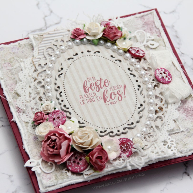
 Jeg var innom Hobbykunst i januar og fikk en utfordring om å bruke et
  Teksten er et stempel fra
  Kortet ble ikke veldig postgangvennlig, det er ganske tykt, selv om jeg kun har pyntet forsiden. Det var nemlig ikke nok igjen av arket til å bruke inni og bak. Sløyfen med knapp sitter fast i en tag som er under hovedpanelet. Teksten på tagen er også et Huldra-stempel. Hvilket kan du se i Hobbykunst-butikken, der er nemlig kortet.
 It’s Mo day (aka Wednesday). One of the last things I did in 2019 was to clear away all the jars of flowers from the desk in my craft room (I had about 50 of them). I figured I don’t really use flowers all that much on my cards anymore, so I didn’t need them to be easily accessible and take up space on my desk. I put them in a cabinet right below the ceiling, I was able to cram all of them into one single cabinet. The last card I made in 2019 had flowers on it. We’re barely two weeks into the new year, and I’ve made another one with flowers. For both cards I had to climb on a ladder and pull out a bunch of jars to get to the flowers I wanted. Maybe removing those jars wasn’t such a good idea after all?
 Good idea or not, this was the card I made. I colored up Mo’s
  I partially die cut my image with some of the bubble hanging out, and glued it to my card using lots of foam tape. I haven’t used my frame dies from GoKreate in a while, so I thought I’d break them out for this one. I usually make my card from the third largest die in the set (the XXL Square Frilly Frames #10 set), but I want to see how far into 2020 I can get with using just scraps, and the third largest die in the set requires a full sheet of paper to die cut two pieces (front and back of the card). The next size down was the perfect size for this scrap of Maja Design patterned paper, and it was also a good size for the green patterned paper from Papirdesign that I used behind my image and on the insides of the card.
 Speaking of insides – I diecut an eyelet circle with a Cottage Cutz die, stamped a Norsk Stempelblad AS sentiment using Memento Sweet Plum ink and again used lots of foam tape. I even diecut a scrap strip of another purple piece of Maja Design patterned paper to go across.
 The second inside has plenty of space for a personal message, and I diecut another eyelet circle from patterned paper and added a couple of diecut numbers from Scrapmagasinet to my circle. I thought this card would be the perfect birthday card for my niece, she turns 10 in June!!
 I used the same design on the back, but used a green strip instead of a purple one. Another NSB sentiment, once again stamped in Memento Sweet Plum ink, and once again glued on with lots of foam tape.
 There’s quite a bit of dimension in this card, and with that great image as the focal point, I think this will be perfect for my niece!
 Lots and lots of Copics used for this one, but there are 15 colors in the heart bubble alone.
 What’s more summery than peachy colors, flowers and butterflies? I colored up
  I’ve sort of gone back to my roots with this card. Layers (though not many), colored Bazzill card base, Pion Design patterned papers, flowers and those little clear acrylic branches are all things I used to use a lot, but rarely use any more. It’s fun to shake things up every once in a while, especially after making so many clean and simple Christmas cards.
 I don’t know what colors I used to color up my image, it’s been about eight months, after all. I may have written it down somewhere, but if I did, I don’t know where. I’m usually good at writing things down in a book, but I’m also known for some serious Post-it notes usage. I’m not sure where the Post-it went. Or even if there ever was a Post-it for this particular color combination on this particular image. What I do know is that it’s not in my book.
 I glued all my cardstock and patterned paper panels down using double sided tape. For the diecut image, I used foam tape, and lots of it. I was not shy. A roll of foam tape lasts forever, so I like to cover the entire back for even dimension with no sag. I think I bought ten rolls a couple of years ago. I’ve given one away and am halfway through my second roll, so I still have seven sitting in a cabinet in my craft room.
 I used a hot glue gun to attach my flowers and those acrylic branches. I have a low temp hot glue gun that I love for things like this. It dries instantly and stays put. For the butterflies and the pearl in the center of the largest flower, I used connect glue from Gina K. It’s the best liquid glue out there, those butterflies aren’t going anywhere!
 I used the same design on the insides and on the back of my card. There’s no dimension to the circles on the inside of the card, but I used foam tape on the back circle as well. A sentiment from Norsk Stempelblad AS stamped in a combination of VersaMark and two different colors of Distress Ink (Worn Lipstick and Abandoned Coral). Normally, I’m not a fan of distress ink used with clear stamps, they tend to bead up on the surface of the stamp, and the result you get isn’t the best. I didn’t have a peachy ink pad, however, and if you use VersaMark on the stamp and then distress ink right on top of that, you can reduce the beading and get a better stamping. Not perfect, but better than distress ink on its own. And much better than having to compromise and use black or brown or another color that wouldn’t go as well with the rest of the card.
 Med enkle kort kan man faktisk ikke gjøre feil, det syns så veldig godt, så jeg måtte være nøye med plasseringen av hjertene mine på dette kortet. De måtte alle være like langt fra høyrekanten, de måtte alle ha lik avstand mellom, og det måtte heller ikke være forskjell på avstanden fra det øverste hjertet til toppen og fra det nederste hjertet til bunnen. Pirk, med andre ord. Jeg er glad i pirk!
 Jeg brukte en die fra Lawn Fawn til å stanse ut alle hjertene i det hvite panelet mitt. Panelet er limt med lave 3D-puter til kartongen under, som er i fargen Melon Berry fra Papertrey Ink. I det nederste hjertet stanset jeg ut flere hjerter i Melon Berry-fargen og limte oppå hverandre, med en liten tekst fra Norsk Stempelblad stemplet og embosset på toppen. Til slutt pyntet jeg med paljetter fra Pretty Pink Posh på hjertet, og limte en diamant fra Kort & Godt i midten av hver.