
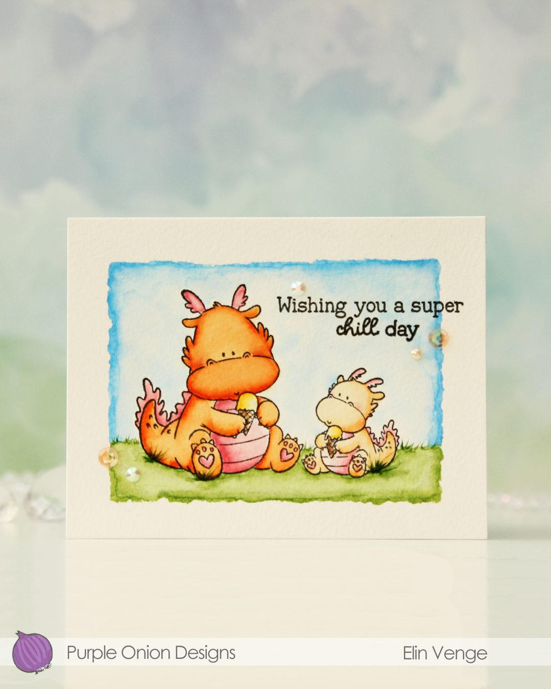
Hi, crafty friends! Sometimes you need a big hug, and this Hugs image featuring Elliot & Marcel from Purple Onion Designs is the perfect one to use.
 I actually decided to watercolor this one with my Zig Clean Color Real Brush markers. I prefer using a paintbrush with water with these, but there’s also a blender that you can use. Marcel is small, but I still used three different browns and a pink for him (064 Oatmeal, 607 Milk Tea, 068 Deep Brown and 200 S. Almond Pink). For Elliot and the die cut letters I used 312 Overcast Sky only. I did use a little pink for the bow on his tail, but for the actual elephant, it was just the one blue. I love the movement you get with watercolor, it’s something you can’t really achieve with Copics.
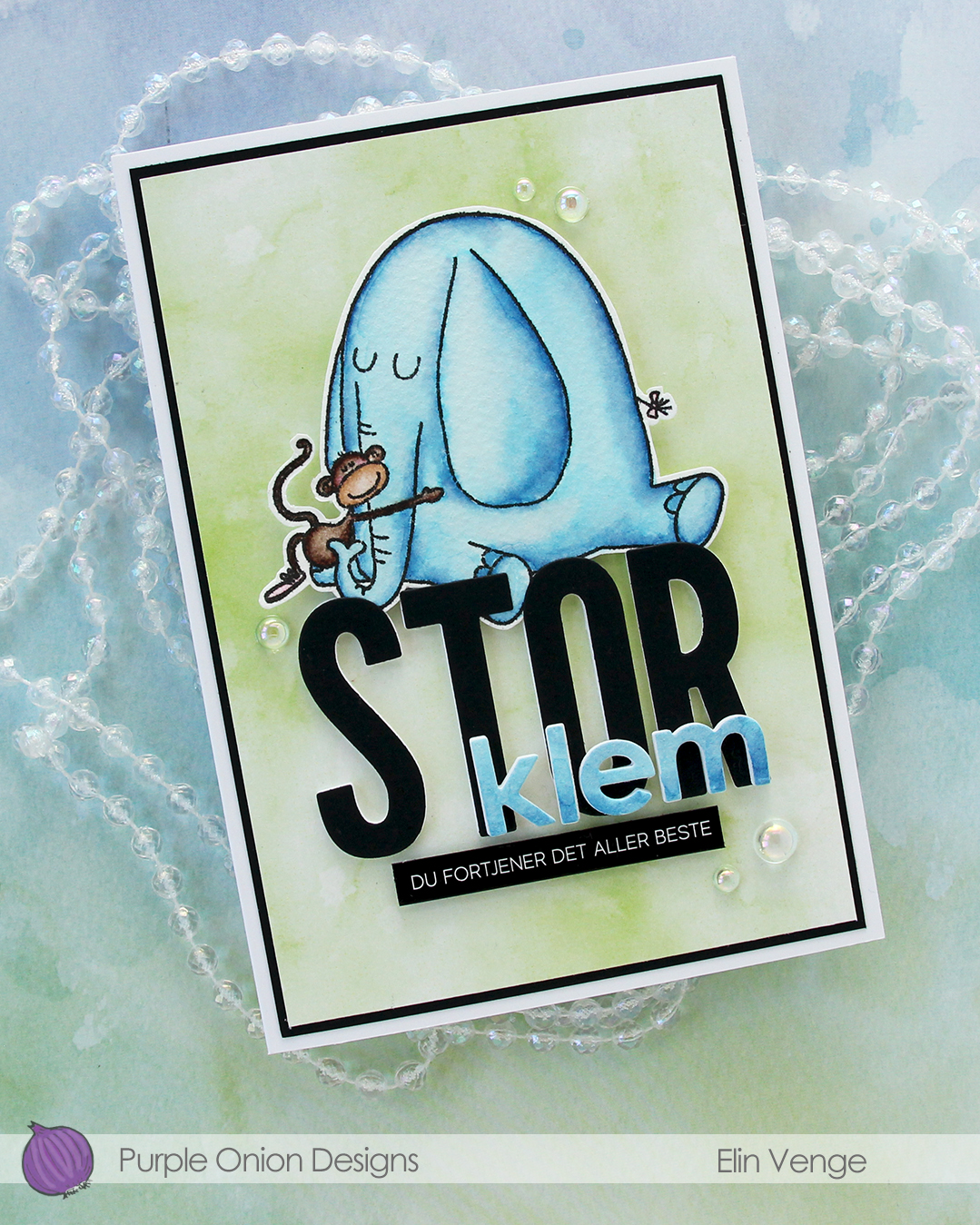 I fussy cut my image, leaving a thin white border. Using the Impact Alphabet die set from My Favorite Things, I die cut the letters to spell out STOR (big) four times from white cardstock and once from Black cardstock from Concord & 9th. I used the Parker lowercase alphabet die set from Memory Box to die cut the letters for klem (hug), again four layers of white, this time topped by a layer of the watercolor paper.
 I stacked my layers, and sandwiched the image between the white and black letters for the large word. I created a black mat on the card front, covered that with a piece of green patterned paper from the Watercolor Wash 6×6″ paper pad from My Favorite Things and mounted the letters and image in the center. I adhered the klem letters directly on top of the larger letters and added a sub sentiment sticker strip from Kort & Godt below it. I popped it up a bit to level it with the black letters, before finishing off with a few dew drops from the Spring Leaves embellishment mix from Little Things from Lucy’s Cards.
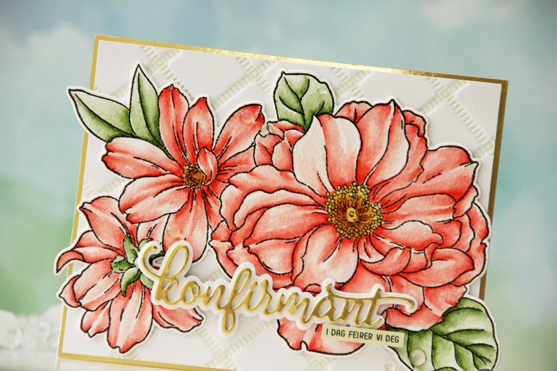
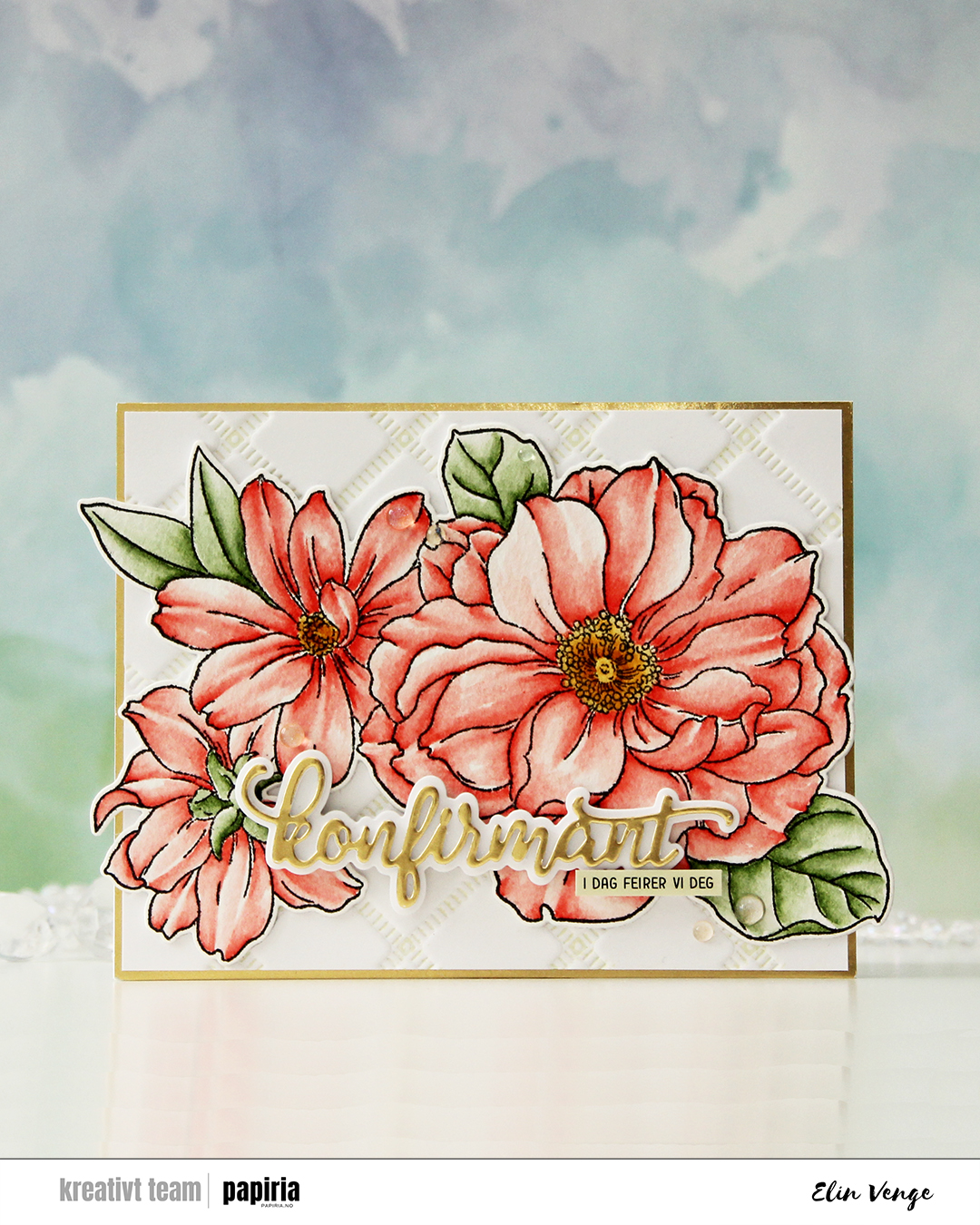 I started by stamping the big floral stamp in the Blooming Delight stamp set from Altewew using Altenew Obsidian ink onto watercolor paper (cold pressed Fabriano Artístico), before coloring with Zig Clean Color Real Brush markers. When my coloring was complete, I die cut the flower with the coordinating die and also cut a few extra from white cardstock to build dimension.
 I used the Stippled Plaid press plate from Pinkfresh Studio with Pistachio ink from Altenew to create a subtle background. I matted it with some gold shine cardstock from My Favorite Things and adhered my florals pretty much in the center. The flowers stick out on both sides, but I just made a larger envelope to accomodate the larger size.
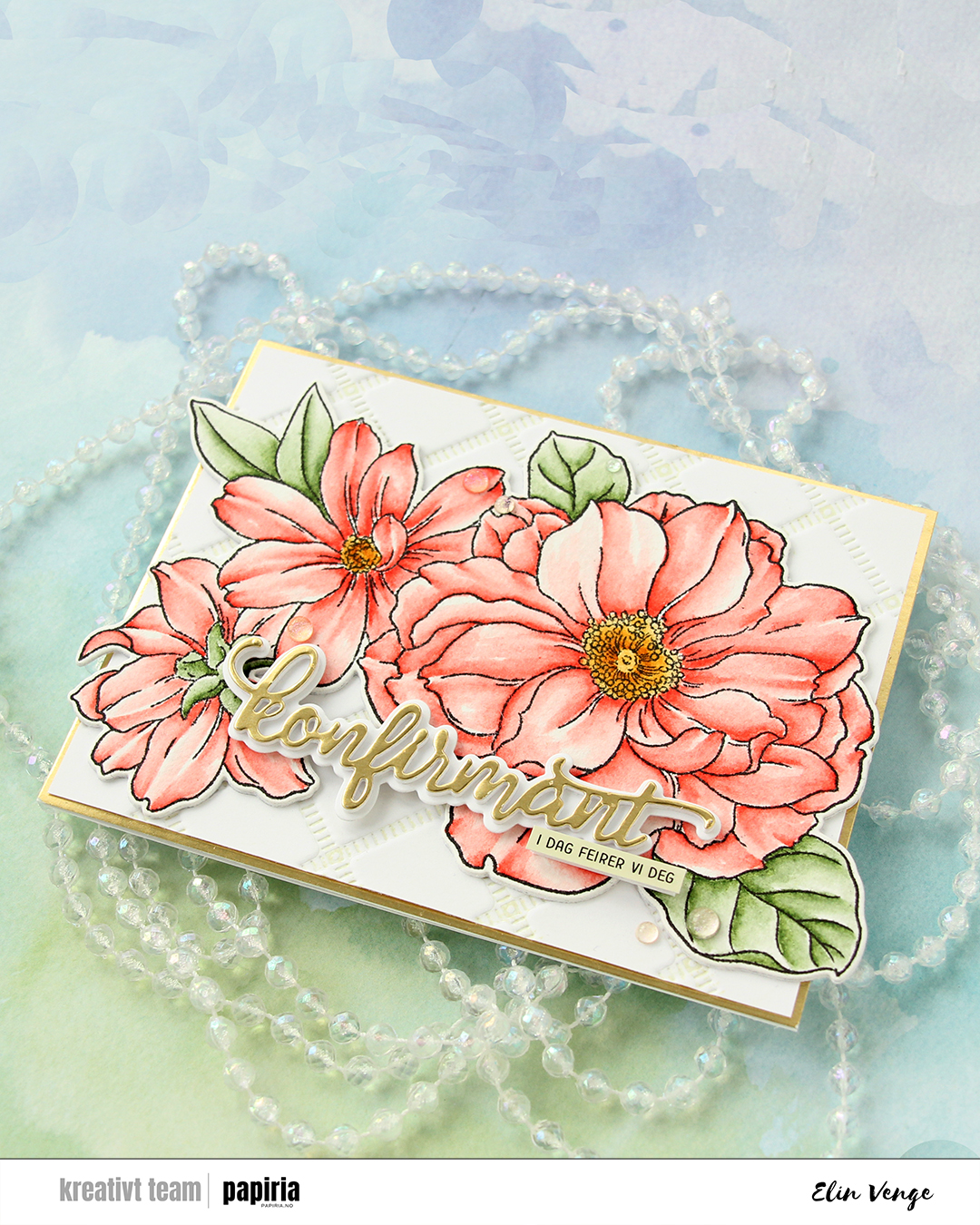 For the sentiment, I used a konfirmant die set from Papirdesign. I die cut the shadow layer from white cardstock and the word itself from the same gold cardstock that I used previously, with a few white die cuts stacked behind it for dimension. I even stacked a few behind the shadow, so it looks like the shadow floats on top of the flowers. For a sub sentiment, I used a sentiment sticker strip from Kort & Godt that I ink blended with Misty Sage ink from Altenew, before finishing off the card with a few Iridescent Dew Drops from Pinkfresh Studio.
 I added some tufts of grass to my coloring. The markers make it super easy because of their actual brush.
 Once all my coloring was dry, I stamped a sentiment from the

 I combined
  I didn’t want color on the entire piece and decided on coloring a strip that includes the largest part of the waterfall, the beaver and part of the mama swan. I used Zig clean color real brush markers to color, using the blender for some of it, but a size 4 round watercolor brush from Princeton, along with water, for most of it. The Zig colors I used are the following: 068 Deep Brown, 816 Soft Violet, 028 Pale Pink, 705 Peach Orange, 505 Yellow Ochre, 407 Grass Green, 406 Sage Green, 411 Cactus Green, 307 Aqua Blue, 315 Ultramarine and 910 Warm Gray 6.
 Once my coloring was complete, I cut the colored section apart from the rest. I adhered the uncolored sections onto a black mat I created from Black cardstock from Concord & 9th. Behind the colored panel, I stacked a few layers of cardstock for dimension and adhered it in between the other two pieces. I adhered my finished piece onto a card base that I created from Blue Beyond cardstock from My Favorite Things.
 I stamped and white heat embossed a sentiment from the
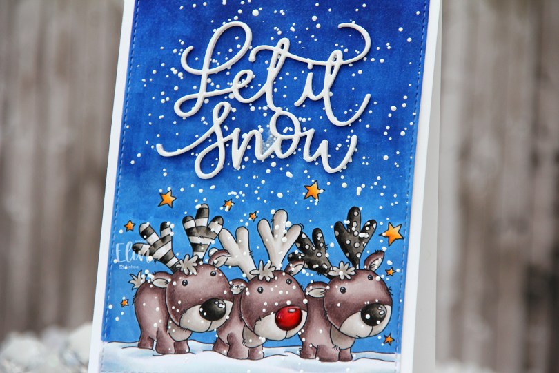
 I often wind up running out of time to create cards from my colored images in a timely manner, but better late than never? I colored most of this image in very neutral tones, I wanted the red nose to really stand out, and it does. It helps that I added Glossy Accents to it, but it’s a very red nose!
 Once I’d colored my image, I used the largest die in the A2 Stitched Rectangles STAX 2 set from My Favorite Things to give it that nice finished edge that I’m so fond of.
 I sprinkled on lots of Chunky White embossing enamel from Stampendous and heated the panel from the back, before adhering it to the front of a top fold white card base I created from Stamper’s Select White cardstock from Papertrey Ink.
 From the same white cardstock I die cut the sentiment three times using a die from Mama Elephant and stacked them for a dimensional look, before gluing them to my sky.
 I added some shimmer to the die cut words using a Wink of Stella brush marker from Kuretake. It doesn’t really show up in photos, but it gives a nice effect in real life.
 Last but not least – lots of Copics. 6 markers for that tiny red nose might have been overkill…
 I blame the cardinal. I really wanted to create something of a scene with this bird flying to trees in the distance to add the star to the top, and I couldn’t really choose any other color for him.
 Onto a piece of X-Press It cardstock, I stamped the hillside in a grayish green ink, before using the Sending Christmas Joy die to partially cut from it. I only wanted the word joy to be cut from the white panel, so I made sure not to cut the words above by not having the cutting plates cover the top two words of the die as I ran everything through my die cutting machine. I did this twice, stacking the two layers together, trimming off a little on each side before adhering it to a cardbase I created from Wild Cherry cardstock. I added the center of the o back in, and really love how the cardbase is showing through the opening of the die cut letters.
 I die cut my little colored cardinal with the Christmas Cheer die set that coordinates with the Christmas Cheer stamp set, added two more die cut layers behind him for stability and a little bit of dimension and adhered him to the front of the card.
 Here you can see the tiny bit of dimension you get by stacking die cuts and also the recessed JOY.
 What’s more summery than peachy colors, flowers and butterflies? I colored up
  I’ve sort of gone back to my roots with this card. Layers (though not many), colored Bazzill card base, Pion Design patterned papers, flowers and those little clear acrylic branches are all things I used to use a lot, but rarely use any more. It’s fun to shake things up every once in a while, especially after making so many clean and simple Christmas cards.
 I don’t know what colors I used to color up my image, it’s been about eight months, after all. I may have written it down somewhere, but if I did, I don’t know where. I’m usually good at writing things down in a book, but I’m also known for some serious Post-it notes usage. I’m not sure where the Post-it went. Or even if there ever was a Post-it for this particular color combination on this particular image. What I do know is that it’s not in my book.
 I glued all my cardstock and patterned paper panels down using double sided tape. For the diecut image, I used foam tape, and lots of it. I was not shy. A roll of foam tape lasts forever, so I like to cover the entire back for even dimension with no sag. I think I bought ten rolls a couple of years ago. I’ve given one away and am halfway through my second roll, so I still have seven sitting in a cabinet in my craft room.
 I used a hot glue gun to attach my flowers and those acrylic branches. I have a low temp hot glue gun that I love for things like this. It dries instantly and stays put. For the butterflies and the pearl in the center of the largest flower, I used connect glue from Gina K. It’s the best liquid glue out there, those butterflies aren’t going anywhere!
 I used the same design on the insides and on the back of my card. There’s no dimension to the circles on the inside of the card, but I used foam tape on the back circle as well. A sentiment from Norsk Stempelblad AS stamped in a combination of VersaMark and two different colors of Distress Ink (Worn Lipstick and Abandoned Coral). Normally, I’m not a fan of distress ink used with clear stamps, they tend to bead up on the surface of the stamp, and the result you get isn’t the best. I didn’t have a peachy ink pad, however, and if you use VersaMark on the stamp and then distress ink right on top of that, you can reduce the beading and get a better stamping. Not perfect, but better than distress ink on its own. And much better than having to compromise and use black or brown or another color that wouldn’t go as well with the rest of the card.
 Jeg har stemplet blomstene og bladene fra
  Teksten jeg har brukt kommer fra
  På den grå kartongen har jeg stemplet de to prikkestemplene fra Brushtekstplaten med grått blekk for en ton-i-ton-effekt. Jeg satte stemplene inntil hverandre på akrylklossen min og stemplet dem over hele bakgrunnen. Ved å bruke samme farge på blekket som på kartongen får jeg en veldig diskret, nøytral bakgrunn, og det er en super måte å bruke de minste stemplene på.


 Her vises dimensjonen litt bedre.
 Neste kort ut er et rødt et. Jeg er vanligvis ikke overbegeistret for rød jul, men når jeg kan gjøre den om til en dyp rød og kombinere den med grått syns jeg det duger. Her har jeg brukt en dyp rød kortbase, og jeg har brukt en die til å stanse ut en sirkel med snøfnugg i hvit kartong. Motivet jeg har brukt kommer fra Juleramp-platen, og jeg har klippet henne ut med en tynn hvit kant rundt hele motivet. Det gjør at hun får litt kontrast til bakgrunnen på kortet, den hadde ikke vært like tydelig om jeg hadde klippet helt inntil kanten på motivet, siden jeg også har brukt rødt til å fargelegge henne med.
 Med det hvite panelet limt rett på basen ville jeg ha dimensjon på en litt annen måte, så jeg klippet ned en stor action wobbler så mye jeg klarte og limte rampejenta på den. Det gjør at kortet får plass i en vanlig konvolutt, men wobbleren gjør at jenta spretter opp så fort kortet tas ut. Jeg limte på noen perler i midten av snøfnuggene for å pynte opp litt.
 Med rampejenta på utsiden med teksten Kjære julenissen… måtte jeg nesten finne på noe inni også. Jeg stemplet …definer rampete med samme blekkfarge som kartongen jeg har brukt til kortbasen. Hjertene kommer fra
  Det siste kortet ut er av slaget som ser veeeldig enkelt ut. Og det er det forsåvidt også, men det er mer tidkrevende enn man kanskje først skulle anta. Her har jeg nemlig først stemplet lua fra julehunden over et helt panel hvit kartong med lysegrått blekk. Det tar tid å maskere stempelet, legge på blekk, fjerne masken og stemple så mange luer, men jeg ble kjempefornøyd med resultatet, så det kan fint hende jeg gjør dette senere en gang også.
 Jeg stemplet en tekst fra Julebil-platen med VersaFine Onyx Black og embosset med klart embossingpulver.
 Jeg la på et tykt strøk med glitterpensel på lua for å pynte opp bittelitt. Her syns det også veldig godt at teksten er embosset.
 Jeg har brukt acetatarket mitt (Heat Resistant acetat fra Hot off the Press) som et vindu på forsiden. Det eneste jeg har gjort på selve vinduet er å stemple og embosse ballongen i svart. Den rosa ballongen er fargelagt med Copics på X-Press It, klippet ut og limt på vinduet, før den har blitt dekket med et lag Wink of Stella glitterpensel. Teksten er et stempel fra Norsk Stempelblad AS, stemplet med Extreme Black blekk fra My Favorite Things.
 Når man drar i den lille flappen som stikker ut til høyre forsvinner hele teksten. Den er nemlig stemplet på den hvite kartongen, så det eneste som blir igjen er den rosa ballongen på selve vinduet.
 Bak kartongen skjuler det seg nemlig et par kyllinger fra My Favorite Things. De er (som begge ballongene) farget med Copics. Kyllingene er maskert, og bakgrunnen rundt er svertet med Distress Oxide Ink i fargene Peacock Feathers, Cracked Pistachio og Twisted Citron. Jeg har også stemplet noen bursdagstekster fra Norsk Stempelblad AS rundt kyllingene og embosset med hvitt embossingpulver fra Ranger. Dermed blir hele panelet kun ett lag, selv om det ser ut som om kyllingene er limt oppå. Jeg har pyntet kortet superenkelt med paljetter fra Pretty Pink Posh.