Hi, crafty friends! I actually have three cards to share today, all featuring the Wild Meadow turnabout bundle from Concord & 9th. This set is a lot of fun to play with, and there are sooo many color combos to choose from.
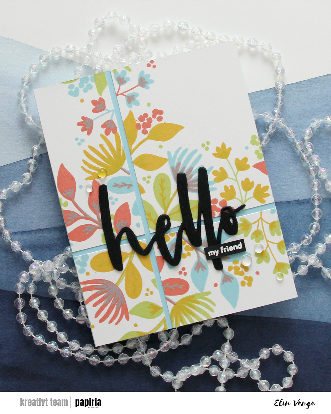
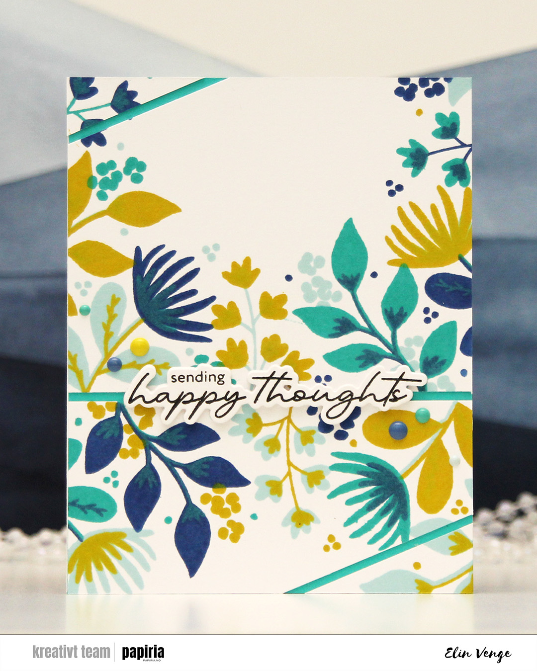 First up is this one. I chose an analogous color combo of Powder, Blueberry and Oceanside inks from C9, and a pop of Lemongrass for a somewhat contrasting color as my fourth. I cut the stamped panel in two, and then cut diagonal lines on each of my two pieces.
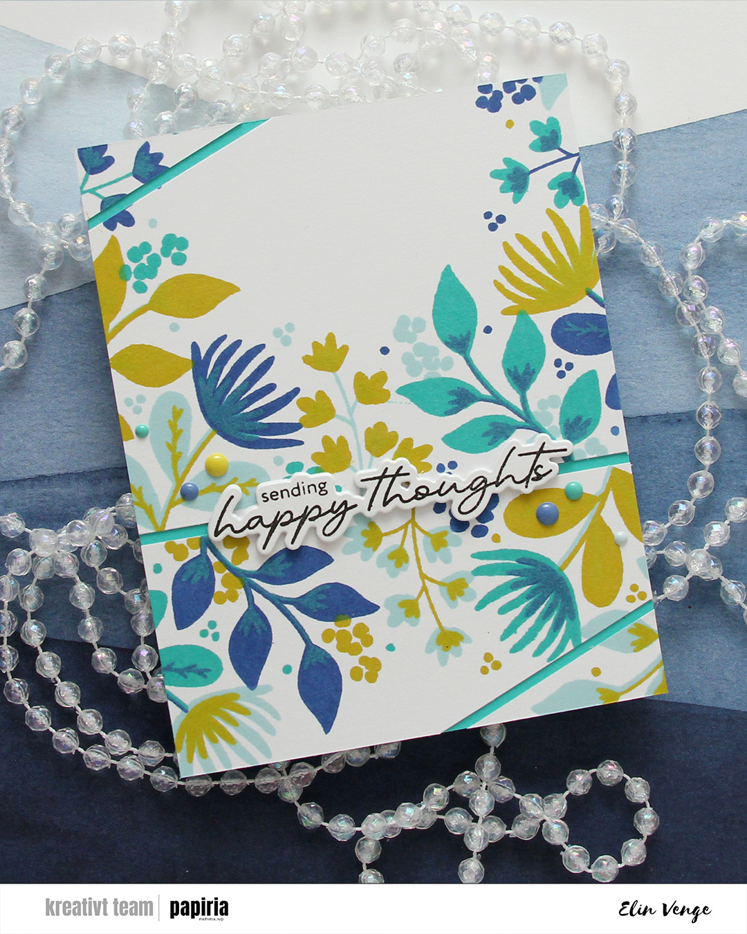 I covered a card base with Oceanside cardstock and adhered my panel pieces on top, leaving a gap between them so the Oceanside cardstock would show through.
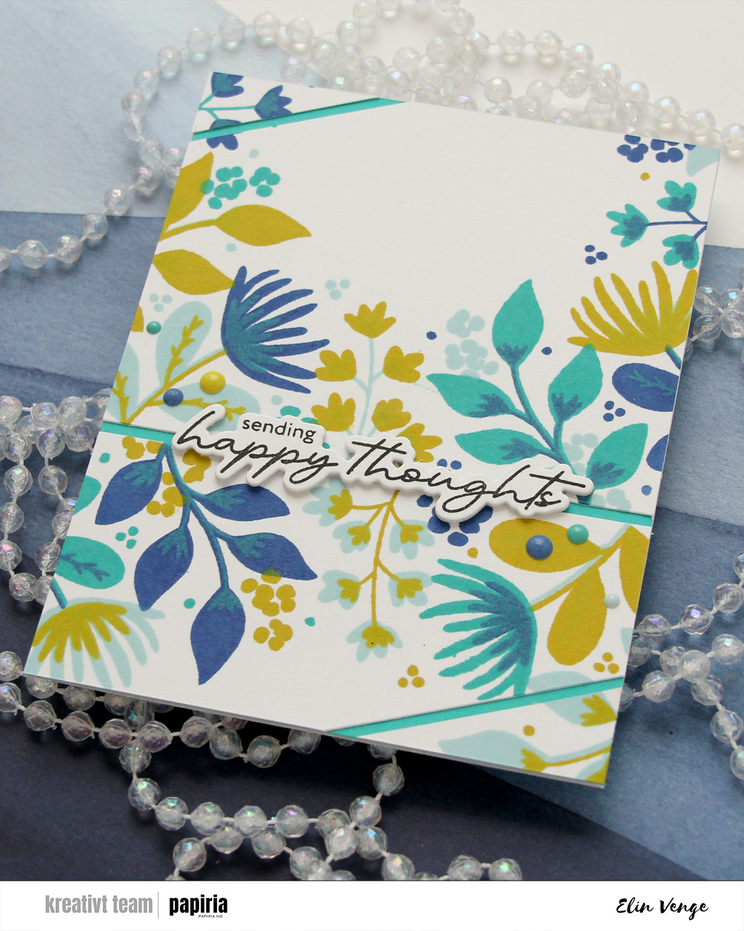 I stamped a sentiment from the Serene Blooms stamp set from Altenew using Obsidian ink from Altenew, and die cut it using the coordinating die. I stacked another three die cuts behind the sentiment for some dimension, and adhered my stack on top of the opening between the two largest pieces of the stamped background, before finishing off with enamel dots from C9 in the same colors that I used for the stamping.
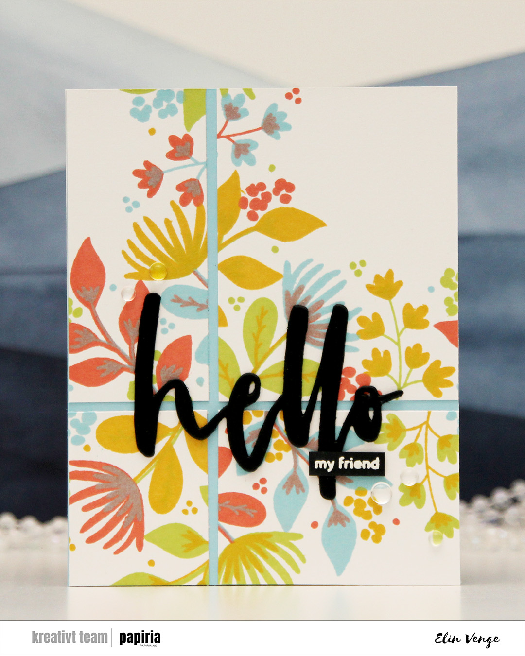 My second card features the same technique of cutting up the finished piece into smaller bits. Here, I used Sprout, Sunflower, Sorbet and Harbor inks, which makes for a way more colorful background (it’s basically a green, a yellow, a red and a blue).
This time I only cut horizontally and vertically, and I added Harbor cardstock behind the pieces. The openings are also a little bit wider on this one. By cutting the panel apart instead of using it as a whole piece, you can rearrange the pieces to make the flowers appear in the center of the card instead of as a frame around a ton of white space in the center, which is what this turnabout stamp actually creates.
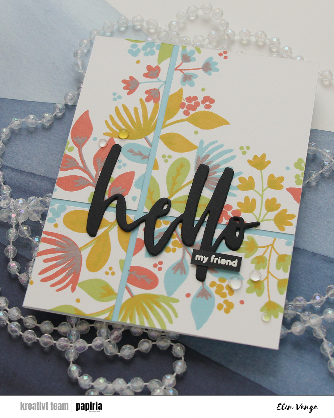 I used the Waterbrush Hello die from Altenew to create my sentiment for this card. I stacked three black die cuts for a bit of dimension and stamped and white heat embossed the sub sentiment from the Serene Blooms stamp set from Altenew. I’ve just replaced my VersaMark pad, so the letters are a bit thicker than I’d like, but i really did need a new pad. I finished off with a few dew drops from C9. There was a lot going on with the background already, and the dew drops are a bit more subtle.
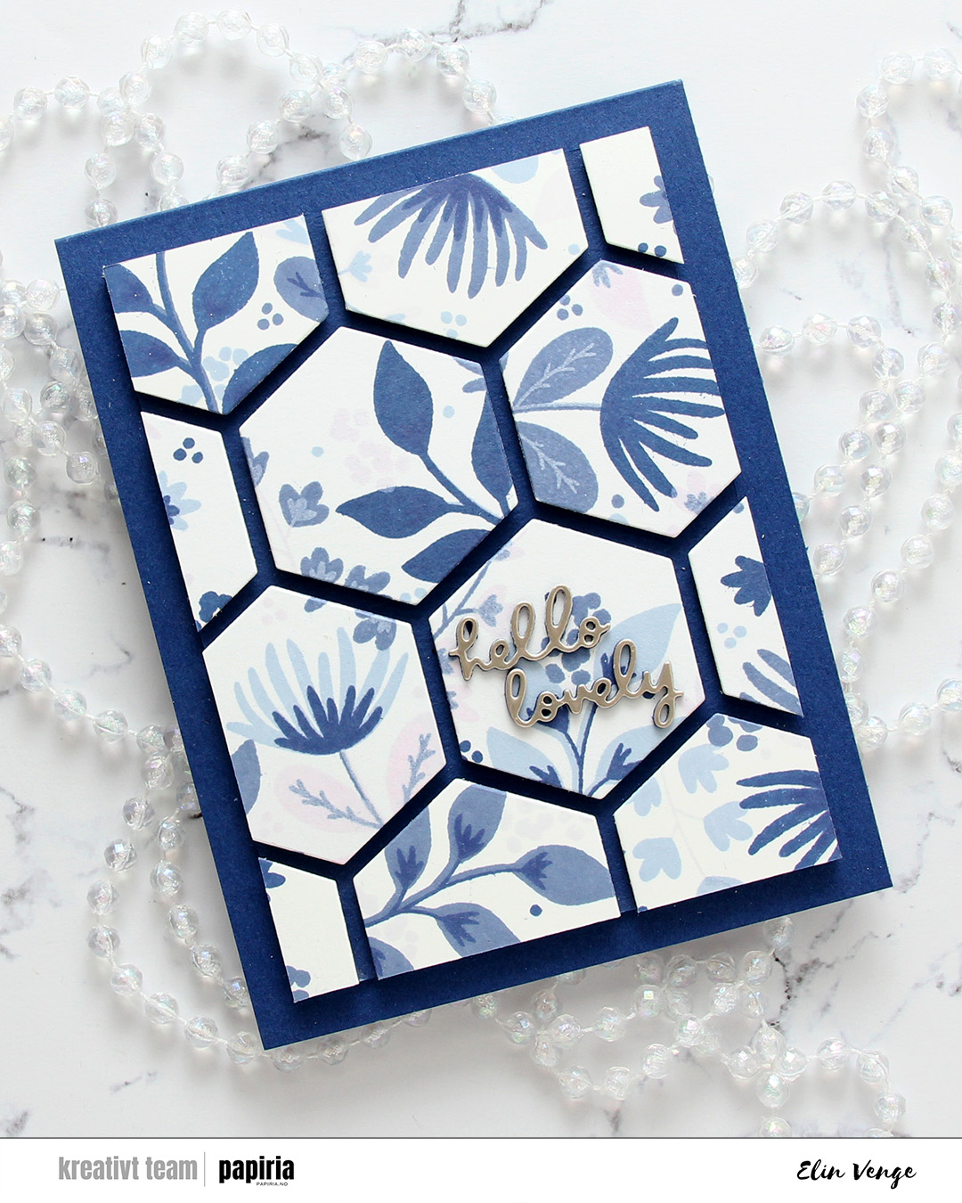 The final card is very different. For this one I had two full panels that I’d stamped with the Northern Shore bundle of fresh dye inks from Altenew (Polar Bear, Icy Water, Winter Lake and Arctic Mountain). I used the hexagon die in the Wild Meadow die set from C9 to cut as many hexagons as I could from the two panels and mounted them on foam tape to a piece of Blue Beyond cardstock from My Favorite Things. I then chopped off a bunch on all four sides for a nice border and adhered it to a card base I created from the same color.
 The die cut sentiment is from the Just picked die set from C9. I die cut two layers from blue cardstock and the top layer from Champagne cardstock from C9, adhered my sentiment in the center of one of the hexagons and decided to skip embellishments for this card. There’s a lot going on already with all the hexagons and dimension, I felt like the card really didn’t need more.
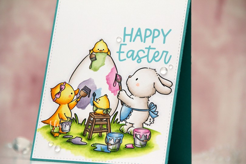
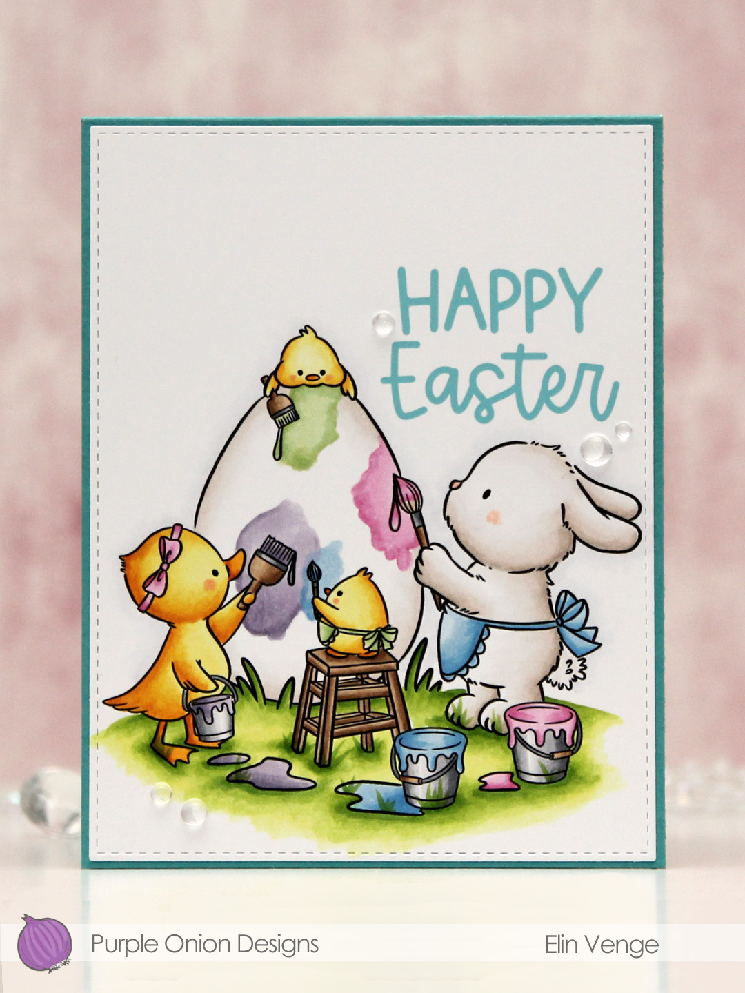 I colored the image with Copics on a piece of X-Press It blending card and nestled one of the sentiments in the little nook between the bunny and the egg. I die cut the panel using the largest die in the Stitched Rectangles STAX 1 set from My Favorite Things.
 I adhered the panel directly onto a card base I created from Caribbean Sea prestige cardstock from My Favorite Things and finished off the card with a few dew drops from Concord & 9th. Simple, yet sweet, right?
 Lots of pastels for this one.
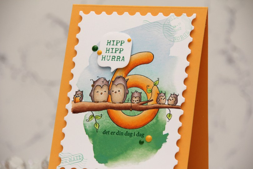
 I printed the image onto a piece of X-Press It blending card, adding a digital watercolor background behind the image before printing. I colored the image with Copics and opted for a warm yellow for the actual number and the book, an analogous color palette always works well.
 I die cut the panel using the Postage Stamps infinity die set from Hero Arts, then stamped the sentiments from the Bursdagsbillett stamp set from by.cino (hipp hipp hurra) and the A06 stamp set from Norsk Stempelblad AS (det er din dag i dag) using Clover ink from Concord & 9th. I also used second generation stamping of a couple of the images from the CS0879 stamp set from Marianne Design in the corners of my large postage stamp. I mounted my postage panel onto a card base I created from Summer Sunrise cardstock from Papertrey Ink, then die cut and mounted the Hipp hipp hurra sentiment using the MSTN Say Anything die set from My Favorite Things, before finishing off the card with Clover and Honeycomb enamel dots from Concord & 9th, as well as a dot of a black Sakura Glaze pen to each eye for a little bit of shine and dimension.
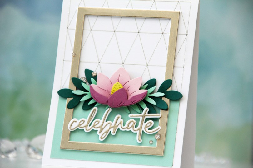
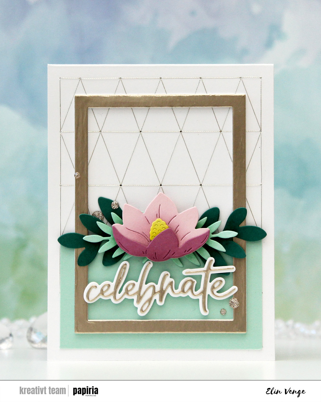
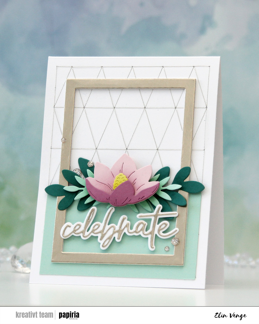 I used the Triangle Piercing die from C9 to cut into the card base. I then used Sulky metallic sewing thread in color 7003 and a size 26 tapestry needle for my stitching. I was initially planning on having the floral swag span the width of the card and adhering it directly to the stitched background with a sentiment below, but somehow it evolved into something else, I was just along for the ride. I trimmed a piece of Sea Glass cardstock to cover the bottom two rows of rectangles and adhered this to the card base, planning on adhering the flower where the panel ends. Then I found an already die cut frame (I realize now that this is the Classic Rectangle Frames die set from My Favorite Things) in my stash cut from Champagne cardstock from C9, which was the perfect size to add to the card.
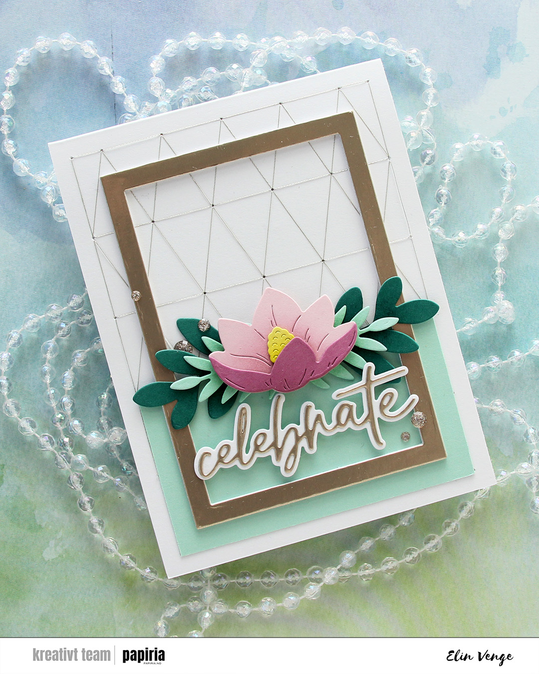 I adhered the Juniper die cuts directly to the line that separates the Sea Glass from the card base, then mounted the Sea Glass ones on top, before finishing off with the flower on another layer of foam squares.
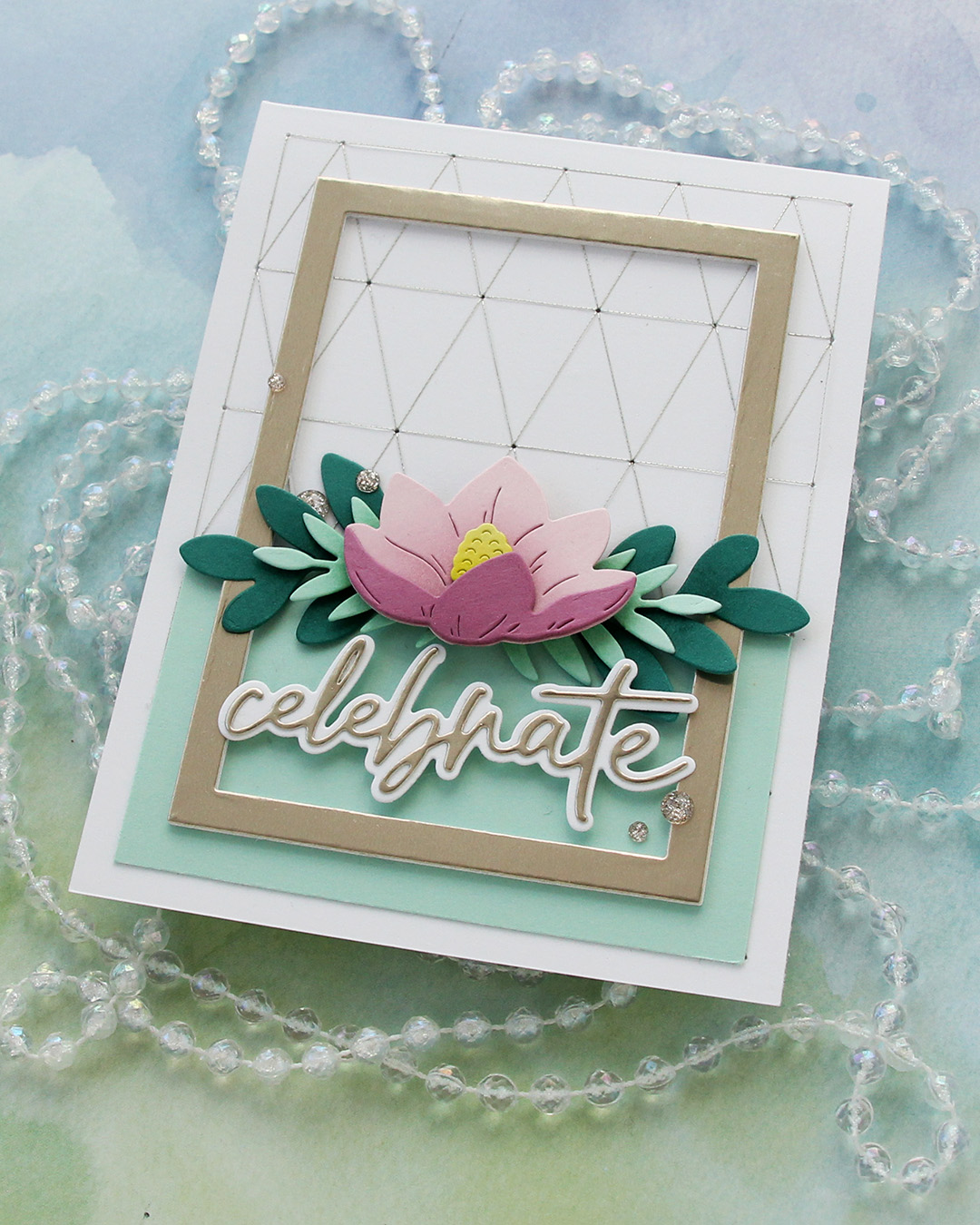 I die cut the word celebrate from Champagne cardstock from C9 using the Sweet Sentiments die set from Altenew. I die cut the shadow from white and mounted it on foam squares to make it float across the frame. I usually stack die cut words, but this gives a different look and worked better for this card. I finished very simply with a few champagne glitter drops from Pinkfresh Studio.
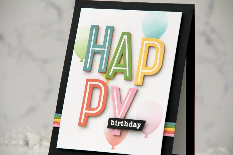
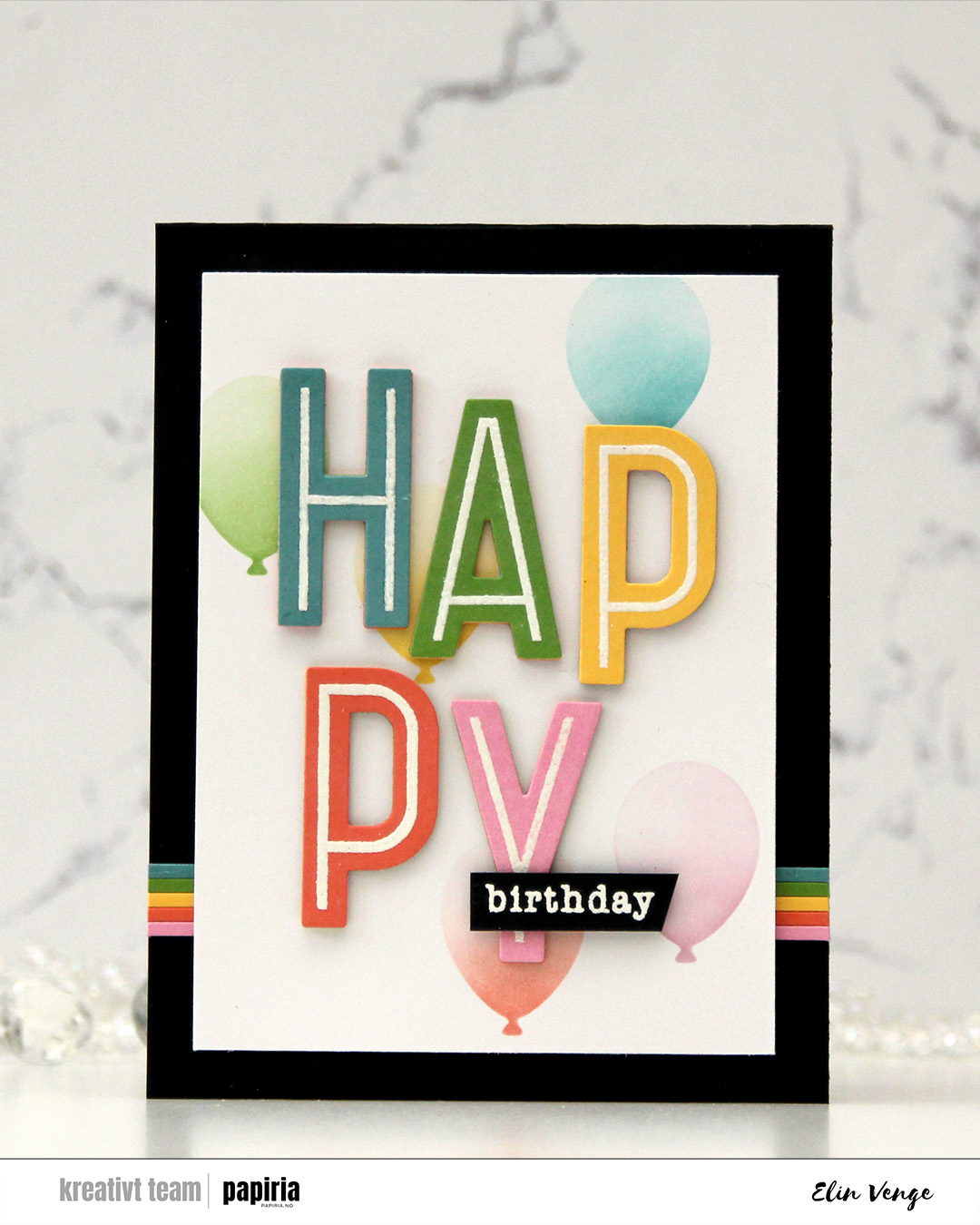 I started by stamping the word happy from the Happy Birthday Words stamp set from Kristina Werner onto five different colors of cardstock from Concord & 9th. I used Lakefront, Parsley, Buttercup, Sorbet and Carnation. I heat embossed them all with white embossing powder from Ranger and stacked the letters for dimension, choosing a different color on top for each. This gives a bit of a rainbow look from the side.
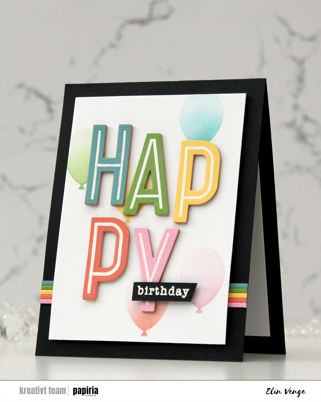 I cut a white panel to 3 1/2 x 4 7/8″ and used the Balloon Party stencil from My Favorite Things to add ink blended balloons in the background. I used the same ink colors as my cardstock colors for the letters, and added a gradient on each of the balloons, concentrating the color on the base of the balloon, then fading as you go up the balloon. I adhered my letters staggered onto the stenciled background.
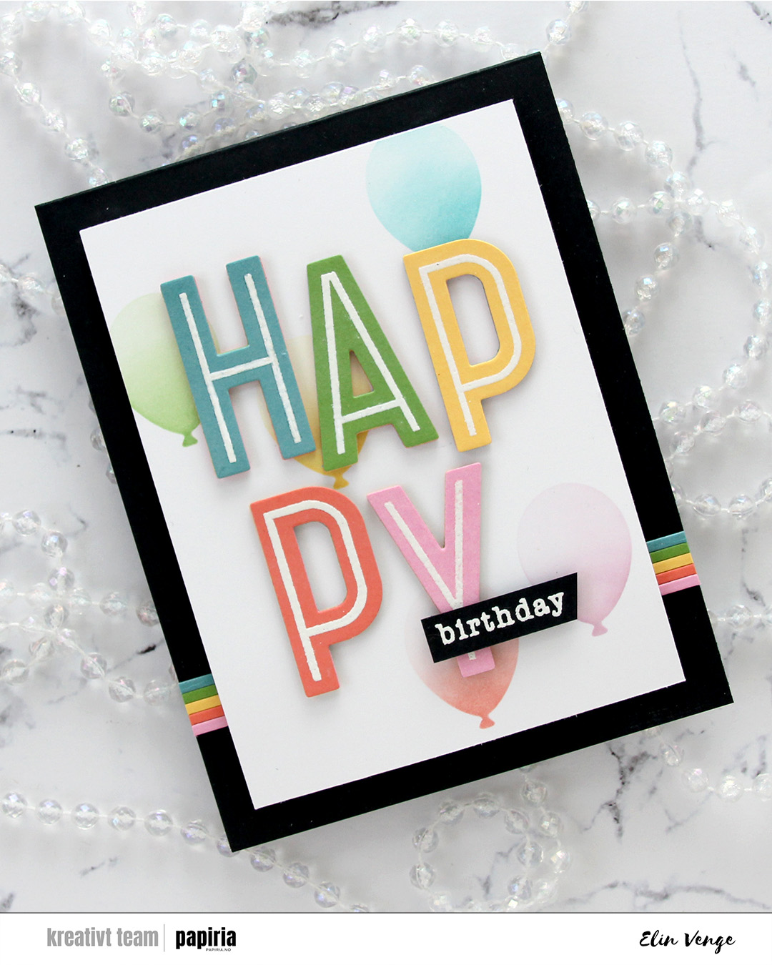 I stamped and white heat embossed the word birthday from the All the birthdays stamp set from Concord & 9th onto a scrap of Black cardstock. I added a few extra layers of cardstock behind it, before adhering it near the bottom of the pink Y.
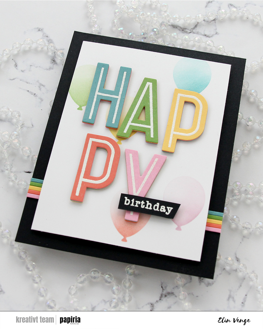 I cut slivers of the same colors of cardstock to create some interest on the card base. I like the beveled edge you get from die cutting as apposed to using a trimmer, which is why I used one of the frames in the A2 Thin Frames die set from Kristina Werner for this. I put a scrap of each color cardstock along the sides of the die for a bit of selective die cutting. It was then super easy to butt the strips up against each other. I adhered the strips horizontally across the card base, added foam tape to my panel and adhered it in the center of the card.
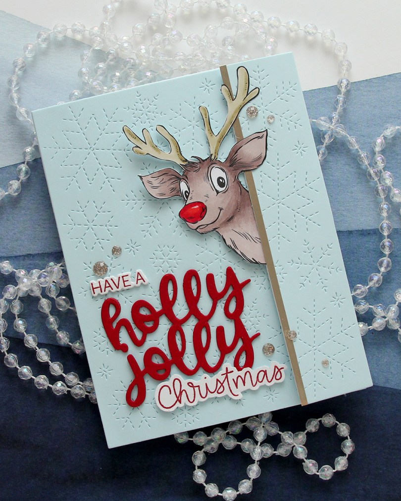
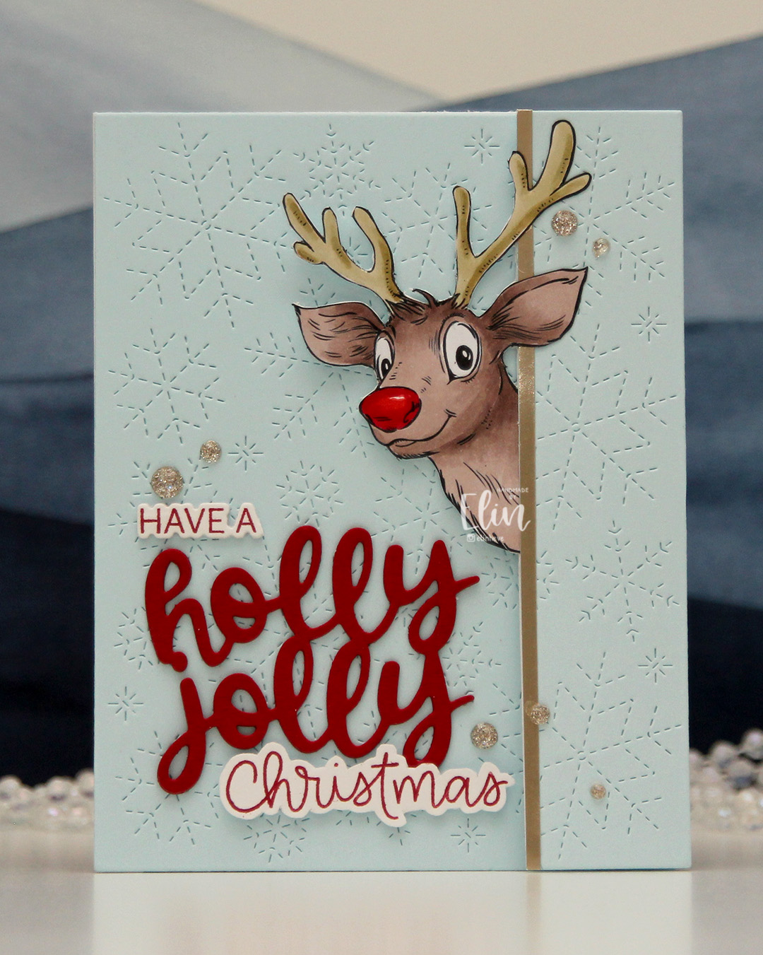 I created a tri fold card this time, with the reindeer peeking out from one of the folds. I couldn’t resist a red Rudolph nose, even if that makes my card inaccurate in its reindeer portrayal. Only female reindeer have antlers in the winter, so this is technically a female reindeer. It’s not like a red nosed reindeer is all that believable to begin with, so I guess it doesn’t really matter, it’s just a fun little tidbit.
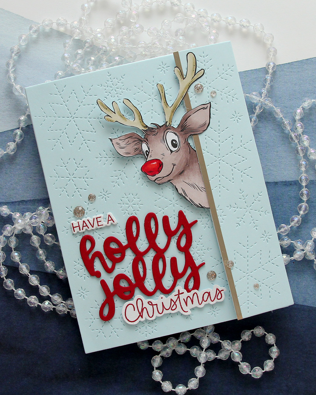 For the blue background, I used Powder cardstock from Concord & 9th. I used the Stitched Snowflake Backdrop die from Lawn Fawn to create some interest in the background. I die cut the a sentiment from the Jolly Holiday Greetings die set from Concord & 9th using Cranberry cardstock, also from C9. I stacked three layers, stamped part of a sentiment (have a) from the Christmas Wishes stamp set from My Favorite Things and the word Christmas from the Scripty Xmas stamp set from Mama Elephant, both in Cranberry ink. I die cut the have a with the coordinating die and fussy cut around the Christmas (there’s no coordinating die for this set), and put the three parts together to form a complete sentiment.
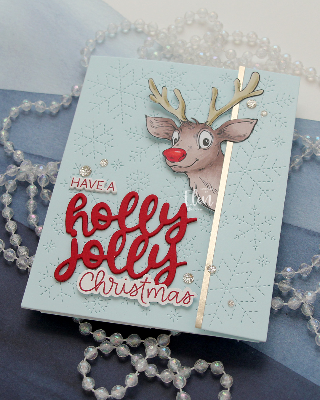 I added a strip of Champagne cardstock from C9 to the edge where Rudolph (not really Rudolph) is peeking out, to emphasize the edge of the panel that opens. I scattered a few Champagne glitter drops from Pinkfresh Studio for a little bit of embellishment.
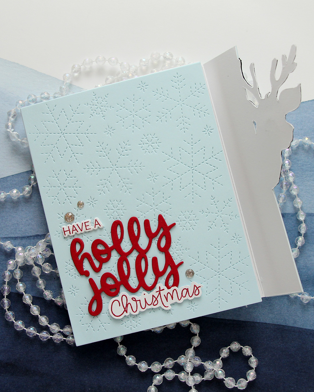 When you lift the flap with Rudolph (not Rudolph), you’re left with a regular side folding card. I’ve hidden magnets so Rudolph (not Rudolph) keeps the flap closed until it’s time to open the card.
 This one has a super simple color combo, there’s was very little coloring to do on Rudolph (not Rudolph).
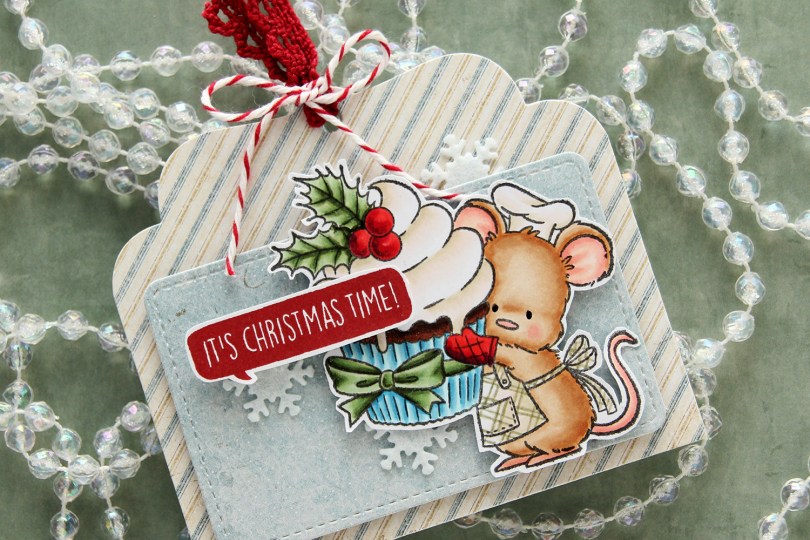
 I colored up the cute little mouse with Copics, adding a plaid pattern to the apron using a Zig watercolor brush marker (No. 98 Pale Dawn Gray), before fussy cutting the image leaving a white border. I used the Gift Pocket Tag die set from Mama Elephant to die cut from patterned paper from the Christmas Nostalgia collection from Maja Design to create my tag. I mounted the smaller piece with foam squares and did the same with the cute little mouse.
 I stamped a sentiment from the
 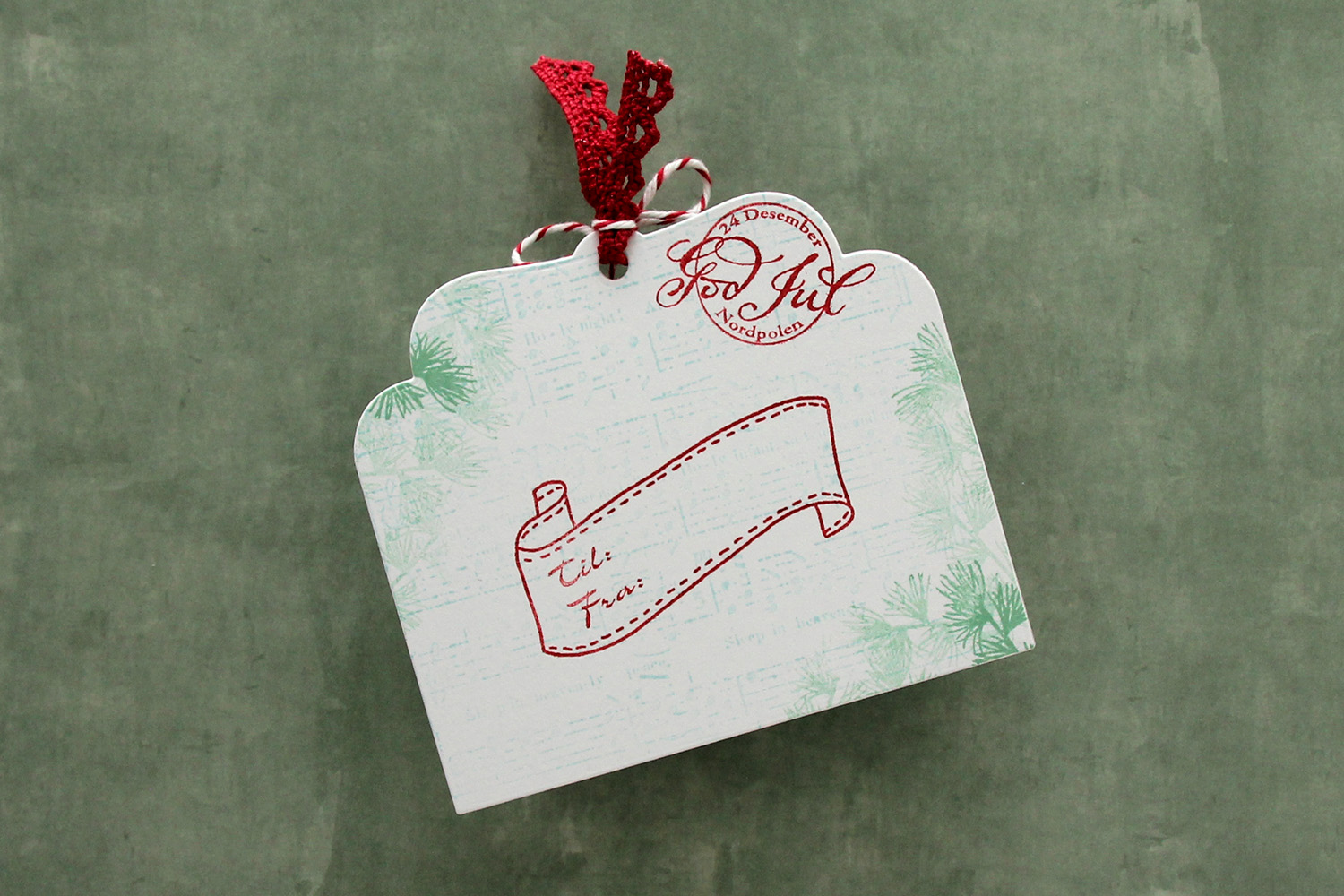 I die cut the tag a second time from white cardstock and did quite a bit of stamping on it. I used second generation stamping of an old sheet music stamp from Magnolia using Powder ink from Concord & 9th – I wanted it to be very soft. The sheet music is actually for Silent Night, making it extra Christmas-y – not that you can really tell. I used first and second generation stamping of a branch from a Mathia Design stamp set using Eucalyptus ink from Concord & 9th to add a little something to the corners. I stamped a postmark stamp from Ladybug & Friends, as well as a to/from stamp from Norsk Stempelblad AS using Amarena Cherry ink from My Favorite Things. I don’t think Ladybug & Friends is in business anymore. Neither is Norsk Stempelblad, but I love their stamps and can’t bring myself to stop using them.
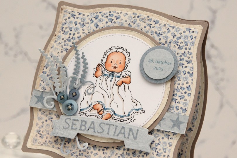
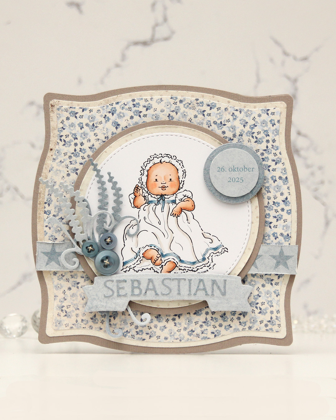 I colored the image and die cut it using one of the circle dies in the Stitched Circle STAX die set from My Favorite Things. I also die cut circles from grey cardstock and patterned paper from the Denim & Friends collection from Maja Design using the Nesting Circles die set from Lifestyle Crafts. The shape of the card is created with the Nesting Frames #8 die set from Lifestyle Crafts.
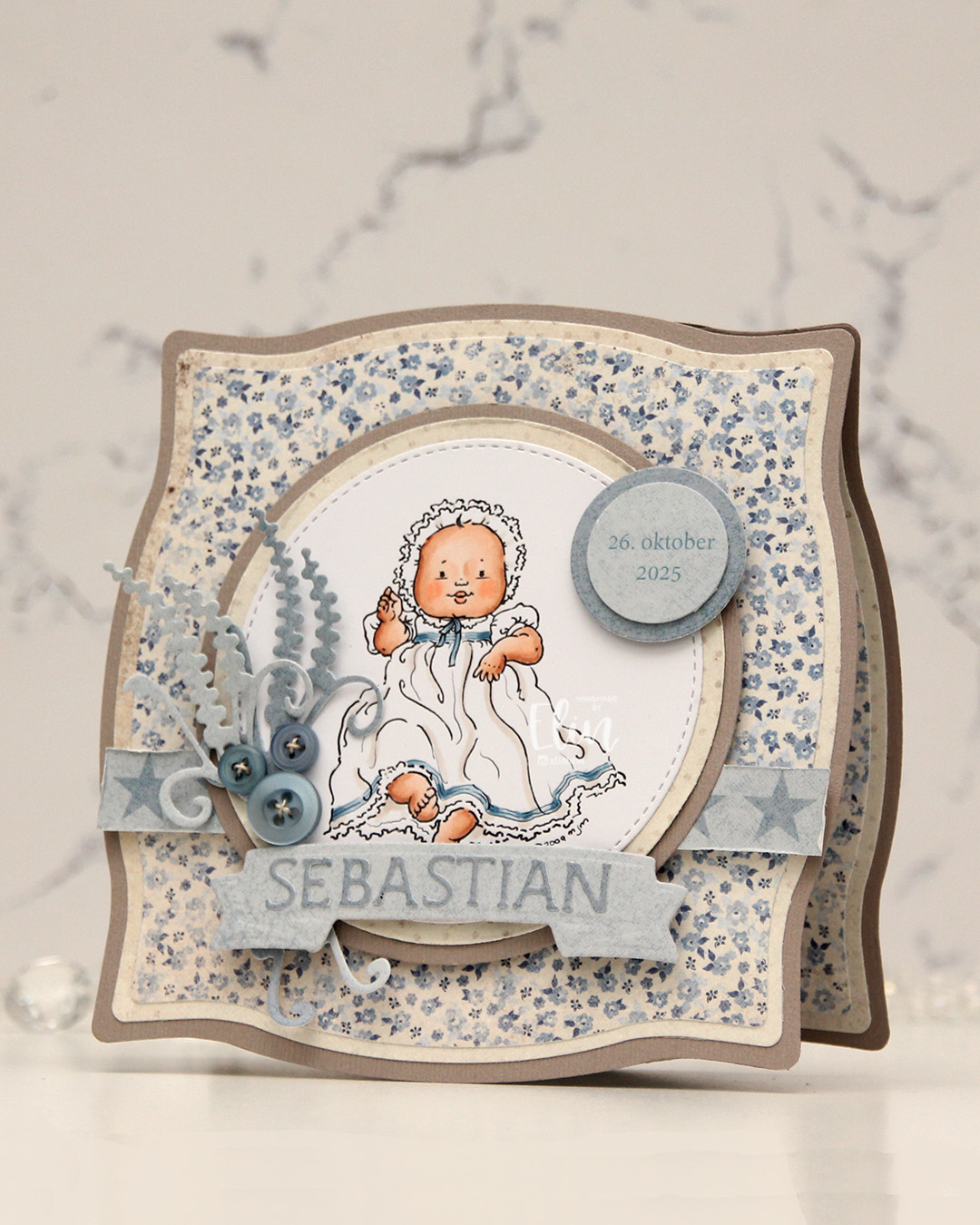 I popped some pieces up using foam tape, die cut the letters for the name using an alphabet die set from Scrapmagasinet and adhered the letters to a banner I die cut with an old die from Spellbinders. I used an old die from Marianne Design for the spriggy things on the left, and used some old Blueberry Sky buttons from Papertrey Ink to embellish.
 Very limited color palette for this one.
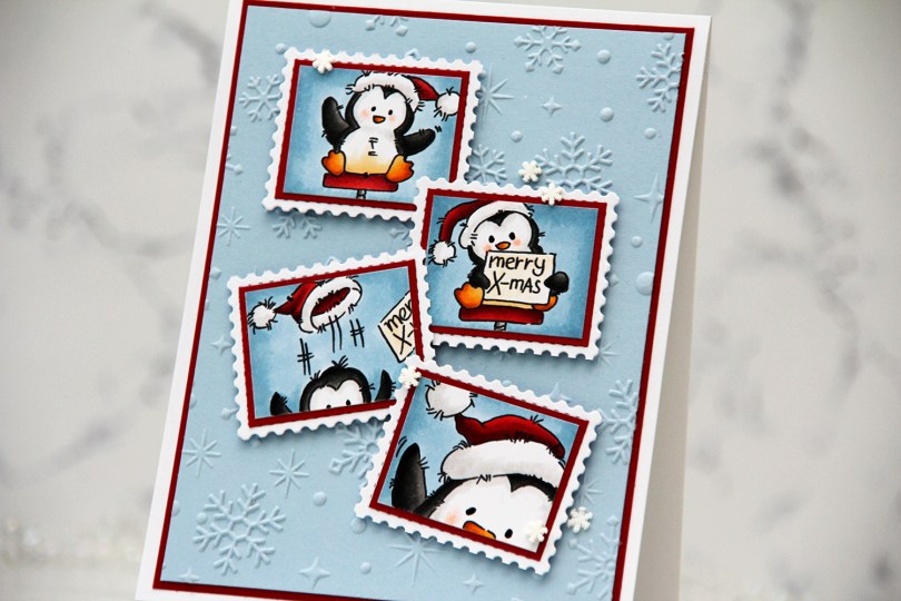
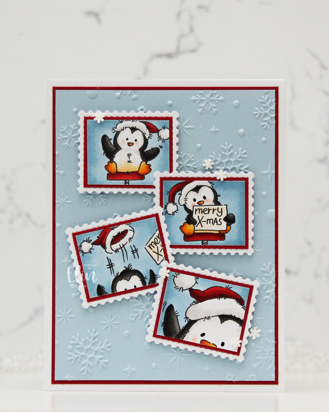 I started by coloring the images with Copics. They each come with a frame, but I wanted this postage stamp look, so I cut my images on the inside of the frames.
 I wanted some interest in the background, and the Sparkling Snow embossing folder from Simon Hurley/Spellbinders is amazing! It creates proper six pointed snowflakes and gives such a cool texture, I want to use it on everything. I used it with a panel of Blue Breeze cardstock from My Favorite Things. It’s one of my favorite light blue colors, I may need to hoard it since MFT went out of business. I trimmed my panel down, matted it with a panel of Cranberry cardstock from Concord & 9th and adhered both to a top fold white card base I covered with an A2 panel of X-Press It blending card, just so that my whites would match.
 I adhered each of my colored images onto Cranberry cardstock for a nice framed look, then adhered my matted images to postage stamps I die cut with the Postage Collage die from Waffle Flower.
 I mounted each of my postage stamps using foam squares, adding the first two straight before making sure the last two were wonky. I like that both the images and their placement tell a story about what happened in that photo booth, everything going perfectly at the start, followed by slight chaos. To finish off the card, I added black glaze to the eyes for some shine and a tiny bit of dimension, as well as snowdrift sprinkles from Little Things from Lucy’s Cards.
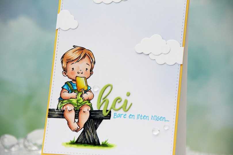
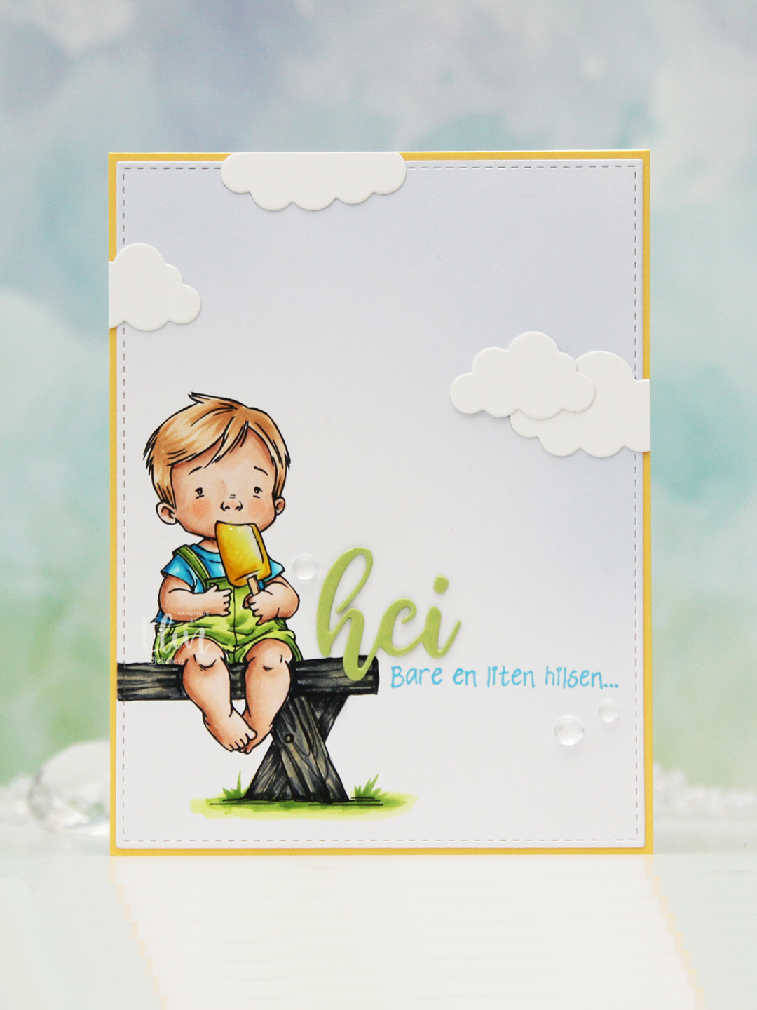 I colored the image with Copics, opting for the cool grays for the bench. I wasn’t planning on making it this dark originally, but when my C9 made a blob, dark was the only way to go. It still works, and I don’t think you can really see where the blob was. I used the largest die in the A2 Stitched Rectangles STAX 1 set from My Favorite Things to trim the panel down a little, then a large blending brush to add some soft blue to the background. I didn’t add any ink to the brush, I simply used whatever was left from a previous project.
 I stamped a sentiment from the Småtekster stamp set from Norsk Stempelblad AS next to the bench using Tide Blue ink from Altenew. I added my colored piece to a panel of Buttercup cardstock from Concord & 9th, which I then adhered to a top fold white card base. I die cut the word hei twice from Green Parakeet cardstock from Papertrey Ink, stacked them and adhered my double die cut next to the boy on the bench before adding a few die cut clouds and some dew drops. Both the cloud dies and dew drops are from Concord & 9th.
 I used quite a few colors for this very simple image.