Hi, crafty friends! I’m back today with a confirmation card I made on commission. I was told that the recipient does kickboxing, likes car races, swimming (lake or beach doesn’t matter as long as it’s water) and is a bit of a prankster. Lots of interests that I tried to incorporate into my card. They’re all very different interests, so I had a tough time figuring out what to do, but the card was a huge hit with the recipient, and that’s never a bad thing.
 I looked for a kickboixng image I could color up, as I wanted that to be the main focus on the card – it was his main hobby. I didn’t have one, nor could I find one, but I found this greyscale sketched image with boxing gloves that was perfect.
 The gloves cover the entire front of the card. I still needed something to color, because a black and white image isn’t very interesting on its own. I settled on Blast from Mo Manning, which was the perfect image for a prankster who loves water. I colored it up in very vibrant colors, making sure to include some red, which I thought would work great with the boxing theme AND the car racing theme. I fussy cut him and placed him on top of one of the gloves. He blended in with the background a little too much, so I decided to print the gloves again, this time with a very low opacity. I fussy cut the glove, scored it on one side and made it into a flap that opens. Put the colored image on top of this one, and now it didn’t get lost in the background. I also added a bit of Glossy Accents to the goggles for a bit of shine.
 I mounted the colored image on pieces of foam tape, making sure to add a magnet in a strategic spot to keep the flap from opening on its own. I put another magnet behind the image of the gloves to keep both magnets hidden. They’re still plenty strong enough to work through a couple of layers of cardstock.
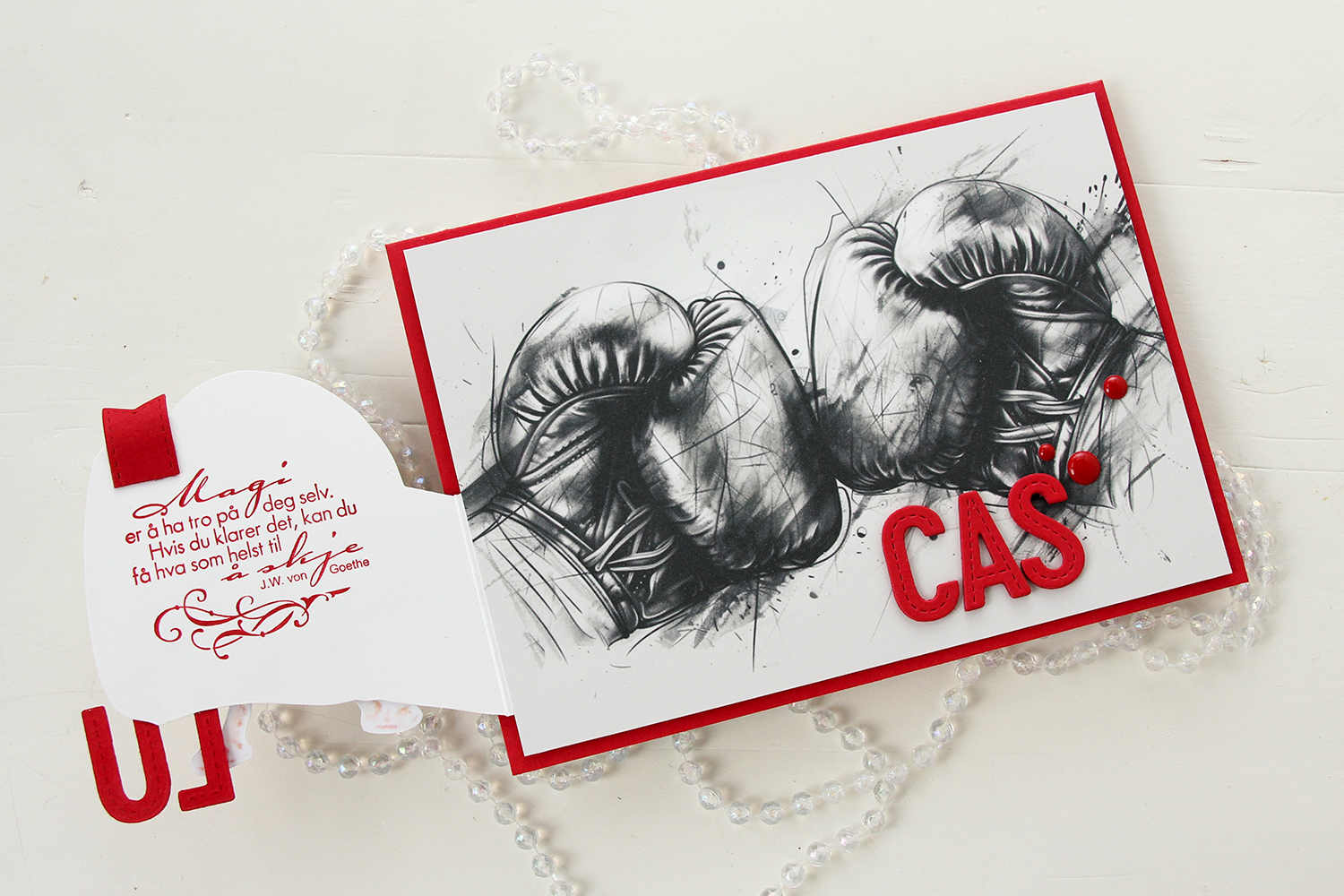 Once you open the glove fully, there’s a sentiment from an old confirmation stamp set from Stempelglede, stamped in Wild Cherry ink from My Favorite Things. I used one of the dies in the Essential Stitched Sentiment Strips die set from My Favorite Things to create a flag end to pull the glove open when the card is closed. The magnets are so strong, it won’t open on its own, and by adding the little flag end, it gives the recipient a little clue to look behind the glove.
 Back to the front of the card when it’s closed. I stamped an white heat embossed the word KONFIRMANT from the A05 stamp set from Norsk Stempelblad AS onto a piece of Red Hot cardstock from My Favorite Things, and then die cut it using a banner die from MFT – they have lots! I popped it up and made sure the end crossed into the image, to tie the two together. I did the same thing with my letters, die cut using the In Stitches Alphabet die set from My Favorite Things, also from Red Hot cardstock. I stacked a few layers for dimension and stability, the L and the U are only barely attached to the glove and the back of his left leg, so they needed a little bit of strength.
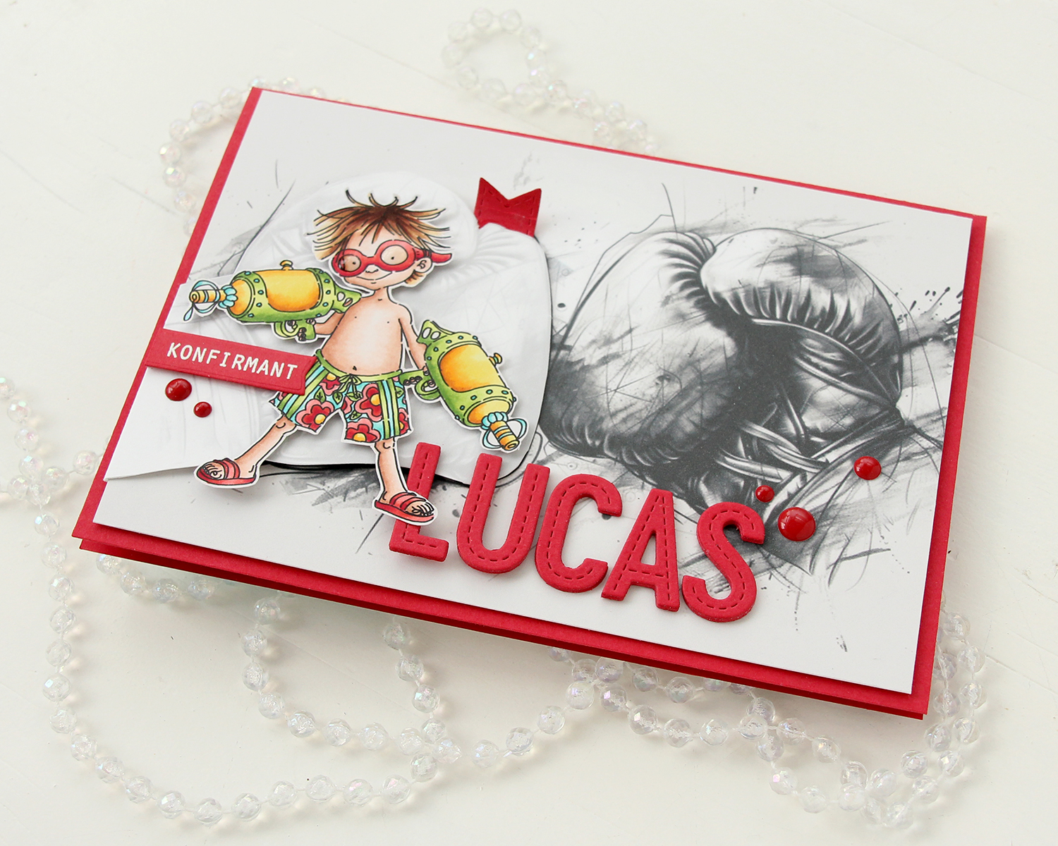 I finished off the front with a few red enamel dots from Papirdesign.
 On the inside, I printed and cut out a checkerboard pattern, which I thought worked well with the car racing theme. There’s still plenty of room to write a personal message. I also used the Wax Seals die set from Waffle Flower to create a rosette badge with a Norsk Stempelblad AS confirmation sentiment heat embossed in the center. I used the Itty Bitty Strips dies from My Favorite Things to create the ribbon ends hanging down from the actual rosette.
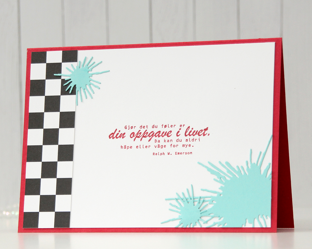 On the back of the card, I used more of that checkerboard pattern, stamped another confirmation sentiment (it’s actually an Emerson quote) and used the Splash die set from Papirdesign to create some water splashes from Summer Splash cardstock from My Favorite Things. I thought they tied in well with the super soakers in the colored image on the front of the card.
 A simple color palette to finish off. This card was a hard nut to crack, but once I got going I had a blast (no pun intended) creating it.
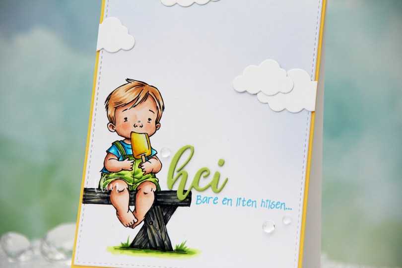
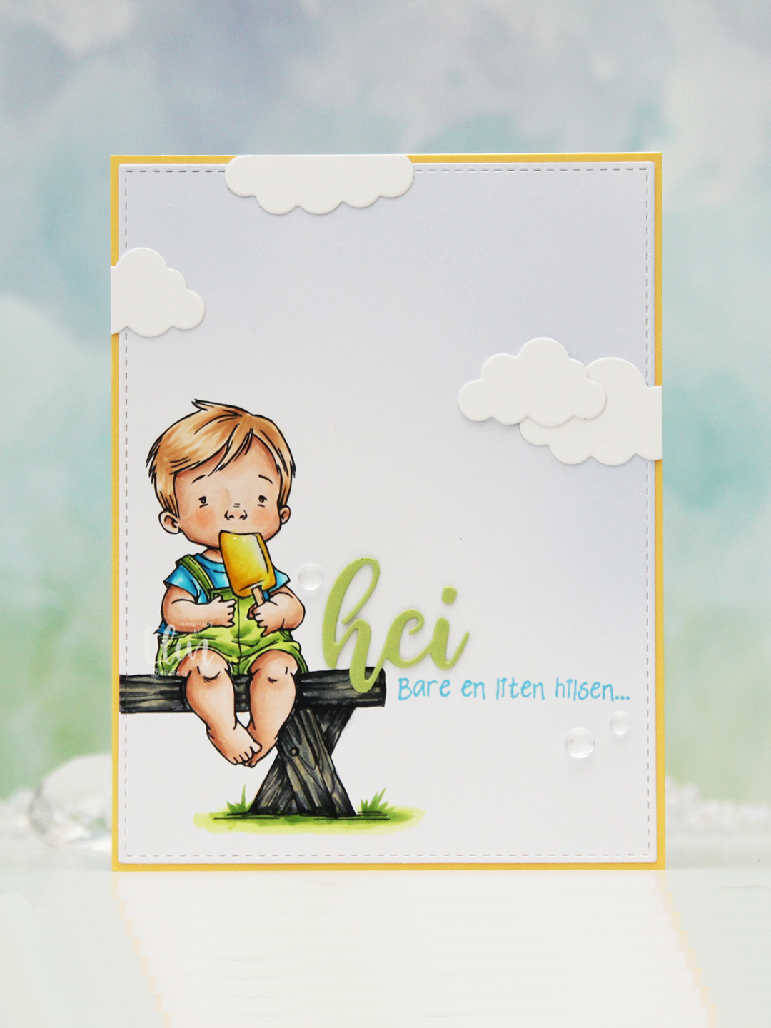 I colored the image with Copics, opting for the cool grays for the bench. I wasn’t planning on making it this dark originally, but when my C9 made a blob, dark was the only way to go. It still works, and I don’t think you can really see where the blob was. I used the largest die in the A2 Stitched Rectangles STAX 1 set from My Favorite Things to trim the panel down a little, then a large blending brush to add some soft blue to the background. I didn’t add any ink to the brush, I simply used whatever was left from a previous project.
 I stamped a sentiment from the Småtekster stamp set from Norsk Stempelblad AS next to the bench using Tide Blue ink from Altenew. I added my colored piece to a panel of Buttercup cardstock from Concord & 9th, which I then adhered to a top fold white card base. I die cut the word hei twice from Green Parakeet cardstock from Papertrey Ink, stacked them and adhered my double die cut next to the boy on the bench before adding a few die cut clouds and some dew drops. Both the cloud dies and dew drops are from Concord & 9th.
 I used quite a few colors for this very simple image.
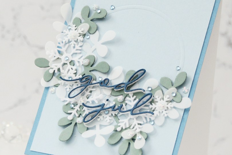
 This card was a bit of an evolution. I originally wanted to make a snowflake wreath, but quickly decided that that was too simple. I then had an idea of half a very layered wreath, and this stems from that.
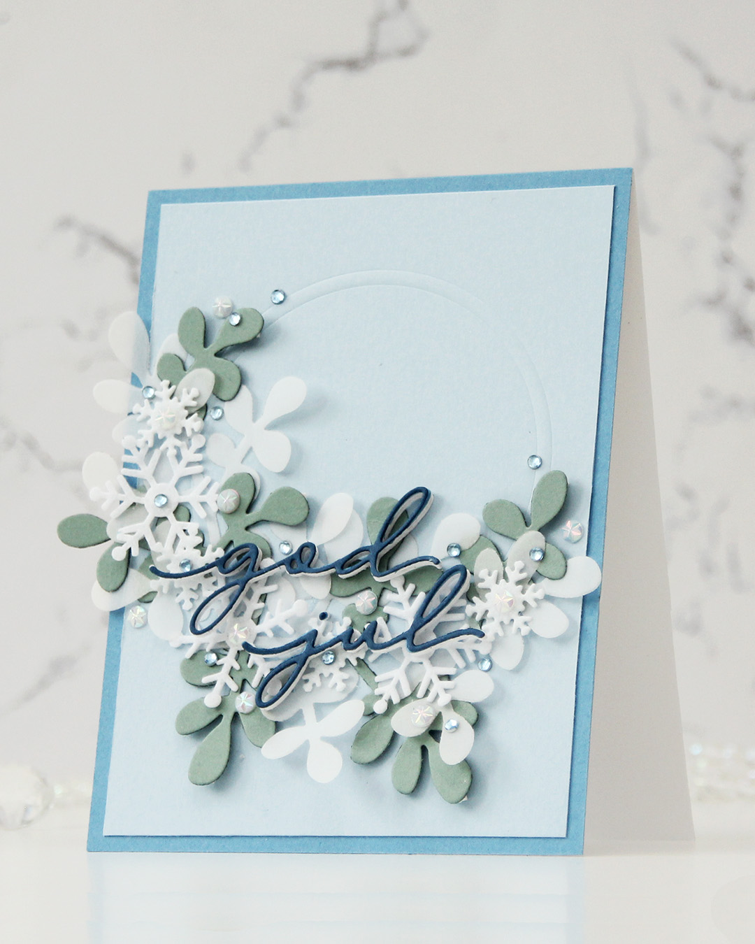 I die cut a sprig of leaves a few times – two from 40 lb vellum from Bazzill and a couple from Ocean Tides cardstock from Papertrey Ink. I dry embossed a couple of circle dies into a panel of Blue Breeze cardstock from My Favorite Things and adhered the two vellum pieces in the bottom left of my impressed circle. I cut the green leaves apart and added them here and there, before topping with felt snowflakes, alternating between large and small.
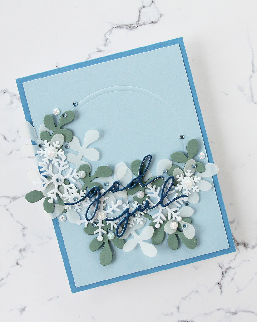 I wanted a white sentiment, and started with white glitter cardstock. The white didn’t match the snowflakes, so I went to regular white cardstock and die cut four of each word and stacked them. The sentiment got lost, there was too much going on in the background. I then die cut the words from Blueberry Sky cardstock from Papertrey Ink and added that on top. I also cut down the panel slightly and added a 4 1/4 x 5 1/2″ panel of Blueberrry Sky cardstock behind the lighter one to pick up the color from the sentiment. Guess what? The sentiment was still lost in the busy background. Plan D: die cut one more layer from Enchanted Evening cardstock from Papertrey Ink and add that on top. This is one of my most used blue cardstocks, I love it. The sentiment was finally legible.
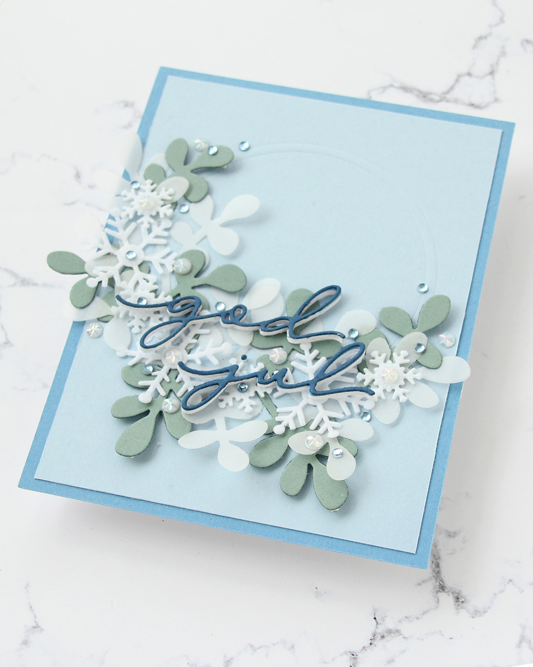 I embellished with a mix of faceted white pearls and some blue diamonds, and the card was finished. I kind of wish I’d made my half wreath tighter, it’s very wide, but I’ll revisit the snowflake wreath idea, I might have a plan for a new card using these products.
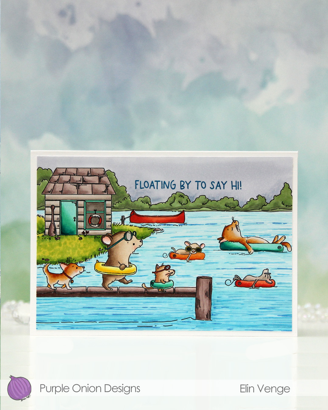 I fit a lot of images into this scene.
  I colored in my scene with Copics, opting for very vibrant colors for all the floating elements and the details on the boat house, while keeping the rest fairly muted. The lake is lighter the further back you get, and the sky is a bit moody off in the distance. I added a bit of black glaze pen to the eyes of the gang on the pier for a little bit of dimension and shine.
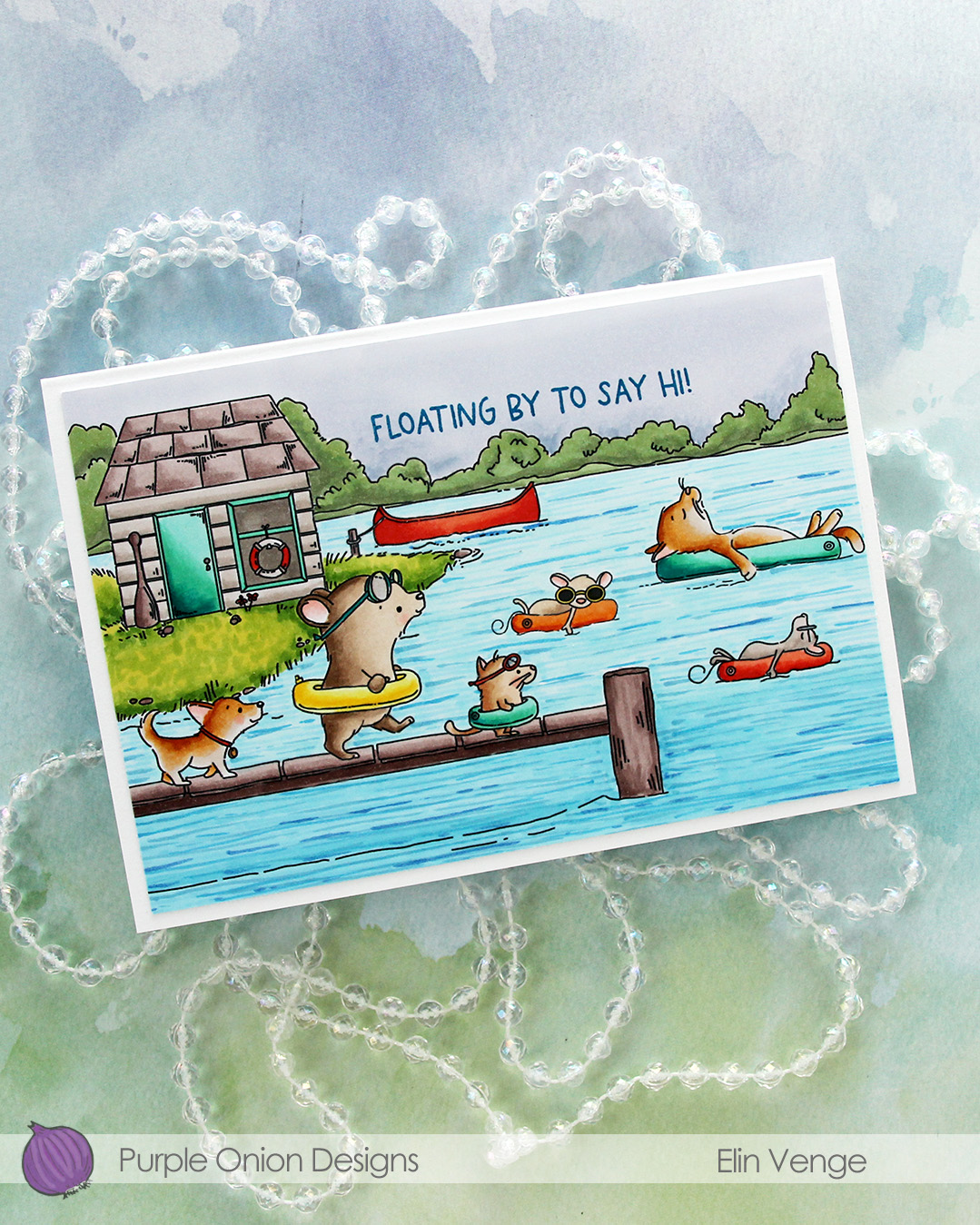 I stamped a sentiment from the
 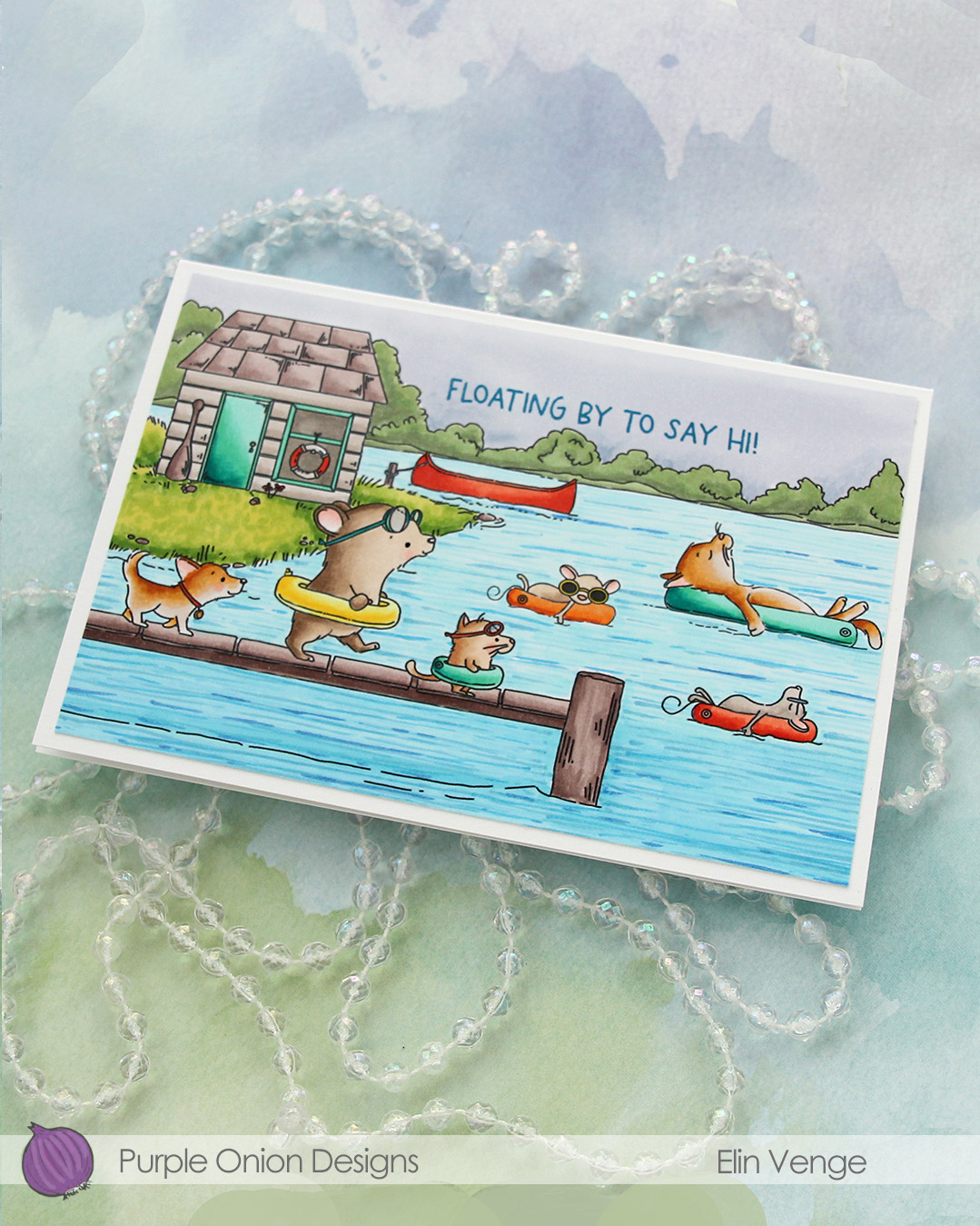 I adhered the panel to a card base that measures 6 1/8″ x 4 1/4″. This is an irregular size for a card, but when I create scenes like this, I let the scene dictate the size of the card. I can always make a custom envelope to fit.
 I used lots of Copics for this one.
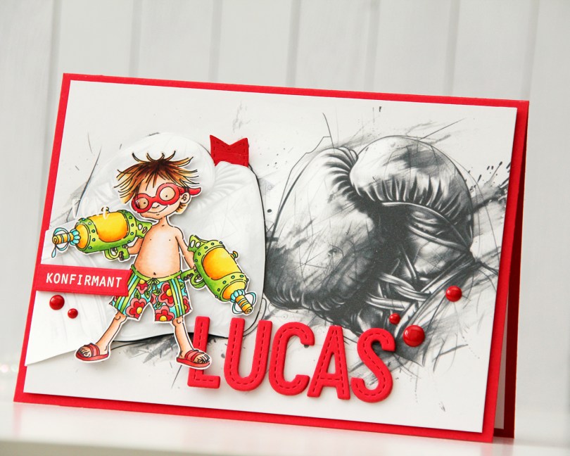

 I actually decided to watercolor this one with my Zig Clean Color Real Brush markers. I prefer using a paintbrush with water with these, but there’s also a blender that you can use. Marcel is small, but I still used three different browns and a pink for him (064 Oatmeal, 607 Milk Tea, 068 Deep Brown and 200 S. Almond Pink). For Elliot and the die cut letters I used 312 Overcast Sky only. I did use a little pink for the bow on his tail, but for the actual elephant, it was just the one blue. I love the movement you get with watercolor, it’s something you can’t really achieve with Copics.
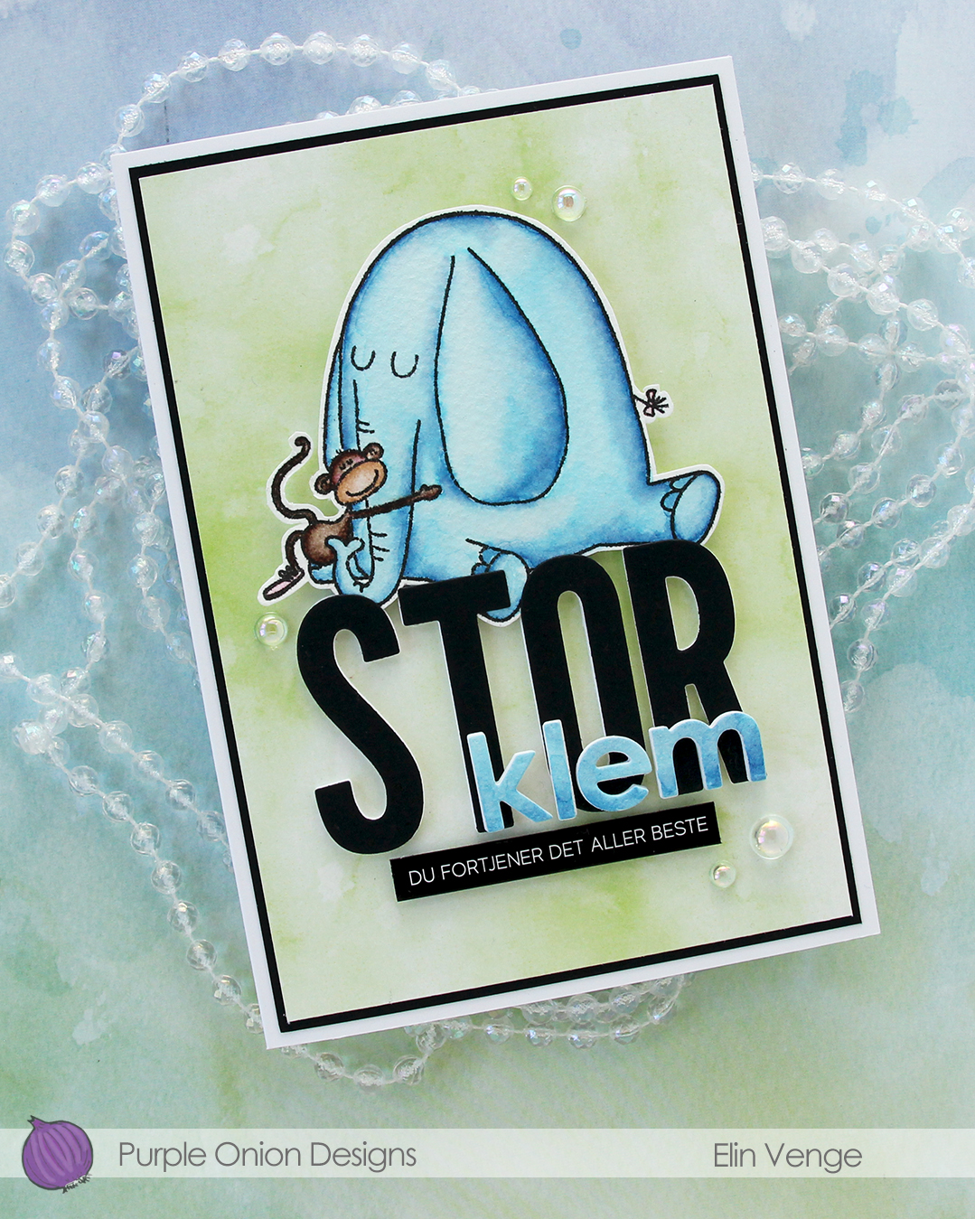 I fussy cut my image, leaving a thin white border. Using the Impact Alphabet die set from My Favorite Things, I die cut the letters to spell out STOR (big) four times from white cardstock and once from Black cardstock from Concord & 9th. I used the Parker lowercase alphabet die set from Memory Box to die cut the letters for klem (hug), again four layers of white, this time topped by a layer of the watercolor paper.
 I stacked my layers, and sandwiched the image between the white and black letters for the large word. I created a black mat on the card front, covered that with a piece of green patterned paper from the Watercolor Wash 6×6″ paper pad from My Favorite Things and mounted the letters and image in the center. I adhered the klem letters directly on top of the larger letters and added a sub sentiment sticker strip from Kort & Godt below it. I popped it up a bit to level it with the black letters, before finishing off with a few dew drops from the Spring Leaves embellishment mix from Little Things from Lucy’s Cards.
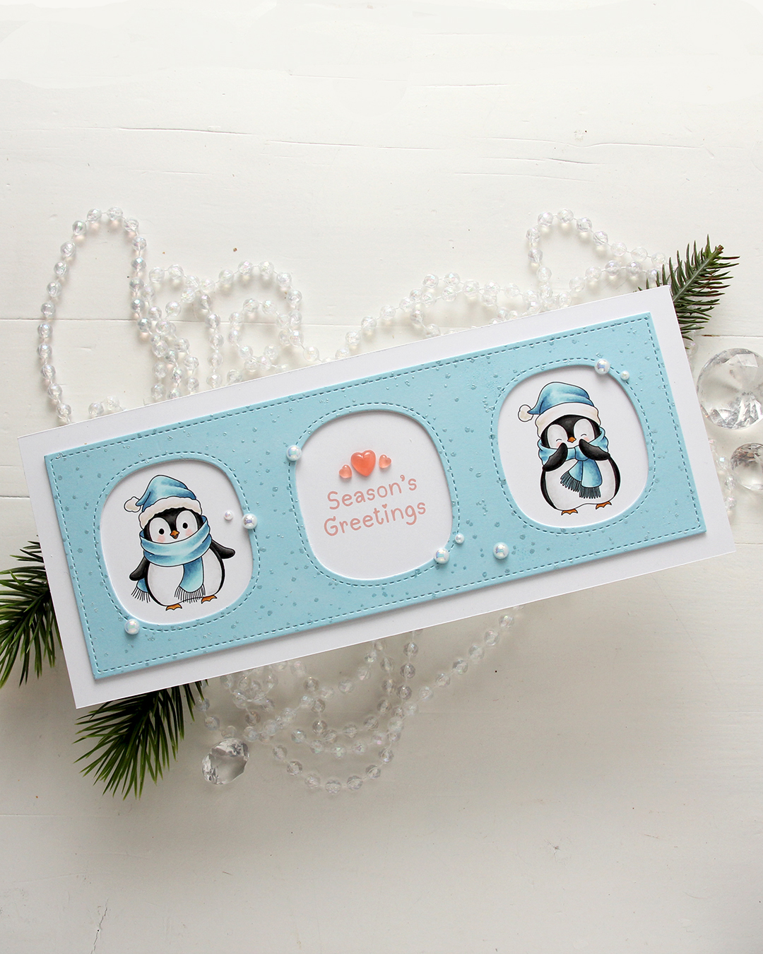 I colored the penguins with my Copics, making sure to add blue for their hats and scarves. Nothing beats blue for Christmas, right? I left plenty of space between the penguins for a greeting, which is from the
  I used a die in the Slim card basics die set from Mama Elephant to die cut the frame with openings from Harbor cardstock from Concord & 9th. I also cut two from white to add behind it for dimension. I stamped the Paint Splatter background stamp from My Favorite Things onto the blue using VersaMark ink, then sprinkled on White Satin Pearl embossing powder from Hero Arts and heat set.
 I added pearls from the Glossy Porcelain mix from Little Things from Lucy’s Cards here and there around the openings and also three Coral Heart Droplets, also from Little Things from Lucy’s Cards.
 Limited color palette for these two penguins.
 It’s kind of weird that I, as an avid colorist, really enjoy using images like this, where all the work is done for you and you just have to cut it apart from the other images on the same sheet. I created a 4 bar card this time, so even though the image itself isn’t THAT big, it still takes center stage on this smaller card. I added a thin strip of copper glitter cardstock above and below the image. It gives more definition and it also works really well with the orange balloons in the image.
 I used the Terrazzo press plate from Altenew to create some fun texture in the background. I inked up the press plate with Caribbean Sea ink from My Favorite Things and pressed it onto Caribbean Sea cardstock, also from MFT. I mounted my image on foam tape, added a sticker sentiment that I also popped up and finished off the card with a few faceted pearls. I love these!!
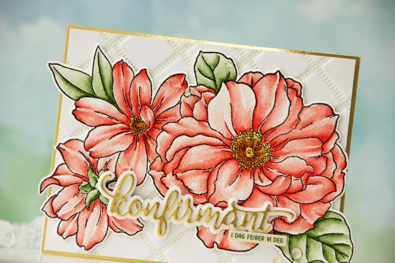
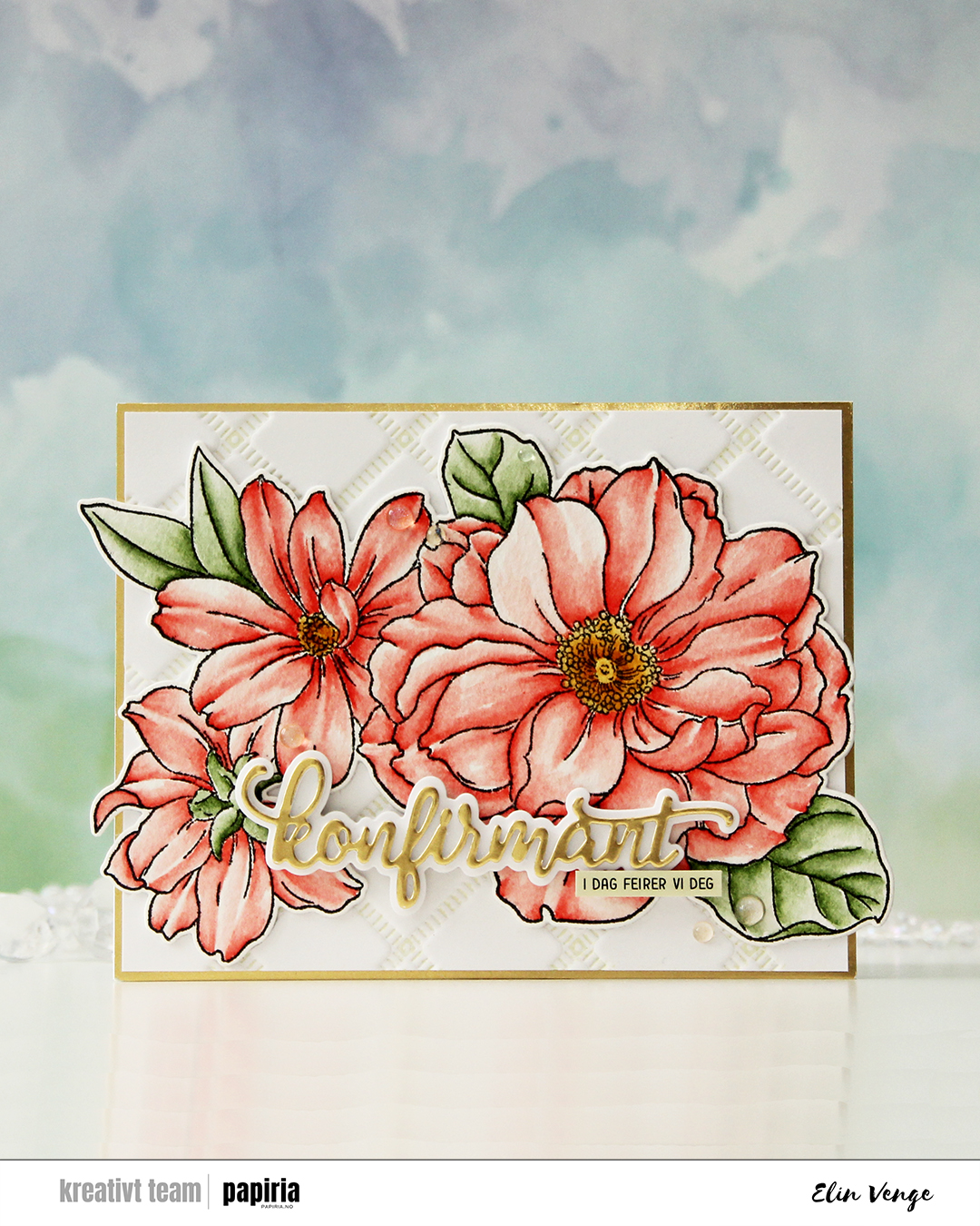 I started by stamping the big floral stamp in the Blooming Delight stamp set from Altewew using Altenew Obsidian ink onto watercolor paper (cold pressed Fabriano Artístico), before coloring with Zig Clean Color Real Brush markers. When my coloring was complete, I die cut the flower with the coordinating die and also cut a few extra from white cardstock to build dimension.
 I used the Stippled Plaid press plate from Pinkfresh Studio with Pistachio ink from Altenew to create a subtle background. I matted it with some gold shine cardstock from My Favorite Things and adhered my florals pretty much in the center. The flowers stick out on both sides, but I just made a larger envelope to accomodate the larger size.
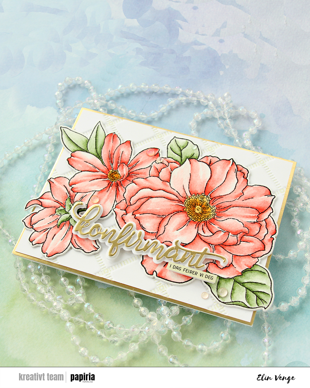 For the sentiment, I used a konfirmant die set from Papirdesign. I die cut the shadow layer from white cardstock and the word itself from the same gold cardstock that I used previously, with a few white die cuts stacked behind it for dimension. I even stacked a few behind the shadow, so it looks like the shadow floats on top of the flowers. For a sub sentiment, I used a sentiment sticker strip from Kort & Godt that I ink blended with Misty Sage ink from Altenew, before finishing off the card with a few Iridescent Dew Drops from Pinkfresh Studio.
 I used a couple of the brand new cardstock colors from Concord & 9th (Brickyard and Pimento), along with a bunch of older ones (Sorbet, Grapefruit, Nectar, Eucalyptus, Rainforest) for the rest of the florals. I also used a little bit of vellum and some gold shine cardstock for the flower centers.
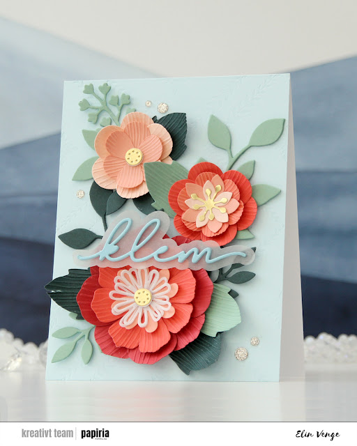 Once you’ve die cut the florals and greenery, you can use the embossing folder that coordinates to create texture on the petals and large leaves. They come out looking like crepe paper, and I love the look. There are many ways to assemble these flowers, and I created a bunch more that I wasn’t able to fit on this card. For the circular centers, I stacked some white die cuts behind the gold ones for dimension, and I curled all the petals and “crepe paper” leaves before assembly.
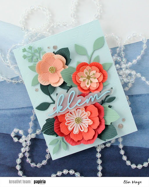 On the Powder panel that covers the card base, I wanted a little bit of texture. I used the Leafy Lattice press plate from Pinkfresh Studio with Polar Bear ink from Altenew for a subtle background – it’s so subtle it barely shows in the photos, it’s definitely more noticeable in real life. I probably could have gone a little bit darker with the ink, or ink up the press plate a second time and run it through again if I wanted it darker.
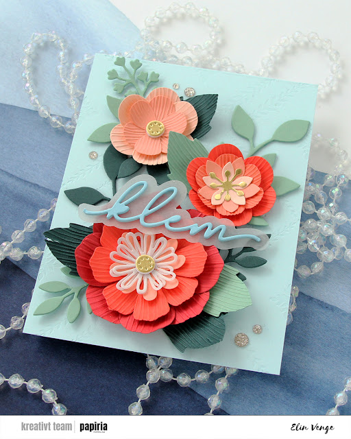 I adhered all my flowers and leaves with liquid glue, stacking the pieces in the background for strength and dimension. They’re only attached at the base of the sprigs, so they have som lift at the tips. I die cut a sentiment die from Kort & Godt four times from Harbor cardstock, stacked them, added a vellum shadow layer behind and glued my sentiment on top of the larger flower, before finishing off with a few champagne glitter drops from Pinkfresh Studio.
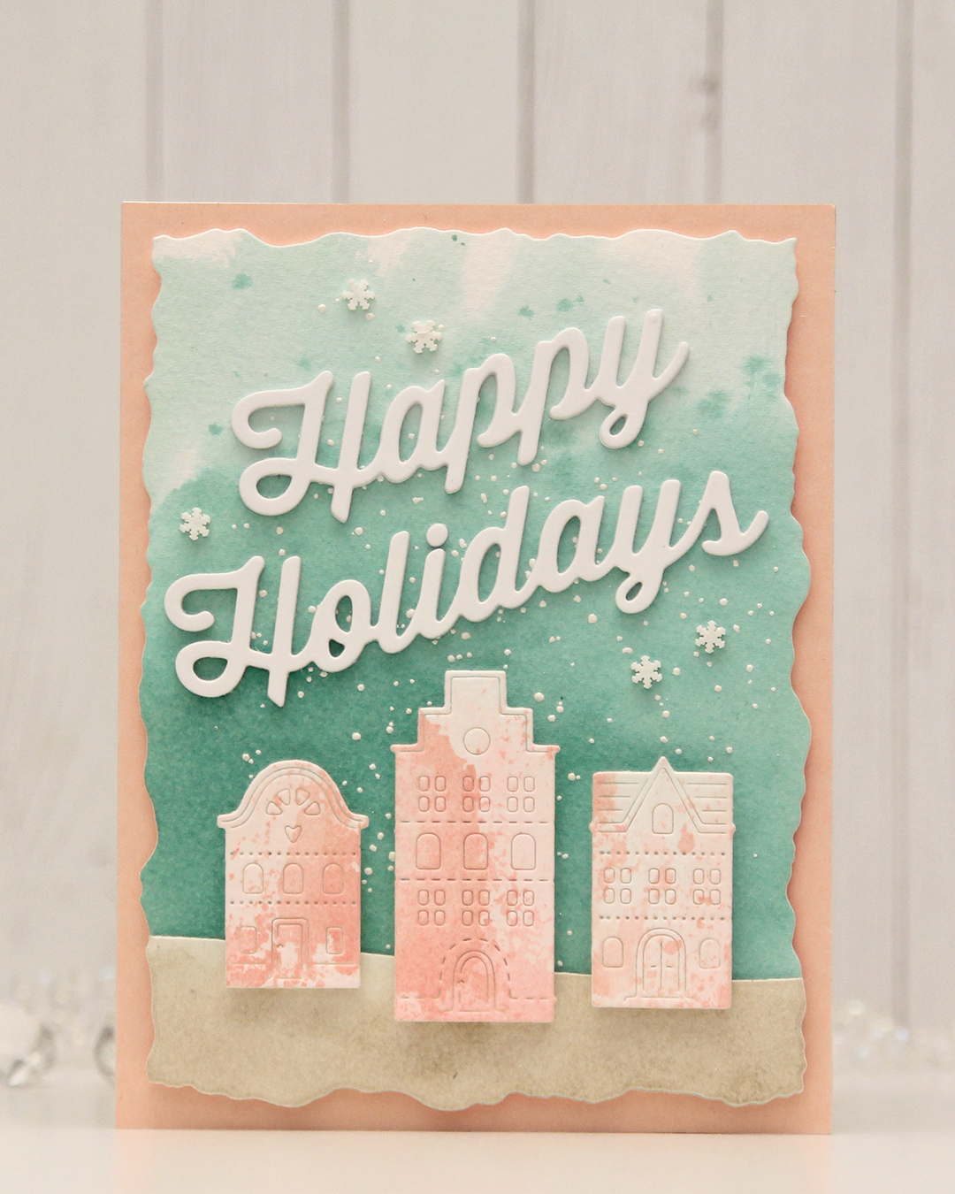 For this card, I really tried. I chose a color combo of Pebble, Ballet Slipper, Brickyard, Cranberry, Cobblestone and Tidepool from C9. I wanted to focus on Ballet Slipper, Cranberry and Tidepool for the Gummiapan diecut houses, but Tidepool and Ballet Slipper created mud when they mixed, while ink smooshed Cranberry looked like an episode of Dexter. I switched gears and ink smooshed Ballet Slipper on its own on watercolor paper. When it dried it looked like Grapefruit. So much for not using peach tones. I watercolored a background using Tidepool reinker and did the same with Pebble reinker on a separate piece of watercolor paper. Once dry, I die cut the Pebble piece with a curved landscape die from the Slim Card Basics die set from Mama Elephant, then layered the two pieces together and die cut them using the largest die in the Watercolor Rectangle STAX die set from My Favorite Things.
 I sprinkled on Chunky white embossing enamel from Stampendous onto the background, heat set it so the granules melted to look like snow, adhered the slope with 1 mm foam squares and mounted the entire panel onto a card base that I covered with a piece of Nectar cardstock from Concord & 9th. I tried Grapefruit first, but felt it was too dark against the background. I mounted the houses using foam tape, die cut and stacked four layers of Happy Holidays from the Jolly Holidays Greetings die set from Concord & 9th and adhered the greeting at an angle above the houses, before finishing off with Snowdrift Sprinkles from Little Things from Lucy’s Cards.