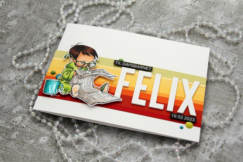
Hi, crafty friends. I’m back today with a fairly simple card. Whenever I make Christening cards, I tend to turn to either my Lili of the Valley images or my Mo Manning ones. This Christening card is kind of special – it’s for a 3 year old. Mo Manning to the rescue. She has lots of toddler images, but I really love this Stock’s Up image. A little boy in his bathrobe with a newspaper in his hands, glasses that are too big and a mug sitting next to him. It’s such a good one.
 I colored the image with My Copics and decided to fussy cut around it this time. I tend to turn my colored pieces into panels for my card and work from there, but I wanted to do something a little different today.
 I left a white border around the image to make it easier on myself. You tend to lose some of the details in the hair if you cut up close to the line, and I wanted to keep the hair intact. I also added Glossy Accents to his glasses for shine and a touch of dimension.
 I wanted to include his name on the card, but had printed my image fairly large. My solution was to make a landscape A7 card (7×5″). I rarely make landscape cards (trickier to photograph) and the same goes for A7, but it’s fun to shake things up. I also shook things up by adding cardstock strips going across the card. I tried with cool colors first, but the image got lost, so I went through my solid colors of cardstock again and made a version with warm tones. From top to bottom they are:
- Spring Moss (Papertrey Ink)
- Lemon Tart (Papertrey Ink)
- Harvest Gold (Papertrey Ink)
- Buttercup (Concord & 9th)
- Summer Sunrise (Papertrey Ink)
- Orange Zest (Papertrey Ink)
- Terracotta Tile (Papertrey Ink)
- Pure Poppy (Papertrey Ink)
As you can see, I really love my Papertrey Ink cardstock. They have awesome colors.
 I used the Impact Alphabet die set from My Favorite Things to spell the name. I die cut four of each letter and stacked them for a dimensional look, gluing them right onto the stripped background, before adding the sentiment and date in white on black.
 I mounted the image on foam tape and added a few enamel dots from Altenew (teal dots from the Cool Summer Night pack) and Papirdesign to finish the card.

Simple color palette.
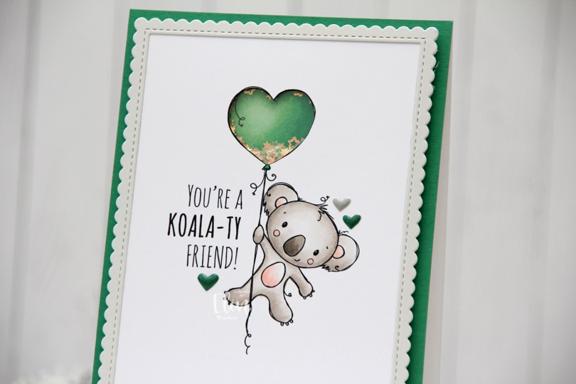
 I’m using the new
  I adopted Laura Bassen’s new coloring motto for 2023 for this card: “no muss no fuss coloring”. This was very simple, a few grays and a little bit of pink for the cheeks, the inner ears and the belly. I used a craft knife to cut out the interior of the balloon and printed another panel with just the balloon in the same size. I colored that balloon in green (thanks for the color suggestion, Liz) and added foam strips along the outer edge of the balloon, before filling it with tiny iridescent stars from the Icicle sequin mix from Hero Arts. I then added a piece of acetate on top to complete my shaker, and adhered the koala panel to the shaker, making sure to line up the window with my shaker heart balloon as best I could.
 I added foam tape on the back of the rest of the panel and adhered it to a top fold card base. The card base is actually Stamper’s Select White cardstock from Papertrey Ink, but I adhered a panel of Clover cardstock from Concord & 9th on top to create the green front. The color matched with my green balloon, but I don’t have unlimited amounts of Concord & 9th cardstock, so I’m trying not to use it all at once. Also, it’s a thinner cardstock, and not sturdy enough on its own to hold the weight of lots of foam tape and a shaker.
 Using the largest of the dies in the Stitched Rectangle Scallop Edge Frames die set from My Favorite Things, I die cut a frame from Soft Stone cardstock from Papertrey Ink. This is such a perfect soft grey, I love it. I finished off the card with a few enamel hearts from Altenew, from the Green Fields pack and the Rock Collection.
 The iridescent stars inside the shaker heart really catch the light nicely.
 Super simple color palette, as I mentioned.
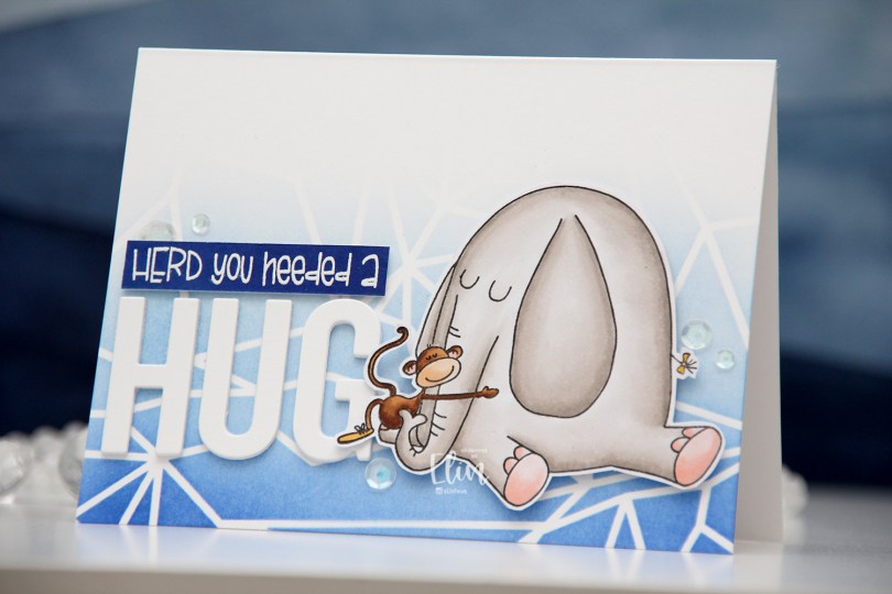
 I chose to color Elliot in a very soft grey, and once fully colored, fussy cut the image leaving a thin white border. I put the image aside and started working on the rest of the card.
 I felt a landscape design would work best for what I had in mind, and used the Geometric Landscape stencil from Altenew to create some interest in the background with blue inks, also from Altenew. I used the entire Lapis Lazuli color palette from Altenew for my blending, (Azurite, Ultramarine, Eastern Sky, Iceberg) which fades to white at the top.
 Using the Sending You Hugs die from My Favorite Things, I die cut the letters to spell out HUG four times from white cardstock from Papertrey Ink, which happens to be the same cardstock I used for my cardbase. I love their white cardstock, it’s the best by far. I stacked the letters for dimension and stamped and white heat embossed a punny sentiment that comes with Elliot & Marcel. There are actually a few more sentiments in the set, and I added another one to the inside of the card. I didn’t have the right color cardstock, though, so I cheated and covered white cardstock with the Azurite color, which is the darkest of the four blues I used for the blending of the background. To create the sentiment strip, I went direct to paper, and used my heat tool to speed up the drying process of the ink so I could stamp and heat emboss on top. I added three additional strips of cardstock behind it to make it flush with the die cut letters, adhered it to the card and finished off with a few sequins from the White Orchid Sequin mix from Little Things from Lucy’s Cards.
 I chimply love punny sentiments and couldn’t resist.
 Very simple color palette for this one. This was fast to color.
 I love these animal number images from Rachelle, and these ducks are sooo cute. Perfect for a birthday card, I think. I colored the image with my Copics, before temporarily adhering the Watercolor Wash Free Form stencil from My Favorite Things and ink blending with Harvest Gold ink from Papertrey Ink. I then stamped a sentiment from the A06 stamp set from Norsk Stempelblad AS using Shadow Creek ink from Altenew.
 I used the largest of the Wonky Stitched Rectangle STAX dies from My Favorite Things to create a quirky faux stitch interest around the edge and adhered my panel to a top fold card base I created from Meadow cardstock from Hero Arts.
 To finish off the card I added a few raindrops from Little Things from Lucy’s Cards, I thought they fit well with the water theme in the image.
 I colored the donut with my Copics and fussy cut it, leaving a thin white border around the edge. I printed a panel of several donuts in light gray for a bit of added interest in the background, popped up my panel onto a card base I created from Rustic Cream cardstock from Papertrey Ink, while I worked on the rest of the card.
 Using the Parker alphabet die set from Memory Box, I die cut the letters to spell sweet from Grapesicle cardstock from My Favorite Things. I stacked six of each for a dimensional look.
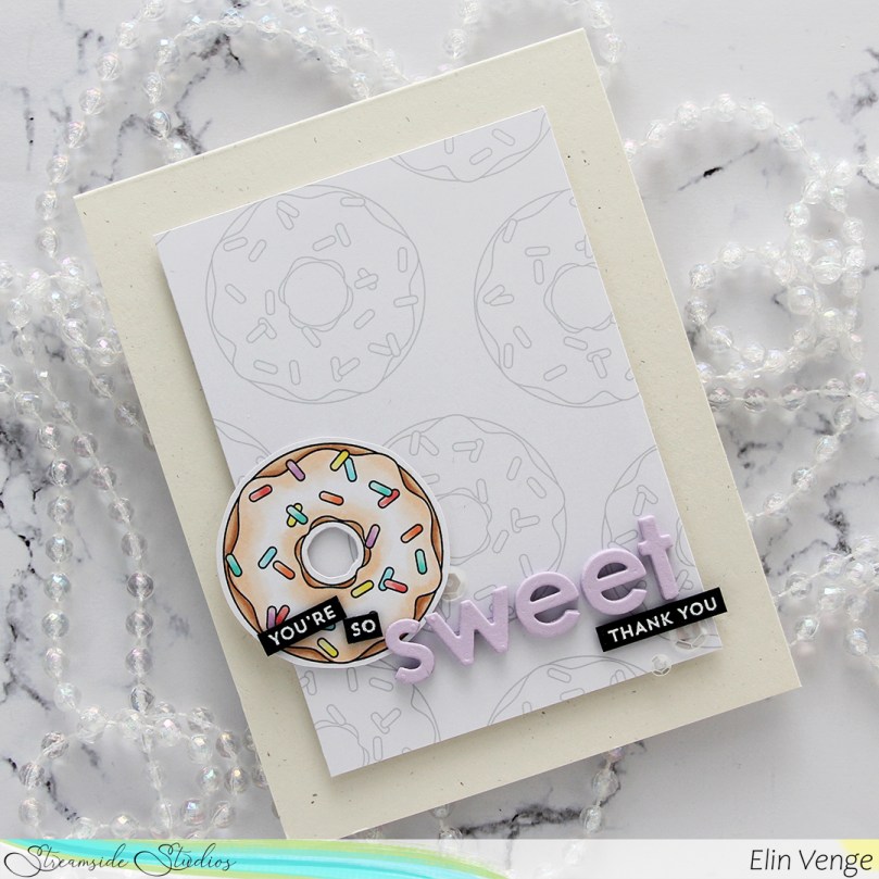 I stamped and white heat embossed partial sentiments from the Itty Bitty Basics and Itty Bitty Gifting stamp sets from My Favorite Things to complete my sentiment, adhered it all to the card and finished with a few sequins from the White Orchid Sequin mix from Little Things From Lucy’s Cards.
 I colored my image with Copics, before using one of the stitched rectangle dies from My Favorite Things to create a nice faux stitching detail along the edges of the panel. I then sprinkled on a generous amount of chunky white embossing enamel from Stampendous and melted the granules from the back of the panel.
 I created a card base from Vintage Timber cardstock from My Favorite Things and mounted my colored panel in the center using foam tape. Using the Believe die from Simon Says stamp, I die cut four white believe that I glued together for a stacked look and added one more on top that I colored with blue Copics (B91 and B0000) before die cutting. It gives the word a little bit of added interest. I stamped and white heat embossed a sentiment from the Holiday Messages stamp set from Mama Elephant onto Wild Cherry cardstock from My Favorite Things and cut the sentiment down to strips, adding a few extra layers of cardstock behind for dimension and strength.
 I have a coloring/card making buddy in Liz Vefall and sometimes ask her for suggestions when I’m stuck and/or can’t make up my mind. I always run with her ideas and the cards usually end up looking great, but I seem to have lost the ability to turn her suggestions into a final product that I’m happy with. The black pants and the brown card base were both suggestions from her, and I’m not comfortable with the end result, somehow. Diecutting the white word with a little bit of blue at the bottom was also her suggestion, and I wound up loving that, so I ended on a positive, at least
 Fairly standard Christmas color palette, with a couple of odd ones thrown in there for good measure.
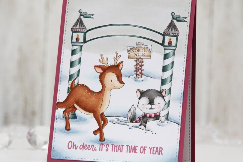

 I used a white Gelly Roll 05 pen to create the white dots on the deer, and a die from the A2 Stitched Rectangles STAX 2 set from My Favorite Things to create the faux stitching on the edges of the panel. By not stamping the entire deer, it creates a dynamic effect of having it walk in from the edge of the card.
 I stamped a sentiment from the
 The pink and blue green color combination is definitely not traditional for Christmas, but I kind of like it. What do you think, does it work?
 Quite a few Copics for such a simple card.
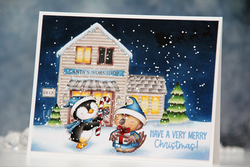

 I love creating these scenes with Stacey’s images. It’s a time consuming process, as I create masks for each critter and fussy cut them, but the end result is always worth it.
 I stamped Winter and Balsam using Extreme Black ink from My Favorite Things before covering both of them with masks. I then did second generation stamping of Santa’s workshop using Memento Rich Cocoa ink, using first generation for the signage only. I like the softer look of the brown lettering in the background. I stamped the silhouette of Santa’s sleigh using VersaFine Onyx Black ink AFTER I’d colored in the entire scene. This is an ink that stamps very black and very crisp, but it’s a pigment ink and doesn’t play well with Copics, so it’s best to leave it to the end. I stamped the sentiment using Blueberry Sky ink from Papertrey Ink.
 I also went back over the “cast iron” of the OPEN sign using a 0.3 cool gray multiliner from Copic and added white dots on the penguin’s hat and scarf using my white Gelly Roll 05.
 I sprinkled on chunky white embossing enamel from Stampendous, melted the granules from the back of the paper and adhered my finished scene onto a 5 3/4 x 4 1/2″ white card base, making this card slightly larger than the regular A2 size card.
 Lots of Copics used for this one.
 There are some awesome stamps in the
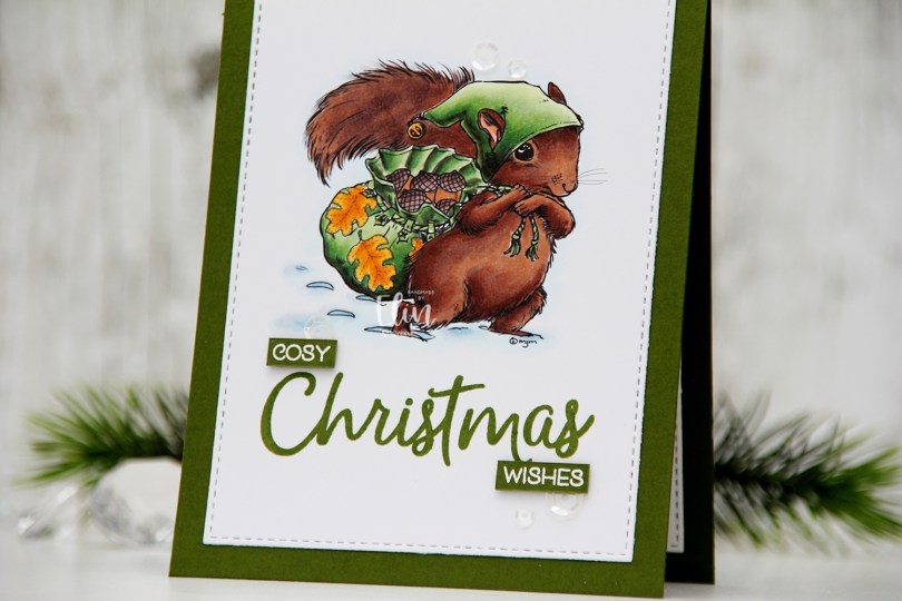
 This image is
  I have a tall pine tree outside my craft room window. In it, there’s a huge nest that magpies built a few years back. One morning last week, I heard the magpies making more sound than usual. When I looked outside, there was a squirrel that had taken over the nest. It was adding one twig after another to the nest, I guess it had evicted the magpies. After quite some time, one of the magpies tried to get back in, but was chased away by the squirrel. I must admit I was delighted, I’d much rather have a squirrel outside my window than magpies. The squirrel is much cuter, and it’s a lot quieter too.
 Back to the card. Once I finished the coloring, I stamped the word Christmas from the Christmas Greeting stamp set that Lili of the Valley released earlier this year using Jalapeño Popper ink from My Favorite Things.
 I then die cut the panel using the second larges die in the A2 Stitched Rectangles STAX 1 die set from My Favorite Things and adhered it directly to a card base I created from Jalapeño Popper cardstock, also from My Favorite Things. On a scrap piece of cardstock the same color, I stamped and white heat embossed the words cosy and wishes to complete my sentiment. I put a couple of additional layers of green cardstock behind each word for a little bit of added dimension.
 I added a few sequins from the White Orchid Sequin Mix from Little Things from Lucy’s Cards to finish off this very simple card. A little bit of shine is never a bad idea on a simple card.
 You’d think an image this simple would have less Copics used, but I tend to go overboard on snow. This time I also went overboard on the fur, even though it might not look like it.
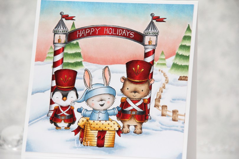
 Whenever the design team members get a glimpse of the new collection, I start my planning process. I sketch out very rough card ideas using the stamps I’d like to work with, send my stamp wish list off to Michele, the owner of Purple Onion Designs, and then wait patiently for the stamps to arrive.
 Whenever there’s a new collection I like to create scenes to show off as many of the cute images as possible (without overcrowding the card), and for this card I stamped
  I always start by coloring the sky, and for this collection, I wanted each of my cards to have a different sky. I tend to go for all blues, but winter sunsets are explosions of color, so I was very conscious of that when I created my card. Once the sky was done, I colored the snow, followed by the trees and that cute fence, before starting with the rest of the scene.
 I colored the critters, then the arch and finally all the red. I always leave the red details to the very end. It eliminates the chance of smearing and getting red ink where you don’t want it when you go in with another color right next to it. I wrote Happy Holidays with a black 0.35 Copic pen before coloring, but once the red was colored, you could hardly see the lettering, so I went back over with a white 05 Gelly Roll pen, and the text is much more visible now. My Ps are a little further apart than I’d like, and they’re also leaning a tiny bit to the right, but it’s a homemade card, it’s not supposed to be perfect, right?
 Whenever I create these scene cards with Purple Onion images, I always let the stamping and the scene itself dictate the size of the finished card. This one wound up at 5 1/4 x 5 1/4″, which seemed pretty perfect. I haven’t made a square card in a while, so this was fun.
 I used an obscene amount of Copics for this card.