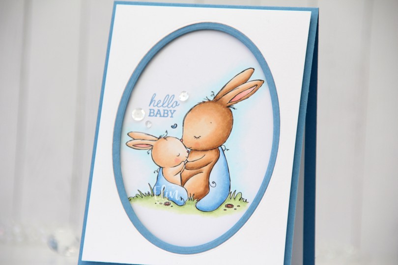
Hi, crafty friends. I have a simple card to share today featuring this Mother and Baby Bunny from Rachelle Anne Miller, which was released last week.
 The card isn’t just simple, it’s super simple. I colored the scene with my Copics and decided to just create a frame around it and leave it at that, letting the image really shine.
 Using the Card Front Designs die set from Neat & Tangled, I die cut the oval frame twice; once in the center of a panel of Stamper’s Select White cardstock from Papertrey Ink, once from Blueberry Sky cardstock, also from PTI. I used the negative of the white die cut and the actual frame from the blue, taped them together on the back and mounted them on my colored panel with lots of foam tape.
 In the perfect “corner” of the image, I stamped a sentiment from the Mini Messages stamp set from Mama Elephant using Blueberry Sky ink from Papertrey Ink.
 I added three sequins from the Seaglass mix of sequins from Simon Says Stamp around the sentiment. Nothing else, I wanted this to be very simple.
 A little dimension, a little shine and an adorable image. What more does a card really need?
 Super simple color palette for this one. I also used a color I’ve made myself. I’ve made my own B20 using a couple of refills and an empty marker, which I used for the blanket.
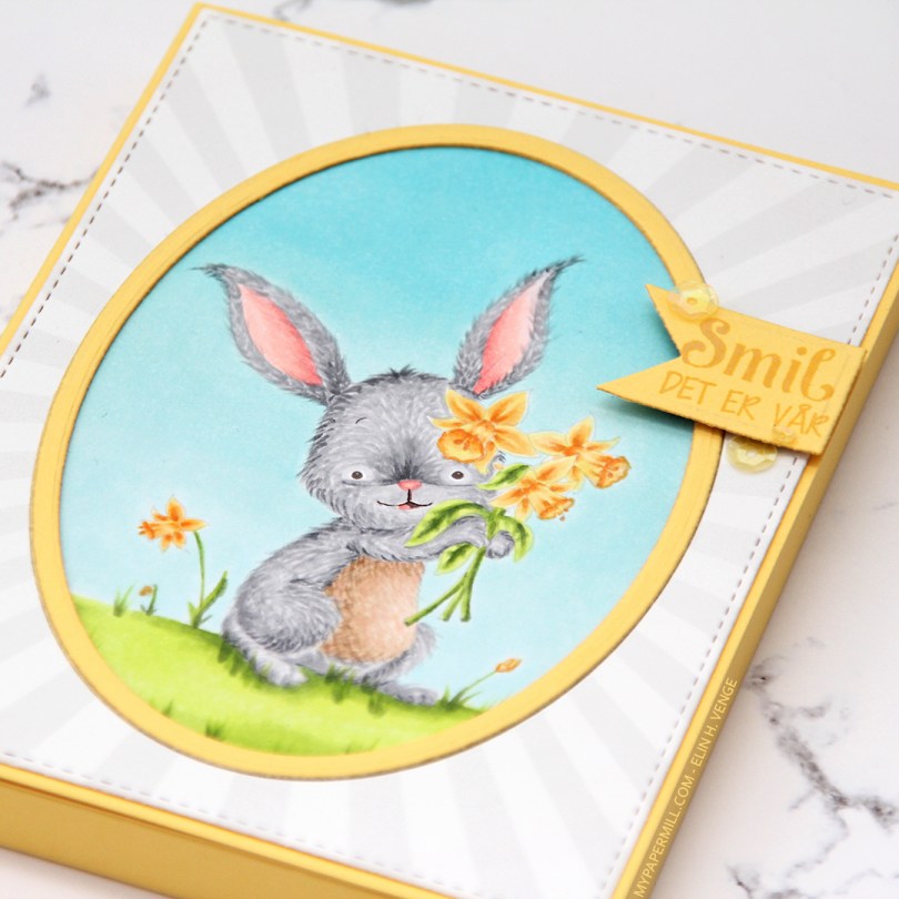


 I used a cover die from Neat & Tangled to diecut twice from white cardstock and several times from scraps of different green patterned paper scraps. These are a mix of Papirdesign, Maja Design, Kaisercraft, and one that I don’t even know. Great way to use all those little bits.
 I glued my white frames together and inlayed my green pieces, before die cutting a word die from Papirdesign using Ripe Avocado cardstock from Papertrey Ink for the word itself and white for the shadow. I stacked a few of the green ones on top of each other for it to stand out a little bit.
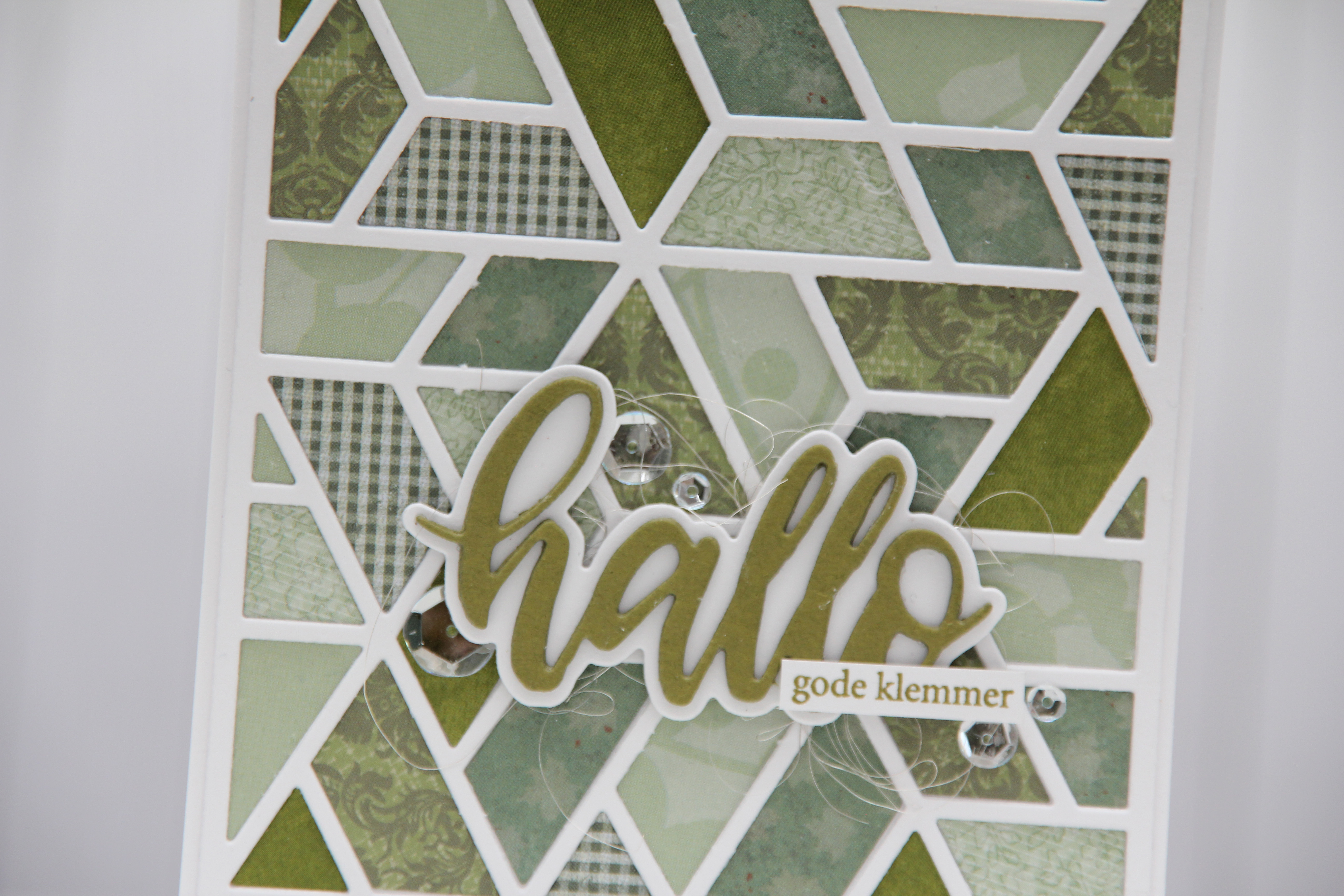 I used some angel hair to make a nest underneath my diecut and glued it right on top using liquid glue. I also added a few sparkling clear sequins from Pretty Pink Posh for some shine, and stamped a Norsk Stempelblad AS sentiment in Ripe Avocado ink from Papertrey Ink on a white strip and added it below my die cut word.
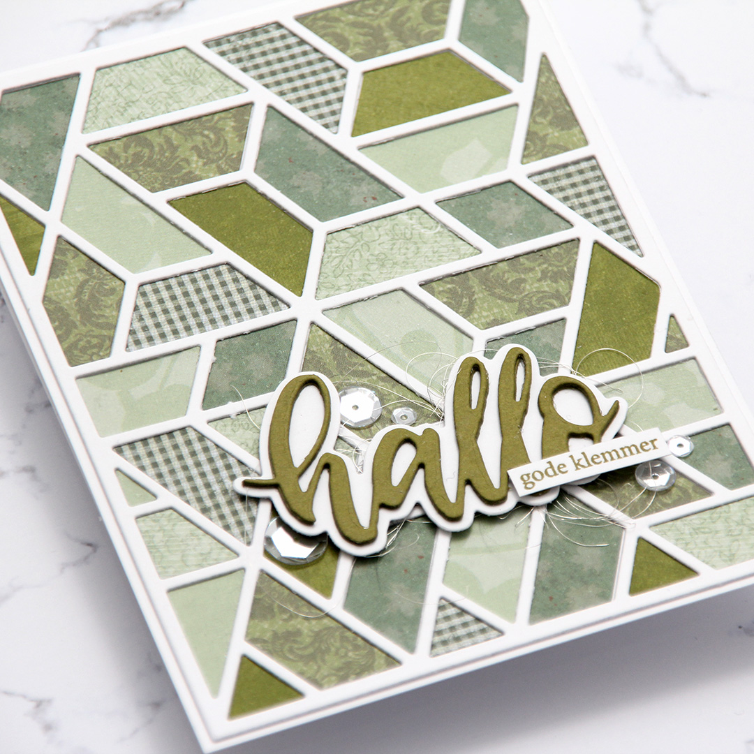 Simple, but the dimension in the frame and the focal point still give the card a little bit of interest.
 I try very hard not to have favorites, but I can’t help it.
  I used the largest of the Stitched Rectangles STAX dies from My Favorite Things to create the front of the shaker, then the oval dies from the Card Front Designs die set from Neat & Tangled to create the actual window and the frame around it. I doubled up on my foam tape, and used acetate from Hot off the Press to create my window. I used the Urban Chic mix from Little Things from Lucy’s Cards for my filling.
 This really shakes, those sequins have a lot of room to move freely. I stamped an InkyWings sentiment using Ocean Tides ink from Papertrey Ink (which matches the Ocean Tides cardstock SO well) on a scrap piece of X-Press It (I wanted the white to match the white in the image) and mounted it on 1mm foam squares onto the front of my card, and it was finished.
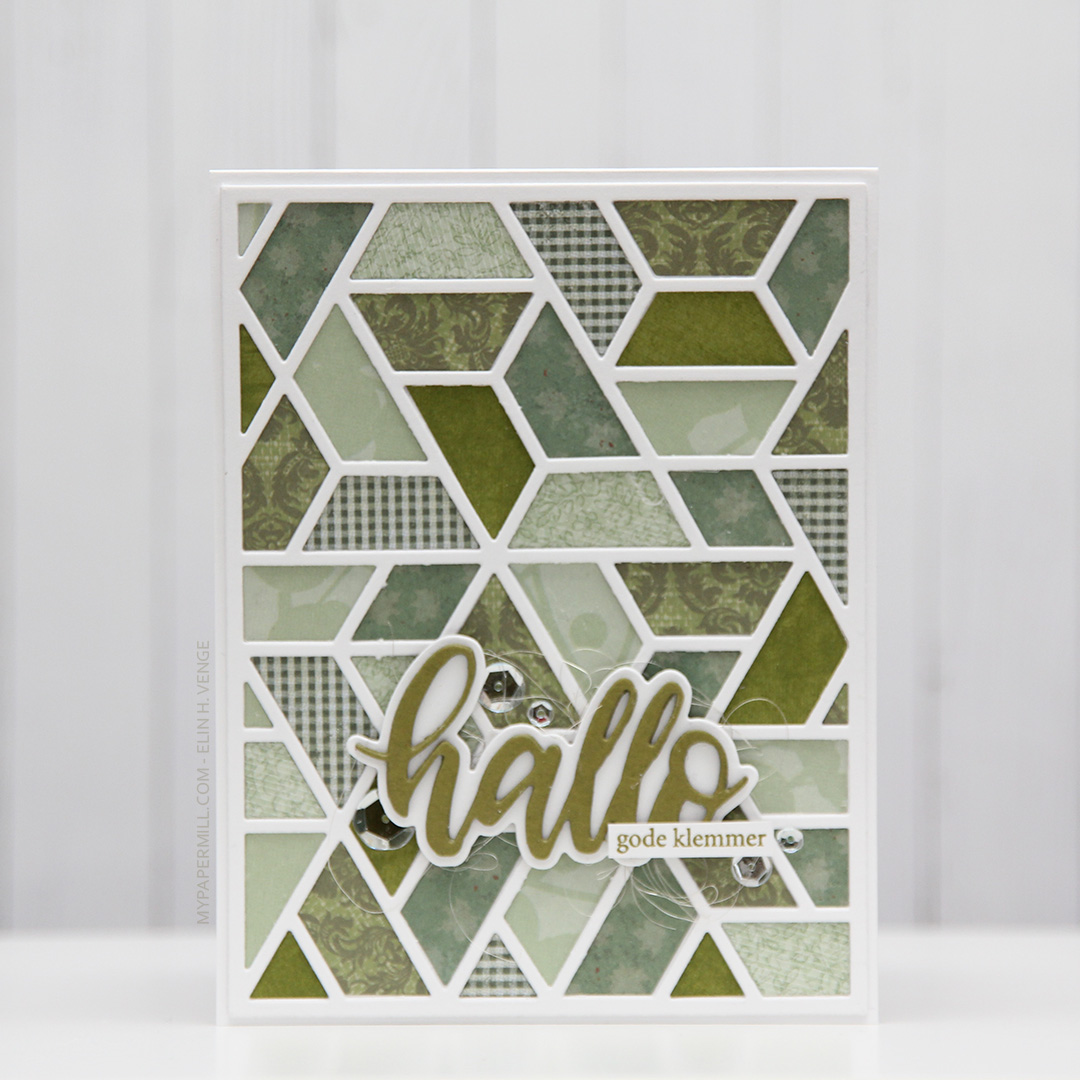
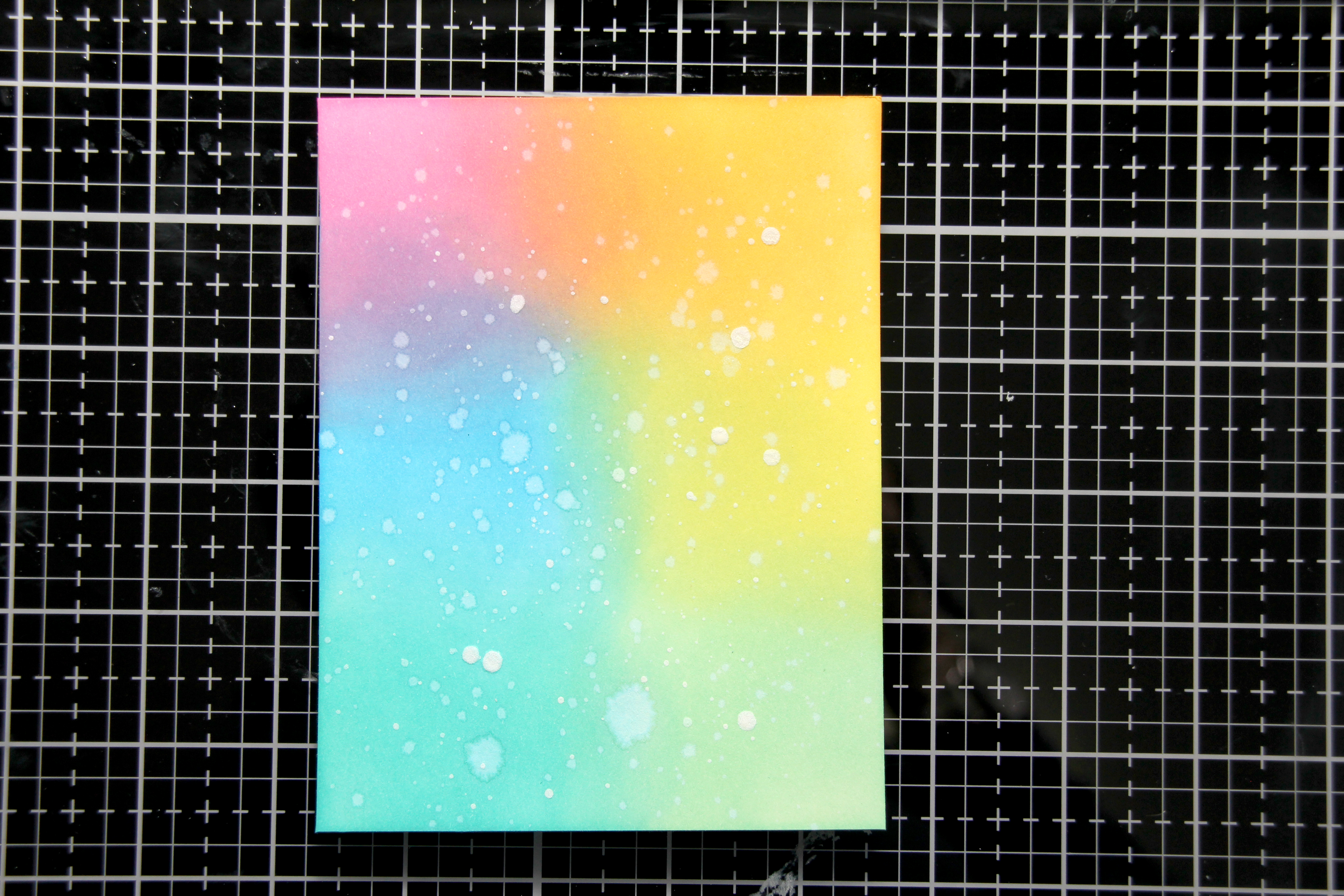 Jeg startet ved å sverte distress oxide-blekk (fargene
  Jeg limte deretter
  Deretter skjærte jeg til en bit
 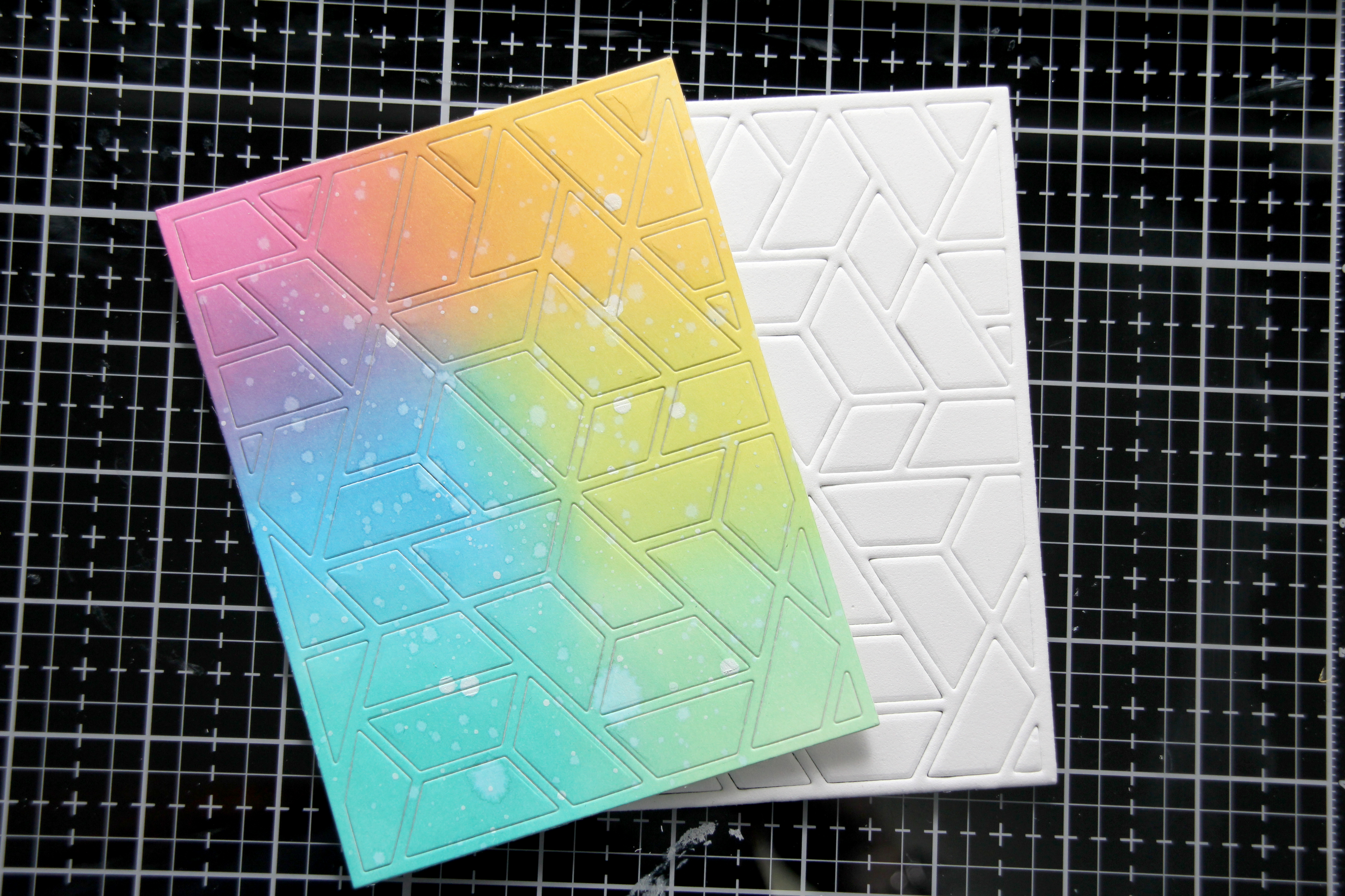 Jeg stanset ut det svertede panelet først, og deretter mosegummien med samme die. Jeg tar dette i to runder. Hvis jeg stanser ut begge samtidig blir ikke kuttekantene på mosegummien jevne, og jeg kan få rynker i kartongen siden presset under dermed ikke er jevnt. Ved å stanse ut i to omganger holder alt seg mye penere.
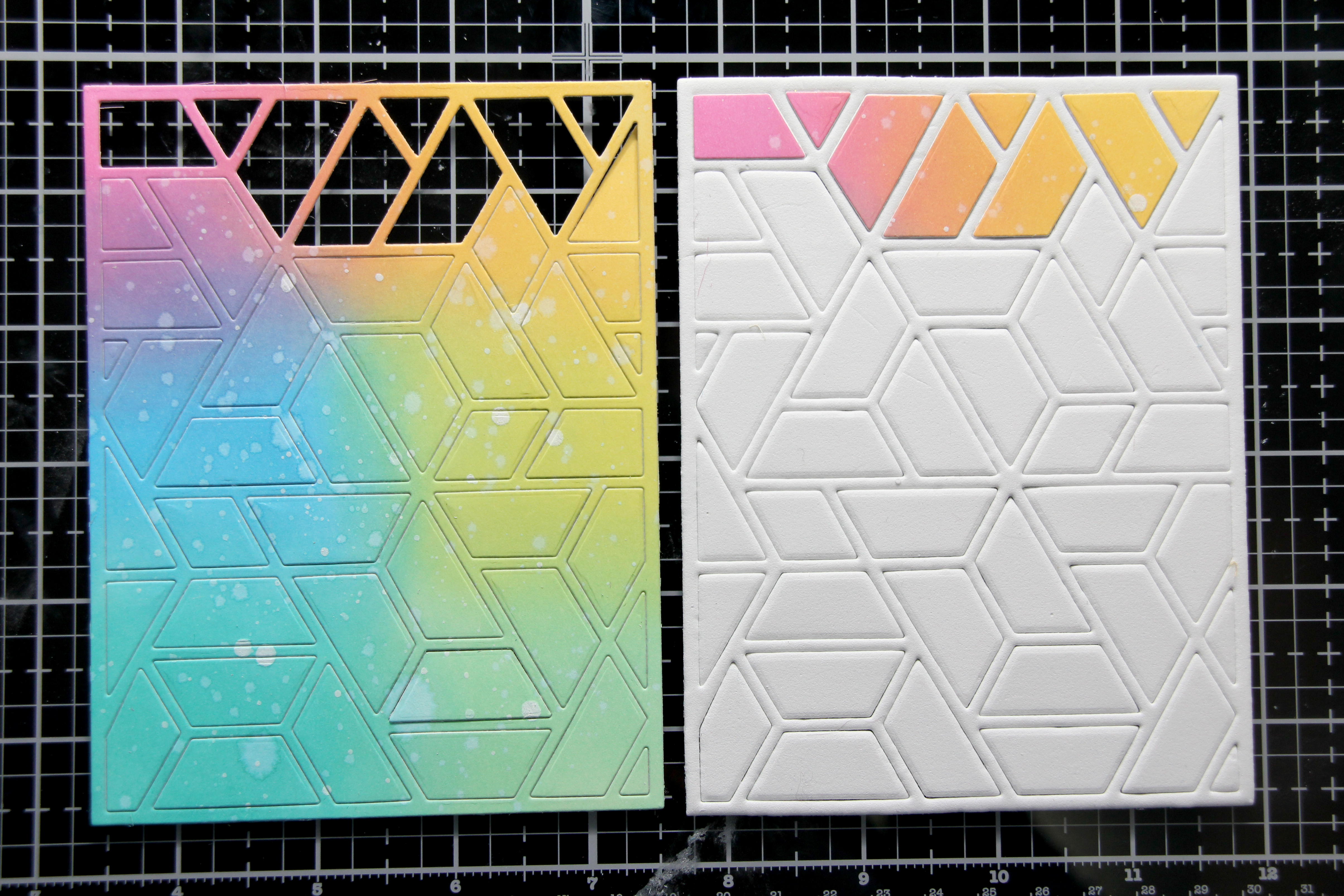 Den neste delen av jobben er litt pirkete. Her tok jeg ut hver bit av den svertede biten, fjernet beskyttelsespapiret fra den dobbeltsidige teipen på baksiden og limte den på tilsvarende bit mosegummi. Da alle bitene var på plass tok jeg flytende lim på baksiden av hver mosegummibit (forsiktig, så jeg ikke fikk lim på rammen) og limte det på frontpanelet på kortet mitt. Jeg la noe tungt oppå og sørget for at alt tørket ordentlig.
 Deretter kunne jeg fjerne mosegummirammen forsiktig fra resten av kortet, og bitene ligger igjen der de skal.
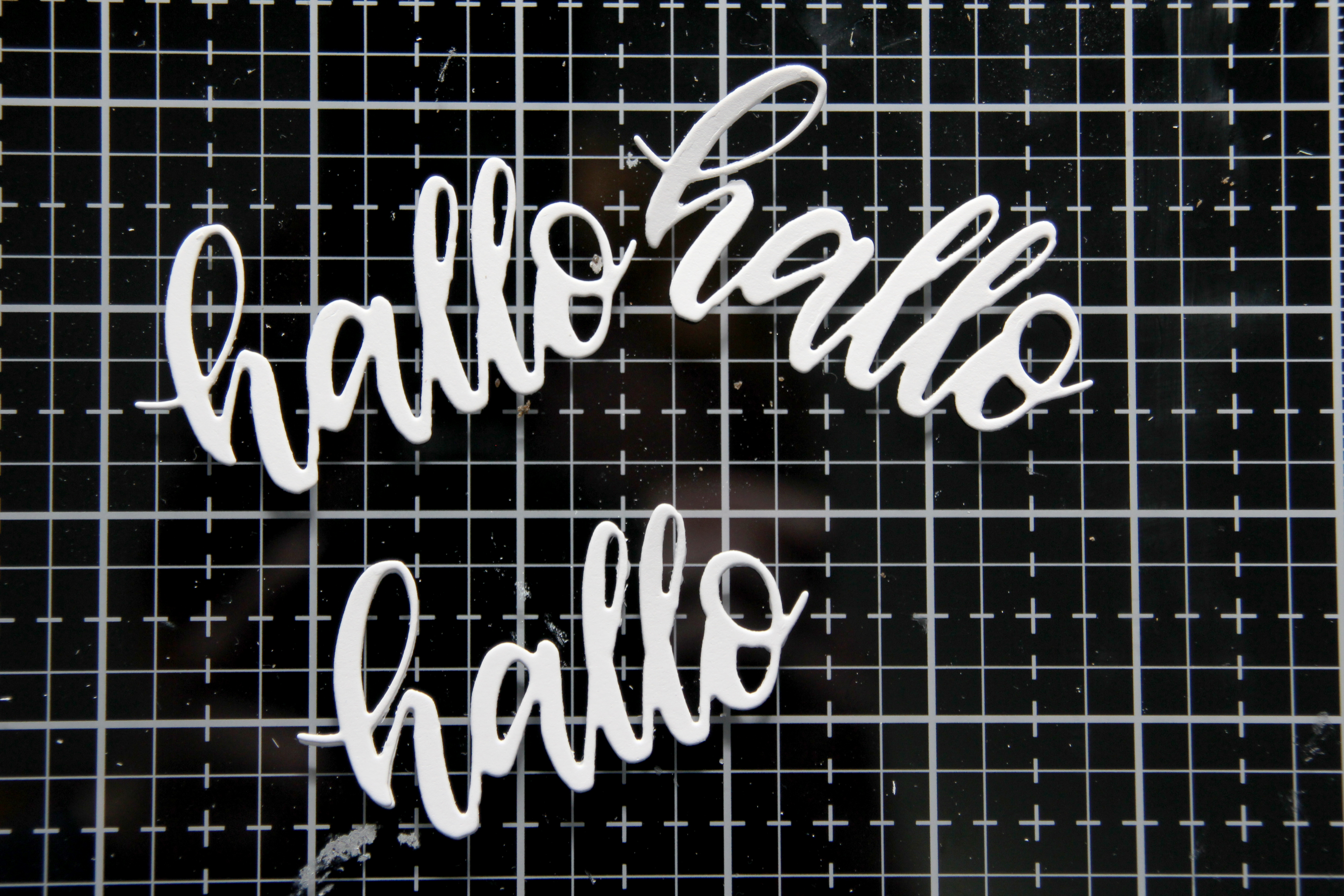 Jeg stanset ut en hallodie fra Papirdesign flere ganger i hvit kartong og limte dem oppå hverandre for dimensjon.
 Da var det bare igjen å lime hallo på kortet, også her brukte jeg flytende lim, og lurte litt englehår fra Mester Grønn under for å lage litt mer liv i kortet.
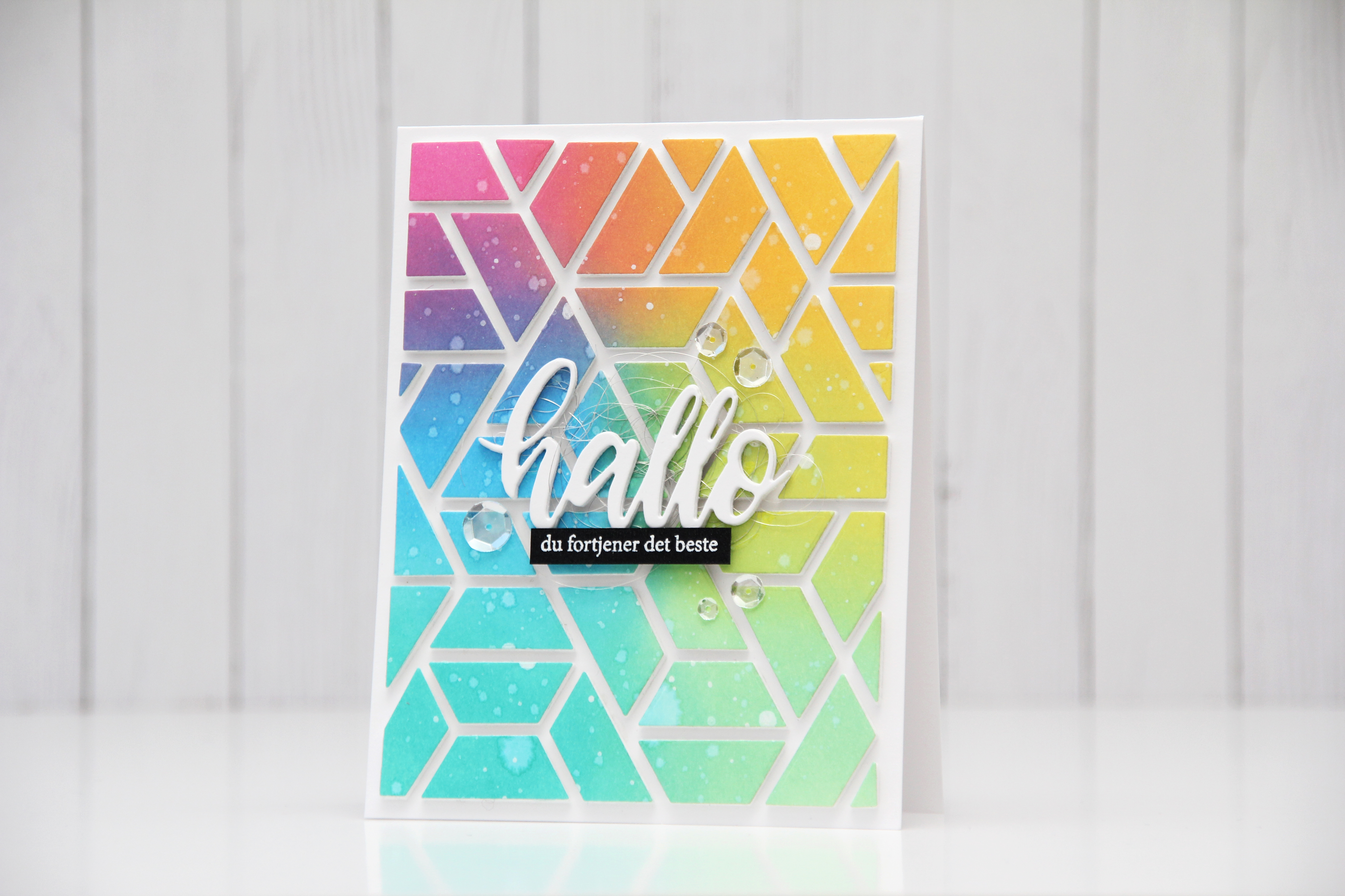 Jeg stemplet også en undertittel på svart kartong og embosset i hvitt. Det blir et ordentlig blikkfang på et såpass fargerikt kort. Jeg satte på tekststripen min med 3D-teip.
 Noen paljetter fra Pretty Pink Posh er siste lille finish.
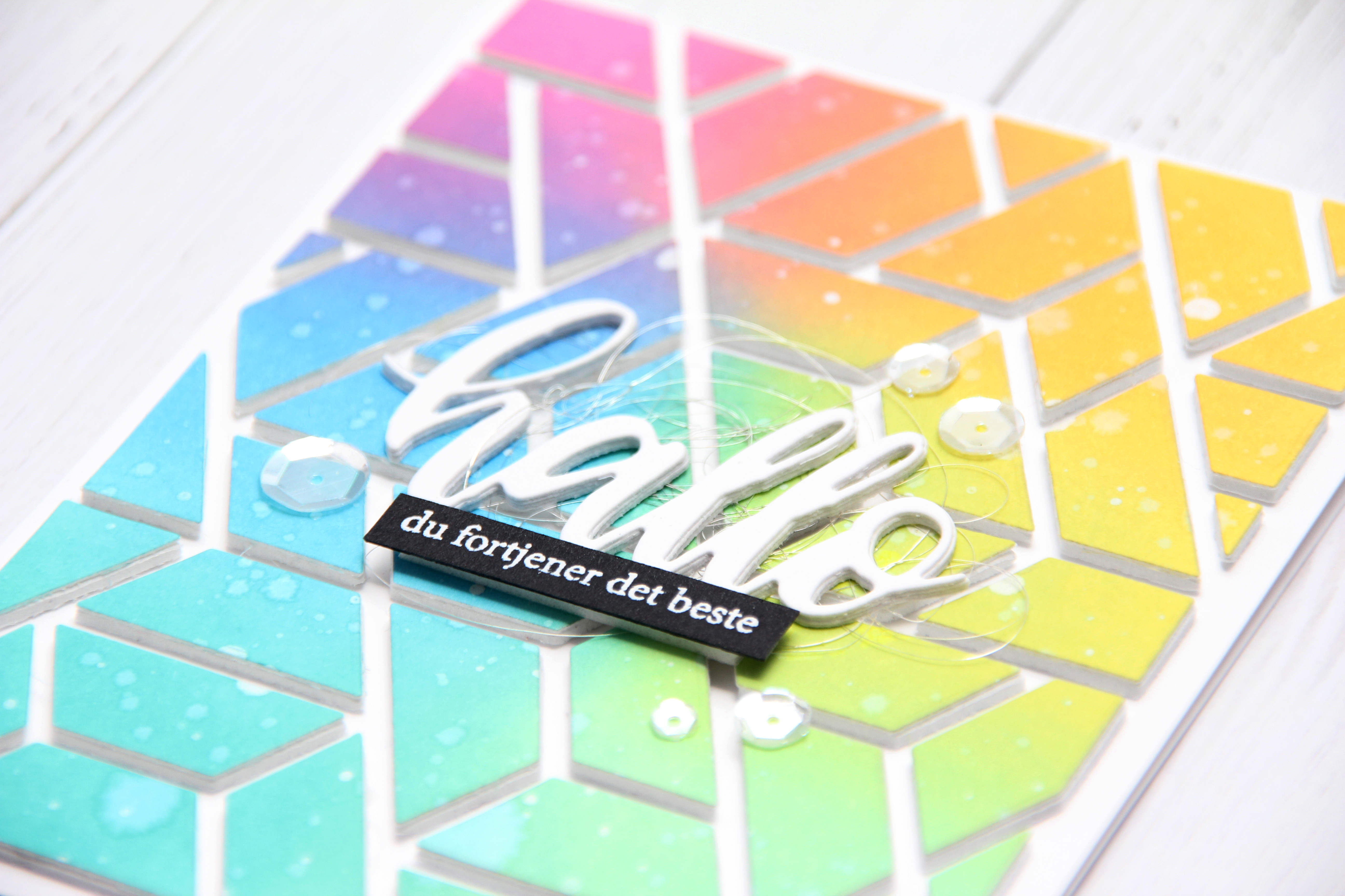 Takket være at jeg limte alle bitene på kortet mens jeg fortsatt hadde rammen rundt er de nå perfekt plassert, og kortet er veldig rent selv om jeg har brukt mange farger.
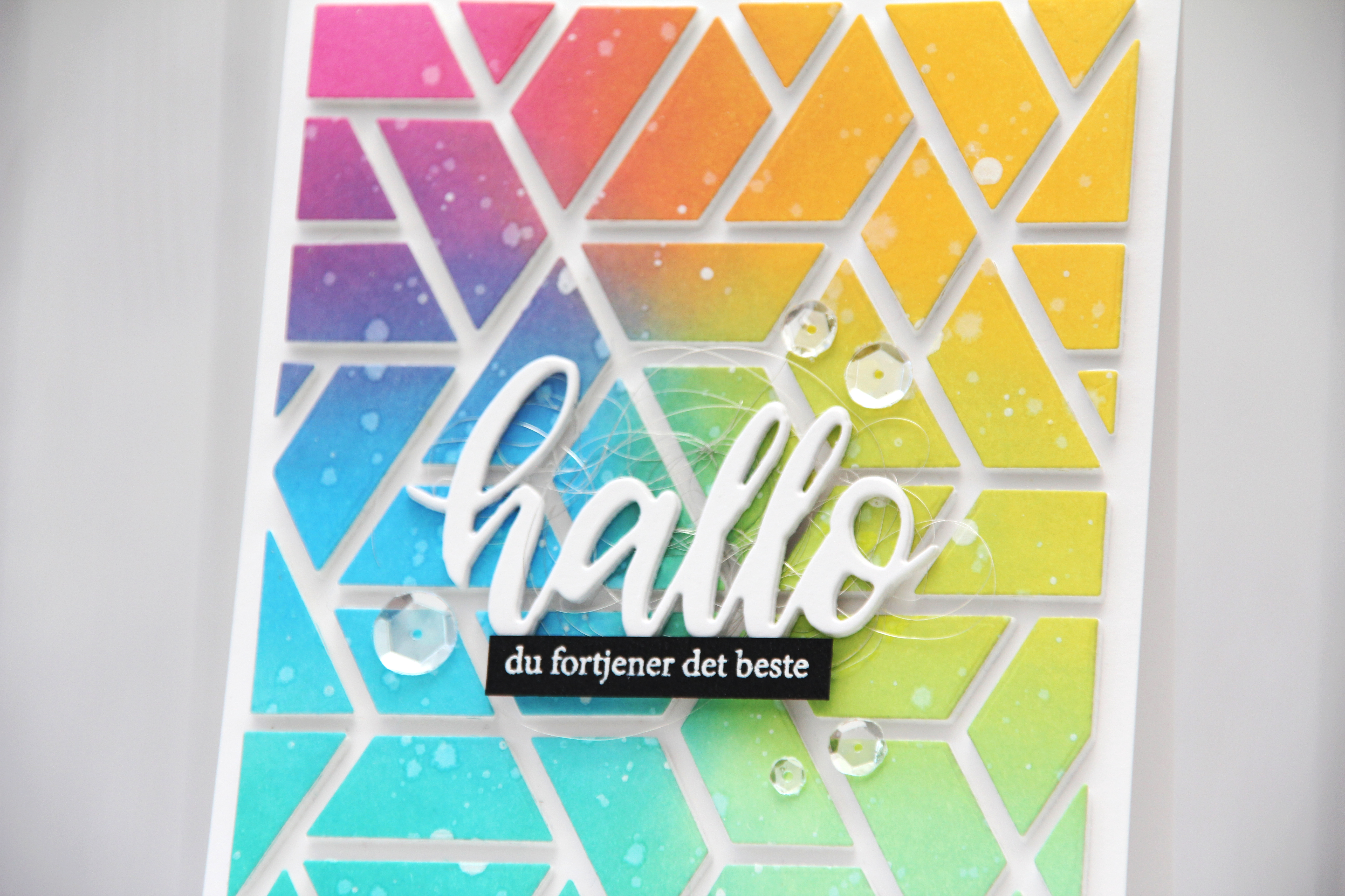 Det er ingen hemmelighet at jeg digger å fargelegge, men jeg digger også å lage kort som dette, selv om det er litt pirk å lime alle bitene sammen. Jeg er faktisk ganske glad i pirk også!
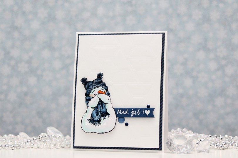
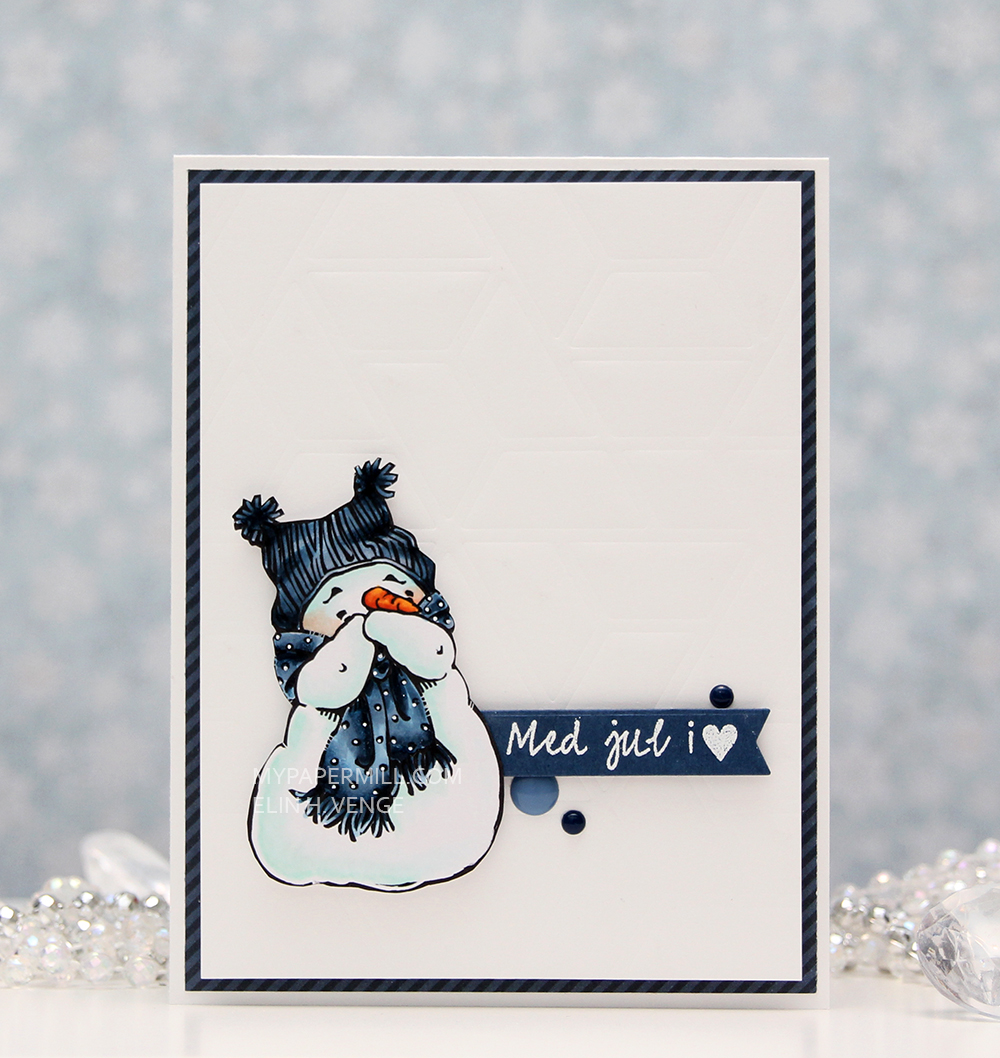 I fussy cut my little snowman and stamped a Norsk Stempelblad AS sentiment on a diecut banner. I’ve dry embossed the bacground using a cover plate die from Neat and Tangled.
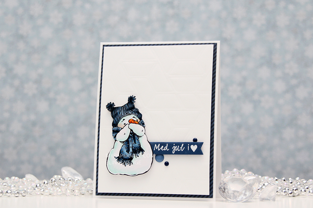 I’ve added a few Papirdesign dots, mounted my dry embossed panel on foam tape and added a diagonally striped patterned paper from Papirdesign behind it. That’s it. Very clean and simple, and this time even fairly quick to make. My cards tend to be clean and time consuming, but this was clean and simple, it took me less than two hours from start to finish, including coloring.