Hi, crafty friends. Today’s the last day to take advantage of the 30% bundled discount offer for the new Charmed by the Sea release from Purple Onion Designs. The design team and guest designers have shared lots of amazing cards over the last two weeks featuring stamps from this release, and if you haven’t purchased this collection yet, I have another card for you today that I’m hoping will inspire you that little bit more.
 Meet Slumber. This little mouse taking a nap in a hammock tied to palm trees won me over as soon as I saw it. Can you imagine relaxing by the ocean, listening to the sound of the waves rushing to shore? Heaven! I stamped and masked the surf board from the beach accessories set, the crab and the bottle from the seaside accessories set, then stamped Slumber, did more masking, then added the shoreline background, all using Extreme Black ink from My Favorite Things. With the masks still in place, I stamped the sunrise sunset background using Fadeout ink from Inkon3 for a soft, no line look.
 Whenever I color scenes like this, I always start with the background elements. For this card, I started with the sky and sun, then colored the ocean, the sand and the palm trees, leaving the accessories and the mouse for last. These are the most colorful elements. I even opted to color the crab blue. I didn’t want it to be brown and not show up in the sand, so I decided a blue swimmer crab was a good fit for this scene. It stands out against the other elements in the foreground, but still works with the overall design, because there’s already lots of blue on the card with the ocean and sky. Three completely different blue combos, but they work together still. Also, the blue swimmer crab makes me want to move back to Australia, even though it’s winter in Australia at the moment, and soooo cold (at least winter’s cold in Adelaide, where I used to live)!
 I’ve used the sunrise sunset background on more than half the cards I’ve made with this release, and I’ve tried to color it differently for each card. I love love love the versatility of this stamp, and never in a million years did I guess in advance that this would wind up being my favorite stamp of them all, but there you go. It’s just THAT good.
 To finish off the card, I stamped a sentiment from the coordinating Seaside sentiment set using Classic Kraft ink from Papertrey Ink, and I also used a white Sharpie to add dots to the sand to mimic foam.
 Lots of colors used for this one, and I realize I’ve even left out a few in my graphic. I used W3, W1 and W00 for the mouse, in addition to R21 and R000 for his cheek and ears.

 I stamped three of the little penguins using Extreme Black ink from My Favorite Things, colored them all in using my Copics, then restamped using Obsidian ink from Altenew, which is a pigment ink that stamps extra crisp and extra dark to bring the details of the linework back in.
 Onto a separate piece of cardstock, I stamped a sentiment from the Mini messages stamp set from Mama Elephant using Hunter Green ink from Altenew.
 Using the Circle Frames die from Avery Elle, I die cut the openings from Evergreen cardstock from Concord & 9th. I also die cut a few panels from white cardstock to layer behind the green, so my penguins would be recessed a little bit.
 Using the Snowflake Confetti Fancy die from Hero Arts, I die cut a bunch of snowflakes from white cardstock (Stamper’s Select White from Papertrey Ink, which I also used for my card base) that I adhered around my circle openings to draw the eyes in toward those cute penguins and the sentiment. Easy peasy card, right?
 Quick and easy peasy to color too.
 I love hydrangeas, and this image was is one I just HAD to color. Even though I’m more confident with my Copics because I use them so much, I love the soft look and those edges lines you get with watercolor. I stamped the image on a piece of Fabriano Artistico Extra White watercolor paper using Obsidian ink from Altenew. This is a pigment ink, which makes it perfect for embossing. I sprinkled on clear embossing powder from Ranger and melted the powder.
 I grabbed a couple of paint brushes and my Mijello Mission Gold watercolor set and mixed pinks and purples for my flowers, and a bunch of different greens for the stems and leaves. I’m no expert watercolorist (if you want to watch an expert watercolor, head over to Debby Hughes’
  This stamp set actually comes with a couple of additional leaves and petals and dies to cut them out, but there’s no die for this large image. Fussy cutting it was easy enough, though. I stamped and white heat embossed a sentiment from the stamp set onto a piece of True Black cardstock from Papertrey Ink. I dry embossed a piece of patterned paper from the Watercolor Wishes 6×6 inch paper pack from Lawn Fawn using the Geometric Landscape stencil from Altenew. I wanted a little bit of texture to create interest in the background without distracting from the main image, and this did the trick.
 I added a few more layers of cardstock behind my black strip for dimension, popped the flower up on foam tape and finished off the card with a few faceted pearls. Or are they gems? No matter what they are, they’re gorgeous, and I have a feeling I’ll use up the entire pack of these in no time, I love them so much.
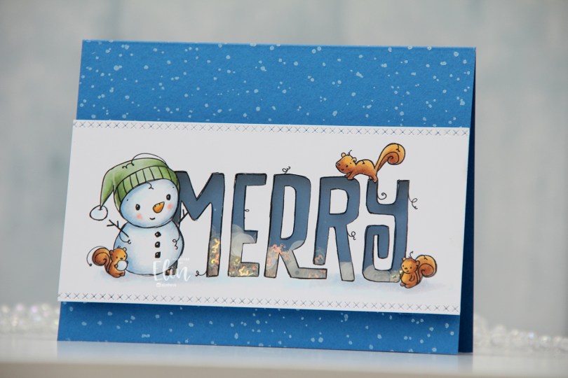

 I colored the image with Copics, then used a craft knife to cut away the insides of the letters. I used a die from the Stitched borders die set from Lawn Fawn to create a defined edge on my colored panel and added a piece of acetate from Simon Says Stamp behind the letters. I’d made sure to keep the counters on the Rs intact when I did my cutting, so I could add them back in once the acetate was in place.
 I used Cornflower cardstock from My Favorite Things to create the shaker well. I doubled up on foam tape and put sequins and confetti from the Icicle Sequin mix from Hero Arts in the well, then adhered the window on top.
 I created a top fold A2 landscape card base using Cornflower cardstock once again. I stamped the Paint Splatter background stamp from My Favorite Things onto the card base using Fresh Snow hybrid ink from Papertrey Ink, and adhered my shaker panel on top. Easy peasy.
 By doubling up on the foam tape, the sequins and confetti have lots of room to shake.
 Super simple color palette for this one.
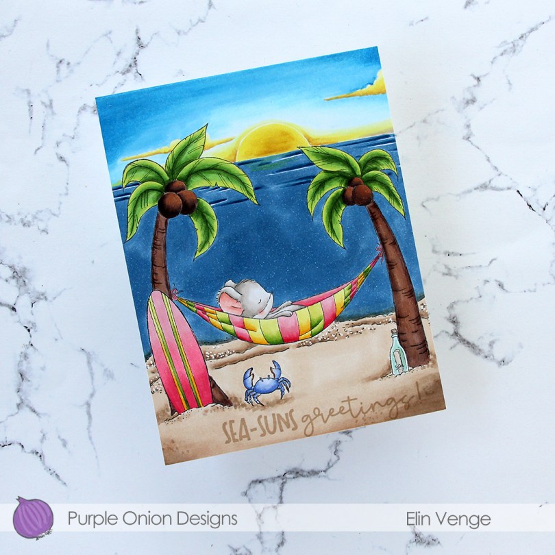
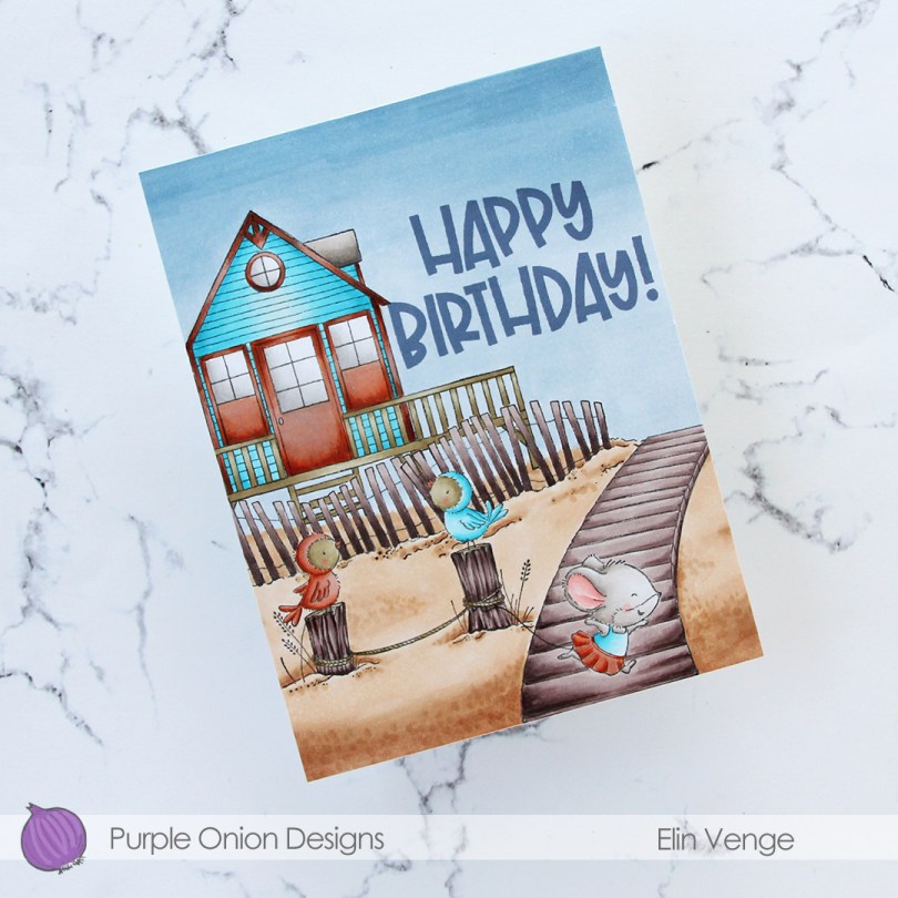
 This time, I made a birthday card. I stamped and masked
  I had the scene all figured out, but struggled with the colors for this one. I’m usually confident in my color choices, but had a hard time with this card. I didn’t want to repeat the color combinations I’d used for the cards I’d already made using stamps from this release, and the combo I tried just didn’t work with the bright aqua. The door, windows and the trim of the beach house all have so many layers of different colors, and the end result is a mottled, rusty look. The rusty look, while not what I was going for, is cool, and I leaned into it by coloring one of the birds in the same color, as well as Iris’ skirt.
 The end result is more of a fall vibe than a summer feel, but some people still go to the beach late in the season, and little Iris looks like she’s running away, so that part at least feels appropriate.
 To finish off the card I stamped a sentiment from the coordinating
  Fairly limited color palette, actually, considering how many colors I tried for the beach house trim.
 I started with a quarter sheet of Stamper’s Select White cardstock, the Wintry Forest stencil set from Pinkfresh Studio and the Northern Shore color family from Altenew. The stencil set has 6 different stencils that you layer to create a gorgeous wintry forest. I started with stencil number 1 (the Pinkfresh Studio stencils are numbered, which makes it really easy) and Polar Bear ink, which is the lightest of the four colors in the Northern Shore color family. I then moved on to stencil number 2, but didn’t change the color. Since I had to stretch my four colors and use them on five stencils (the last stencil adds snow on the trees), I kept the lightest one for this second layer and ink blended with a heavier hand, which makes the color appear darker. I used stencil number 3 with Icy Water ink, which is the next shade, then stencil number 4 with Winter Lake ink, and finally stencil number 5 with Arctic Mountain ink, which is the darkest color in this set of four gorgeous blues.
 On top of the ink blending, I stamped a snow flurry background stamp from Kort & Godt (M-428) using Fresh Snow hybrid ink from Papertrey Ink, which added lots of white snowy dots to my background. I then used a die in the DIE240 set from Kort & Godt to die cut the banner directly from my background. I put it to the side, placed the last stencil on my background and spread a layer of Light & Fluffy modeling paste from The Crafter’s Workshop through the stencil, before sprinkling on Rock Candy Distress Glitter and let that dry. Onto my banner, I stamped a sentiment from the M-467 stamp set from Kort & Godt using Arctic Mountain ink. I ink blended a little bit of Winter Lake ink to the edges to make it stand out a little bit more, added a stack of white die cuts behind it for dimension and adhered a couple of faceted iridescent pearls (ST178) to finish off the card.
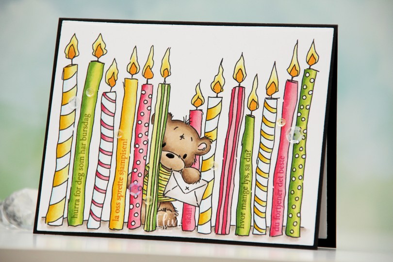
 I printed the image fairly large and chose a summery color palette of hot pink, apple green and bright yellow. I colored the image with Copics and used the largest die in the Additional A2 Layers die set from Waffle Flower to turn it into a nice rectangular panel. I put the panel in my MISTI, and used the A06 stamp set from Norsk Stempelblad AS to stamp sentiments on the plain candles. I used Jalapeño Popper ink from My Favorite Things for the green candles, Raspberry Fizz ink from Papertrey Ink for the pink candles and Spiced Marmalade distress ink from Ranger for the yellow candle, with a little bit of help from VersaMark to prevent the distress ink from beading up on the photopolymer.
 Once all my stamping was done, I adhered the panel onto a black card base I created from True Black cardstock from Papertrey Ink. I also die cut a panel to go on the inside from Stamper’s Select White cardstock from Papertrey Ink for a place to write my personal greeting. I used my black Glaze pen from Sakura to create a little bit of shine to the eyes and the nose of the bear, and added sequins from the Seashore and Iced Sherbet mixes from Little Things from Lucy’s Cards for a finishing touch.
 Simple color palette for this one 🙂
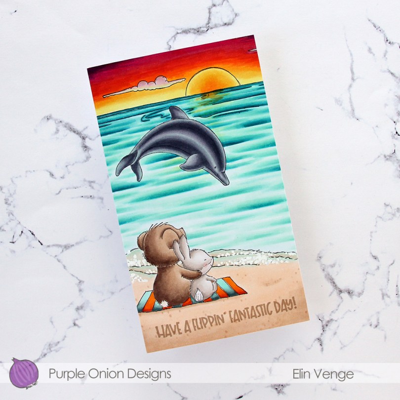
 I wanted a bit of a dramatic sunset for this card, and also for the critters (
 I adhered my colored panel to a card base I created from Stamper’s Select White cardstock from Papertrey Ink, stamped a sentiment from the
  Lots of colors for this one.
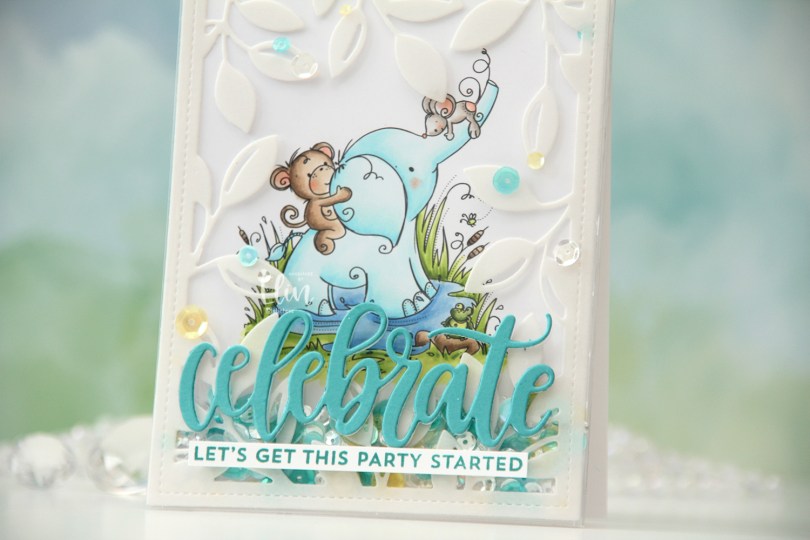
 I actually decided to create a shaker card this time. I colored in the
  I put an adhesive sheet from Altenew on the back of a piece of heavyweight translucent vellum from My Favorite Things, before using the Leafy Cover die from Mama Elephant to die cut a frame to put on my card front. I cut off a couple of leaves where I thought they covered up too much of the image and adhered the rest directly onto the bottom of a large stamp storage pocket from Avery Elle. The storage pocket was just wide enough for my colored panel to fit when I turned it 90 degrees. I trimmed off a tiny bit of my panel (1/16″) so it would be less snug in the pocket, and cut off a couple of inches from the top of the pocket. This way I could put the panel inside the pocket, and there would only be one side of the pocket that needed to be sealed once my shaker bits were in place.
 I adhered my shaker pocket to a top fold card base I created from Stamper’s Select White cardstock from Papertrey Ink. I die cut the sentiment using the Celebrate die from My Favorite Things. I used Caribbean Sea cardstock from My Favorite Things for the top layer and a few layers from white cardstock behind it for dimension. I also stamped a sentiment from the Bitty Birthday Wishes stamp set from My Favorite Things onto white cardstock using Caribbean Sea ink, also from My Favorite Things, turned it into a strip and placed it directly underneath the die cut word. To finish the card, I adhered some sequins from the Seashore mix from Little Things from Lucy’s Cards, as well as from the Seaglass mix from Simon Says Stamp. These two mixes work really well together, and they’re also what I used to fill my shaker.
 Speaking of, here they are. Full shaker cards are fun, and I’d say they’re a lot easier to create than regular shaker cards, where you need to create dimension for the shaker bits to shake around.
 The storage pocket works so well as a shaker pouch, and because of it, it gives everything a bit of a lift off the card. It looks like the vellum and the die cut sentiment both float on top, even though they’re both adhered directly to the pocket.

 I created a white card base from Stamper’s Select White cardstock from Papertrey Ink, and on the left side of the card, between the center and the bottom, I placed a circle I die cut from the Watercolor Wishes paper pack from Lawn Fawn. I cut off the piece of the circle the left of the fold, I actually created a side fold card this time. I die cut a leaf cluster from heavyweight translucent vellum from My Favorite Things using a die from Kort & Godt, and I also die cut for you from the Sweet Sentiments die set from Altenew from Berry Sorbet cardstock from Papertrey Ink. I stacked four die cuts for each of the words, so they’d stand out on my card. I put foam tape on the back of my colored vase, added the vellum behind it and adhered it to my die cut patterned paper circle. The vellum leaves are only adhered to the card behind the vase, the rest is floating. I added my die cut sentiment and finished off the card by adding Nuvo Jewel Drops in the Limoncello color to the yellow berries in my vase.
 Super simple color palette for this one.