Hi, crafty friends. It’s been a while since my last post. Things have been crazy busy this past month, and I’ve had zero time in my craft room, and not even time to write blog posts for cards that were finished before things went bananas. The annual holiday sale from Purple Onion Designs is a great way to come out of hibernation, though.
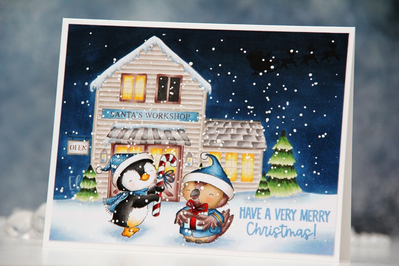
 Winter and Balsam from the latest Christmas release from Stacey Yacula are exchanging gifts. They both look pretty happy to be out in the snow in front of Santa’s workshop. I snuck in the Santa silhouette in the sky and stamped a sentiment from the Santa Sentiments set in the snow.
 I love creating these scenes with Stacey’s images. It’s a time consuming process, as I create masks for each critter and fussy cut them, but the end result is always worth it.
 I stamped Winter and Balsam using Extreme Black ink from My Favorite Things before covering both of them with masks. I then did second generation stamping of Santa’s workshop using Memento Rich Cocoa ink, using first generation for the signage only. I like the softer look of the brown lettering in the background. I stamped the silhouette of Santa’s sleigh using VersaFine Onyx Black ink AFTER I’d colored in the entire scene. This is an ink that stamps very black and very crisp, but it’s a pigment ink and doesn’t play well with Copics, so it’s best to leave it to the end. I stamped the sentiment using Blueberry Sky ink from Papertrey Ink.
 I also went back over the “cast iron” of the OPEN sign using a 0.3 cool gray multiliner from Copic and added white dots on the penguin’s hat and scarf using my white Gelly Roll 05.
 I sprinkled on chunky white embossing enamel from Stampendous, melted the granules from the back of the paper and adhered my finished scene onto a 5 3/4 x 4 1/2″ white card base, making this card slightly larger than the regular A2 size card.
 Lots of Copics used for this one.
 There are some awesome stamps in the Black Friday – Cyber Monday deals category over at the Purple Onion Designs store, a few of my very favorites even. Take advantage of this massive sale while you can.
 Whenever the design team members get a glimpse of the new collection, I start my planning process. I sketch out very rough card ideas using the stamps I’d like to work with, send my stamp wish list off to Michele, the owner of Purple Onion Designs, and then wait patiently for the stamps to arrive.
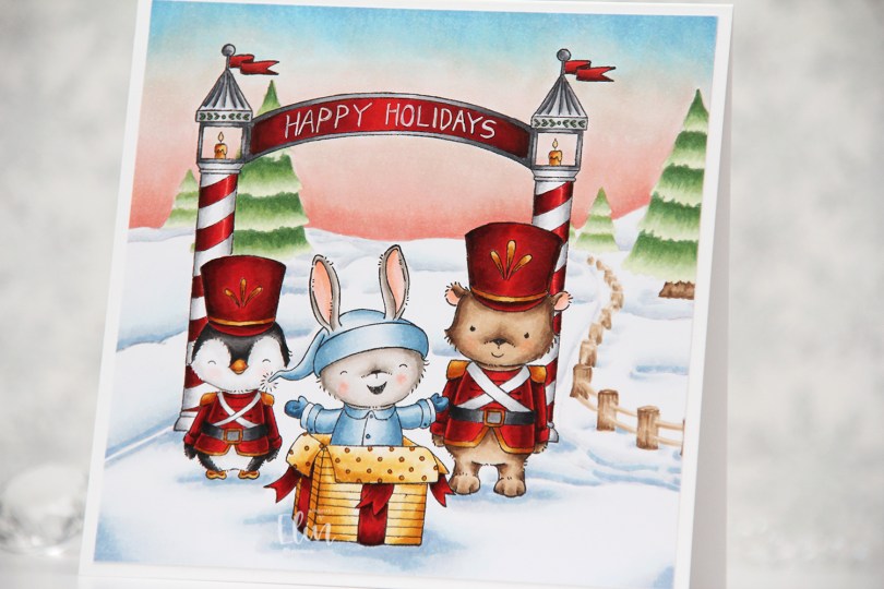
 Whenever there’s a new collection I like to create scenes to show off as many of the cute images as possible (without overcrowding the card), and for this card I stamped
  I always start by coloring the sky, and for this collection, I wanted each of my cards to have a different sky. I tend to go for all blues, but winter sunsets are explosions of color, so I was very conscious of that when I created my card. Once the sky was done, I colored the snow, followed by the trees and that cute fence, before starting with the rest of the scene.
 I colored the critters, then the arch and finally all the red. I always leave the red details to the very end. It eliminates the chance of smearing and getting red ink where you don’t want it when you go in with another color right next to it. I wrote Happy Holidays with a black 0.35 Copic pen before coloring, but once the red was colored, you could hardly see the lettering, so I went back over with a white 05 Gelly Roll pen, and the text is much more visible now. My Ps are a little further apart than I’d like, and they’re also leaning a tiny bit to the right, but it’s a homemade card, it’s not supposed to be perfect, right?
 Whenever I create these scene cards with Purple Onion images, I always let the stamping and the scene itself dictate the size of the finished card. This one wound up at 5 1/4 x 5 1/4″, which seemed pretty perfect. I haven’t made a square card in a while, so this was fun.
 I used an obscene amount of Copics for this card.
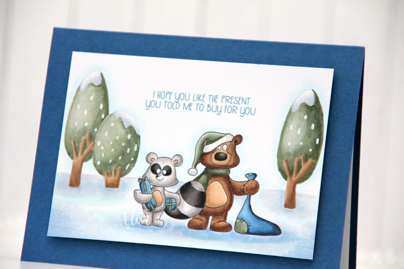
 For my final card I’m focusing on the Birthday Wonderland stamp set, and I used both trees, the raccoon and the bear for my card, in addition to one of the sentiments.
 I decided to go for a no line look in the background with the trees and used black lines for the two cute critters.
 Once my image was stamped and colored I cut it down significantly and mounted it on foam tape to a top fold landscape card base I created from Enchanted Evening cardstock from Papertrey Ink.
 There’s something about this bear that reminds me of Yogi. That might actually be the reason I colored his hat green. These two have such character, but the bear’s my favorite, just don’t tell the raccoon.
 I used a white Sharpie with an extra fine tip for the dots of snow (is it snow?) on the trees.
 Simple, subdued color palette for this card.
 I love teal for Christmas cards. I actually love teal for anything, but it’s the perfect color to pair with the dreaded traditional red. I’m not a fan of complementary colors, so red and green don’t really work for me, but red and teal totally do. As does red and light blue, or red and grey, but that’s pretty much my entire list for what goes with red at Christmas. I’m weird, I know.
 Once my coloring was done I used the Notebook Edge die from My Favorite Things to die cut from the left hand side of the panel. Below the image, I stamped a sentiment from the Holiday Messages stamp set from Mama Elephant using Hawaiian Shores Ink from Papertrey Ink.
 I thought about adding some sort of embellishment to the card, but in the end, I decided to keep it simple.
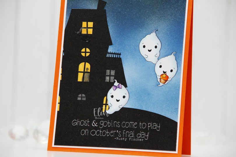
 I thought the ghost stamps in the
  I colored the ghosts with Copics, and used a yellow and a grey marker to color the windows. Most of the rooms have the lights on, but by coloring two windows grey, it gives the illusion that the lights aren’t on in those particular rooms. I also used the grey to add a silhouette of a person in one of the lit rooms, upping the creep factor a tiny bit.
 I masked off the ghosts and the house before I ink blended the nighttime sky. I used Eiffel Tower ink from My Favorite Things as well as Distress Inks in the colors Chipped Sapphire, Faded Jeans and Stormy Sky. Evidently, I’d used the paper I laid down to do my ink blending on to catch overspray from another project I added shimmer to, so the sky has a subtle shimmer to it when you tilt the card in the light. Completely unintentional, but not the worst thing in the world. My ink pads are now a little shimmery too, but it’s not too bad.
 I decided to also add an acetate ghost outside the top window of the haunted house. The ghost is from the Candy Corn mix from Little Things from Lucy’s Cards.
 I added my panel to a piece of white cardstock, and then adhered everything to a card base I created from Orange Zest cardstock from Papertrey Ink.
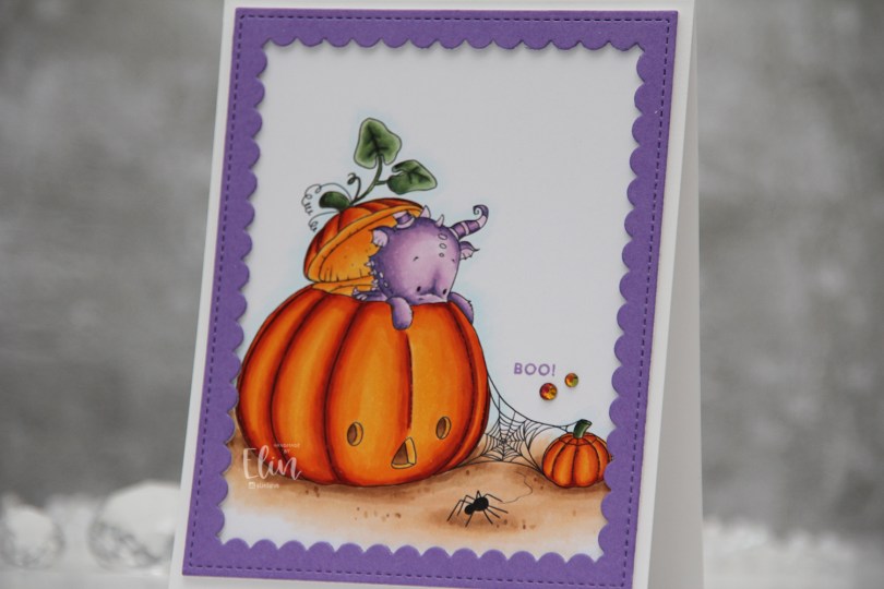
 Halloween isn’t really a big thing in Norway, but this image was so cute I just couldn’t resist. I colored up the ground, pumpkins and leaves before asking my “twin” Liz for a color suggestion for the actual dragon, thinking in my mind “please don’t say purple”. What did she choose? It was inevitable, I knew she’d say purple, she even said which purples to use. I actually think he’s cute in purple, and I don’t think I’ve colored one of Lee’s dragons purple before, so I guess it was about time.
 Once I finished coloring, I embraced the purple, stamping the Boo! sentiment from the Itty Bitty Boos stamp set from My Favorite Things using Deep Iris ink from Altenew. I then die cut the largest frame in the Scallop Frames die set from Pretty Pink Posh from Amethyst Allure cardstock from Papertrey Ink, adding two additional white die cuts behind it for dimension.
 The outside dimensions of the die cut frame are 4 x 5″, so I cut 1/4″ off the height of my card base, making it 4 1/4 x 5 1/4″ instead of the normal A2 size to get an even white border on the outside of it.
 The sentiment is tiny, and to draw the eye to it I decided to add a couple of gems. These are from the Meraki Sparkle Red Illusion jar. They’re color changing glass rhinestones, and this color was perfect for this card.
 If you look at the various photos in this post, you’ll see that these rhinestones appear to have different colors depending on how the light hits them, it’s a really cool effect. In this photo, you can also see the dimension added by using stacked die cuts.
 Fairly simple color palette for this card. It was a pretty quick image to color too!
 I colored the penguins with Copics and fussy cut them all, leaving a white border around the edge. I used the Fold-Up Tags from My Favorite Things to die cut four tags from the Hvite juleblomster patterned paper from the Gledelig Jul collection from Papirdesign before I adhered each penguin to each of the tags using 1 mm foam squares.
 I stamped and white heat embossed several sentiments from the Jul stamp set from Norsk Stempelblad AS onto Classic Kraft cardstock from Papertrey Ink. I also die cut reinforcements for the tags from the same cardstock, and some tiny snowflakes from white cardstock (also from PTI) using the Snowflake Confetti Fancy die from Hero Arts. I mounted the sentiment strips on foam squares, adhered the snowflakes using liquid glue and added a 2 mm white pearl from Kort & Godt to the center of each of the snowflakes. I used natural twine from May Arts through the reinforcements and threaded two gold bells to each piece of twine before securing the twine to the tags.
 On the back of the tags I stamped to/from labels from the B06 stamp set from Norsk Stempelblad AS using Dark Chocolate Ink from Papertrey Ink. I stamped the labels before adding the reinforcements. In hindsight, I wish I’d kept the stamps in my MISTI and restamped after the reinforcements were glued on, so the label would be continuous on the back, but I didn’t think of it as I was creating. I’ll try to remember for my next batch of tags.
 Three same, but different gift tags using all the gingerbread people in the stamp set. I created the tags themselves using dies (two of them are actual tag dies, I used the topper from the ornament die set to create a topper for the heart to create a tag from that too). I used the Itty Bitty Gifting stamps and the Itty Bitty Strips dies, both from My Favorite Things, for all my to/from strips.
 I used Classic Kraft and Stamper’s Select White cardstock for most of my die cutting, both from Papertrey Ink. For the ornament I also used a piece of silver cardstock from Rayher. I did all my Copic coloring on 120 lb white cardstock from Simon Says Stamp. This isn’t the cardstock I normally use with my Copics, but it’s great for one layer cards and elements that you can see the back of, because the markers don’t bleed through. Getting smooth color blends with Copics is trickier on this cardstock than my beloved X-Press It blending card, but the thickness saves me from having to fussy cut each of those gingerbread twice to cover up any bleed through. It’s worth the trade off, I think.
 For the yellow one, I used the Snøfnugg, stor die from Papirdesign to create the snowflake tag. I added Nuvo Jewel Drops in the Key Lime color to the green buttons on the belly, and used a couple of pearls from the Igloo mix from Little Things from Lucy’s Cards for a little bit of embellishment. I put a piece of Divine Twine in the Lemon color through the hole at the top, making it easy to add to a gift.
 For the pink one I used the Hjerte 3 die from Papirdesign to create the tag (and the Julekule die to create the hole at the top). The sequins are from the same Igloo mix that I used for the yellow, and I also added Jewel Drops in the color Key Lime to the buttons on her belly. The twine is Divine Twine in the Cotton Candy color.
 And finally the green one. I used the Julekule die set from Papirdesign to create the actual tag, Nuvo Jewel Drops in the Limoncello color for the star on his sweater, and green dots from Papirdesign to embellish. The twine is Divine Twine in the color Green Apple.
 Very simple color palette for these.
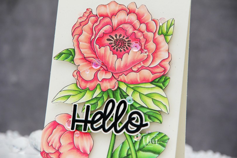
 I used the large flower from the Lovely hello stamp set for this card. This image is huge, and it covers most of an A2 card front. I colored the image with Copics and then fussy cut the whole thing. This image isn’t very detailed on the edges, so it was easy enough to fussy cut.
 I mounted my fussy cut image to a card base I created from Rustic Cream cardstock from Papertrey Ink using the Double Thick Crystal Clear Foam Tape from the Rabbit Hole Designs. This tape is super thick and super sticky, and it adds a ton of dimension.
 I used part of a sentiment from the same stamp set. It actually says Hello lovely, but I wanted the hello. I also fussy cut this, leaving a thin border around the black letters. There’s a coordinating die to go with this sentiment, but I don’t have it and don’t actually mind fussy cutting.
 I popped up the sentiment with foam tape and added sequins here and there using the Rosy Glow mix from Little Things from Lucy’s Cards to finish the card.
 This card has it all – dimension, shine and a gorgeous flower. What more could you possibly want?
 I used very few Copics for this image, actually.
 I created a very simple scene for this card, stamping the snowman in Fadeout ink from Inkon3 before adding a mask, then stamping the
  Every once in a while, I break out my airbrush system. I actually keep it out on my desk, but I have a big desk and don’t usually sit close to it. I love the airbrush system, it’s such an awesome way to get a layer of color quickly. Coloring an entire nighttime sky with Copics takes a while, airbrushing it is faster. Use colors that are darker than what you think you want, and make sure there’s enough ink in the marker before starting. I used B99 and B97 for this sky, and it’s wonderfully dark and the perfect backdrop for the lighter colors of the snowy scene in front.
 Once I finished the airbrushing, I carefully removed the masks and did no line coloring of the rest of the scene. At this point, I’ve colored snow so often, I can do it in my sleep. This snowman is pretty easy to color too, most of the areas are pretty big surfaces, so it’s a very forgiving image.
 After I finished my coloring, I stamped and white heat embossed a sentiment in the sky. The sentiment is actually from the Scripty Xmas stamp set from Mama Elephant, I kind of forgot for a second that I was creating a Purple Onion card, I was a little lost in a creative zone. After heat embossing the sentiment, I sprinkled on chunky white embossing enamel from Stampendous to create my super snowy scene, making sure to remove any granules that landed on top of the embossed letters before melting the granules from the back.
 I trimmed 1/8″ off each side of my scene and adhered it to a white card base I created from white cardstock from Papertrey Ink, deciding not to add any embellishments. I figured there was enough going on already with all the snow.
 As usual – lots of colors used for the snow. The two blues at the very bottom after the break are the colors I used for the airbrushed sky.