Hi, everyone! I’ve got a quick Christmas card to share today, featuring Santa Boy from Rachelle Anne Miller.
 I wanted my cluster with the sentiment to be more to the right than to the left, so I flipped my image in Photoshop to make the boy and the dog look to the right instead of the left, it fit my card better. It’s one of the great advantages of digital stamps.
 Once I’d colored in my image, I used my favorite faux stitch rectangle die from My Favorite Things to turn my colored piece into a panel for the front of my card. I added about half a tiny paper doily from Doodlebug Design, and some die cut scraps of Maja Design patterned paper, before adding a green strip with a word (Christmas hug) from Papirdesign using foam tape.
 I added another little piece of the green patterned paper from Maja Design towards the bottom of the left hand side and glued on a few snowdrift sprinkles from Little Things from Lucy’s Cards, before adhering everything to a card base I made out of Soft Stone cardstock from Papertrey Ink. Easy peasy, lemon squeezy, right?
 I tried to limit the amount of Copics I used on the snow for this one. Only five (plus the blender) isn’t too shabby.

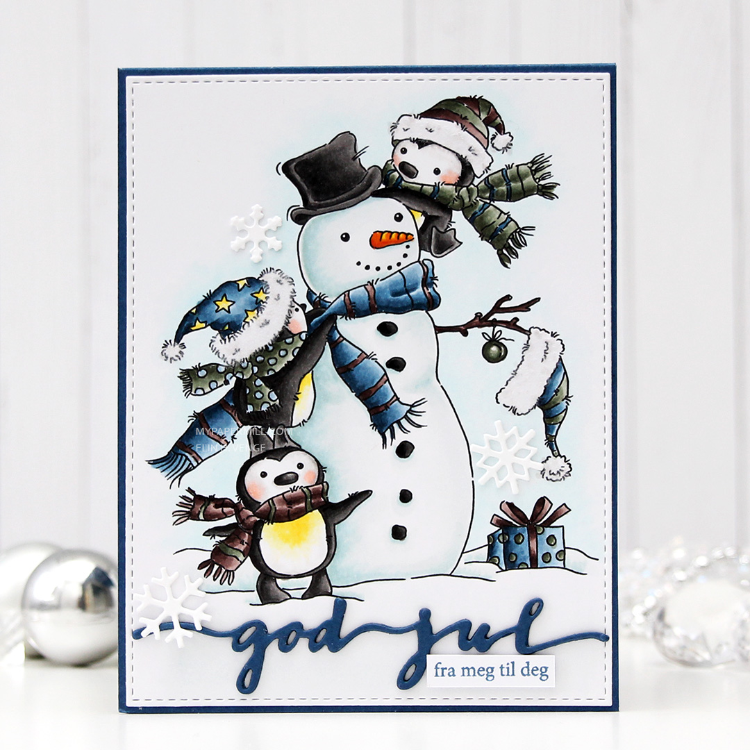
 When I first got the stamps, the first thing I did was create masks for each and every single one of them. Time consuming, sure, but so worth it to be able to create scenes like this. For this card, I started by stamping the S
 I colored the scene using Copics, making sure to use muted, soft colors for the background and brighter colors and more detailed coloring for the snowman and his friends. That penguin chick had me, I love him!! I stamped a sentiment from the
  I cut my colored piece down a little and was going to add it to a 5×7″ card base, but realized I’d cut too much off the height, so I had to shrink the card front accordingly. The finished card measures 5 x 6 1/2″. A bit of an unusual size, I guess, but I think it works. I added a piece of green patterned paper from Papirdesign to my white side folding card base and mounted my colored piece with plenty of foam tape. Normally I’d use Stormy Sea card stock for my base, but I didn’t have a piece big enough, and that patterned paper (without much of a pattern) was a great match.
 Lots of colors for this one, but I used the ones before T7 on the snow alone… No wonder it’s a lot.
 I used a very bright red for the hat and sweater on the mouse, and the only color that really goes with it, in my opinion, is gray. I found some red and gray die cut scraps from a couple of Maja Design collections (Fröjdefull Jul and Joyous Winterdays) and made a little mini cluster in the top right corner.
 I started with a mini paper doily from Doodlebug Design, added a red fishtail flag frame die cut with a die from My Favorite Things, then a piece of a ticket die cut with a Docrafts die. I used some 1 mm foam squares for that. I added my sentiment at the end, which is from one of those strips at the bottom of the 12×12″ papers that you usually cut off. Maja Design has always had some kind of pattern on the back of theirs, which means that nothing needs to go to waste. This one was perfect in gray with a hint of red, and I used 1 mm foam squares to add it. I even doubled up on the foam on the left hand side of it.
 I added some red enamel dots from Papirdesign to finish it off, and glued a leftover piece of the doily to the bottom left corner and an additional two dots. I added my panel to a top folding card base I made from Gravel Gray card stock from My Favorite Things.
 This was a very simple image to color, so obviously I didn’t use a lot of colors.
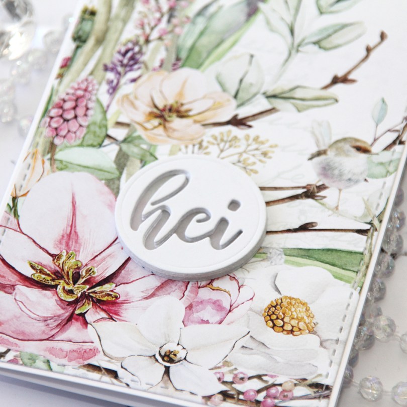
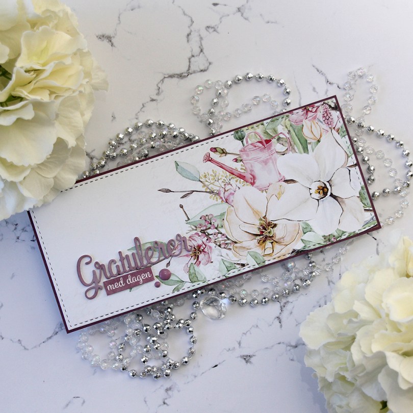
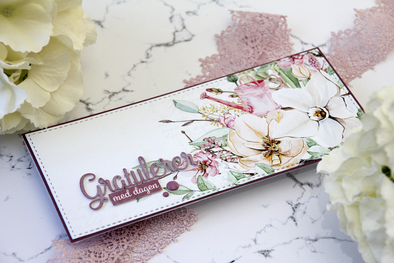
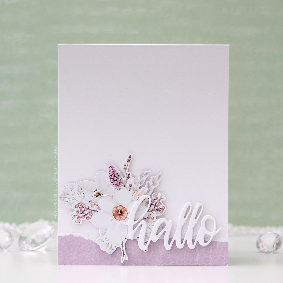
 This first one might not even technically be a proper slimline card. It’s about 7-3/4 x 3-3/4″. I’ve used beautiful patterned paper from P13 for both my cards. I wanted the paper to be the hero, so I didn’t do too much to it. The sheet I used for this card is
  I used a
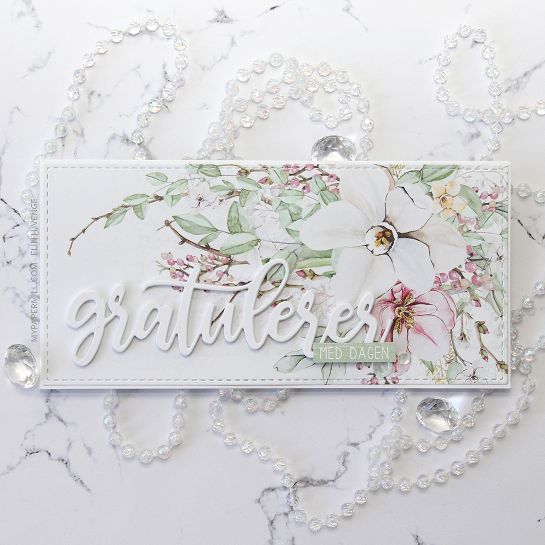
 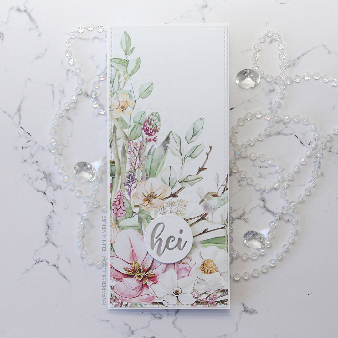 My second card uses a different part of that same sheet of patterned paper, as well as the same slimline die from Pinkfresh Studio. The sentiment is even die cut using a die from the same set as the sentiment on my first card.
 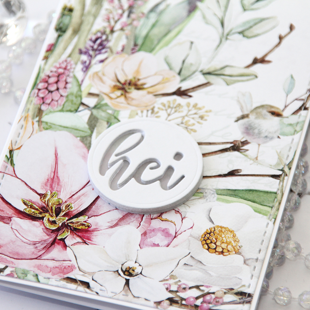 On this one I have four layers stacked on top of each other, then a vellum circle, then another four layers of the negative word die, making this sentiment really stand out as a statement on my card.
 Let’s talk for a minute about P13. They’re a Polish company, and they make beautiful, thick patterned paper. That’s really all you need to know, because it’s all I know. When I say thick, I mean thick. I don’t know their exact weight, but it’s close to card stock weight! I’m telling you, these are wonderful. They’re double sided, and the little strip you see at the bottom here with the torn edge is the back of that very same sheet (
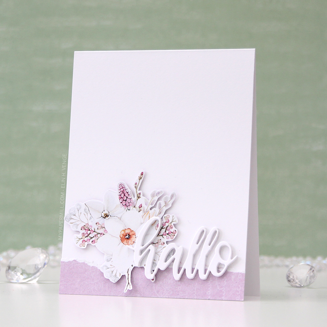
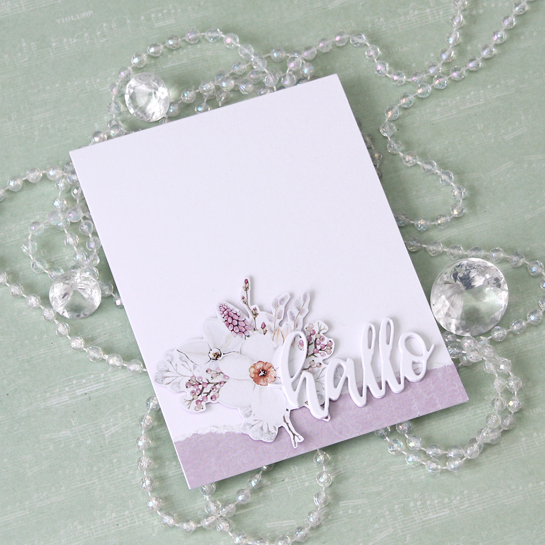 I have tons of floral clusters left over from the patterned paper, and one of the wonderful things about the P13 papers is that the design isn’t repetitive. This specific sheet of patterned paper had plenty of florals on the front, but they were all a little different, which means creating different cards from them will be a breeze.
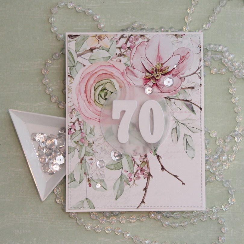
 For this card, I used the largest die in the Stitched Rectangles STAX 2 set from My Favorite Things. You can find set 1
 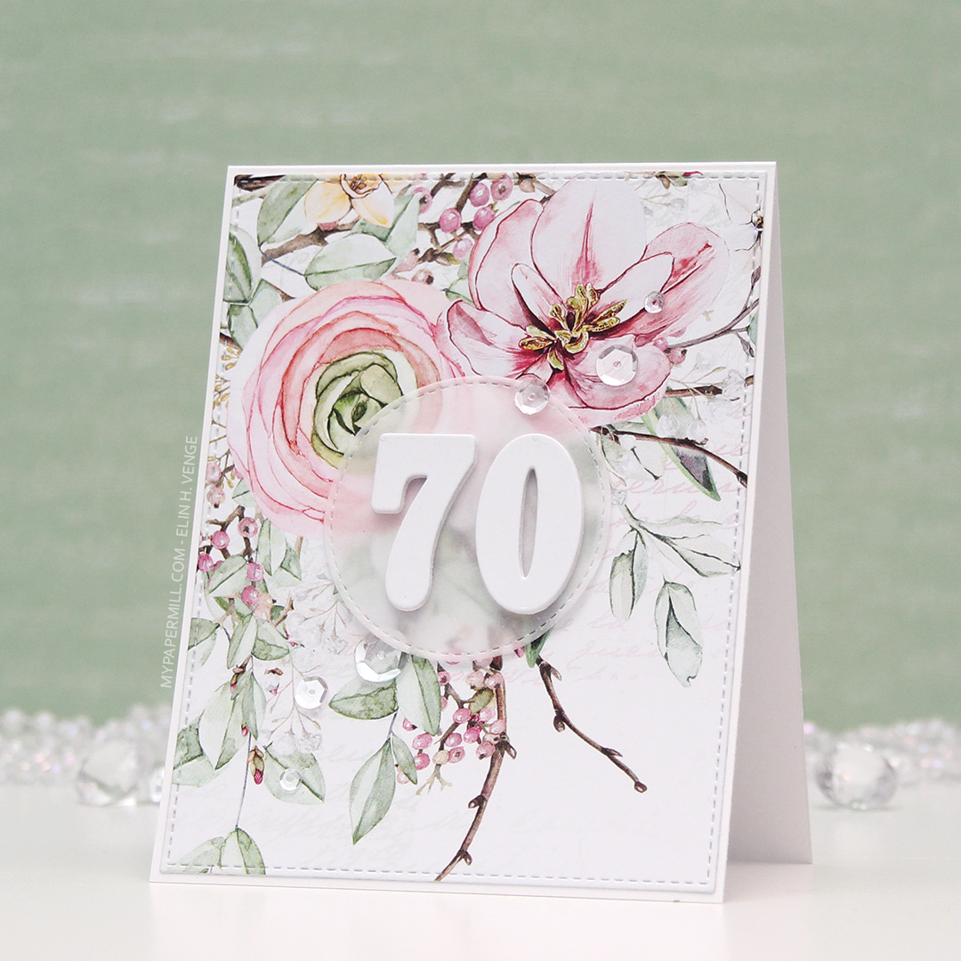 I glued my die cut panel onto a cardbase made from Stamper’s Select White cardstock from Papertrey Ink. I die cut a circle from vellum using a circle die from the Stitched Circle STAX set, also from My Favorite Things. It matches nicely with the stitching around the edge of my floral panel.
 I also die cut a bunch of numbers using a die set from Papirdesign. I made most of them from white card stock, but the top numbers from a piece of that same patterned paper. It might not look like patterned paper, but there’s a lot of white space on this sheet, and I used some of that for my numbers. It makes the whites match, which I really love. I put a 3 layers of my numbers underneath the vellum, and the remaining four layers on top. It makes the vellum stand out a bit from the background, which makes the number show up a little better and not get lost in that busy background.
 I finished off the card by gluing on some sparkling clear sequins from Pretty Pink Posh.
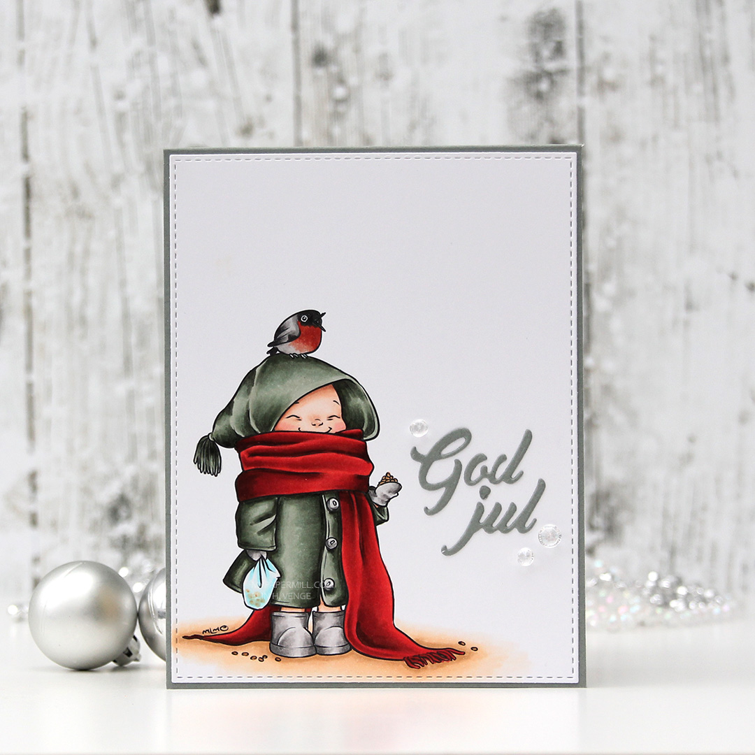 As usual, I colored my image in with my Copic before die cutting it down to a panel using a stitched reclangle die from My Favorite Things. I glued it to a card base I made from Stormy Sky cardstock from Papertrey Ink, also a gorgeous color, and it matches my coloring pretty well.
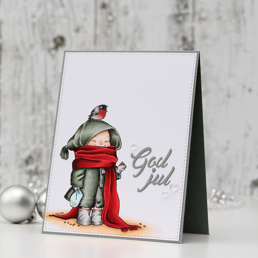 I didn’t want to do too much to distract from my coloring, so I die cut a God jul (Merry Christmas) sentiment using a die from Papirdesign and that same color cardstock as my base, and glued that next to the little girl. I didn’t even stack several die cuts on top of each other like I normally would.
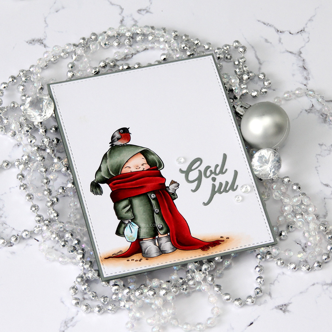 I finished my card by gluing on some diamonds from the Glass mix in the Crystal Collection from Little Things from Lucy’s Cards.
 Those last six colors in this graphic? All the colors I used to create the red scarf (I only used E08 for the red on the bird).
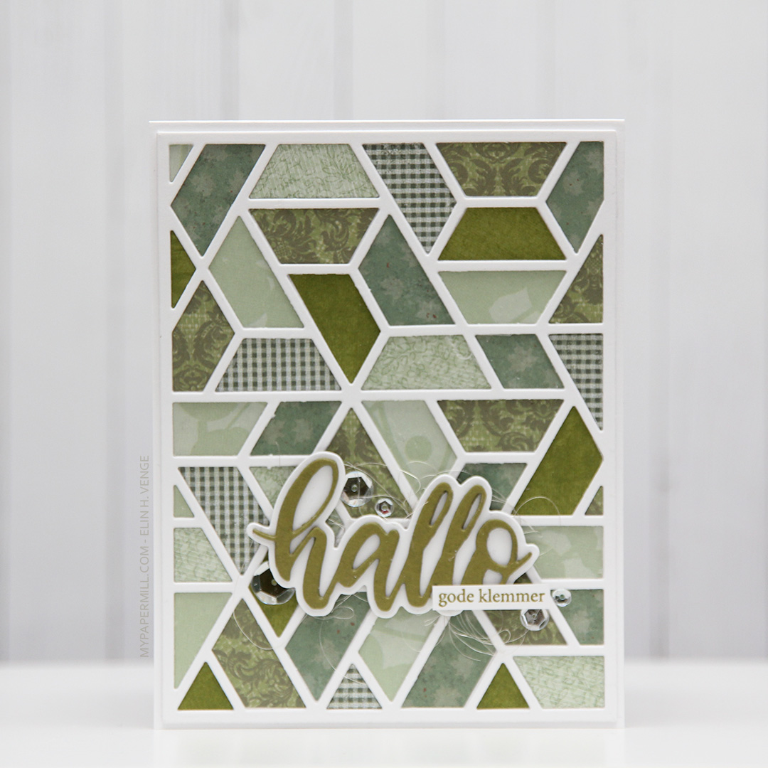 I used a cover die from Neat & Tangled to diecut twice from white cardstock and several times from scraps of different green patterned paper scraps. These are a mix of Papirdesign, Maja Design, Kaisercraft, and one that I don’t even know. Great way to use all those little bits.
 I glued my white frames together and inlayed my green pieces, before die cutting a word die from Papirdesign using Ripe Avocado cardstock from Papertrey Ink for the word itself and white for the shadow. I stacked a few of the green ones on top of each other for it to stand out a little bit.
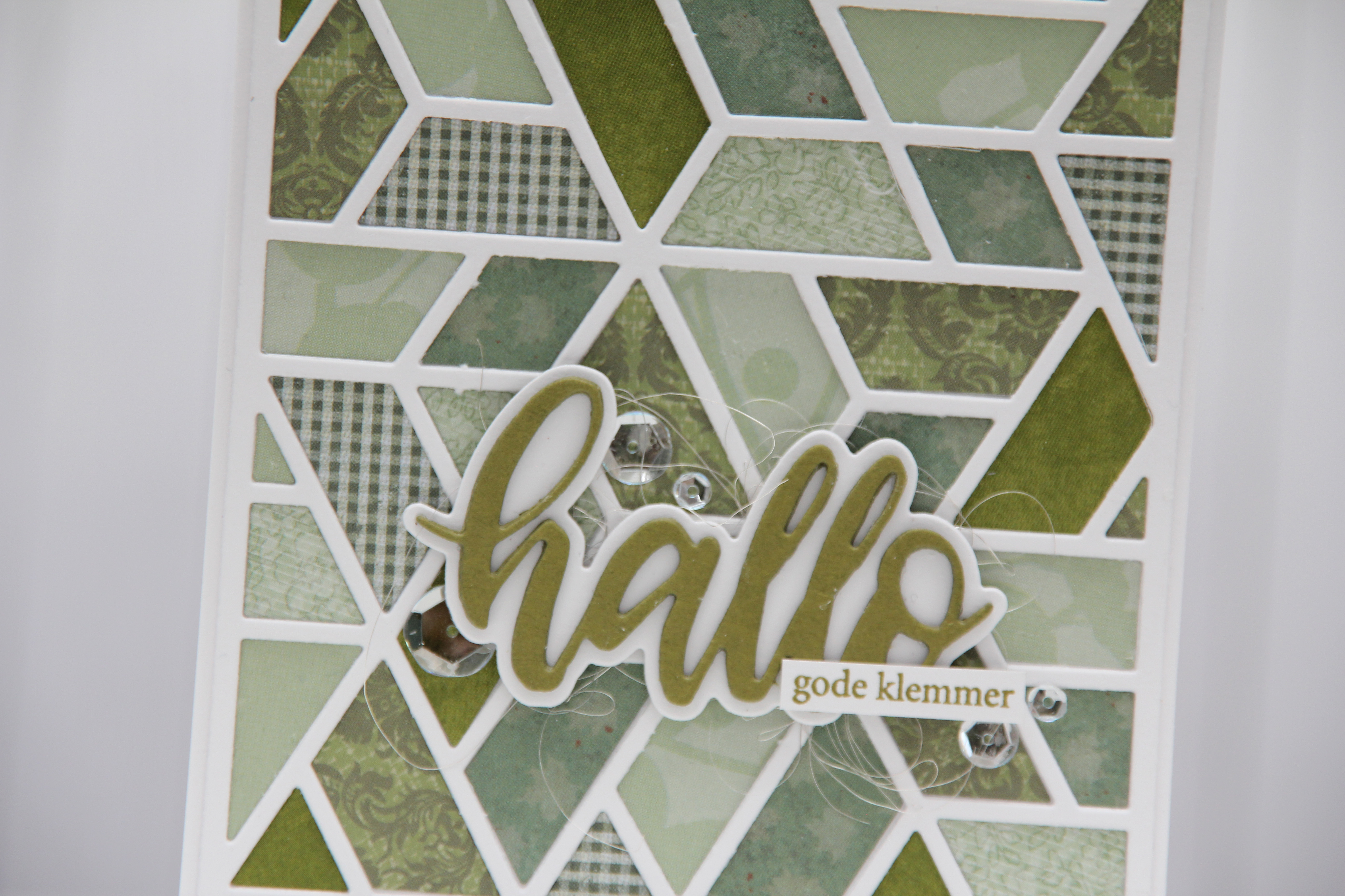 I used some angel hair to make a nest underneath my diecut and glued it right on top using liquid glue. I also added a few sparkling clear sequins from Pretty Pink Posh for some shine, and stamped a Norsk Stempelblad AS sentiment in Ripe Avocado ink from Papertrey Ink on a white strip and added it below my die cut word.
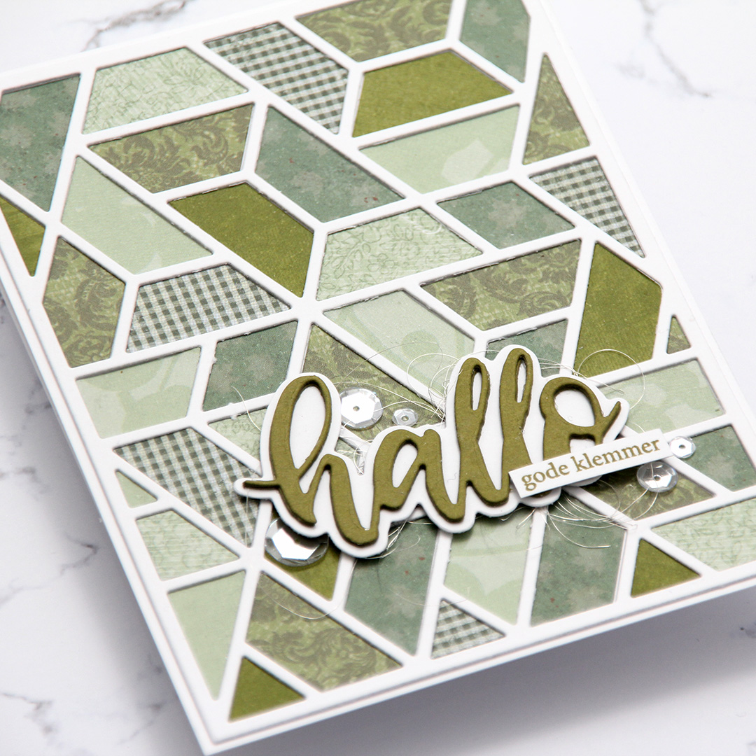 Simple, but the dimension in the frame and the focal point still give the card a little bit of interest.
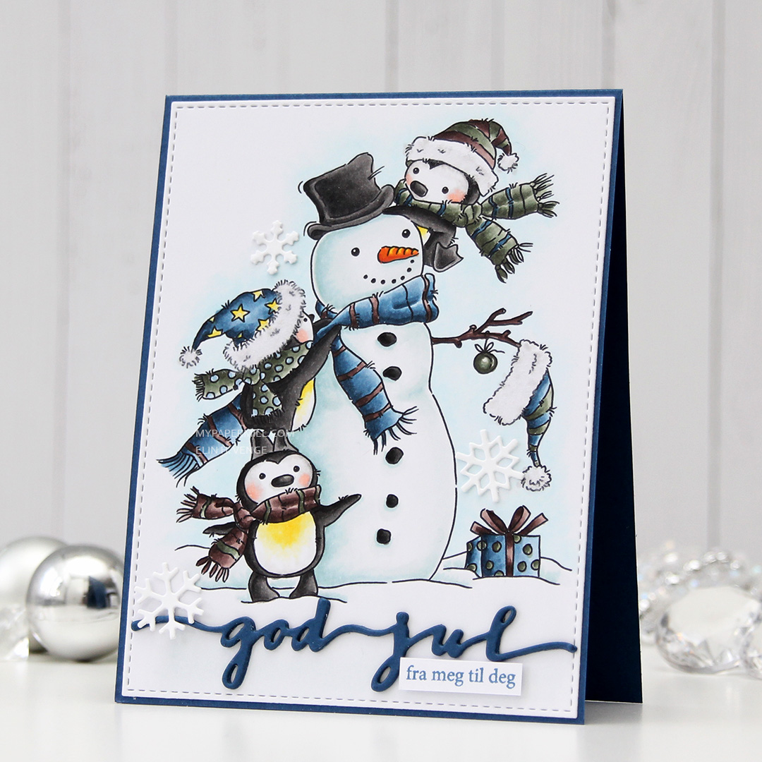 This image was part of the Christmas release from Lili of the Valley that came out a few weeks ago, you can find the stamp