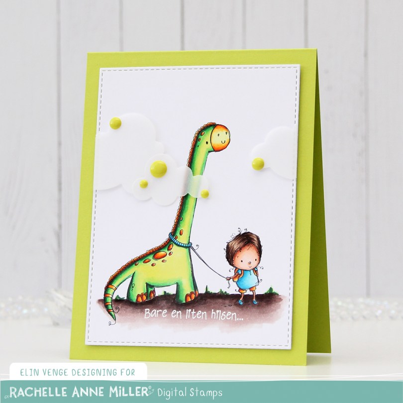
Hi, eveyone! The dumping of snow we got yesterday doesn’t stop me from wanting spring and summer, and my remedy tends to be on the colorful side. This card is so bright you might actually need sunglasses.
 I colored up Dinosaur from Rachelle Anne Miller, and this bright green is definitely one that you notice! The dinosaur actually reminded me of Littlefoot, and for some reason, I thought that he was green (he’s not, but Spike and Ducky are!). I die cut my colored piece down to a faux stitched rectangle using a die from My Favorite Things, before heat embossing a Norsk Stempelblad AS sentiment in white onto my colored ground.
 I added two layers of cardstock behind my colored piece, so it would stand out a little from my Limelight card base (colored card stock from My Favorite Things).
 I added some vellum clouds on tiny pieces of foam tape, so it looks like the dinosaur’s neck is really long, I thought that was a fun little detail to add. Placed some enamel dots from Papirdesign in strategic places to cover the foam tape, and made an envelope from Papirdesign patterned paper using the A2 V flap envelope dies from Simon Says Stamp for the card to go in.
 Bright, bold Copics!

 I thought
  Using Memento Bamboo Leaves ink, I stamped a sentiment from Norsk Stempelblad AS inside one of the balloons, stamped again in VersaMark ink and clear heat embossed it. It makes it stand out a little more from the balloon. I die cut the panel using a die from the A2 Stitched Rectangles STAX 1 set from My Favorite Things and adhered it to a card base made from Sour Apple card stock from MFT using lots of foam tape for dimension.
 I added Sparkling Clear sequins from Pretty Pink Posh to three of the balloons, and my card was finished. All that was missing was an envelope. The only colored envelopes for A2 sized cards I have left are in warm tones, so I decided to make my own using the A2 V flap envelope dies from Simon Says Stamp with a scrap piece of patterned paper from Papirdesign.
 I thought the color of the patterned paper matched the blue balloons on the card so well, and it made the pile in my scrap drawer shrink ever so slightly, gotta love that!
 I kind of went overboard with the number of Copics used for each balloon, but I think it turned out pretty good in the end.
 I don’t often purchase coordinating dies for stamp sets, but boy, they make it easy to add dimension. Once I’d colored up the little girl with the balloon, I die cut her and four additional pieces from white card stock to add dimension behind her. Way more sturdy than foam tape.
 I wanted to use lots of other goodies from MFT on this card, so I used the cloud stencil with a very light blue ink (Iceberg from Altenew) to create a barely there puffy cloudy sky behind her. It’s really soft, but shows up better in real life than in photos. I used a couple of elements from the Scene Builder stamp set and stamped those near the bottom using Fadeout ink from Inkon3 for a little bit of no line coloring. I die cut the largest of the Stitched Rectangle Scallop Edge Frames four times from Peach Bellini card stock and glued them together for dimension.
 I added clear Wink of Stella glitter and a thick layer of Glossy Accents on the balloon, before stamping and white heat embossing one of the sentiments in the Birthday Cutie stamp set onto Berry Sorbet card stock from Papertrey Ink. I die cut the sentiment using one of the Fishtail Flag Frames dies from MFT, and found some scraps in my stash that I’d already die cut using dies from the same set. I use that die set a lot. I added three green enamel dots from the Tropical Forest set from Altenew and my card was finished. I paired the card with a Persimmon envelope, also from MFT. I love their envelopes!
 Lots of colors for this one! I was going for a peachy pink jacket and leggings, but it was too close to the pink I’d used for the rest of her, so I added some yellows on top. I also decided to go for a brighter green on the grass than her little stuffie.
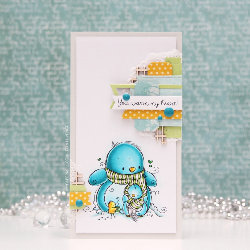
 My card measures 3 1/2 x 6 1/2″. I printed the image onto X-Press It blending card and colored it with my Copics. I was planning on doing a split complementary color scheme, but went with an analogous in the end, which is never a bad idea, in my opinion. I adhered the colored panel onto a card base I made from Soft Stone card stock from Papertrey Ink, adding two layers of cardstock behind the image for added dimension.
 It’s no secret that I love enamel dots, and the Cool Summer Night enamel dots from Altenew were the *perfect* color to match my penguin. Since I didn’t have any envelopes in the right size for this card, I created my own using patterned paper from Papirdesign and my envelope punch board from WRMK.
 I love this color palette. In addition to these colors, I also used BG71, which is a color I’ve created myself.
 I colored the image using my Copics, die cutting it with a faux stitch rectangle die from My Favorite Things for a nice finished loo, before stamping the definition of friend (stamp from Norsk Stempelblad AS) using VersaFine Onyx Black ink.
 I added shimmer to the bird and bee using my clear Wink of Stella brush. The sparkle is hard to catch in photos, but in real life it’s very shimmery. I found a scrap piece of patterned paper from Kaisercraft that was already cut down to the perfect size and adhered it to my card base, before adhering the colored panel on top of that. The color of the patterned paper matches the bird nicely. It’s a closer match in real life than I’ve managed to capture in this photo.
 I added a couple of sparkling clear sequins from Pretty Pink Posh and left it at that, this is a very simple card. In this photo you can see a little bit of the sparkle in the bird and the bee.
 Super limited color choices for this one. I also used BG71, which is a color I’ve made myself using refill of BG72 and blender solution.
 I stamped a sentiment from Norsk Stempelblad AS below the image using Scarlet Jewel ink from Papertrey Ink. Using a faux stitch tag die from My Favorite Things, I die cut four tags, one from the panel with the image and three from scraps of patterned paper from the Fröjdefull Jul collection from Maja Design. I glued two and two back to back, before gluing the two double tags together, offset quite a bit.
 On the back, I used another stamp from Norsk Stempelblad AS and the same color ink as I used for the front.
 I punched a hole through the top of the tag, added a red eyelet for strength, pulled some twine through and also added a snowflake charm to finish.
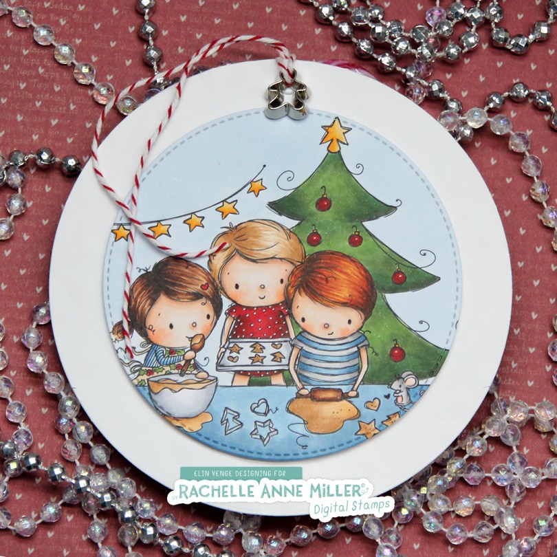
 I created this gift tag for my niece. It’s quite a big tag, its diameter is about 5″. The white circle panel isn’t just a panel, it’s dry embossed using an embossing folder from We R Memory Keepers. Unfortunately, dry embossing doesn’t show up very well in photos, and even less so when you’ve used white cardstock. It’s there in real life, though, and it provides a little bit of texture. I colored and die the Christmas Baking image from Rachelle Anne Miller, and popped it up on foam tape in the center of the white panel, before creating a hole at the top, adding an eyelet for strength. Through the hole I thread some cherry red divine twine and a tiny little cookie cutter embellishment, I thought it fit the image well.
 On the back I added another diecut circle that I’d already added a To/From stamp to, using Scarlet Jewel ink from Papertrey Ink. I cut a slit above and below that to feed the candy cane to, and double up on the foam tape when I glued it to the larger circle.
 Quite a few Copics for this one, and I used B90, which is a color I’ve created myself, on the background.
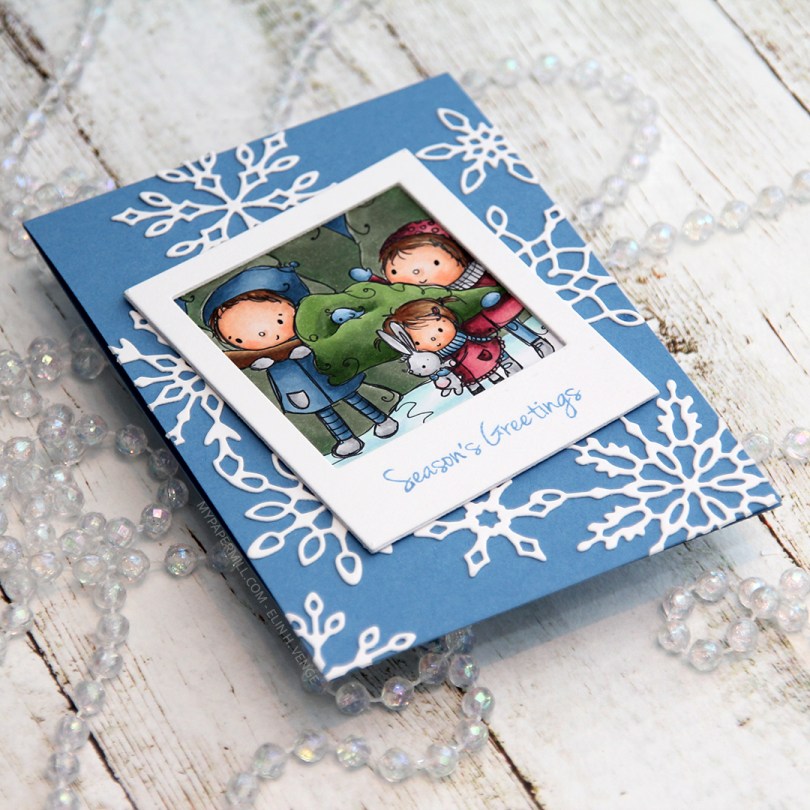
 I colored up just a portion of the image and made it into a polaroid by using a polaroid frame die from My Favorite Things that I love. I die cut the frame three times from white cardstock and glued them together for a stacked look.
 I decided to stamp a sentiment onto the polaroid frame using Blueberry Sky ink from Papertrey Ink. The sentiment is from a stamp set from Inky Wings.
 I decided to put my polaroid frame on a blue card base. This blue cardstock is Blueberry Sky from Papertrey Ink, the same color as the stamped sentiment. I used an old snowflake frame die from Memory Box that I diecut from white cardstock.
 I cut down my card base to make a 4 bar card. I like the smaller size, but don’t make too many cards this size, so I thought I’d change things up a bit. Once again, I have no graphic to show what Copics I used, but hopefully I’ll have my template remade in a few days.
 I started by coloring my little snowman and his friend using my Copics. I went with a bit of a split complementary color scheme on this one. I’m no fan of complementary colors, but split complementary are infinitely better, and blue green (which I used for the snow on the snowman), purple and orange are split complementary colors. I didn’t want a bright orange, though, so I went more coral, and I love how it turned out.
 I used a faux stitch rectangle die from My Favorite Things to turn my colored piece into a nice panel. I love these dies, they add such a finished look. I sprinkled on a moderate amount of chunky white embossing enamel from Stampendous and melted the powder. I love the snowy look this gives.
 I mounted my die cut piece onto a card base made from Lavender Fields cardstock from My Favorite Things using plenty of foam tape. This color perfectly matched the purple in my image, something I always try to accomplish in my cards for a nice, cohesive design. I die cut and stacked four Hurra from Melon Berry cardstock from Papertrey Ink using a Kort & Godt die. I love stacking die cuts, it adds a super nice look of dimension. I also white heat embossed a sub sentiment from Norsk Stempelblad AS onto more of that Lavender Fields cardstock, and stacked that, as well, making it flush with the die cut word.
 I added a couple of sparkling clear sequins from Pretty Pink Posh and my card was complete. I cut a little bit off the largest one with my scissors to make it look like it’s tucked behind that sentiment strip.
 Last, but not least, the Copic markers I used to color my image. I also used B40 and BG71, which are colors I’ve made myself.
 This card was a bit of an evolution. Things really didn’t go my way, but I was able to fix it all in the end. The piece of Papertrey Ink Stormy Sea card stock I was planning to use was a teeny tiny bit smaller than I needed to be (and I’m running seriously low on that particular color), so I used a die from Waffle Flower to cut it down a little, and it’s now 4-1/8 x 5-3/8″. I cut the center portion out to use for later, no one will ever know that there’s a whole in the center of it. I glued it to a top folding white card base, creating a nice 1/16″ border around the perimeter. Problem number 1 solved.
 Problem number 2: My hair was wet from showering when I started assembling this card, and there was a drop of water that fell on the bear’s head. Solution: Sprinkle on chunky white embossing powder from Stampendous and melt the powder with my heat gun…
 … which led me to problem number 3. My heat gun was too hot and I burned the panel. It’s not super visible in the photo, but it tuned the piece yellowish right underneath the pole. Solution: use Copics to color the snow under the bear in a similar color, making everything look intentional.
 My final struggle was figuring out where to put the sentiment from Norsk Stempelblad AS. I wanted it on the right side of the card, but it just wasn’t working, so I stamped and heat embossed it a second time with the fishtail end on the right and put it on foam tape on the left side of the front instead. I think it worked pretty well. I added a few snowdrift sprinkles from Little Things From Lucy’s Cards as my final touches.