Hello there {Mo’s Digital Pencil}

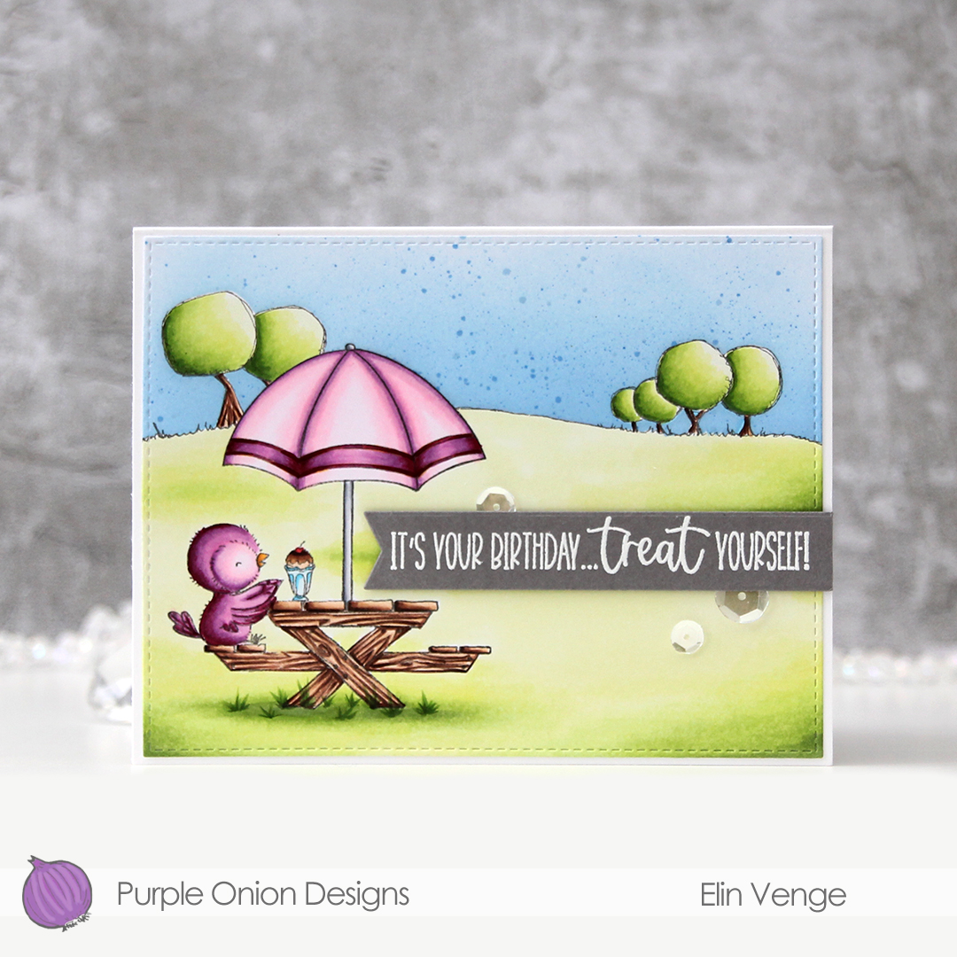
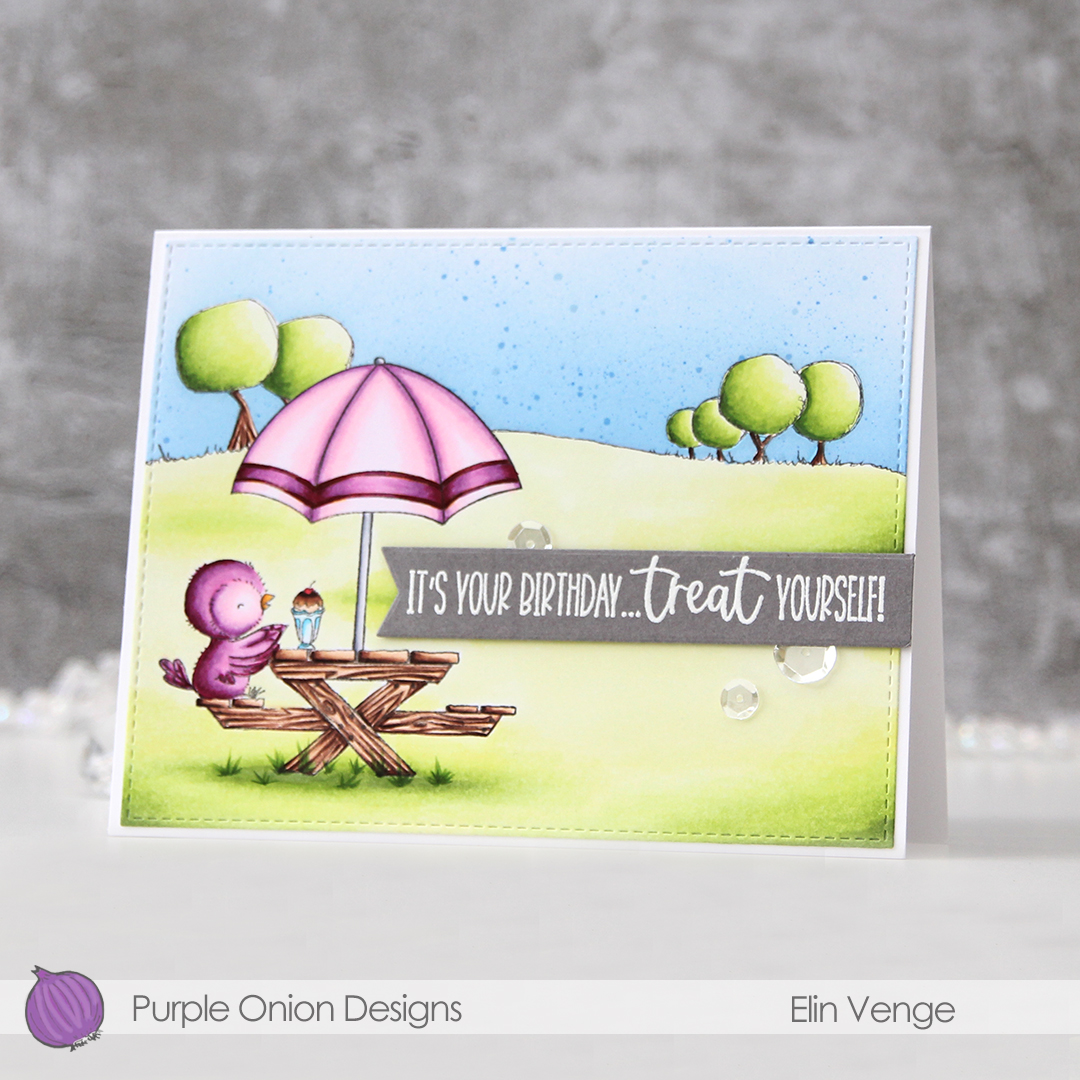
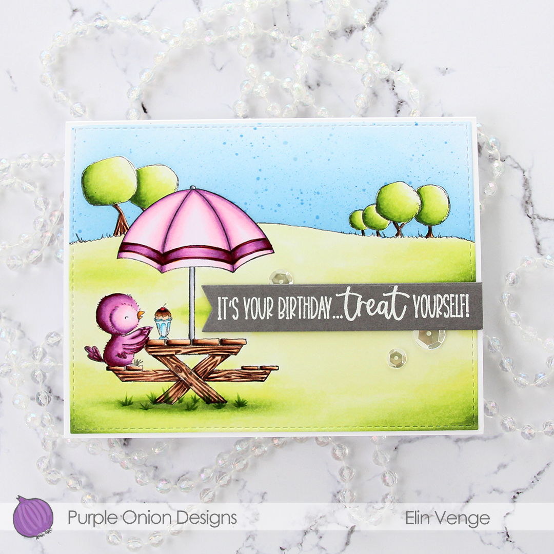
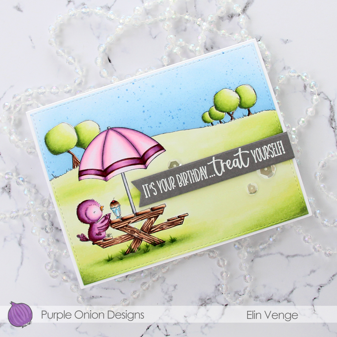
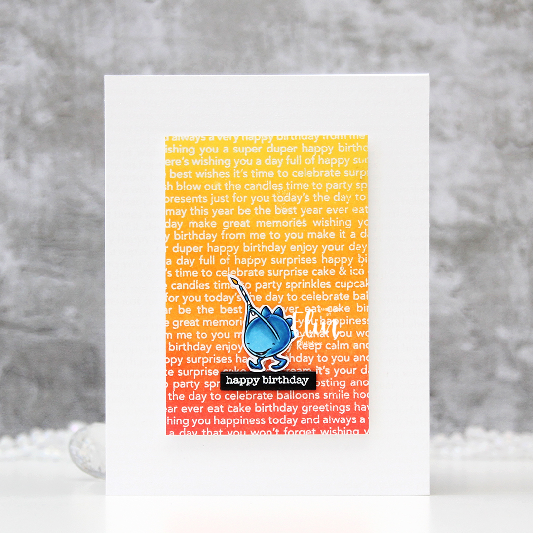
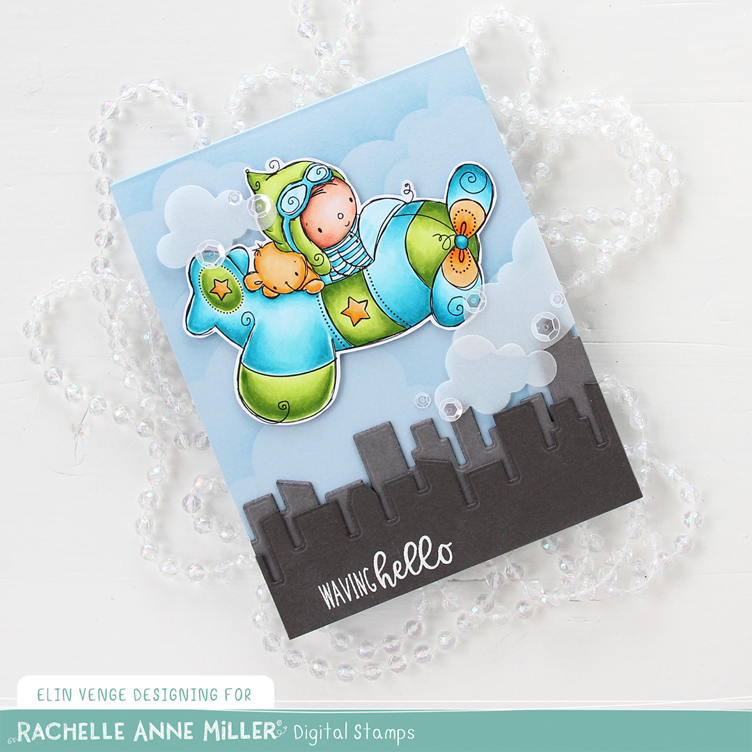
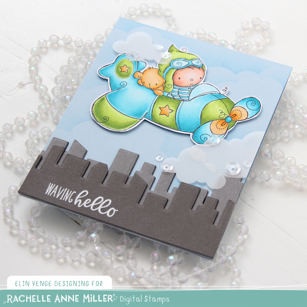
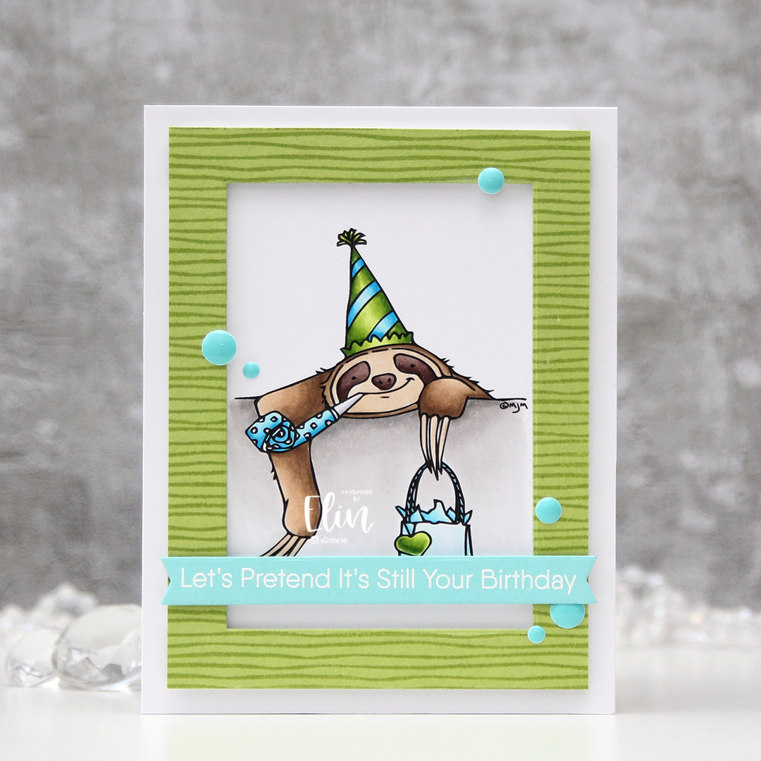
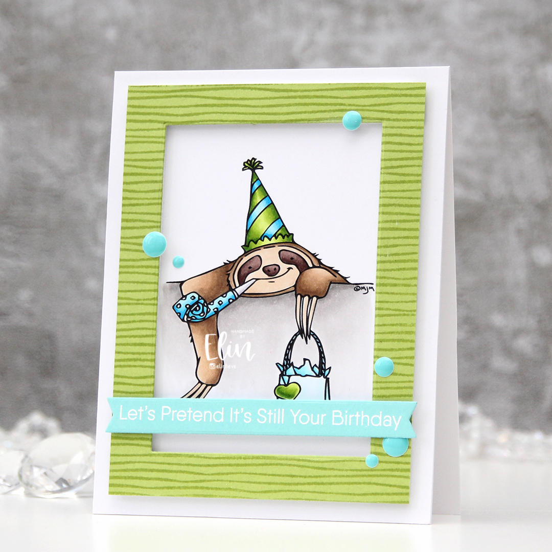
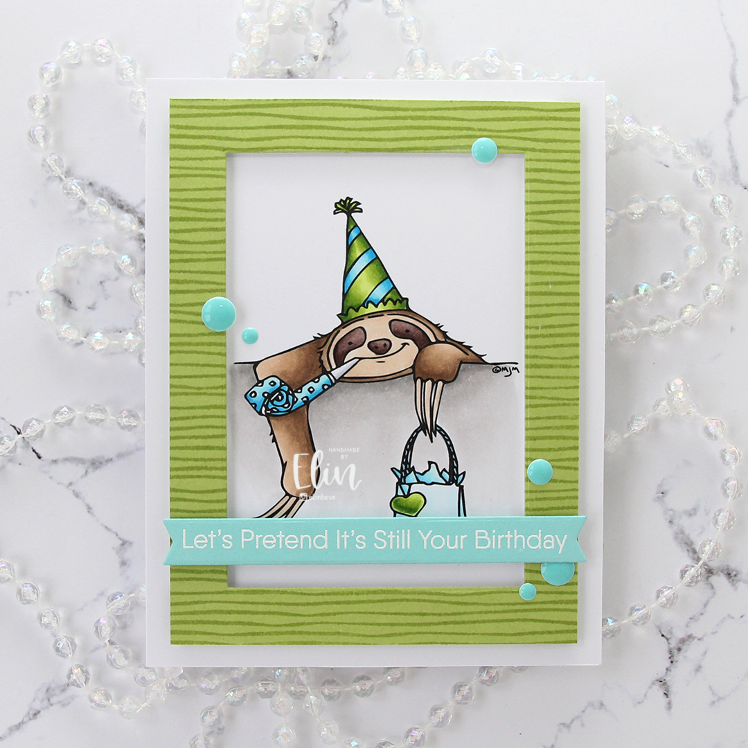
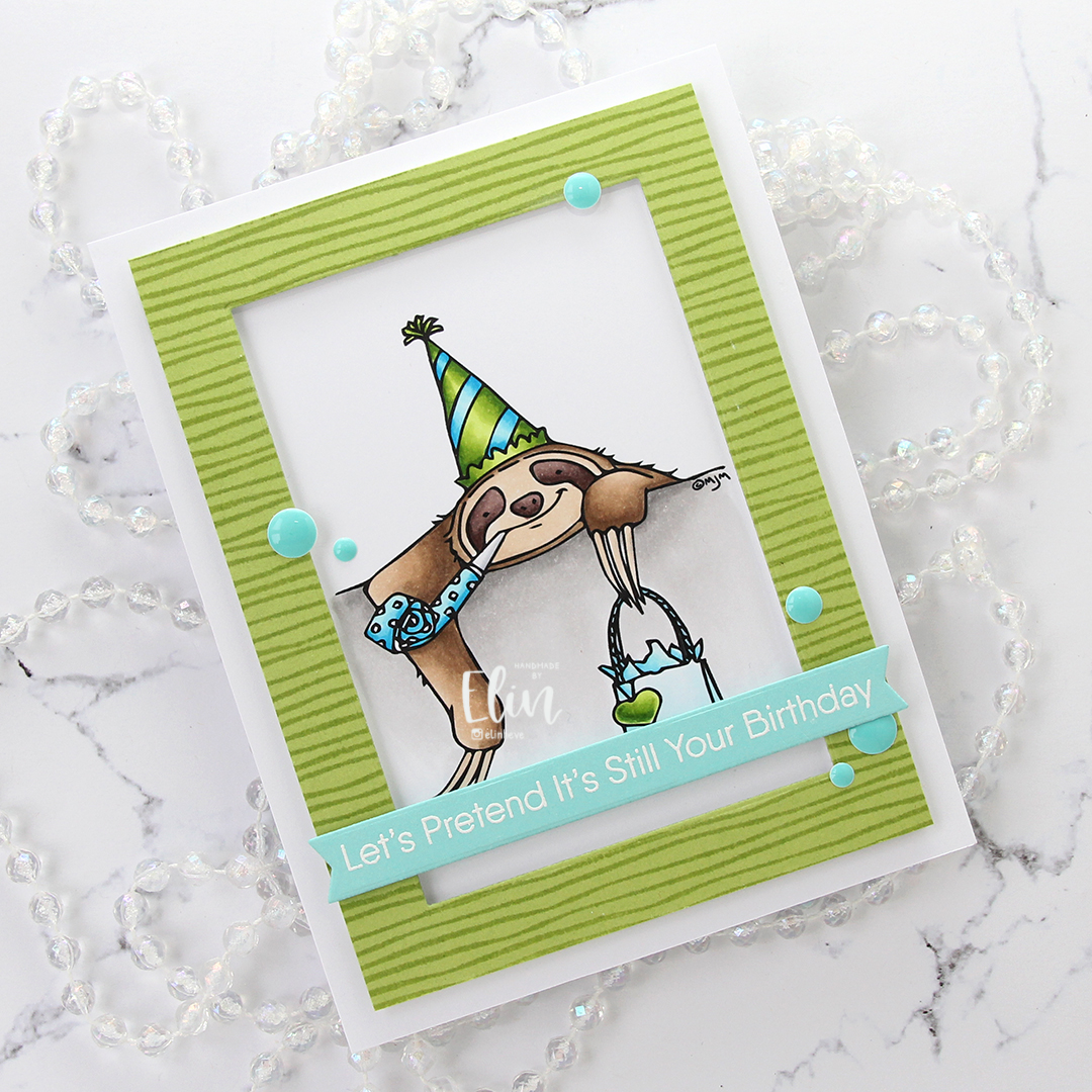
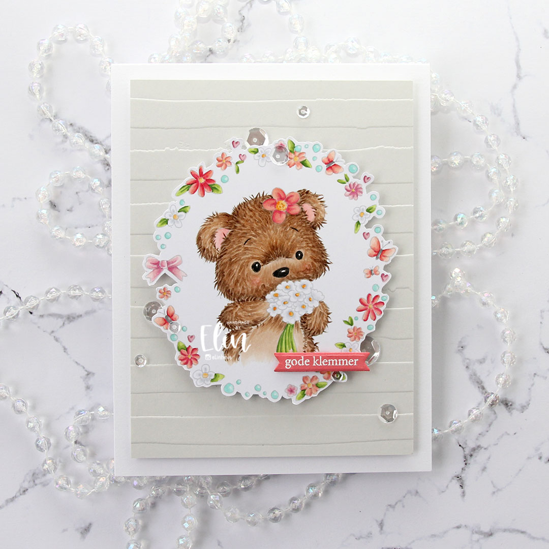
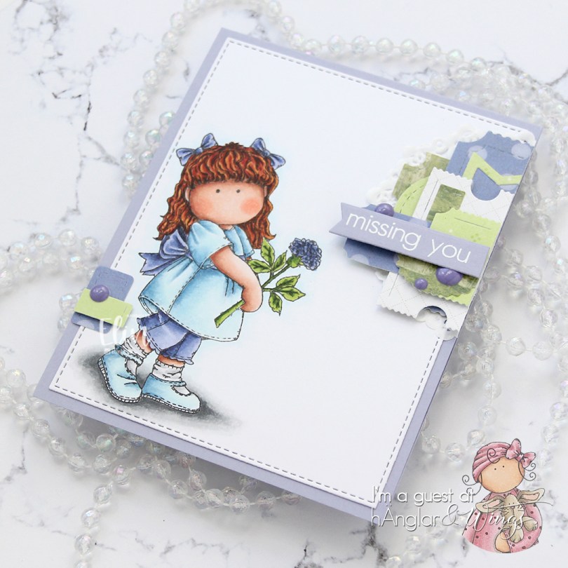
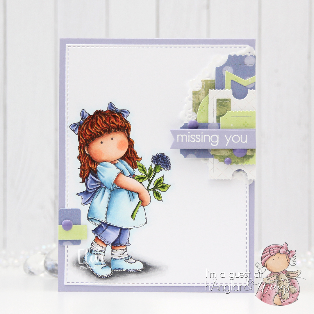
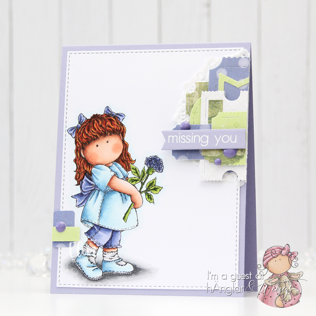
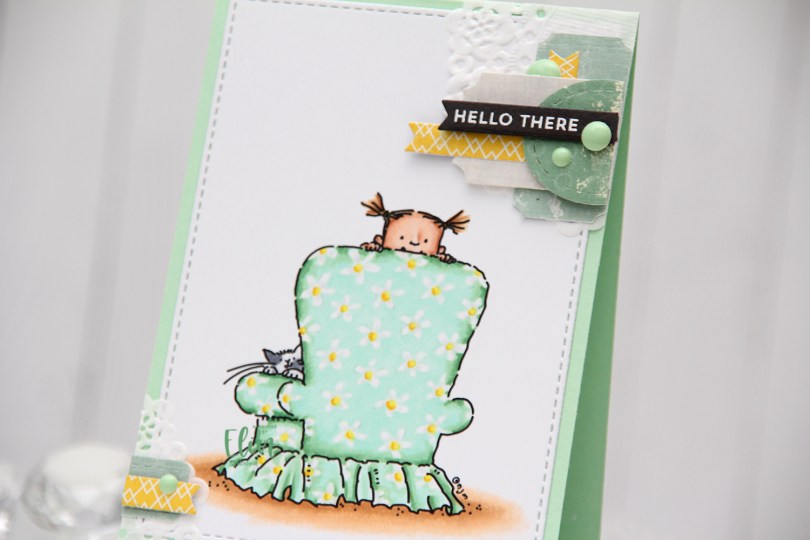
Hi there! Today’s card actually features an image called Hi there. This is a very simple image, and I should have been able to color it super quickly, but coloring the mint green around the white of the paper to leave the flowers white took a while. It might have something to do with the fact that I was watching the semi-final, then the first two parts of the finale of MasterChef Australia while coloring, but I won’t mention that.

Mo Manning Hi there front rett

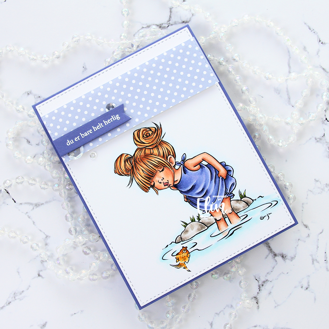
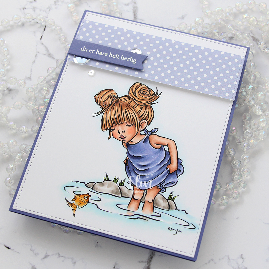
I used mostly light colors for my coloring on this card, and die cut the colored panel using a die from the A2 Stitched Rectangles STAX 1 set from My Favorite Things and adhered it onto a top fold card base made from Mint Julep card stock from Papertrey Ink. It’s a pretty small card measuring in just shy of 4 Bar dimensions at 3 1/2 x 4 3/4″. I added my “typical Elin cluster” in the top right corner using scraps of paper doilies from Doodlebug Design and scraps of patterned paper from various companies (Maja Design, Papirdesign, Diecuts with a view and Making Memories are represented here) die cut using dies from My Favorite Things and XCut.

Mo Manning Hi there front skrått

I stamped and white heat embossed a sentiment from the Itty Bitty Basics stamp set from My Favorite Things onto Smokey Shadow card stock from Papertrey Ink, before using one of the Itty Bitty Strips dies from MFT to die cut it. I added it on top of my cluster with a little bit of dimension behind it, before finishing off with a few enamel dots from Altenew. I added an even smaller cluster using similar elements in the opposite corner.

Mo Manning Hi there Copics

Not a lot of Copics, that’s bound to happen with a pale color palette.

Treat yourself! {Purple Onion Designs}

Hi, there! I’m back with another card where it’s pretty much all about the coloring. As a Stacey Yacula fan, getting the chance to play with her images is a dream, and today I dreamt up a very summery birthday card… with a sundae. Can’t beat a sundae!

Purple Onion Designs - Elin Venge - Juliet Tree Line Horizon Sunshiny Sentiment set front straight

I stamped Juliet, masked the umbrella and stamped the Tree Line Horizon before removing the mask and coloring in my scene using Copics. I usually color the whole panel, but this time I left the sky white.

Purple Onion Designs - Elin Venge - Juliet Tree Line Horizon Sunshiny Sentiment set front angled

To add color to the sky I once again placed a mask on the umbrella, masked off the trees and the horizon line and put a piece of printer paper at the bottom to protect the rest of the scene before using a blender brush from Taylored Expressions and inks from Altenew. I wanted a darker blue towards the grass, going lighter further up. I used Eastern Sky at the bottom and Iceberg towards the top.

Purple Onion Designs - Elin Venge - Juliet Tree Line Horizon Sunshiny Sentiment set flatlay

I wanted a little bit of extra interest in the sky, and decided to add some ink splatters. I added a spritz of sheer shimmer spray to an acrylic block along with Eastern Sky ink for a sparkly blue. I liked it, but thought it needed a little more contrast, and went one shade darker with Ultramarine mixed with a little bit of water and added that too.

Purple Onion Designs - Elin Venge - Juliet Tree Line Horizon Sunshiny Sentiment set flatlay angled

I stamped and white heat embossed a sentiment from the Sunshiny Sentiment set onto a piece of Gravel Gray card stock from My Favorite Things and die cut it using the largest of the three dies in the Fishtail Flag Frames die set, also from MFT. I added a couple of more strips of card stock behind the banner for a little bit of lift, and tucked a couple of sparkling clear sequins from Pretty Pink Posh under for a little bit of embellishment.

Purple Onion Designs - Elin Venge - Juliet Tree Line Horizon Sunshiny Sentiment set angled

I really really really love Stacey’s images, and they’re so much fun to create dreamy scenes from.

Purple Onion Designs Juliet Tree Line Horizon

I want to say I didn’t go overboard with my Copics on this one, but there were a lot of greens used for this card. I just can’t help myself.

Happy birthday to you!

A certain someone nudged me to play along with this week’s sketch at My Favorite Things. Little challenges like that really drive me, and using a stamp set from the July release, which came out earlier this week, I made a colorful birthday card with a party penguin!

My Favorite Things Penguin Party sketch 549 front rett

I wanted the focus to be on the party penguin carrying the balloon, and colored him before turning him into a stacked die cut (3 layers behind the colored one). I stamped and die cut the bunting from another stamp in the stamp set, but only added one layer behind each of these, they’re in the background, after all. On a piece of white cardstock, I stamped the Scattered Triangles background stamp using Picked Raspberry and Squeezed Lemonade distress inks. I thought the triangles went well with the bunting, and wanted an ombré effect from the hot pink up to the yellow. I’ve come up with a great trick for achieving this: ink blending on the stamp. By using blender brushes and ink blending onto the actual stamp, I get a really nice gradient in my stamping. It’s a little tough on my blender brushes, and a couple of the bristles have fallen off, but I don’t mind, I don’t normally ink blend that much anyway, a missing bristle or five is a nice trade off for the effect I get – I’ll take it.

My Favorite Things Penguin Party sketch 549 front skrått

I die cut the background using the largest die in the A2 Stitched Rectangles STAX 2 set and adhered it directly to a top fold card base made out of Ripe Raspberry cardstock. I die cut a stitched circle from the same color cardstock for the penguin to stand on, and mounted it using foam tape in the center of the card. I added a white heat embossed sentiment strip below, with lots of extra strips of cardstock behind it, so it would be flush with the penguin. I finished off the card by adding Glossy Accents to the balloon and a few Sparkling Clear sequins from Pretty Pink Posh, and glued what was left of the bunting on the inside of the card for added detail.

My Favorite Things Penguin Party skisse 549 Copics

Not a whole heap of Copics for such a small image.

It’s cake time {Mo’s Digital Pencil}

Hi, there. After yesterday’s super long blog post, I thought it was time for a shorter one. Just one card today, and it’s a super simple one. A tiny colored image, an emboss resist background, a cardbase and a sentiment. So, so simple.

Mo Manning Cupcake Monster front rett

I colored up a tiny monster from the Cupcake Monster stamp set from Mo’s Digital Pencil and fussy cut the monster leaving a white border. I prefer cutting along the edge, but this monster is so tiny, and with those thin arms, tiny legs and even smaller flame I decided it was best to leave a border. It also helps the monster stand out against the background a little bit better.

Mo Manning Cupcake Monster front skrått

Speaking of backgrounds. I stamped the Happy Birthday background from My Favorite Things onto white cardstock and clear heat embossed it, before ink blending over it with three different colors of distress ink (Worn Lipstick, Spiced Marmalade and Squeezed Lemonade). I mounted it using foam tape and placed in the center of the card base, which is also clear heat embossed using that same background stamp. I used 1 mm foam squares behind my monster and added a black cardstock strip with a white heat embossed sentiment from Mama Elephant for his feet to stand on.

Mo Manning Cupcake Monster Copics

It feels a little silly to be adding the Copic graphic for this one, but here it is in all its minimalist glory.

Waving hello {Rachelle Anne Miller Creative Studios}

Hi, there! I have a little pilot to share with you today. This image is from the July release from Rachelle Anne Miller and will be available for purchase on Thursday, along with the other images in the release.

Rachelle Anne Miller Little Pilot front rett

I’ve been using a lot of vibrant colors lately. I think there’s something about the sunshine and the warm temperatures that contribute to happy colors! I’m here for it, fall will be here way too soon anyway. I usually cut against the black lines when I fussy cut, but Rachelle’s images have wonderfully whimsical wispy lines on the outside, and I didn’t want to cut those away. The white border also helps make the plane stand out against the blue background.

Rachelle Anne Miller Little Pilot front skrått

Speaking of backgrounds, I used the Rolling Clouds stencil from My Favorite Things with Lazy Day ink (also MFT) directly onto my card base to create clouds in the background. The card base itself is made from Blue Breeze cardstock from My Favorite Things.

Rachelle Anne Miller Little Pilot flatlay

Using a die in the Slim Film City die set from Mama Elephant, I die cut a skyline from two gray colors of cardstock from My Favorite Things (Gravel Gray and Eiffel Tower). I die cut three layers of the lighter one (Gravel Gray) and stacked them. I die cut two layers of the Eiffel Tower cardstock and stamped and white heat embossed a sentiment from Purple Onion Designs onto the top layer, and adhered these two offset from the lighter gray buildings behind them.

Rachelle anne Miller Little Pilot flatlay angled

I wanted to add a little something extra, and decided to die cut a few clouds from vellum. I love creating vellum clouds, there’s something dreamy about them. I’d adhered my plane using 1 mm foam squares for a little bit of dimension, and by placing my clouds directly onto the plane and the layered cityscape, I get dimension without having to use more foam squares, which can kind of be a pain with vellum, because most things show trough. I put tiny drops of glue in strategic places behind my clouds, anchoring each of the clouds in two spots.

Rachelle Anne Miller Little Pilot flatlay høyre

I thought about adding enamel dots on top, but went with sequins from the White Orchid Sequin mix from Little Things from Lucy’s Cards. These aren’t as distracting from the focal image as enamel dots would have been.

Rachelle Anne Miller Little Pilot Copics

Not a lot of colors for this one.

Let’s Pretend… {Mo’s Digital Pencil}

… it’s still your birthday! I don’t know about you, but I’m notorious about not getting those cards in the mail. I know the birthday’s coming way in advance, and I make the card and everything’s ready to go… and then everything stops. The card doesn’t leave the premises when it should. If any of this is familiar to you, this card may be your jam. I had to color up this Belated Birthday Sloth from Mo Manning as soon as I saw it, it was just too funny and on the nose not to.

Mo Manning Belated Birthday Sloth front rett

It’s a very simple image, and I decided to color it up using one of my favorite color combinations. I kept my two main colors going on the rest of the card as well.

Mo Manning Belated Birthday Sloth front skrått

I stamped the Thick and Thin background stamp from My Favorite Things onto a 3 3/4 x 5″ piece of Sour Apple card stock using Sour Apple ink. The cardstock and ink are also from MFT. The ink is the new MFT formulation of their dye inks. The pad itself is squishy, which I don’t associate with dye inks at all, but they stamp very very well and super crisp! I used a rectangle die to die cut a window from the panel and used the remaining frame for my card. The sides of the frame were just wide enough for my foam tape to fit behind, without me having to trim it down.

Mo Manning Belated Birthday Sloth flatlay

Onto a piece of Summer Splash card stock, also from My Favorite Things, I stamped and white heat embossed a sentiment I thought went perfect with my belated birthday sloth. The sentiment is from the Balloon Bouquet stamp set from My Favorite Things. I used partial die cutting to turn my sentiment into a banner with flag ends using the Fishtail Flag Frames die set, also from MFT. I love my MFT products! I added that to my card using more foam tape and some foam squares.

Mo Manning Belated Birthday Sloth flatlay skrått

The card was super simple, and I felt like adding a little bit more to it, so I dug out the pack of Cool Summer Nights enamel dots from Altenew and added a few in a visual triangle on my card. Just an extra pop of that teal color against all that green.

Mo Manning Belated Birthday Sloth flatlay høyre

This card came together so easily, but I like all the dimension and particularly the colors. And the sloth, let’s not forget him, he’s the star of the show!!

Mo Manning Belated Birthday Sloth Copics

Not a lot of colors for this one. A simple image and simple color palette will do that. 🙂

Let’s get floral {Streamside Studios}

Hi! Sometimes, I like to change up the use of a stamp or two in a stamp set. Small stamps in stamp sets, for example, are great for making backgrounds (though time consuming). This time, I’ve turned a floral image from the Fairy Happy Couple stamp set from Streamside Studios into a card that isn’t wedding related at all. It could be, though, I chose a sentiment that can be used for a birthday card, a wedding card and many other occasions.

Streamside Studios Fairy Happy Couple front

This wedding bouquet is so gorgeous, and I printed it onto X-Press It blending card before fussy cutting it, leaving a white border around the edge. For some reason, I’ve been riding a pink, peachy, yellow wave whenever I’ve colored flowers lately, and this one is no exception.

Streamside Studios Fairy Happy Couple flatlay skrått

I cut down a piece of Lemon Tart card stock from Papertrey Ink to 3 1/4 x 5 1/2″ and ran it through my die cutting machine with an impression plate to create some texture to my yellow background. I mounted it with foam tape onto a side fold A2 card I created using Stamper’s Select White card stock from Papertrey Ink. It’s my favorite white card stock, it’s thick, bright white and doesn’t crack.

Streamside Studios Fairy Happy Couple flatlay

Onto the yellow, I added my colored flowers using 1 mm foam squares. On the part that hangs off the yellow edge, I used foam tape in addition to the 1 mm foam squares to prevent sagging and make everything level. Using a die set from Papirdesign, I created a stacked sentiment. For the shadow, I used some 40 lb vellum, and on top of that I have four white die cuts stacked on top of each other for dimension. The trick here is that I also put two layers of white die cuts behind the vellum, giving it a little lift. In fact, the part of the word that overhangs to the right of the flowers has an additional three white die cuts behind it to compensate for the height of the 1 mm foam squares behind the flowers. Dimension is life?

Streamside Studios Fairy Happy Couple flatlay høyre

I stamped and white heat embossed part of a sentiment from Norsk Stempelblad AS onto Melon Berry card stock from Papertrey Ink and added a few more strips of the same card stock behind it for dimension. I embellished the card very simply using sparkling clear sequins from Pretty Pink staggered around the flowers. Some are tucked behind, others hanging off the edge, I really like the effect it brings.

Streamside Studios Fairy Happy Couple zoom 1500

Lots of layers, and lots of dimension.

Streamside Studios Fairy Happy Couple Copics

Quite a few colors despite a fairly simple palette. I didn’t want the center flower to be the same color as the other ones, so I went in with dark colors and plenty of layers before I was happy.

Bear hugs {Lili of the Valley}

Hi! I have a simple card to share today, featuring Jenny floral border, which is an image from Lili of the Valley. I printed the image with a low opacity setting to get the no line look and colored in my image with Copics, drawing the facial features back in with a black pen.

Lili of the Valley Jenny floral border front rett

I don’t often color fur like this. It’s very relaxing to do and a very forgiving technique, but it’s a time consuming one, layering up all those fine lines isn’t done in five minutes, or fifteen, for that matter, so I don’t usually take the time to do it, but this cute little bear was begging for it.

Lili of the Valley Jenny floral border front skrått

Using the watercolor stripes stencil from Altenew, I dry embossed a piece of Soft Stone card stock from Papertrey Ink. I’ve had a love affair with the Papertrey Ink card stock for close to a decade now; it’s my favorite, and this particular grey color is so soft and perfect! I mounted it onto a top fold white card base (made out of Stamper’s Select White card stock, another one from PTI) using lots of foam tape, leaving a 1/4″ border around the edge. Using even more foam tape, I mounted my fussy cut colored piece in the center of the grey card stock for even more dimension.

Lili of the Valley Jenny floral border flatlay høyre

I stamped and white heat embossed a sentiment from Norsk Stempelblad AS onto a scrap piece of Berry Sorbet card stock from Papertrey Ink and turned it into a small banner with one of the dies in the Itty Bitty Strips die set from My Favorite Things. This particular pink card stock is another favorite of mine, and I only have tiny scraps left, I need to stock up! I mounted the banner onto my colored piece using 1 mm foam squares.

Lili of the Valley Jenny floral border flatlay rett

I added sparkling clear sequins from Pretty Pink Posh to finish off my card. Three groupings forming a visual embellishment triangle. I usually only place my embellishments near the sentiment to draw the eye to the sentiment, but for this one I staggered them elsewhere too. I love that these sequins come in a bag with four different sizes. I have other sequins I love too (the mixes from Little Things from Lucy’s Cards are awesome), but I still believe these are my favorites. If I could only buy one type of sequins for the rest of forever, these are the ones I’d choose.

Lili of the Valley Jenny floral border flatlay angled

I’m sending sparkling, dimensional, flowery bear hugs your way!

Missing you {hÄnglar & Wings}

Hi there! A few months ago I was asked to guest design for hÄnglar & Wings. I have a hard time saying no to guest design gigs no matter how busy I am, and today I’m sharing the first of two cards I made with the stamp set I chose. Part of me wanted to choose a Christmas set (I loooove creating Christmas cards), but I went completely opposite in the end and chose a stamp set with a couple of very summery girls called Bästa Vänner.

hÄnglar & Wings - Bästa Vänner missing you front

For this first card I decided to create a card that is very typical for me. Colored image, die cut panel with faux stitch edge and an embellishment cluster with a sentiment.

hÄnglar & Wings - Bästa Vänner missing you front skrått

I colored the girl from the Bästa Vänner stamp set with my Copics, and used a die from My Favorite Things to turn it into a panel with the aforementioned faux stitch edge that I love so much. I adhered it to a card base I made out of Wild Wisteria card stock (sadly, a discontinued color) from My Favorite Things.

hÄnglar & Wings - Bästa Vänner missing you flatlay

I love creating these embellishment clusters with die cut patterned paper scraps. I have a tub of these die cut scraps on my desk, sorted by color so I don’t have to go through the whole tub for each card. I typically choose two or three colors that go with the colors in my image and play with sizes and directions of my scraps until I come up with a design I’m happy with. It’s my favorite way to use up my patterned paper scraps. Back in the day I used a ton of patterned paper, and I still have lots left as I don’t use much of it anymore, but this method makes my scrap pile shrink ever so slightly with each cluster.

hÄnglar & Wings - Bästa Vänner missing you flatlay høyre

For this cluster I used paper from P13, Imaginisce, Scenic Route and Karen Foster. I put a mini paper doily from Doodlebug Design at the bottom and built up my cluster with a little bit of foam tape here and there for dimension. The sentiment comes from the Bästa Vänner stamp set, embossed in white on a die cut piece of the same color card stock that I used for my cardbase. To finish off the card, I added a few enamel dots from Altenew.

hÄnglar & Wings - Bästa Vänner missing you Copics

Not a whole heap of colors used for this one.

You are simply wonderful {Mo’s Digital Pencil}

Hi! Today, I have a simple card to share. Nothing out of the ordinary, really, my cards are usually pretty simple.

Mo Manning August front rett

August from Mo Manning is such a cute image, and I colored it up with my Copics in the beginning of the month, and I’ve turned my colored piece into a very simple card.

Mo Manning August front skrått

I die cut my colored piece with the largest of the A2 Stitched Rectangles STAX dies from My Favorite Things and adhered it to a top fold card base I made from Lavender Fields card stock, also from MFT. I also die cut a white piece to put on the inside of the card for a space to write a personal message.

Mo Manning August flatlay

I die cut a patterned paper piece from My Favorite Things using the same die, and cut it down to a 1 1/4″ strip with my paper trimmer. I mounted it on foam tape above my image. I love that the faux stitch edge is continuous across the colored panel and this patterned paper strip.

Mo Manning August flatlay angled

I stamped and white heat embossed a Norsk Stempelblad AS sentiment onto a separate piece of Lavender Fields card stock, and die cut it into a banner using the smallest die in the Fishtail Flag Frames die set from My Favorite Things and mounted it on 1 mm foam squares to the patterned paper.

Mo Manning August flatlay høyre

I finished off with a few sparkling clear sequins from Pretty Pink Posh near my sentiment.

Mo Manning August Copics

I used lots of colors for her skin, but other than that, I didn’t use a whole lot of Copics for this one.