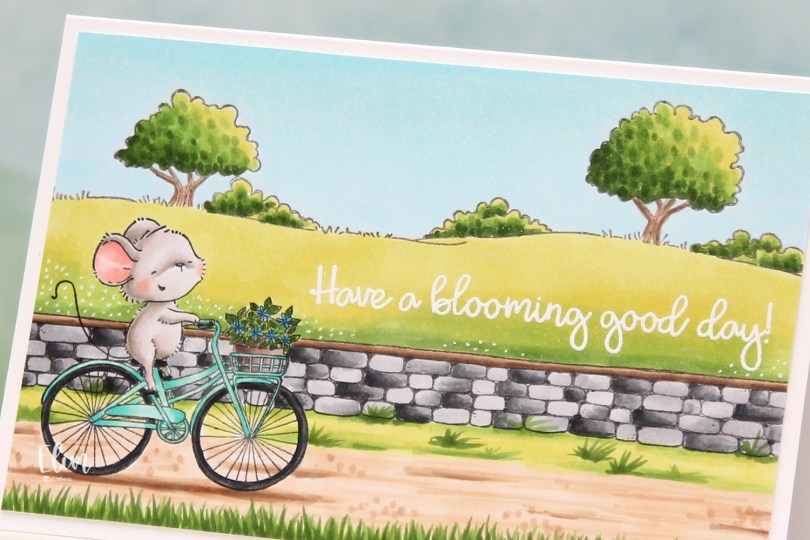
Hi, crafty friends. I have a springtime card to share today. Can you tell I’m sick of this cold, wet, snowy, rainy weather? This is Anna from Purple Onion Designs, riding her bike in the country side with a stone wall separating her from fields of green.
 I love how happy this mouse looks riding that bike. Stacey Yacula has a way of creating characters that really come to life, I’m such a big fan of her style.
 I stamped Anna, added a mask, then stamped the stone wall. Both were stamped with Extreme Black ink from My Favorite Things, which is a Copic friendly ink. I then used second generation stamping with the country side background, this time with Memento Espresso Truffle ink for a somewhat softer look.
 I colored in my scene using Copics, then stamped and white heat embossed a sentiment from the Around the Town sentiment set.
 I used a white Gelly Roll 05 to create the white dot “flowers” in the background and added my panel to a top folding white card base I created. The finished card measures 6 x 4″.
 This is a very mail friendly card. No embellishments, it’s almost one layer and sooo simple.
 Quite a few Copics, but that usually happens with these full scene cards I create with Purple Onion stamps.
 This is
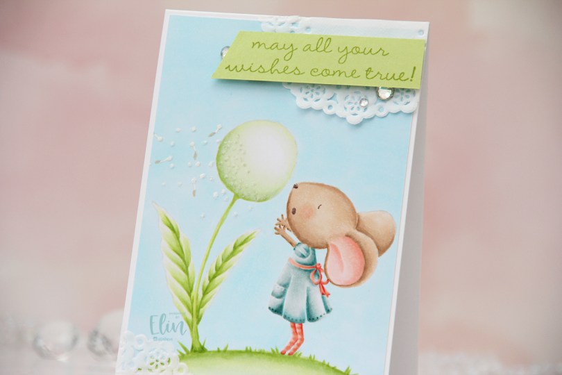
  I love no line coloring, and no line is perfect for an image like this, which has just enough detail to make it interesting, but it’s still large enough to get soft gradient in colors and not too fiddly.
 Once I finished my coloring, I added my panel to a 4 bar card base I created from Stamper’s Select White cardstock from Papertrey Ink. I created some texture to the dandelion fluff by using my Quickie glue pen and sprinkling on Rock Candy Distress glitter.
 I adhered scraps of a Doodlebug mini paper doily to opposite corners of the card to add to the soft, delicate look I was aiming for. Using Sour Apple ink from My Favorite Things, I stamped a sentiment from the
  Very soft color palette.
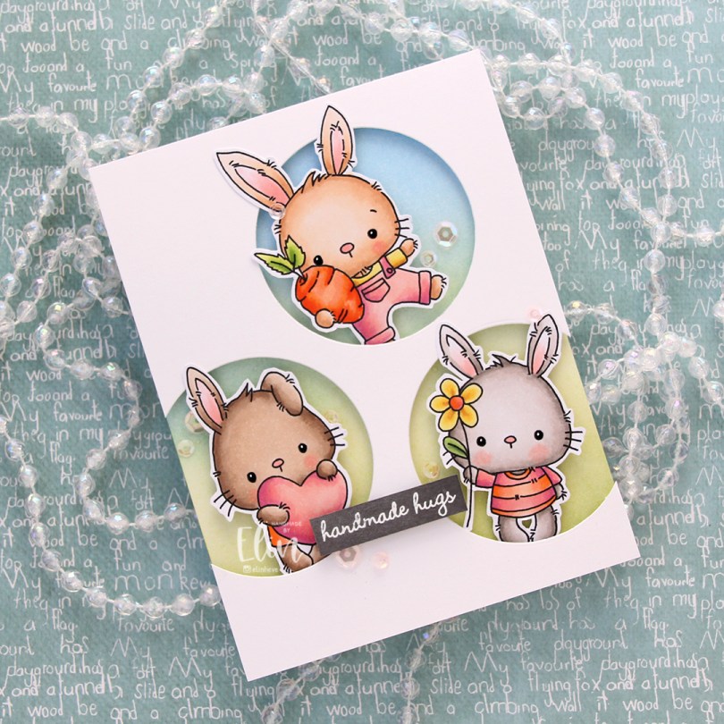
 These guys are from the
  Onto the card base, I ink blended Fresh Leaf and Eastern Sky inks from Altenew to create a soft background that went from green to blue. I then added splatters of my sheer shimmer spray from Imagine. It’s not really visible in the photos, but in real life it adds a bit of sparkle.
 I die cut three circle openings in a quarter piece of white cardstock and mounted it with foam tape to the card base.
 I added foam tape to the back of my critters, popping each of them into the circle openings. I stamped and white heat embossed a sentiment from InkyWings onto a piece of Mushroom cardstock from Concord & 9th, mounted it on foam tape and added it to the card.
 To finish off the card I added sequins from the Rosy Glow mix from Little Things from Lucy’s Cards.
 Such a simple color palette for this one. Aside from the colors of the fur, which differ for each bunny, I used the same colors throughout.
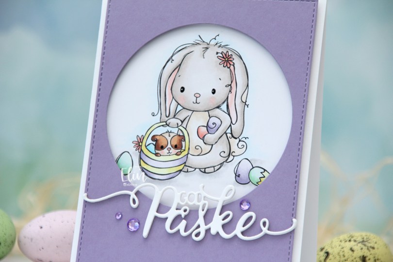
 I used the
  I wanted a pastel look for my card, and this is probably the lightest wash of color I’ve ever done with my Copics. Except for E25 on the guinea pig, I’ve only used markers ending in numbers that are 3 or lower. That’s super light for someone who doesn’t shy away from using markers ending with 9. Once the coloring was complete, I used a black glaze pen to create shine in their eyes, and I went over it with a dot of white Gelly Roll 05 on the bunny.
 From a piece of Winter Wisteria cardstock from Papertrey Ink, I die cut a circle opening and also used a faux stitch rectangle die from My Favorite Things to create a little bit of extra interest around the edge of the panel, before mounting it on foam tape.
 I used a die from Papirdesign to make my God påske (Happy Easter in Norwegian) sentiment, and made it dimensional by stacking four white die cuts on top of each other, before finishing off the card with a few crystals from Papirdesign that match the Winter Wisteria cardstock nicely.
 Here it is, the softest color palette ever.
 I colored the image with Copics and fussy cut around it, leaving a white border. This image is pretty easy to fussy cut, so it didn’t take long. I’m trying to get out of my standard “full panel with cluster” mode, and fussy cutting the image gives me endless possibilities.
 I needed something in the background behind my image, and decided to create a circle stencil to ink blend into. I used Distress Ink from Ranger in Abandoned Coral, Spiced Marmalade and Squeezed Lemonade, before I removed the stencil and looked through my stash of background stamps I could use to add some more interest. I wound up with a mixture of stamps from Inkido, Tim Holtz and My Favorite Things, and used Distress Ink once again for the stamping. This time Spiced Marmalade and Mustard Seed for a bit more of an intense yellow on top of the ink blending.
 I mounted the image using foam tape, and die cut the word happy from the Bold Happy Birthday die set from My Favorite Things. I die cut four of each letter and stacked them for a dimensional look, overlapping them on my card to make them fit.
 I stamped and white heat embossed a sentiment from the Anything-but-Basic Birthday Wishes stamp set from My Favorite Things onto a piece of Caribbean Sea cardstock, also from MFT. The sentiment actually says Commencing Happy dance, but since I already had a diecut happy, I only needed the first and last word for my card. I added three additional strips of cardstock behind the words for dimension, and finished off the card with a few enamel dots. The teal ones are from the Cool Summer Nights pack from Altenew, the orange ones from a Halloween pack from Papirdesign. I also added a dot of black Glaze pen to the kittens’ eyes and the boy’s eyes, then a white dot using the Gelly Roll 05 from Sakura once the black had dried on the boy.

 Aren’t these bunnies cute? I paired the three bunnies in the Teacup Bunnies stamp set with a digital sentiment. The sentiment will be a freebie digi, along with a few others in the same style and sub sentiments to pair with it.
 I colored the bunnies and letters with Copics and did some fussy cutting, leaving a thin white border to preserve the “fuzzies” that are part of the signature Lili of the Valley style. I used a black glaze pen for their eyes to make them pop and shine, and once dry, added a tiny white dot to each eye using a white Gelly Roll 05 pen.
 I used the Crystal Distortion Embossing folder from Simon Says Stamp on a piece of Lemon Tart cardstock from Papertrey Ink to create a little bit of interest in the background. Below the yellow panel, I added a strip of Sprout cardstock from Concord & 9th for a little bit of extra green.
 I adhered the cardstock pieces to a white top fold card base and mounted the teacup bunnies and sentiment on foam tape for dimension, before finishing off with a few enamel dots from the Tropical Forest set from Altenew.
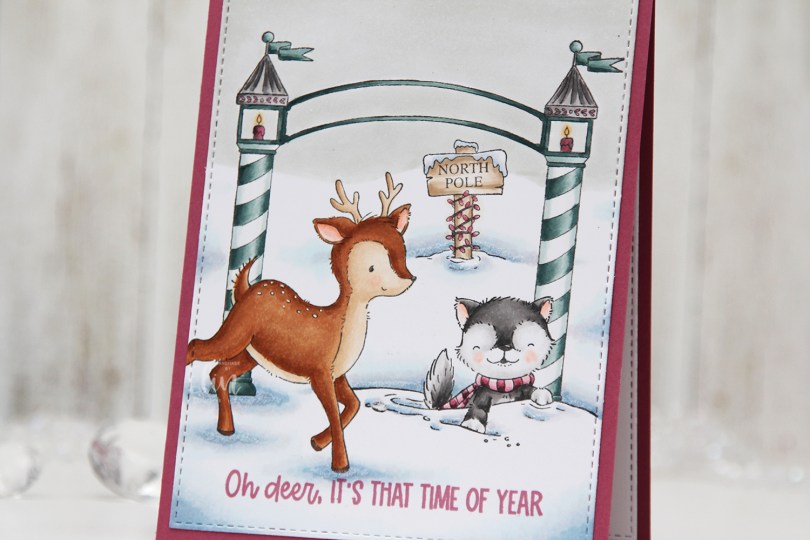

 I used a white Gelly Roll 05 pen to create the white dots on the deer, and a die from the A2 Stitched Rectangles STAX 2 set from My Favorite Things to create the faux stitching on the edges of the panel. By not stamping the entire deer, it creates a dynamic effect of having it walk in from the edge of the card.
 I stamped a sentiment from the
 The pink and blue green color combination is definitely not traditional for Christmas, but I kind of like it. What do you think, does it work?
 Quite a few Copics for such a simple card.
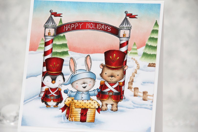
 Whenever the design team members get a glimpse of the new collection, I start my planning process. I sketch out very rough card ideas using the stamps I’d like to work with, send my stamp wish list off to Michele, the owner of Purple Onion Designs, and then wait patiently for the stamps to arrive.
 Whenever there’s a new collection I like to create scenes to show off as many of the cute images as possible (without overcrowding the card), and for this card I stamped
  I always start by coloring the sky, and for this collection, I wanted each of my cards to have a different sky. I tend to go for all blues, but winter sunsets are explosions of color, so I was very conscious of that when I created my card. Once the sky was done, I colored the snow, followed by the trees and that cute fence, before starting with the rest of the scene.
 I colored the critters, then the arch and finally all the red. I always leave the red details to the very end. It eliminates the chance of smearing and getting red ink where you don’t want it when you go in with another color right next to it. I wrote Happy Holidays with a black 0.35 Copic pen before coloring, but once the red was colored, you could hardly see the lettering, so I went back over with a white 05 Gelly Roll pen, and the text is much more visible now. My Ps are a little further apart than I’d like, and they’re also leaning a tiny bit to the right, but it’s a homemade card, it’s not supposed to be perfect, right?
 Whenever I create these scene cards with Purple Onion images, I always let the stamping and the scene itself dictate the size of the finished card. This one wound up at 5 1/4 x 5 1/4″, which seemed pretty perfect. I haven’t made a square card in a while, so this was fun.
 I used an obscene amount of Copics for this card.
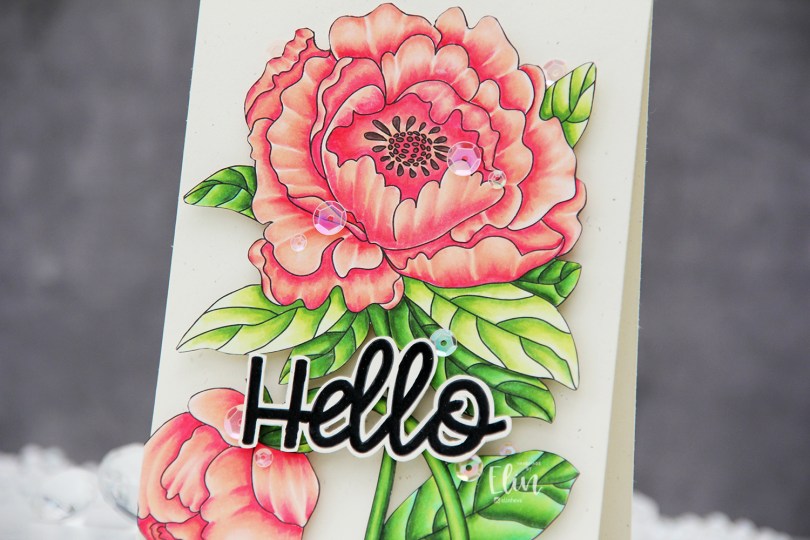
 I used the large flower from the Lovely hello stamp set for this card. This image is huge, and it covers most of an A2 card front. I colored the image with Copics and then fussy cut the whole thing. This image isn’t very detailed on the edges, so it was easy enough to fussy cut.
 I mounted my fussy cut image to a card base I created from Rustic Cream cardstock from Papertrey Ink using the Double Thick Crystal Clear Foam Tape from the Rabbit Hole Designs. This tape is super thick and super sticky, and it adds a ton of dimension.
 I used part of a sentiment from the same stamp set. It actually says Hello lovely, but I wanted the hello. I also fussy cut this, leaving a thin border around the black letters. There’s a coordinating die to go with this sentiment, but I don’t have it and don’t actually mind fussy cutting.
 I popped up the sentiment with foam tape and added sequins here and there using the Rosy Glow mix from Little Things from Lucy’s Cards to finish the card.
 This card has it all – dimension, shine and a gorgeous flower. What more could you possibly want?
 I used very few Copics for this image, actually.
 I created a very simple scene for this card, stamping the snowman in Fadeout ink from Inkon3 before adding a mask, then stamping the
  Every once in a while, I break out my airbrush system. I actually keep it out on my desk, but I have a big desk and don’t usually sit close to it. I love the airbrush system, it’s such an awesome way to get a layer of color quickly. Coloring an entire nighttime sky with Copics takes a while, airbrushing it is faster. Use colors that are darker than what you think you want, and make sure there’s enough ink in the marker before starting. I used B99 and B97 for this sky, and it’s wonderfully dark and the perfect backdrop for the lighter colors of the snowy scene in front.
 Once I finished the airbrushing, I carefully removed the masks and did no line coloring of the rest of the scene. At this point, I’ve colored snow so often, I can do it in my sleep. This snowman is pretty easy to color too, most of the areas are pretty big surfaces, so it’s a very forgiving image.
 After I finished my coloring, I stamped and white heat embossed a sentiment in the sky. The sentiment is actually from the Scripty Xmas stamp set from Mama Elephant, I kind of forgot for a second that I was creating a Purple Onion card, I was a little lost in a creative zone. After heat embossing the sentiment, I sprinkled on chunky white embossing enamel from Stampendous to create my super snowy scene, making sure to remove any granules that landed on top of the embossed letters before melting the granules from the back.
 I trimmed 1/8″ off each side of my scene and adhered it to a white card base I created from white cardstock from Papertrey Ink, deciding not to add any embellishments. I figured there was enough going on already with all the snow.
 As usual – lots of colors used for the snow. The two blues at the very bottom after the break are the colors I used for the airbrushed sky.