
Hi, crafty friends! I suppose it’s hard not to notice that I create a lot of cards with peach tones. I spent quite a bit of time this week creating a ton of die cut color combo swatches from C9 cardstock to kind of step away from the peach. Obviously, there are combos with peach in them, but I also have plenty without.
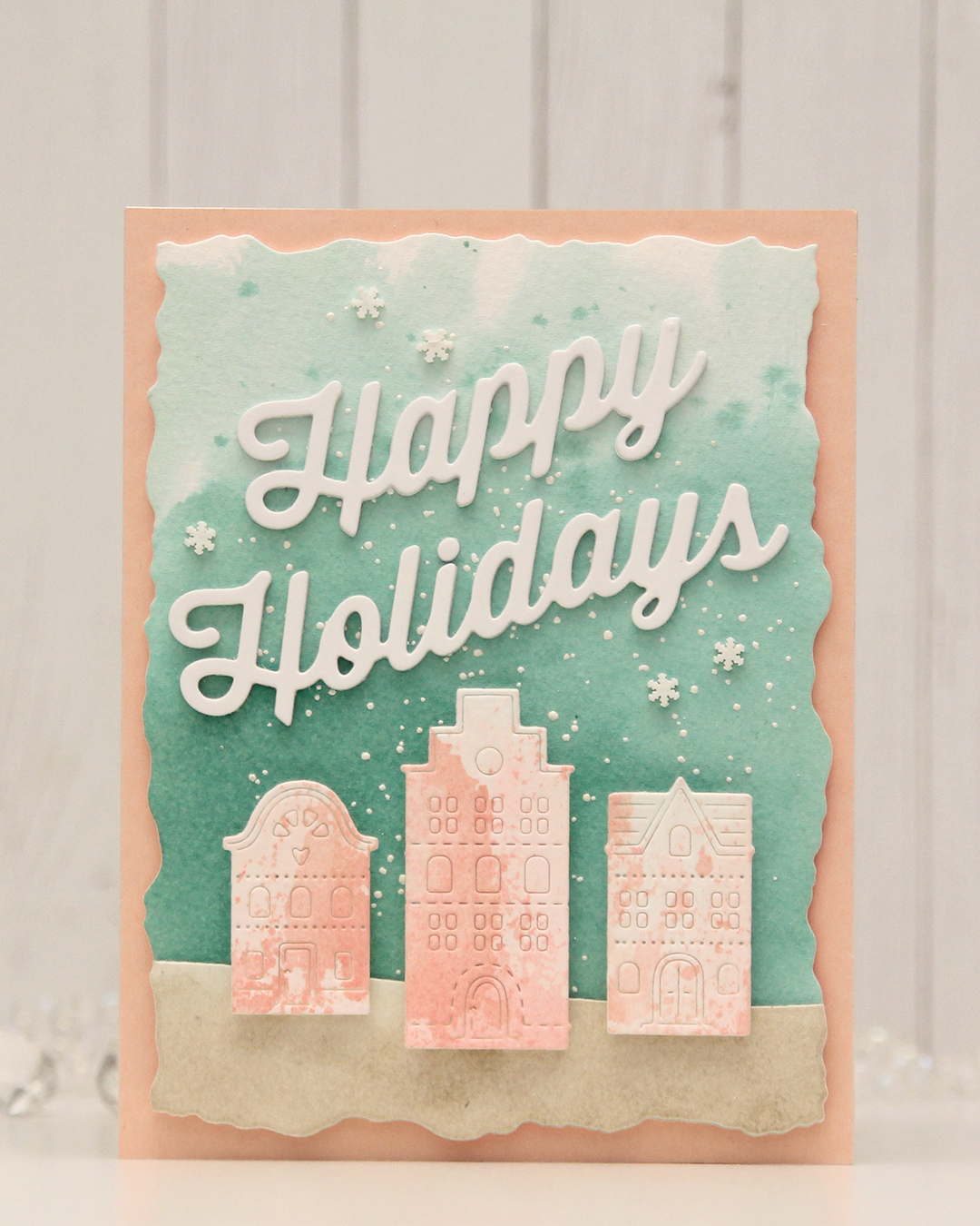 For this card, I really tried. I chose a color combo of Pebble, Ballet Slipper, Brickyard, Cranberry, Cobblestone and Tidepool from C9. I wanted to focus on Ballet Slipper, Cranberry and Tidepool for the Gummiapan diecut houses, but Tidepool and Ballet Slipper created mud when they mixed, while ink smooshed Cranberry looked like an episode of Dexter. I switched gears and ink smooshed Ballet Slipper on its own on watercolor paper. When it dried it looked like Grapefruit. So much for not using peach tones. I watercolored a background using Tidepool reinker and did the same with Pebble reinker on a separate piece of watercolor paper. Once dry, I die cut the Pebble piece with a curved landscape die from the Slim Card Basics die set from Mama Elephant, then layered the two pieces together and die cut them using the largest die in the Watercolor Rectangle STAX die set from My Favorite Things.
 I sprinkled on Chunky white embossing enamel from Stampendous onto the background, heat set it so the granules melted to look like snow, adhered the slope with 1 mm foam squares and mounted the entire panel onto a card base that I covered with a piece of Nectar cardstock from Concord & 9th. I tried Grapefruit first, but felt it was too dark against the background. I mounted the houses using foam tape, die cut and stacked four layers of Happy Holidays from the Jolly Holidays Greetings die set from Concord & 9th and adhered the greeting at an angle above the houses, before finishing off with Snowdrift Sprinkles from Little Things from Lucy’s Cards.

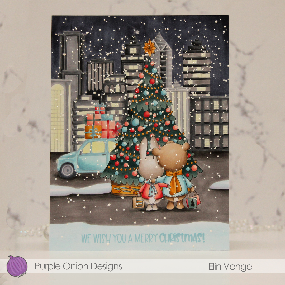
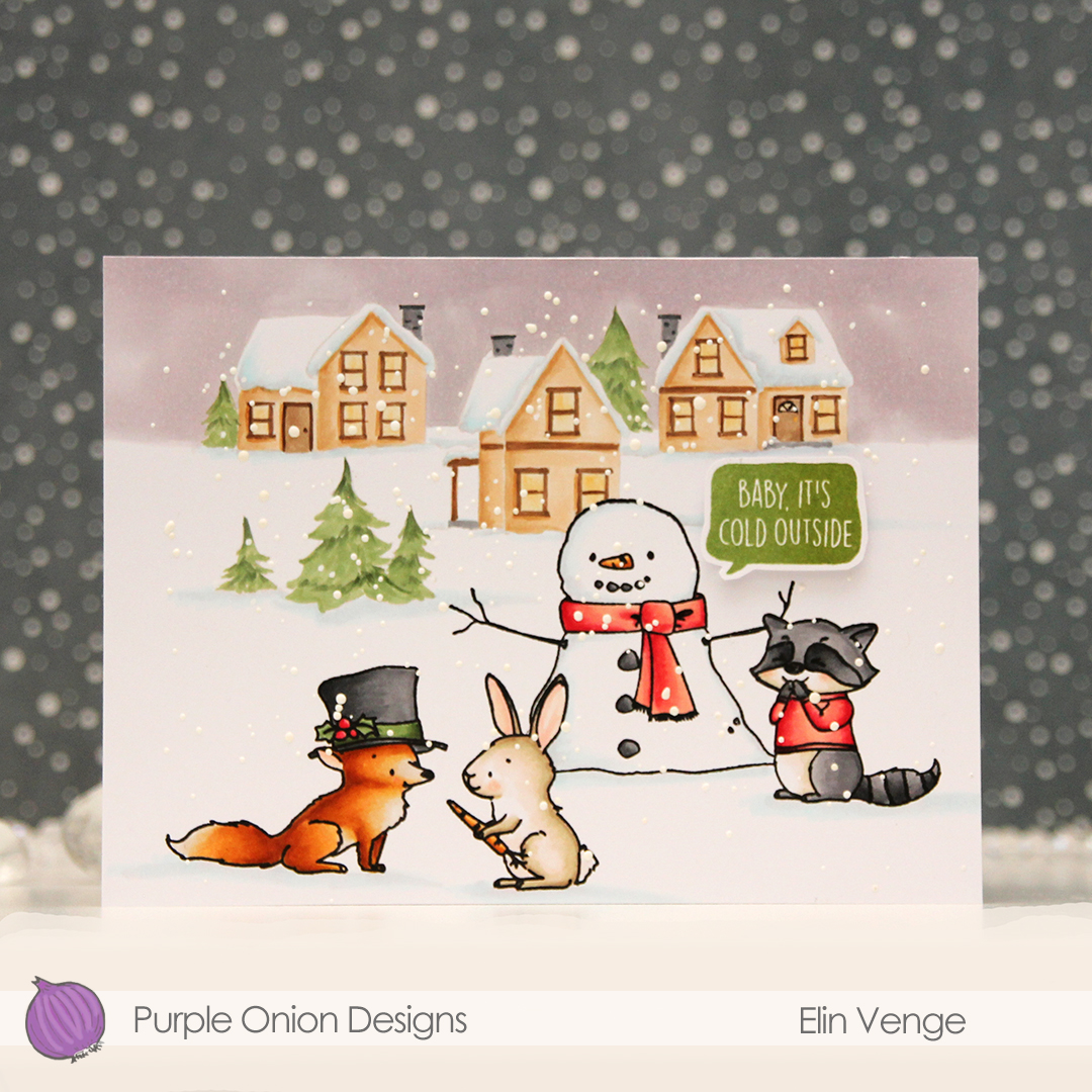 These images in this scene are all from the Winterwood collection from Purple Onion Designs, illustrated by Holly Mabutas. We have
  I colored the scene with Copics, then stamped the critters and the snowman again, this time using Obsidian ink from Altenew to get crisp black lines. This is a pigment ink, which doesn’t play nice with Copics, but as long as the coloring’s already complete, using this ink is totally fine. I sprinkled on Chunky White embossing enamel from Stampendous, melted the granules from the back of the paper and finished off the card with a sentiment from the
  Not a whole lot of colors used given the large scene, but I did use 7 for the fox alone. But he came out so cute, it was totally worth it!
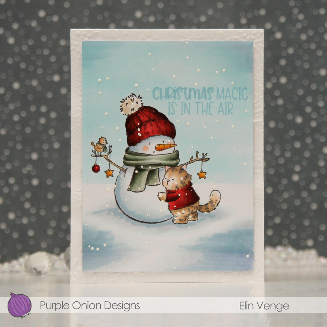 i colored the scene with Copics, before using a die in the Additional A2 Layers die set from Waffle Flower to trim down my panel. I stamped a sentiment from the
 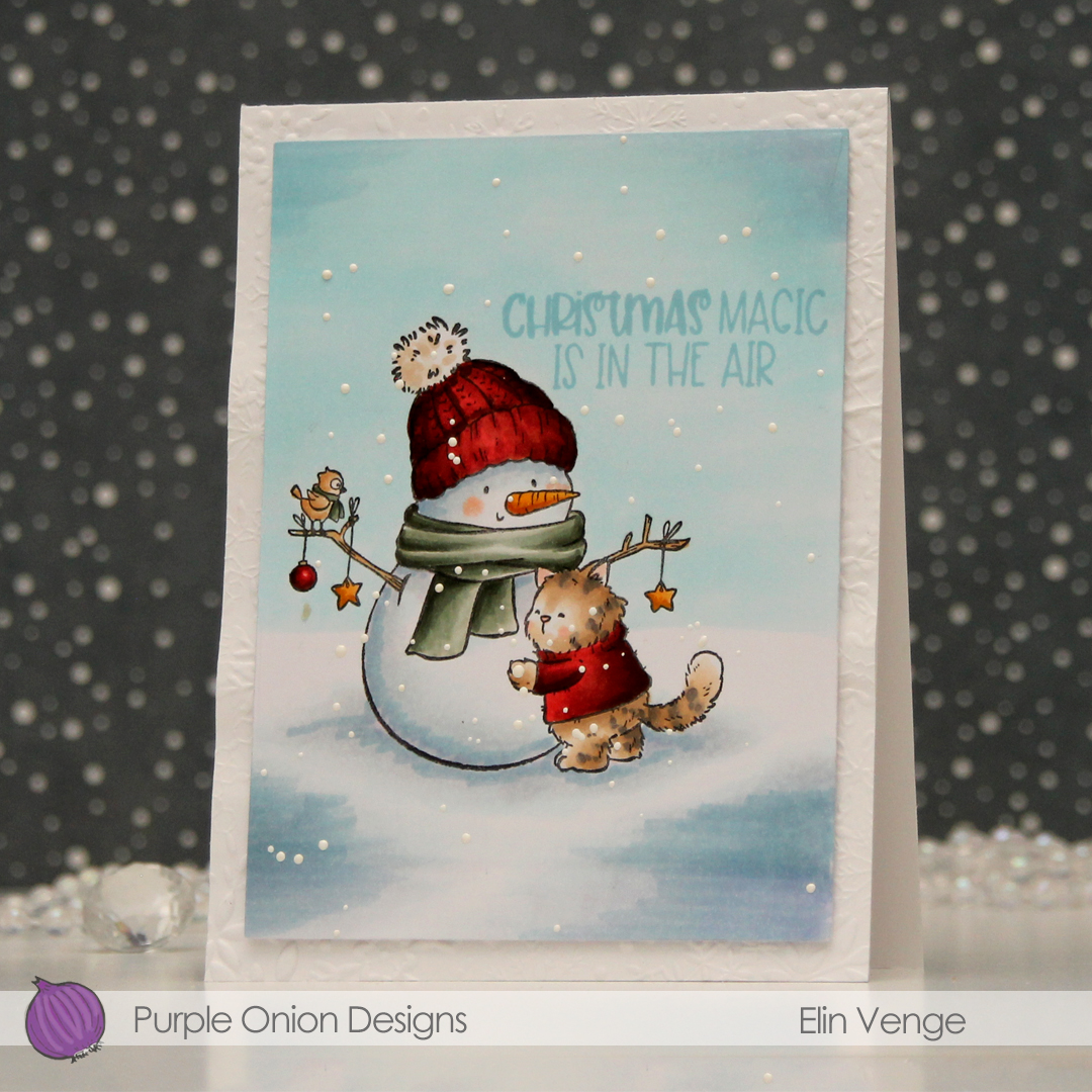 I used the Snowflake Oval Frame embossing folder from Simon Says Stamp to create some texture on a panel of white cardstock which I adhered directly to a top fold card base, before mounting the panel on foam tape to finish the card. Super simple, right?
 A lot of Copics for this one.
 This scene is created entirely with images from last years holiday collection from Stacey Yacula.
  I colored the entire scene with Copics, stamped the sentiment from the
  I used lots of Copics for this, and all the different gray families, actually.

 I took a quick look at the colors I’ve focused on recently to try to choose something different and opted for this blue green combo. I colored the image with Copics and added a horizon in the distance with a few trees scattered about.
 I made sure not to add to many trees so there would be room for the sentiment, which I stamped in Oceanside ink from Concord & 9th. The sentiment itself is from the Snøstorm stamp set from byCino. I die cut my panel using the lartest die in the A2 Stitched Rectangle STAX 1 set from My Favorite Things, before I sprinkled on chunky white embossing enamel from Stampendous. I made sure that none of the granules covered the sentiment or the eyes of the polar bears before melting the powder from the back.
 I adhered my panel to a card base I’d covered with a quarter sheet of Oceanside cardstock from Concord & 9th. This is actually a side fold card. I usually make top fold cards, but I didn’t have any landscape oriented card bases on hand and didn’t feel like breaking open a new pack of cardstock. Long live lazy crafting, right?
 Very cool color palette for this one.
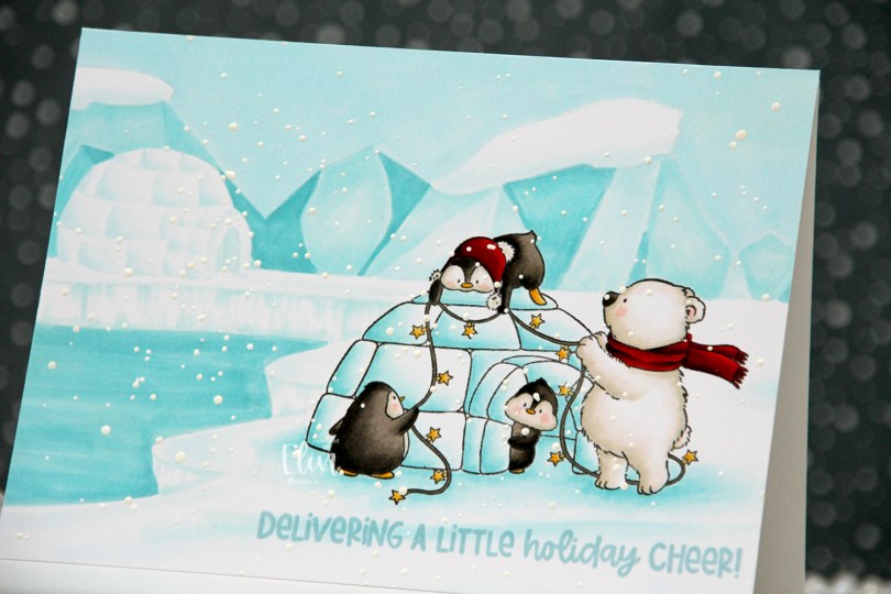
 I originally planned on creating a regular portrait oriented A2 card with this image, but I had this idea of another igloo in the distance, and it kind of evolved from there. I don’t usually create my own backgrounds for cards (I like background stamps that do all the work for me), but I had a blast with this one. Keeping the colors to a minimum certainly helped. I only used five Copics for the entire background.
 Once the background and the actual stamped image were both colored in, I stamped a sentiment from the
  Limited color palette for such a large card.
 Meet
Meet  Once everything was colored in, I stamped Santa’s Silhouette using Obsidian ink from Altenew. This is a pigment ink, which doesn’t really play well with Copics, so it’s best to use it once the coloring’s complete. I then stamped a sentiment from the Home for the Holidays sentiment set using Jalapeño Popper ink from My Favorite Things, before I sprinkled on chunky white embossing enamel from Stampendous, which I melted from the back for a textured snow look. I adhered my panel to a top fold card base and my card was complete.
 I used a lot of Copics for this scene. A lot.
 This card was so easy to create. I rummaged through my scraps of patterned paper and found these from the Greetings from the North Pole collection from Pion Design, which happens to be a collection from 2016. I don’t buy patterned paper anymore, but I have loads of scraps from the days when I did. The two pieces on the left were actually already torn (and the top was already heat embossed with white Fran-táge. This is an embossing powder which has a little bit of gold in it, and the gold pops off the background. I adhered the dark piece directly to a top fold card base I created from Rustic White cardstock from Papertrey Ink, and I popped the other one up on foam tape.
 I die cut the shadow for God and the word jul from the same dark pattern, and I die cut a few extra of the words themselves in white for dimension, using Die 347 God jul from Kort & Godt. I also used Die 231 to create the little branch of leaves from patterned paper, and I mounted it on foam tape for a little bit of dimension, before gluing the God die cut on top. I added a few pearls to finish.
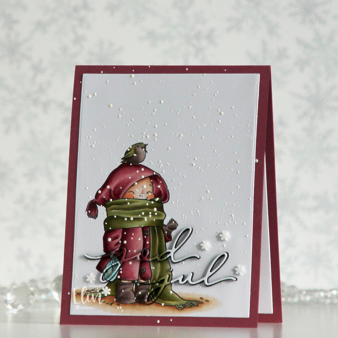 I printed the image on a piece of X-Press It blending card, colored it with my Copics and used a die in the Additional A2 Layers die set from Waffle Flower to trim the rectangle down a bit. You could also use a trimmer for this. Into the panel, I die cut the words god jul using dies from Kort & Godt. The two words are actually from separate die sets, but work perfectly together like this.
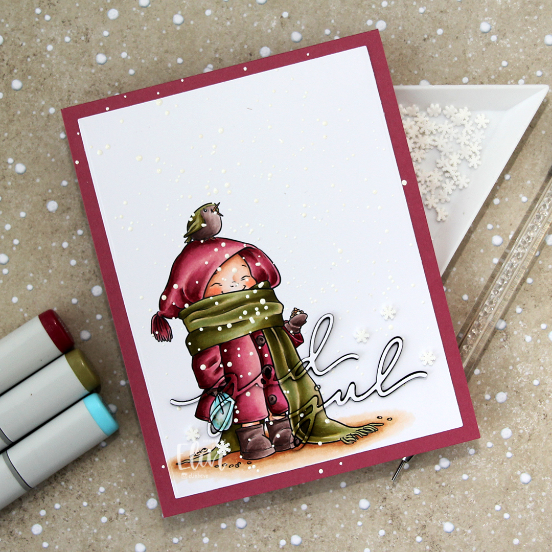 I adhered my panel to a top fold card base I created from Autumn Rose cardstock from Papertrey Ink, paper pieced the counters back into place, sprinkled on Chunky White embossing enamel from Stampendous and heated the granules from the back. I should have done this before adhering my panel to the card base to spend less time with the heat gun (melting the powder through two layers of cardstock takes significantly longer than doing it through just the one layer), but I honestly forgot about it. It does work through two layers, it’s just a matter of patience.
 Once my snow was in place, I die cut four layers of each of the words from black cardstock. I stacked them, added the colored one on top and puzzle pieced them in where they belonged, before adding a few Snowdrift sprinkles from Little Things from Lucy’s Cards to finish the card.
 Pink and dirty green. This is about as close as I (willingly) get to using red and green together on a card.
 I colored the cute mouse and the tree with Copics, before fussing cutting them. I left a white trim around the edge to make it a little easier on myself, that mouse is small and I didn’t want to accidentally cut off his tail. Onto Stamper’s Select White cardstock from Papertrey Ink, I ink blended trees using the Wintry Forest stencil set from Pinkfresh Studio along with Polar Bear, Icy Water and Winter Lake inks from Altenew. I used the largest die in the Stitch. Trad. Tag STAX die set from My Favorite Things to turn it into a tag and sprinkled on chunky white embossing enamel from Stampendous, which I melted from the back for a snowy look.
 I mounted Pippin and the Christmas Tree to the tag using foam tape. I stamped a sentiment from the
  I used a reinforcer die from the Fold-up Tags die set from MFT to add strength to the hole at the top of the tag, added a couple of Snowdrift Sprinkles from Little Things from Lucy’s Cards, as well as some blue satin ribbon, a piece of Blueberry Divine Twine, a thin string and a snowflake charm to the top of the tag for a finished look.
 Simple color palette for this one. I didn’t even go overboard with the snow on the tree.