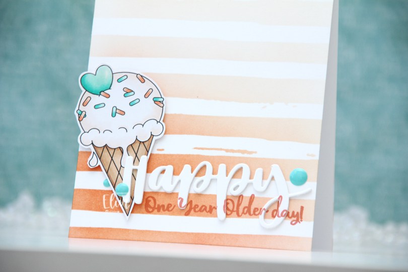
Hi, crafty friends! Today, I’m sharing with you a quick, clean and simple birthday card, featuring the ice cream from the Sloth-some Sloths digi stamp set from Streamside Studios. Today’s my sister’s birthday, so it’s kind of fitting, I think. It also happens to be our dad’s birthday, March is a big birthday month in our family.
 I colored the ice cream with my Copics, fussy cut it leaving a thin white border and put it aside while I worked on the rest of the card. Using the Watercolor Stripes stencil from Altenew, I ink blended stripes using Melon Berry ink from Papertrey Ink, going heavy handed at the bottom with a soft gradient toward the top of my A2 card base.
 I used the Hand-Lettered Happy Birthday die from My Favorite Things to die cut the word happy from white cardstock from Papertrey Ink. I then did a little stamp surgery, by combining two sentiments in the Anything-but-Basic Birthday Wishes stamp set from My Favorite Things to stamp a sub sentiment to the lower part of the die cut word. I then stamped the same sentiment directly on my card base, still using Melon Berry Ink. I die cut two more of the happy to glue behind the stamped one, stacked all three together and adhered it to the card front, lining up the stamping on the die cut with the stamping on the card base. I then mounted the ice cream on foam squares, added a bit of Glossy Accents to the heart and some enamel dots from the Cool Summer Night pack from Altenew for a little bit of added interest and color.
 Very limited color palette.

 I colored the donut with my Copics and fussy cut it, leaving a thin white border around the edge. I printed a panel of several donuts in light gray for a bit of added interest in the background, popped up my panel onto a card base I created from Rustic Cream cardstock from Papertrey Ink, while I worked on the rest of the card.
 Using the Parker alphabet die set from Memory Box, I die cut the letters to spell sweet from Grapesicle cardstock from My Favorite Things. I stacked six of each for a dimensional look.
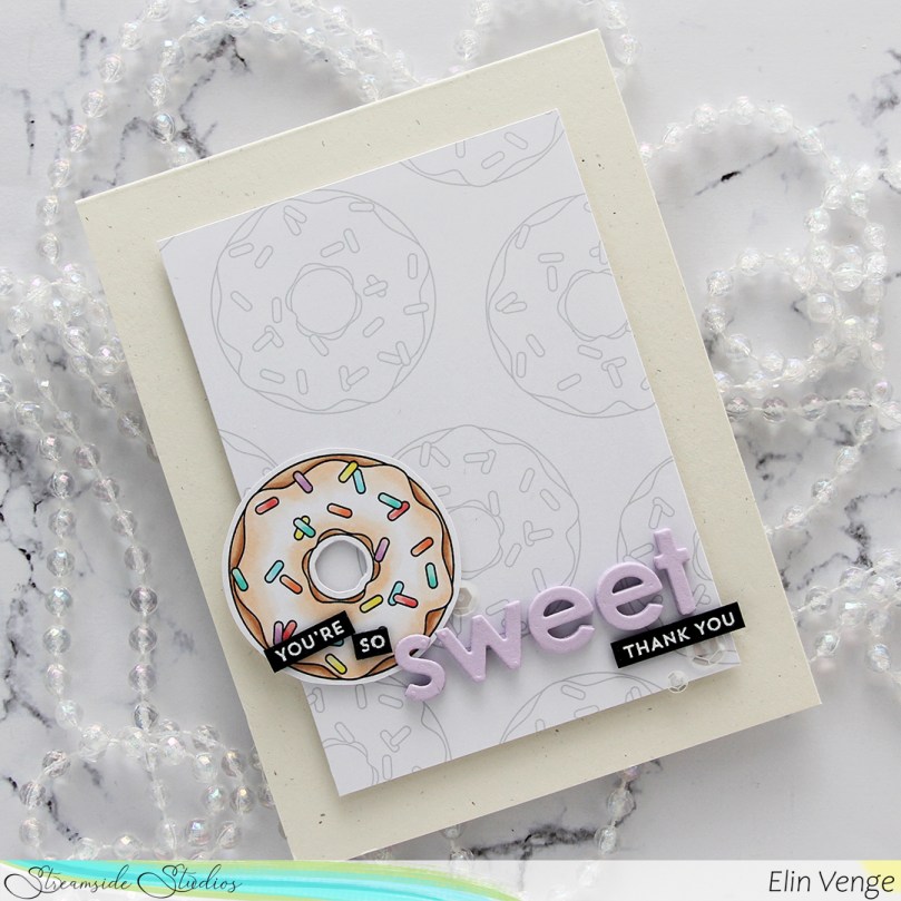 I stamped and white heat embossed partial sentiments from the Itty Bitty Basics and Itty Bitty Gifting stamp sets from My Favorite Things to complete my sentiment, adhered it all to the card and finished with a few sequins from the White Orchid Sequin mix from Little Things From Lucy’s Cards.
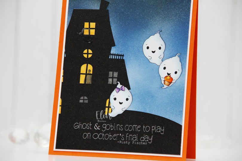
 I thought the ghost stamps in the
  I colored the ghosts with Copics, and used a yellow and a grey marker to color the windows. Most of the rooms have the lights on, but by coloring two windows grey, it gives the illusion that the lights aren’t on in those particular rooms. I also used the grey to add a silhouette of a person in one of the lit rooms, upping the creep factor a tiny bit.
 I masked off the ghosts and the house before I ink blended the nighttime sky. I used Eiffel Tower ink from My Favorite Things as well as Distress Inks in the colors Chipped Sapphire, Faded Jeans and Stormy Sky. Evidently, I’d used the paper I laid down to do my ink blending on to catch overspray from another project I added shimmer to, so the sky has a subtle shimmer to it when you tilt the card in the light. Completely unintentional, but not the worst thing in the world. My ink pads are now a little shimmery too, but it’s not too bad.
 I decided to also add an acetate ghost outside the top window of the haunted house. The ghost is from the Candy Corn mix from Little Things from Lucy’s Cards.
 I added my panel to a piece of white cardstock, and then adhered everything to a card base I created from Orange Zest cardstock from Papertrey Ink.
 I colored up the image yesterday, actually, while watching Tim Holtz’ live on Instagram. Once the coloring was complete, I used the largest of the dies in the Wonky Stitched Rectangle STAX die set from My Favorite Things to give it a nice faux stitch edge.
 I adhered my colored and die cut panel to a quarter piece of Classic Kraft cardstock from Papertrey Ink, then adhered it all to a top fold note card I created from white cardstock, also from Papertrey Ink.
 I thought the sentiment was perfect for this little image, and decided to print it in brown onto Classic Kraft cardstock. I then used a 1″ circle punch from EK Success to cut it, then added it to the card using foam tape for a little bit of dimension.
 I kept the card very simple and decided to only add a few sequins. I love the sequin mixes from Little Things from Lucy’s Cards and use them very often on my cards. These particular ones are from the White Orchid sequin mix.
 A little bit of a side view shows the dimension and those sequins a little bit better.
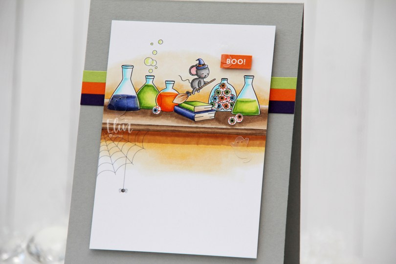
 This set comes with sooo many images, and I’ve actually used 11 different ones for this card. I added the lines for the shelf with a black pen, but everything else in the scene comes in the one stamp set.
 I’m known on the design team for occasionally printing my images very small. This time I might have set a new record, the mouse and the eyeballs in this scene were so small, they were tricky to color, but I really wanted them this size to fit the scene and the card design.
 Once I finished the coloring, I trimmed the panel down to 3 1/4 x 4 1/2″, and put it aside while I worked on the rest of the card.
 I created a card base from Cement Gray cardstock from My Favorite Things, added three 1/4″ strips of cardstock in colors that matched the scene (Royal Velvet from Papertrey Ink, Orange Zest from Papertrey Ink, Sour Apple from My Favorite Things), before I mounted the scene on top using plenty of foam tape.
 I stamped and white heat embossed the sentiment from the Itty Bitty Boos stamp set from My Favorite Things, added a few more layers of cardstock behind it for stability and dimension and finished off the card with a trio of acetate ghosts from the Candy Corn mix from Little Things from Lucy’s Cards.
 Lots of Copics for this little scene.
 I colored my scene with Copics on X-Press It cardstock and fussy cut right up against the black lines. This image has very simple outlines, making fussy cutting a cinch.
 I covered the entire colored panel with sheer sparkle craft spray from Imagine, it adds so much sparkle, which unfortunately is hard to capture in photos. It’s there in real life, though, trust me. I glued my colored piece onto a thicker white cardstock, both for a bit of stability and to hide the back of the colored panel. Copics bleed through to the back (you want that, it’s actually a sign that you’re using a good cardstock for Copic coloring), and I usually add my panels to card bases, but this one was different. I scored the white cardstock at the bottom and glued the back flap to the back bottom of an A2 card base I created from Lovely Lady cardstock from Papertrey Ink. With hidden magnets between the layers of the card, it stays shut and doesn’t fall open.
 You can see some of the shimmer in this photo, a couple of big droplets fell on the mushroom and the rainbow. I added pearls from the Igloo mix from Little Things from Lucy’s Cards for the mushroom, and used a black glaze pen from Sakura to make the eyes stand out.
 Lots of Copics for this one.
 I printed the image in the center of a quarter piece of A4 X-Press It blending card, before coloring it with my Copics. I’ve never colored waves like this before, so I felt like I was in deep water.
 I’ve found, however, that the best thing to do is to just jump in. It’s just paper and ink, and not the end of the world if it’s not perfect.
 I trimmed my panel down, adhered it to a top fold card base I created from After Midnight cardstock from My Favorite Things and printed a punny sentiment that I put an additional four layers of cardstock behind for dimension, before finishing off with a few raindrops from Little Things from Lucy’s Cards. Super simple.
 That little bit of dimension is everything on a simple card like this. Oh, and the raindrops too, I thought they fit well with the aquatic theme.
 Lots and lots of blues for this!
 The stamp is called Coco Loco, the name’s even funny. And also very fitting. I printed it near the bottom left of my panel of X-Press It blending card and printed my sentiment near the top right corner.
 I did some very simple Copic coloring of the palm tree, the beach and also colored a pale blue halo around it to give the illusion of some sort of sky around it. I prefer the look of this light blue on the outside of the actual image instead of the bright white of the paper, I think it looks more finished this way.
 I used the largest die in the A2 Stitched Rectangles STAX 1 die set from My Favorite Things to trim down my panel slightly and add faux stitching around the edge, before I adhered it to a card base I created from New Leaf cardstock from Papertrey Ink.
 I added some brown enamel dots from Papirdesign near the sentiment and also a couple near the image itself to embellish a tiny bit. I love enamel dots!
 To enhance the nuttiness of this image, I colored the cheeks pink and added Glossy Accents to what was already crazy looking eyes for a bit of extra fun.
 Simple image equals simple color palette.
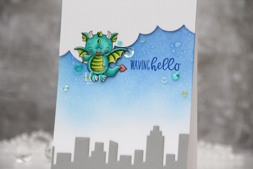
 I colored the dragon with my Copics and fussy cut him right up against the black lines of the image. I put him aside while I worked on the rest of the card.
 Onto a top fold white A2 card base I created from Stamper’s Select White cardstock from Papertrey Ink, I ink blended Azurite, Ultramarine and Eastern Sky inks (all from Altenew) towards the top of the card, fading to white near the bottom. I splashed some water droplets on top for a cool effect. Dye inks are water based and react with water, so this works with most inks you probably have. The darker the color, the bigger the impact.
 From Cement Gray cardstock from My Favorite Things, I die cut two layers of the skyscraper skyline in the Slim Film City die set from Mama Elephant and adhered them at the bottom of my card. Using the cloud die in the Slim Basics die set, also from Mama Elephant, I die cut the cloud shape three times from Stamper’s Select White cardstock, stacked them and adhered them to the top of the card.
 Onto the card base, I stamped a sentiment from the
  I adhered the dragon partially on top of the clouds, using foam squares behind the parts hanging off the clouds for even dimension, and sprinkled a few gems and sequins from the Seashore mix from Little Things from Lucy’s Cards around the dragon and sentiment to finish the card.
 Suuuuper simple color palette for this dragon.
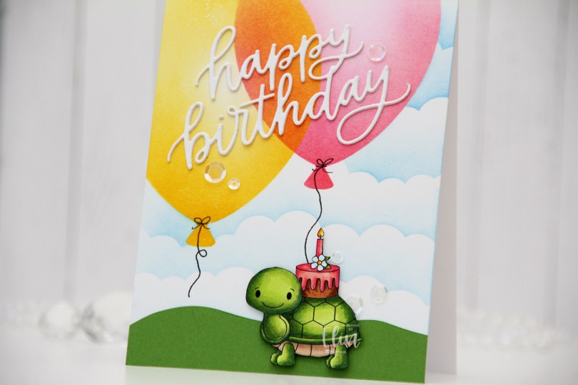
 I colored in the image using Copics, before fussy cutting it, right up against the black lines of the image. I put the image aside while I worked on the rest of my card.
 I actually worked directly on the card base for this one. Using the Big Balloon stencil from My Favorite Things, I ink blended two balloons using Distress inks – one using Picked Raspberry, Worn Lipstick and Abandoned Coral; the other using Mustard Seed and Squeezed Lemonade. And in the words of Laura Bassen – the magic’s in the overlap.
 Once the balloons were done, I used the mask in the Big Balloon stencil set to mask off the balloons while I used the Slimline Cloud Edges stencil, also from MFT, to create the illusion of clouds in the distance. I used Eastern Sky ink near the top of the card, Iceberg ink towards the bottom, both are gorgeous colors from Altenew.
 I free hand cut a grassy hill from Parsley cardstock from Concord & 9th and adhered it to the bottom of my card. I die cut the Happy Birthday die from My Favorite Things twice using white cardstock from Papertrey Ink (same cardstock as my card base) and adhered the two layers together for a tiny bit of dimension and adhered my layered die cut on top of the balloons.
 To finish off the card, I drew in balloon strings using a 0.35 Copic Multiliner, popped the tortoise (I can’t bring myself to write the word “turtle” when this is clearly a tortoise) up using some 1/16″ foam squares and added sequins from the White Orchid sequin mix from Little Things From Lucy’s Cards for a bit of sparkle and shine.