Hi, crafty friends. I’m back with one of those cards I make once in a blue moon, which happens to be a type of card I used to make all the time back in the day (I realize I’m making myself sound really old by saying that). It’s a 6×6″ card, but still not square.
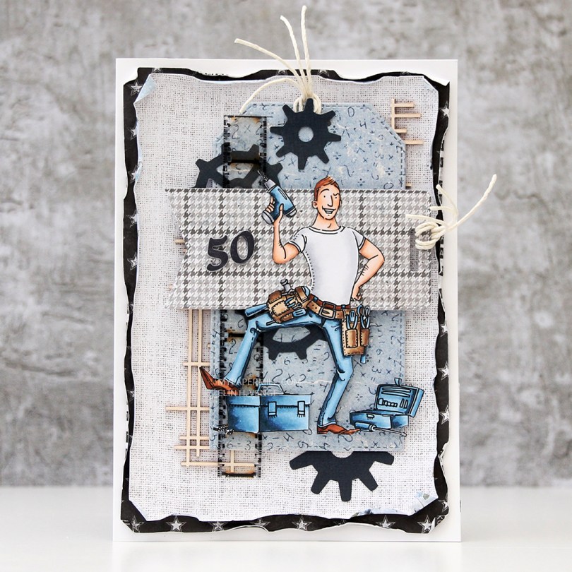
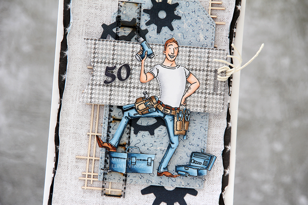
 The card was made on order for a superintendent turning 60. I was told he likes wine, good food, sunny, warm weather and enjoying life and was given free reign to do as I pleased. Mr. Fixit from Mo Manning seemed like the perfect choice for an image to color.
 I rarely use patterned papers on my cards anymore, and certainly not pieces this big, but I love the XXL Square Frames Frilly #10 die set from GoKreate, the dies in the set are perfect for creating shaped cards. I use two 12×12″ sheets of patterned paper to make one of these cards, and this time I used the Drivers License patterned paper from the Denim & Friends collection as well as the Tough but sweet sheet from the Denim & Girls collection, both from Maja Design. I can cut two of the larger shapes and two of the smaller shapes from one sheet, so the insides of the card are reverse.
 I colored the image in colors that went with the patterned paper, adding a bit of red to catch the eye and writing the words on his t shirt with a black Copic friendly pen. I thought the pun would tick the “loves wine” box.
 I used foam tape to add the smaller shape to the larger one, and also to add the die cut circle to the smaller shape. I stamped postmarks from various cities in the world using Memento Rich Cocoa ink to add a little bit of interest to the circle and the panel behind it. I figure if the guy loves warm, sunny weather, he probably also loves to travel, there’s not a whole lot of warm days in Oslo over the course of a year.
 I added some metal embellishments from Tim Holtz in a bit of a cluster near the bottom left “corner”, as well as his age, die cut and put on a 1″ circle with an epoxy sticker on top for a bit of added dimension.
 I hid a die cut tag behind my image. I used to do this all the time, and it’s a fun way to add a sentiment without having to find space for it on the front of the card. The sentiment is from the Til mannen stamp set from Norsk Stempelblad AS. The dies I used for the tag and reinforcer are old ones from Magnolia. I tied a bow from twill onto the tag, and some cutlery charms to the twill bow using natural twine from May Arts. I thought the cutlery was perfect for a food lover, I have so many treasures in my stash that I forget about until I go looking for something to use.
 The inside of the card are pretty simple. The same patterned paper as the front, only with the reverse size. I used more of the postmark stamps from Marianne Design, as well as a sentiment from the Gratulerer stamp set from Norsk Stempelblad AS. There’s plenty of space for a personal message on the second circle, which only has the postmark stamps on the edges.
 The back of the card is also simple. Another sentiment from Norsk Stempelblad AS, this time it’s the B03 stamp set. I love their stamp sets and use them more than any other of my Norwegian sentiment stamps. They’re hard to get your hands on because the company is no longer in business, but they’re the best sentiments out there.
 Simple color palette.

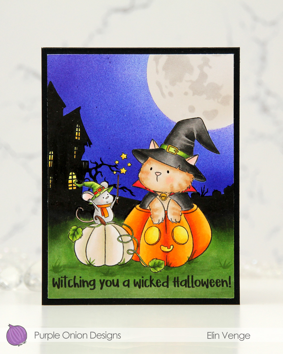 I stamped the image near the bottom center of a panel of X-Press It blending card using Extreme Black ink from MFT, which is a Copic safe hybrid ink. I colored the image and created a spooky silhouette background which fades from black in the distance to green as you get closer to the front of the image.
 I masked off the scene and put a moon mask from an old Simon Says Stamp Stamptember collaboration with Tim Holtz into the top right corner, before I went in with Copics and an airbrush to create the sky. I used three colors of blue, trying to make it a bit lighter near the moon and darker further away. I took off the moon mask, masked the sky and airbrushed into the circle opening using E40 for a very pale moon. I then added the detail mask for the moon and airbrushed the openings with T1, which is a very light grey that I also used for the mouse. Once all the coloring was complete, I removed all the masks, added a bit of black glaze pen to their eyes and stamped a sentiment at the bottom using Obsidian ink from Altenew, before trimming the panel down a little and adhering it to a card base I created from Black cardstock from Concord & 9th to finish.
 I used quite a few markers for this. The ones after the gap are the ones I used for the airbrushing of the moon and sky.
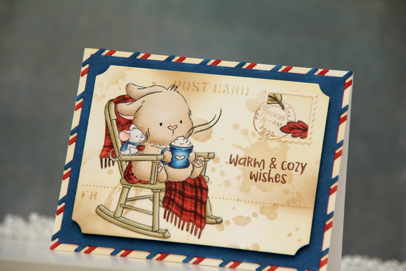
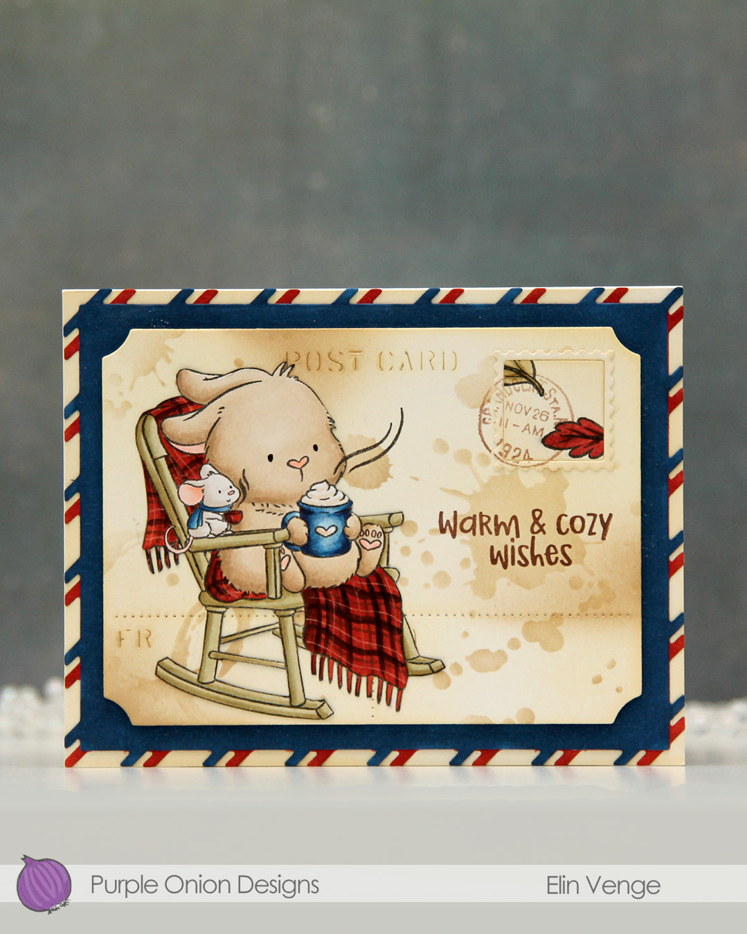 I colored the image with Copics onto X-Press It blending card and fussy cut it right up against the black lines. From another piece of X-Press It, I die cut the postcard shape using the Postcard combo die set from Mama Elephant. I used Peachy Glow ink from Altenew to ink blend across the panel, giving it a vintage feel. I then went in with a stencil from the mini stencil set 3 from Tim Holtz and added the splatter texture using Classic Kraft ink from Papertrey Ink along with a blending brush. In some areas, I added ink with the blender brush without using the stencil.
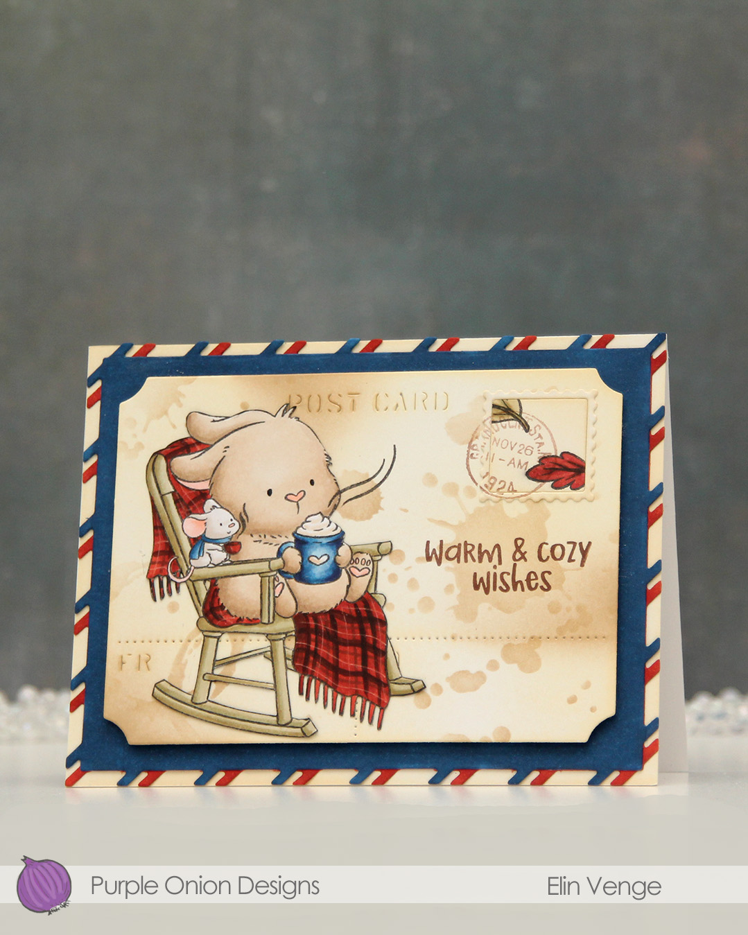 I stamped the leaves from the

 I colored my penguin mug with Copics and fussy cut the image right up against the black stamped lines. This image doesn’t have a whole lot of the whispy, perpendicular lines that are so characteristic of Lili of the Valley images, which was the reason I opted not to include a white trim around the edges. There are 3 or 4 lines at the top of his head that I had to cut off, but I was okay with that. I stamped some snowflakes onto a card base using Spring Rain ink from Papertrey Ink. The snowflakes are from an old Tim Holtz stamp set. I mounted the mug on foam tape near the bottom right of the card.
 I die cut a few snowflakes using a couple of die sets from Memory Box. The one at the top, that is partially hidden behind the penguin and speech bubble is from the Stitched Let It Snow Circle Frame die set. The die set comes with a stitched snowflake circle frame and three individual snowflake dies. The snowflakes with the stitching detail are from the Twilight Snowflakes die set. I added some blue diamonds from Kort & Godt to the mug, as well as a heart from the Festivities mix from Little Things from Lucy’s Cards. I stamped a couple of sentiments from the Holiday messages stamp set from Mama Elephant using Lazy Days ink from My Favorite Things and die cut them into speech bubbles using the Say Anything die set from My Favorite Things. I stacked a couple of additional white die cuts behind the speech bubbles for dimension.
 Simple color palette for this one, and I realize now that I forgot to jot down the blue Copics I used for this, but I believe they are B93, B91 and B90, which is a color I’ve made myself.
 This week is Designer Week at Lili of the Valley! This means you can save 20% on any item on

 As soon as I saw this train, I immediately thought of the movie The Polar Express, which happens to be my favorite animated Christmas movie. I colored my train in similar colors to the one in the movie, and I put a mask on top when my coloring was done and airbrushed the sky, moon and glow coming from the headlight.
 My best friend and I have a tradition where we sit down and watch this movie every year, and I thought the sentiment from the
  The sentiment is actually one long line, but I did some masking to create a staggered one, which I thought fit my card better. I stamped the sentiment in VersaMark ink and heat embossed it in white using Super fine detail embossing powder from Ranger.
 I created the moon by first masking off a circle as I airbrushed the sky, then I used the moon mask that was part of the Tim Holtz/Simon Says Stamp collaboration set for Stamptember 2021 to create my moon.
 Once I’d created my moon I covered the circle opening again with VersaMark ink and sprinkled on Iridescent Sparkle embossing powder from Judikins, which I then melted. It gives the moon a nice sparkly glow. I thought that would be a nice detail to add to what is otherwise a very simple card. I adhered the colored scene to a white top fold card base and decided not to embellish, I wanted the image to be the focal point on this card.
 Lots of Copics for this one. The ones after the white gap are the ones I used to airbrush the sky, moon and the glow from the headlight.
 This cute vampire is from the My Little Pet Ghost stamp set. There’s also a witch in the same set that I used for a similar treat bag, which you can read all about in


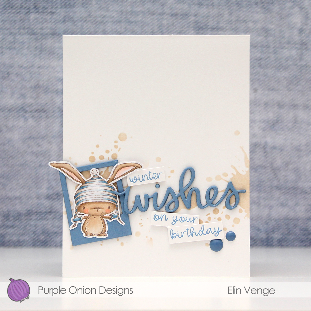 I stamped
  I used one of the Precious Polaroids dies from My Favorite Things, as well as a wishes die from Mama Elephant. I die cut both four times from Blue Yonder card stock from My Favorite Things and stacked them for a dimensional look. Directly onto the card base, I used a blender brush from Taylored Expressions with Classic Kraft ink from Papertrey Ink over a Tim Holtz mini layering stencil to create some interest in the background. I stamped selected words from two sentiments from the
  I’m woefully short on envelopes to fit A2 cards, and definitely didn’t have any blue, kraft or white ones to go with my card, so I pulled out my A2 V Flap Envelope dies from Simon Says Stamp and created one using scraps of patterned paper from Papirdesign. Blue with snowflakes, can you get any better for a blue, wintery birthday card?
 Very limited color palette this time, but it’s no wonder given the size of the image. I also used B90 for the hat, which is a color I’ve made myself.
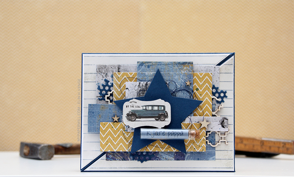 Jeg har brukt mørkeblå kartong fra Papertrey Ink (fargen heter Enchanted Evening) som kortbasen min, og lagd et lag på lag-kort som jeg likevel syns er ganske maskulint.
 Jeg har blandet ark fra mange forskjellige serier fra flere produsenter på dette kortet. Her er Skolestart-serien til Papirdesign (arket med linjer i bakgrunnen og også det som ser ut som betong), Julehilsen fra samme produsent (trevirke), Kaffepause (det sennepsgule med sikksakk), også fra Papirdesign, Pipeline fra Fancy Pants (det blå mønsterarket) og til slutt Maja Design (bilen).
 Arkene er limt litt småstrukturer, men likevel hulter til bulter, både rett oppå hverandre og med 3D-puter i forskjellige høyder for dimensjon. Det krevde litt planlegging, for all pynten måtte være limt fast i den ene halvdelen av kortet for at det skulle kunne åpnes. Jeg valgte den høyre halvdelen, og venstresiden av diagonalen har dermed ingen mønsterark, annet enn linjearket helt bakerst. Jeg har også limt magneter under et par av mønsterarkene, så kortet skal kunne lukkes ordentlig.
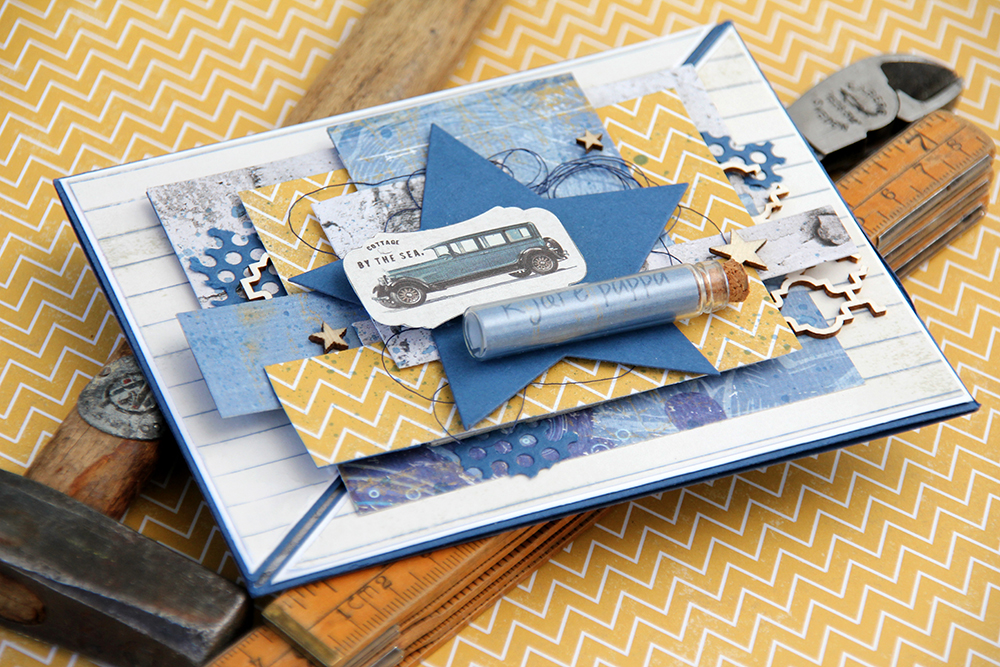 I tillegg til mønsterark brukte jeg noen andre elementer for å myke opp uttrykket litt. Jeg brukte en hullmønsterdie fra Papirdesign på en bit kartong og brukte biter av den her og der på kortet. Jeg stanset også ut en stor stjerne i kartong med en Spellbindersdie for å rydde opp litt, så ikke kortet så så rotete ut med alle mønsterarkbitene. Stjernen gjør også at bilen kommer bedre frem, og den er også en fin plass til å lime på glassrøret fra Tim Holtz med NSB-tekst stemplet inni med samme farge som kartongen.
 Jeg brukte også noen chipboardbiter fra Snip Art som jeg dyttet inn her og der og limte på plass, og også noen finérstjerner fra Studio Calico. En liten bit blå sytråd fra Mölnlycke myker opp enda litt mer, og jeg blandet blekkfargen med litt vann og sprutet over kortet for å få det enda litt mindre rigid.
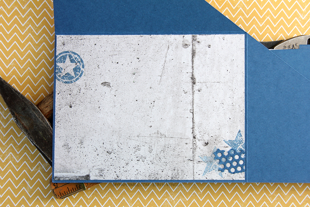 Siden kartongen er så mørk valgte jeg å bruke et mønsterark til skrivefelt inni kortet. Her stemplet jeg noen stjerner fra Stampers Anonymous med samme blekkfarge som jeg har brukt ellers, og den ene stjernen nede til høyre er andregenerasjonsstemplet for et litt dusere uttrykk. Jeg limte også på en bit av hullmønsteret mitt for en siste lille finish. Her syns også at arkene på kortets forside kun er limt på trekantpanelet til høyre.