Hi, crafty friends. I’m usually pretty good at making Christmas cards all year. What I’m not usually so good at is creating Christmas tags to go on presents. It’s often one of those things I do last minute, even after the gifts are wrapped. I’m trying to be better, though, and today I have three tags to share featuring the Snow Cute stamp set from Lili of the Valley, I just can’t get enough of this set.
 These penguins are about 4 cm tall, which makes them the perfect size to create gift tags from. By stamping them on a sheet of X-Press It blending card (or your cardstock of choice) with a little bit of space between them, you can die cut some and fussy cut the remaining ones. I decided to fussy cut the one in the center, while using dies for the other two.
 I colored all the penguins with Copics and used a black glaze pen to create a little bit of shine and dimension to their eyes. Once the black was dry, which didn’t take long, I used a white Gelly Roll 05 on top of the black to put the white back into their eyes.
 I’m starting with this fussy cut penguin. In a drawer, I had a scrap of a snowy background that I created last fall using Rustic Cream cardstock from Papertrey Ink, the Falling Snow stencil from Simon Says Stamp, modeling paste from The Crafter’s Workshop and Rock Candy distress glitter from Ranger. I decided to put it to use and die cut it using the 210 die from Kort & Godt, I really like the heart shaped hole it creates at the top. I mounted the penguin using foam tape and added a sentiment strip below. The sentiment is from the Christmas Greetings stamp set from Lili of the Valley, it’s got heaps of great sentiments for the holidays. I used a bit of red lace ribbon, a couple of bells and a piece of thread to the top of the tag to embellish it a little.
 On the back, I added die cut letters to spell the words to and from. The words are from the Tag Builder Blueprints 6 die set from My Favorite Things, die cut from Amarena Cherry cardstock, also from MFT.
 Simple color palette for this one.
 Next up is the circular tag. I used the Tag Builder Blueprints 6 die set for this one as well, as well as another sentiment from the Christmas Greetings stamp set from LOTV. I added Divine Twine in the color Cherry to the top, a bell charm and a few red enamel dots from Papirdesign to finish it off.

On the back, I used the to/from circle die that I used for the first tag, but for this one, I used the negative of the die cut, popping in the centers of the o’s to complete the look. I figured it would be easier to see the writing on white cardstock instead of the red in the dim light on Christmas Eve when we open our presents, so this is meant to be practical too.
 A few additional colors for this one, I wanted to ground my penguin and also needed some color on that candy cane.
 For the blue one, I used the Fold-Up Tags die set from My Favorite Things to create my tag. I made sure not to cut off his scarf by fussy cutting that and putting it behind the die as I ran it through my die cutting machine. I used a piece of Blue Breeze cardstock from My Favorite Things to create the reinforcing element near the top, added some Divine Twine in the color Blueberry, a couple of white bells from UiT Hobby and some thread that’s actually meant to use with a loom (it’s super strong). Once again, I used the Christmas Greetings stamp set for the sentiment, and scattered a few snowdrift sprinkles from Little Things from Lucy’s Cards to finish.
 On the back, I used that same die from the Tag Builder Blueprints 6 die set from My Favorite Things that I used for the other two tags, this time die cut from Enchanted Evening cardstock from Papertrey Ink.
 Once again, simple color palette. These were such fun to make. I want to make more, and have a bunch on hand when it’s time to wrap Christmas presents, so I’m not rushing last minute to get the tags done.
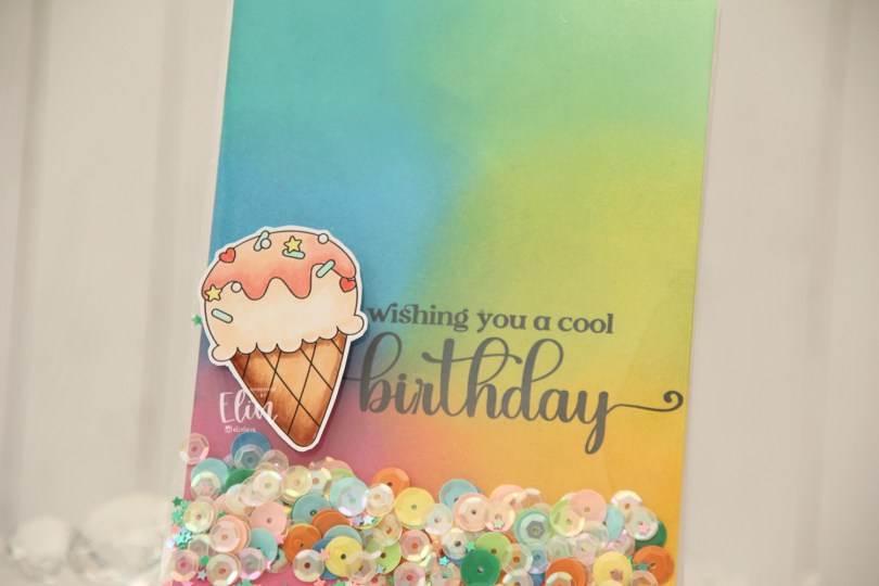
 Everyone loves ice cream, right? I colored up this one using my Copics, and fussy cut around it leaving a thin white border. The border makes it stand out against the colorful ink blended background.
 Speaking of backgrounds – I ink blended Distress Oxide Inks (Peacock Feathers, Cracked Pistachio, Twisted Citron, Fossilized Amber, Picked Raspberry and Salty Ocean) across a quarter sheet of Stamper’s Select White cardstock from Papertrey Ink. I heat set the panel to make sure it was dry, before running it through my printer to add the sentiment.
 The large stamp storage pockets from Avery Elle are 5 1/2″ wide, making them perfect for full A2 size shaker cards. I cut slivers off the panel to make it go in a little easier, then turned it on its side and put it at the bottom of the storage pocket. I cut the pocket down to about 5″, scored at the 4 1/4″ mark and folded it over. I actually cut the back of the storage pocket at the 4 1/4″ point to make it easier to fold. I cut the corners of the remaining flap, filled the pocket with sequins and confetti and glued the pocket shut on the back, before adhering it to a top fold card base I created from Stamper’s Select White cardstock from Papertrey Ink.
 I added the ice cream on top of the shaker pocket using foam tape, and that finishes the card. The sequins and confetti I used are a mix of different brands. The opaque ones are from Studio Calico, and I’ve probably had them for almost 10 years, the same with the iridescent cream colored sequins. Those are from UiT Hobby, and the little star confetti is from Søstrene Grene, they’ve also been in my stash for many years.
 Simple color palette for this one.
 I colored my snowman with Copics and fussy cut him leaving a thin white border. I put him aside while I worked on the rest of the tag. Onto some white cardstock (Stamper’s Select White from Papertrey Ink), I ink blended distress inks in the colors Picked Raspberry, Spiced Marmalade and Scattered Straw for a soft background. I then used a die set from Hero Arts (Snowflake and Ornament) to die cut the ornament from my background and the snowflake circle twice from white cardstock. I adhered the two white die cuts together for a smidge of dimension, before adhering them to the base.
 I mounted the snowman on foam tape and white heat embossed a sentiment from Norsk Stempelblad AS onto a strip of Enchanted Evening cardstock from Papertrey Ink, mounted that on foam tape and added diamonds from Kort & Godt to the centers of the snowflakes, before finishing off the tag with a piece of ribbon, some thread and a couple of bells from UiT Hobby.
 Super simple color palette for this one.
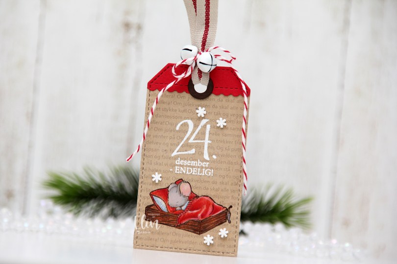
 I stamped the cute mouse using Memento Rich Cocoa ink onto Classic Kraft cardstock from Papertrey Ink, before covering the image with a mask and running the cardstock through my printer to add the lyrics to a Norwegian Christmas song all about mice. I thought it was a fitting background. I colored the image with Prismacolor pencils (not Copics, I know, it’s rare), heat embossed a sentiment from the B04 stamp set from Norsk Stempelblad AS above the cutie and used a die from the Stitched Traditional Tag STAX die set from My Favorite Things to turn it into a tag. I then die cut a label from the Everyday Gift Box die set (also MFT) from Wild Cherry cardstock from My Favorite Things, and used the tag die again to turn it into the top piece of my tag. I also used a reinforcer die from the Fold-Up Tags die set (also from MFT) and die cut that from Dark Chocolate cardstock from Papertrey Ink. I added a ribbon, a couple of bells and some Cherry twine from Whisker Graphics to the top of the tag, before adhering a few snowdrift sprinkles from Little Things from Lucy’s Cards to finish.
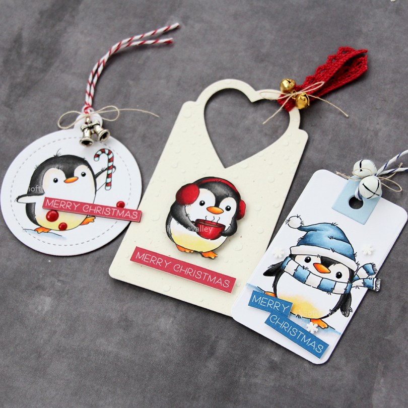

 Igjen har jeg brukt ark fra Summer Feelings-kolleksjonen til Studiolight, men denne gangen falt valget på ikke bare turkis, men også arket med trestruktur. Jeg har revet og krøllet kanter også på dette kortet. Sydde med symaskin noen runder rundt på bakgrunnsarket for å få en litt løs og ledig sømkant.
 Jeg tok noen gamle små bakgrunnsstempler jeg har fra Tim Holtz og stemplet litt her og der på bakgrunnen med Distress Oxide Ink i fargen Peacock Feathers. Jeg stanset ut noen tags av mønsterarkene som jeg brukte til å bygge opp designet på kortet med.
 Her syns det at kortet egentlig består av ganske mange lag. i tillegg til arkene har jeg brukt et par blonder oppå hverandre for litt mer interesse. Den turkise kommer fra Papirdesign og passet perfekt i fargen. Jeg har duset den ned bittelitt med gesso her og der. Jeg har også brukt gesso på støvbærerne i den ene blomsten for at de ikke skulle være gule.
 Bokstavene er stanset ut med bokstavdies fra Memory Box, noen ganger i turkis kartong og ett lag i mønsterark som jeg limte på toppen. Jeg har pyntet med blomster fra Wild Orchid Crafts, pyntebær fra Kort & Godt, krystallgrener av ukjent opphav og også noen paljetter fra UiT Hobby og halvperler fra Kort & Godt spredd litt rundt. Har også splættet litt over hele kortet med utvannet Distress Oxide Ink i fargen Peacock Feathers.
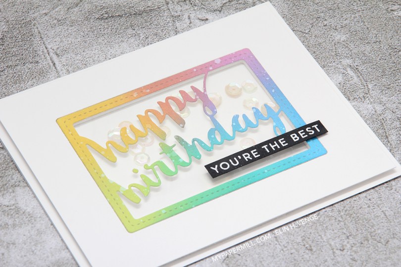

 Jeg har laget kortet som et shakerkort der HELE frontpanelet er proppet opp fra kortbasen, så kanten på shakerpanelet går i flukt med resten av fronten. Til slutt har jeg satt på en tekststrimmel med lave 3D-puter. Selve teksten er et stempel fra Papertrey Ink, stemplet og embosset i hvitt på svart kartong, også en Laura-spesialitet.
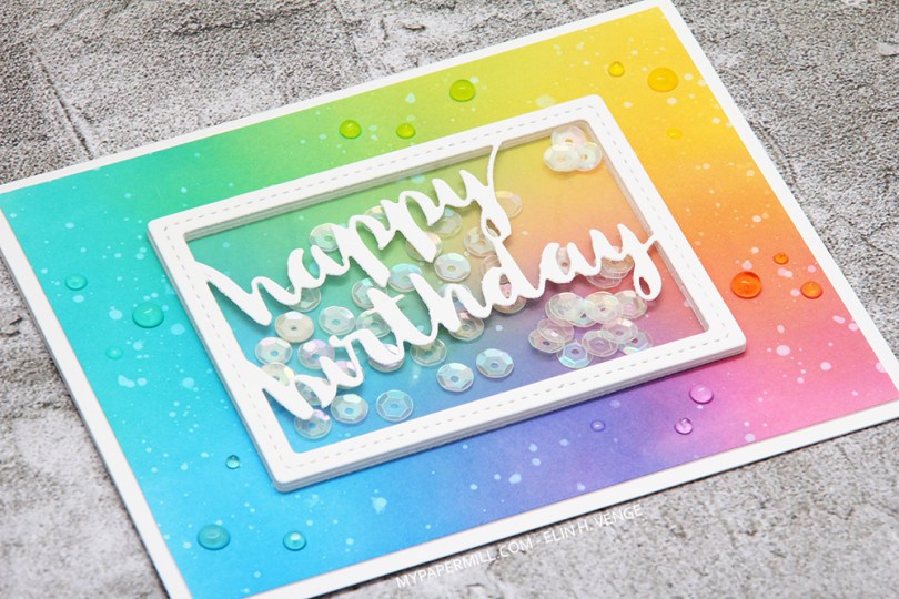
 Laura er dronningen av sverting, så jeg har svertet forskjellige farger Distress Oxide på bakgrunnen min (Picked Raspberry, Salty Ocean, Peacock Feathers, Cracked Pistachio, Twisted Citron og Fossilized Amber), og så sprutet vann over for å få de hvite flekkene. Jeg har stanset ut en bursdagsramme fra Memory Box som jeg har lagd til en shakerboks som jeg har fylt med paljetter.
 Jeg syns jeg måtte ha bittelitt pynt, og Laura bruker mye Jewel Drops, så jeg syns det var den siste lille finishen jeg trengte. Jeg har brukt Jewel Drops i forskjellige farger på de forskjellige delene av panelet mitt, så de skal fremheve fargen bak (Limoncello på det gule, Pale Periwinkle på det lilla, Key Lime på det grønne, Sea Breeze på det turkise, Rosewater på det rosa og Grey Mist på det blå).
 Jeg har fargelagt rådyrene med Copics, klippet dem ut og satt dem på en base svertet med Papertrey Ink Aqua Mist blekk. Jeg har strødd litt Shabby White embossingpulver fra Stampendous over og smeltet til snøfnugg. Jeg stanset ut en tynn ring med mosegummi og lagde en shakerboks med litt acetat som vindu, en diecut laget med en Memory Box die og noen paljetter og diamanter.
 Her syns det at paljettene og diamantene er løse inni shakerpanelet. Jeg har ikke brukt så mange paljetter og diamanter, men jeg syns det er nok, det er ikke mye som skal til. På bakgrunnen har jeg brukt en stensil fra Simon Says Stamp og embossingpaste. Det rødstripete mønsteret kommer fra et digitalt mønsterark.
 Jeg avslutter som vanlig med fargene jeg har brukt på motivet mitt. For å lage bakgrunnen med himmelen og bakken brukte jeg faktisk refiller til fargene mine og en pensel istedenfor tusjene.
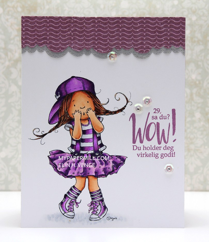 Motivet
 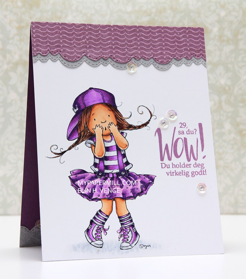 Jeg har stanset ut scallopkanter på rester av mønsterark fra Papirdesign og Pion Design, som jeg har limt øverst på kortet. Jeg pyntet enkelt med paljetter fra UIT-Hobby og diamanter fra Kort & Godt, og det er det hele. Her kan du se at jeg har gjentatt scallopkanten, paljettene og diamantene også inni kortet, som har en kortbase av Papertrey Ink kartong i fargen Plum Pudding.
 Som vanlig avslutter jeg med fargene jeg har brukt på motivet mitt. Ikke akkurat mange denne gangen.