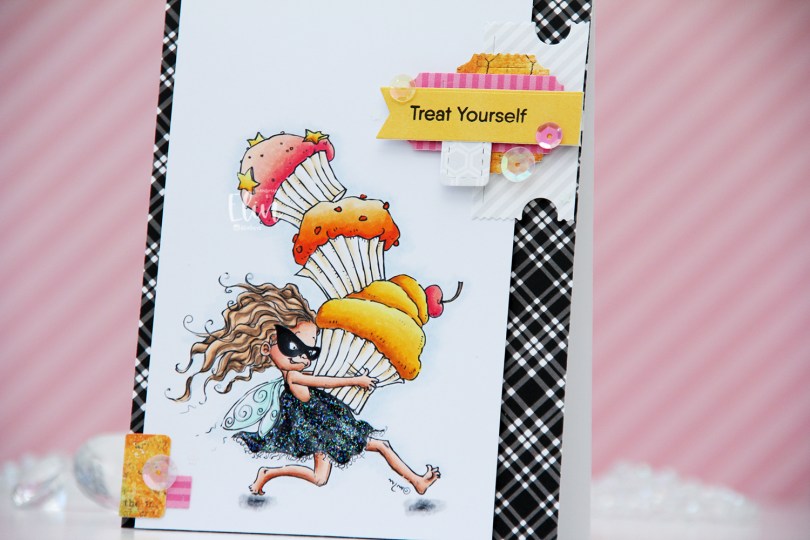
Hi, crafty friends! I haven’t shared one of my “signature cluster” cards in a while, so I thought it was about time. I thought the Cupcake Thief image from Mo’s Digital Pencil would be perfect for the occasion, and by opting for a black dress, I could pair the image with a recently acquired black and white patterned paper pad that I’ve wanted to use for a while.
 This is Cupcake Thief. I’ve used the image once before. This time, I flipped it so she’s facing right, it’s one of the many advantages of using digital stamps. I colored her with Copics and cut my panel down to a width of 3 1/2″. I put it aside, covered a white card base with the black and white plaid patterned paper from My Favorite Things, then mounted the colored panel on foam tape, leaving a little bit of the patterned paper showing on one side, and more showing on the other.
 On my desk, I keep storage pockets of die cut patterned paper scraps that I use on my cards. I keep them organized by color family, and pulled out the pink, orange and yellow ones for this, as well as a grey/white/neutral one. The great thing about this system is that everything’s already die cut (using the Happy Days Ticket Stubs die from XCut [which cuts 9 different tickets with one die] and the Fishtail Flag Frames die set from My Favorite Things), so I just play with sizes, colors and composition of the different pieces until I’m happy with the result. For this particular card I used a combo of patterned papers from Sunny Studio, P13 and Bo Bunny. Onto one of the die cut banners I stamped a sentiment from the Little Birthday Notes stamp set from My Favorite Things using Obsidian ink from Altenew. I finished off the card with a few sequins from the Sweet Shop mix from Little Things from Lucy’s Cards and some Stardust Stickles to the dress.
 Quite a few Copics for this one. I also used B90, which is a color I’ve made myself, for a subtle hint of a sky.

 I added a bunny to the top of the teacup stack and colored the image with Copics, before fussy cutting, leaving a thin white border around the edge. I used a black glaze pen from Sakura to add shine and a tiny bit of dimension to the bunny’s eyes, then a white dot of Gelly Roll 05 on top of the black, once the black was dry. The glaze pen dries fairly quickly once applied, so I didn’t have to wait long.
 I adhered a panel of Blueberry cardstock from My Favorite Things to my white card base. Using a die in the A2 Double Stitched Rectangle STAX die set, also from My Favorite Things, I die cut a piece of patterned paper from Sunny Studio to adhere on top of the blue. This patterned paper is from the Subtle Grey Tones pack, and it really is subtle.
 I realized I hadn’t made any of my signature clusters in a while, and decided to pull out my die cut scraps of patterned paper and have a play. These patterned papers are from Sunny Studio (more from the subtle grey pack), Kaisercraft (light blue with dots), Papirdesign (dark blue with smaller dots) and Maja Design (pink floral), all die cut using a combination of the Happy Days Ticket Stubs die from XCut and the Fishtail Flag Frames dies from My Favorite Things. I used a mini paper doily from Doodlebug to mat my little clusters, and embellished with sequins from Pretty Pink Posh and Simon Says Stamp.
 The sentiment is from the Coffee and Chocolate stamp set from hÄnglar & Wings, white heat embossed on a strip of the same color cardstock I used for the card front. I then die cut it using one of the dies in the Itty Bitty Banners die set from My Favorite Things.
 The interactive element that I mentioned at the beginning of the post is actually the image. As you can see in this photo, it sits pretty high off the base. The reason for that is that it’s on an action wobble, so it’ll shake and move once you help it along a tiny bit.
 Fairly simple color palette for this one.
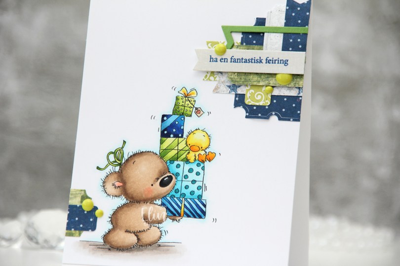
 I colored up
  These clusters are pretty easy to put together. On my desk I keep a bin with die cut scraps of patterned paper. I organize these scraps by color, and put each color in a stamp storage bag. Whenever I want to create a cluster, I choose the colors that go with my card, dump the contents of the storage pockets on my desk and play. This time I used three bags; the blue, the green and the gray – it’s nice to throw a neutral into the mix. The scraps I used for this card are from a few different companies. The blue ones are from Papirdesign (the grey with the blue stars is the back of that blue with the lighter dots), the green ones are from 3ndypapir and Karen Foster, with a little bit of New Leaf cardstock from Papertrey Ink thrown in for a darker green to make the dark blue a little less dominant. The top grey one is actually from Magnolia, whereas the one with the sentiment is from DCWV. The sentiment itself is from Norsk Stempelblad, stamped in Cornflower ink from My Favorite Things. To finish off the card I added a few green enamel dots from Papirdesign.
 This color palette makes me happy.
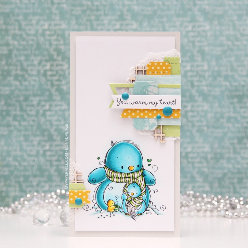
 My card measures 3 1/2 x 6 1/2″. I printed the image onto X-Press It blending card and colored it with my Copics. I was planning on doing a split complementary color scheme, but went with an analogous in the end, which is never a bad idea, in my opinion. I adhered the colored panel onto a card base I made from Soft Stone card stock from Papertrey Ink, adding two layers of cardstock behind the image for added dimension.
 It’s no secret that I love enamel dots, and the Cool Summer Night enamel dots from Altenew were the *perfect* color to match my penguin. Since I didn’t have any envelopes in the right size for this card, I created my own using patterned paper from Papirdesign and my envelope punch board from WRMK.
 I love this color palette. In addition to these colors, I also used BG71, which is a color I’ve created myself.
 I feel like every other day is Wednesday, and today’s another one. Time just goes by so incredibly quickly, it’s hard to keep up and keep track of the weekdays. I colored up
  I haven’t made one of my cluster cards in quite some time, but I really enjoy the process of putting these clusters together, so I decided to do it for this card. It’s a great way to use some patterned paper scraps, and one of these patterned papers is actually from 2007! It’s from Autumn Leaves. Remember them? I think it’s been a while since they ceased to exist. Now, when you go to autumleaves.com, you get to a site for assisted living communities for those with dementia. It’s a Texas based company, and definitely not a maker of pretty patterned paper. The other papers I’ve used are also what we’d call old in the card making world, the yellow one is from My Mind’s Eye and was released in 2011, and the remaining two were both released in 2013, they’re from Maja Design and Inkido, respectively.
 I use a couple of different dies to make these clusters, I make the banners using the Fishtail Flag Frames set from My Favorite Things, and I use the Happy Days Ticket Stubs die from Xcut for all those tickets. It’s one die that cuts nine different tickets, and I love that I get that many from one run through my diecutting machine. I mounted some of my diecut pieces on 1 mm foam tape, and glued others down using just double sided tape. Behind the whole thing I put half a mini paper doily from Doodlebug Design. I used the other half for the card I posted yesterday. On top I added a sentiment from Norsk Stempelblad AS stamped in Ocean Tides ink from Papertrey Ink. I mounted that on foam squares, and tripled up the foam squares on the left side of the banner. Finished off with a few pink dots from Papirdesign.
 I leave you with the colors I used for the adorable little girl. Not too many today.
 For noen uker siden fikk jeg bestilling på et bursdagskort til en mann som blir 70 år, dyrker grønnsaker og er glad i å grave i jorda.
  Som vanlig har jeg fargelagt med Copics. Denne gangen har jeg brukt Vintage Autumn Basics-papirer fra Maja Design og også en kantdie fra Magnolia.
 Jeg stanset ut bokstavene i navnet hans og tallene med dies fra Scrapmagasinet og satte det på en billett stanset ut med en Xcut-die. Jeg la noen hvite blomter og en bit twillbånd i en pose med BG75-refill blandet med vann. Da det var tørt hadde jeg bånd og blomster som matchet motivet mitt. Jeg har lagt perler fra FabScraps i midten av noen av blomstene, og jeg har også limt på grønne biter av en grenkvast fra Kort & Godt her og der rundt blomstene.
 På innsidene har jeg stemplet noen poststempler langs kantene av tekstpanelene mine med Spring Rain blekk fra Papertrey Ink. Poststemplene er en blanding av Marianne Design og Basic Grey. Teksten, som er fra Norsk Stempelblad AS, er stemplet med Blueberry Sky blekk, også fra PTI.
 På baksiden har jeg gjort det samme som inni. Kantstempling med poststempler i lyseblått, og tekst fra Norsk Stempelblad AS stemplet med en mørkere blåfarge.