I did it. Very under the pump towards the end there, but I finished my entry into the Coloring Virtuoso category for the MFT Superstar contest. And I’m so happy with how it turned out. Looks like an ordinary landscape A2 card, but when you open it up, there’s more fun on the inside.
 I stamped a couple of penguins running into the scene to assist the little mouse decorating the tree. The sky that you see at the top is actually the inside.
 In this photo the card is half open. I used the die with the snowbanks and trees from a coordinating die set to cut the top of my front. I traced on the back and used a knife and scissors to fussy cut a mirrored version of the die cut line for the the inside.
 And this is it. Another Christmas tree, a couple of bunnies, a few more penguins and the rest of the sentiment. I had so much fun coloring this, and kept everything else very simple. I used the new Sending Christmas Joy die to die cut the letters for Christmas twice from Blue Breeze card stock. I glued the two layers together for each of the letters and added it below my horizon line. I’d planned this out carefully so there would be room between the stack of presents on the penguin’s head and the bunny’s ear on the right. I stamped the word Cheer from the Christmas Cheer stamp set in light blue ink right over my coloring. I’m glad I didn’t mess that up!
 I thought I’d include some close ups. I wasn’t sure which color to choose for the sweater on this little mouse. I didn’t want it green, because it was next to the tree, and I didn’t want red, because there’s already enough of that. I figured why not go for the same “gold” color as I used for the baubles and the string on the tree. I think it worked out pretty good. I also wanted the tree to be a different green than the green I used for the clothing on the other animals, so I added some YG90s to the tree as well as the BG90s I’ve used elsewhere.
 I love adding textured fur to my penguins. Penguins are usually lighter towards the underside of their “arms” (Flaps? Wings? What are they, really?), so I tried to mimic that a little in these ones. A lot of them also have yellow on their bellies. I couldn’t decide between gray or orange feet and beaks, so I went gray with a hint of orange. I think it turned out pretty good.
 More gold, red and green. I never thought I’d use these colors on a Christmas card, they’re so not me. Adding texture on the fur of that tiny penguin was a challenge, but you can definitely see it, at least on his head.
 I had no idea which colors to choose for my little fox, there are so many to choose from. In the end I think I ended up with a total of 6 colors for his fur, 8 if you include the lighter parts. I went with a warm gray ribbon on his present. I obviously couldn’t choose red or green, I already had those right next to it. The same was true of the E40s (his belly). I used warm grays on the last bunny as well, so it all ties together.
 Speaking of – here he is. Warm gray fur, with a hint of E43 here and there. He’s holding a tiny candy cane, and I somehow managed to get 5 different red shades in there. I wanted it to look like he was entering the card from the right, so I made footprints behind him in the snow.
I used three different stamp sets and two die sets for this card, as well as an obscene amount of Copics.
Sweet Holiday Penguins stamp set.
Merry Wishes stamp set
Christmas Cheer stamp set
Christmas Cheer die set
Sending Christmas Joy die
Blue Breeze card stock
 A total of 57 Copics. It’s actually 58, because for the sky I also used B90, which is a color I’ve created myself.
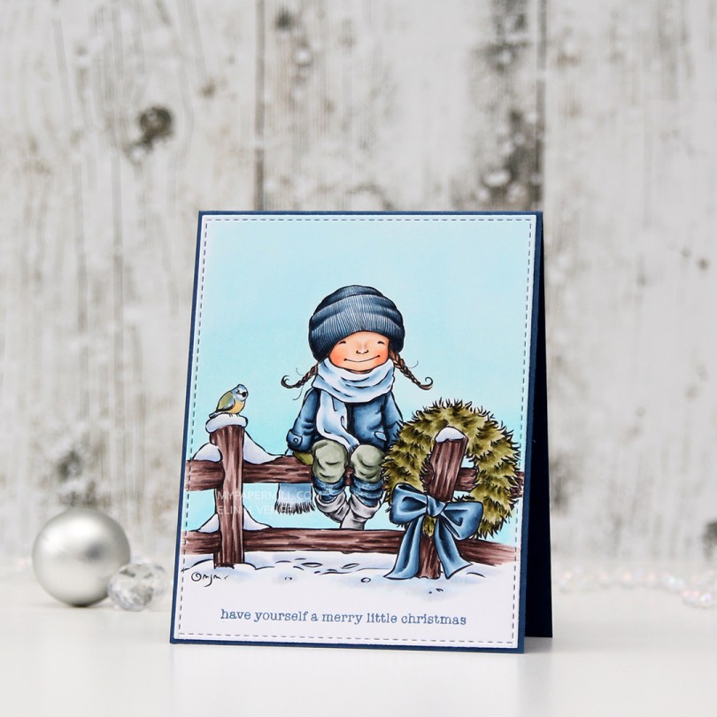
 I love this Merry Little Christmas image from Mo Manning, and I can’t quite believe it’s taken me so long to color it up. I pulled it out today, though, and it was a very easy one to color.
 I felt like I’ve colored up far too many red Christmas images lately, so I didn’t want even a hint of red on this one. The blue bow totally works, I think, the same is true of the blue, green and hint of yellow on the bird that I tried to color up like a Eurasian Blue Tit. I die cut my image using a stitched rectangle die from My Favorite Things.
 I glued my panel onto a cardbase made from Enchanted Evening cardstock from Papertrey Ink, and stamped a sentiment from the Holiday Messages stamp set from Mama Elephant using Enchanted Evening ink, and my card was complete. I didn’t add any embellishments to this, I wanted the image to shine.
 Speaking of the image, here are the colors I used. I also used B90, which is a color I’ve made myself, on her scarf.

 I stamped, colored and diecut the bunny a couple of days ago, so he was ready to go. I wanted the background stamp from that same stamp set to be in the shaker, and also going across. The shaker portion was stamped using Extreme Black ink, then colored with Copics, while the parts on the outside were stamped and white heat embossed on vellum and colored on the back. You don’t want to ruin the tips of your Copics by touching the embossing, so the back’s a great option when using vellum, because it still shows through.
 I like my shakers done a certain way. I use a die slightly bigger than my shaker window to die cut several times from white cardstock. I stack my negative die cuts (for this card it was 7), glue them together and glue a thin strip of cardstock to the inside of my negative diecut stack. That way, none of the sequins or other bits in the shaker get stuck anywhere, but can shake freely in their little confined space.
 I used a sequin mix from Hero Arts for the inside of the shaker. It’s a mix of matte white sequins and clear sequins, as well as iridescent star confetti. I’m not usually a fan of iridescent elements on my cards, but for a night time Christmas shaker, I don’t mind.
 Not too many Copics used for this one! And the red one that says B97 should say R27, I must have undone the correct one before I saved my graphic in Photoshop.
 Let’s talk for a minute about P13. They’re a Polish company, and they make beautiful, thick patterned paper. That’s really all you need to know, because it’s all I know. When I say thick, I mean thick. I don’t know their exact weight, but it’s close to card stock weight! I’m telling you, these are wonderful. They’re double sided, and the little strip you see at the bottom here with the torn edge is the back of that very same sheet (
 I have tons of floral clusters left over from the patterned paper, and one of the wonderful things about the P13 papers is that the design isn’t repetitive. This specific sheet of patterned paper had plenty of florals on the front, but they were all a little different, which means creating different cards from them will be a breeze.
 I colored in my little scene using more Copics, die cut that using the same die, then fussy cut around the trees, snow and house. I added a sprinkling of snow by heat embossing chunky white embossing enamel on both panels. I glued my blue background to a cardbase I made from Pure Poppy cardstock from Papertrey Ink and added the rest of the scene on top using 1 mm foam squares – lots of them! I added a stacked die cut sentiment using a die from the So Many Snowmen die set from Mama Elephant and my card was done.
 I didn’t use too many colors on this, and most of these were actually used on the sky and the snow.

 This is a small, but mighty one. It may look very unassuming as a 2-3/4″ square shaker card, but there’s a secret. It opens up to be quite big in the end. The shaker itself is filled with sequins, gems and a few die cuts in colored cardstock die cut using one of the dies in the Tag Builder Blueprint 5 set. I cut them down a little with my scissors and cut the ends off so they wouldn’t get tangled inside the shaker.
 The gorilla from the Picture Perfect Party Animals stamp set covers the entire front, but there’s a magnetic flap on the back, and once you undo that, more is revealed.
 Flip the gorilla over, and you’ve got more animals ready to join the party. I used the yellow polka dot pattern from the Party Patterns paper pad for even more fun and a way to get even more happy color into my card. These three panels are flaps that open to the sides (two to the right and one to the left) to reveal even more…
 The last three (technically four, since there are two parrots in that one selfie) animals are ready to party. They’re tucked inside pockets, and I’ve stamped a couple of the sentiments that come with the stamp set onto Razzle Berry heavyweight cardstock from MFT and heat embossed them. That pink really packs a punch. I die cut my sentiments using the largest of the Fishtail Flag Frames dies, and cut down another patterned paper from the Party Patterns paper pad to strips that included the yellow, green and pink colors that I have throughout my card. I also added some die cut streamers from the Tag Builder Blueprint 5 die set using Razzle Berry, Pineapple and Limelight cardstock, all from MFT.
 You can pull the selfies out of their pockets, and there’s room to write a personal message to the birthday boy or girl on the back of the selfies. The best thing about this card is that no specialty dies are required, this is all done with a paper trimmer, score board, bone folder, craft knife and a steel ruler. I prefer the craft knife and steel ruler over the paper trimmer, but that goes way back to my days of creating architectural models. Those knives are handy!
 There you have it, my entry for the Innovation Master category for MFT’s annual superstar contest.
 I wanted a soft color palette for my card, so I have no colors that are really dark in this image. The darkest marker I used is E57, and it’s contained to the hair on one of the fairies, the flower centers and the ladybug.
 Once I’d colored the entire panel, I took the largest of the dies from the Stitched Rectangles STAX 1 set from My Favorite Things to turn it into a panel and create a nice border on the front of my card. I knew from the start that I wanted my sentiment inside the balloon, but I couldn’t decide on white or black. I thought the white might not pop enough against the yellow balloon, but I also knew that the end of the pigtail on the fairy would mess with any black stamping, making the letter illegible. In the end, I went with the white, but you can hardly see it in the photos against that lightest yellow. I might go in with a water brush and the refill for the darkest color I used on the balloon to darken it up later. I don’t want to ruin the nibs of my markers by touching the embossing, but refill and water brush with a little bit of blender solution will work without ruining anything.
 I finished my card by adding some groupings of sequins and Jewels from Little Things from Lucy’s Cards. I used the Iced Sherbet mix for this card.
 Last, but certainly not least, are the colors I used for my image.
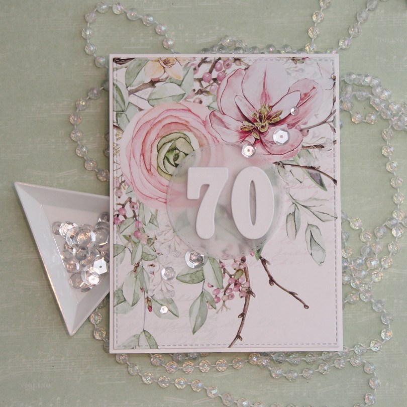
 For this card, I used the largest die in the Stitched Rectangles STAX 2 set from My Favorite Things. You can find set 1
  I glued my die cut panel onto a cardbase made from Stamper’s Select White cardstock from Papertrey Ink. I die cut a circle from vellum using a circle die from the Stitched Circle STAX set, also from My Favorite Things. It matches nicely with the stitching around the edge of my floral panel.
 I also die cut a bunch of numbers using a die set from Papirdesign. I made most of them from white card stock, but the top numbers from a piece of that same patterned paper. It might not look like patterned paper, but there’s a lot of white space on this sheet, and I used some of that for my numbers. It makes the whites match, which I really love. I put a 3 layers of my numbers underneath the vellum, and the remaining four layers on top. It makes the vellum stand out a bit from the background, which makes the number show up a little better and not get lost in that busy background.
 I finished off the card by gluing on some sparkling clear sequins from Pretty Pink Posh.
 As usual, I colored my image in with my Copic before die cutting it down to a panel using a stitched reclangle die from My Favorite Things. I glued it to a card base I made from Stormy Sky cardstock from Papertrey Ink, also a gorgeous color, and it matches my coloring pretty well.
 I didn’t want to do too much to distract from my coloring, so I die cut a God jul (Merry Christmas) sentiment using a die from Papirdesign and that same color cardstock as my base, and glued that next to the little girl. I didn’t even stack several die cuts on top of each other like I normally would.
 I finished my card by gluing on some diamonds from the Glass mix in the Crystal Collection from Little Things from Lucy’s Cards.
 Those last six colors in this graphic? All the colors I used to create the red scarf (I only used E08 for the red on the bird).
 I used a cover die from Neat & Tangled to diecut twice from white cardstock and several times from scraps of different green patterned paper scraps. These are a mix of Papirdesign, Maja Design, Kaisercraft, and one that I don’t even know. Great way to use all those little bits.
 I glued my white frames together and inlayed my green pieces, before die cutting a word die from Papirdesign using Ripe Avocado cardstock from Papertrey Ink for the word itself and white for the shadow. I stacked a few of the green ones on top of each other for it to stand out a little bit.
 I used some angel hair to make a nest underneath my diecut and glued it right on top using liquid glue. I also added a few sparkling clear sequins from Pretty Pink Posh for some shine, and stamped a Norsk Stempelblad AS sentiment in Ripe Avocado ink from Papertrey Ink on a white strip and added it below my die cut word.
 Simple, but the dimension in the frame and the focal point still give the card a little bit of interest.