Hi, everyone! I’ve got a Christmas card to share today. I know it’s Easter time, but there’s a line of lyrics in a Norwegian Christmas song that says Christmas lasts till Easter, and I’m sticking to it. The next line in the song states that it’s not true, but that’s beside the point 😉
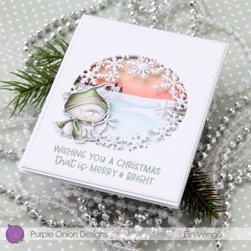
This started out as an idea of a fairly simple card with a window on the front so you could see inside, but evolved fairly quickly into a trifold card. A heavy one at that, even though it looks simple, there are a lot of layers, and the card actually weighs in at 28 g.
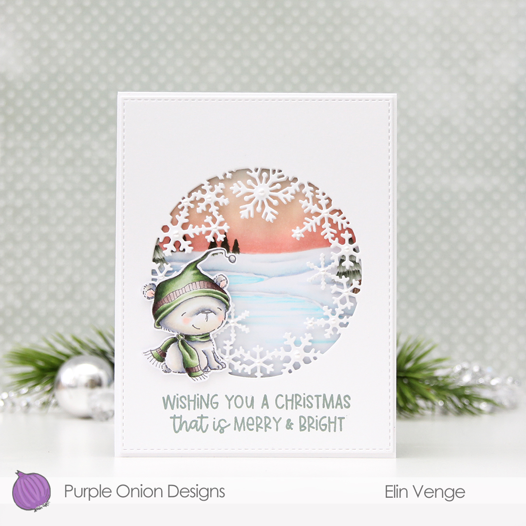 I started by coloring the polar bear (Icicle) and fussy cutting him, leaving a thin white border around him. I’m not good at leaving a white trim when I fussy cut (my scissors naturally gravitate towards the stamped lines), but I get around that by drawing an outline about 1 mm outside the stamped line with a mechanical pencil, and then cut along that.
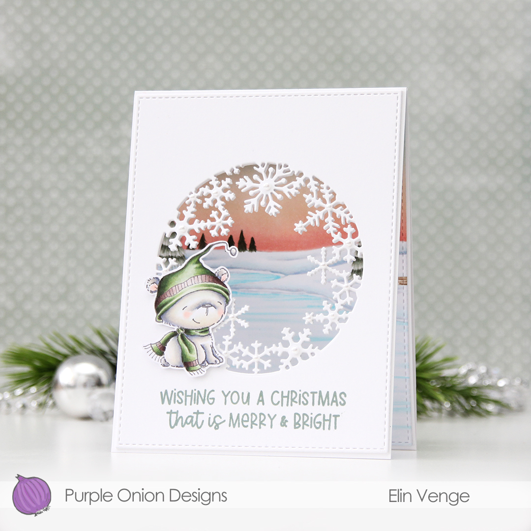 I love the snowflake circle die from Hero Arts and have used it many times before. I die cut a window into the center of the front of my card base, and at first thought that would be it. Once it morphed into a trifold, though, it was so back heavy that I needed an additional two die cut windows on top of the card base for some strength and stability. I used the largest of the A2 Stitched Rectangles from My Favorite Things to create a nice finished edge to the top layer.
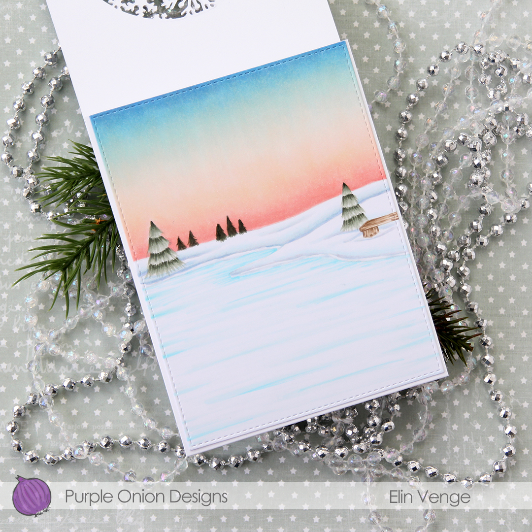 For the inside panel that you can see from the front, I stamped the Frozen Pond using fadeout ink from Inkon3 and colored in the entire panel, before using the same stitched rectangle die that I used for the front for a nice finished edge. This entire panel flips down, leaving lots of space on the inside for a personal message.
 I stamped a sentiment from the Holiday Messages Sentiment set straight onto my card using Ocean Tides ink from Papertrey Ink, before adding the polar bear with 1 mm foam squares.
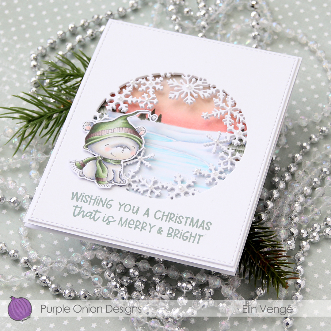 In this photo it’s pretty evident that the three layers of panels with die cut windows add a nice bit of dimension, as well as stability to what would otherwise be a pretty floppy card front, since the window is so big. I use 110 lb white card stock (Stamper’s Select White from Papertrey Ink), which is a nice, sturdy card stock, but with that big of a window, the only thing that will work is using several layers.
 I added white pearls from Kort & Godt to the center of the snowflakes. 3 mm pearls for the largest snowflakes, 2.5 mm pearls for all the others.
 Lots and lots of Copics for this one. I used 20 markers to color just the bear, 10 for his fur alone, which is a little bit crazy.


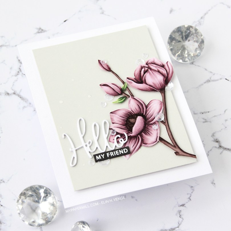
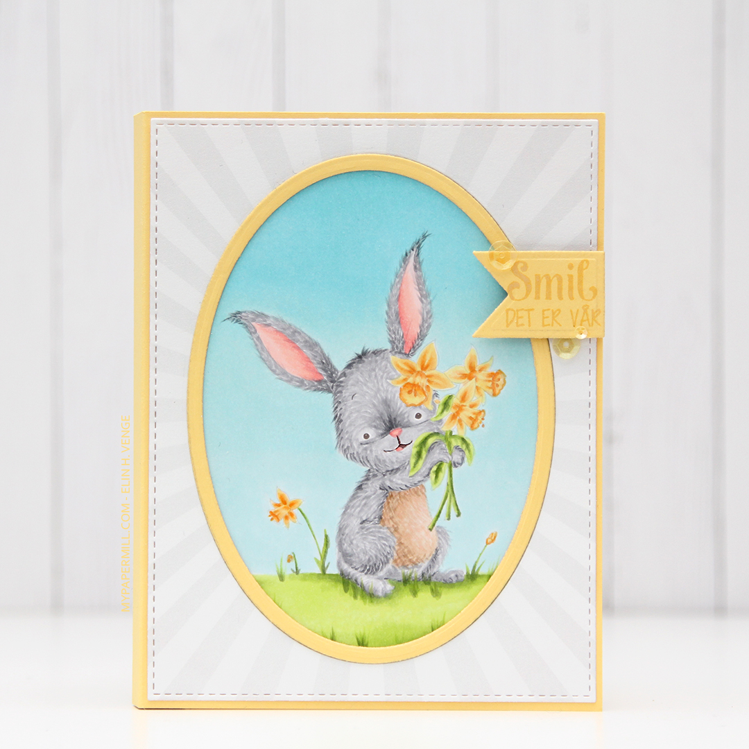
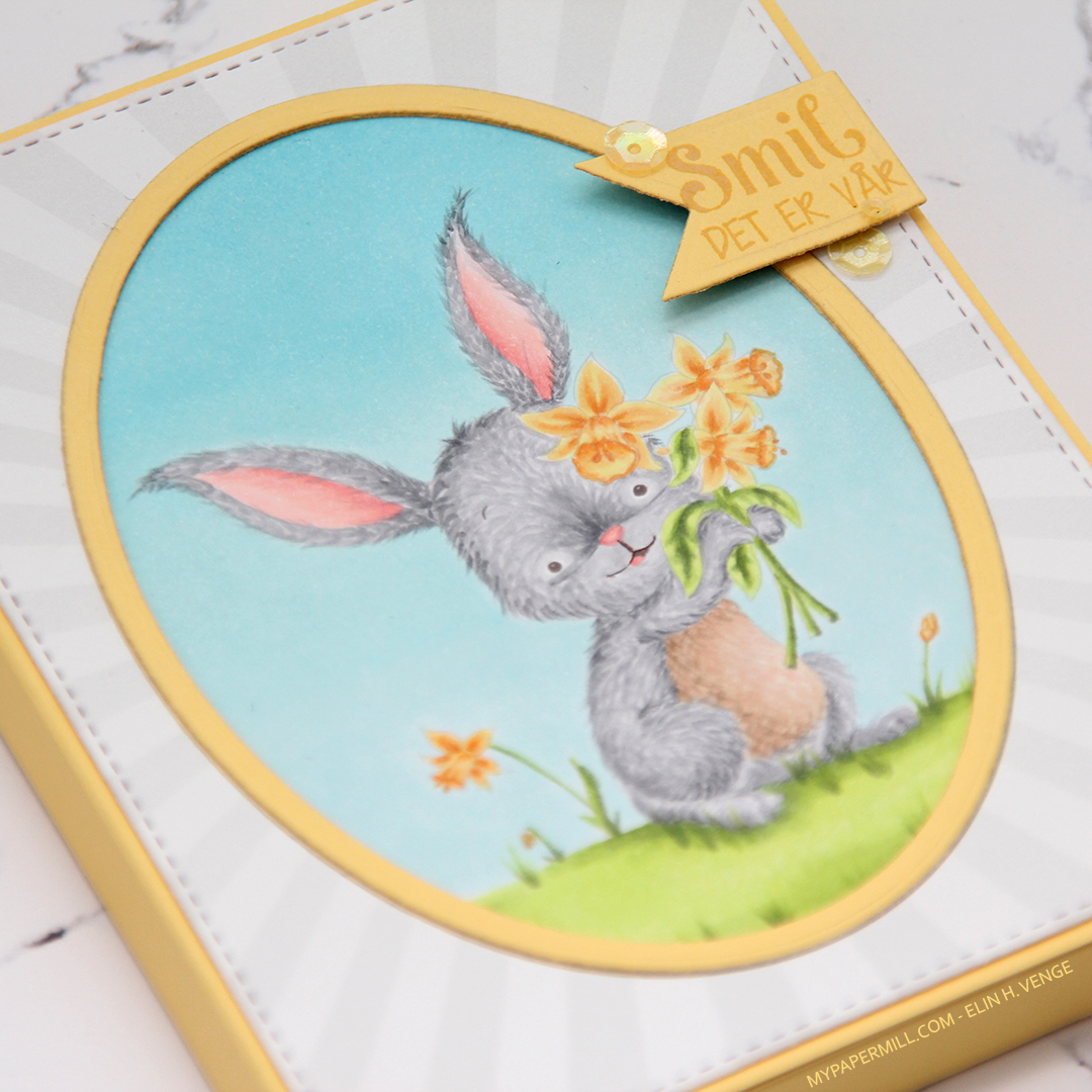
 I stamped the flowers in fadeout ink from Inkon3, before coloring them in with Copics and fussy cutting up to the line.
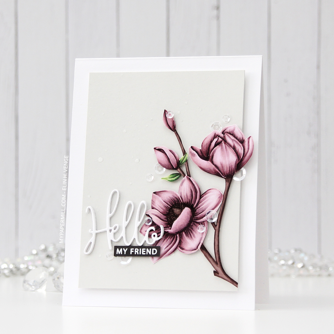
 I die cut Hello three times from white card stock and stacked the die cuts for dimension. The die is from a die set that came with my Gemini when I bought it two years ago, and this is the first time I used it. It has a swirl going down at the bottom of the H that connects to the o, but I chopped that off.
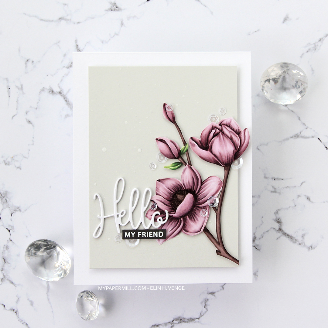
 I added sequins from the White Orchid Sequin mix from Little Things from Lucy’s cards on or near the flowers and the sentiment, and my card was complete.

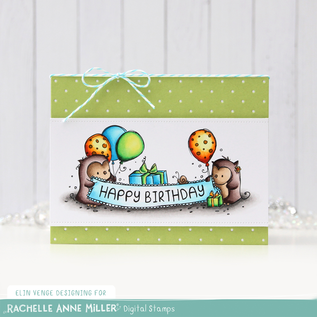
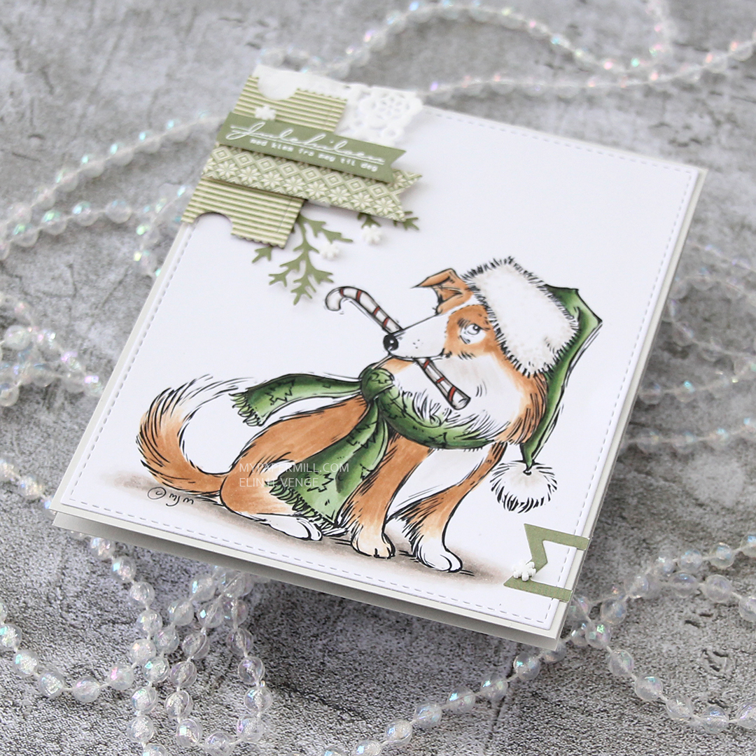
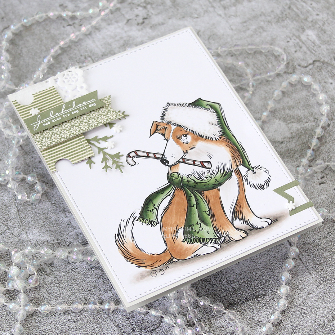
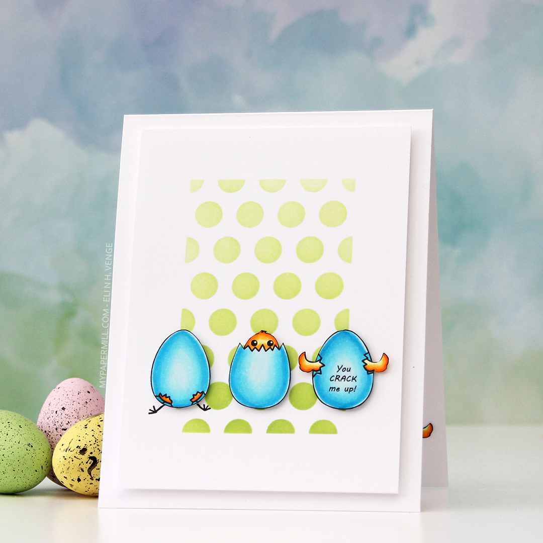
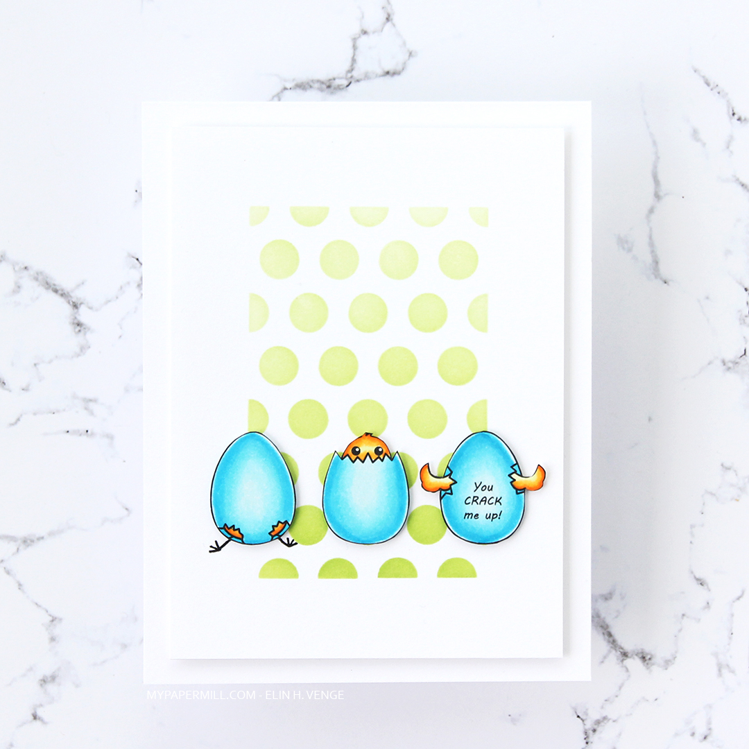
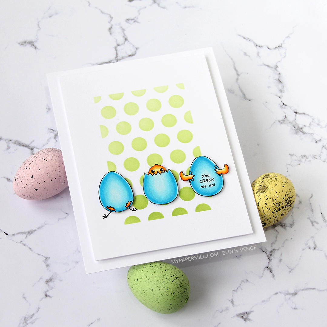
 Not a whole lot of Copics used for this image, it IS simple, after all. I also used V97, which is a color I’ve made myself.

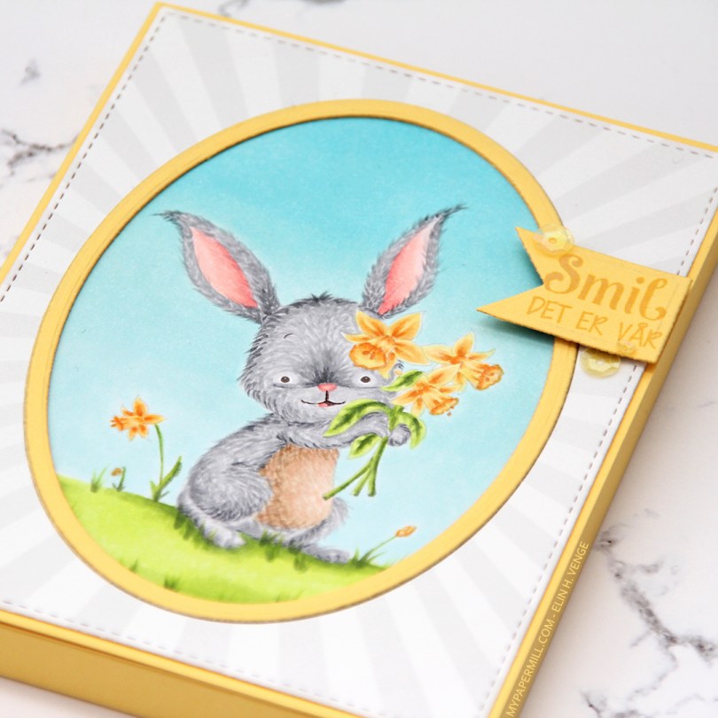


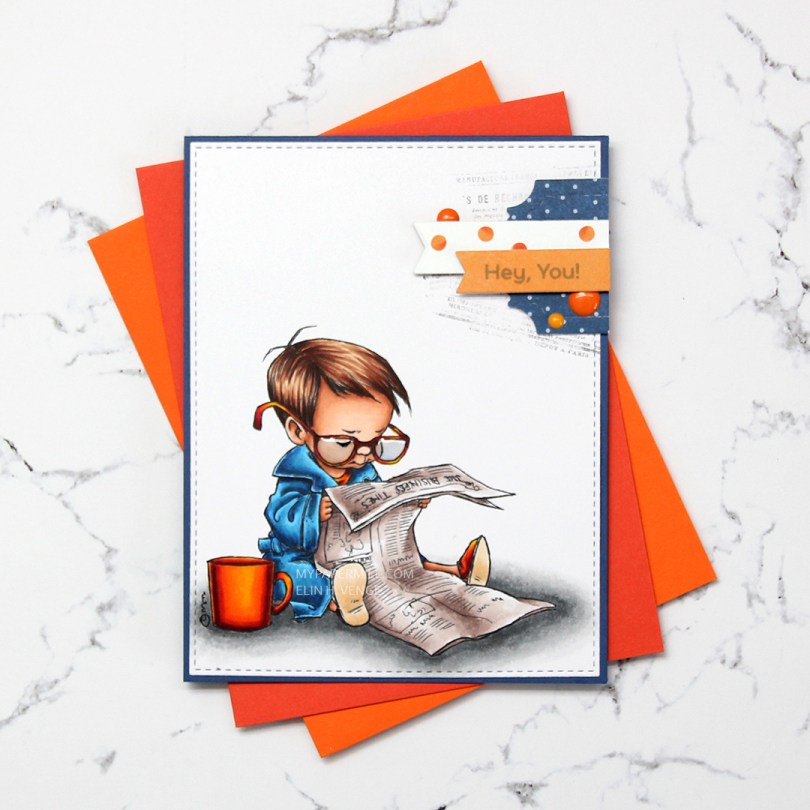
 I colored up the boy version of
  Near the top right corner, I randomly stamped part of an old background stamp from Tim Holtz and Stampers Anonymous. I thought the small text on the stamp would pair well with the newspaper in the image and stamped pieces of it at an angle with Memento Espresso Truffle ink. I didn’t even put the stamp in my Misti or on an acrylic block, I bunched it in my hand and stamped, giving it less of a rigid feel, since the stamping is uneven. I added my colored and stamped panel onto a card base made from Blueberry card stock from My Favorite Things, and a small cluster on top of my stamping.
 I die cut some patterned paper scraps with a couple of dies from XCut and My Favorite Things to create my cluster. The blue piece is from Papirdesign, the other two from the Happy Birthday collection from P13. I stamped a sentiment from the Bitty Bears stamp set from My Favorite Things onto the orange banner using Hero Arts Soft Granite ink. I finished off with three enamel dots from Papirdesign and added Glossy Accents to the boy’s glasses.
 Not a huge amount of colors. For the soles of his slippers I actually used the two lightest colors that I used for his hair (E31 and 30).
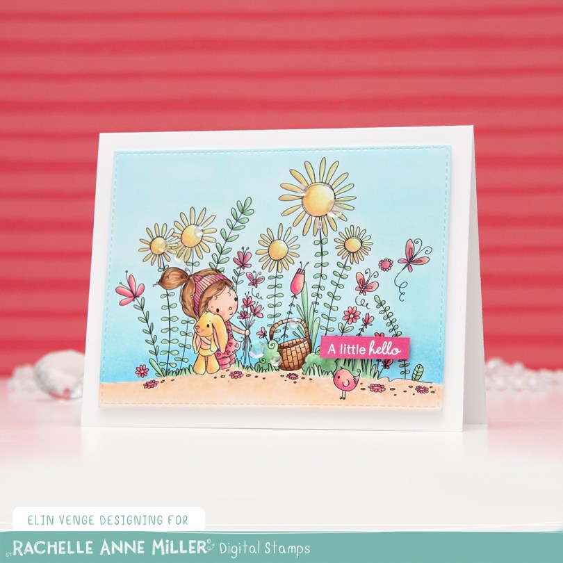
 As usual, I printed the image on X-Press It blending card and colored it in using my Copics. Once done coloring, I took the second largest die in the A2 Stitched Rectangles STAX 2 set from My Favorite Things to turn it into a panel with nice faux stitching along the edges. I mounted it with foam tape onto my card base.
 I stamped and white heat embossed a sentiment from InkyWings onto a tiny scrap of Raspberry Fizz card stock from Papertrey Ink. It was so small I barely even cut it smaller before adhering it to my card using Gina K foam tape, which isn’t as thick as the foam tape I used for my colored piece. I added some gems and sequins from the Iced Sherbet mix from Little Things from Lucy’s Cards, and my card was finished.
 Colors. Not a lot, but some, with an added confession. I made a very similar card to this about six months back, and I’ve used the exact same colors on this one, except for one. Being a little lazy this time, I didn’t want to redo the entire graphic because of one single marker, so this graphic is one I’ve used before. The only color in there that I didn’t use for this card was E13, simply because I forgot.