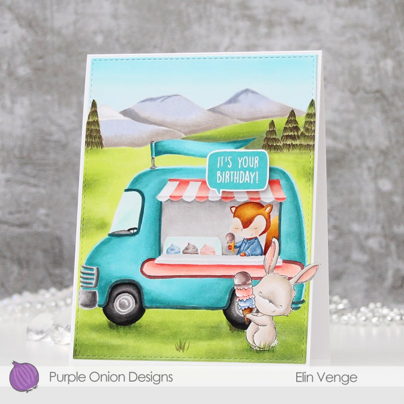
Hi, there! I’m back with a birthday card for an ice cream loving friend today.
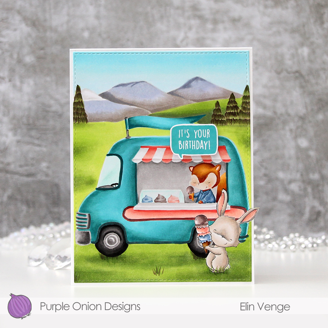
I stamped Marigold from Purple Onion Designs in Extreme Black ink from My Favorite Things, before masking and stamping the Ice Cream Truck and the Mountains using fadeout ink from Inkon3.

I’ll admit, this took a while to color. I always start with my background elements and finish with the main image in the scene. Believe it or not, but I actually added quite a bit of brown to those trees. I added darker greens under the wheels of the ice cream truck and under the bunny, and a little bit here and there in the rest of the scene as well, for a little bit of interest. Once the entire scene was colored in, I went in and added a few blades of grass in the foreground.

I knew even before I started that I wanted the ice cream truck to be teal. Originally, I was going for a very light color, but it was looking a bit too blue, so I went in with some darker colors and made the whole truck darker, that did the trick. I went for a corally, peachy type color for the awning and the side panel, I really like peach tones with teal. Kind of weird, since I’m not generally a fan of complementary colors, but these work.
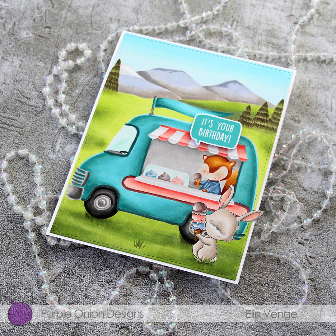
Once everything was colored, I did some fussy cutting around the bunny’s ear and used the largest of the A2 Stitched Rectangles STAX 2 dies to die cut the entire panel. Except for the ear, of course. I adhered my panel onto an A2 card base, and I admit I love the little detail of the ear sticking out past the edge of the card. Of course it meant that I needed to make my own envelope, the ear would have gotten crumpled inside the envelope had I used an A2 envelope.

I stamped one of the sentiments in the Everyday Blurbs stamp set using Distress Oxide ink in the color Peacock Feathers, before fussy cutting the speech bubble and mounting it on foam tape onto the card.

Lots and lots of Copics used for this one!

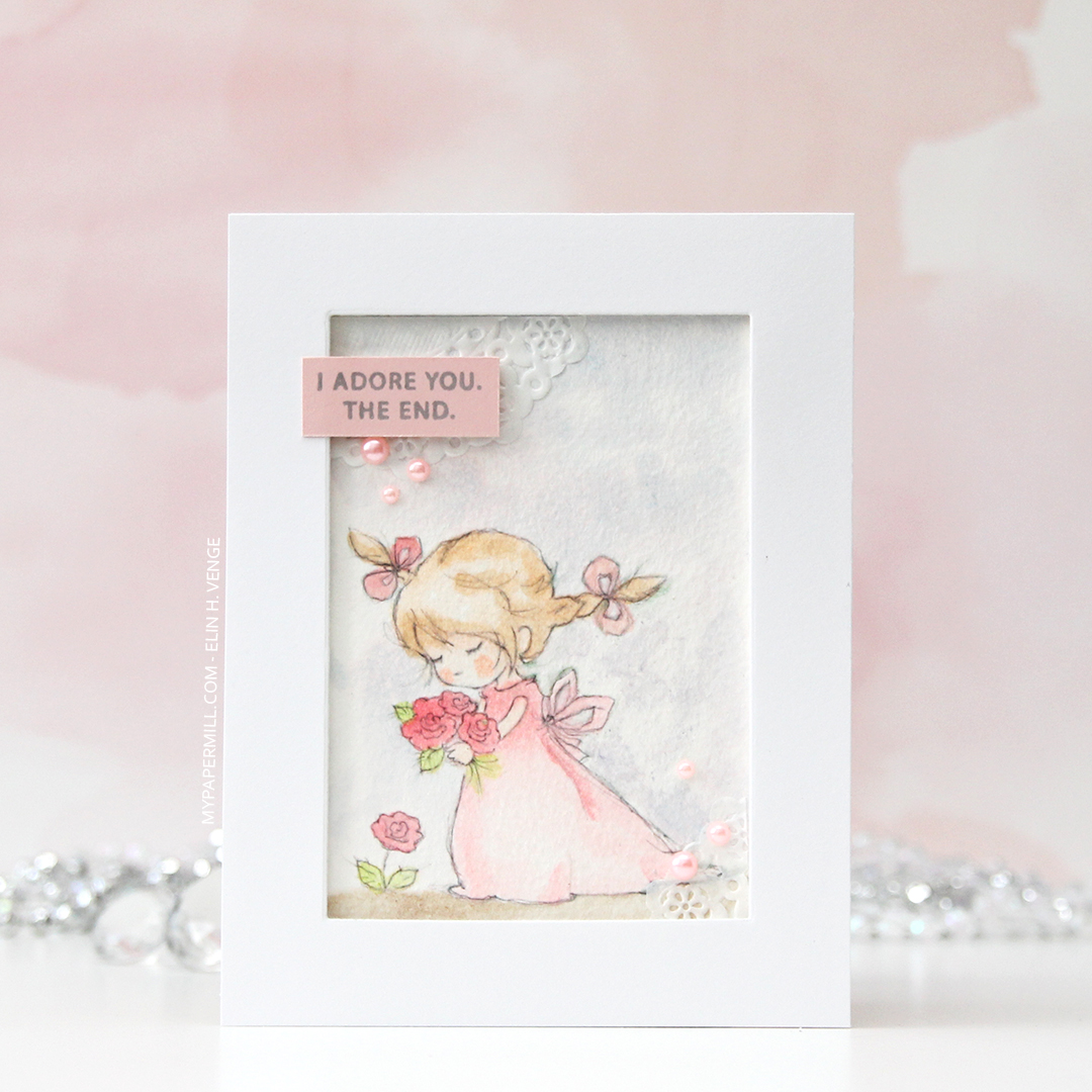
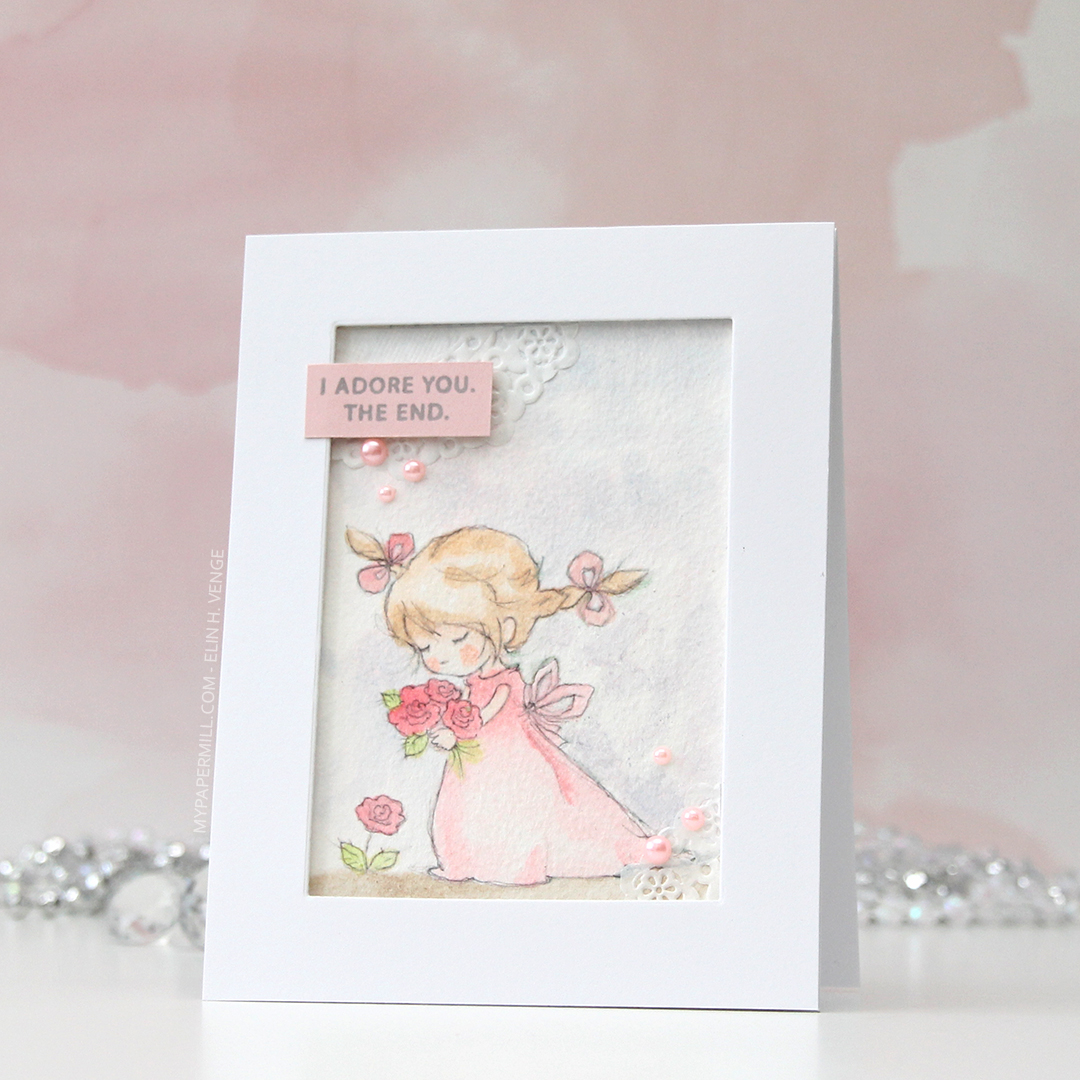




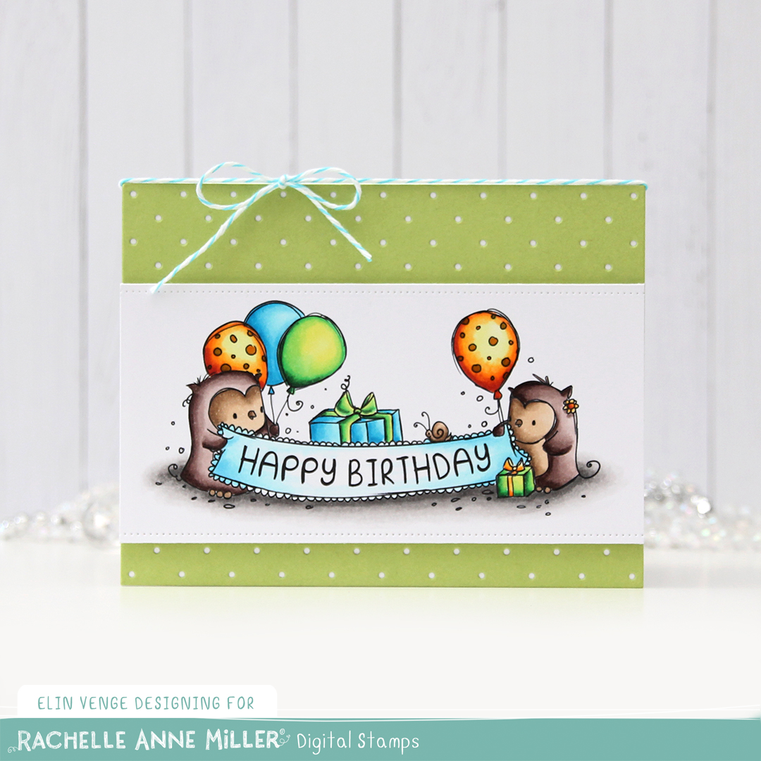
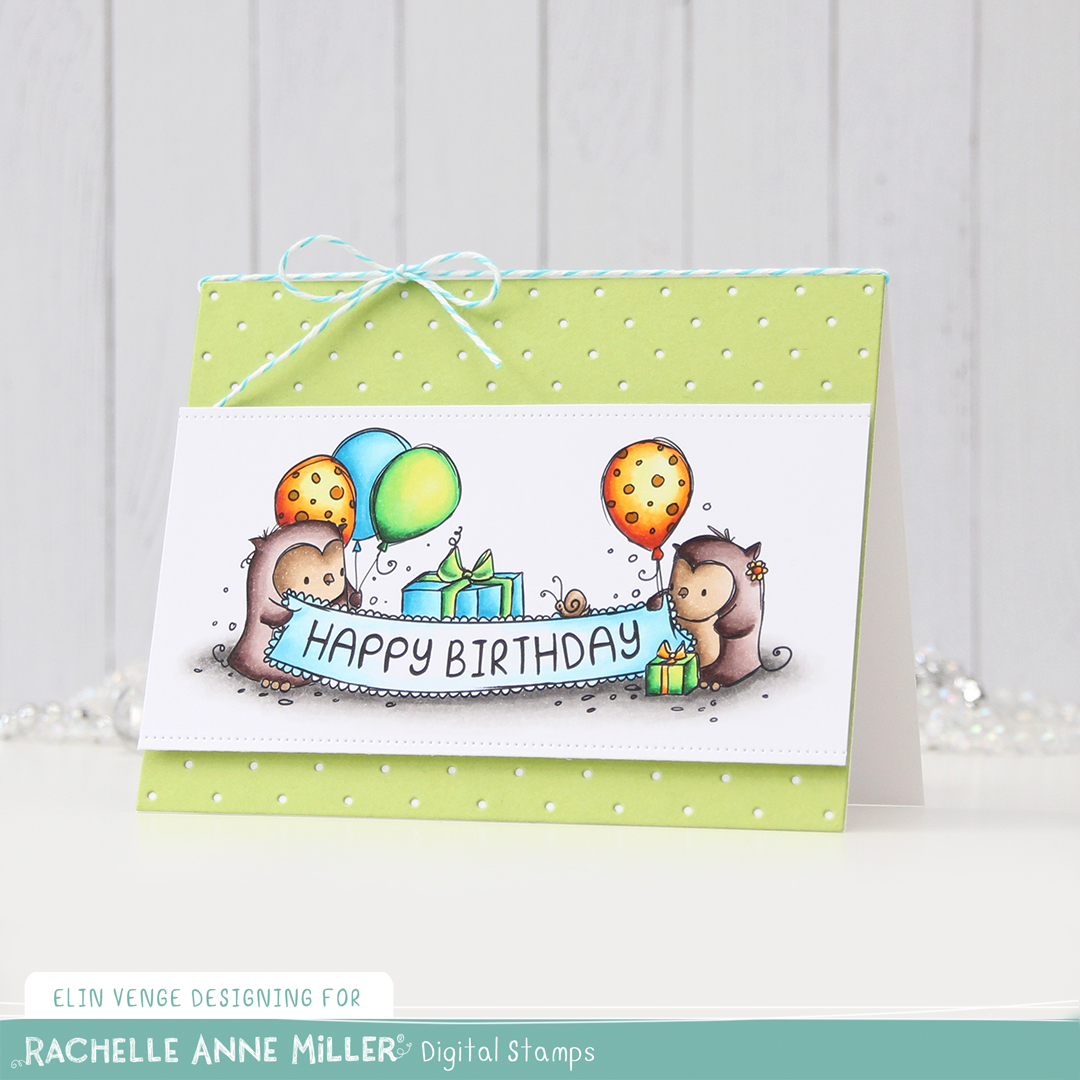

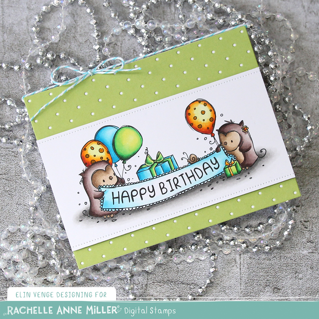




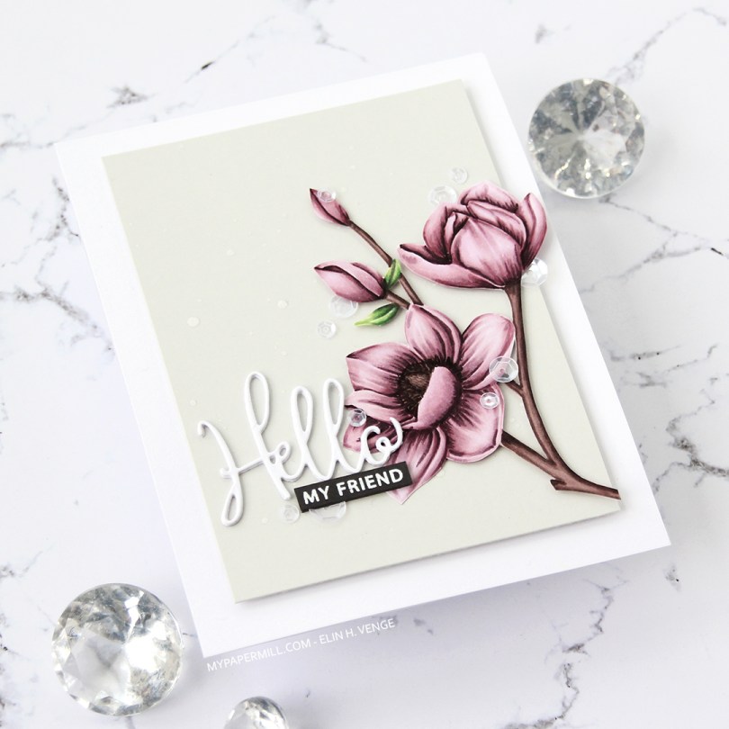
 I stamped the flowers in fadeout ink from Inkon3, before coloring them in with Copics and fussy cutting up to the line.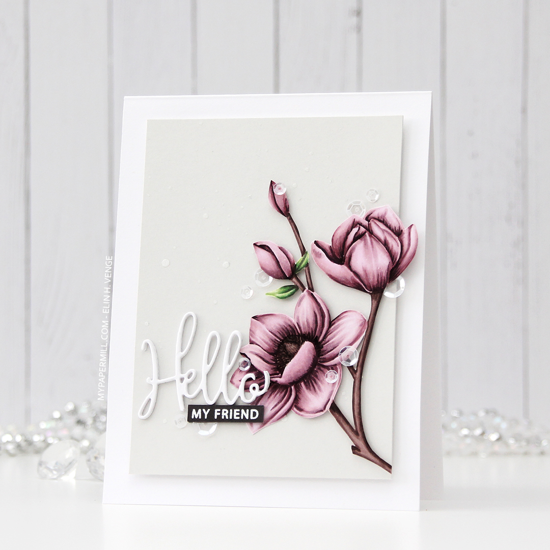
 I die cut Hello three times from white card stock and stacked the die cuts for dimension. The die is from a die set that came with my Gemini when I bought it two years ago, and this is the first time I used it. It has a swirl going down at the bottom of the H that connects to the o, but I chopped that off.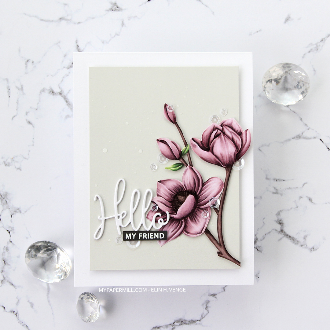
 I added sequins from the White Orchid Sequin mix from Little Things from Lucy’s cards on or near the flowers and the sentiment, and my card was complete.
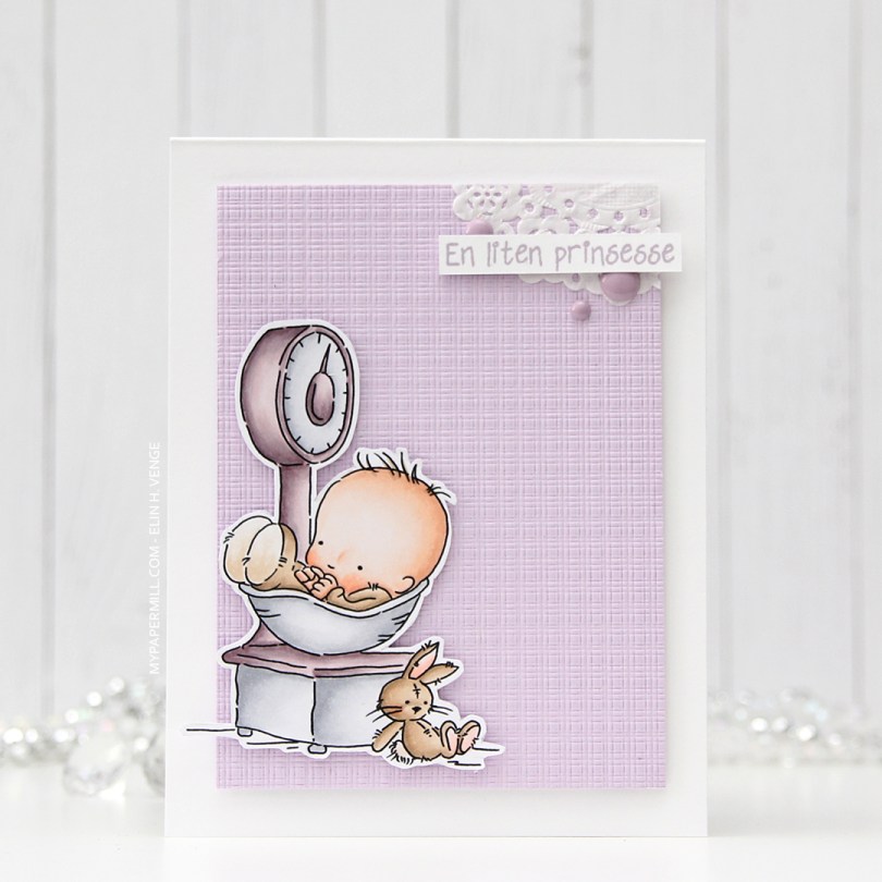

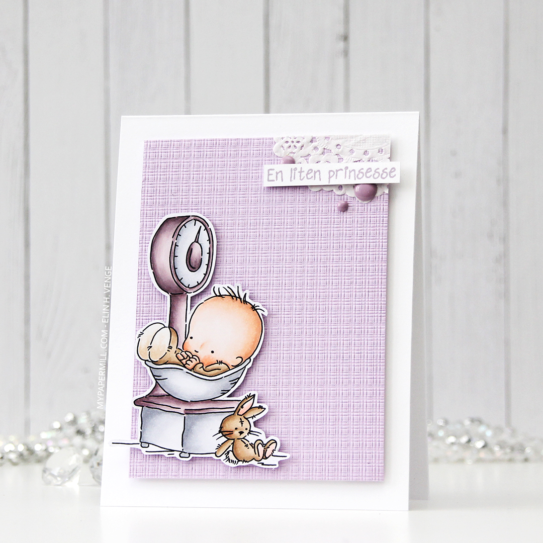
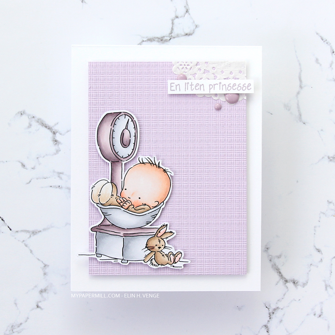
 Not a whole lot of Copics used for this image, it IS simple, after all. I also used V97, which is a color I’ve made myself.







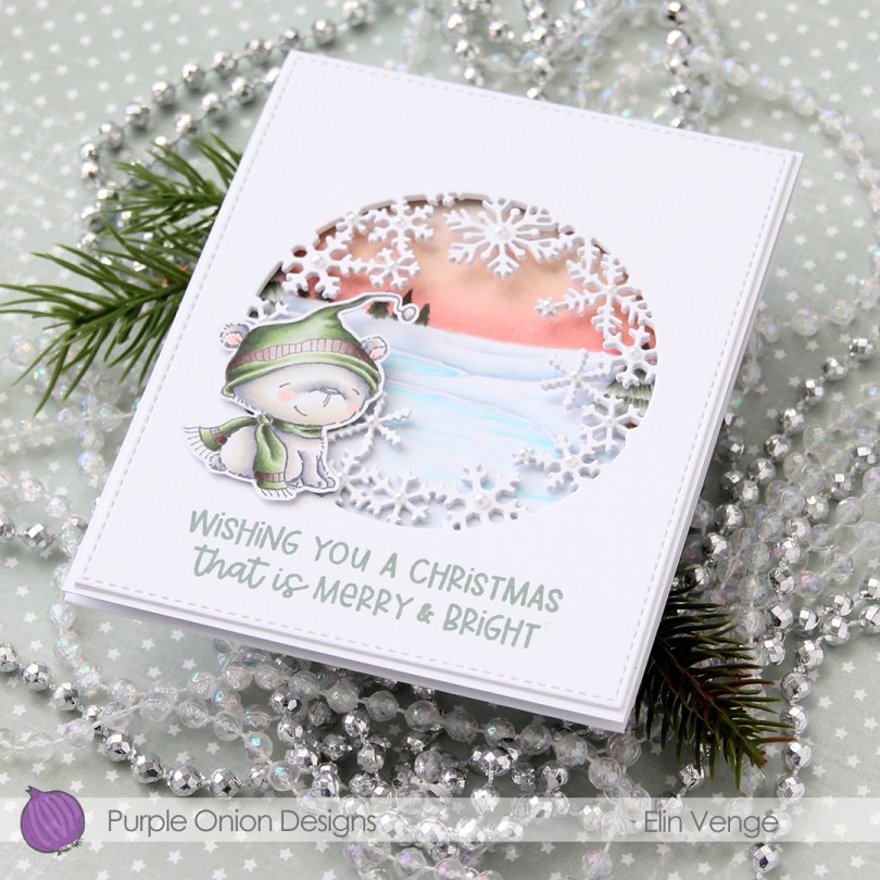
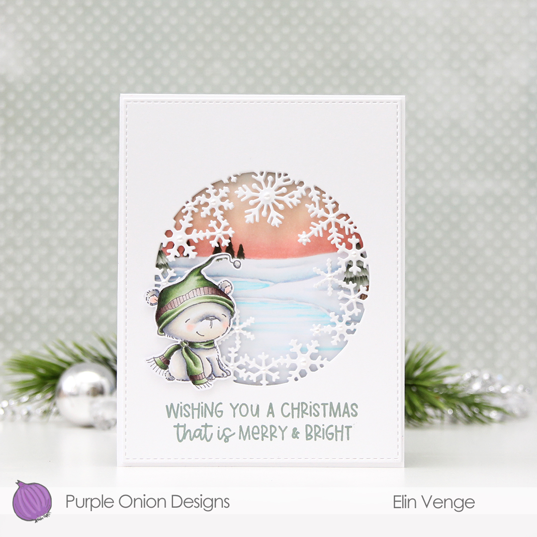 I started by coloring the polar bear (
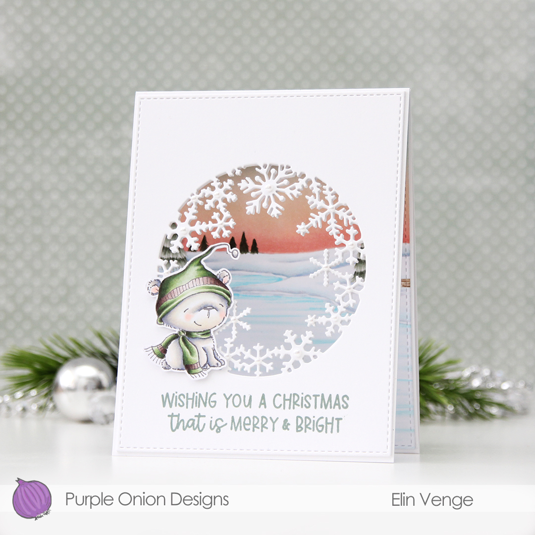 I love the snowflake circle die from Hero Arts and have used it many times before. I die cut a window into the center of the front of my card base, and at first thought that would be it. Once it morphed into a trifold, though, it was so back heavy that I needed an additional two die cut windows on top of the card base for some strength and stability. I used the largest of the A2 Stitched Rectangles from My Favorite Things to create a nice finished edge to the top layer.
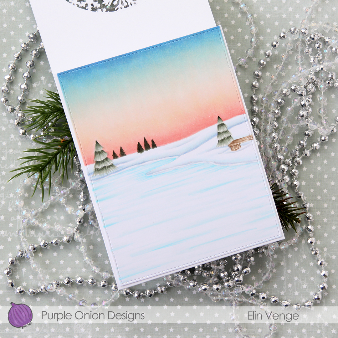 For the inside panel that you can see from the front, I stamped the
 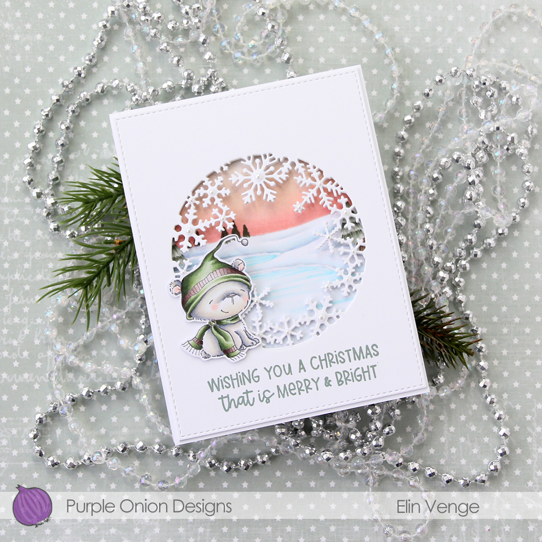 I stamped a sentiment from the
 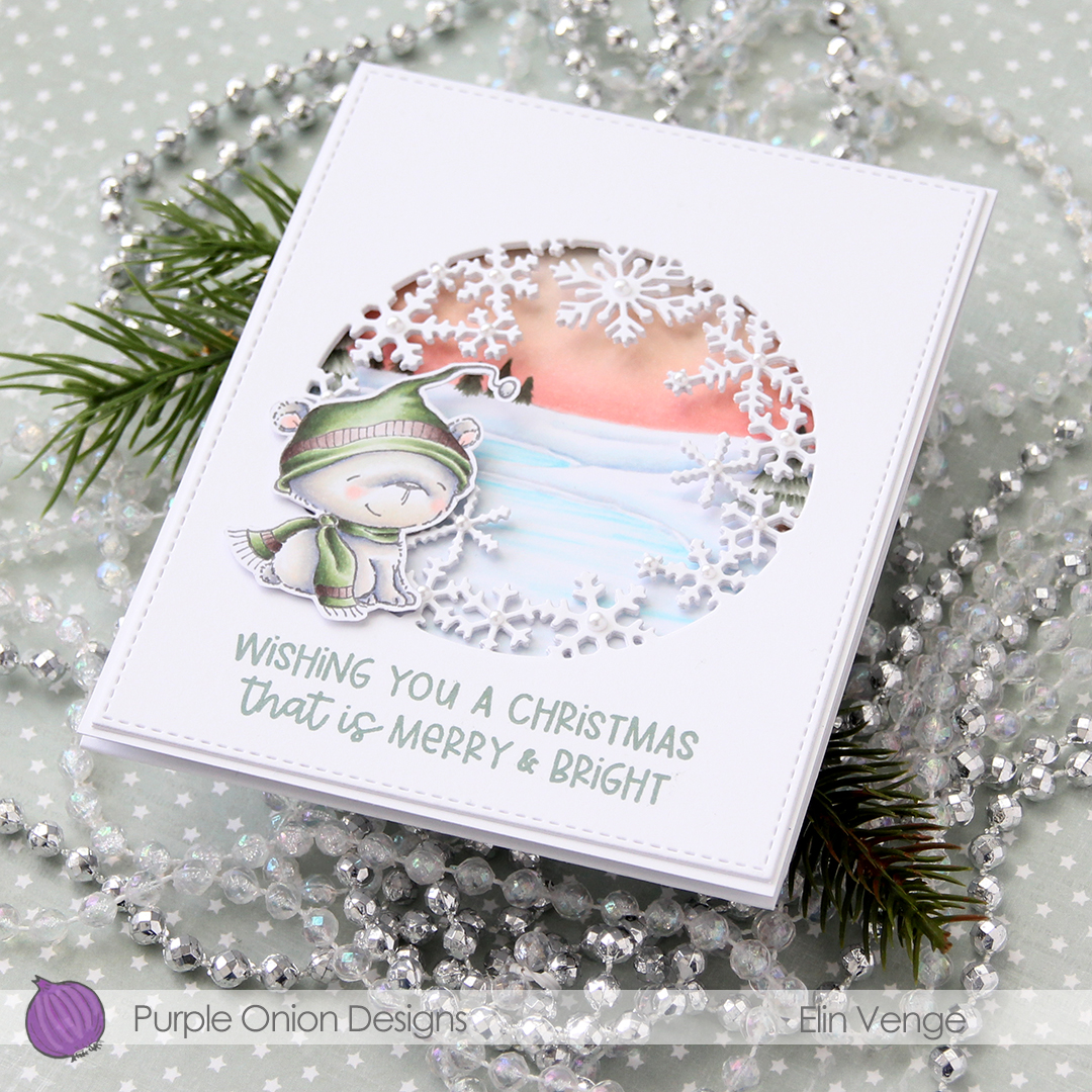 In this photo it’s pretty evident that the three layers of panels with die cut windows add a nice bit of dimension, as well as stability to what would otherwise be a pretty floppy card front, since the window is so big. I use 110 lb white card stock (Stamper’s Select White from Papertrey Ink), which is a nice, sturdy card stock, but with that big of a window, the only thing that will work is using several layers.
 I added white pearls from Kort & Godt to the center of the snowflakes. 3 mm pearls for the largest snowflakes, 2.5 mm pearls for all the others.
 Lots and lots of Copics for this one. I used 20 markers to color just the bear, 10 for his fur alone, which is a little bit crazy.
