
Hi, everyone! I’ve got a bright, cheerful baby card to share with you today. Definitely not traditional pastel baby colors, but the weather’s foggy and dreary these days, and I’m doing my best to restore balance somehow with a bit of brightness.
 I thought Animal Balloons from Rachelle Anne Miller was the perfect stamp for a baby card, even in untraditional colors. I love the little mouse sitting on the yellow balloon, it’s the perfect little detail in this image. I colored the image with my Copics, making sure to overlap colors where the balloons intersect, so they appear somewhat transparent.
 Using Memento Bamboo Leaves ink, I stamped a sentiment from Norsk Stempelblad AS inside one of the balloons, stamped again in VersaMark ink and clear heat embossed it. It makes it stand out a little more from the balloon. I die cut the panel using a die from the A2 Stitched Rectangles STAX 1 set from My Favorite Things and adhered it to a card base made from Sour Apple card stock from MFT using lots of foam tape for dimension.
 I added Sparkling Clear sequins from Pretty Pink Posh to three of the balloons, and my card was finished. All that was missing was an envelope. The only colored envelopes for A2 sized cards I have left are in warm tones, so I decided to make my own using the A2 V flap envelope dies from Simon Says Stamp with a scrap piece of patterned paper from Papirdesign.
 I thought the color of the patterned paper matched the blue balloons on the card so well, and it made the pile in my scrap drawer shrink ever so slightly, gotta love that!
 I kind of went overboard with the number of Copics used for each balloon, but I think it turned out pretty good in the end.
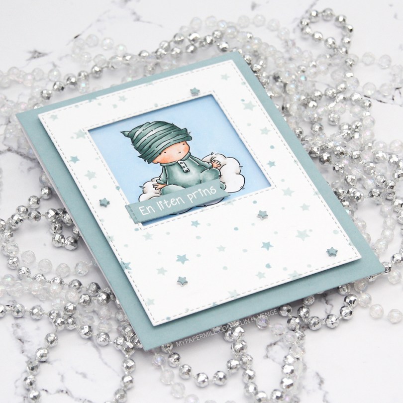
 I had the beginnings of a plan before I started coloring this cutie, and knew that I wanted a window of sorts for the image to be sitting in. I traced a square die onto my panel before I started coloring, so I knew how large of an area I needed to fill in beyond the baby and the cloud.
 Using the Star turnabout stamp from Concord & 9th along with Misty Morning and Cloudy Sky Ink from Altenew, I was able to create a quick panel of scattered stars in colors that matched my colored image. Using dies from two die sets from My Favorite Things, I turned my panel into one with a window and nice faux stitching along the edges. I really like the look of the faux stitch lines that many of the MFT dies have. Other companies have faux stitching dies too, but there’s something about the length of the stitches, the distance between them and the adjacency to the edge of the MFT ones that make them a favorite of mine. I put foam tape on the back of my stamped star panel, making sure to center my image in the window.
 I didn’t have any card stock colors that fit my stamping and coloring perfectly, so I went direct to paper using the Cloudy Sky ink from Altenew onto a quarter piece of white lettersize card stock. I adhered that to a white top folding card base made out of Stamper’s Select White card stock from Papertrey Ink, which is the same card stock that I use throughout (except for the colored image, which is on X-Press It blending card, the only paper I use for Copic coloring). Using another die set from MFT, I die cut tiny little stars and stacked some scattered around on the stamped star panel. I stamped and white heat embossed a Norsk Stempelblad AS sentiment onto a scrap piece of my dyed card stock, before using a couple of additional dies from MFT to turn it into a banner. I love my MFT dies!
 Limited color palette. For the sky, in addition to B21, I used B20, which is a color I’ve made myself. I also used BG71, another color I’ve made, for the clothing on the baby.
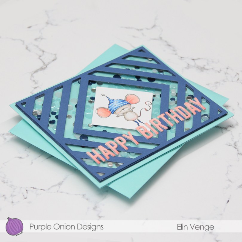
 My sister’s birthday’s in a few weeks, and I thought this was the perfect card for her. She used to have the nickname “musa” (the mouse) when we were kids. Our cousin, a few months younger, was also quite a bit bigger, earning her the nickname “rotta” (the rat). Of the two, I think my sister got the better nickname.
 I die cut the frame five more times, cutting away the interior pieces and stacking the frames to form the walls of my shaker. The frame is quite thin, so I didn’t trust myself enough with a ruler and a craft knife to create five identical frames. Die cutting seemed safer and quicker. I’ve kept all the pieces and am planning on using them in the future for a card or two.
 There’s quite a bit of dimension in this. Card base, five layers of walls for the shaker, a piece of acetate, die cut cover frame on top, then three layers of letters. Dimension is life!
 Limited color palette with such a small image.
 I colored up the image with my Copics. Nothing unusual about that, but these blues are brighter than the ones I normally use. The colored panel was too narrow to fill the width of a regular card, so I decided to put a frame around it. I used one of the wood frame nested dies from Hero Arts to create my frame from Classic Kraft card stock from Papertrey Ink, and built up layers by adding a few more frames behind the top one. I created a card bas from Lush Lagoon card stock from Papertrey Ink, and used the By the numbers impression, also from PTI, to create a debossed look to the card base. There’s quite a bit of blue showing outside the frame, so I wanted a little bit of texture there.
 Using Limelight card stock from My Favorite Things, I die cut the number (from the By the numbers die set from Papertrey Ink) four times and stacked them for a dimensional look. I adhered the number to the frame using liquid glue, and glued a white heat embossed black sentiment strip on top, with two more layers of black card stock behind that, for even more dimension.
 I added a bunch of green enamel dots from Papirdesign, and rummaged through my old patterned paper for one I could make an envelope from. I struck gold with this green one from Pion Design from 2010. I don’t use a lot of patterned paper anymore (at least not big pieces), but I can’t exactly throw it away, either, so I figure it’s perfect to create envelopes from. This way, they get used!
 Super bright colors. Well, except for all the browns. I actually used five colors for his sheriff’s badge before I ended up with a color I liked.
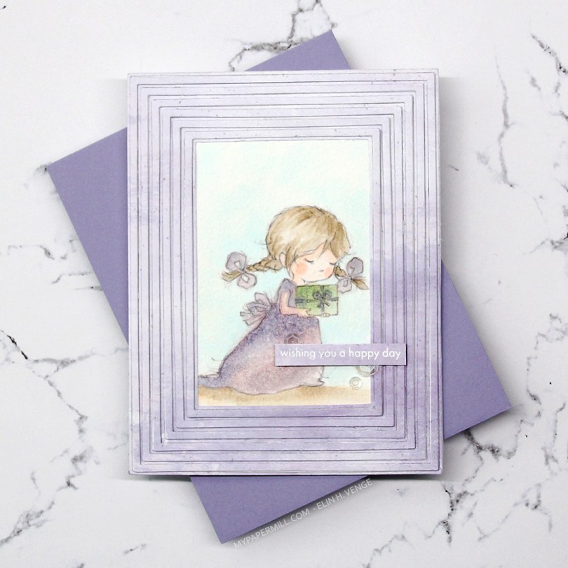
 Meet Grace. She comes in seven different poses, and each pose comes in a regular black lined version, and a more sketchy pencil style version, which is what I used for my card. I thought the sketchy look would be amazing with watercolor, but watercolor doesn’t play well with the ink in my printer, so I’ve totally cheated and used Copics. Well, Copic refills on watercolor paper, to be exact. Works like a charm and you get soft results, it’s fast to do and you don’t need a lot of colors. And for a sketchy style image like this, it doesn’t even matter if you go outside the lines a bit, it adds to that watercolor feel. I used this technique years ago (blog post
  I wanted all the focus to be on the image, and used the Fine Frames Cover die with some patterned paper from Papirdesign in a soft, matching purple, adding dimension behind every other frame (the wider ones), while gluing the others straight onto the card base.
 I stamped and white heat embossed a sentiment from the Statement Flowers stamp set from Altenew, before adding a few sequins from the White Orchid Sequin Mix from Little Things from Lucy’s Cards.
 Very limited color palette. I put a drop or two of color onto my glass work surface and picked up the color with a watercolor brush filled with blender solution instead of water. I have a watercolor brush just for blender solution.
 I stamped
  I used one of the Precious Polaroids dies from My Favorite Things, as well as a wishes die from Mama Elephant. I die cut both four times from Blue Yonder card stock from My Favorite Things and stacked them for a dimensional look. Directly onto the card base, I used a blender brush from Taylored Expressions with Classic Kraft ink from Papertrey Ink over a Tim Holtz mini layering stencil to create some interest in the background. I stamped selected words from two sentiments from the
  I’m woefully short on envelopes to fit A2 cards, and definitely didn’t have any blue, kraft or white ones to go with my card, so I pulled out my A2 V Flap Envelope dies from Simon Says Stamp and created one using scraps of patterned paper from Papirdesign. Blue with snowflakes, can you get any better for a blue, wintery birthday card?
 Very limited color palette this time, but it’s no wonder given the size of the image. I also used B90 for the hat, which is a color I’ve made myself.

 I adhered everything to my die cut panel, some directly, and some with a couple of more layers of paper behind them for added dimension. I added a couple of veneer snowflakes from Crafty Moly that I’d already white heat embossed with three layers of super detail embossing powder from Ranger. I used a piece of the strip of 12×12″ paper that has the barcode on it from Papirdesign. Their barcode strips are awesome. One side has the barcode and all the information, the other side of the strip actually has a design on it, so nothing needs to go to waste.
 I adhered everything onto a card base I made from Classic Kraft card stock from Papertrey Ink. I didn’t have any colored envelopes to match (and I’ve run out of white envelopes for A2 sized cards), so I used the A2 V Flap Envelope dies from Simon Says Stamp to create an envelope from some larger scraps of Maja Design patterned paper.
 As usual, I leave you with the Copics I used. In addition to B0000 and the blender, I also used B90, which is a color I’ve made myself, for the sky.
 I colored the skater boy using Copics, then fussy cut him right up against the black stamped lines.
 I don’t often use green as my main color in my cards, but on boy cards, I think it’s one of the best colors out there, even better than blue. And coming from me, that’s saying a lot. For this one, I used the Geometric Landscape stencil from Altenew, along with five different colors of Altenew ink for my background; Bamboo, Parrot, Grass Field, Shadow Creek and Evergreen. I smooshed the Grass Field onto an acrylic block and added some water to it, before using a paint brush to create green paint splatter in the background. I also pulled out my Black Marble ink spray from Ranger (Dylusions) and did the same with that.
 I mounted my ink blended background to a white card base using lots of foam tape, before adding the skater boy on top using some
  Blues, greens, gray and a little bit of skin and hair.

 I realized I hadn’t done my signature cluster in quite some time, so I found a few scraps of patterned paper from the Home for the holidays collection from Maja Design and die cut a couple of tickets from the scraps using my Happy Days Ticket Stubs die from XCut. I adhered them to the top right of the card and cut off the excess, before white heat embossing a couple of snowflakes from Crafty Moly. I white heat embossed part of a sentiment from the Oh penguin tree stamp set from Mama Elephant onto a scrap piece of blue patterned paper, before die cutting it into a banner using one of the fishtail flag frames dies from My Favorite Things. I added that to my cluster with a little bit of dimension behind it, glued a snowflake on top and finished off the card with three blue enamel dots from Papirdesign.
 Kind of a muted color palette for this one. I tried to keep it to a minimum, because there’s a lot going on in that image, and I didn’t want the end result to feel cluttered.
 After coloring the image, I used a die from the nested stitched doily set from Cottage Cuts to turn my colored piece into a circle with some nice detailing along the edge. I die cut two more from white cardstock and added them to the back for a little bit more strength and stability.
 Using the Detail Ringlet Plate from Simon Says Stamp, I created a white panel with subtle texture. I wanted something that wasn’t too plain while at the same time not being too distracting from the image. I cut down four more pieces of white card stock, added them to the back of the die cut one and adhered it to a card base I made from Berry Sorbet card stock from Papertrey Ink.
 A stacked die cut sentiment (die from Papirdesign) and a heat embossed sub sentiment from Norsk Stempelblad AS were added to the front, and finally a couple of matte gold sequins from Little Things From Lucy’s Cards. Before adhering it to the card, I used a shimmer spray on my colored piece, you can sort of see it in this photo, but it’s a lot more sparkly in person.
