
Hi, crafty friends. I’m sharing another birthday card today. Somehow I seem to be able to create birthday cards from pretty much every image I color. Birthday cards and holiday cards are my favorite cards to make, though, so I really don’t mind.
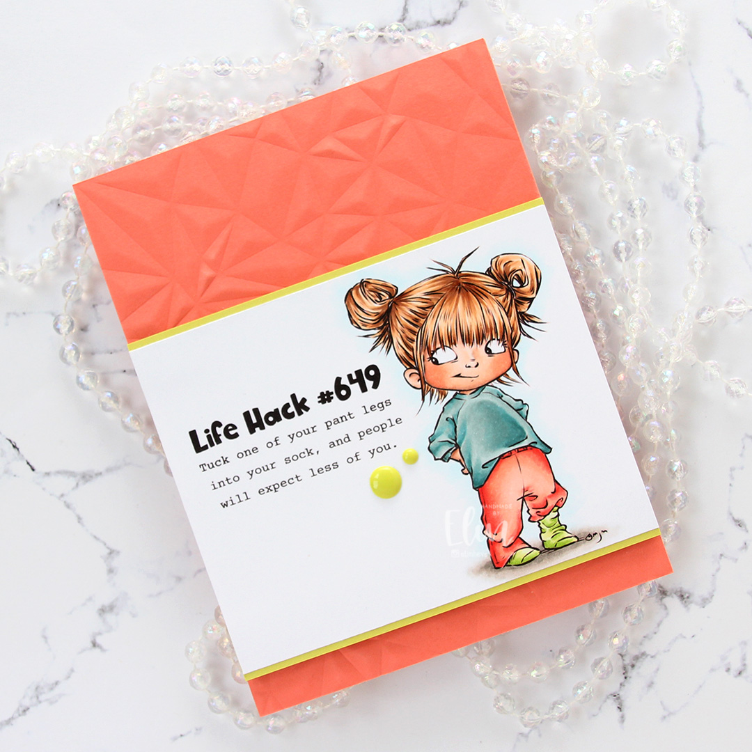
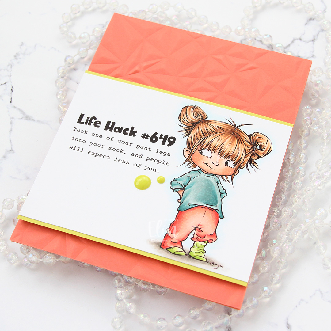
 I colored up The Sweetest from Mo Manning for this card. It’s one of her newer images, and it’s so cool. I went for a bit of an unusual color combination for me, starting with the BG90s which were already out on my desk after my previous project. Less markers to clean once done, that way – I always try to clean my markers after each image.
 Once the coloring was complete, I used the largest die in the A2 Double Stitched Rectangles STAX die set from My Favorite Things to turn my panel into a rectangle with a nice faux stitch around the edges. I then added a thick layer of Glossy Accents to the heart and let that dry.
 Using the Geometric Landscape stencil from Altenew, I ink blended a bit of yellow in the top right corner using Distress Inks in the colors Mustard Seed and Squeezed Lemonade, letting the lighter shade of the two fade to white. I then adhered my panel onto a top fold card base I created from Stormy Sea cardstock from Papertrey Ink.
 I die cut the word wishes four times from the same color cardstock using a die from Mama Elephant. I stacked the die cuts for a dimensional look and adhered them on top of my ink blended section.
 Using two stamp sets from My Favorite Things (Bitty Birthday Wishes and Itty Bitty Gifting), I heat embossed sub sentiments onto strips of Canyon Clay cardstock from Papertrey Ink. I die cut those using the Itty Bitty Strips dies, also from My Favorite Things, before finishing off the card with a few yellow enamel dots from the Pocketful of Sunshine pack of enamel dots from Altenew.
 This was a fun color palette to work with, and I think the finished card echoes that. I’d say it’s my usual style of card, just not my usual color palette. I need to branch out more often, I had a blast using these colors.
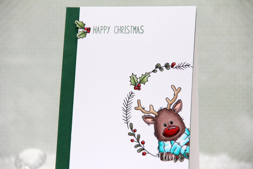
 There’s a stamp set in the release which includes a wreath and six different critters you can put inside, as well as a few individual stamps that go well with the wreath. I chose the wreath and the reindeer in the set for this card, making sure Rudolph was stamped a little crooked peeking into the front of the card from the side, I thought that made for a dynamic card design.
 Using my Copics, I colored Rudolph and the wreath and also one of the smaller images, which I also fussy cut.
 I trimmed my panel down so that it was 1/2″ more narrow than the card base and mounted it on foam tape onto a 4 1/4 x 5 1/2″ piece of Clover cardstock from Concord & 9th. They have the most gorgeous color range! Their cardstock isn’t very thick, so I don’t use it for card bases, but their colors are magical. This panel I adhered to a top fold card base I created from Stamper’s Select White cardstock from Papertrey Ink.
 I stamped a sentiment from the
  To finish off the card, I decided to add a layer of black glaze pen to Rudolph’s eyes. This makes them shiny and also adds a tiny bit of dimension. Once dry, I put a white dot in each eye using a 05 Gelly Roll pen. I also added Glossy Accents from Ranger to the berries and Rudolph’s nose for some extra shine.
 Rudolph and his shiny nose say hi. It’s really shiny!
 Fairly simple color palette. This card was so much fun to make, I love the playfulness of Rudolf with his head tilted in from the side of the card.
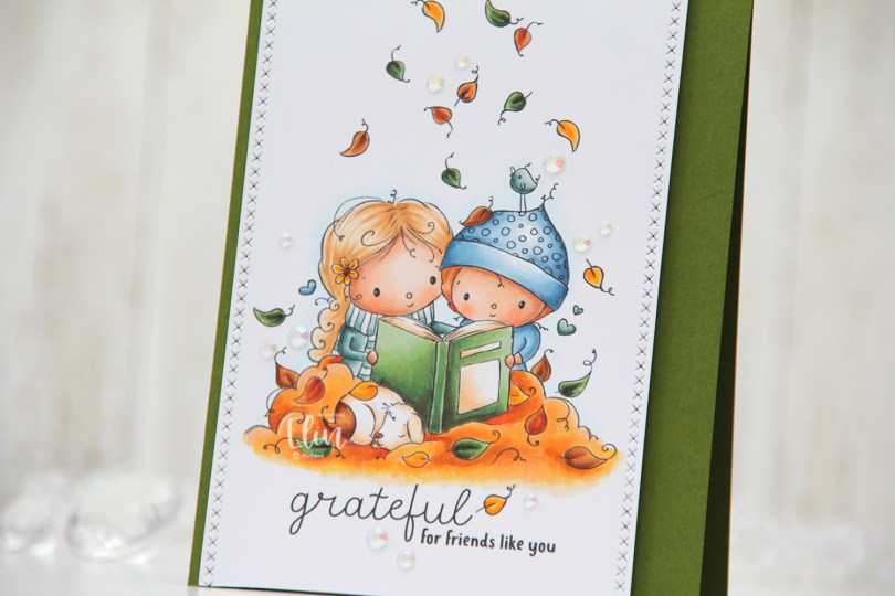
 The sentiment comes with the image. You can omit it if you want to, but I really like both the placement and the mix of the handwritten style with the playful print style. I decided to also add a few additional leaves above their heads. Aside from the green leaf to the left of the bird and the one leaf that’s landed on the hat, all the leaves above their heads are ones I added. I did that by copying the leaves already in the image and placing them where I wanted them; it’s one of the many advantages of working with digital stamps.
 I colored everything with my Copics and went for a much warmer color palette than I usually choose. Their clothes are cool tones, but everything else is in warm tones.
 I used one of the dies in the Stitched Borders set from Lawn Fawn to create the faux stitching on the sides of my colored piece, before I adhered it to a top fold card base I created from Jalapeño Popper cardstock from My Favorite Things. I did add a few additional layers of cardstock behind the panel for dimension, though.
 I wanted to keep the focus on this cute image, and scattered a few iridescent gems from the Glass Crystal collection from Little Things from Lucy’s Cards to finish it off.
 The gems catch the light and add to the warm feel of the card.
 I used quite a bit of Copics for this card, even though my coloring is pretty simple.
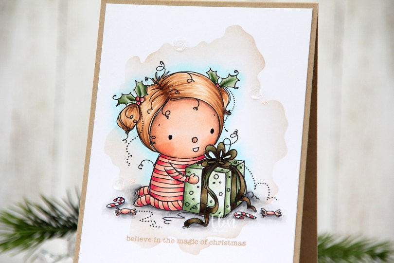


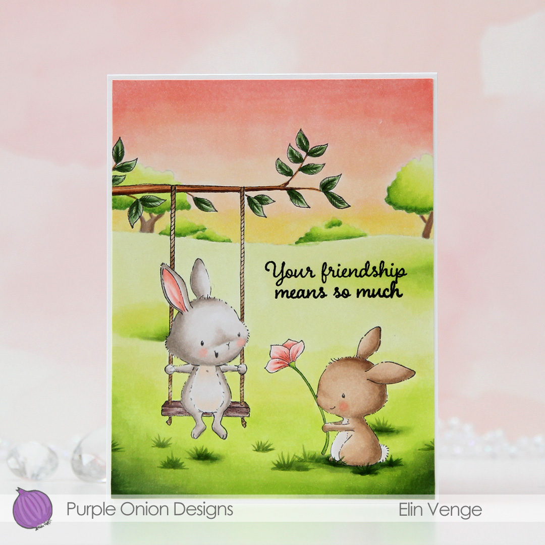 I stamped April (the bunny on the swing), masked off the rope of the swing, stamped the
 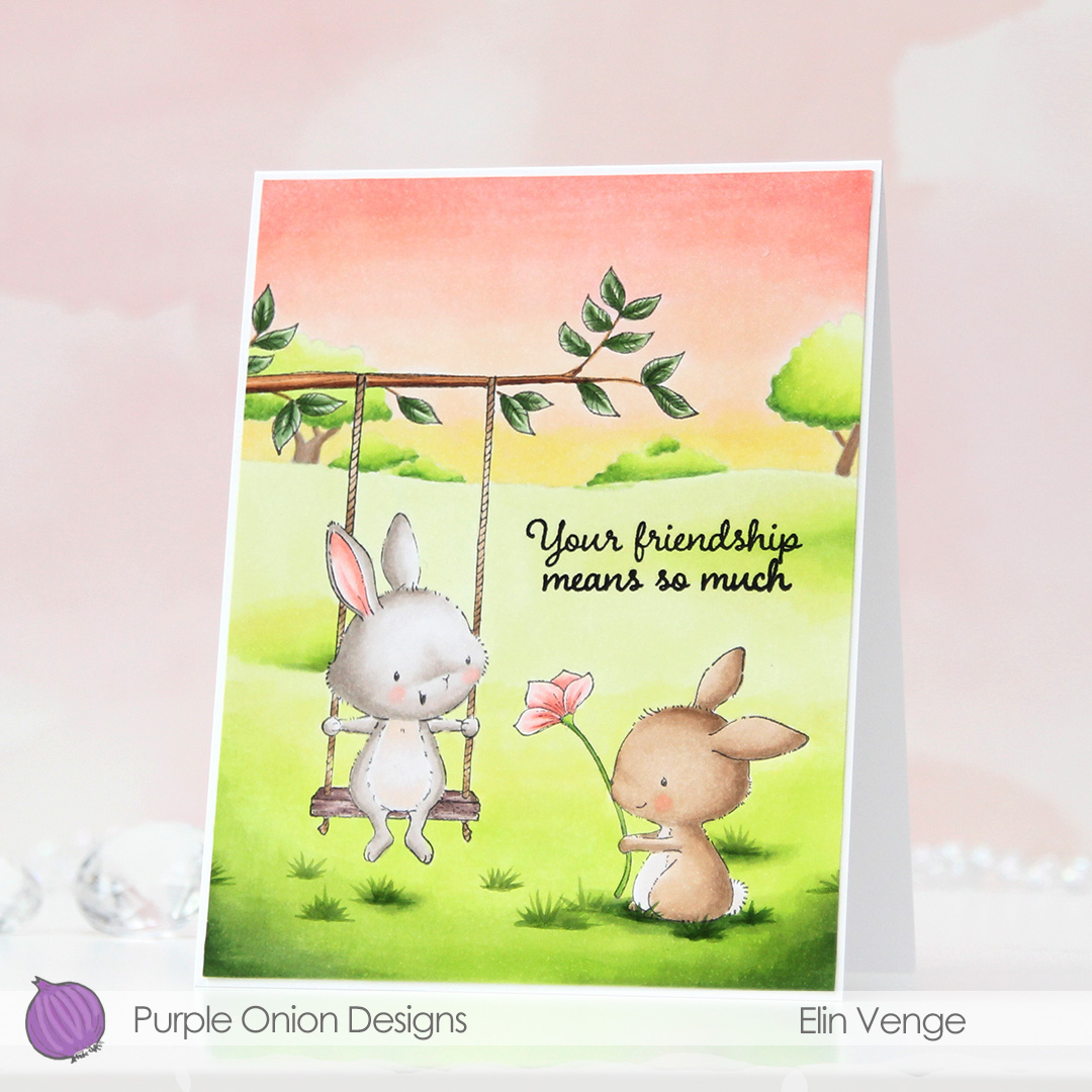 When I color full panels like this, I usually color the sky blue, but I wanted to shake things up a little for this card and gave it a soft sunset vibe instead. I live far enough north that the sun doesn’t really set until really late at night in the summer, but a girl can pretend, right? Anything goes when it’s a card, it doesn’t have to be very realistic – not that a bunny on a swing (or one holding a flower for that matter) is very realistic to begin with.
 I lost track of how many layers of green I added for the grass. I wanted it to be light and soft looking almost fading into white in the background to make the foreground stand out, and darker in the foreground so the critters would look like they belonged to the scene. I started with the lighter colors for my blends, then kept introducing darker greens towards the bottom and fading up into the background until I found the intensity I was after.
 Once I finished coloring in the scene, I added a sentiment from the
 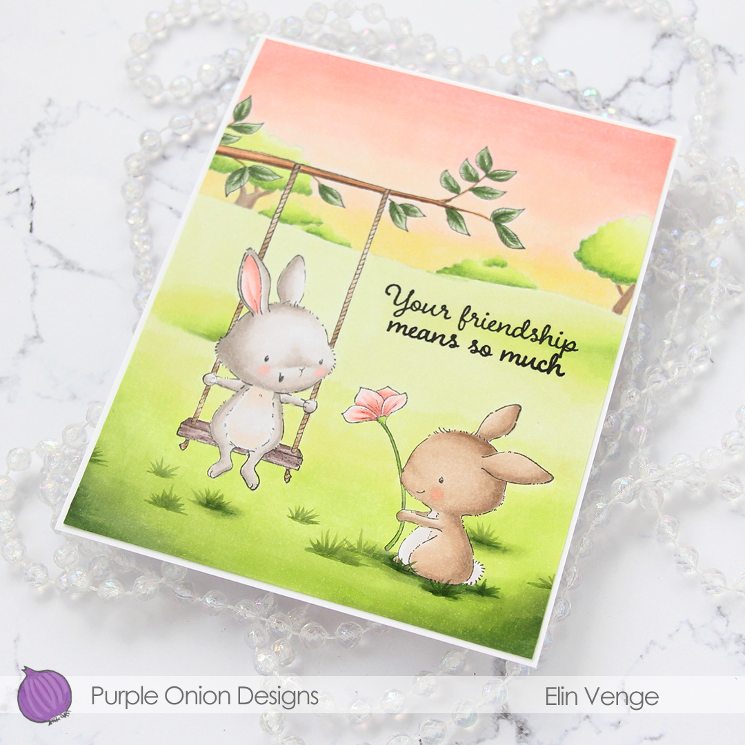 I trimmed off 1/16″ on all four sides of my colored panel and adhered it to a white card base I created from Stamper’s Select White cardstock from Papertrey Ink. I thought about leaving the panel a full size, but I really like the border the white cardstock gives, it’s a nice little frame.
 I find it odd that I rarely use more colors for full panels like this than just a simple image, but that tends to be how it is around here.
 For this card, I’m once again focusing on the
  I created a top fold card base from Enchanted Evening cardstock from Papertrey Ink. This is one of my all time favorite cardstock colors, and I hoard it, always afraid I’m going to run out even though I have several packs of it. I die cut the lighter blue panel from Blue Breeze cardstock from My Favorite Things using the Stitched Snowflake Backdrop die from Lawn Fawn. The die cuts a full size panel for an A2 card, I trimmed mine down slightly to have the darker blue border showing around the edges.
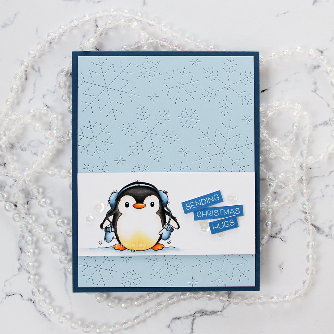 I added a few extra white pieces of cardstock behind my colored panel to make it stand out a little more against the background. I like the dimension it adds.
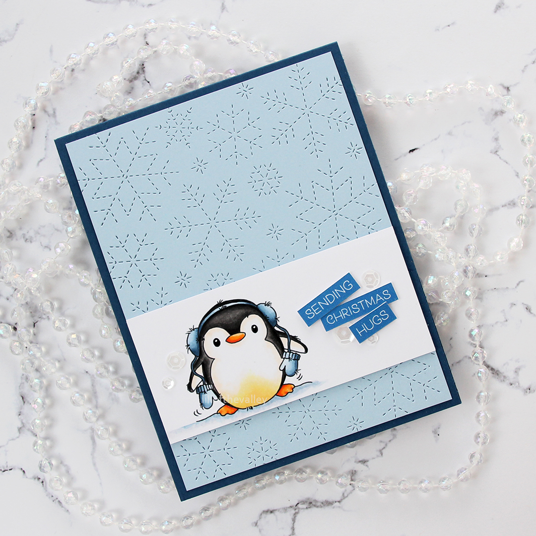 I used a few words from the
  To finish the card I added a few sequins from the White Orchid sequin mix from Little Things from Lucy’s Cards. I also added a bit of black glaze pen to the penguin’s eyes, and then a white dot of Gelly Roll 05 on top once the black had dried. This makes the eyes stand out a little against the rest, and the shine looks great in real life. It’s hard to photograph, though, so you’ll just have to trust me.
 Simple color palette for this one, these penguins don’t require a lot.
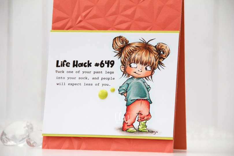
 Meet
Meet 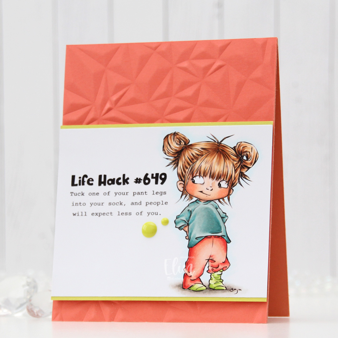 I colored the image with Copics, trimmed my panel down and added a thin strip of Limeade Ice cardstock from Papertrey Ink above and below for a little bit of extra color and definition.
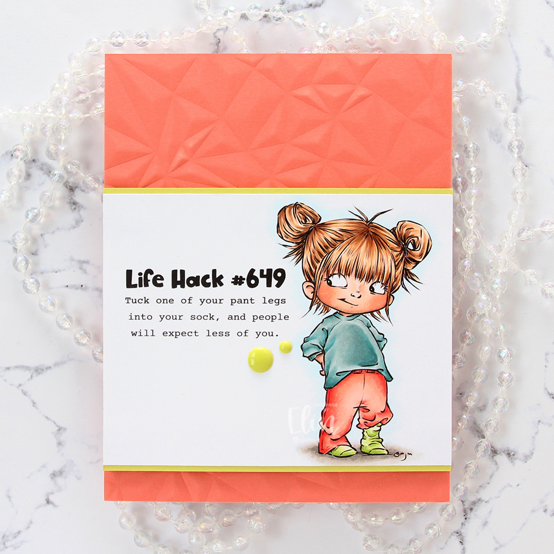
 I used more Copics than I thought I would for this. I even used BG71, which is a color I’ve created myself.
 This is
 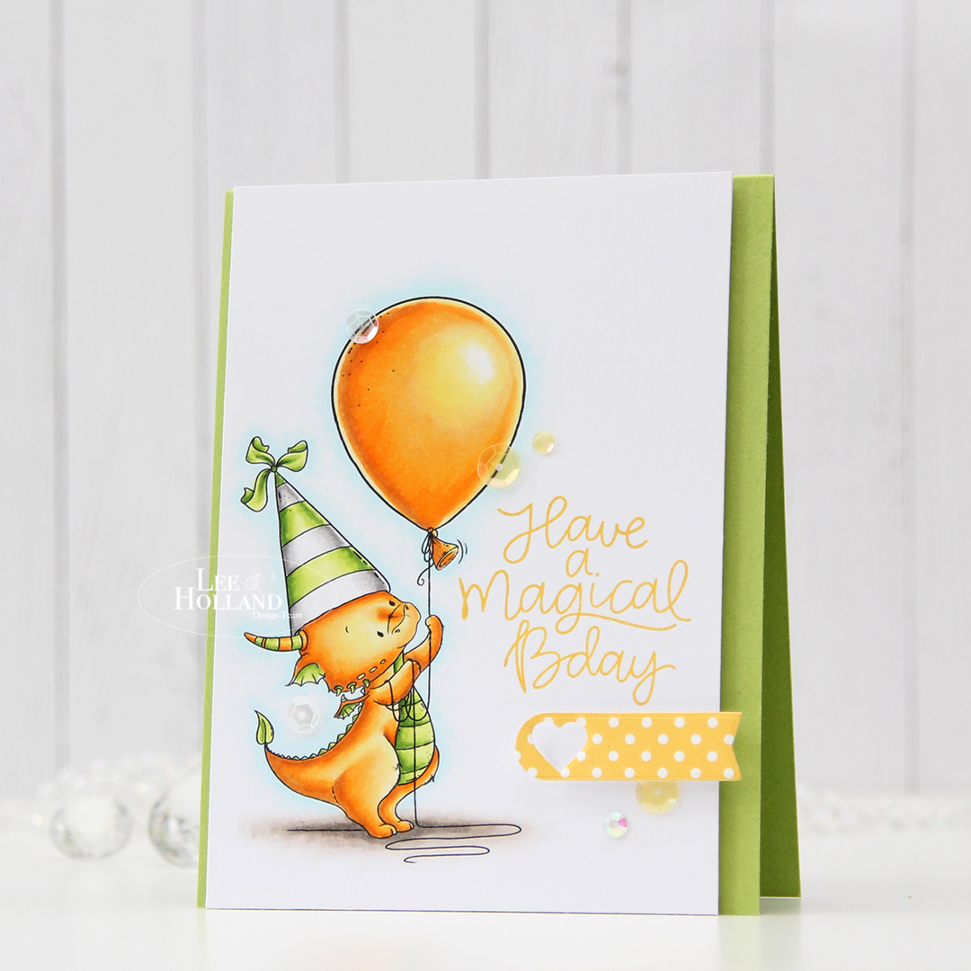 I stamped a sentiment from the Scripty Bday stamp set from Mama Elephant using Fossilized Amber Distress Oxide ink, then trimmed my panel down slightly and mounted it using foam tape onto a top fold card base I created from Green Parakeet cardstock from Papertrey Ink.
 I finished the card by adhering some sequins and a gem from the Seashore mix from Little Things from Lucy’s Cards.
 I colored the image with the colors she suggested, adding different colors only to bear. I trimmed my panel down slightly and stamped a sentiment from the Mini Messages stamp set from Mama Elephant using Sour Apple ink from My Favorite Things.
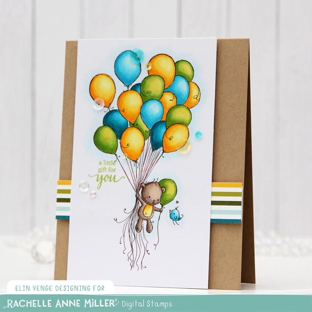 I created my card base from Classic Kraft cardstock from Papertrey Ink. I trimmed a piece of patterned paper from the Party Time 6×6″ paper pad from My Favorite Things down to a strip, and it had just the right colors for my card. I put four layers of white cardstock scraps behind it for dimension, and adhered it to my card. I did the same thing with my colored piece, adhering it to the card left of center, before using the Seashore mix of embellishments from Little Things from Lucy’s Cards to finish off the card.
 This color palette makes me happy!
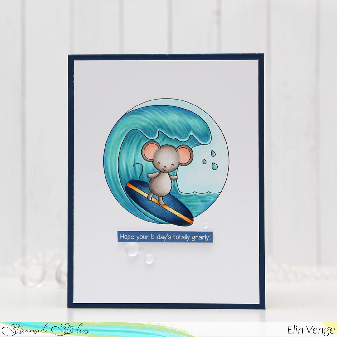 I printed the image in the center of a quarter piece of A4 X-Press It blending card, before coloring it with my Copics. I’ve never colored waves like this before, so I felt like I was in deep water.
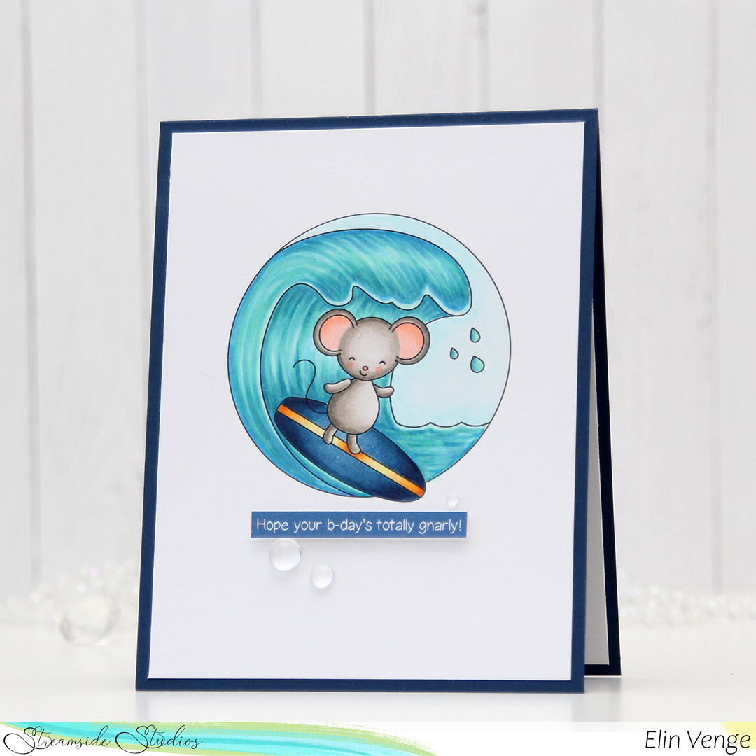 I’ve found, however, that the best thing to do is to just jump in. It’s just paper and ink, and not the end of the world if it’s not perfect.
 I trimmed my panel down, adhered it to a top fold card base I created from After Midnight cardstock from My Favorite Things and printed a punny sentiment that I put an additional four layers of cardstock behind for dimension, before finishing off with a few raindrops from Little Things from Lucy’s Cards. Super simple.
 That little bit of dimension is everything on a simple card like this. Oh, and the raindrops too, I thought they fit well with the aquatic theme.
 Lots and lots of blues for this!