
Hi, crafty friends. I’m back with the card I made for the second blog hop for the Alex Syberia Kickstarter Campaign. We had our first blog hop mid September, which you can find here, and our first IG hop about a week later. My blog post for that is here. For the first two cards I featured a sentiment set and one of the beautiful floral stamp sets. This time, I’m focusing on critters – penguins, more specifically. ONE penguin, to be perfectly accurate.
 I thought this guy from the Smile and Wave stamp set was too cool not to use, so I colored him with my Copics and did some fussy cutting, leaving a white border around the edge. I wanted him to stand out and to make a super simple card.
 I created a mask with some 2″ post-It tape by cutting a sloping hill with a craft knife. This is easy to do free hand, but you can use a curved die if you’d like.
 I wanted this guy to really stand out against the background and decided to ink blend using distress inks. I used Abandoned Coral, Worn Lipstick, Spiced Marmalade, Mustard Seed and Scattered Straw for the sky. The yellow and orange tones pick up the colors from his belly, beak and feet and really stand out against the blue of his hat. For the ground I used a little bit of Tumbled Glass Distress Ink near the horizon, fading into white near the bottom.
 I sprinkled on Chunky White embossing enamel to the background, making sure no granules covered my stamped sentiment before melting the granules from the back. I mounted the panel onto the white top fold card base using foam tape for dimension.
 I mounted the penguin onto foam tape and used some clear iridescent crystals from the Crystal Collection (Glass) from Little Thing from Lucy’s Cards to finish off this very simple card.
![]() Simple color palette.
Simple color palette.
Did you know that Kickstarter is all or nothing? That means that Alex Syberia Designs need to reach their funding goal to be able to go ahead and manufacture this beautiful collection, so please, help them! You can back them on their Kickstarter Campaign and you can help them spread the word about it!
Remember that you have some fantastic discounts, which are only available through their Kickstarter Campaign.
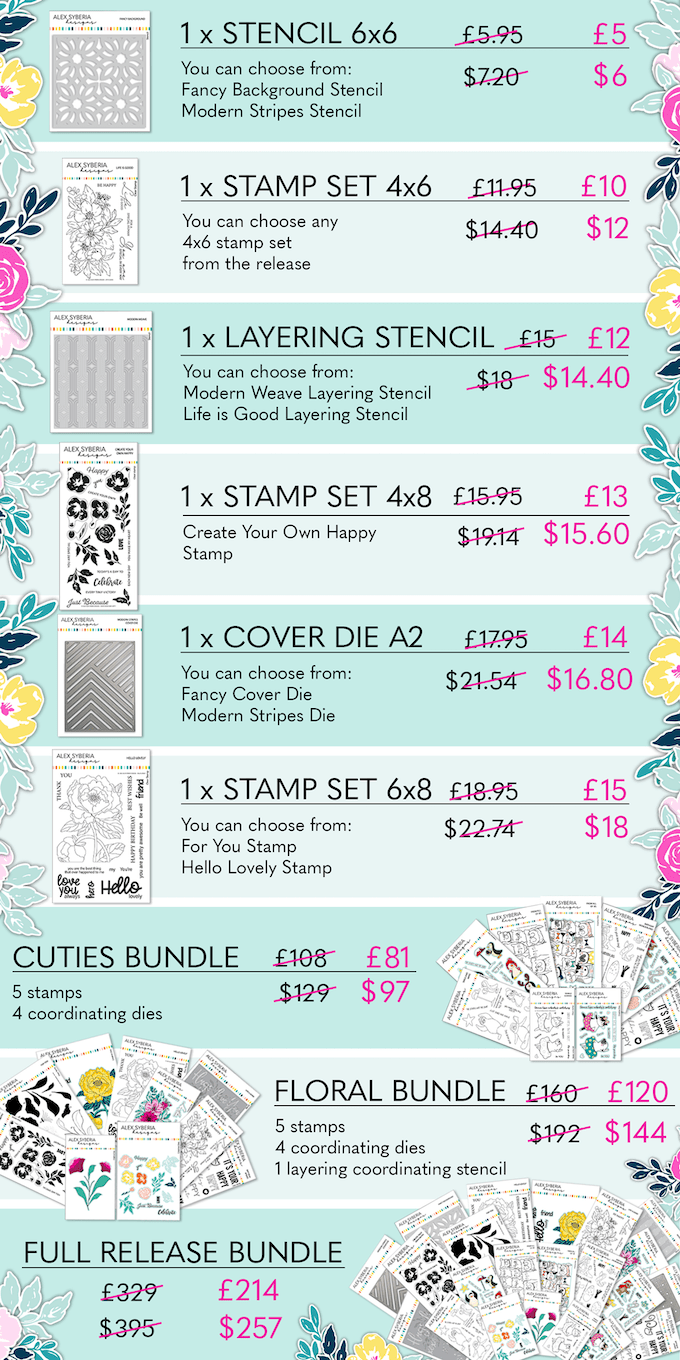
GIVEAWAY PRIZES | OVER £1000/$1200 IN TOTAL
- Alex Syberia Designs:
- Full September Release Bundle (worth £329/$395)
- Two bundles to choose from: Floral Bundle (worth £160/$192) or Cuties Bundle (worth £108/$129) *
- Artcreatiu – 25€ Gift Card
- Bearly Art – $50 Gift Card (open to US participants only)
- Catherine Pooler Designs – $30 Gift Card
- Crafty Purple Frog – £25 Gift Card
- Kit & Clowder – 30$ Gift Card
- La papelería de Lola – 25€ Gift Card
- Organizemore – $50 Gift Card
- Picket Fence Studios – $75 Gift Card
- Seize the Stamp – CHF 50
- The Gray Muse – $50 Gift Card
- Tonic Studios – £100/$100 Gift Card
- Wow! Embossing powder – £20/$20 Gift Card
* Check the Kickstarter Campaign for more info
That’s a total of 15 prizes for 15 lucky winners! To be in with a chance to win one of these amazing prizes all you have to do is play along with each of the four hops! Alex Syberia Designs will draw winners from those entrants that have played along the hops by 16th October 2022.
To enter, leave a comment on this blog post as well as those of all other amazing designers. You can see the full list, with links to each blog, below.
Winners will be announced on the Alex Syberia Designs blog on the 23rd October 2022.
BLOG HOP 2 | DESIGNERS LIST
- Alex Syberia Designs
- Bonnie Crane
- Brenda Noelke
- Carly Tee
- Cheryl Espie
- Colleen Balija
- Elin Venge <- You are here
- Erica
- Hannelie Bester
- Ilda
- Jessica Frost-Ballas
- Jo Herbert
- Jo Laverty
- Laura Fadora
- LauraJane
- Lien Leysen
- Liz
- Michelle Short
- Mindy
- Natasha Vacca
- Nicoletta
- Raquel Arribas
- Sandhya
- Seeka
- Tasha
- Tina Wilstrup
- Yasmin Diaz
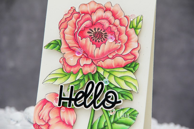
 I used the large flower from the Lovely hello stamp set for this card. This image is huge, and it covers most of an A2 card front. I colored the image with Copics and then fussy cut the whole thing. This image isn’t very detailed on the edges, so it was easy enough to fussy cut.
 I mounted my fussy cut image to a card base I created from Rustic Cream cardstock from Papertrey Ink using the Double Thick Crystal Clear Foam Tape from the Rabbit Hole Designs. This tape is super thick and super sticky, and it adds a ton of dimension.
 I used part of a sentiment from the same stamp set. It actually says Hello lovely, but I wanted the hello. I also fussy cut this, leaving a thin border around the black letters. There’s a coordinating die to go with this sentiment, but I don’t have it and don’t actually mind fussy cutting.
 I popped up the sentiment with foam tape and added sequins here and there using the Rosy Glow mix from Little Things from Lucy’s Cards to finish the card.
 This card has it all – dimension, shine and a gorgeous flower. What more could you possibly want?
 I used very few Copics for this image, actually.
 I printed the image with a 10% opacity onto X-Press It blending card before coloring. Whenever I want to color things that are supposed to look close to white (ice, snow, polar bears +++), I prefer doing a no line version. To me, there’s something very distracting about black lines on an image that’s supposed to look white, so I prefer the softer no line version. I colored the image with Copics, starting with the sky, then ocean, ice floe, polar bear and finally the penguin and his little scarf. I prefer doing the black towards the end, it’s just good practice to avoid getting it into nearby areas where you don’t want it.
 Once I finished the coloring, I die cut the panel using the second largest die in the A2 Stitched Rectangles STAX 1 set from My Favorite Things, before mounting it on foam tape onto a white card base I created from white cardstock from Papertrey Ink. I die cut the word klem (hug) twice from white cardstock using a die from Kort & Godt. It’s actually a Christmas die that says juleklem (Christmas hug), but by using only the latter part of the word, I have a completely different use for the die, which I love. That’s the whole card, I decided not to add any embellishments, I wanted to keep the focus on the image.
 Loooots of Copics for this deceptively simple scene.
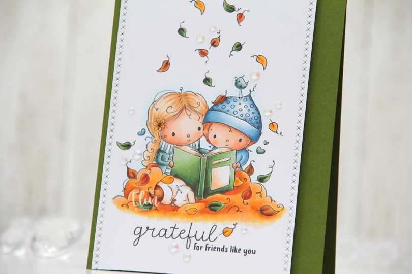
 The sentiment comes with the image. You can omit it if you want to, but I really like both the placement and the mix of the handwritten style with the playful print style. I decided to also add a few additional leaves above their heads. Aside from the green leaf to the left of the bird and the one leaf that’s landed on the hat, all the leaves above their heads are ones I added. I did that by copying the leaves already in the image and placing them where I wanted them; it’s one of the many advantages of working with digital stamps.
 I colored everything with my Copics and went for a much warmer color palette than I usually choose. Their clothes are cool tones, but everything else is in warm tones.
 I used one of the dies in the Stitched Borders set from Lawn Fawn to create the faux stitching on the sides of my colored piece, before I adhered it to a top fold card base I created from Jalapeño Popper cardstock from My Favorite Things. I did add a few additional layers of cardstock behind the panel for dimension, though.
 I wanted to keep the focus on this cute image, and scattered a few iridescent gems from the Glass Crystal collection from Little Things from Lucy’s Cards to finish it off.
 The gems catch the light and add to the warm feel of the card.
 I used quite a bit of Copics for this card, even though my coloring is pretty simple.
 I colored my scene with Copics on X-Press It cardstock and fussy cut right up against the black lines. This image has very simple outlines, making fussy cutting a cinch.
 I covered the entire colored panel with sheer sparkle craft spray from Imagine, it adds so much sparkle, which unfortunately is hard to capture in photos. It’s there in real life, though, trust me. I glued my colored piece onto a thicker white cardstock, both for a bit of stability and to hide the back of the colored panel. Copics bleed through to the back (you want that, it’s actually a sign that you’re using a good cardstock for Copic coloring), and I usually add my panels to card bases, but this one was different. I scored the white cardstock at the bottom and glued the back flap to the back bottom of an A2 card base I created from Lovely Lady cardstock from Papertrey Ink. With hidden magnets between the layers of the card, it stays shut and doesn’t fall open.
 You can see some of the shimmer in this photo, a couple of big droplets fell on the mushroom and the rainbow. I added pearls from the Igloo mix from Little Things from Lucy’s Cards for the mushroom, and used a black glaze pen from Sakura to make the eyes stand out.
 Lots of Copics for this one.
 There’s a stamp in the stamp set with a penguin holding a present. I thought it was perfect for a simple birthday card. I colored the penguin with Copics and added a layer of black glaze pen to the eyes for shine. Once the black was dry (this stuff dries fast), I went back in with a 05 Gelly Roll to add the white dots back in. I fussy cut the penguin and started working on the rest of the card.
 Using the Snow Drifts Cover-Up die from My Favorite Things, I decided to create some waves on the front of my card. I die cut four layers from white cardstock and used various shades of aqua tones for the top layer. From bottom to top they are: Tropical Teal from My Favorite Things (bottom two waves), Caribbean Sea from MFT, Hawaiian Shores from Papertrey Ink, Summer Splash from MFT, Sno Cone from MFT and Stamper’s Select White from PTI (top two waves).
 On the Hawaiian Shores wave, I used one of the big words in the
  I used the Sea Glass mix of embellishments from Little Things from Lucy’s Cards for a finishing touch. This mix was the perfect color for my card, and it’s sometimes fun to add something besides JUST sequins. There are a couple of gems and even confetti stars on this card, too, all from the same mix.
 I love the dimension of those waves, it’s very impactful, and the reason I wish I’d added dimension behind my penguin, as well, I feel he’s a little flat compared to the rest. Oh well, next time.
 Simple color palette for this one.
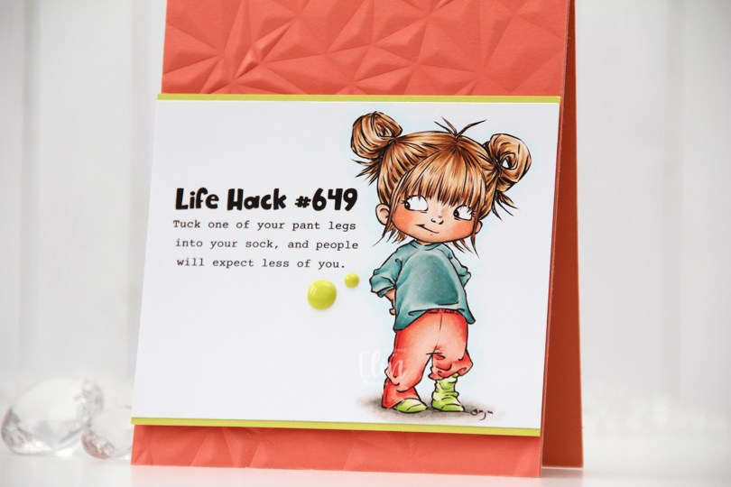
 Meet
Meet  I colored the image with Copics, trimmed my panel down and added a thin strip of Limeade Ice cardstock from Papertrey Ink above and below for a little bit of extra color and definition.


 I used more Copics than I thought I would for this. I even used BG71, which is a color I’ve created myself.
 As usual, I colored the image with Copics. I didn’t use very dark colors for this one, because I wanted the coloring to look soft. I purposely colored the owl in colors that wouldn’t stand out. By using the same colors that I used for the tree, they’re somewhat hidden and go well with the sentiment, which was my plan.
 I created a top fold A2 card base from Jalapeño Popper cardstock from My Favorite Things, cut down my colored panel to 3 5/8 x 4 7/8″ and mounted it on foam tape in the center of my card.
 From the same color cardstock, I used the Connected alphabet die set from My Favorite Things to die cut the letters to spell the word FRIENDS. I die cut each of the letters three times and stacked them for a dimensional look. Using Jalapeño Popper ink from My Favorite Things, I stamped the rest of the sentiment using the Bella Letters stamp set from Mama Elephant onto a strip of white cardstock from Papertrey Ink. I took my time stamping, I wanted this to look pretty straight, and if you’ve ever stamped a sentiment with individual letter stamps, you know that you just can’t rush it.
 I added an additional two layers of white cardstock strips behind my stamped sentiment. I added my dimensional white strip onto a slightly wider green strip, before adhering it directly to the colored image, before finishing up the card with some sparkly sequins from the Seaglass mix from Simon Says Stamp.
 Lots of dimension going on here. Dimension is life, after all 🙂 I added a tiny dot of black to their eyes with a Glaze pen to make them pop.
 Very simple color palette for this one.
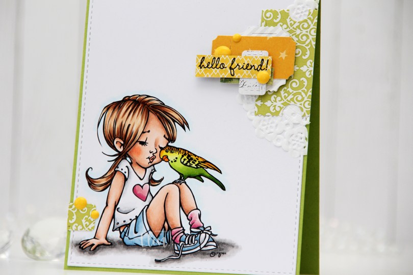
 I colored the image with Copics and die cut the panel using the largest die in the A2 Stitched Rectangles STAX 1 die set from My Favorite Things, before adhering it to a card base I created from Sour Apple cardstock, also from My Favorite Things.
 On my cluster cards, I usually choose two to three colors from the image to create scraps from. This time I chose green and yellow with a little bit of gray. Neutrals are always a good thing to add. I keep die cut scraps in stamp storage pockets on my desk, sorted by color. Whenever I want to create a cluster, I choose the storage pockets with the colors I want, dump the contents on my desk and start PLAYING.
 For this card I wound up using scraps from 3ndypapir, Karen Foster, Sunny Studio, P13, Magnolia and Papirdesign. By limiting the size and colors of my clusters, the design stays harmonious and you can’t tell that I’ve used patterned paper from 6 different companies. I adhere some directly to the layer below, some using foam squares. As a base, I used half a doily from Doodlebug Design that I had in a drawer. I love these tiny paper doilies, they’re perfect for this.
 Using VersaFine Onyx Black ink, I stamped a sentiment from the
  These cluster cards are so fun to make. They make my piles of scraps shrink EVER so slightly, but anything’s better than nothing, and I love the dimension they add to the card.
 I used quite a few colors for this one.
 The stamp is called Coco Loco, the name’s even funny. And also very fitting. I printed it near the bottom left of my panel of X-Press It blending card and printed my sentiment near the top right corner.
 I did some very simple Copic coloring of the palm tree, the beach and also colored a pale blue halo around it to give the illusion of some sort of sky around it. I prefer the look of this light blue on the outside of the actual image instead of the bright white of the paper, I think it looks more finished this way.
 I used the largest die in the A2 Stitched Rectangles STAX 1 die set from My Favorite Things to trim down my panel slightly and add faux stitching around the edge, before I adhered it to a card base I created from New Leaf cardstock from Papertrey Ink.
 I added some brown enamel dots from Papirdesign near the sentiment and also a couple near the image itself to embellish a tiny bit. I love enamel dots!
 To enhance the nuttiness of this image, I colored the cheeks pink and added Glossy Accents to what was already crazy looking eyes for a bit of extra fun.
 Simple image equals simple color palette.